
Mark Simonson is a long-standing figure of the type trade. During the many years he was employed as a graphic designer for a mail-order catalog company he was also designing fonts in his spare time, including Felt Tip Roman, an adaptation of his own handwriting. He began to sell them as early as in 1992 with the support of the American retailer Fonthaus (remember floppy disks?), but in 2000, he founded his own studio with the intention of doing design, lettering, illustration, and type, which has been his main activity since 2005.
Sign up for mailing
Get more typography articles straight to your mailbox. Sign up for our mailing list.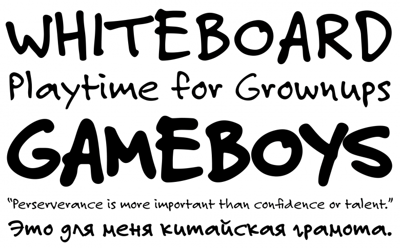
Felt Tip Roman
Simonson is unmistakably a designer who enjoys exploring the margins of history and crafting brand-new typefaces and families from neglected, forgotten sources. “I mostly try to identify gaps in what’s available. Nobody needs another typeface similar to something that already exists. Even if you can see a way to improve on it, it’s very difficult to compete with something that’s well established. This leads me to think in terms of hybrids, typeface ideas that exist in the unexplored conceptual spaces between existing typefaces. I also like to do thought experiments sometimes. For example, what if Morris Fuller Benton had made a geometric sans? What would it look like? Since he didn’t, it’s completely hypothetical, but it can lead to interesting new ideas. Or sometimes I will just find some old bit of lettering that appeals to me and doesn’t exist as a font yet. Bringing new typefaces into being and seeing what people do with them is what motivates me.”
“Some old bit of lettering” as Simonson wryly puts it, i.e. the hand-drawn logotype of a literary magazine from the late 1920s, gave birth to Goldenbook (2003). This typeface (available in three weights) takes on the classic Roman letterforms and brings another layer of refinement to their constant reinvention. Another example of this approach is Kinescope (2007), inspired by the hand-lettered titles in the Fleischer Brothers’ Superman cartoon series from the 1940s. Simonson energized the original designs, turning them into a poised and lively brush script typeface with deftly implemented OpenType features.
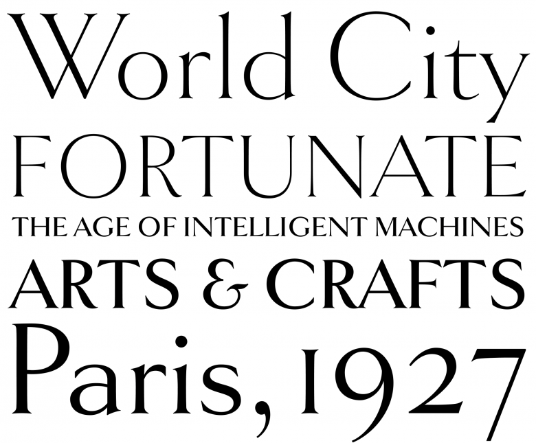
Goldenbook
“I enjoy looking at and learning about type from all eras, but I think I have a special affinity for the early- to mid-twentieth century. I grew up in the late 1950s and 60s, surrounded by artifacts from the preceding decades, things I would see at my grandparents’ houses, around the city in which I lived, in old photos, old magazines, old books. In the same way you learn to speak from hearing those around you and it becomes the language with which you think, I learned a kind of visual graphic language from the world around me. It’s indelibly imprinted on my subconscious mind. As a result, certain letterforms and styles are almost effortless for me to conjure up. I don’t have to think about them, they’re just there, just as you don’t have to think about how to say something in your native language. I used to resist it, thinking ‘no! you must be totally original!’ but I found that exploring these ideas was satisfying and was a genuine part of my ‘voice’ as a type designer.”
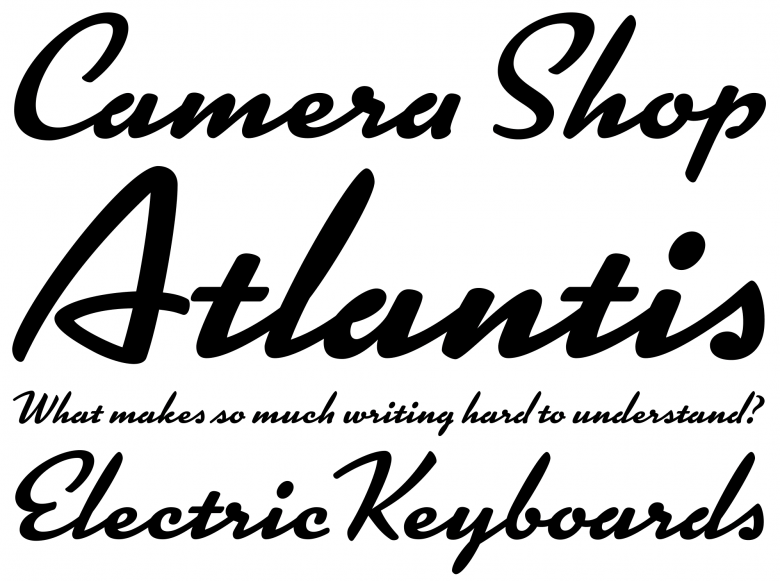
Kinescope
Bookmania (2011, Roman & italic, five weights) proves that Simonson can handle broad text families, even such an American typographic cornerstone as Bookman. First introduced in 1901 by the Bruce foundry as Bartlett Oldstyle, this typeface was regularly remade, remodeled and revamped throughout the 20th century, but Simonson decided it needed a new, digital version for the 21st. In particular, he increased its range of swash characters and kept its original sloped Roman as the italic. Would he consider his version to be rooted mainly in his country’s typographic tradition?
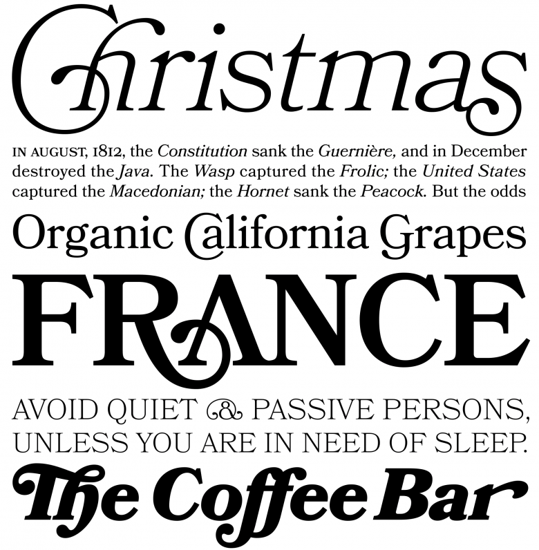
Bookmania
“Yes and no. I grew up in a small city in the midwest. My earliest memories of type were faces like Century Schoolbook, News Gothic, and Stymie. But I also remember noticing something like Futura when I was learning to read. It’s not like I was only exposed to American typography. I would notice that things imported from Europe had a different look, cars, toys, books, whatever. So that was entering my subconscious as well. When I was studying graphic design in college, a lot of that was about European design and typography, the Bauhaus and Swiss designers. So, as a type designer, I have always been aware of these different traditions in western typography. I like to think that I am outside of it, that I can pick and choose which of these traditions to draw from. But I’m sure that being an American affects the way I perceive these things.”
“There are so many young and talented type designers today. I think we are in a kind of type design renaissance. There’s a ton of crap, but there’s also more good stuff than ever before being released. When I got interested in type design back in the 1970s, there were maybe a dozen or two new releases each year that I was aware of, and only a handful of major ones. Seems like we get that every month now. And the quality is often higher.”
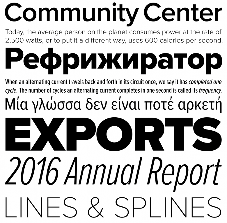
Proxima Nova
Among Simonson’s body of work, Proxima Nova (2005, revised and enlarged from his 1994 original, Proxima Sans) might be the intersection where several different traditions cross to create the perfect modernist sans serif. This substantial family (52 styles) remains his most successful project, especially for screen and website applications. Today, maintaining his catalogue keeps him busy, but he still has a few aces up his sleeve:
“It seems that for a while I’ve been spending all my time maintaining and updating my existing fonts. There is a certain amount of overhead once you build up a library. Customers want new characters to be added, expanded language support, new formats, technical issues fixed (it happens)… Whenever I revisit a font, I notice things that could be tweaked or improved, and I can’t leave them be. Sometimes I add new features. It seems like a font is never really finished. My workflow also went through some changes over the last few years, and it takes some time to get up to speed with new tools. I’m at a point now, though, that I think things have settled down, and I’m ready to get back to working on new things. I’d like to get some new faces out. I haven’t released anything new since Bookmania at the end of 2011. It really bothers me because I have a lot of ideas I want to work on, and I’m not getting any younger. So, I guess my long-term project is to get back to releasing new fonts on a regular basis. Soon!”