As this past year drew to a close, it was nearly impossible not to reflect on its chaotic explosion and wonder what in the world had just happened: 365 days of feeling politically blindsided, outraged, emboldened and weakened by the events of each day. But so much of what this past year has shown us reminds us of the importance of democratic institutions that protect rights like free speech, the freedom to assemble and protest, a free press, and the accountability of truth, all of which are served by typography. If 2016 was the year we were introduced to variable fonts, 2017 was surely marked by a more existential perspective of how typographers’ work contributes to how we access truth. By the sheer amount of output from typographic institutions and communities in exhibitions, books and conferences—all separate, of course, from actual client work—one thing becomes clear: we are striving to figure out the world the only way we know how: through type.
Type is the material with which we construct language, so it is fitting that—in terms of the public and private debates that happened this past year—contemporary culture demanded we ask tougher questions about the language typographers use. On Twitter, our community wondered whether the phrase “non-Latin” is problematic for smacking of otherness? The Alphabettes compiled last year’s notable conferences and highlighted the gender (in)equality of their speaker lineups, asking, are those we choose to speak on behalf of our industry representative of us as a whole? We are seeing more and more that this kind of public acknowledgement of inequity has positive consequences, as awareness drives real change.
Sign up for mailing
Get more typography articles straight to your mailbox. Sign up for our mailing list.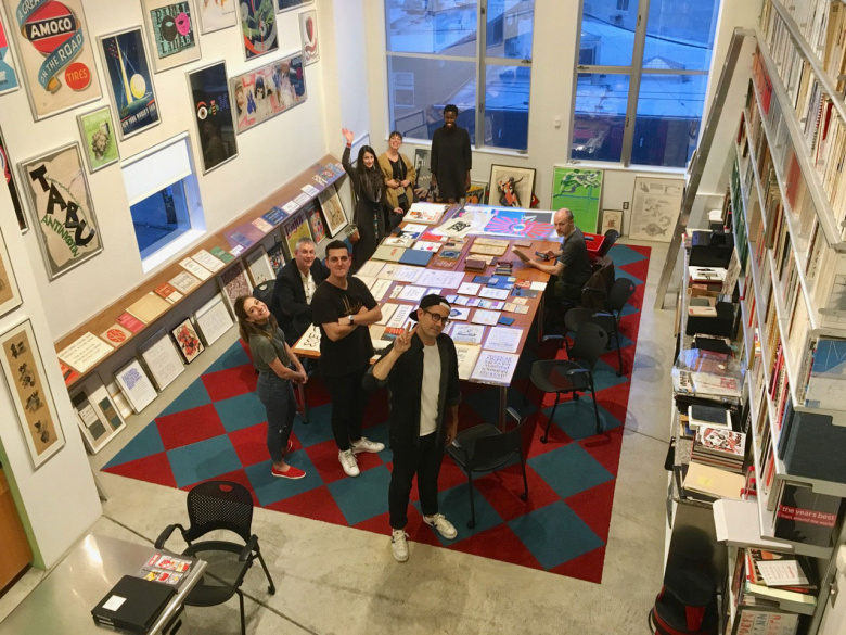
Photo © Letterform Archive
Institutions
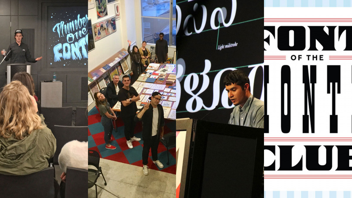
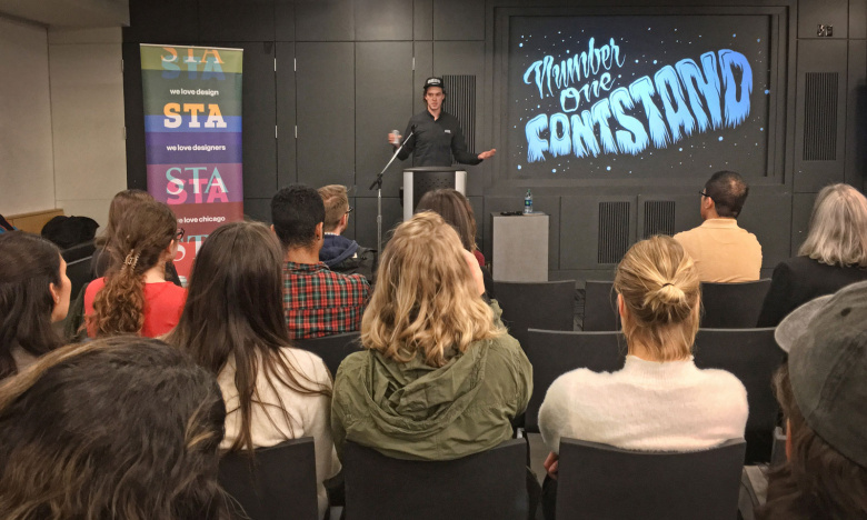
St Bride Library in London received renewed support from our community, with new membership schemes that help support and maintain this revered and storied institution for type and printing. And newer institutions, like Letterform Archive, in conjunction with Type@Cooper West, launched a new series of lectures at the San Francisco Public Library. Fontstand, in partnership with the Society for Typographic Arts in Chicago, organized a new lecture series of its own, which is an important addition to type education in the Midwest US.
James Edmondson. Photo: Frank DiBraccio
Exhibitions
If you’re looking for exhibitions that are still on view, Monotype has organized an exhibition and made a short video to support their five revivals of Berthold Wolpe’s faces, redrawn by Toshi Omagari, at the Type Archive, also in London.
The Bodleian Library at Oxford University features Designing English: Graphics on the Medieval Page, still on view through March. And at the Hoffmitz Milken Center for Typography in Pasadena, California, one can still see selections from the Type Hike project through the end of February, 2018.
The Grolier Club in New York featured an exhibition in the summer of 2017 entitled The Revival of Calligraphy: 1906–2006, curated by Jerry Kelly, which will be the last of its kind before the Club undergoes restoration beginning this February. At The Henry Ford Museum in Detroit—the renowned institution for the reverence of early manufacturing—House Industries opened, A Type of Learning, an ode to the influences of the foundry’s designers, which ran from May through September.
Conferences
The Type Directors Club marked its 70th anniversary with a one-day conference in New York City, called Type Over Time, featuring Paula Scher, Louise Fili, Stephen Heller, Erik Spiekermann, and a live Design Matters interview between Debbie Millman and Ed Benguiat. Following on the success of that conference, the TDC has organized another day-long conference for this March, called Type Drives Culture, featuring speakers and panelists who work at the intersection of typography and music, fashion, politics, and more.
The third TypoLabs conference was held in Berlin to much excitement, as were conferences such as ISType in Istanbul. The Non-Latin conference at Stanford followed on an exhibition, Facing the World: Non-Latin Type Design, 1450 to Now.
Typographics, the “festival for people who make and use type” at The Cooper Union in New York, and its sidekick, Type Lab, had a successful third year, complete with not only speakers and workshops, but also hugely popular walking tours of lettering in Brooklyn neighborhoods.
TypeCon was in Boston this past August, where it awarded Ramakrishna Saiteja its annual Catalyst Award, which is given to a designer under 25 who has demonstrated outstanding achievements in the field of type design. Just a few weeks later, ATypI held its 61st annual conference in beautiful Montreal. In April, Fontstand will hold its first own type design conference in Zagreb, Croatia.
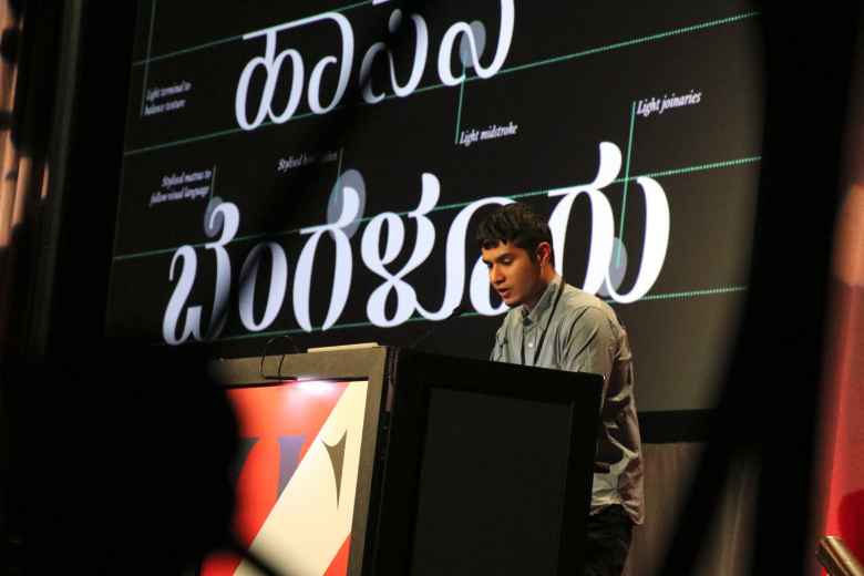
Ramakrishna Saiteja. Photo: Peter Bella
Books
Several incredible books were released in 2017, notably: Paula Scher: Works, a monograph by Unit Editions; House Industries’ The Process Is the Inspiration, another gorgeous tome that reflects on the foundry’s work over the past 25 years. A personal favorite was True Print, a book of work by the Swiss designer and printer, Dafi Kühne. Kühne breathes new life into the role of letterpress, bridging old technologies with digital tools, resulting in highly unique works, mainly posters, that are decidedly both contemporary and future-forward, and refreshingly never nostalgic.
A number of how-to books emerged this year, including How to Create Typefaces: from Sketch to Screen, written by type designers Cristòbal Henestrosa, Laura Meseguer, and José Scaglione, released by Tipo e, and featuring an introduction by Gerry Leonidas. Meanwhile, Danish designer Sofie Beier, who also spoke at ATypI in Montreal, published the compact Type Tricks: Your Personal Guide to Type Design. Lettering artist and type designer Martina Flor published The Golden Secrets of Lettering: Letter Design from First Sketch to Final Artwork.
In reference and history, September saw the publication of The Visual History of Type, written and designed by Paul McNeil, who is a co-founder of the British design firm MuirMcNeil. And Briar Levit’s documentary, Graphic Means, has been touring the world, with screenings taking place at conferences and within design communities from Sydney to Saskatoon. The documentary explores the technology and recent history of desktop publishing, with commentary by some of the world’s leading practitioners of graphic and type design, many of whom began their careers in the analog era.
Fast forward to technology today, with exciting explorations into new ways for people to experience and use fonts, such as the Future Fonts collaboration between Lizy Gershenzon, Travis Kochel and James Edmondson, and the India-initiated and Singapore-based platform, Fontstore. David Jonathan Ross’ eponymous foundry DJR launched Font of the Month, a fun way to get projects out into the world to see other people’s approaches to using the letterforms. Experimentation in type marketing continued with the microsite and exhibition for Klim’s Untitled Series. Also notable is the release of IBM Plex, IBM’s new and open-source corporate typeface.
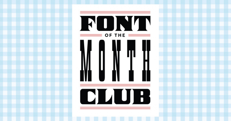
DJR's Font of the Month Club
Technology
Updates and new versions were introduced for many contemporary type-making tools, including FontLab 6, and an update from Typekit launched new features such as visual search. The continued development of variable fonts and color fonts indicates broader understanding and use in our future, including Google Chrome (Canary) support. Unicode 10 was released, and Fontstand released a public beta version for Windows support, with a shipping version soon to be announced.
Memoriam
The typographic community said goodbye to brand designer Margo Chase this past summer at the age of 59. Rich Roat, founder of House Industries, also passed away unexpectedly this fall. Advertising and branding giant Ivan Chermayeff died last month at the age of 85.
* * *
2018, even in its infancy, promises a fighting chance. While the road ahead doesn’t look any less choppy than the road behind us, typography and design can continue to push against norms and normalization that fail to respect others’ freedoms. Our abilities as communicators can be used for good: for speaking out, speaking up, making posters and digital products and tools, for serving clients with noble missions and ethical strategies. System-loving brains can help reframe conversations and create efficiencies where there weren’t enough before. We can continue to create typography that helps to inform, protect, and entertain. Or at the very least, lobby for and finally win the battle for a capital ß.
By Elizabeth Carey Smith, with contributions by Indra Kupferschmid