As the name implies, Commercial Type means for their typefaces to be used. Founders Paul Barnes (UK) and Christian Schwartz (US) have been collaborating since 2004 when they were commissioned to design the extensive Guardian Type family for the British newspaper of the same name. With two offices separated by the Atlantic and several time zones, passing the ball belongs to Commercial Type’s daily routine (and our interview).
Schwartz works out of the main studio in New York, “so I am more involved in the day-to-day running of the company, but other than that we both do a bit of everything,” he explains. “I am more technically minded than Paul, while he has more of a historical sense of type design. In terms of design direction, we have a lot of shared tastes, which I guess shows in Commercial’s typefaces, but we also realize that other tastes and ideas are needed for us to be interesting.”
Barnes works out of an office in London. “I like to say that I am the one who comes up with the loss-making ideas in the company, and Christian has the ones that actually are useable and make money. But we complement each other; a lot of projects are 90% done by one of us, but the other’s 10% contribution is vital. Being able to look at things with some distance of not being directly involved and from the other side of the Atlantic is great. We haven’t done a typeface together in a couple of years, but we really enjoy those kind if things.”
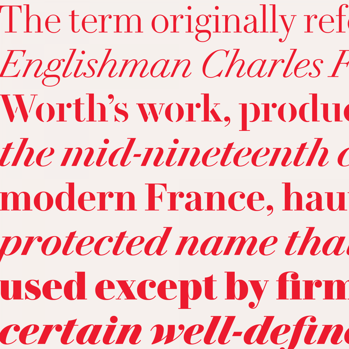
“The last was Le Jeune, a French Modern we did for Vanity Fair”, Schwartz recalls. “I had a good idea of what they needed, and with the help of Sébastien Morlighem, Paul found some interesting stuff that Molé Le Jeune had cut in the 1820s. I started drawing it, and then Paul got interested in drawing the Italic, which seems to be his natural preference, so we worked together. It was mainly remotely, but Paul was in New York for part of it. When we decided to release it, Greg Gazdowicz, one of our staff designers, came in and drew the stencil” .
In Barnes’ view, their collaboration is frequently an important catalyst for their work as individuals. “If one of us thinks something is a bad idea it normally makes the other one pursue it even more! When Christian first showed me Graphik I didn’t get it at all. And now, two years later, I think it’s brilliant!”
Sign up for mailing
Get more typography articles straight to your mailbox. Sign up for our mailing list.Despite their largely transatlantic working relationship, Schwartz and Barnes have much in common. Both, for example, worked in graphic design before specializing in type. “I had an education in typography at Reading”, says Barnes. “I think they had just gotten the Ikarus software in 1990, but making typefaces seemed an impossible dream so I never pursued it. It was only when I started working in New York with Roger Black, that I got introduced to people like Tobias Frere-Jones, and then the Dutch crowd, that I thought I would experiment. I never wanted to express myself in type, rather I wanted to make typefaces for design. I was brought up using metal type, and I was always trying to find things that didn’t exist in digital form, so I just made them. Not very well it has to be said. Only later did I learn a few good habits.”
Schwartz: “I had always been tinkering with letters and type design, even while working at a sign shop in high school, so it was natural that I ended up going to Boston and working for the Font Bureau, twice — once as an intern and later as a staff designer. Tobias Frere-Jones was working there during my first stint and it was very much like design school for me. Font Bureau’s co-founder David Berlow and Tobias taught me so much. After my second stint I left Boston to become the next great publication designer in New York, but I quickly learned that I was probably never going to be better than mediocre at making magazines, and gradually I was releasing typefaces through Font Bureau, House, and Emigre and doing a lot of work with Erik Spiekermann. And then I met Paul.”
That meeting happened through a mutual acquaintance, Andy Crewdson, and online, “like all couples these days,” Barnes jests. “Andy used to do a great website, Lines and Splines, which used my FF Bau,” Schwartz expands. “Next thing I know, this English guy is asking why I drew a double storey g. His email was both polite and accusatory. Turns out we both knew this typeface from different sources, Paul knew the version Haas issued with a single storey g. We started talking about projects, then Paul started recommending a few of my typefaces.” Barnes: “It was Amplitude for Wallpaper* when I was its creative consultant. And maybe Farnham for something or other. We quickly realized we had a lot of mutual friends. We had both worked for Roger Black, which is a kind of education in itself.”
One day, Barnes approached Schwartz to see if he could draw a proper version of Neue Haas-Grotesk. “I had been asked to be typographic consultant to The Guardian, by the design consultant Mark Porter, and I had this theory that the original Neue Haas-Grotesk would be just perfect. It never came off, but then The Guardian was looking for a serif typeface and I thought maybe Christian and I could do something together.” Schwartz: “So we started, and before I knew it I was coming to England, although I had never met this guy before! He turned up at the airport with a sign in Amplitude. We just seemed to click on things on lots of levels; design, music, humor.”
Barnes: “And we just learned so much from each other. I am a rank amateur at making typefaces, but Christian is a natural and has taught me how to make something properly. And the rest as they say is history. Even though we have been working together for over 13 years, we still get on. We still enjoy making things. I think both of us don’t get offended by the others criticism. And if we really disagree about a character, we put two versions in the finished typefaces.” “I think we knew pretty much straightaway that we could do things together,” Schwartz adds, “and when we finished Publico and then Guardian, we had these ‘children’ together, so eventually we decided that we would start Commercial Type. I am sure at times it would be good if we were both in the same place, but normally when Paul comes over to New York we end up getting nothing done, while he’s really productive.”
80
Commercial Type font families available to rent on Fontstand for a fraction of their retail price.Besides the work of Barnes and Schwartz, the company also releases typefaces by their staff designers Greg Gazdowicz, Tim Ripper and Miguel Reyes (working remotely out of Mexico) as well as with outside collaborators. “When we set up Commercial Type we didn’t want to just release our stuff,” Schwartz says. “That’s part of why we didn’t name the company after ourselves. Kai Bernau’s Lyon, which we had seen as a student project, was one of our first releases, later designs by Berton Hasebe, who was our first hire and was with us for 5 years.” “Don’t forget Erik van Blokland! He’s one of our heroes”, Barnes adds. “We like working with other people, and we also like helping young designers to release things. We know that things that Berton make, we couldn’t do.”
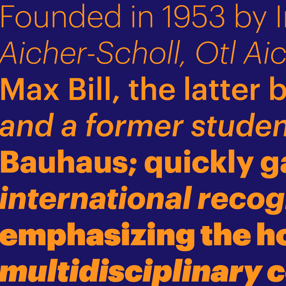
The Commercial Type catalog is varied and versatile, from corporate to playful to fashionable to timeless. “A good selection for designers in lots of fields”, as Barnes puts it. “Some are very contemporary, some more historical. We like making things that reference history — very accurately, or just in passing.” Schwartz: “Some like Graphik are very vanilla and can be used every day and bent to a designer’s will. Some like Marian are for special occasions, and are very flavorful. They almost impose their will on the designer. And lots of things in between. Marr Sans and Duplicate Sans are examples of this, plain sans serifs with some flavor to them. We probably release too many sans serifs, but that’s predominantly what graphic designers want to use right now!”
From the very beginning, Commercial Type has worked extensively in the realm of editorial design. To get to know some different groups of users and talk about their work, Barnes and Schwartz tried something extraordinary: they went on tour, through Australia in 2011 and through the US in 2015.
“Australia is small compared to the USA; we did six dates and probably reached a huge percentage of the design population. It was a lot of fun,” Schwartz remembers. “For the US tour it was over twenty dates, and we had to get a tour manager, but we probably only scratched the surface. It’s great getting to meet so many people, and we really liked the regional cuisine of both countries.” “Those pies in Australia were something else!” Barnes adds. “But it’s a huge amount of work, preparing the talks. Rachel, our tour manager for the USA tour, did so much but it was a logistical nightmare. We couldn’t do it in a logical way because AIGA (the American Institute of Graphic Arts with whom most events were organized) is all separate chapters, not centrally organized, so we were jetting back and forth across the US. It’s great to be able to hopefully enthuse people about type design and our work.
“For both of us New York was an amazing moment; it felt like we had achieved so much in five years. Talking about your work gives you some kind of buzz, but it’s also a way of analyzing things yourself, ‘why did I do it’?”. — “I think Paul also just wanted to see the USA.” — ”Sure. It was an interesting cultural experience. Seeing that liquor store in downtown Dallas using Dala Floda was great and very unexpected.” “There were some very humbling moments as well,” Schwartz recalls, “being picked up at airports by very nice people who had no idea who we were, and audience members who came up to us at the end and said ‘I really just came for the free beer, but it’s weird to learn that there are people who care so much about fonts!’”

