Montréal-based Coppers and Brasses is a studio and digital foundry specializing in “retail typefaces, custom fonts and tailored lettering.” It was created in 2012 by Étienne Aubert Bonn and Alexandre Saumier Demers, whose friendship goes back a long ways, as Aubert Bonn recalls: “Actually, we grew up not even a kilometer apart in the same little city, Rock Forest (How badass is that name? Sadly it doesn’t exist anymore), but never really met before college. We really met again while working at the same design studio during our studies at the Université du Québec à Montréal (UQAM). We also got our first real taste of type design together in a small class that Alessandro Colizzi was giving at UQAM, where we started toying with type design ideas, most of which were terrible but essential for learning the basics and developing a good eye. By the way, I hope there isn’t anything left of those. He could totally blackmail us with them.”
Sign up for mailing
Get more typography articles straight to your mailbox. Sign up for our mailing list.“For me,” he adds, “there wasn’t any big ‘Aha’ moment. I think my interest in type design came slowly from a combination of my passion for tools—really tools in general, I’ve always liked objects and software that allow the user to make something great with them—and my love of books and good editorial typography. While in college and university, upon my discovery of Hyphen Press, I started reading everything I could find about typography and type design and slowly started getting more and more interested. So I guess what makes it even more interesting to me today than it was yesterday is that it feels like there is an infinite amount to learn about the subject. Every day you stumble on a different problem, everyday you search for a different solution, everyday you learn something.”
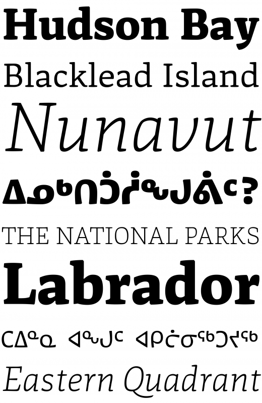
Nurraq
This process eventually brought him to the Type@Cooper course in New York where he earned a certificate in type design before entering the Type & Media program at the Royal Academy of Art in The Hague (KABK), where his graduation project was Nurraq, a Latin/Inuktitut type family. The following year, in 2014, Saumier Demers followed in his friend’s footsteps and moved to the Netherlands, winning the Royal Academy Master Award and the Department Award Master Type and Media with Lewis, a typeface designed for mathematical typesetting.
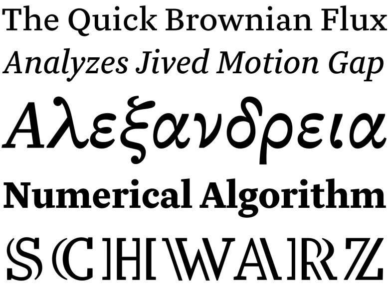
Lewis
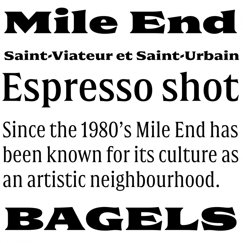
After returning to Montréal, they released their first joint effort, Martha (four weights, from light to black). This sans serif combines the strictly equal character widths of a monospaced typeface with the features of the grotesque style refreshed in a loose, whimsical way. Another of their projects, Double (2015), explores the late-nineteenth century “Latines” territory through a simple concept, a gradual expansion of width and weight in five steps from an elegant, light condensed version to its congenial, fat, large extreme.
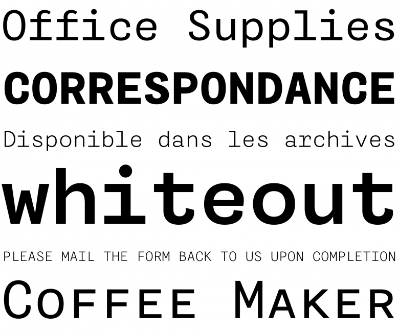
Martha
Double
“Regarding the development of the foundry,” says Aubert Bonn, “I think for us having complementary skills and personalities really helps. It’s all about working together towards a common goal, but the road to getting there individually would probably be much longer. By combining our visions and skills, I like to believe we get confronted with problems earlier and, together we can work to overcome these faster.”
“The way we work together on projects is pretty straightforward. For typefaces, usually we discuss an idea that motivates both of us and try to define the family and system as much as we can. Then, each of us starts working at one end (for example on different masters) while sharing and discussing (and sometimes arguing about) our discoveries, problems, limitations, etc. Trying to make two masters made by different designers work together well is a really fun challenge. Lots of back and forth, lots of discussion and lots of concessions are required, but I believe it is all for the best. Getting to mix our visions and our ideas always brings out something interesting.”
“When possible we work equally on every project, but sometimes it’s easier to go on our own,” adds Saumier Demers. “For example, when developing a single font or drawing a custom lettering, we may start together, but at one point one of us takes the lead and completes the job. We still exchange thoughts and critique each other's work, which greatly influences the results. Also, Etienne spends more time than me drawing fonts, while I enjoy taking care of the font production and developing our website. I am always looking for an excuse to write a new piece of code, even when it’s clearly a waste of time…”
“I guess teaming up came almost naturally. There weren't that many people around us with a real interest in typeface design. Therefore, in order to learn more, explore, get critique and discuss about it, we almost always had to do it together. In other cases, it would simply make the process more fun.” — Étienne Aubert Bonn
Coppers and Brasses’ latest typeface, Triade, was designed solely by Aubert Bonn. It is a heavy single-weight sans in three styles: Upright, Slanted and Backslant. These variations in slope were not artificially generated but individually designed and fueled with the crude and exuberant energy of sign painting. Like the rest of the collection, and indeed the foundry itself, it is bold, fresh and lovingly crafted. Is this two-man show breaking new ground in a country where type design seems to be less developed, less recognized than in other parts of the world?
“I don't think we can call our venture ‘groundbreaking’ but type design certainly isn't as common in Canada as it is in some other places,” ponders Aubert Bonn. “There aren't that many foundries in the country and we are pretty much spread all over the place. For this reason, I think I have a hard time seeing the Canadian field of typeface design as a whole. Not that there isn't a sense of community, but more in a way that there are very big cultural and social differences between regions —I guess that is the French Canadian in me speaking. But on a more local level, there have been and still are some people doing really nice work around us. We haven’t invented anything new.”
8
Coppers and Brasses font families available to rent on Fontstand for a fraction of their retail price.
Triade
Still, the arrival of Coppers and Brasses is another welcome sign of vitality, imagination and diversity in the trade, and their future looks bright.