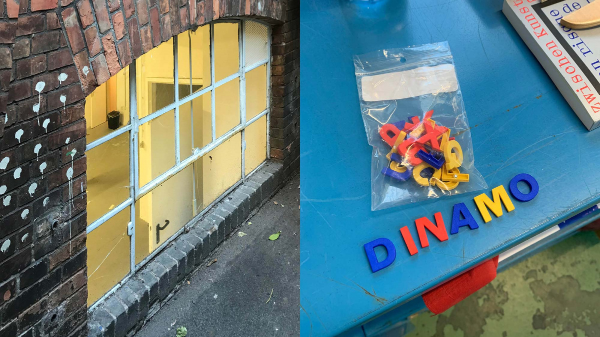
On your next visit to a type foundry’s website, take a moment to notice that you won’t find a toothbrush or a board game among its offerings. That is, if you’re shopping anywhere other than Dinamo. Perhaps founders Fabian Harb and Johannes Breyer describe their prolific Swiss company as a type design agency only because that is the best brief descriptor they could think of for a type-centric research practice producing tools, household objects, apparel, AR face filters, and soon, furniture. Dinamo continues to challenge the definition not only of what a type design company should offer, but also what a typeface is, and it regularly adjusts its recipe for doing so. The main ingredient? Community.
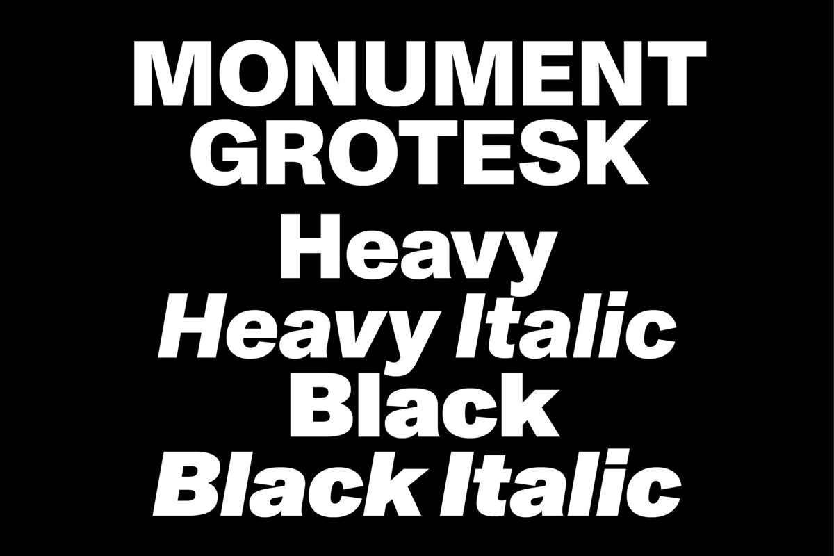
Dinamo is a force that prides itself on its people, and since its founding in 2013, it has worked with more than two dozen collaborators from various fields. In fact, Harb and Breyer themselves were first introduced to each other in 2009 by future Dinamo designer, Larissa Kasper of independent studio Kasper-Florio. “Larissa gave birth to Monument Grotesk half a decade later, a type child we eagerly adopted—full circle,” Breyer says. Soon after meeting, he and Harb “became friends and started to, very innocently, exchange graphic and type designs.”
Sign up for mailing
Get more typography articles straight to your mailbox. Sign up for our mailing list.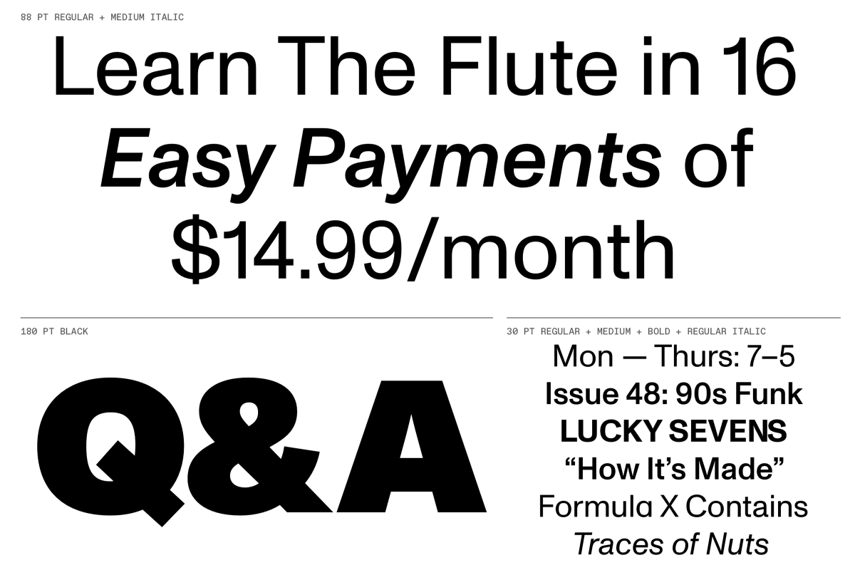
“I wouldn’t say that we’re necessarily finishing each other’s sentences—hard to tell anyway because there’s all these lags and gaps while Skyping—but it can come close to that.”
The ever-evolving Dinamo dynamic allows them to challenge each other to execute on spontaneous ideas that might otherwise be dismissed as incomplete. “A lot of ideas just come along the way and feel interesting or tempting to explore. Sometimes those what-ifs lead to […] something great, and many times not,” Harb says, “but if you do the same thing again and again, it gets a bit boring.” This abundant exchange continues to thrive, even though Harb is in Basel and Breyer is in Berlin. One might assume the challenges of remotely co-running an independent company outweigh the benefits, but according to Breyer, “sitting in different locations automatically makes you look at things from different perspectives. Everybody involved is shaped by their surroundings, and if those surroundings vary, it can only benefit the output.”
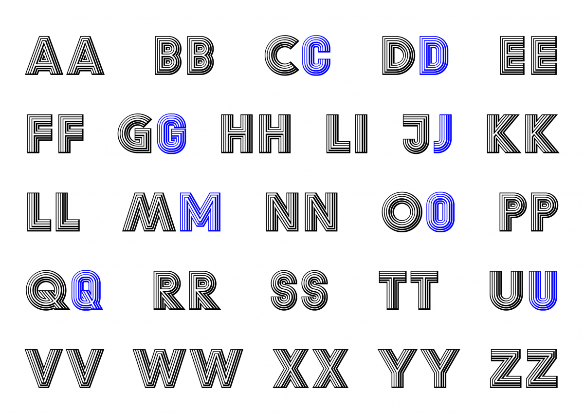
Beyond finding the seed of an idea and planting it, the duo also has a skill for gathering the right collaborators to make it bloom. Dinamo’s first official typeface release in 2013 was Grow, in retrospect a very appropriate title. It began as a proof of concept for something bigger, a type family comprised of several styles that could be layered in any given permutation, so from the start, Dinamo’s areas of interest extended beyond the fundamental processes usually associated with typeface design. In order to make the technical challenge of Grow a reality, they brought on programming aficionado and TypeMedia alumnus Gustavo Ferreira, who built a set of custom scripts to essentially automate the production of the 60+ style family from Dinamo’s 6 base styles.
“It made us realize that there are more possibilities than what Glyphs, RoboFont and co. offer you by default, and that most of the time there is somebody great out there who can help you with whatever idea you have.”
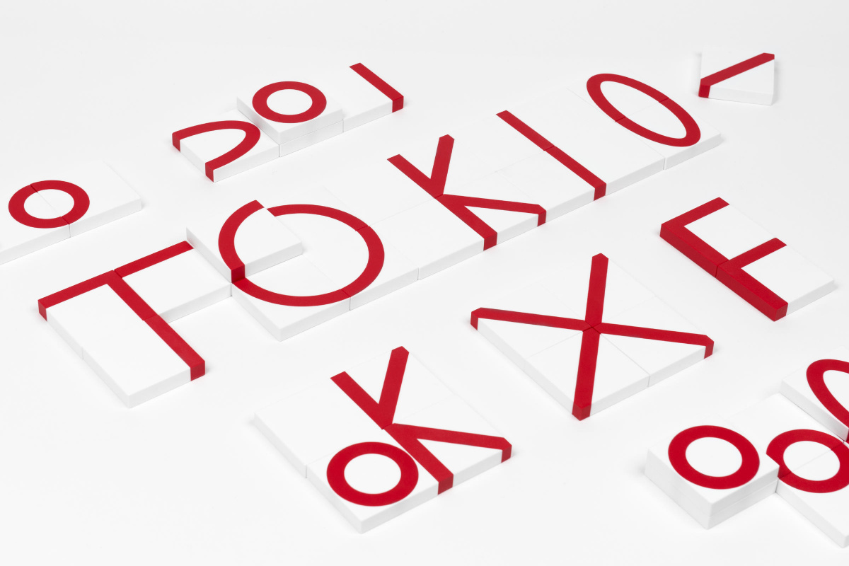
Soon afterwards, a similar technical challenge arose when they began developing the Galapagos system, a modular type family based on Felix Salut’s game Galapagos. Dinamo and their friends have continued to build tools not only for developing their own typefaces, but also for public use. For example, their web-based Dinamo Font Gauntlet allows designers to test and analyze various aspects of font software.
All of this is made possible by the teams Harb and Breyer build, with roles shifting organically as needed. “Typeface creation is inherently a collaborative process, and it always has been,” Breyer says. “For us, collaborating has proven rewarding in many ways, productivity-wise and socially, to name the two most obvious ones. I can’t imagine how one-dimensional it’d be if it were only me and Fabian telling our jokes to each other (even though those jokes are good!).”
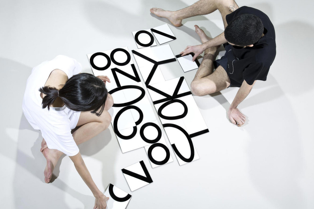
Galapagos
Through such open communication, ideas can be exchanged freely, and the more voices there are in the room, the more diverse the set of ideas. Although rooted in graphic design, Dinamo sees any project’s medium as fluid as long as it serves the concept. Nonetheless, typeface design remains the through line of the company’s broad collection of work. “Type, at least at the moment, feels like one of the most rewarding formats that we can exploit to apply our ideas, ideas that often originate in other areas of our lives. In some cases, ideas end up being translated into a product like a toothbrush, or an AR application like face filters,” Breyer says. “Some of our projects can feel as if one has Google-translated a piece of text one time too many. The result doesn’t have much to do with the original anymore, but it feels rewarding in a new way and in its own right.”
“We also grew into this over time, from learning and doing graphic design, slowly shifting to type design, being fascinated with fonts being these very basic and functional things that still allow for so much personal and stylistic choice.”
Their most recent project, the Dinamo Darkroom Toothbrush, came out of a partnership with Swiss toothbrush manufacturer Curaprox and is arguably one of the more high-quality, long-lasting design objects one might receive when visiting Dinamo Studios or attending a conference they speak at. It seems the best things to come out of Dinamo are born of inclusivity, whether that means freely inviting colleagues to join forces or boldly obfuscating the boundaries between what sorts of experiences a type foundry should and shouldn’t provide. Lately, Harb and Breyer have been most excited about their upcoming new website, or a slated partnership with Swiss chair manufacturer Dietiker, empowering Dinamo to support graphic designers in a more literal sense.
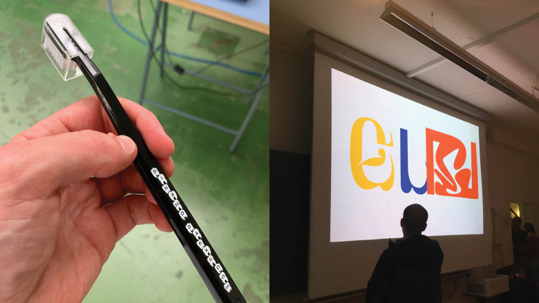
Dinamo Darkroom Toothbrush
61
Dinamo font families available to rent on Fontstand for a fraction of their retail price.Depending on where and when you look, Dinamo can present itself as a type kiosk, a fashion label, a product manufacturer, an indie-tech incubator, or a research facility. “I like the idea that we haven’t really defined what Dinamo is, but that you have to come back every now and then to see what it is at the moment,” Harb says. It shouldn’t be a surprise to learn that Dinamo avoids any concrete brand strategy or formulaic approach to carrying on with business. Dinamo is — at least as of the time of this article — an expression of what can happen when you stay open to new ideas.