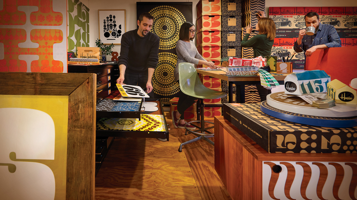
“I think I can speak for everyone in saying that we’re proud of the diverse body of work that we’ve been able to produce,” says Rich Roat, who founded House Industries with Andy Cruz nearly 25 years ago. Indeed, at first glance it might be difficult to describe what constitutes the House touch, as their output forms a compendium as consistent as it is multifaceted: fonts, obviously, promoted by a flamboyant series of specimens, catalogues and prints, but also objects such as alphabet blocks, toys, pillows and pitchers as well as bicycles and cycling outfits! Perhaps it would be best to say that House Industries gathers people with a passion for crafting witty, vibrant things, both reverent and irreverent, that are mainly rooted in the American design culture of the twentieth century, especially in its commercial and modernist aspects.
Sign up for mailing
Get more typography articles straight to your mailbox. Sign up for our mailing list.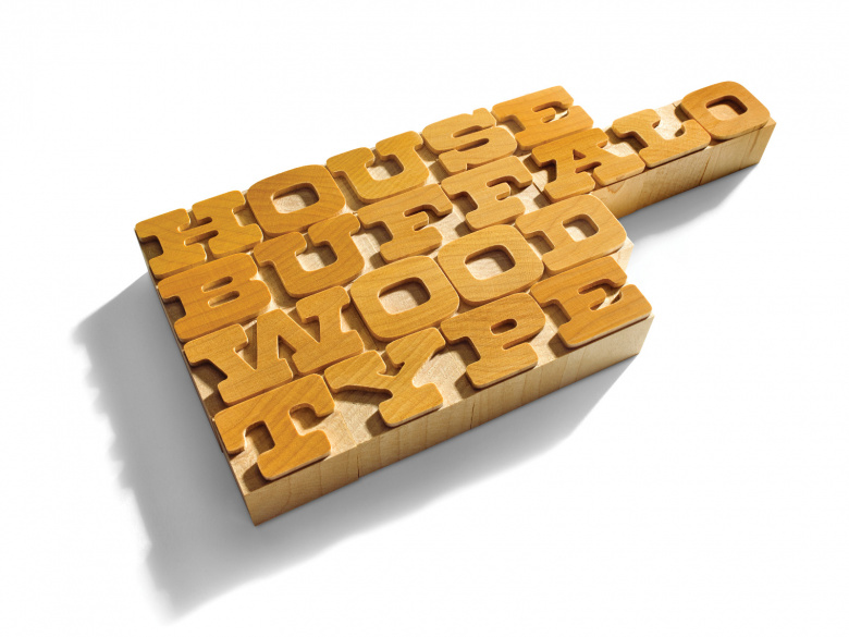
“Lettering and typography, whether digital or analog, have always been at the core of what we do,” adds Roat. “We have a huge exhibition running now [at the Henry Ford Museum of American Innovation in Dearborn] called ‘A Type of Learning,’ a convenient pun that describes how type is the gateway to our ongoing design education as well as being the common thread that holds House Industries together.”
This common thread has sparked countless projects and fostered many talented designers, first and foremost Ken Barber, the “in-House” type director and lettering wizard, but also Christian Schwartz, Tal Leming and Ben Kiel, among others. Several trends of display faces inspired by sign painting, hand lettering or calligraphy are prominent in the foundry’s catalogue. There’s also a significant modernist streak represented by high-impact sans serif families such as House Gothic, Neutraface or Chalet, the product of an elaborate prank resurrecting the groundbreaking typefaces of the fictitious Swiss clothing designer René Albert Chalet.
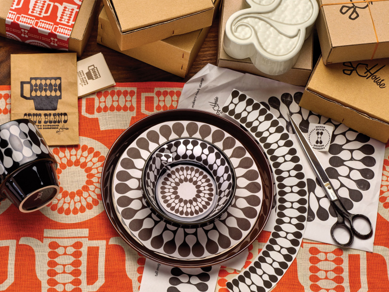
Not that House Industries doesn’t rejuvenate forgotten letters and transform them into state-of-the-art fonts. Alexander Girard’s alphabets gave birth to the jaunty collection bearing his name, and the eye-popping Rat Fink series pays tribute to the illustrator and cartoonist Ed “Big Daddy” Roth. Furthermore, House developed an unparalleled knack for growing typefaces from esthetic elements with origins in architecture and design, and skilled veteran Erik van Blokland was commissioned to create Eames Century Modern, a family comprising “16 serif fonts, 2 stencil cuts, 4 number sets, a ‘smart’ frames font and countless ornaments,” an impressive achievement and tribute to Charles and Ray Eames.
All these projects, and many more, are displayed in The Process Is the Inspiration, a lavish book recently published by Watson-Guptill, an imprint of Penguin Random House. “It was an answer to a question that is commonly asked of us: ‘Where do you find inspiration?’” says Roat. “When we thought about it, our inspiration came from the act of working, getting our hands dirty, figuring things out, failing, and trying again.”
“We started our company with one foot in the analog world and one foot in the digital, so that made us appreciate the lessons and advantages of both. We’re not so enamored with either technology or tradition that we can’t put the best of both worlds into our work.” — Rich Roat
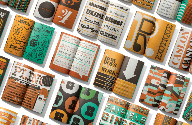
In 2003 this relentless dedication and love for the popular history of letterforms led House Industries to purchase the entire catalog of Photo-Lettering, Inc. (or Plinc), a “type house” originally established in 1936 in New York. For six decades, Photo-Lettering provided its clientele of graphic design studios and advertising agencies with a colossal catalogue of alphabets, using photographic methods to create and deliver on the spot logos, catchwords and tag lines.
A few years after rapidly emerging desktop publishing technologies drove Plinc out of business, House Industries got in touch with Ed Benguiat, Plinc’s art director and arguably the most prolific type designer ever. True to its modus operandi, House came up with a proposal to digitize five of his Plinc alphabets for a font series. This collaboration eventually set a much bigger project into motion, and in 2011, with the help of several partners, including Erik van Blokland who devised the Lettersetter system, House relaunched Photo-Lettering’s service as a simple headline-vending website that digitally approximated the original process. So far, 75 different faces (digitized Plinc alphabets and a few House hits) are available on this platform, and have also been remastered as print and web fonts for the retail market.
Fontstand is currently offering a selection of Photo-Lettering’s delights, such as Plinc Quaint (Paul Carlyle, digitized by Dan Reynolds), a rococoesque Tuscan; Plinc Behemoth (Dave West, digitized by Martin Wenzel) a robust slab-serif; Plinc Cooper Nouveau (Dave West, digitized by Dave Foster), a whimsical display; Plinc Stan Slope (Tony Stan, digitized by Susana Carvalho), a sloping script-modern; or Plinc Caslon (Ed Benguiat, digitized by Christian Schwartz), a vigorous bold interpretation of the eighteenth century British punchcutter’s Roman type. According to Roat, “there are many more Photo-Lettering fonts on the horizon (the original collection of film includes over 10,000 alphabets). Plus we have two big families in the works that we hope to release within the next twelve months.”
24
House Industries font families available to rent on Fontstand for a fraction of their retail price.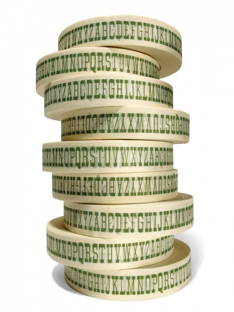
House Industries is certainly eager to continue its success story and seems set to thrive during its next quarter century. How does it see itself today in the context of the ever-expanding type business? “There are so many great type designs and great typefaces out there that it’s hard to say,” answers Roat. “Our type is unique in that we’re not afraid to celebrate the history and inspiration behind our fonts while keeping them relevant and useful in the present. That makes a connection to the past, present and future that adds another dimension to our collection.”