Your average type foundry wouldn’t choose a name that combines “letter” with “error” (and perhaps with moments of terror, depending on how you read it). To do so would surely go against all the pseudo-positivity of received marketing wisdom. But then again, received wisdom is hardly what one looks to LettError for.
Less a foundry and more a design space, LettError is the name under which designers Erik van Blokland and Just van Rossum first published the results of their creative collaborations, and which has since afforded them a space for “working separately together,” as they put it.
This is no one-stop, boutique-style type collection. While others set out to cater for your everyday needs as a designer, LettError has playfully opened up needs you never knew you had, or could have. Its output represents some of the most inventive thinking in type design over the last thirty years, manifested in fonts such as Beowolf and Bitpull, some of which illuminate catalogues from the independent and pioneering years of digital distributors such as FontShop International, some of which remain unpublished trail-finding experiments.
Sign up for mailing
Get more typography articles straight to your mailbox. Sign up for our mailing list.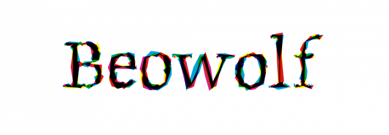
Beowolf
And still LettError continues to question the assumptions of the design process and to explore the possibilities of the experimental and imperfect in type. In van Blokland’s words, “‘I wonder what happens if ___’ is a good place to start for any designer.”
If there is a consistent strategy underpinning LettError’s design, it is almost certainly curiosity, the giving of form to a particular kind of pragmatic wondering.
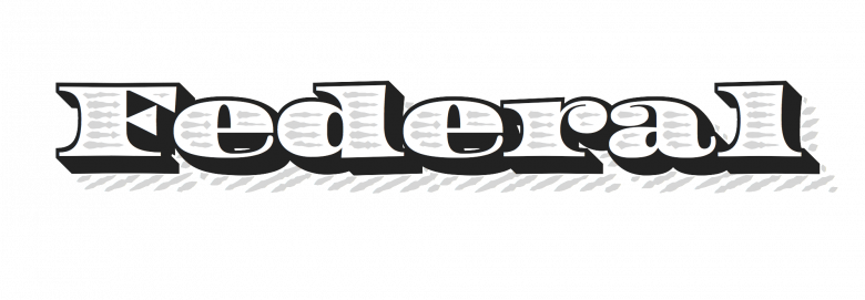
Federal is a good example. Taken at face value, it may seem to be just a revival, albeit forward facing and fearless. It revels in every exaggeration and exuberant excess of a bygone era but in such a way as to challenge the stifling sickliness of nostalgia, reframing the past in terms of present possibilities. “[Author of Modern Typography Robin] Kinross once called Federal ‘small beer,’” recalls van Blokland, “I suppose because it lacks the conceptual depth of Beowolf. But many of these ideas come from the same place, a curiosity about how a technical fact can be used to explore something new or different, add some liveliness to text or find ways to question precision and consistency. It helps to understand some of the underlying technology. It means you don’t have to wait for permission or someone else’s definition of what belongs in a tool for a designer and what does not.”
Federal Six Line
Federal Eighteen Line
This understanding of how things work manifests itself in the essential wit of LettError design, as with their “unleaded’ letterpress typeface Bleifrei, or in their everyday engagement with hands-on creation and the innovative practices it opens up, and for them, “opening up” might quite literally involve taking a screwdriver to a console and splicing old circuitry together with new. Van Rossum recently set about about incorporating audio tools into his design investigations, and has demonstrated the possibility of processing letterforms as discernibly different sounds.
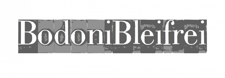
Bleifrei
Background informs this hands-on approach. “Both my parents are designers and had their atelier at home,” van Blokland says. “They worked on all sorts of projects, wooden toys, identity work, illustrations, so growing up I saw how all these things are made. The ideas, the process, the materials, the manufacturing; everything together affects the results. In order to design toys you need to have some understanding of children, but you also need to know what the wood does as a material and which milling machines the factory has available. And within all this you can still make something new.”
Background also informs van Blokland’s and van Rossum’s hands-on approach to an understanding of letters as forms, through their grounding in Gerrit Noordzij’s philosophy of type design as a form of writing, (both studied under Noordzij at the Royal Academy in The Hague though in consecutive years), and as a consequence, both are skilled in the drawing of letters.
Salmiak, a “wobbly Roman” from a time before wobbly lettering was a thing, evidences not only such ease with drawing but also an ability to make the most of a digital opportunity. Van Blokland describes the process of creating Salmiak as “a direct result of having learned sketching letters at all sizes. Rough and quick, and ‘oh hey, now we can make that into a font, why not?’” As the big foundries were just starting to digitize their existing catalogues LettError saw a chance to do something more original. “I think some of the excitement we felt with these early rough designs was because these things were not done. The first version of Salmiak took just a day. It was very rough but it was in the (home built) online store in the evening.”

Salmiak
It is this reciprocal relationship of hand and machine that perhaps best characterizes the LettError approach. Though they are still portrayed by many as “digital whiz kids,” such glib description not only belies their persistent success but also fails to recognize the essential celebration of the human as designer that centers their practice. As van Blokland explains, “Drawing by hand and drawing with digital tools are complementary, maybe even with some overlap. I think we may have reached that conclusion accidentally. There were some, but not many computers when Just and I were in at the academy in The Hague. But quite a few classes still focused on different kinds of drawing skills. I think practicing drawing changes the way you see, even when you’re not drawing. A better understanding of shapes maybe? Digital drawing tools have a mind of their own. While Bézier curves can make any shape, they tend to favor certain directions and it takes effort to impose your own ideas on them. So it is vital to have a plan for the shape that exists outside of the Bézier.”
A sketching metaphor is also how van Blokland describes his use of code, which also helps situate LettError foremost as designers who program. Intentionality is key, though their process pushes the limitations of protocols in an open-ended and iterative way. “As a tool in a design process, code lets us explore certain ideas,” Van Blokland says. “The code is often quickly written and ugly, and often discarded after seeing it work. Looking at iterations, choosing a direction for the next step means rewriting the code. For quick prototyping you need to be able to let go and throw things out. When everything is finished there is a program that does exactly what it needs to do, but we could not have written specifications for that code at the start. RoboFab, UFO, MutatorMath and of course FontTools, all started as small sketches that explored an idea.”
Such coding outcomes have been instrumental in the design of many fonts, and not only their own; LettError have been generous in their contribution back into the design community. As van Blokland explains, “In the beginning there weren’t that many people working on these problems and it made sense to share some of the code.”
“Sharing the basics kept a lot of wheels from being reinvented, and the reciprocation was beneficial to all.” — Erik van Blokland
10
LettError Type font families available to rent on Fontstand for a fraction of their retail price.“Just’s FontTools project is a great example,” says van Blokland. “It started as a small tool but has grown and now has serious support from a group of very skilled developers, not least among them Tal Leming and Frederik Berlaen.” Van Rossum continues, “It’s a Python library that deals with intricate technical details of fonts. It is very hard to get these things right in the light of incredibly complex and often confusing specifications and challenging legacy requirements. If we had kept FontTools to ourselves, we would not have been able to get it to the level of quality that it currently has.” Not that they have completely escaped those duties. “The code that started as a solution to a shared problem has grown into an unpaid responsibility that is increasingly difficult to combine with the demands of a small design practice.”
Nevertheless, such issues have yet to curb their enthusiasm for investigating the technological possibilities of the responsive and variable typefaces of the future they predicted in the past. Writing for Emigre back in 1990, van Blokland theorized, “If we put more data into our typefaces we can have some very intelligent fonts”. Today the potential for practicable application of those ideas seems imminent, as moving and dynamic type on high-resolution screens in everyone’s pockets becomes a reality.
In these transitional moments between eras in the story of type design there is plentiful opportunity to challenge existing orthodoxies and open up new creative spaces. As nascent car design drew upon the horse and carriage, so digital type perpetuates many of the formal assumptions underpinning the orthodoxies of modular metal type. Faced with the limitations of such rectangular ways of thinking, designers need to keep looking for different approaches, aesthetically and technically, challenging even the most basic of our received ideas. That LettError are out there leading the search and shaping our typographic futures through their digital expertise and human intelligence is reassuring. That they should make us smile while doing it, the best of bonuses.