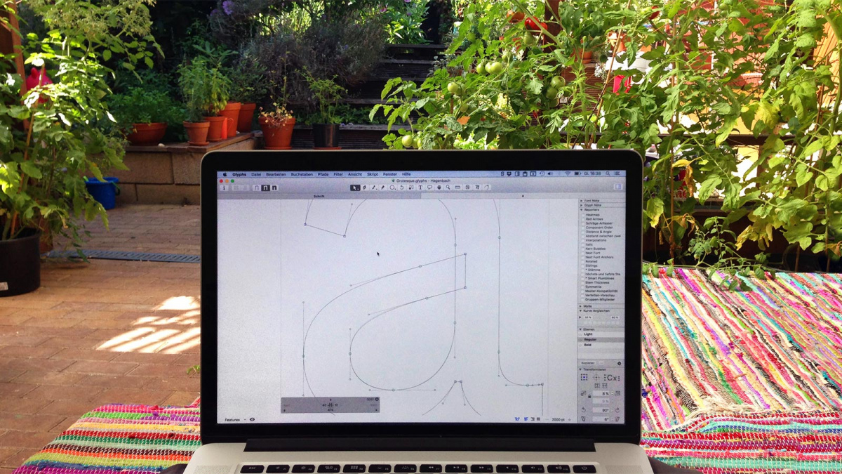
Among the new type designers who have appeared in the past ten years, Ludwig Übele may not be the most visible, but in the years since he established his digital foundry, LudwigType, he has crafted many fonts for retail as well as for various clients (a watchmaker, a bedding company, a rolling paper brand), not to mention numerous lettering projects and logotypes.
Sign up for mailing
Get more typography articles straight to your mailbox. Sign up for our mailing list.His design experience is broader, however. “I studied graphic design at Augsburg University of Applied Sciences. This school was not the best for design, but very good for typography, calligraphy and type design, and I really enjoyed working with type and looking at it. I think what I liked was the pairing of the simplicity of basic shapes in black and white with the cultural, historical, mysterious act of reading. I liked that it was not only about nice shapes, but also had an almost scientific, yet certainly cultural dimension. At this school, I also tried my first type designs. They were awful, but I enjoyed doing them. And then I worked for several years in design agencies. It was a good experience, but in the long run not really satisfying. Whenever I had a job which was related to type design I was much more enthusiastic. I also studied one year in Rovaniemi, in the very north of Finland, where I actually started my typeface Helsinki, which was inspired by the Finnish road signs.”

Helsinki
Aiming to become a professional in this area of design, Übele successfully applied to the Type & Media course at the Royal Academy of Art in The Hague (KABK) in 2006. “My final project was Marat, a serif typeface family, created first and foremost for printed text. The goal was to design a typeface suitable for what I call contemporary reading. Nowadays, most texts appear as an amalgamation of fragments: headlines, subheadlines, abstracts, captions, infotexts, tables and pullquotes mixed in with body text set in fairly narrow columns. We are used to skimming a text quickly and selectively rather than reading linearly from the beginning to the end. On the contrary, classic book typography usually consists of one text in one column, set in one type style and size.”
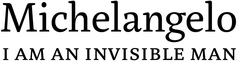
Marat
Marat Sans
“A typeface for contemporary reading has to deal with two major issues. First, the wide range of styles, weights and sizes in order to create a hierarchy from small text to big headlines. Secondly, the wide range of content from straight linear text to fragmented information consisting of plain text, numbers and symbols.”
“Marat, accordingly, is designed to be rather narrow, but not cold. Actually, due to its specific construction and individual forms, I think it’s very friendly and warm. The letterforms are relatively open, creating text that is pleasant and legible even at small sizes. Marat works very well in bold weights, which is not always the case for a serif typeface. I also made a very fat display Roman version that works as well. Again, I think the reason for this is its peculiar construction, especially how the shoulders connect with the stems. I continued to develop it after I graduated. And even after its first release in 2008, I modified some details…”
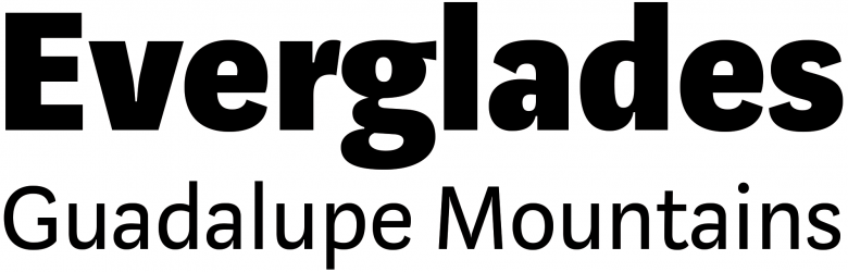
Marat, which received a Certificate of Excellence in Type Design from the Type Directors Club, sold unexpectedly well, a success gave him enough confidence to add a substantial Marat Sans family (27 styles) and to open LudwigType. “Naively, I thought that owning a foundry was just maintaining a website; only later did I realize how much additional work it is. But I’m happy that I did it.” His catalogue has grown at a steady pace and is now clearly divided between sans typefaces such as Riga and the recently released Kakadu, and serif typefaces like Diogenes and Brenta.
Riga
Kakadu
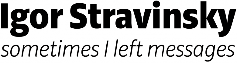
Diogenes

Brenta
Godfrey
Asked about his approach to these different kinds of letterforms, he says, “I think it’s much more important for a sans serif typeface to have a distinctive idea in the beginning. For me, it’s actually easier to give a very unique character to a serif typeface because you have many more elements to play with, whereas with a sans serif, you don’t have so much ‘material’. No serifs, no crazy terminals, no (or very little) stroke modulation. Sans serifs are much more uniform, so it’s harder to create something unique, new, interesting. For a serif typeface you just start and continue drawing, try different things, explore and balance, and if you do this carefully and keep on working, at some point, almost automatically, you get a nice typeface. But if you do this for a sans serif, you’ll most probably get a boring typeface which already exists, so it’s important to start from a strong concept. Of course, it can evolve during the design process, or can even sometimes disappear. But still, it’s very helpful to have it.”
“In my opinion, the most interesting sans serifs are the American grotesques. You can probably see this in most of my designs and also in my new sans serif typeface, which should be ready for release soon. I'm not sure how exactly to describe it; it’s a text typeface, more narrow than wide, with more classical than modern proportions. Its italic is full of verve.”
17
LudwigType font families available to rent on Fontstand for a fraction of their retail price.Regarding how existing designs from the past are likely to inform his work, Übele has ambivalent thoughts: “I’m very interested in the history of type. I love looking at old specimens and exploring the letterforms of the old fellows, but still I hate ‘historicized’ designs. All these typefaces currently attempting to copy this quirky-retro style which looks like ideas from 50 or 100 years ago, that’s not really my thing. I don’t think I could ever do a real revival. I feel too much of an urge to make my own design decisions. Of course, I’m very much influenced by history and by the different styles that appeared over time, but I don’t want to copy them, I want to create something new. I really like what Mahler once said: ‘Tradition is not the worship of ashes, but the preservation of fire.’”