10 years ago, Joana Correia left her native Portugal and moved to England. She entered the University of Reading’s renowned master’s program in type design, a crucial experience that confirmed her newfound vocation.
“Coming into type design was a surprise to me,” says Correia. “I never thought about designing type. I studied architecture first at the University of Porto, and I worked in architecture for some time after that, but I quickly became disappointed with the field. There was already an economic crisis in Portugal when I graduated in 2003, and there weren’t many jobs in architecture, so I started to teach yoga. I taught many classes, and I even founded a yoga studio in 2005. I did it for two years until the money ran out.”
Sign up for mailing
Get more typography articles straight to your mailbox. Sign up for our mailing list.“I went back to architecture because I missed the intellectual challenge and the design work. At the studio I actually ended up doing more graphic design, and that made me interested in going back to school to study it more. I was lucky enough to go to the Escola Superior de Artes e Design (ESAD) in Matosinhos, close to Porto, in 2008. I studied communication design and took a course in typographic studies taught by type designer Dino dos Santos from DSType. I’d always loved letters, books, and reading, and I fell in love with designing type. It felt quite close to architecture: the history, the attention to detail, the systems you need to create. From there, I read all the books I could find and was always asking my teacher questions. Then I traveled to Reading and met Gerry Leonidas, and the rest is history.”
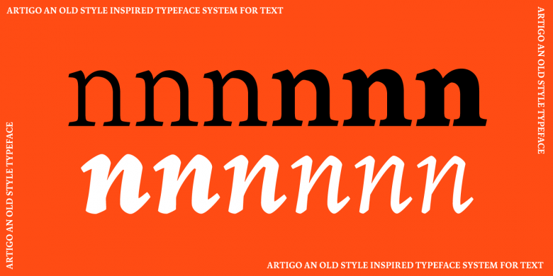
Artigo
Artigo
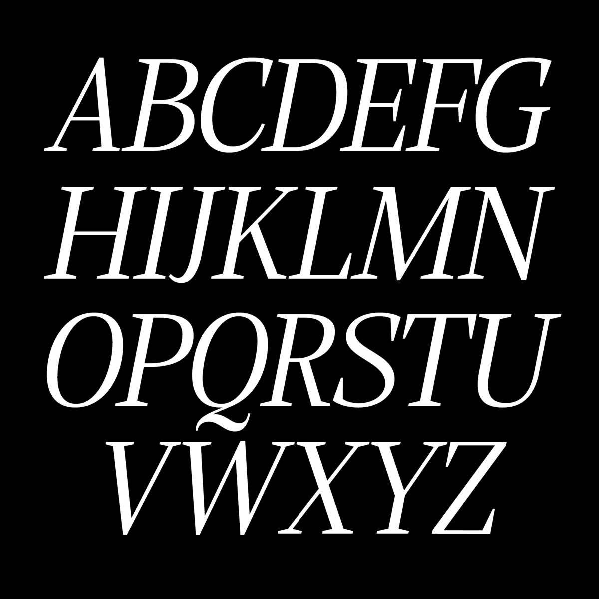
Her master’s project was named Artigo, a lively design rooted in early humanistic types that showed a precocious maturity. It also opened the door to dealing with other scripts such as Greek and Devanagari. “It’s interesting to note that my interest in Devanagari started with yoga, and this led me to design Devanagari typefaces both during and after the MA. I guess things happen for a reason, or in my case, paths aligned and brought me into this fantastic industry of type design.”
After a few years of practice, Correia decided to set up her own foundry, like many type designers of her generation. “I’d been thinking about it ever since I came back from Reading to Porto. I tried to publish Artigo with other foundries, but nobody picked it up. I was designing fonts for foundries like Indian Type Foundry and FontYou, but I also kept working on Artigo and received some valuable feedback about it from other type designers. Eventually I decided to establish Nova Type Foundry to publish Artigo as well as my new projects. It allows me to contribute to the design community with typefaces and work I believe in and enjoy doing. Living in Porto also pushed me to create my own job. Here you have to do everything yourself!”
Correia gradually diversified her catalog with new typefaces, including Lemongrass, a connected script partly inspired by the strong wind that blows on the North Portuguese coast, or the recently released Alga, a classy yet slightly quirky modern face. While pursuing her own projects, she has also developed several collaborations.
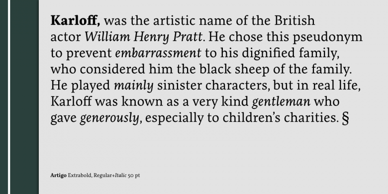
“From the start I’ve been very lucky to have met and worked with great people like Eben Sorkin, Joyce Ketterer, and Viktoriya Grabowska. The collaborative aspect of my career is highly important to me; it made me grow and learn a lot as a type designer. I’ve enjoyed the collaborations we’ve had and the work we’ve produced. Publishing the first Devanagari typeface in Google Fonts was a great achievement for me. I think another great achievement was starting my own foundry, and continuing it for years to come will be my greatest achievement of all. I was very happy about the TDC Award for Artigo Display in 2018 which was unexpected for such a special typeface. It made me feel like my voice can have a place in the design community.”
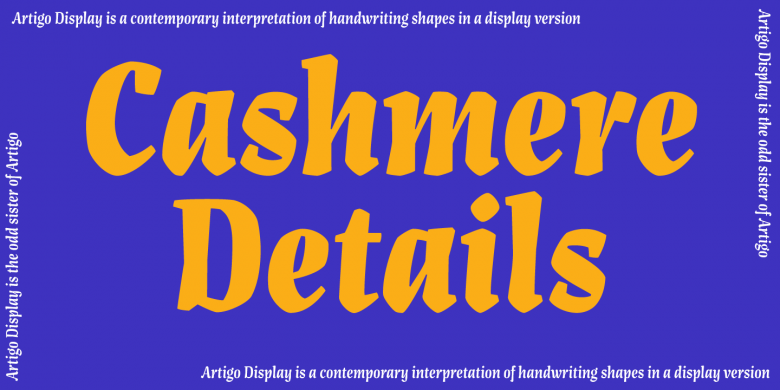
Artigo Display
Artigo Display
“I would like my typefaces to feel familiar in a way that makes people connect to something they might think they have seen before, but with a new perspective.”
9
Nova Type Foundry font families available to rent on Fontstand for a fraction of their retail price.Artigo Display has been recently updated with several weights and Correia has many other irons in the fire: “I usually work on two typefaces at the same time. I like to sketch and brainstorm ideas, and then decide which ones will be produced. I am currently finishing the Cyrillic and Greek extensions of Artigo. Last year was rich in Cyrillic extensions for other foundries but I also do custom and freelance work, mainly designing Cyrillic, Greek and occasionally Devanagari and Tamil. Language support is an important aspect of where I want to be as a foundry in the future. I feel it’s important to reflect the variety of scripts of the world, serving speakers of many different languages, creating design with beautiful aesthetics that translate into text that is highly readable and comfortable while still sparking an emotional connection.”
I count myself quite lucky to have witnessed Joana blooming in Reading alongside several other students, now prominent figures of the type design industry, and I’m glad that she has been able to build such a fruitful and consistent career.