Born in Córdoba, Argentina, Alejandro Lo Celso started his career as a graphic designer before moving to England in 1999, where he entered the Department of Typography and Graphic communication at the University of Reading. After completing his MA in type design, he crossed the Channel and continued as a postgraduate student at the Atelier National de Recherche Typographique, in Nancy.
“After that, it seemed totally natural to me to set up a foundry,” says Lo Celso. “It was the next step to take. Latin America was a region where type design voices wouldn’t be heard until the arrival of desktop publishing. High-quality typefaces with a singularly Latin flavor were clearly missing in the global scene, and my feeling was that they would be welcome. It was the right challenge to take on! The landscape of independent foundries was also far less atomized than it is nowadays, the horizon was clearer and one could propose the rules of the game more freely. The name of our foundry, PampaType, clearly reflects that. Even today, colleagues ask me how I managed to position a foundry with such a name! Hopefully when they see our work, they can understand our approach.”
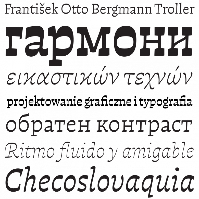
PampaType’s first release, Rayuela (2001), was a project Lo Celso had developed in Reading and Nancy. It instantly established the foundry’s philosophy of looking for fresh, different design concepts outside the realm of type. Rayuela (“hopscotch” in English) refers to the title of a book published in 1963 by Julio Cortázar, an Argentinian author exiled in Europe, perfectly reflecting its malicious and playful structure (no spoilers, read it!). It comprises several Roman and italic weights suited to running text, but also unusual display companions such as an open face (Luz) and a “scrabble-like” face (Miscelanea).
Sign up for mailing
Get more typography articles straight to your mailbox. Sign up for our mailing list.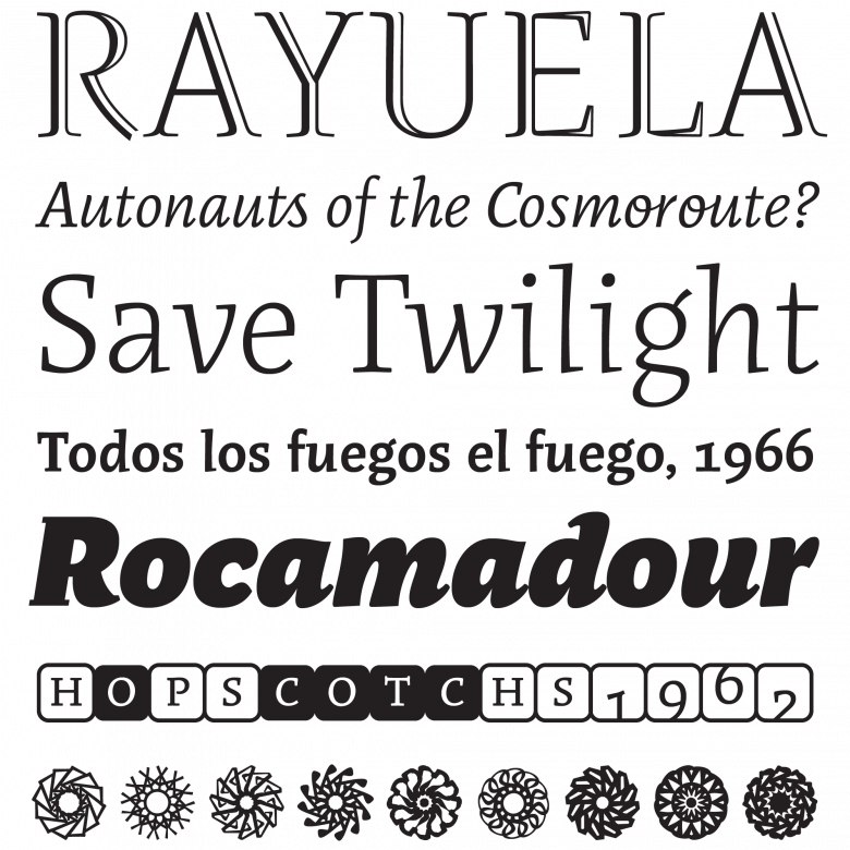
Rayuela
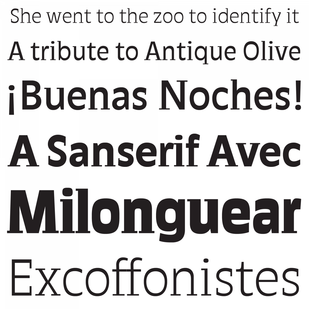
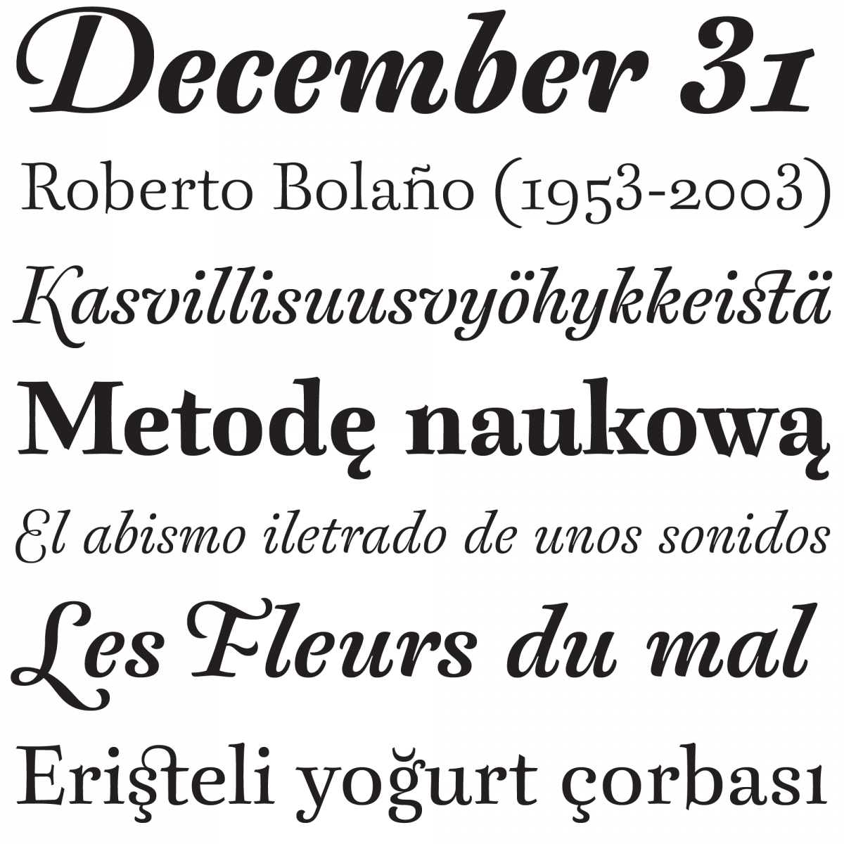
Rayuela was rapidly followed in 2002 by Quimera, a “sanserif avec” exploration in horizontal contrast (before horizontal contrast was trendy) and by Borges, another refined family inspired by the most famous of Argentinian writers as well as an interpretation of the Renaissance typographic pattern. This “literary” series would later expand to include Arlt (2008) and Perec (2010), both more ambitious and versatile type systems replete with unexpected nods and “what if” moments. Lo Celso can be seen as a forerunner in building type ensembles upon “a spirit of diversity,” an approach that is now more common.
“One of the key points of our work is the commitment to originality,” Lo Celso asserts. “As you know, the industry lacks quite a lot of it nowadays. Tons of ‘new’ designs are just quick copies of what has already been published through history. It mystifies me why so many graphic designers still choose over-recurrent styles and thus help sustain the unoriginal, the boring, the obvious, even the plagiarized. Most of the best selling fonts are just the same boring sans serifs we’ve been seeing for decades. We try to work in the opposite direction.”
“Originality is more difficult to achieve. It takes much more time and much more work to build a new form that balances singularity and readability, that looks different but is also comfortable to read. But this is how we think and how we approach type design, and we couldn’t do it differently. We see it as a challenge. And as a result of this, we think our typefaces appeal not to insecure designers willing to fit in but to the daring who want to make a difference.”
In the the foundry’s early days, Lo Celso was living in Mexico, teaching at the University of the Americas Puebla and helping to develop the local type design scene as well as expanding his own catalog. In 2010, he returned to Argentina and gradually opened PampaType to new people.
“What was my personal foundry for 15 years has become a collective project, and I am very happy about that. We are a small but strong team. Two very talented type designers from Chile, Francisco Gálvez and Javier Quintana Godoy, have joined the venture, as well as Guido Ferreyra, a skilled and versatile programmer-designer from Córdoba. We continuously exchange our thoughts and designs, which enhances our projects and helps them mature faster. As a group we have also made several decisions towards reaching our own working philosophy and defining our own approach to type design.”
Upcoming typeface family Otta by Francisco Gálvez
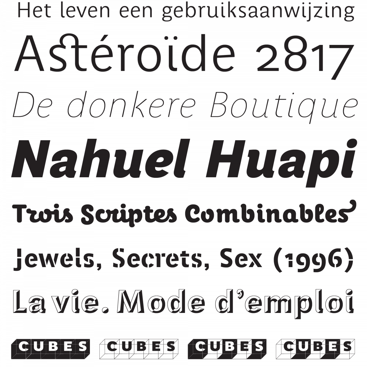
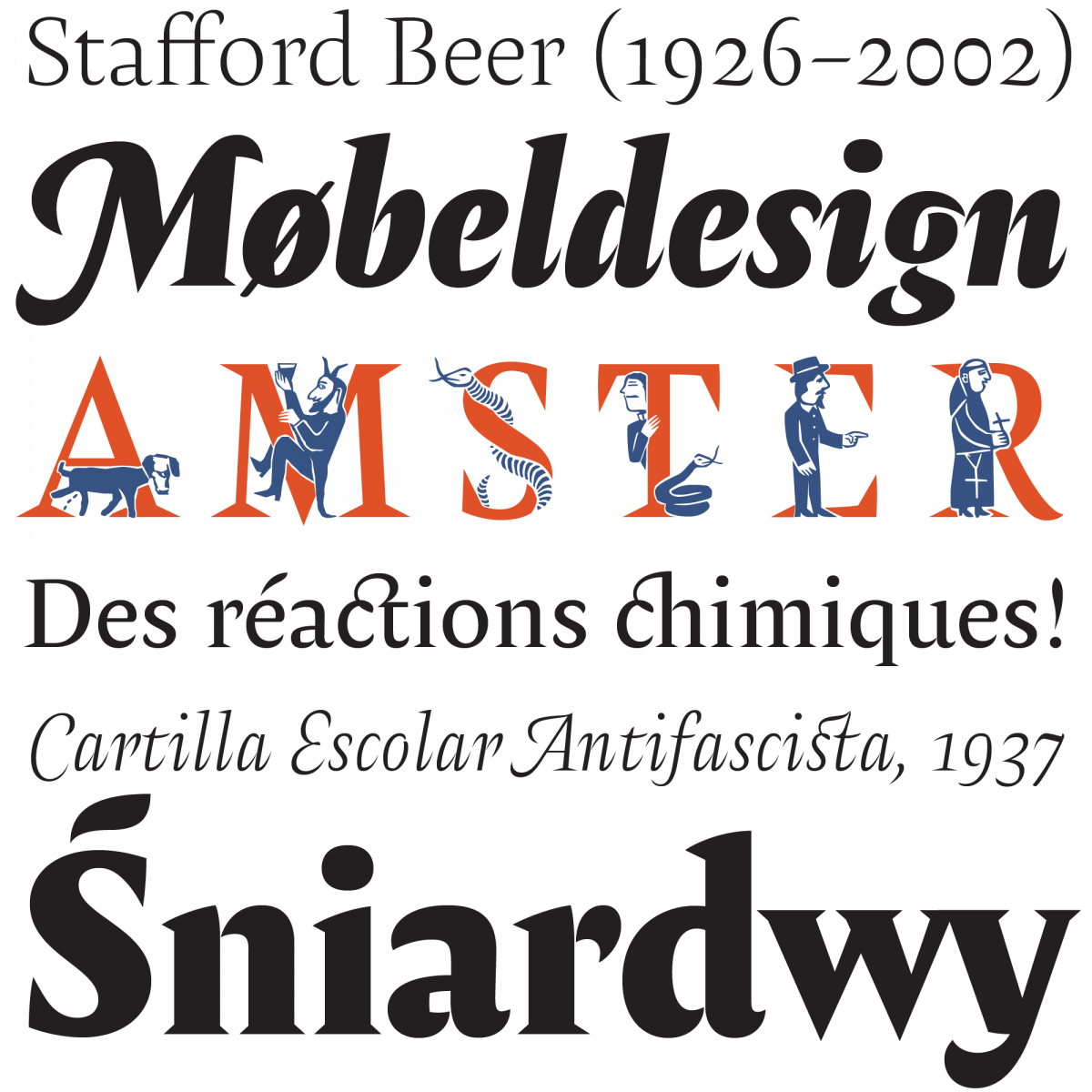
Among PampaType’s latest releases, Berenjena (2014), designed by Quintana Godoy, is an laidback take on flowing 18th-century English letterforms, whereas Gálvez’s Amster (2014), a punchy, sharp-as-sharp-can-be serif typeface, pays tribute to Mauricio Amster Cats, an émigré graphic artist who fled Europe for Chile before the Second World War. Gálvez’s following project, Chercán (2016), looks as if it had come from a parallel timeline where Antique Olive had been designed by the recently departed José Mendoza y Almeida instead of by Roger Excoffon.
Moreover, it is important for Lo Celso and his colleagues to provide their customers with well-crafted and fully usable fonts. “Globalization is a big word, though one not necessarily put into practice with honesty and justice. As type designers, we face a responsibility to human culture and the transmission of language, so we decided to drop the traditional division between ‘standard’ and ‘pro’ and instead make an effort to offer comprehensive character sets that cover around 200 Latin-based languages. Of course, setting the bar that high (about 1,500–2,000 glyphs) demands much more energy and time, which impacts a project’s commercial feasibility, but for us, this is a fundamental aspect of our job, and we will remain firm on that. We know people will value it in due time.”
With so many changes and tasks to deal with, it’s not surprising that it took several years for Lo Celso to design his latest typeface, Atahualpa (2017). Returning to his interest in horizontal contrast, he achieved a unique blend of tempered and dynamic features shaped into a pulsating slab-serif, an outstanding distillation that reflects PampaType’s commitment to serving a broad spectrum of customers.
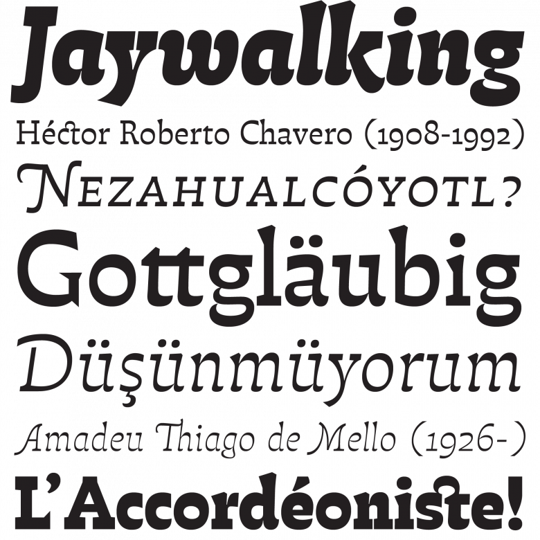
Atahualpa
23
PampaType font families available to rent on Fontstand for a fraction of their retail price.“Surrounding our small team, there is a growing community of colleagues, friends, designers, typographers and type enthusiasts who also make their own contributions from different places and points of view,” says Lo Celso. “They like what we do and they want to participate in it. Our blog ‘Scriptorium,’ for instance, is gradually expanding with their articles and ideas. We think that working within a community is much more stimulating and enriching than keeping your ideas to yourself. In order to keep the fire burning, we set up periodical meetings which function as working sessions, relaxed professional presentations, and social gatherings. We share a lot about type and projects, but also about books, printing, art, history, food and wine.”
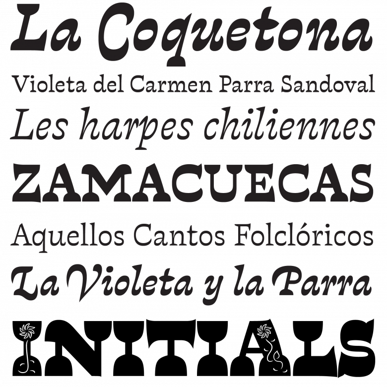
Upcoming typeface family Violeta by Javier Quintana
“I think our new website does a pretty good job of showing what we do, what our values are and how we approach our profession, and so far people have reacted very positively. Joining Fontstand last year was also a significant step for us. The next move is to become more widely known. We’re working on that.”