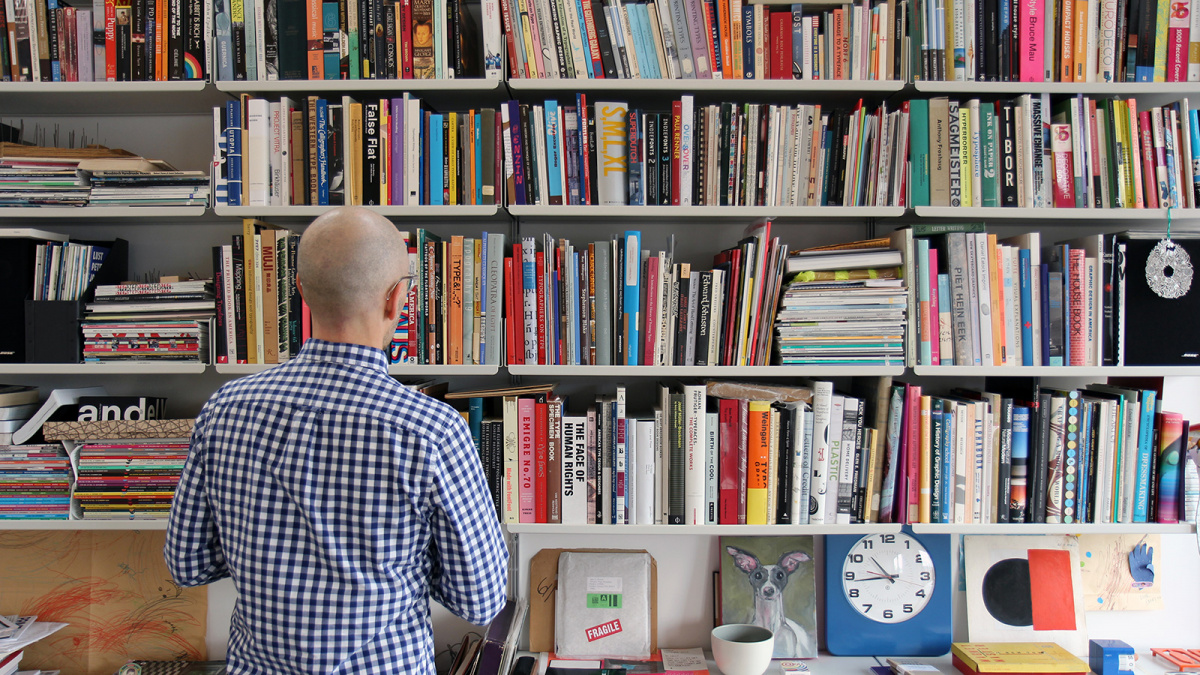
In the 1990s, Eric Olson had a secret passion during his on again-off again graphic design studies at the University of Minnesota. Influenced by Emigre magazine, he began to design his own typefaces, a sideline that he continued to play with as he completed his degree and began his career. Type design gradually came to occupy more and more of his attention, however, and he decided to pursue it part-time while teaching typography at the Minneapolis College of Art and Design (MCAD). In 2002 Olson set up Process Type Foundry, a business venture that became his full-time job only a few years later.
At the same time, Nicole Dotin, Olson’s life and foundry partner, was getting her degrees in photography and visual studies at the University of Minnesota and MCAD, where she also caught the type bug, devoting her graduate thesis to the use of the terms ‘font’ vs. ‘typeface’. After a few years of working as a graphic designer, teaching typography at the MCAD and handling part-time duties at the foundry, she took a decisive step forward and applied to the master’s program in Typeface Design at the University of Reading (England) in 2006. She was accepted, and she and Olson moved to Reading for one year.
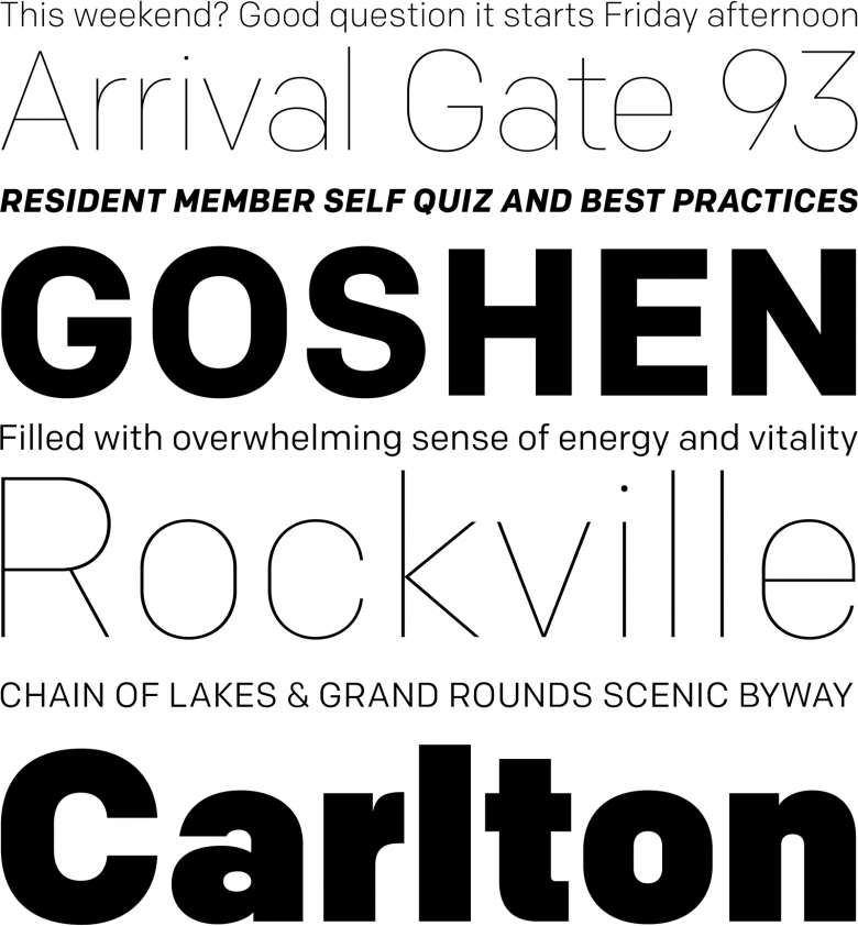
Dotin’s typeface project, initially named Cardigan after the street where the couple was living in Reading, was eventually released as Elena by Process Type in 2011. Designed for extensive blocks of text, Elena comprises only a regular and bold weight, both in Roman and italic. Although it bears faint traces of Renaissance calligraphy, its design is tempered and refined by a restrained, pragmatic approach; it is a racehorse/workhorse typeface, sleek and powerful, and yet practical and dependable.
Sign up for mailing
Get more typography articles straight to your mailbox. Sign up for our mailing list.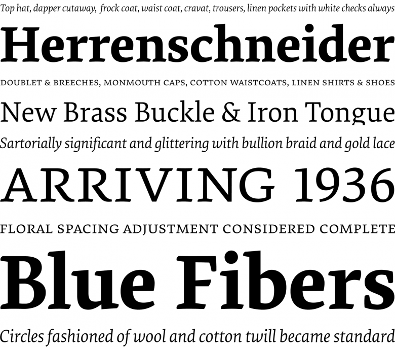
Elena is a typeface for setting large blocks of text, originally designed by Nicole Dotin at the MA program in Typeface Design at the University of Reading.
When asked how different the outcome of a project could be from her original idea, Dotin admits that there’s a part of her that wants to say that “the deviation from start to finish isn’t that great. If you’ve got a strong idea to begin with, then it’s just realizing it or fleshing the idea out. But of course, the way you go about that is what is paramount to the success of the typeface, aside from starting with a good idea to begin with. If anything, it’s an evolution of the idea because along the way, you try tactics to realize your idea that simply don’t work and you have to rethink your approach. So yes, I agree there is a transformation of the original idea, however I feel this is just a natural part of the design process. Sometimes things don’t work and you have to identify them, fix them and move to a better result. Yet, while I can identify problems fairly quickly, I’d say I am slower to resolve them. I take my time in producing clean drawings (I can’t stand lumpy typefaces!) and I take my time with each character, making sure it matches the system and is the best it can be. And of course, developing a system (i.e. a typeface) that is worthy of that time also takes time.”
“We talk a lot about the big ideas of a typeface we’re making and share thoughts about works-in-progress. But we also trust one another and generally leave the other to their work unless they request feedback. In that respect, any influence is usually subtle. If I look at Pique or Colfax, I don’t see Eric in Pique or me in Colfax. I see the uniting factors of a common outlook and philosophy about work between us, but they are each ours.”
Pique, Dotin’s latest release, somehow negates the polarity between dynamism and functionality. This single-weight script typeface is a true case of “lettering as type” that works efficiently without a torrent of OpenType features, simply because it’s astutely designed. Pique displays the inherent shimmering drive of brush handwriting without being encumbered by its digital environment. It is exuberant and joyful, lending a bold energy to every word and phrase.
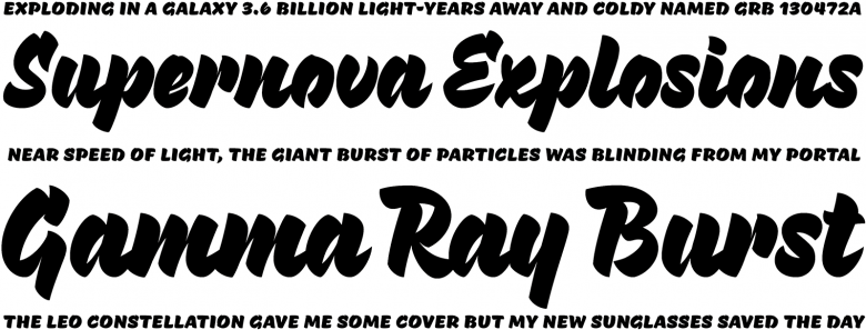
Pique is a sharp and energetic brush script typeface. Its single weight comes complete with small caps and select OpenType features.
Olson’s own body of work obviously demonstrates that he has a soft spot for sans serif families with a subtle modernist vibe. Among many examples, Bryant (2002, revised 2005), inspired by Wrico mechanical lettering kits, was one of the first rounded sans typefaces, released a few years before the style became trendy. Klavika (2004) resembles an anachronism rescued from the Emigre vaults and rejuvenated for our post-postmodern times; it received unexpected exposure after being chosen as the basis for the logotype of the most prominent social network on Earth.
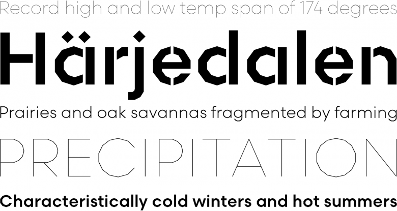
Klavika is an angular and robust Sans, one of the first to be released by Process Type Foundry.
Olson says, “I want something very specific and hard driving when it comes to typefaces, and sans serif fills this request for me. I feel like I have a perspective on them and have tried for many years to add this voice to type design. I haven’t always been successful with this, but I’m trying for something in this area, even if it often drives me nuts. I suppose it’s for this reason I haven’t released any of my serif designs. They’re acceptable typefaces, but wouldn’t contribute to what is already available so I’m keeping them to myself.”
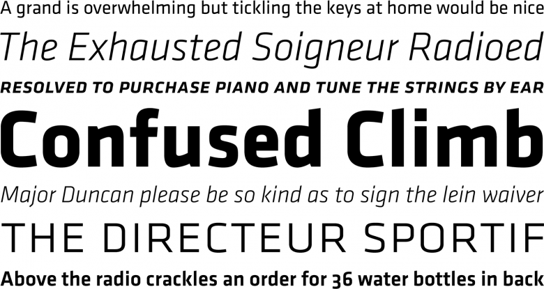
Colfax, previously known as Chrono, is a geometric Sans that breaks the rules of pure geometry to produce legible text even in small sizes.
When asked about their relationship to history, Olson humbly acknowledged that all of his typefaces are “between 95% and 99% connected to forms already in place. The good ones are 95%. That is, I brought the remaining 5% with me and added something to the genre. As type designers, if we’re honest with ourselves, this has to be acknowledged because regardless of how original, the forms haven’t fallen from the sky.” This is especially evident in Colfax (2012), a study of “geometric” grotesques from the 1920s, and Scandia (2015), his fresh take on the “Futuresque” genre which surprisingly sprung from its elder sibling Scandia Line, an experiment in designing a typeface without a single curve. Olson is not a nostalgist, but rather a rapt student of styles and forms.
31
Process Type Foundry font families available to rent on Fontstand for a fraction of their retail price.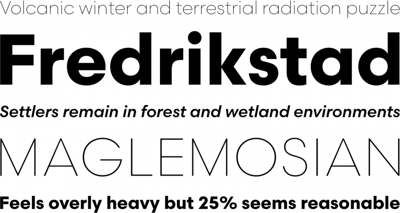
Scandia is a fresh take on the classic geometric sans serifs of the 20th century.
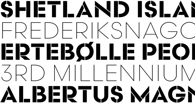
A stencilled variant modelled on Scandia’s bold weight has been added to the family as a display typeface.
Scandia Line is drawn without curves, using angled segments to form the basic geometric shapes of the letters.
Today, Dotin and Olson are developing new projects while doing commissioned work. They continue to create type that is discreet, yet plainly reliable, devoted to organizing the multiple faces of the text and to addressing the various needs of the user, honest evidence that there’s always room for improvement even in the merest corners of a relentlessly plowed field.