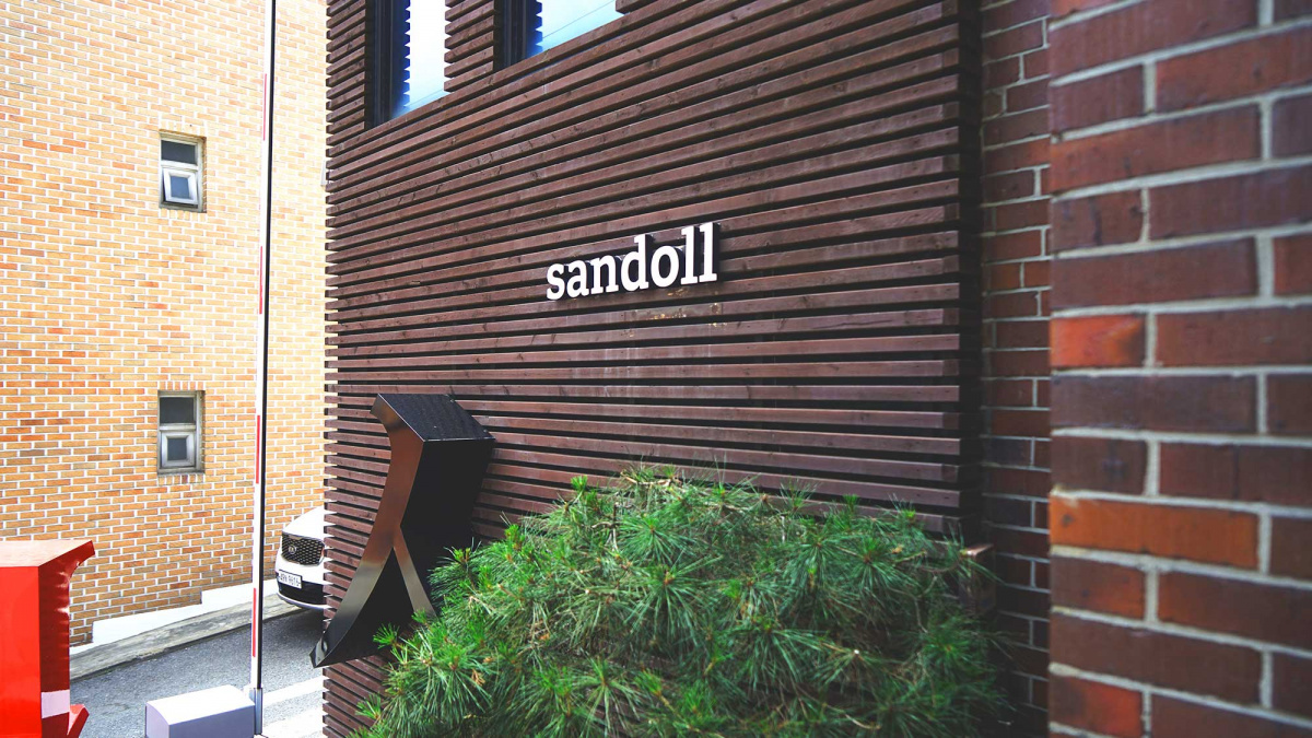
On a wet day in Seoul a rain-soaked me was glad to exchange my dripping plimsolls for dry slippers upon arrival at the studios of Sandoll. Sandoll has developed a diversity of fonts for the Korean language for global companies such as Apple, Google, Kia, Samsung and LG. Thankfully, their studios are far less corporate than that profile would suggest, located just around the corner from a sweep of leafy parks in the city centre. They offered a welcoming haven from the terrible weather for an ill-prepared Westerner there to meet some of the design team and to learn about international type design from a Korean perspective.
Sign up for mailing
Get more typography articles straight to your mailbox. Sign up for our mailing list.Before visiting Korea I had never been in a country so very proud of its letterforms.
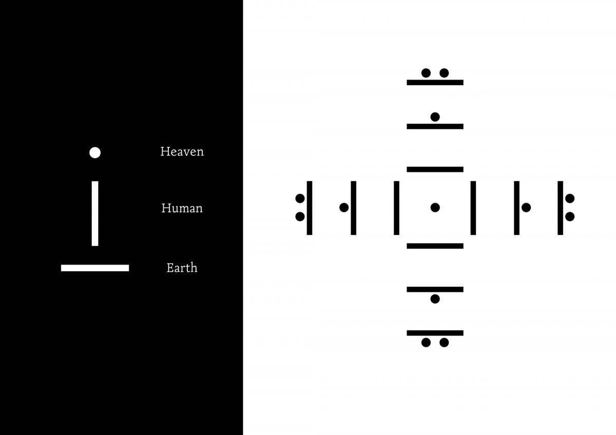
Perhaps it is the story behind Hangul, Korea’s national script, that ensures its place in the country’s affections. Created in the mid 15th century by Sejong the Great, the fourth king of the Joseon Dynasty, it was intended as a gift to the people to enable mass literacy. It follows a simpler and far more systematic approach than the classical Chinese it was intended to replace, with modern Hangul now comprising 24 letters which are combined in syllable blocks. The shapes of the consonants follow the shapes the mouth makes when the sounds are pronounced and the shapes of the vowels are based on three elements: man (a vertical line), earth (a horizontal line) and heaven (originally a dot, now a short line).
The designers I met at Sandoll also speculated that Korea's history has a part to play in the nation’s affection for its unique script. Though the Hangul alphabet had been intended to liberate the Korean language from a cultural-orientation to Chinese characters, this took time, with the script only adopted for use in official documents as late as the 1890s. After flourishing briefly, Japanese annexation followed in 1910, and the use of Hangul was once again limited, though not fully extinguished. The teaching of Hangul persisted even under colonial rule until finally, the script was able to flourish once again following Korean independence in 1945. It is celebrated in the National Hangul Museum in Seoul, and its invention is marked by a national commemorative day and public holiday observed in South Korea on October 9th.
If Hangul itself has such cultural capital, then the design of its forms can be seen to have a very particular resonance. Yet even into the 1980s, the most widely-used of Hangul typefaces were being developed outside of Korea (albeit by Koreans). In 1984, (Paul) Geumho Seok, a young designer busy drawing phototypesetting headline letters for Readers Digest determined to change things and founded Sandoll (San=Living, Doll=stone) to produce Hangul types both for and in Korea.
Geumho Seok followed the influence and type design expertise of Professor Jinpyung Kim. His first typeface was Doll, which now sits in a font menu on Sandoll’s own virtual design environment, SandollCloud, comprising nearly 600 typefaces, in addition to those of international partners they have collaborated with.
I ask the designers what distinguishes a typeface as a Sandoll typeface. They direct me to their largest typeface system, Sandoll NeoSeries, which offers a comprehensive, well-constructed set of traditional typefaces and weight variants for body text with enhanced usability in mobile environments.
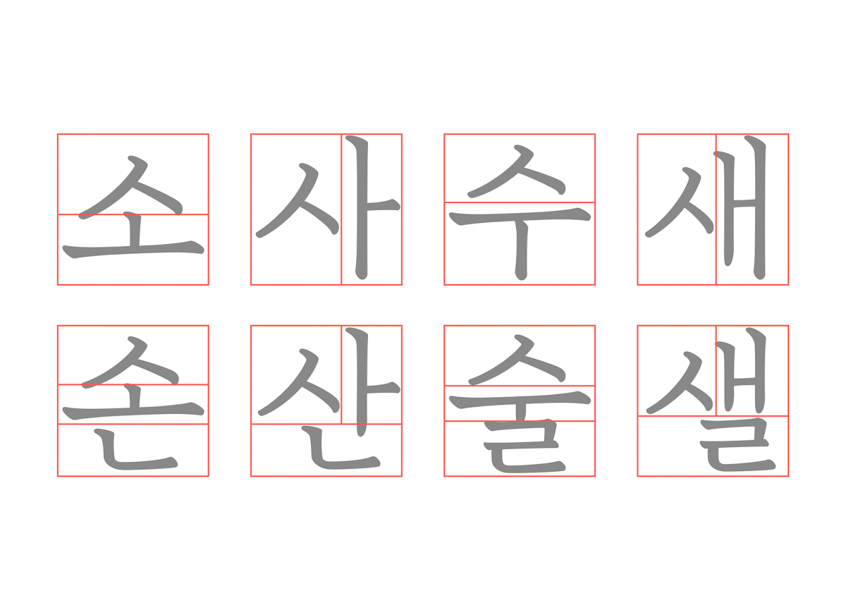
Korean text typeface designs fall into two categories: ‘Gothic’, which is a kind of equivalent to a sans serif style, and ‘Myeongjo’, which equates to seriffed text styles in the Western market. NeoSeries offers both in addition to Latin support.
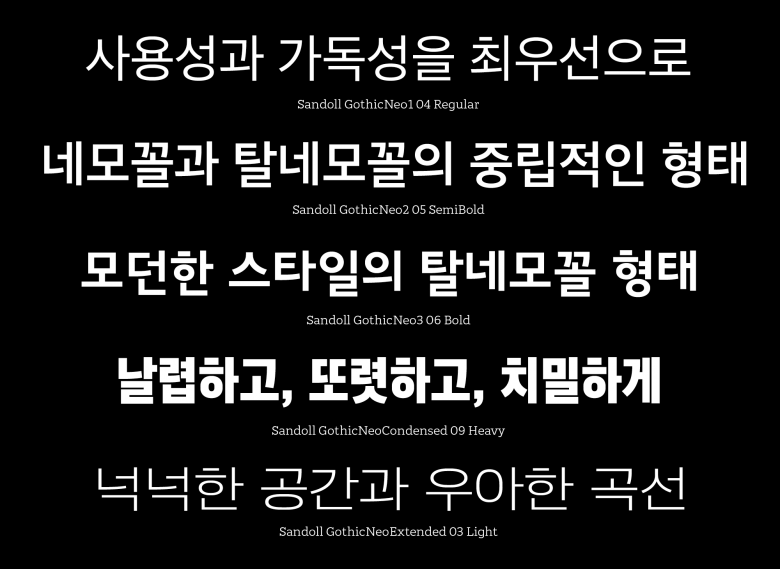
GothicNeo Series
GothicNeo1 is described as the most basic member of the system, with letters positioned to fit comfortably into the classic squared syllable blocks allowing for an even level of grey in terms of overall typographic texture. GothicNeo3 is presented as the most modern. Syllable clusters align at the top, allowing for a more dynamic spatial rhythm along the bottom line. Formatting does not follow the traditional square form, allowing for more distinct visual patterns and a greater difference in component sizes. GothicNeo2 combines elements of both GothicNeo1 and GothicNeo3.
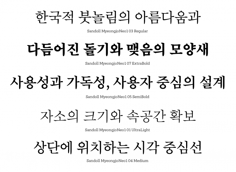
MyeongjoNeo1
By way of contrast, MyeongjoNeo1 is inspired by an original design from one of the first generation Korean font designers, Jungho Choi (1916–1988). Its forms capture the classic style of Korean brushstrokes, with a contemporary design eye maintaining an openness in shaping and spacing compatible with mixing with Latin serif styles. The system is completed by a Rounded style, GothicNeoCond (the first condensed font in a typeface family system in Korea) and, most recently, NeoExtended.
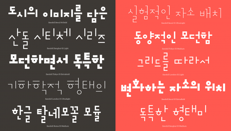
Sandoll City
With a solid library now established, Sandoll are at a point where they can experiment, with some interesting outcomes. The Sandoll City series explores an idea for restructuring Hangul in which the different elements of the script are combined for each typeface in ways which offer an interpretation of a particular city. And they have set themselves the challenge of publishing a new display typeface each month. Their experimentation is starting to feed through into text faces too. Jeongche is a typeface system with the ambition of reinvigorating the legacy of Hangul writing and type design as well as opening an entirely new design space for typefaces for different kinds of literature and reading, both in print and on screen. The first parts of the system, published earlier this year, explore an approach beyond the dominant Gothic/Myeongjo style binary, looking to alternative historical references that encapsulate a closer understanding of actual handwriting and brushstroke forms.
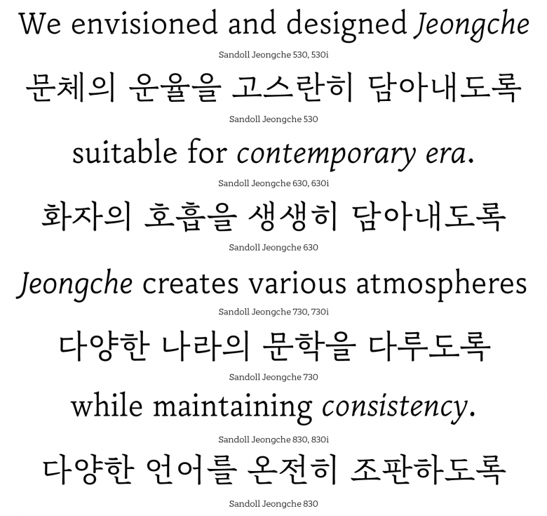
Jeongche
Hangul leads. Latin follows.
4
Sandoll font families available to rent on Fontstand for a fraction of their retail price.Their innovation is very much on Korean terms, they explain. As designers, they are not interested in trying to align Hangul with formal ideas derived from the heritage of Latin type design. Yes, their retail fonts are multiscript and include very good Latin support including italics because their global market necessitates it. In terms of form, however, the Latin styles follow the Hangul design agenda. And it is to the history of Hangul that they are turning to find steps forward in their designs.
That, and the collective imagination of their now sizeable staff. From a solo business, Geumho Seok has grown an agency of 40+ including fifteen type designers and three in-house graphic designers. At a meeting at the start of each year they plan the types they will work on, taking on board the ideas of all their designers, even the most junior.
Sandoll type specimens celebrate their intent to ‘build fonts for the beautiful world’. Too often the world feels far from beautiful, though in the company of a group of type designers talking so passionately about the design possibilities for their script, it was good to be reminded of the possibility of finding beauty in the smallest of things. Letters are a good place to start.
With thanks to Dokyung Lee (Type Designer), Yejin Wi (Type Designer), and Hyewon Han (Business Development & Partnership Coordinator)