František Štorm is one of the world’s most prolific and active digital type designers. Trained as a graphic designer in the studio of Jan Solpera at the Academy of Arts, Architecture and Design in Prague, he began to work in 1991, just in time to witness the declining years of photocomposition and the rise of the digital era. Appalled by the quality of the digital fonts that were then available, he decided to teach himself how to create his own, with the aim of using them for his own projects.
Sign up for mailing
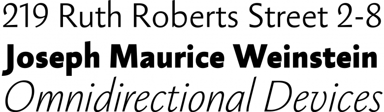
Get more typography articles straight to your mailbox. Sign up for our mailing list.Twenty five years later, Štorm’s impressive catalogue consists of more than a hundred typefaces ranging from one-shot display projects to substantial text families released by his company Storm Type Foundry. He also provides made-to-measure fonts for various clients, and there’s hardly any genre or style that he hasn’t tackled. His latest releases, Amphibia and Ermina (both comprising five weights, in Roman & italic) see him still pushing the limits of the art. Amphibia is a bouncy sans serif with slightly flared stems and terminal balls that can be used either for running text or headlines; Ermina is a sound variation on the Tuscan style (a sans version is in the works and should be available soon).
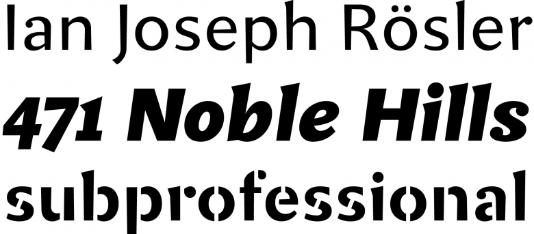
Amphibia
This story may sound quite familiar to our readers, another tale of the self-taught type designer who gradually transitioned from one discipline to another. What distinguishes him from his peers, however, is his extensive library of revivals. “The nature of digital type is a regular grid and mathematical curve modeled by strict coordinates, and its cold and precise rendering was my first impression of digital type,” Štorm recalls in an article recently published on the foundry’s website. “I wondered how to make the digital outline more human and how to incorporate the subtle mistakes which gave letterpress its warm feel. At the same time I desperately needed some good typefaces for my own designs. These circumstances resulted in my concentration on type revivals, to which I devoted about ten years.”
“The strongest imperative in today's design is originality, and as there are thousands of indistinguishable fonts out there, we should ask for unique typefaces.”
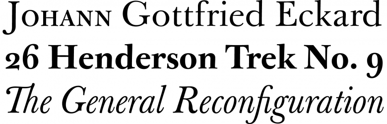
These revivals can be classified into two categories, the first one being a compendium of the Czech Republic’s most significant typefaces of the twentieth century. Štorm carefully adapted and expanded them for desktop publishing, exploring different seminal designs of his country’s recent history: for instance, he revisited 1920s faces such as Preissig Antikva by Vojtěch Preissig or Tusarova Antikva by Slavoboj Tusar, originally created and produced for letterpress printing. Furthermore, he collaborated with several postwar graphics artists and typographers such as Josef Týfa, whose crisp modern face Týfa Antikva or smooth humanist Academia were brought to new life after first being made in the 1960s.
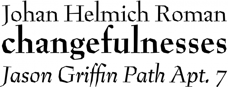
Preissig Antikva
Tyfa Antikva
Štorm also worked with his former teacher Jan Solpera, helping him digitize two of his designs, Areplos and Solpera, both exploring the definition of a sans serif. And his interest went beyond typefaces for text, as proved by his take on Metron, designed in 1970 by Jiří Rathouský for the information system of the Prague subway. As he acknowledges today, “long years spent on digitizing others’ designs were not lost time but a wonderful learning experience. I’d never have been able to create my later large type families without the know-how earned at work with my older colleagues.”
Jannon Sans
John Sans
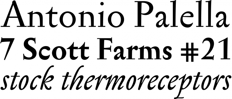
Baskerville Original
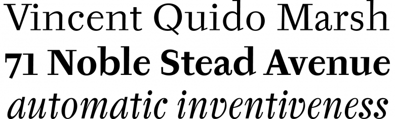
His second category of revivals, no less reverent and yet somehow also refreshing, involves the work of several punchcutters through 200 years of stylistic change: the mannerist types of the Jean Jannon in the seventeenth century (long mistaken for Claude Garamont’s); the groundbreaking designs of John Baskerville, inspired by the English writing style of the eighteenth century; and the well-tempered modern faces of Justus Erich Walbaum, cut in Weimar in the early nineteenth century and influenced by Giambattista Bodoni and the Didots. Since undertaking these three projects in the mid-1990s, Štorm has completed them with sans serif counterparts, named Jannon Sans, John Sans and Walbaum Grotesk, and refined them again with two optical grades for small and large sizes. In particular, his Baskerville Original is among his finest accomplishments, and according to his brazen opinion, these revivals are “the best digital renderings ever”.
Serapion
Biblon
Sebastian
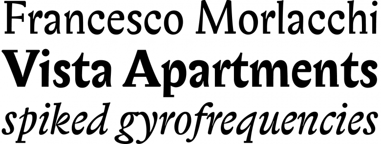
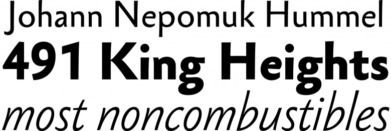
Nevertheless, there’s far more than carefully crafted new versions of typographic classics in Štorm’s body of work: closer scrutiny reveals that something unusual pervades it, something more challenging to describe. Somehow, his devotion to revivals enabled him to shape and sharpen his vision for his own products: a study of Baroque types gave birth to Serapion, which can be seen as a decisive turning point. Several subsequent typefaces also follow this pattern: Mediaeval, Biblon, Sebastian and Anselm Serif & Sans. Even the extreme, deformed Cobra, “a cross between a Roman type face and a slug,” belongs to the same gene pool.
97
Storm Type Foundry font families available to rent on Fontstand for a fraction of their retail price.There’s a flowing, pulsating, driving force at work in this conspicuous pattern. While it may not summarize Štorm’s output, it represents its most prominent and fascinating aspect, a welcome reminder that designing, beyond creating functional tools in tune with their forms and materials, is modulating history and hoping to grasp an unpredicted epiphany. Skillfulness, cleverness and consistency are admirable qualities and values; yet, when vitality and faith are also present they make themselves known, the result of a rare combination of love and time.