He is the founder and owner of Suitcase Type Foundry and co-founder of the experimental Briefcase Type Foundry. The head of the type design and typography department of the Academy of Arts, Architecture and Design in Prague. One of the driving forces of the Czech type community, and the most prominent Czech type designer of the decade. The author of over sixty extensive typeface families. A man of few words. He is Tomáš Brousil.
Sign up for mailing
Get more typography articles straight to your mailbox. Sign up for our mailing list.Type design is a lonely business, as if it were invented for him, and vice versa. The weird timeless era of the worldwide quarantine days, the muted atmosphere of the city of Prague, provide a moody layer to yet another of our type conversations.
One could easily say that Tomáš Brousil’s typefaces have taken the world’s visual space by storm. You can find them virtually everywhere, from newsstands to bookshelves, from TV screens to movie posters, from catalogues to packaging, from the tombstone of Ladislav Sutnar all the way to inflight magazines (which, in the current state of the universe, is of course something more difficult to verify personally).
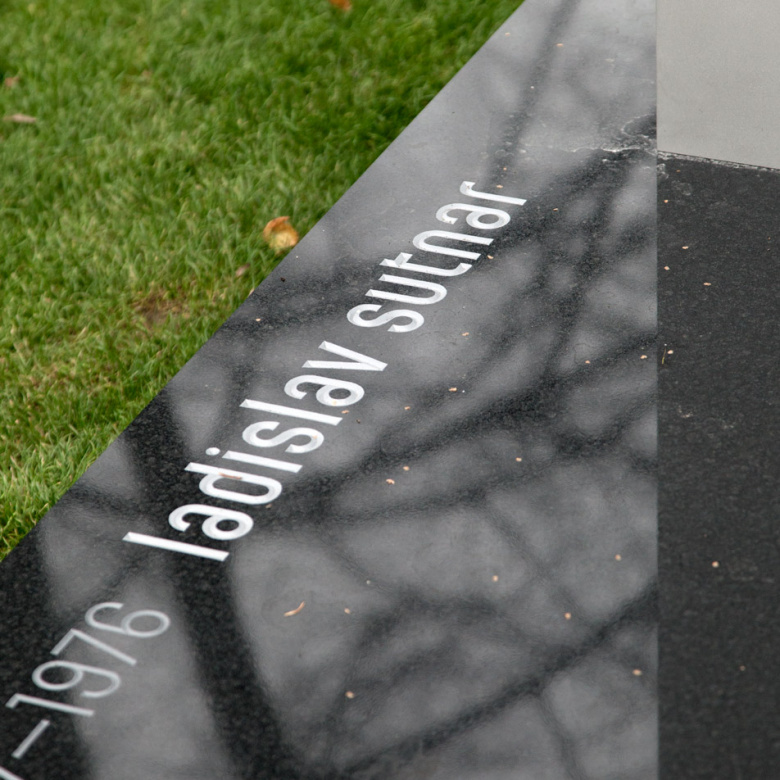
Tombstone of Ladislav Sutnar
“One type designer with a computer can complete the work of several dozen people.”
Thanks to digitization, the type design business has changed entirely and most type foundries have become one-man businesses. Nowadays, the type designer is also an engineer and programmer; he must be able to create the font from beginning to end. “I like to work alone, because… I can work alone. I can literally control the whole project from A to Z. I can always seek expert help when I stumble upon a problem, but I can’t imagine working with someone else throughout the whole design process. Of course there are type foundries that use this model, but I simply could not do it,” Brousil says. “I like to design the whole character set. Even if I were designing my hundredth type family, I would still pay attention to characters such as the per mille or the number sign. I like to keep all the glyphs in context. Also, it is impossible to separate the art and craft when creating a font. Of course, the idea and creative concept are the most important parts of the process, but 90% of the work is based on craft: drawing the missing characters, building from some 120 glyphs to a couple of thousand. Kern, program, export, test, repeat.”
“I usually say that I make typefaces.”
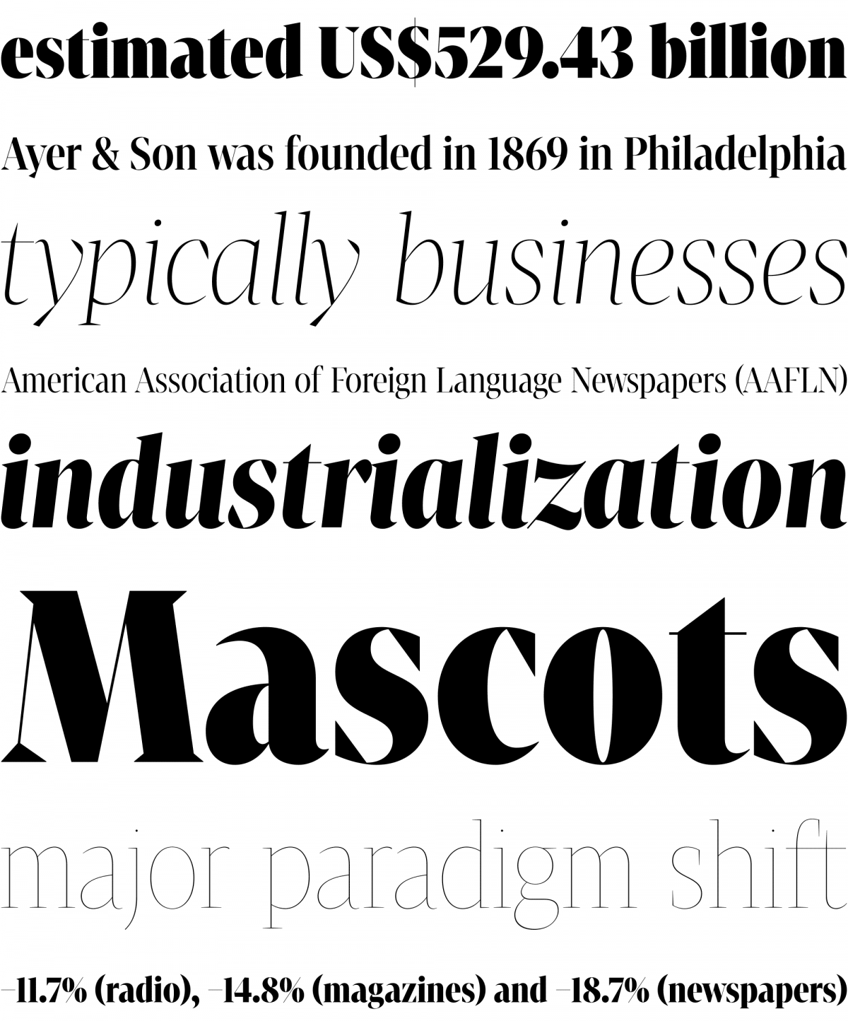
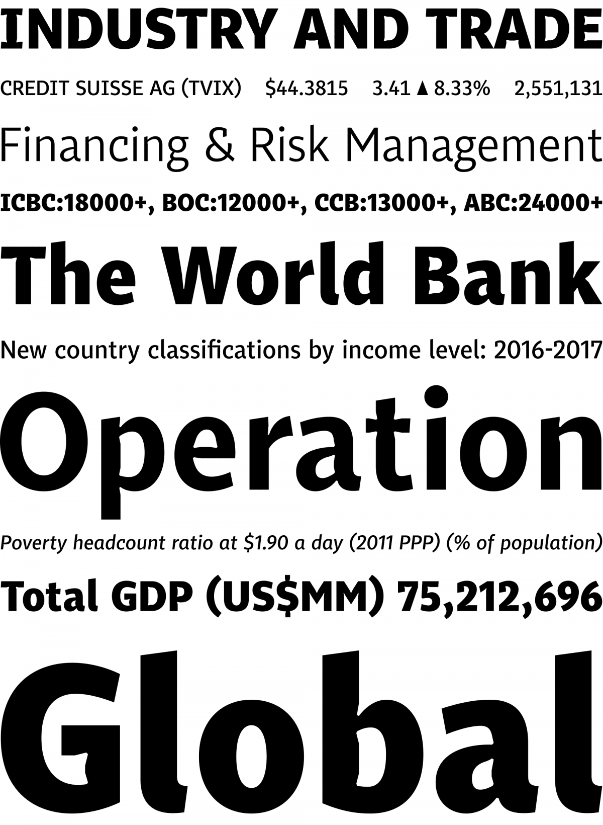
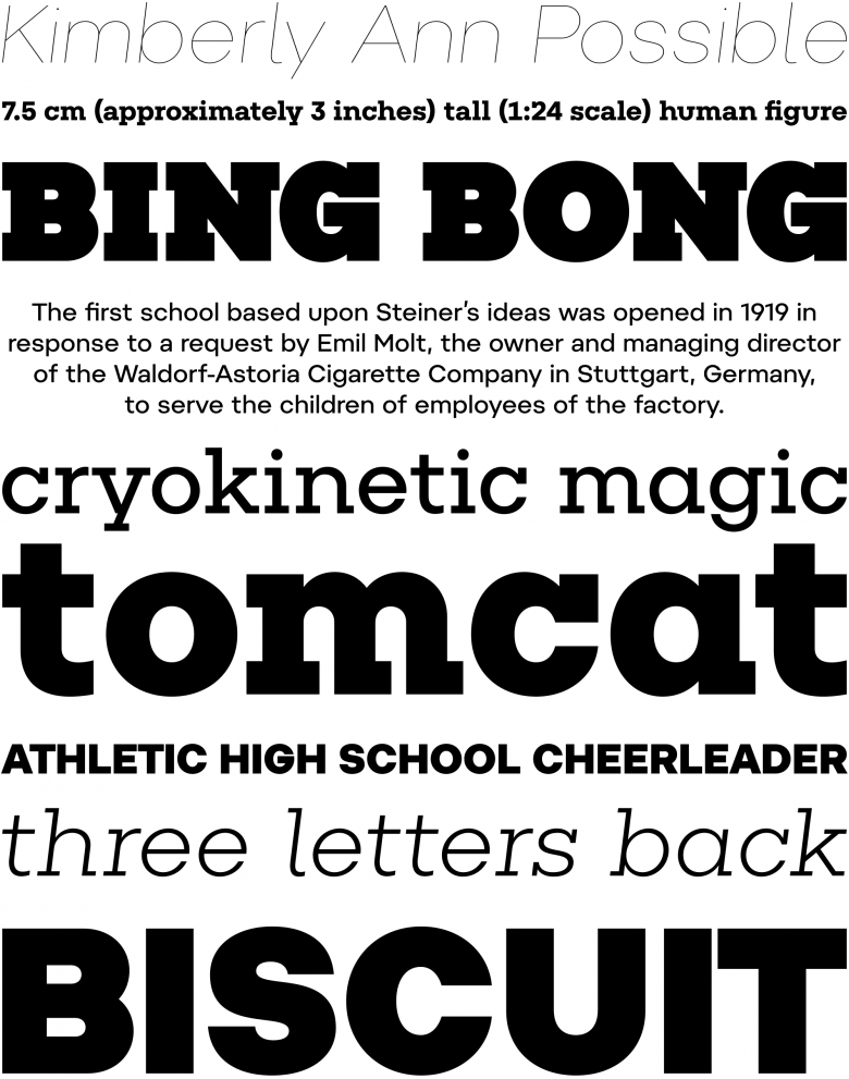
When you devote your whole adult life to type design, you are well aware of the surprised question marks in the eyes of your fellow citizens when trying to explain what you do for a living. Brousil set up his own Suitcase Type Foundry only a year after entering the Academy of Arts, Architecture and Design in Prague, for which the first 96 styles of his Tabac family were his graduation project in 2008. Since then, the Tabac superfamily has expanded to include 184 serif, sans, slab, mono and title styles.
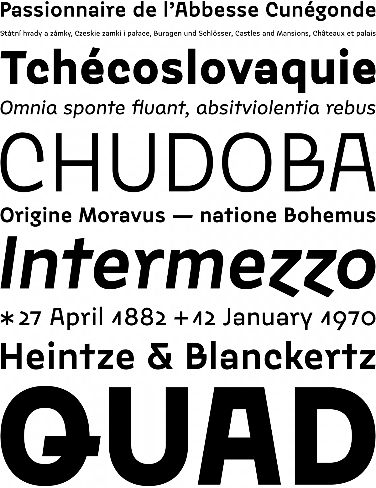
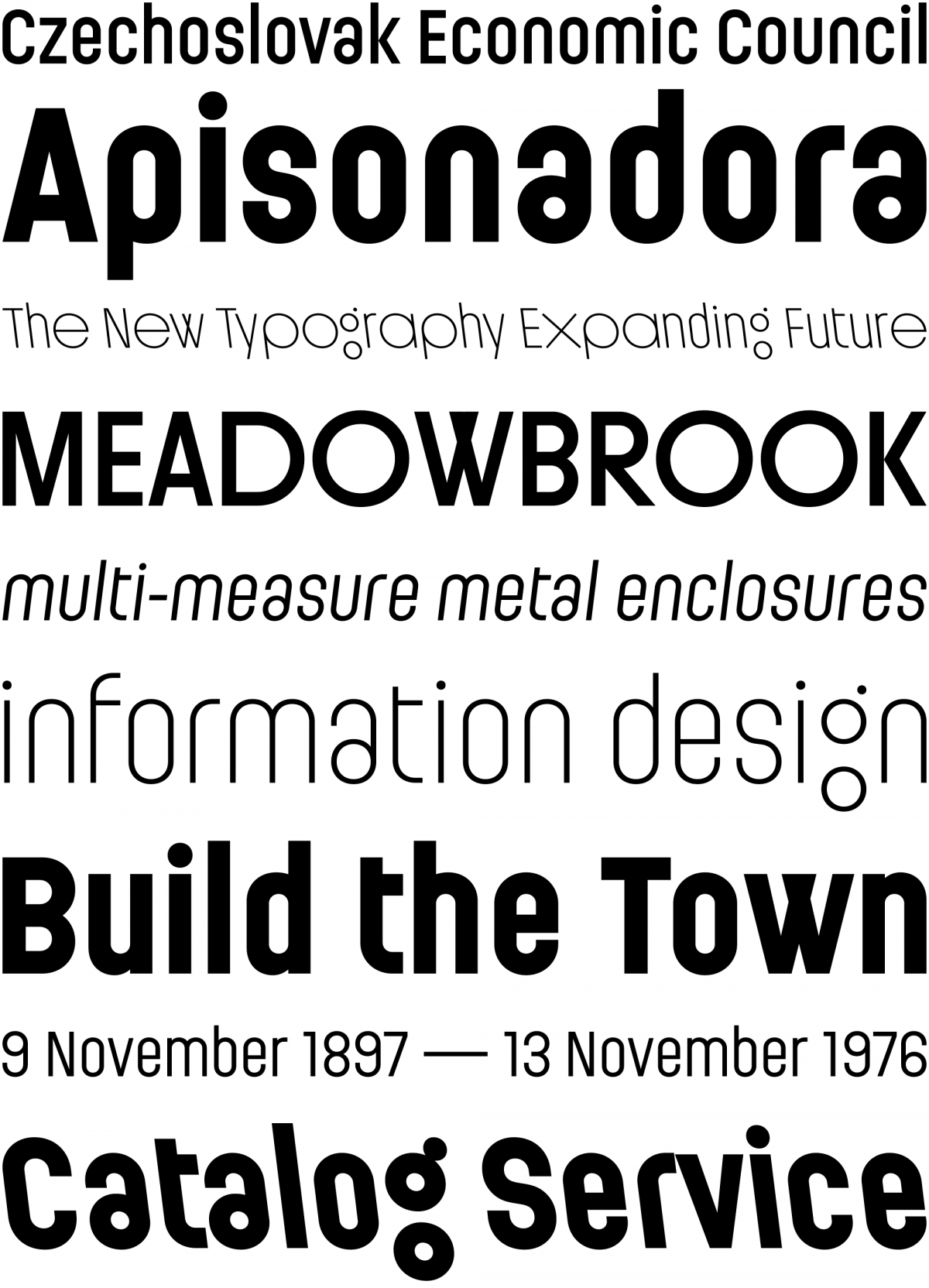
He focuses mainly on his original retail or custom typefaces. In fact, his portfolio contains only two digitizations, or rather interpretations, of typefaces designed by other Czech typographers. In his work, on the other hand, you can find a broad scale of cultural references ranging from a forgotten Bohemian type founder of the baroque era to the Czechoslovak advertisement, poster or sign-painting alphabets of the 20th century. His typefaces, though, are not at all historicist, but rather timeless, history-inspired yet designed in a very contemporary manner.
“I always have many type ideas running simultaneously in my computer,” Brousil says. “In some cases I get back to them after years of distance and finish them step-by-step or rework them from scratch. I always try to keep the needs of an imaginary user in mind.”
This humble approach — frankly, quite rare in the type design community — is typical for Brousil’s work as are his perfectionism, focus on detail and technical excellence. His experimental spirit is combined with respect for local orthography, typography and cultural legacy, which is something that shouldn’t come as a surprise in the work of a type designer from a country, and indeed a region, whose languages are characterized by such local niceties as complicated diacritics. All these details make his typefaces original yet suitable for use in all possible cases.
“Still thinking about killing some of my typefaces.”
Brousil once mentioned that he was thinking about discontinuing some of his typefaces, ones that annoy him and no longer meet his ultrahigh standards. Ten years later he adds: “There are certain typefaces in my collection that I like better, and there are typefaces that I like less. After a while, I can find weak spots or things I would like to improve in each one of them. I haven’t got rid of any of them entirely, of course, but I honestly keep thinking about it.”
Whenever I look at precisely crafted font families such as those by Tomáš Brousil, I can’t help but think about the feelings the type designer has when the design process is over. From the date of its release, the typeface is beyond type designer’s control. “You need to get used to it,” Brousil says. “Of course, you always come across some horrible applications, but you pretend you don’t see them and just keep the memory of the nice ones. Generally, I feel satisfied when I see certain fonts used the way I envisioned them during the design process. Sure, leafing through Delta Airlines or Southwest inflight magazines set in Tabac makes me happy, but finding Tabac on a nice pizza box is equally satisfying.”
“Type archives are an incredible source of new approaches to the Latin alphabets.”
Pepi/Rudi
Suitcase Type Foundry is not the only type design project Brousil is involved in, though. In 2013, he and his colleagues Radek Sidun and Petra Dočekalová founded the Briefcase Type Foundry, specializing in the digitization of experimental typefaces by famous Czech type designers and supporting the work of contemporary young type designers, mainly students at the Academy of Art, Architecture and Design in Prague, where Brousil took over the type and typography department when his former teacher, type designer František Štorm, left the position in 2008. “The only criterion for including new typefaces in the Briefcase collection is their Czech origin. In the beginning, we brought to new life influential typefaces from the turn of millennium, and since then we’ve continued with a mixture of contemporary stuff but also, say, Orion, a 1960 typeface by Czech type designer Stanislav Maršo.”
Working on type revivals inevitably requires detailed research in typography archives. The work of the Briefcase Type Foundry team is closely connected to book projects such as Typo 9010 (2015), covering the Czech type design scene of the 1990–2010, or a monograph of long-forgotten Czech type designer Jaroslav Benda (2019).
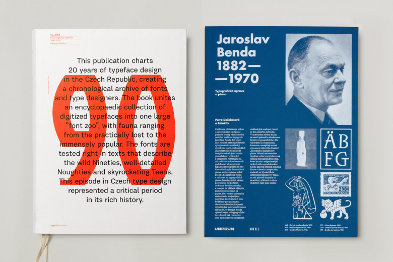
Publications Typo 9010 and Jaroslav Benda
During the long days spent in archives searching for reference materials for their books, Brousil and his team also came across a specimen proving that the first traces of the Bohemian type tradition can be found in baroque Prague: “For a long time, a simple text typeface was missing in my catalogue. At the same time, I have often come across books set in fonts that I didn’t originally intend for this kind of use. Therefore, my latest font, the slightly-baroque-yet-modern Crabath, came to life and was named after one of the first known Czech type founders of the mid-18th century.”
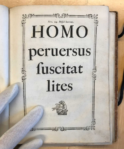
Crabath

Crabath was finished some time ago and subsequently live-tested by skilled typographers and book designers. Based on their feedback, some features have been modified, and the font is now ready for release. This again shows the focus on detail, perfectionism and user-orientation so typical for Brousil’s work.
“There is no such thing as a Czech typeface, but there certainly is a Czech attitude to type design. Playfulness, if you wish.”
38
Suitcase Type Foundry font families available to rent on Fontstand for a fraction of their retail price.Tomáš Brousil’s typefaces have won many awards, from TDC’s Certificate of Excellence in Type Design to some shiny gold medals and even the jury prize at the European Design Awards to name a few. But his typefaces are not the only successful ambassadors of the contemporary Czech type design abroad. “Tradition plays an important role here. The whole of our recent typographic history, which dates back to a few years before the founding of Czechoslovakia in 1918, is very interesting, starting with the first diacritical marks designed by Vojtěch Preissig all the way to typefaces by designers such as Oldřich Menhart, Stanislav Maršo or Josef Týfa. They were the pioneers who trod the path for us. We may only follow. But, of course, we still need new typefaces,” he says. “We need them as much as we need new books, new music and new adventures!”