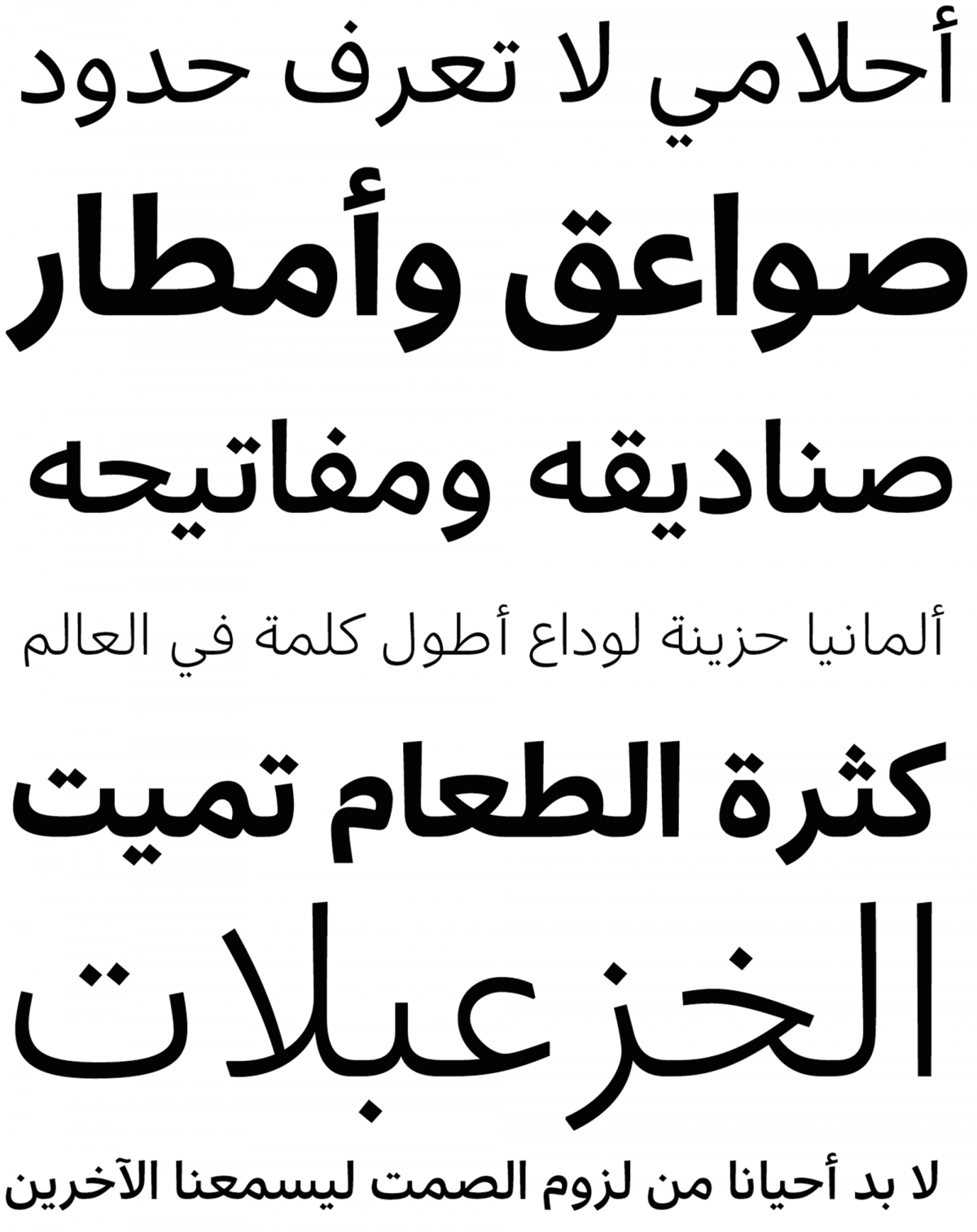
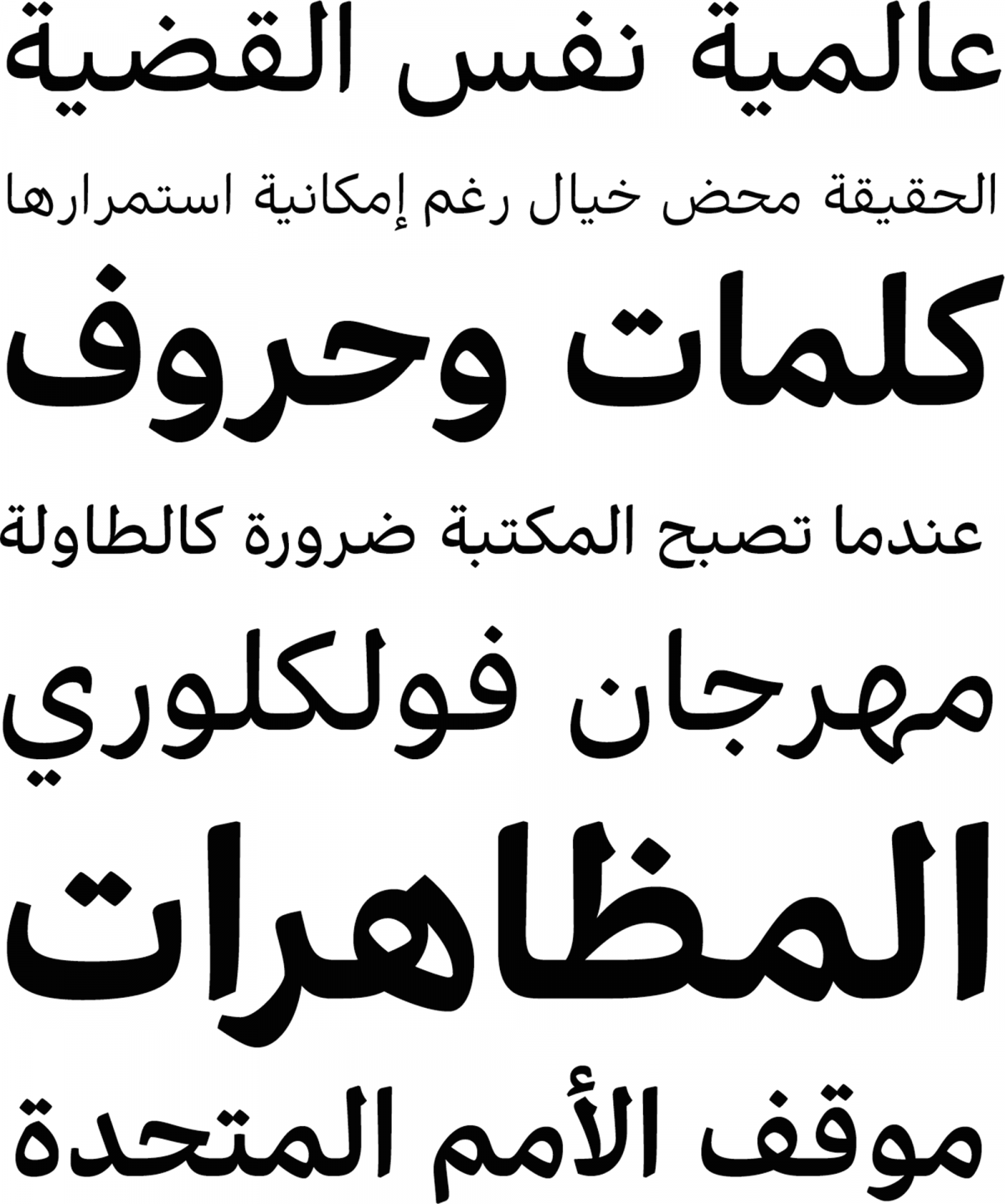
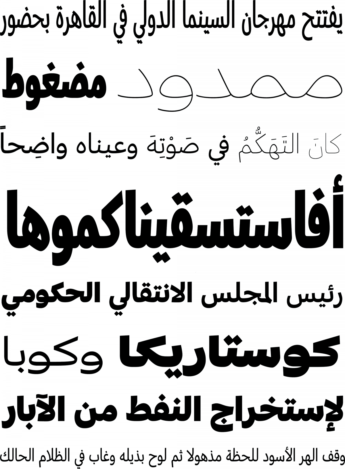
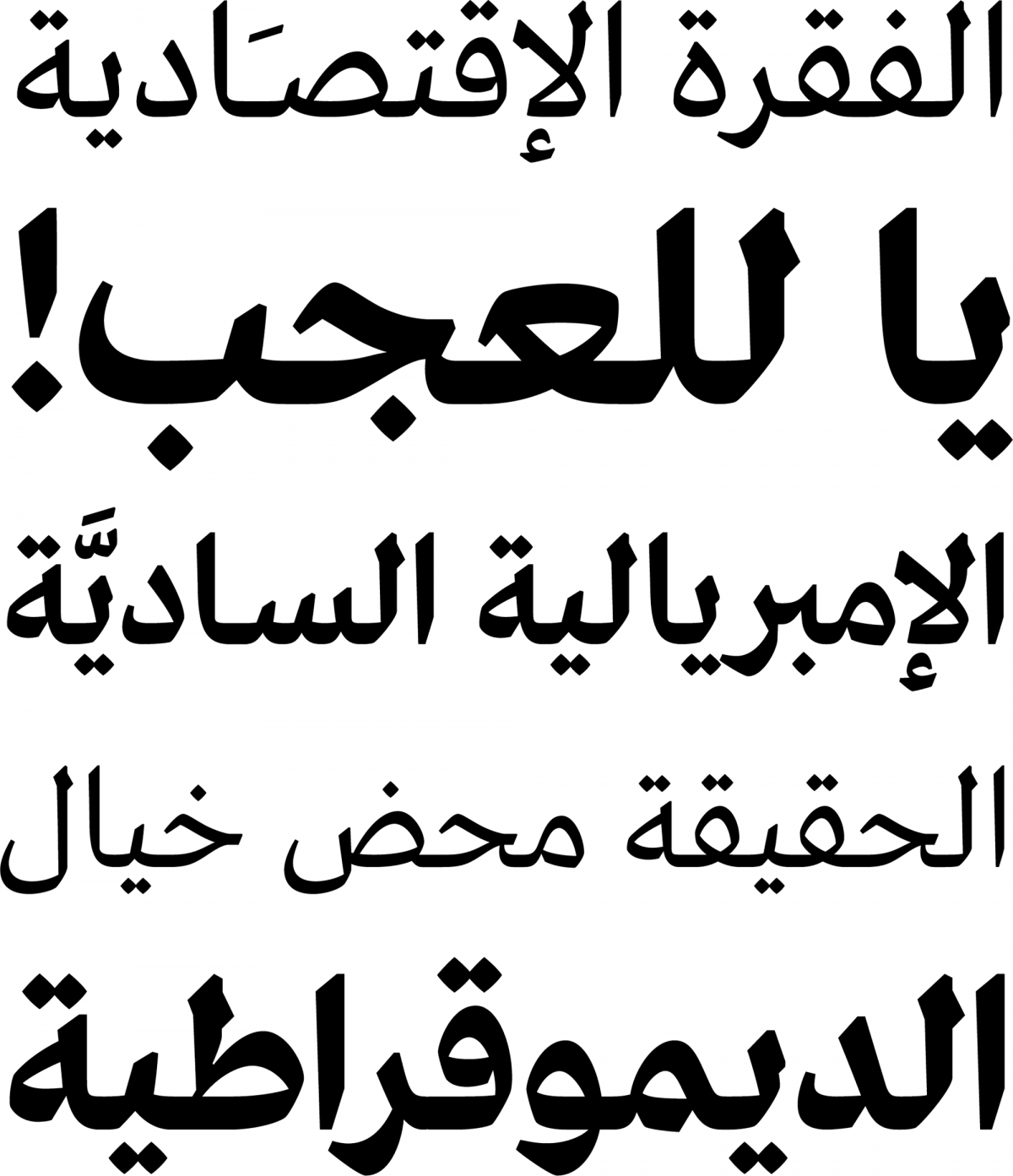
In October 2015, Typotheque founder Peter Biľak and type designer Kristyan Sarkis announced the creation of TPTQ Arabic, a new digital foundry “dedicated to developing original high-quality Arabic typefaces and systems for bilingual typography.”
Sarkis, born and raised in Beirut, Lebanon, studied at Notre Dame University where he encountered type design for the first time: “I was in the senior year of my bachelor’s in graphic design when I took a course with Yara Khoury which included an Arabic type design assignment. In the context I grew up in, the Arabic script, though very familiar especially on a vernacular level, was not something I strongly identified with, possibly because of the absence of any contemporary typefaces at the time. The Arabic script meant the extravagant beauty of its calligraphy (and its religious connotations) on the one hand, and a type culture that I, like many, was not comfortable with, on the other.”
“That perspective quickly changed when I met Yara. She introduced the script to us in a relatable way, encouraging us to see its possibilities and create contemporary Arabic type. After I graduated, Yara asked me to join Mohtaraf design studio in Beirut, where she was the design director. The studio has a long tradition of working with Arabic letterforms in logotypes, lettering pieces and typefaces.”
“One otherwise uneventful afternoon, Yara suggested that I try my hand at a type design assignment. Despite mixed feelings, I started sketching by hand and then drawing on the computer. The process was fascinating and very satisfying, and at the end of that day, Yara said something that stuck with me: ‘Ah, you have a knack for this.’”
Sign up for mailing
Get more typography articles straight to your mailbox. Sign up for our mailing list.“TPTQ Arabic’s main concern is contemporaneity in Arabic type: creating and publishing projects rooted in the knowledge and respect of the script, yet relevant to our modern day and its needs, and pushing the boundaries of common perception and explorations as well as technological restraints. To us, making groundbreaking work is more a necessity than it is a quality. There’s a lot of ground to break in Arabic type!” — Kristyan Sarkis
Over the next two years Sarkis worked on personal lettering and type projects, and in 2009 he successfully applied to the Type & Media masters program at the Royal Academy of Art in The Hague (KABK). There he made another significant connection, this time with one of the course teachers, Peter Biľak, who had designed Fedra Arabic (with consulting by Tarek Atrissi and final mastering by Titus Nemeth). “After graduation,” remembers Sarkis, “I was offered a small assignment by Peter, to create an additional, lighter weight for the first version of Fedra Arabic. It was a pretty straightforward and not especially challenging project, but the collaboration itself was an instant click. I had great admiration for Typotheque and for the conceptual dimension of their font collection, and the more I observed my own approach to type, the clearer it became that this was something I strongly identified with.”
Thuraya
In 2011, Typotheque released Sarkis’ Type & Media graduation project, Thuraya, an adaptation of the complex, calligraphic Diwani style. This naturally consolidated the two men’s professional bond and paved the way towards TPTQ Arabic. “In the summer of 2014, Typotheque was getting more involved in the Arabic type field and I was getting more serious about starting my own foundry. Given our converging interests and harmonious approaches, it took just one meeting with Peter to decide to combine our strengths and find a way to work together. After that, it was only a matter of time before we agreed to team up and start a sister foundry for Typotheque specialized in developing Arabic fonts. Bigger projects followed like Greta Text Arabic and then the massive Greta Arabic type system. It was liberating to have the full freedom to explore new concepts in Arabic type with Peter’s encouragement and insightful advice.”
Regarding the partners’ working process, according to Sarkis, “it differs slightly depending on the nature of the project. There are the Arabic counterparts of Typotheque typefaces, and there are the Arabic typefaces that I initiate. Generally, Peter and I are in an ongoing conversation regarding what makes sense to add to TPTQ Arabic’s library, as the collaboration with Typotheque will be recurrent. Whether Peter expresses a desire to see an Arabic counterpart for a certain family, or I feel especially interested in developing something new, we start by sharing our ideas about the project, then discussing subjects related to it, followed by making a general plan. After that, I work independently. I start researching, sketching and drawing by hand to get some ideas out and start building the structure. Naturally, throughout the process, we meet periodically to discuss the developments and updates.
20
TPTQ Arabic font families available to rent on Fontstand for a fraction of their retail price.When it comes to projects I conceive, I am constantly doodling, drawing, and thinking about a certain idea I would like to explore. Some project concepts are born in a couple of days, others in a couple of years, depending on the time and context that the project needs to mature. Once I have a clear idea where things are going, and a few first drawings to show, I share the project with Peter and we discuss it on a conceptual and logistic level. Again, from this point on, I work independently.
Fortunately, we are always on the same page in terms of the choice of upcoming projects and the design/conceptual decisions. Peter’s much greater experience and helpful advice, especially on how to manage complex projects and how to approach the field in general, continue to be eye-opening to me.”
Their current project is a large “mechanical and ‘cold’ family”; the Latin, designed by Biľak, will be released by Typotheque, while the Arabic, designed by Sarkis, will be released by TPTQ Arabic. The foundry also works with other designers such as the Iranian Bahman Eslami who helped Biľak revise Fedra Arabic (re-released last year). TPTQ Arabic also published Harir, a Naskh-based family in three optical sizes, and doubtless many more creative voices will soon find a home to develop their projects there.


