Type-Ø-Tones began as a four-person collective in 1992, a tiny group of Barcelona designers who figured that digital type design could be a fun side project and perhaps, sooner or later, something more serious. Three of them had met in the late 1980s, each a specialist in a different part of the graphic design process. Josema Urós was mainly working as an IT consultant and programmer for advertising agencies, yet he was deeply fascinated by the more creative aspects of the sector and frequently visited the studio of graphic designer Joan Barjau, who was also an illustrator at the satirical comics magazine El Papus. The third wheel on the wagon was Enric Jardí, who ran his own graphic studio, Propaganda. “Our initial relationship with Enric was one of vendor and client,” Urós recalls. “Enric came to test a laser printer at the computer store where I worked. He gave me a diskette with FreeHand documents, and I came across his custom typefaces. That was the beginning of our collaboration.”
Sign up for mailing
Get more typography articles straight to your mailbox. Sign up for our mailing list.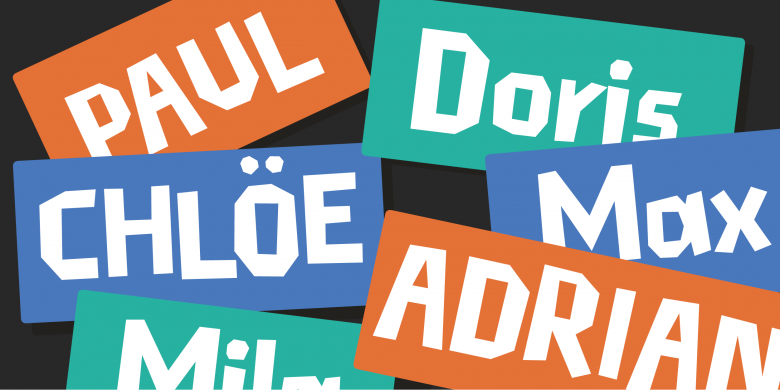
Cortada
“Those were the years when computer graphics still held the fascination of the unexplored,” he reminisces. “We came together as a working unit at a moment when the possibility of creating digital typefaces had barely evolved from a utopian fantasy to a fully functional reality.” Part of that emerging reality, of course, was the Apple Macintosh. Urós opened an informal class for people interested in exploring this new tool, and it was through this class that Laura Meseguer met her future type design partners. Recently graduated as a graphic designer and hired by an advertising agency, Laura felt she was missing something. The daughter and granddaughter of letterpress printers, she had always been fascinated by mid-century lettering and cover design, but wasn’t satisfied with what she knew. “As a student of graphic design,” she says, “I had worked on various separate lettering exercises as part of the program, things like drawing letters for a logo, or copying Helvetica with pencil, rulers and Chinese ink. Fortunately I had also discovered Letraset dry transfer sheets and the copy-and-paste technique using old type catalogues. That’s in fact how I learned to space letters and recognize different typefaces.”
I began connecting the dots…
Urós realized that Laura could be the fourth wheel on the wagon. “She was very eager to learn,” he remembers. “The moment she discovered letterforms seen as outlines in an Adobe software package, her perspective shifted from interest to passion. As I was specializing in the new tools offered by this technology and was working for numerous clients starting in this field, I began connecting the dots and realized I had found talented people sharing a special interest, the design of alphabets.”
And so, in 1992 the quartet began to operate as one of Europe’s first independent digital type foundries, Type-Ø-Tones.
Joost
All of Type-Ø-Tones’ members were fascinated by lettering experiments from the early- and mid-20th century. Urós’ Joost (1995), named after the artful Joost Schmidt, is a study of the structures of classic alphabets developed by Bauhaus teachers, meticulously transformed into a usable font family.
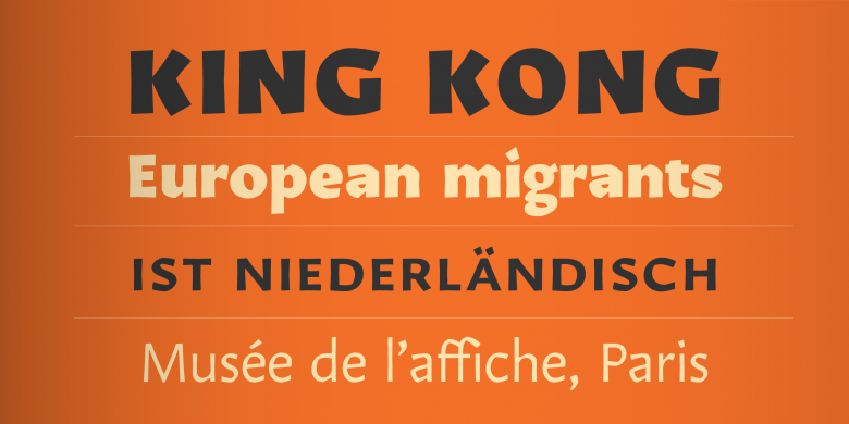
As type designers, all four were self-taught. In its first years the team designed a library of mostly display faces ranging from geometric “techno fonts” to typefaces based on handwriting and modernist lettering. Meseguer felt a need to develop and refine her type designing skills, and in 2003 she enrolled in the Type&Media course at the Royal Academy of Art (KABK) in The Hague. Her graduation project was Rumba, a display face that echoed mid-century Spanish hand lettering. Rumba’s three closely related single-weight fonts are each optimized for use in specific contexts. It won her a Type Directors Club Certificate of Excellence in 2005.
Rumba
In the early 2010s, Type-Ø-Tones became a duo act as Barjau and Jardí left the company to focus on editorial design, digital research and teaching, as well as writing about typography and printing techniques. Then Urós lost his day job in 2011 when Estudio Mariscal ran into problems and let go of several trusted collaborators. Was that an incentive to intensify his type designing work? Urós: “I didn’t realize that at the time because the year in which this happened was very difficult for other reasons as well. Luckily, some mates from Estudio Mariscal and I decided to get together and found our own graphic design studio. So, suddenly I found myself in my own space with lots of time to spare, ready to focus 100 percent of my studio time on Type-Ø-Tones. And that is what I’ve been doing for the past eight years.”
Arboria
Arbotek
Urós’ newly found dedication to type design allowed him to develop a series of versatile type families that reference historic styles while remaining decidedly contemporary. Arboria/Arbotek (2013) is one such hybrid. Arboria comes from the morphing of an archetypical architectural font into an exploration of the grotesque theme. It includes such diverse elements as art deco motifs, humanistic touches and a general geometric flavor. The Arboria skeleton also became the basis for the design of Arbotek, its display companion. The Oz style in the family is a genuine “architect’s typeface,” a basic yet radical approach to pure geometric forms. Arbotek Ultra is a historic Art Deco variant, an homage to heavy yet charming advertising lettering from the 1920s and 1930s.
DINosaur
Urós recently focused on another early 1900s source of inspiration, the DIN alphabet. Compared to the meticulous digitization by Dutchman Albert-Jan Pool, Urós’ DINosaur is a much looser interpretation of the 120-year-old model. The DIN alphabets (named after the Deutsches Institut für Normung or German Institute for Standardization) weren’t originally developed as typefaces but as normative, precise, geometric letterforms for day-to-day signage and lettering on machines. As the name suggests, the references Urós used to create his type family were captured by studying objects from that remote past in which industrial labeling was mainly hand-painted or stenciled. The result is the flexible DINosaur family, whose charming roundness is not ornamental, but reflects the mechanical creation of the original letterforms, the effect of tracers, Rotring pens or rotating chisels softening the sharp corners. As usual, the rounded terminals become more obvious as the stroke thickness increases. Used on a screen and in small sizes, DINosaur’s light weights are just friendly sans serifs, not conspicuously rounded, while the chubbiness of the bolder weights’ terminals is a stylistic feature that lends the family an individualistic, rather cuddly charisma.
Karol
Karol Sans
While specializing in type design, both Meseguer and Urós taught at Barcelona art and design academies. This led to a collaboration with Brazilian graduate Daniel Sabino. His Karol family began life in 2011 as an MA project for the advanced typography course at the Center for Design and Art of the Autonomous University of Barcelona (EINA/UAB). A very thorough yet expressive text typeface, Karol was inspired by the work of Eastern European type designers. Two years later the serif family was ready for public release as a collection of eight styles — four weights with matching italics — characterized by strength, high readability and a distinctive character. In 2013, just before its publication, Karol was awarded the TDC’s Certificate of Typographic Excellence (Judges’ Choice) in 2013. Karol Sans is its natural sans serif companion.
Meseguer’s 2004 MA in type design allowed her to offer her services as a designer of custom fonts for publications. This was the subject of her well-received book TypoMag. Typography in Magazines. She was also the co-author of Cómo crear tipografías. Del boceto a la pantalla (How to Create Typefaces, from Sketch to Screen), published in Spanish in 2012 and translated into Polish, Portuguese, English, and Chinese.
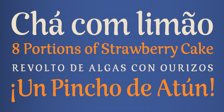
Through her contacts in the Netherlands Meseguer landed an assignment to produce a bespoke typeface family for the redesign of multiple Dutch regional newspapers. This became Multi, her first extensive family.
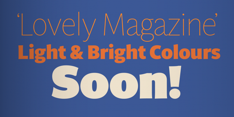
Multi
The brief was to develop a sans serif family matching the serif typefaces used for a comprehensive layout overhaul under editorial art director Luis Mendo. The keywords provided by the client were clear: warm, dynamic, optimistic, friendly, human…
The elaborate design process resulted in two series, Multi Text and Multi Headline, which Meseguer has since expanded considerably, fleshing out the character set and expanding the weight range. Multi Text now comprises three weights in both roman and italic, while Multi Headline (now renamed Multi Display) offers seven, likewise in both roman and italic. Like most of Laura’s typefaces — Rumba, Magasin and Lalola are good examples — the family oozes vitality. Described in musical terms, it has a distinctive ‘phrasing,’ neither humanist nor glyphic but somewhere in between, exploring uncharted territory, its design pragmatic yet not rigid, slightly tinged with tiny incised touches.
8
Type-Ø-Tones font families available to rent on Fontstand for a fraction of their retail price.Both designers still have a broad range of typefaces waiting in the wings. When asked if they have any specific type production plans for the rest of this uncertain year, they answer, “We do have several projects underway, but it is probably not a good idea to generate ‘false expectations.’ As you well know, it is difficult to know when a typographic project is mature/finished enough to publish.’ Of his own projects Urós says, “I’m sure that a new humanist sans serif family will appear in 2020.” Meseguer just designed a new display sans serif stencil typeface family called Sisters, a set of 4 related fonts sporting different contrasts in stroke weight, designed to be mixed together within one line or word.
What is the word that comes to mind when thinking of the broad range of typefaces developed under the Type-Ø-Tones label? For me, the answer is: inventiveness.