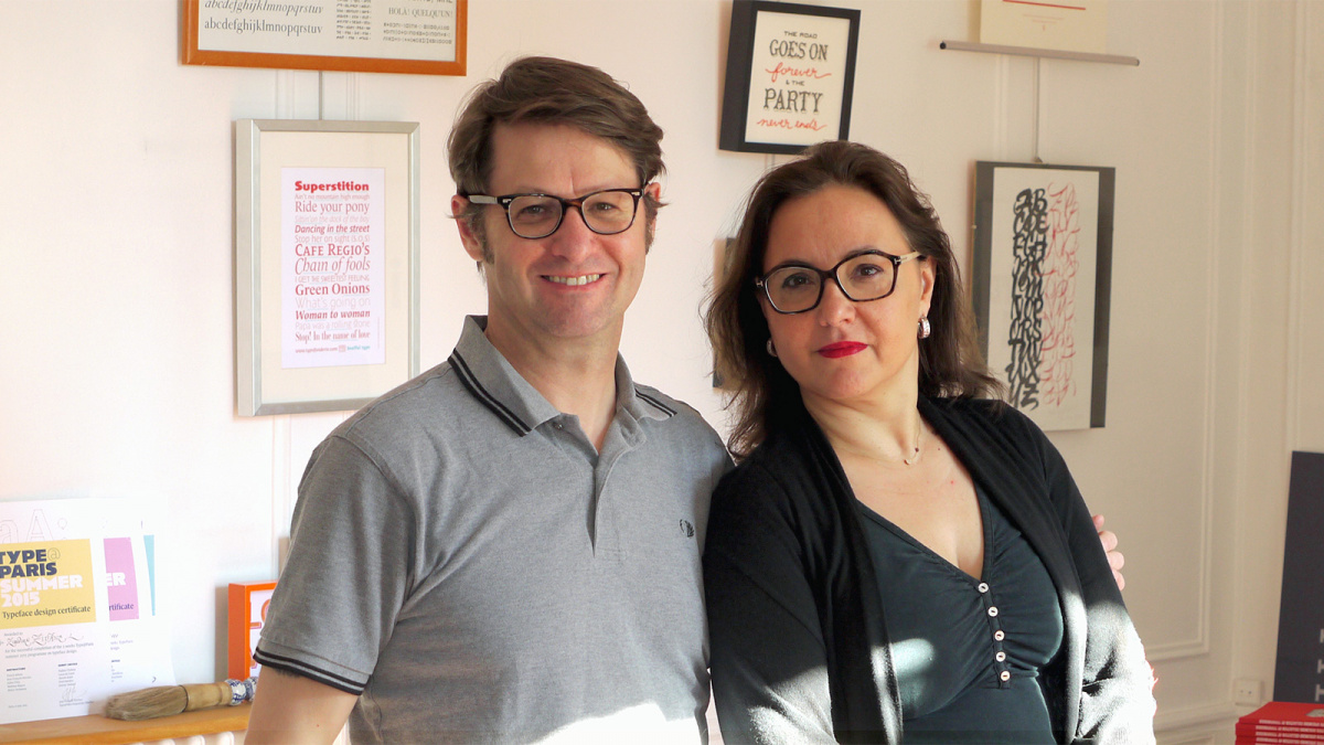
Just a short Vespa ride from the center of Paris is Clamart, the charming suburban town where the energetic duo Véronique and Jean François Porchez run Typofonderie, France’s oldest digital type foundry (founded in 1994) as well as its younger sister ventures ZeCraft and TypeParis.
“Currently, there are four of us here, every day mostly,” says Jean François Porchez (known as JFP for short), “the two of us, plus two designers, sometimes more, depending on the projects we are working on.” Véronique Porchez, who joined the company in 2011, has a background in the fashion industry and handles licensing and finances. “Without Véronique, we wouldn’t have any money in our bank account. She’s the most important person at the company,” asserts JFP. “Well, we wouldn’t exist without Jean François and our other designers who are working with us,” she rebuts. “I do all the things that go on behind the scenes.”
Sign up for mailing
Get more typography articles straight to your mailbox. Sign up for our mailing list.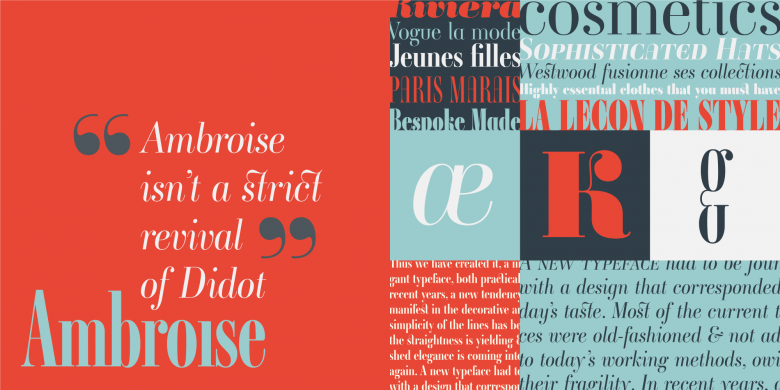
Ambroise is one of Véronique’s favorite typefaces at Typofonderie, “because of its many ornaments,” she says.
JFP studied graphic design at EMSAT (École municipal d’arts et technique) in Paris in the late 1980s. At a time when there weren’t any formalized paths to becoming a typeface designer “it was a matter of meeting the right person,” he says. His first-year calligraphy teacher, Ronan le Henaff, who had worked at the renowned ANCT (Atelier national de création typographique, the precursor of ANRT, helped him discover his interest in letters and typefaces. In his last year at school, his teacher Rodolphe Giuglardo, who was also associated with the ANCT, told him about the Morisawa Award for type design “which he wanted to enter himself, but that got me curious. I had already started to design a typeface for headlines for a school publication. So I submitted this to Morisawa too, and the rest is history so to say,” he laughs. JFP won Peter Brattinga’s Judge’s Prize for Angie in 1990 (it was subsequently published by FontShop International) and a second Morisawa award in 1993 for Apolline.
Apolline and Angie Sans were the first typefaces that JFP released on his own label, initially called Porchez Typofonderie, but he also continued to publish typefaces through other foundries like Font Bureau (Anisette) or Linotype (Sabon Next). In addition, he began to develop custom typefaces and lettering for a wide variety of clients ranging from French newspapers (the Le Monde series) to the Paris public transit system (Parisine) to Beyoncé and luxury brands such as Louis Vuitton.
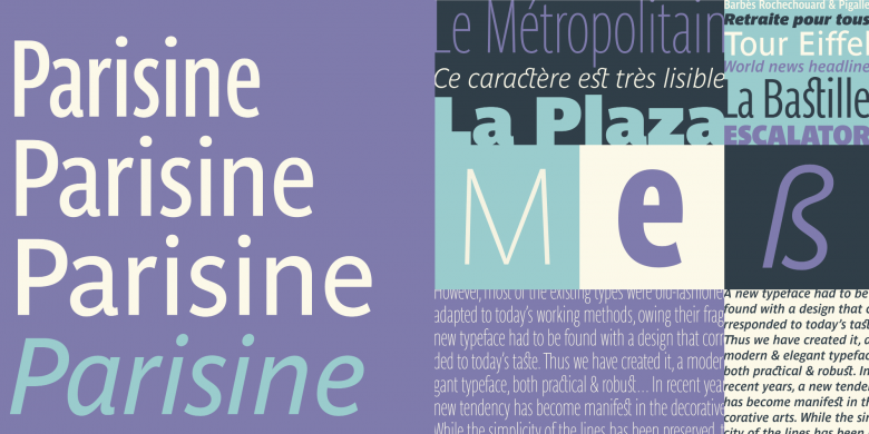
Parisine
These somewhat disparate activities of designing on the one hand and publishing retail fonts on the other hand were eventually separated into designated companies so that custom work, distribution of typefaces, and educational activities would not get in each other’s way:
Typofonderie exists solely to publish, license and distribute high-end retail typefaces by JFP and other in-house and external designers. It focuses on impeccable quality and fully developed, feature-rich families. Its catalogue includes historically inspired typefaces and revivals like the recent Fournier as well as original, contemporary designs for a wide variety of applications, like Mislab or the Prosaic series.
“When we say we want to offer the best quality typefaces it’s not just another empty phrase. We pay a lot of attention to perfect shapes, spacing and kerning. One of the best compliments we once got from a client was that if they use a typeface from Typofonderie, they don’t have any work to do. They just set the text and it’s automatically properly balanced.” — Véronique Porchez
ZeCraft, on the other hand, is concerned with design in a broader sense, including not only typefaces, but also lettering, logos and general graphic design, usually projects initiated by clients with a particular need.
TypeParis, started in 2015, is JFP and Véronique’s newest initiative. The 5-week summer type design course is an intensive first insight into the profession of a typeface designer, bridging the gap between self-study and high-end master’s programs with an entry level offer for graphic designers.
33
Typofonderie font families available to rent on Fontstand for a fraction of their retail price.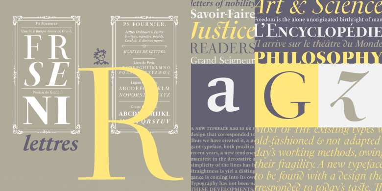
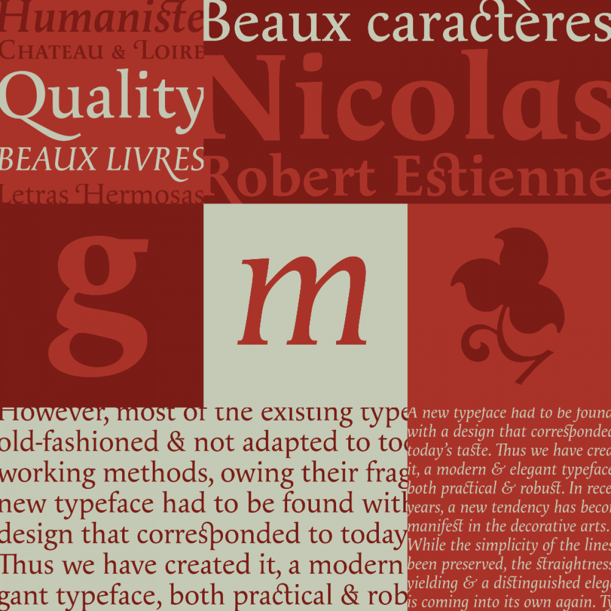
This recently published tribute to the typefaces of Pierre Simon Fournier was designed by Stéphane Elbaz
Having experienced the TypeParis course as a guest myself last summer, I am amazed at how much dedication, energy and time the two put into teaching and organizing talks, essentially—to put it cynically—building up their own competition.
JFP, however, sees it differently: “The idea started because ever since finishing school I have also been teaching. I graduated in June, and in September I started teaching at the same school. It’s part of my life as a designer. From very early on I was active in organizations like Rencontres de Lure or Association Typographique Internationale (ATypI). It’s very important to me to share and teach and try to advance the community. Because I think, not only in France but also in other places, if you build your competitor, you build the local market and make people aware of quality in fonts. And I can see how in France now—compared to the mid 1990s when there was practically nothing—there are a lot of things happening in typeface design. Every graphic designer now has heard about custom fonts, for instance. It has become part of the common language.”
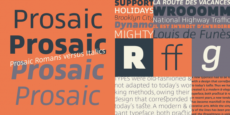
Designed by Aurélien Vret, Prosaic started as experimental letterforms made with a flat brush inspired by vernacular French signs
“In many schools for graphic design you now also have classes in typeface design, not only dedicated programs. I’ve been pushing for that a lot since the 1990s. I was one of the few who told students that they should learn how to draw type even if they were becoming graphic designers. And every once in a while, there is a student as dedicated and interested as I was back in the day, and I take them under my wing and guide them more intensely, so I can be that person they met.”
Véronique adds, “Not everyone who learns how to draw typefaces will become a typeface designer, but they will become better type users. It’s a valuable skill and a competitive advantage if you work in an advertising agency, for example, where most of the people don’t know much about typefaces or how to play with letters.”
“If I learned one thing in my previous career, it’s that you have to continue to learn, all the time. Don’t stop when you graduate. Always try to stay on top of things.” — Véronique Porchez
JFP: “Don’t get me wrong, I’m not against high-level type education, but to dedicate one or two super-specialized years may not always be necessary. We have enough of these high-level programs and graduates, but something shorter, like workshops, can be effective in addressing the need for people in the middle, those between the general graphic designers or art directors on the one hand and the high-end typeface designers on the other.”