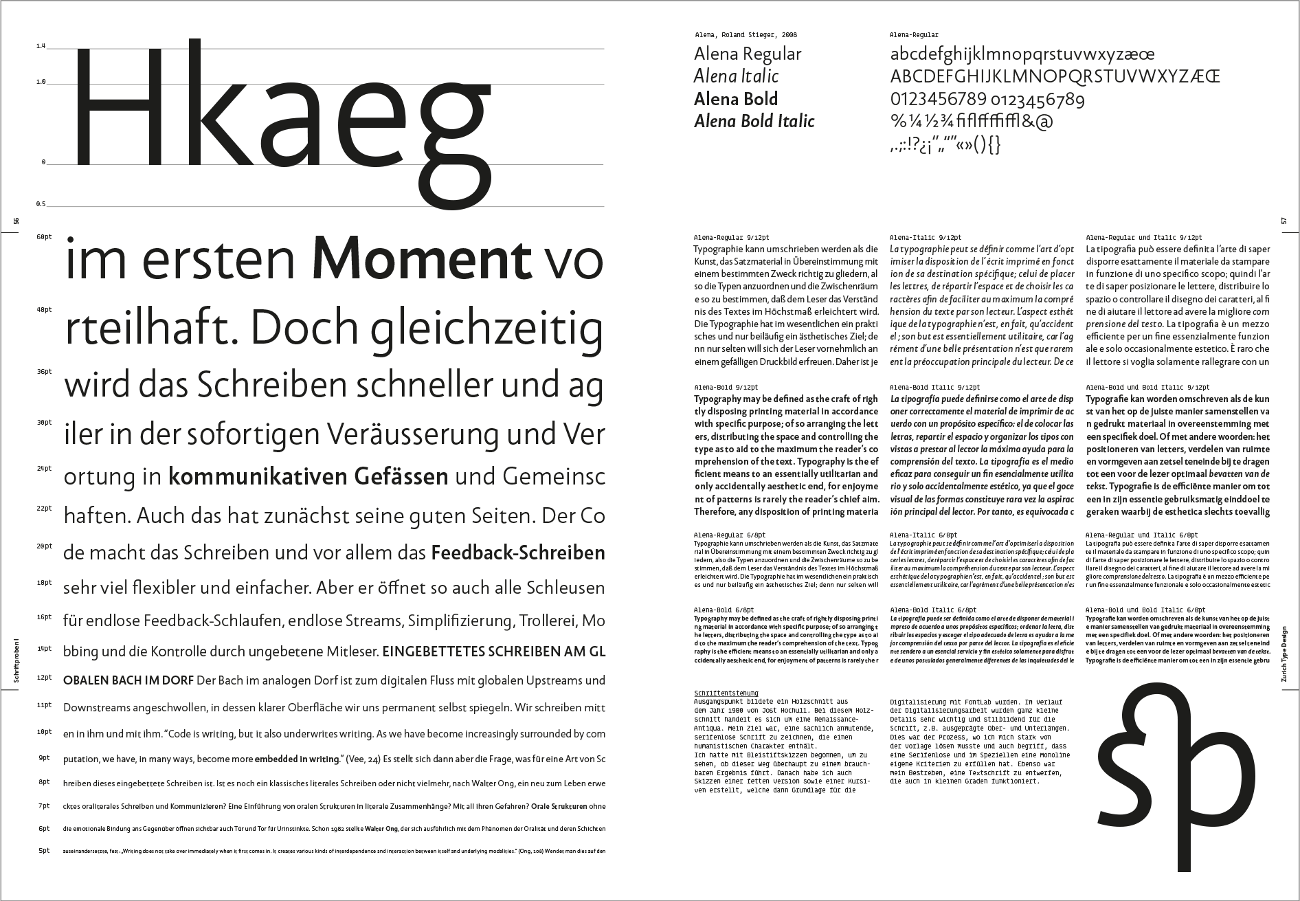
Swiss publisher Triest brought out its new Zurich Type Design book in late 2020. Rudolf Barmettler, professor at the Zurich University of the Arts and director of its type design programs, assembled it. The book presents an excellent overview of the school’s type design curriculum over the past decade and a half or more. It also features specimens of typefaces designed by its program’s students. While most of the book’s text is in German – the articles from Robin Kinross and Fiona Ross are in English – the student type specimens and images from the curriculum over the past several decades will prove useful for readers of other languages as well.
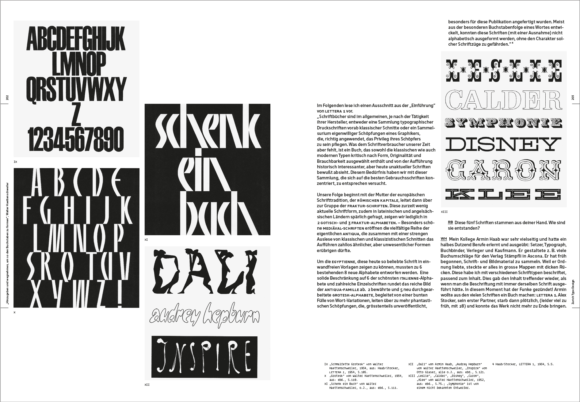
For about a century now, design education in Zurich has periodically included the possibility to learn a great deal about lettering and type design. Walter Käch taught at the Zurich Kunstgewerbeschule from 1940 until 1967, for instance, where the young Adrian Frutiger was one of his students. Zurich Type Design includes a contribution from Hans-Jürg Hunziger – who both studied and taught in Zurich – but the work of other senior Zurich type designers appears in the book as well. The book includes Barmettler’s interview with Walter Haettenschweiler, whose name Fontstand readers may recognize from the Lettera series of books published between 1954 and 1972. Those featured a variety of alphabets that designers around the world used for reference over many decades. Barmettler also contributed an essay reflecting on Hans Eduard Meier. A former Zurich student, Meier went on to design the Syntax typeface Stempel published in the late 1960s. At the beginning of this century, he taught classes for a new generation of Zurich students, where they learned how to use digital font-editing software. There are contributions in the book from designers who work in earlier media further afield from Zurich, too: the German Georg Salden, one of the most prolific designers of photo-typesetting faces in that country, contributed a text.
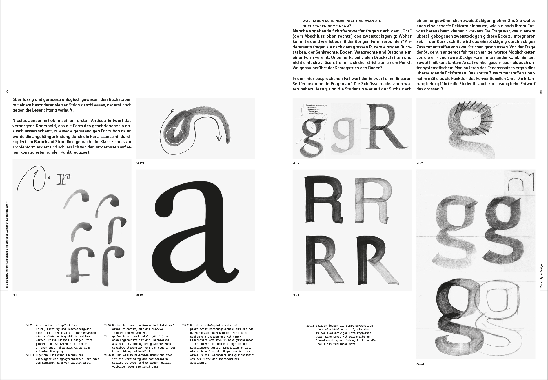
Robin Kinross’s historical overview the Monotype Corporation’s making of type for hot-metal composition and Fiona Ross’s considerations on Non-Latin type designs are also two sorts of texts not readily available elsewhere. They enrich the book, just as their lectures must have been of great benefit for the Zurich students who heard them live. One can easily imagine each inside a future book published by the Typography Department at the University of Reading. These contributions join a panoply of texts that include: a summary of some of Barmettler’s pre-type-design course teaching exercises, a discussion on type and type design between Barmettler and André Baldinger, a short text on optics in type design from Anton Studer, and Katharine Wolff’s piece detailing the importance of calligraphy in the digital era. Additionally, Christian Flepp describes ideal an ideal application for typeface-sorting, Barmettler summarizes his methods for teaching type history, Bruno Margreth describes the changes to type design brought about by photo-typesetting, Remo Caminada recounts a 2003–2006 project for generating typefaces via digital parameters and Mischa CharlesSenn goes through the legal possibilities available for protecting typeface designs. Indeed, his perspective may be new for designers from countries with legal systems similar to those in Britain and the United States.

Zurich Type Design joins a small collection of previous type design programs’ books, including ANRT Archives 1985–2006 (2016) and One Century of Type and Teaching Typefaces in Leipzig (2010). While books like Haagse Letters (1996) and Dutch Type (2004) don’t have the same kind of course overview as Zurich Type Design, each does include images of typefaces designed by students at the Royal Academy of Art in The Hague. The unique mix of texts and images in Theory of Type Design – Gerard Unger’s last book – are similar to some of Zurich Type Design’s essays. Although Unger’s primary focus is not on the typefaces his students designed, the information about typeface design and its history in Theory of Type Design will be familiar to anyone who attended Gerard Unger’s lectures – whether they were those held at the University of Reading and other schools, or at TYPO Berlin and ATypI conferences. Undoubtedly, Zurich Type Design will be just as cherished by those who have come into contact with the Zurich course, either as students, teachers, or guest lecturers.
This is a large-format book, about 29 cm (11 inches) tall. In its dimensions, Zurich Type Design is more like ANRT Archives 1985–2006, One Century of Type and Teaching Typefaces in Leipzig and Dutch Type than Haagse Letters or Theory of Type Design. The book was designed by Baldinger + Vu-Huu in Paris and set in Baldinger Pro and BLine-Mono.