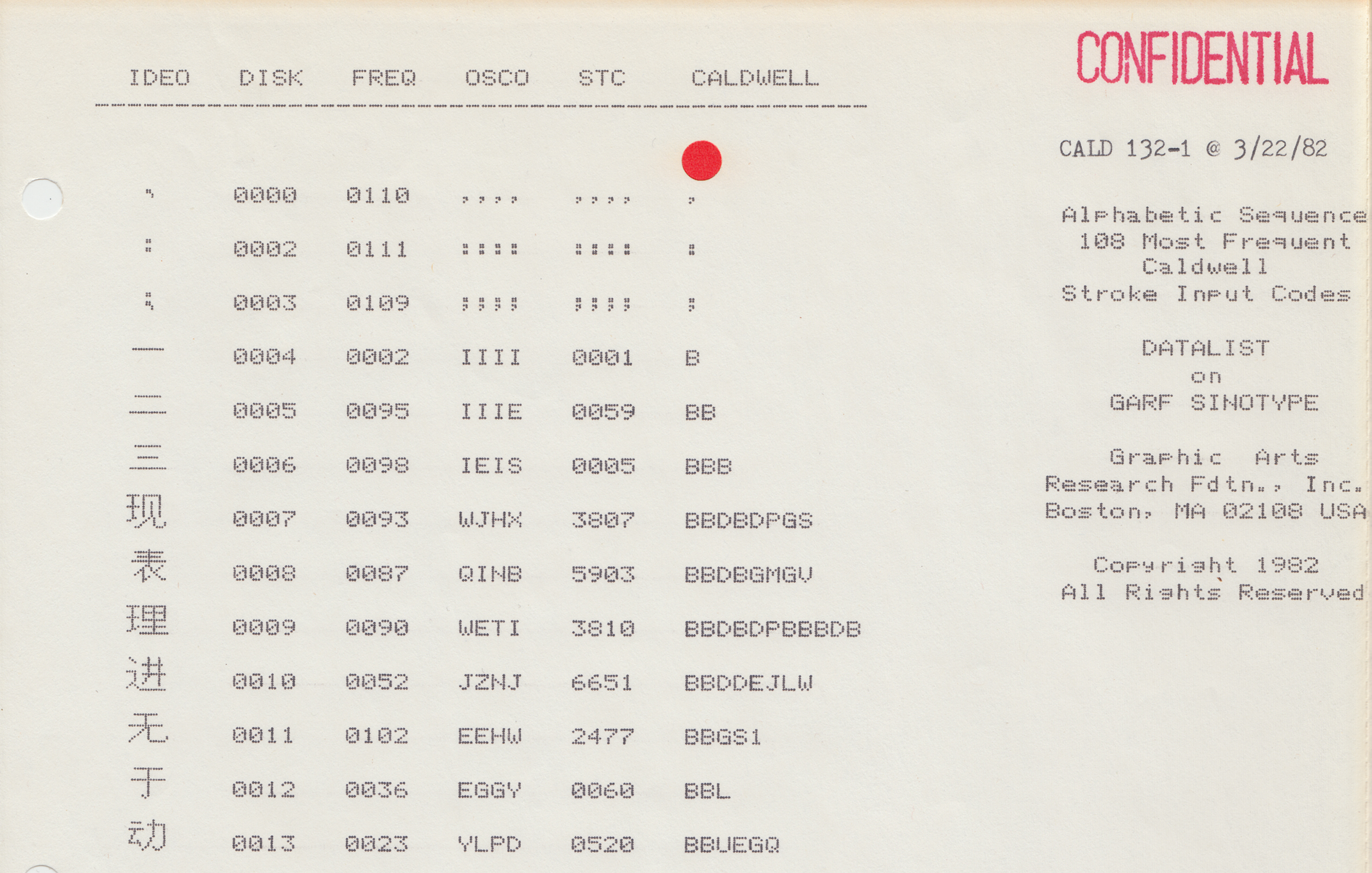
It’s 1990 in Beijing, and “Electronics Street” is humming. Here on Haidian Road, in the city’s Zhongguancun neighborhood, a stretch of computing shops play host to students, teachers, scientists, Traditional Chinese Medicine practitioners, and others trying to find the latest devices and software.
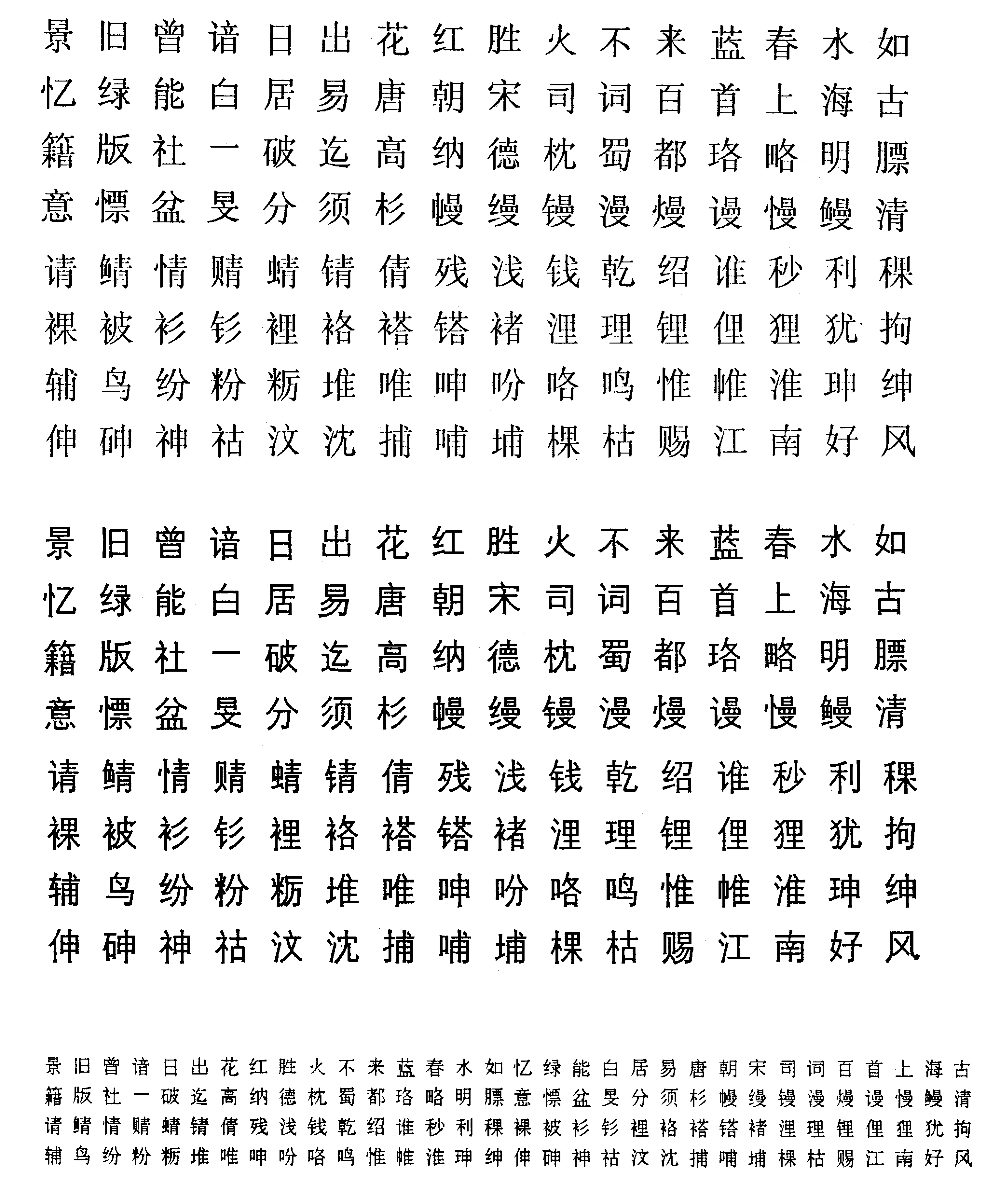
UCDOS 90 is one of the hot new programs, the most recent in a series of Chinese-language operating systems that enable computer users to input and output Chinese-character texts on Western-built personal computers. A purchase yields one a total of ten floppy discs: two are dedicated to the program itself, and eight are filled with the Chinese bitmap fonts needed for the system to operate. In all, just four fonts fill up those eight floppies: a low-resolution, 24-by-24 Songti printer font, a 24-by-24 Heiti font, a 24-by-24 Kaiti font, and a 24-by-24 Fangsongti font. Meanwhile, for customers of CCDOS 4.2—a competitor to UC DOS—a full 35 floppy disks are included in the purchase, containing just 7 fonts amongst them.
Chinese computer fonts take up a lot of memory.
At first glance, the reason behind this is self-evident. Unlike Latin alphabetic bitmaps, which can get away with using a 5-by-7 grid—for a total of just 35 bits of memory per symbol—Chinese bitmaps require at least a 16-by-16 grid—or 256 bits per character.
And there are a lot more Chinese characters than there are symbols in the standard ASCII character set.
Multiply these numbers together, and you start to arrive at memory requirements that far exceed the on-board memory of most off-the-shelf personal computers in the 1980s and early 1990s.
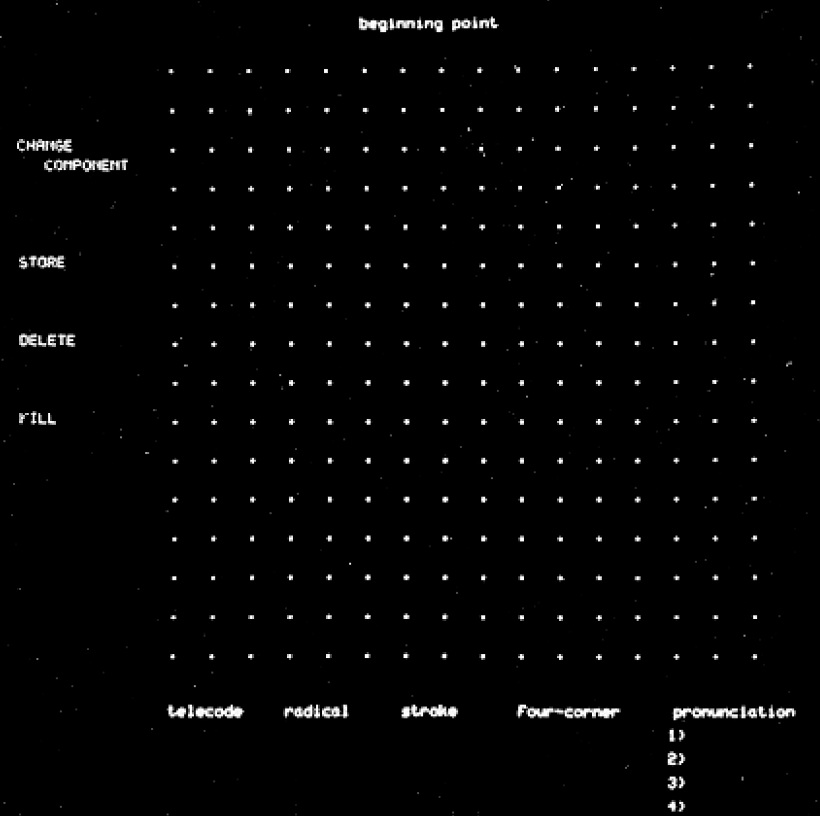
Confronted with this problem, most computer manufacturers and software developers settled on a compromise solution: to include only a limited number of Chinese characters in memory, with priority given to what are often referred to as “common usage characters.” Containing anywhere from a few thousand characters, to perhaps as many as ten thousand, this solution basically gave up on the idea of creating a font containing the entire Chinese lexicon.
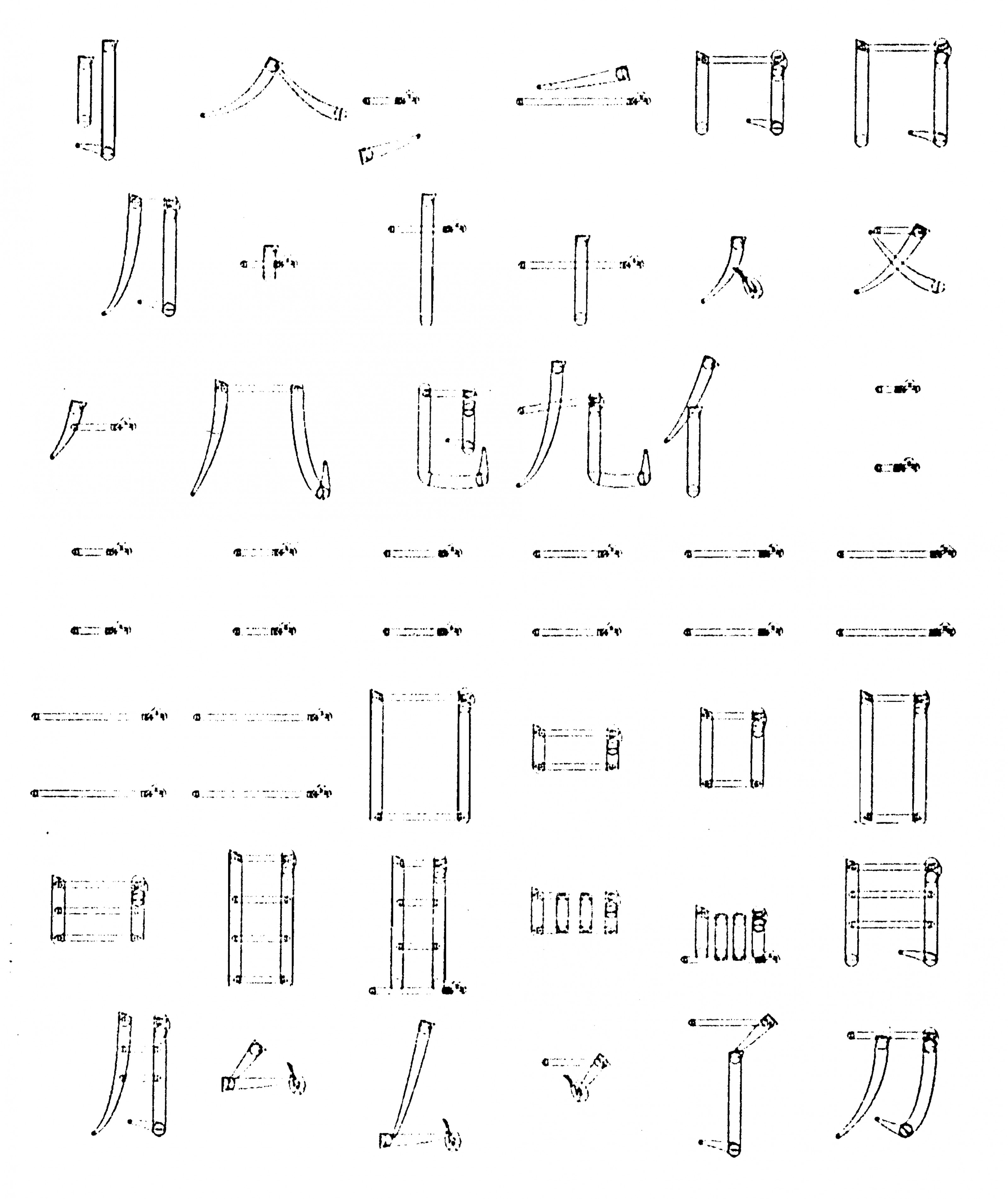
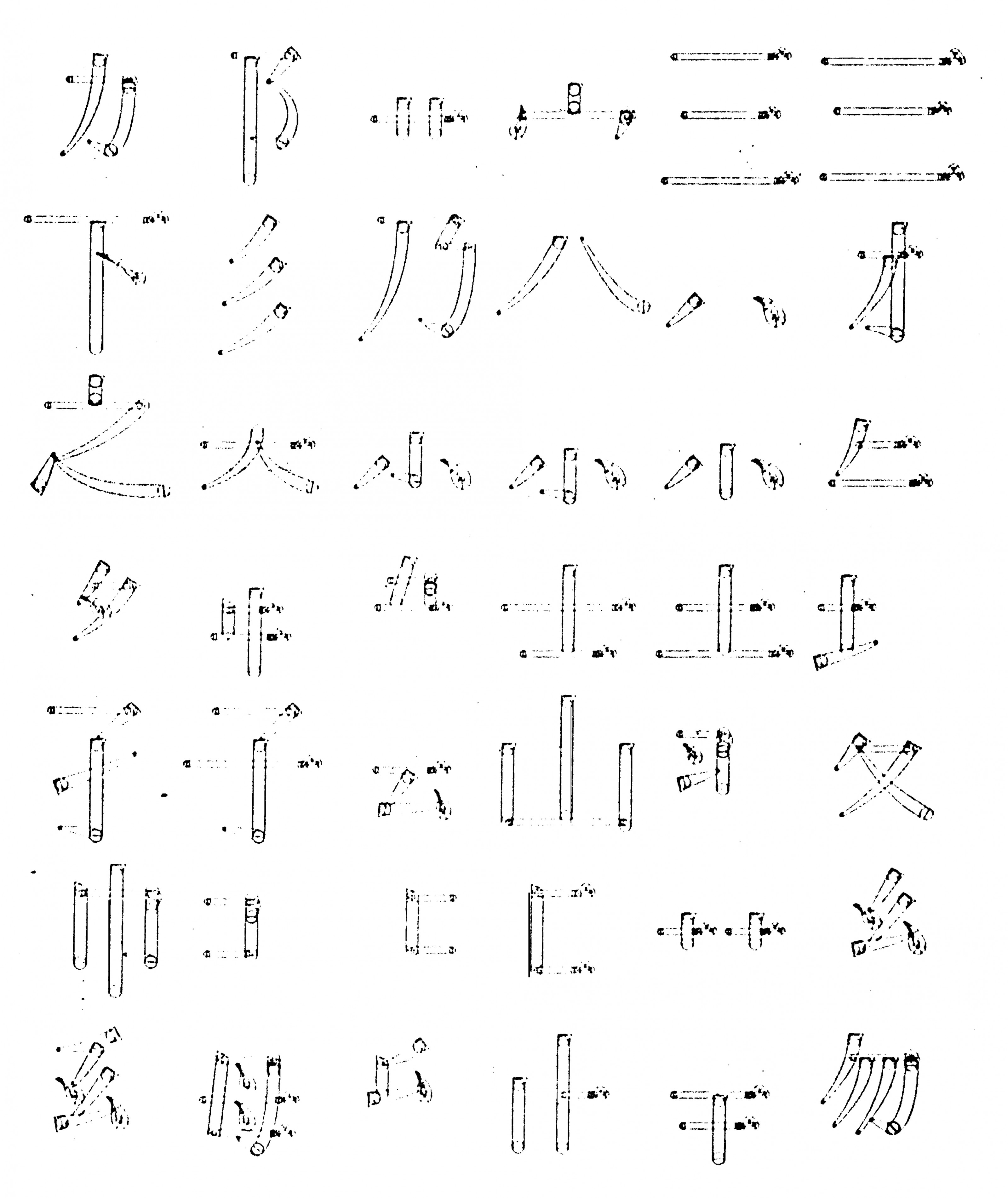
Not everyone accepted this sacrifice, however. Not only that, but they did not accept the premise of the “bitmap equation” I sketched out above—where one takes the oversized Chinese bitmap grid and then multiplies it by the number of Chinese characters. In the early years of Chinese computing, an entirely different approach to Chinese fonts emerged that involved bypassing bitmaps altogether: vector fonts, known in Chinese as shiliang Hanzi (矢量汉字).
In vector fonts1, Chinese characters are digitally rendered, not with a grid of pixels, but with a series of straight-line segments, creating something like orthographic “stick figures.” Rather than storing static pixel data in memory, these skeletal characters are stored as a set of mathematical, x-y coordinates, which the computer then connects dynamically using its native graphics processing capacities. This approach, early advocates argued, would enable Chinese computers to achieve what their Western counterparts already enjoyed: access to one’s entire language, not just a small portion thereof. More than that, it would help achieve what might be termed “digital equality”: a level playing field in which computers would be able to handle any writing system as easily as any other.
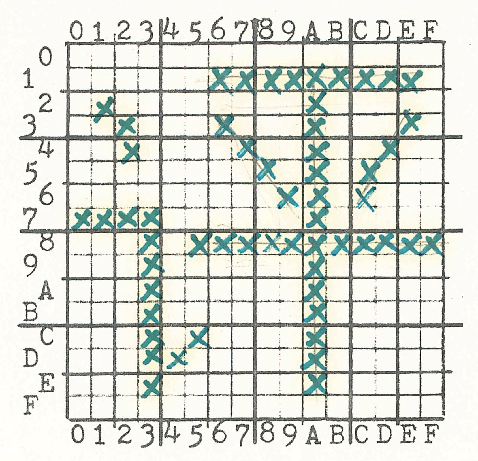
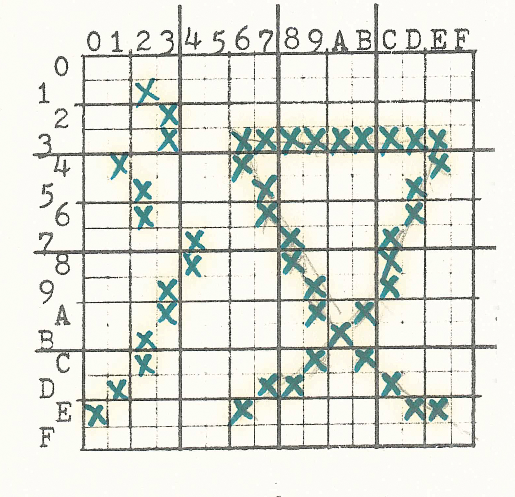
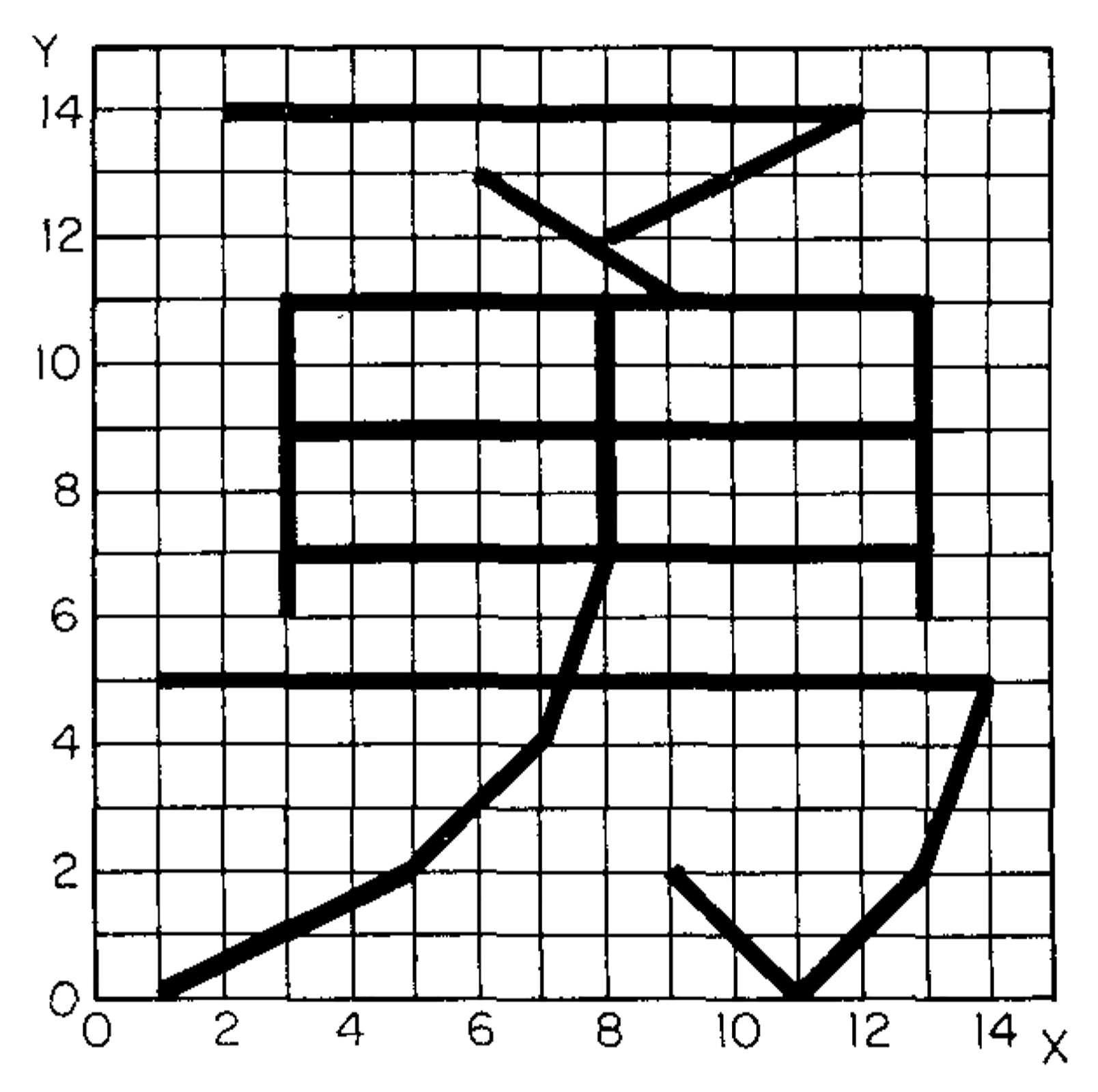
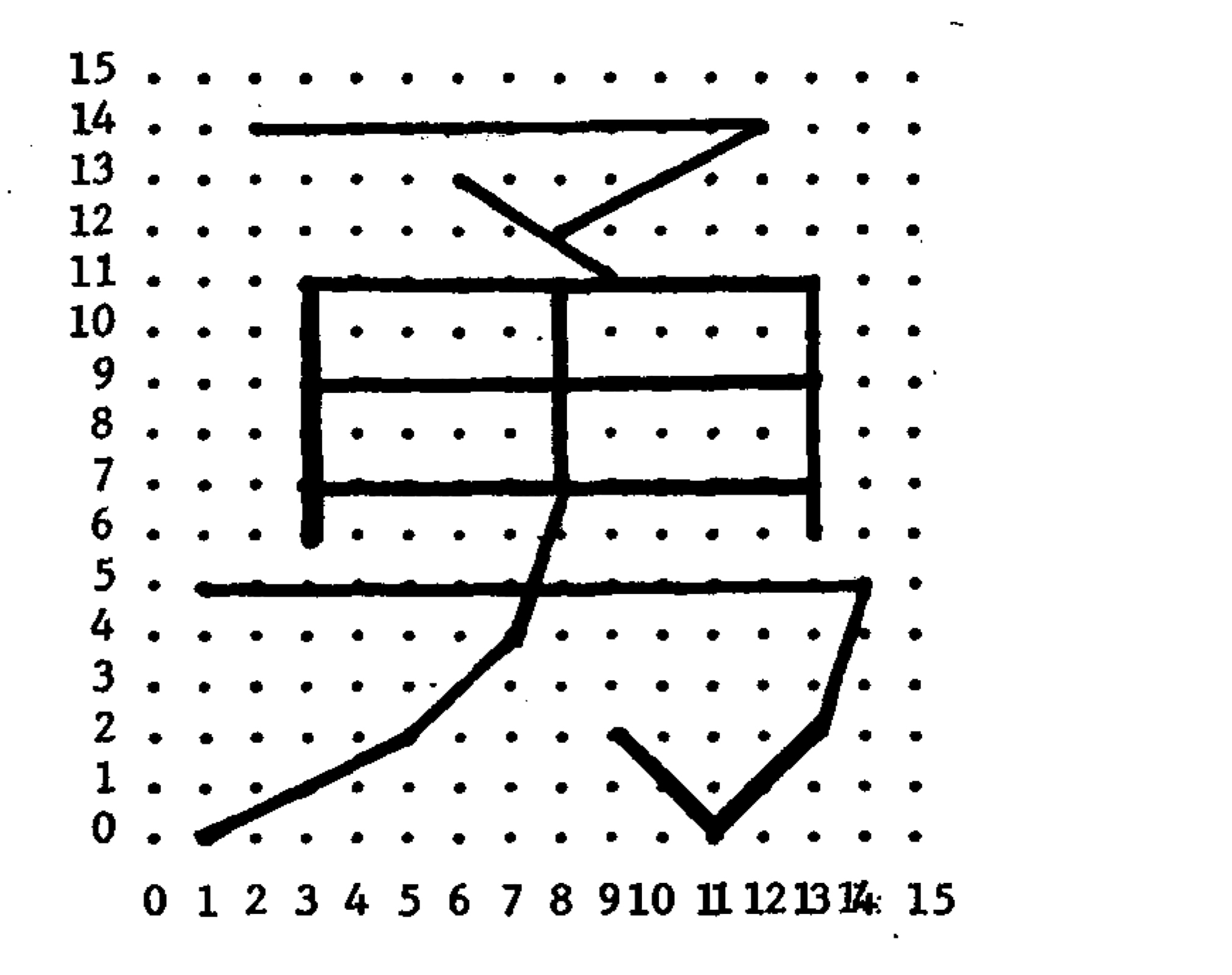
Chinese vector font research started well before the personal computing revolution, dating back to at least the 1960s. One epicenter of research was the University of Wisconsin, Madison, where Shou-chuan Yang and Charlotte Yang worked on decomposing Chinese characters into a series of x-y coordinates, rather than into a conventional bitmap raster. Using their technique, Chinese characters could be drawn on screen, or on paper using a plotter, almost like a children’s “connect-the-dots” puzzle. Using as their example the Chinese character for “brave” (勇 yong, in its traditional form), they explained how this graph could be represented using just 23 pairs of spatial coordinates, with each pair describing the origin and terminus of a single line segment. When compared to a conventional 16-by-16 bitmap raster, the differences in memory were sizable: 256 bits (or 32 bytes) to store this character in bitmap, versus just 192 bits (24 bytes) using the “connect-the-dot” system. What is more, a conventional 16-by-16 grid would likely be incapable of rendering this particular character, given the number of strokes needed to produce it. To achieve bare-minimum legibility for this character in bitmap form, a 24-by-24 bitmap raster would likely be necessary, which in turn would require 576 bits (or 72 bytes). “Taking this as a basis of estimation,” the researchers concluded, “the overwhelmingly numerous 10,000 Chinese characters can be decomposed and packed in 40K of memory.” 24 bytes versus 72 bytes. A stark difference. 40 kilobytes of memory versus 320 kilobytes needed to store a 10,000-character font in 16-by-16 bitmaps. The potential savings were immense.
The potential of this approach went beyond kilobytes, however. It raised the prospect of digital equality: a condition in which a writing system like Chinese would be on the same level playing field as English.
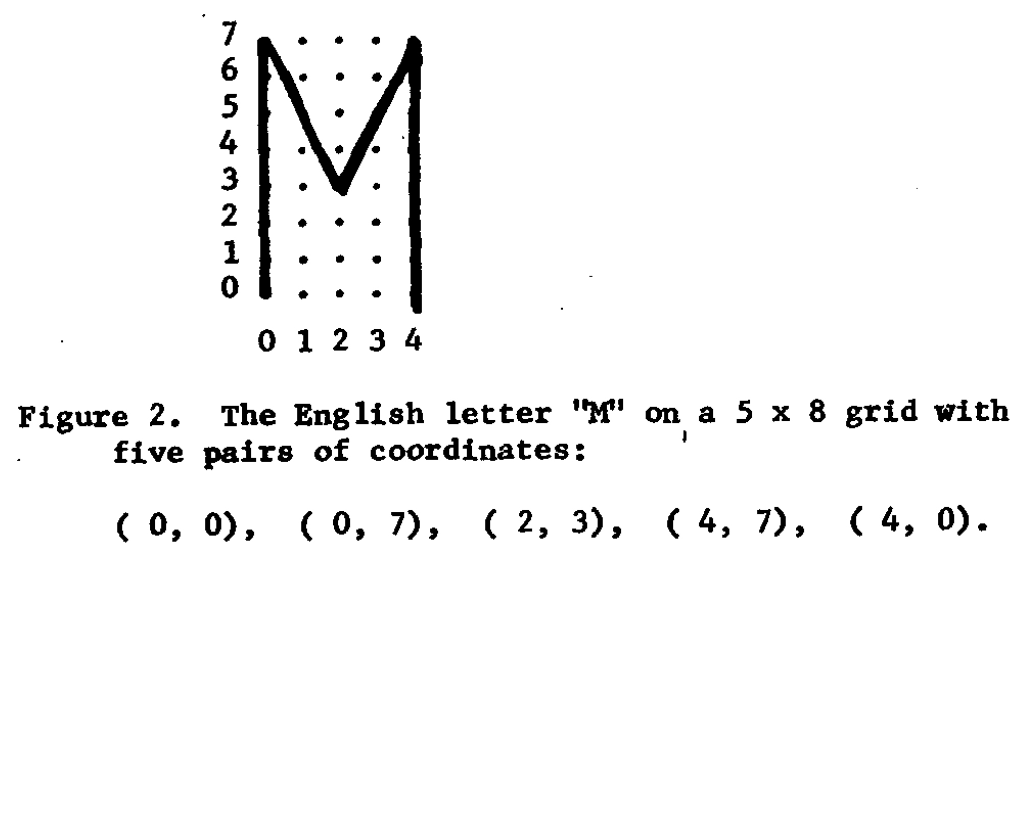
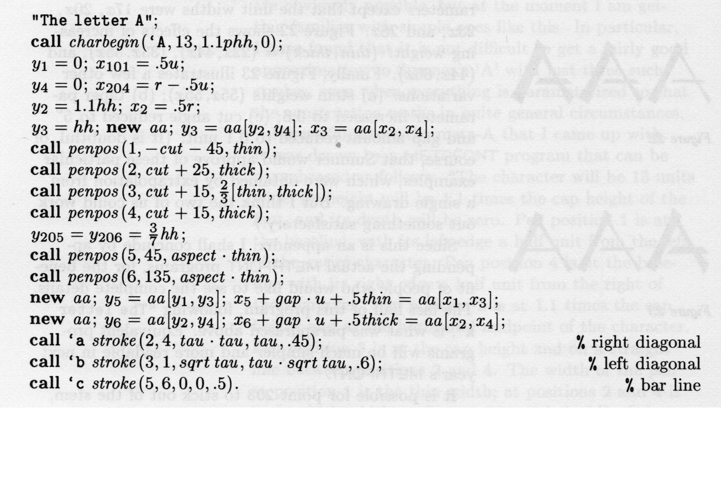
Yang and Yang saw their program as a new system, not only for the compression of Chinese fonts, but perhaps for all writing systems—especially non-Latin writing systems. Naming their system the “Universal Graphic Character Writer,” they tested their system on English (exemplified in a coordinate font for the uppercase “M,” requiring only five pairs of coordinates to produce), and then announced plans to conduct further studies on French, German, Hindi, Hebrew, Italian, Japanese, Korean, Russian, and Spanish.
Overzealous as this may sound, there was a logic behind their lofty ambitions. After all, the problem of digital fonts for scripts such as Devanagari and Korean Hangul was not solely one of computer memory. The main problem involved the grid itself: the way that bitmaps worked, and the kinds of demands and limitations that were baked into the system. After all, Korean Hangul comprises only 28 elements or modules in all: 17 basic consonant letters, and 11 basic vowel letters, bringing one to a total just slightly larger than the Latin alphabet. In theory, then, it should be just as easy to encode this script as English. Why, then, should it require many hundreds of bitmaps to render all of the different ways in which these consonants and vowels merge to form Korean syllables? Devanagari comprises between 44 and 52 letters (depending on how one counts), and yet requires hundreds of bitmaps in order to capture all of the many ways these components cluster together. Arabic comprises only 28 letters, and yet proved remarkably difficult for early digital computers on account of the many ways that these letters combine and connect. Why this difficulty? Why can’t these many non-Latin scripts enjoy the same kind of “one letter, one bitmap” ratio enjoyed by the Latin alphabet?
This problem has a long legacy. In movable type, a Korean Hangul font contains as many as 1000 slugs (not including Hanja, the portion of Korean script derived from Chinese characters). Meanwhile a Devanagari font houses between 700 and 1000 metal sorts. Arabic requires somewhere in the order of 470 movable type slugs. As these numbers bear out, the “problem of the bitmap” is not a computational problem per se, but a legacy of the ways in which the “grid” itself has been conceptualized within a host of modern text technologies.
Put simply, although we are conditioned to think of the bitmap as universal, neutral, and language-agnostic—a system that looks down upon every writing system with equal benevolence—in reality, it is far better at handling some scripts than others. Specifically, the bitmap grid interfaces more or less seamlessly with English, enabling that “one-to-one” ratio mentioned above, all while requiring other writing systems—even ones with a comparably small number of letters or syllables—to jump through a complex series of hoops before being able to benefit from everything the grid has to offer.
Maybe, however—just maybe—there is another kind of grid? One that perhaps brings us closer to orthographic parity?
Specimen of a Chinese font produced by John Hobby and Guoan Gu using Metafont.
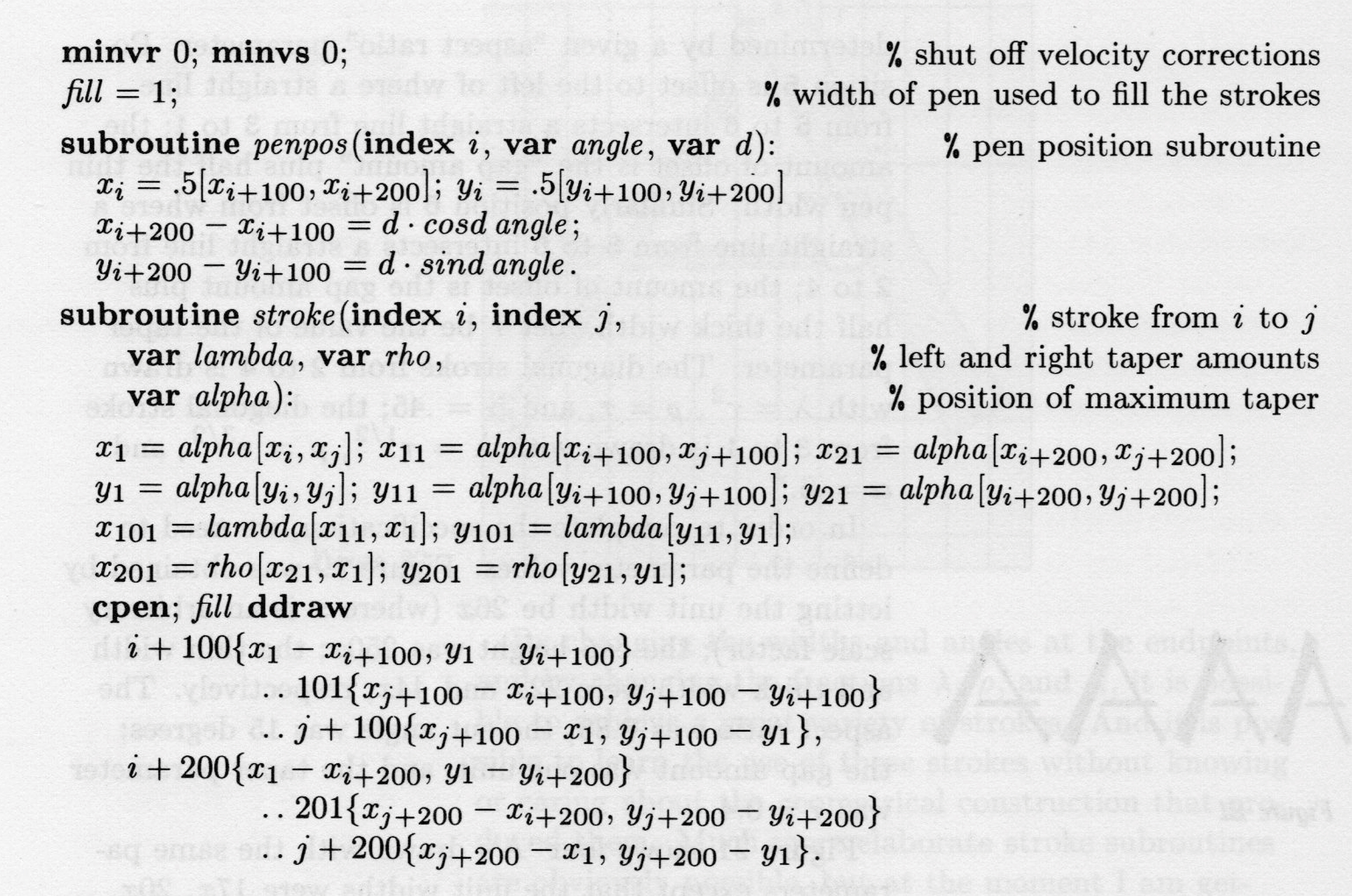
Such was the question driving the two Yangs. And they weren’t alone. Chinese vector fonts—or “compressed Chinese characters” (yasuo Hanzi), as they were sometimes referred to—were also being explored at Harvard, the CIA, the Graphic Arts Research Foundation (GARF), Apple, and elsewhere. At Stanford University, my home institution, visiting researchers attempted to develop a vector-based Chinese font using the METAFONT program, developed by renowned computer scientist Donald Knuth. Better known for the program TeX (1978), a computational typesetting system still widely used in mathematics, physics, and other quantitative academic circles to produce high-quality articles and books. Knuth also created METAFONT (1979/1984), a programming language in which geometric equations are used to produce vector fonts. For all of the reasons outlined above, this program drew international designers to Stanford to explore the application of METAFONT to non-Latin type design in the 1980s and early 1990s, both through a series of visiting scholarships, as well as in a cutting-edge interdisciplinary program in digital type design that Knuth cofounded with Charles Bigelow and Richard Southall.
While more economical than bitmap fonts from the standpoint of memory, however, Chinese vector fonts posed a host of challenges. For one thing, these “skeleton fonts” (another common moniker) were more computationally taxing to produce. Rather than simply printing a bitmap raster to the monitor, each individual line segment had to be calculated and drawn, depending on the system’s CPU—a serious drawback in the early years of personal computing, when computing horsepower was far more limited than it is today.
Early skeleton fonts were also jarring to the eye—even more so than already rough low-resolution bitmaps. Crude as they were, bitmap fonts nevertheless strove to preserve at least elements of hand-drawn Chinese characters, whether the curvature and taper of strokes, or stroke terminals. In Chinese vector fonts, by comparison, curvature was abolished altogether. “A curve of a stroke,” as Yang and Yang explained bluntly in their 1969 report, “is treated as many short straight line segments.”
As such, skeleton fonts were not, by and large, implemented on any significant commercial scale, and remained more a theoretical exercise than a practical solution.
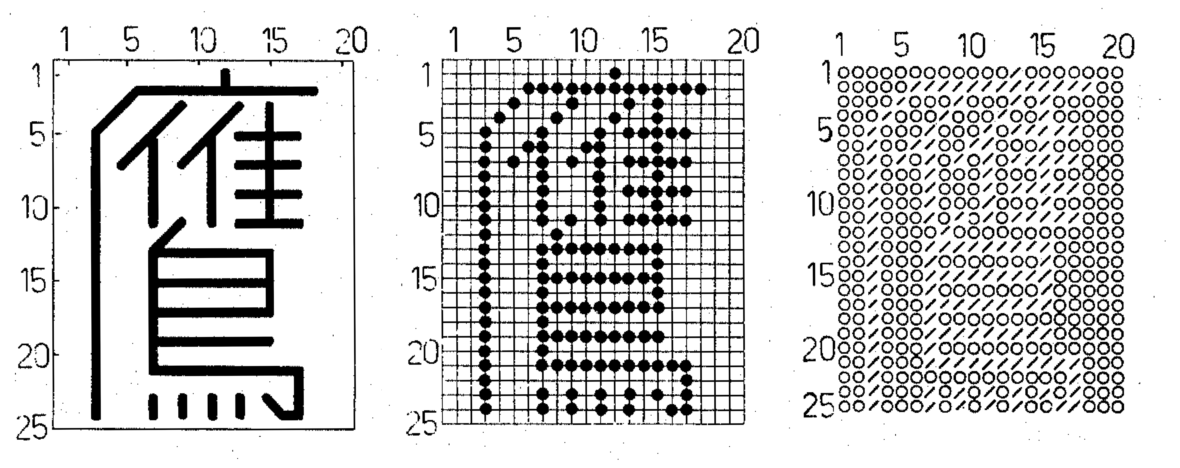
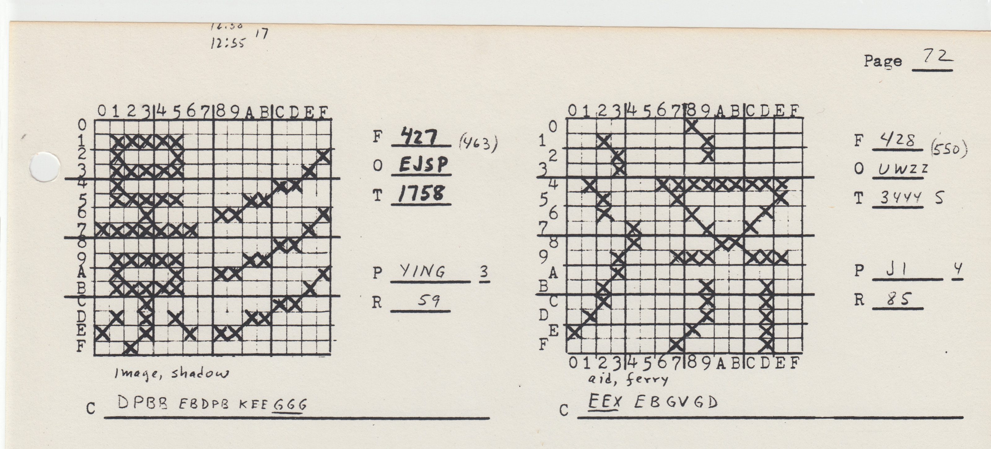
Dot matrix bitmap of the Chinese character ying (鷹 “eagle”), designed by Chan Yeh, founder of the Ideographix corporation.
Nevertheless, the extent to which Chinese and other non-Latin vector fonts were researched—as well as the openly political drive for digital equality that propelled some of this research—serves as a vital reminder: When it comes to computing, the “Chinese font problem” was not so much solved as drowned in a sea of dirt-cheap memory and ever-faster processing speeds. Those 35 floppy discs from Electronics Street are still with us today, so to speak, only we care less about them because of the terabytes of digital play space we now have at our disposal. The root problem of digital inequality has not been cured, so much as anesthetized with a steady drip of pain meds. And now that we’ve all become so “comfortably numb,” it’s difficult to imagine when we might ever revisit and confront the problem of digital inequality again. I, for one, believe that the grid can be overcome, however—if not by way of the vector, then perhaps by other radical approaches we’ve not yet imagined.
…
1. To clarify, these were not “outline fonts” of the sort used today, produced using Bezier curves. These were skeleton fonts made up a series of straight-line segments.
References
Guoan Gu and John D. Hobby. “Using METAFONT to Design Chinese Characters.” Computer Processing of Chinese and Oriental Languages 1 (July 1983): 4–23.
Hideyuki Hayashi, Sheila Duncan, and Susumo Kuno. “Graphical Input/Output of Nonstandard Characters.” Communications of the ACM 11 (September 1968): 613–18.
John D. Hobby and Guoan Gu. “A Chinese Meta-Font.” Tugboat, the TeX User's Group Newsletter 5, no. 2 (1984): 119–136.
Donald E. Knuth. TEX and METAFONT: New Directions in Typesetting. Digital Press and the American Mathematical Society, 1979.
Tung Yun Mei. “LCCD, A Language for Chinese Character Design.” Stanford Computer Science Report STAN-CS-80-824 (October 1980).
Shou-chuan Yang and Charlotte W. Yang. “A Universal Graphic Character Writer.” International Conference on Computational Linguistics Preprint No. 42 (1969, Stockholm).