Marcin Antique is a 21st-century font family reinterpreting sans serifs from late 19th century France. Mario Feliciano created it after examining types sold by Gustave Mayeur’s old Paris-based foundry. Nevertheless, the fonts are not a synthesis of Mayeur’s products. The concept of a unified range of typefaces spanning more than just a small subset of weights and widths was something that only became part of the typographic palette in the early 20th century. While Mayeur sold sans serifs that, in effect, offered single designs across multiple sizes, those cannot be considered as being part of any unified system that included light, regular, bold, italic and condensed fonts, etc. The sans serif fonts Mayeur sold were almost certainly intended for use on their own, with one or two sizes of a single design to be combined on the page with ‘normal’ serif typefaces. What is unique about Marcin Antique is that Feliciano delivers a unified sans serif family in which each member references letterform details common decades before Futura or Helvetica’s creation.
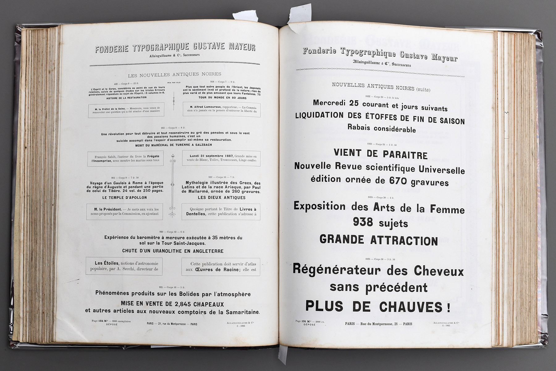
Fonderie Typographique de Gustave Mayeur Allainguillaume & Cie, Successeurs
Les Nouvelles Antiques Noires: Corps 6, Corps 7, Corps 8
Développement et Progrès récents de la Métallurgie
La Reliure Française Commerciale et Industrielle Instruction Morale & Civique
Don’t be fooled by the word Antique: Feliciano hasn’t drawn an old-fashioned set of letterforms. Instead, ‘antique’ is simply the typographic term common for sans serifs in France. The word’s origin may have been meant imply that the style is older than many serif typefaces; after all, in many Greek inscriptions from Antiquity, you’ll see sans serifs. Back in 19th-century France, a place you’d likely find the types Feliciano channels would be in newspaper and magazine headlines. Thanks to Marcin Antique’s range, those are excellent applications for Feliciano’s fonts today as well. You can choose from its eight weights, which begin with thin and end with super. The super weight is darker than Marcin Antique Heavy, and the idea of calling the darkest weight ‘super’ is something you might be familiar with from Akzidenz Grotesk. Unlike the various styles from early-20th-century sans serifs, each part of the Marcin Antique family complements all the others. You can combine a line of Light type with Super in a two-line headline, and the letters’ terminals will have the same kind of design in each line.
Each Marcin Antique weight has a complementary italic. The form that the italics take is sloped roman. That means letters like ‘a’ and ‘g’ – which are each double-storey in the upright fonts – are double-storey in the italics (in some typefaces, those letters get unique ‘true italic’ cursive forms in the italic styles). The sloped-roman nature of Marcin Antique’s italics is in keeping with mid-20th-century neo-grotesques like Helvetica and Univers. Through this, many features of the family’s design – like the horizontally-cut terminals on ‘c’ or ‘e’ – are consistent across the upright and italic styles.
Since consistency across a font family is a 20th-century trait, you might wonder what makes Marcin Antique inspired by 19th-century types. There is indeed 19th-century-style inconsistency in Marcin Antique’s design, but it manifests itself within the typeface’s uppercase and lowercase alphabets themselves, rather than between the fonts in the family. The small details in the typeface’s letterforms are often unexpected. Also, the spacing between their shapes is not always what you might assume. Nevertheless, Marcin Antique’s characters and spacing come together to create a working system, bringing a richness to designs that many neo-grotesques lack. Even though this is one coherent family, texts set in the typeface do not always look so clean-cut, especially in larger sizes. On the other hand, that vibrancy probably makes small-sized texts set with Marcin Antique very readable.

Feliciano has also developed eight upright-only condensed weights. Named Marcin Antique Narrow, those fonts are not yet available for use via Fontstand. Nevertheless, I mention them here because Feliciano has another Marcin Antique extension: Marcin Typewriter, which is available here. In each of Marcin Typewriter’s six weights, every character in a font has the same width, making Marcin Typewriter a monospaced design. As in several other monospace fonts, Marcin Typewriter appears somewhat condensed in width. That allows the designer to reach a happy medium between wide and narrow letters more easily. Feliciano’s changes to the ‘Marcel Antique’ forms for the ‘I’, ‘f’, ‘i’, ‘j’, ‘l’ and ‘r’ are quite noticeable. In Marcel Typewriter, each of those letters has gained at least one serif to help with spacing. ‘M’ and ‘W’ squeeze into the available space, but ‘w’ does not look so altered. Like Marcin Antique, the Marcin Typewriter family includes italics for each of its weights.
Le nouveau Comité composé de membres très influents de la Droite
Ces deux superbes volumes contiennent 845 Gravures tirées avec soin
Nouvelles annales des ponts & chaussées
Lundi 26 Juillet, Exposition et mise en vente de 4,798 Chapeaux
Marcin Typewriter is the most 21st-century part of Feliciano’s undertaking. While Marcin Antique is a typeface that likely works best in editorial design, with brand design coming in after that, Marcin Typewriter is a ‘designers’ typeface. Monospace fonts have been popular with graphic designers for a long time now because they offer interesting stylistic possibilities. With each character having the same length, there is less variation in text. Monospace fonts are also less legible than proportionally-spaced typefaces. When you design with monospace fonts, you are channelling a certain kind of look, and it is clear both to you and your audience that ease of reading is not the prime concern governing your choices. Sometimes, that can be a liberating thing to embrace.