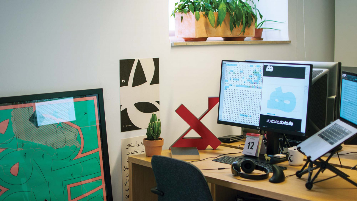
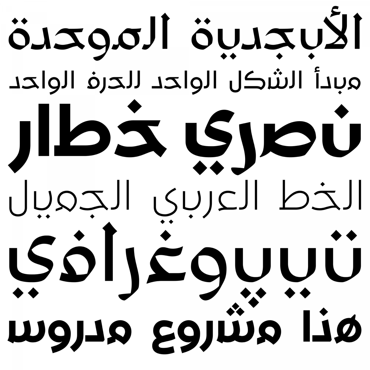
The 29LT font foundry was named after the 28 letters of the Arabic alphabet (plus the hamza glottal stop). It was founded by Lebanese type designer Pascal Zoghbi in 2013. Arabic, though not a minority script, had been up to that point relatively underdeveloped compared to Latin and other scripts with comparable usage, which motivated him to explore designing contemporary Arabic fonts. The fact that he grew up in largely bilingual Lebanese society perhaps explains his natural inclination to establish a type design foundry that specializes in multiscript typeface design using Arabic as a springboard for developing multiscript font families.
Sign up for mailing
Get more typography articles straight to your mailbox. Sign up for our mailing list.Zoghbi began his professional education in graphic design at Notre Dame University in Lebanon and developed his interest in Arabic type design in the typography course there. The course included field trips to 18th century printing presses in Lebanon and introduced him to the Arabic reform projects in Cairo in the 1930s and 1950s, namely the work of Lebanese designer Nasri Khattar and his invention of the Unified Arabic Alphabet. Zoghbi was intrigued by the idea of modernizing the script and his curiosity was amplified after attending an Arabic language course with the progressive Lebanese poet and philosopher Saïd Akl who spoke about his attempts at revolutionizing vernacular Lebanese and developing a “Lebanese alphabet” for it. These courses sowed the seeds for his later professional aspirations, and he continued reading on the subject and practicing Arabic calligraphy with the help of existing workbooks.
Massira
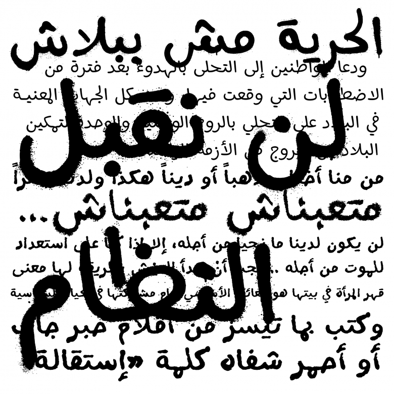
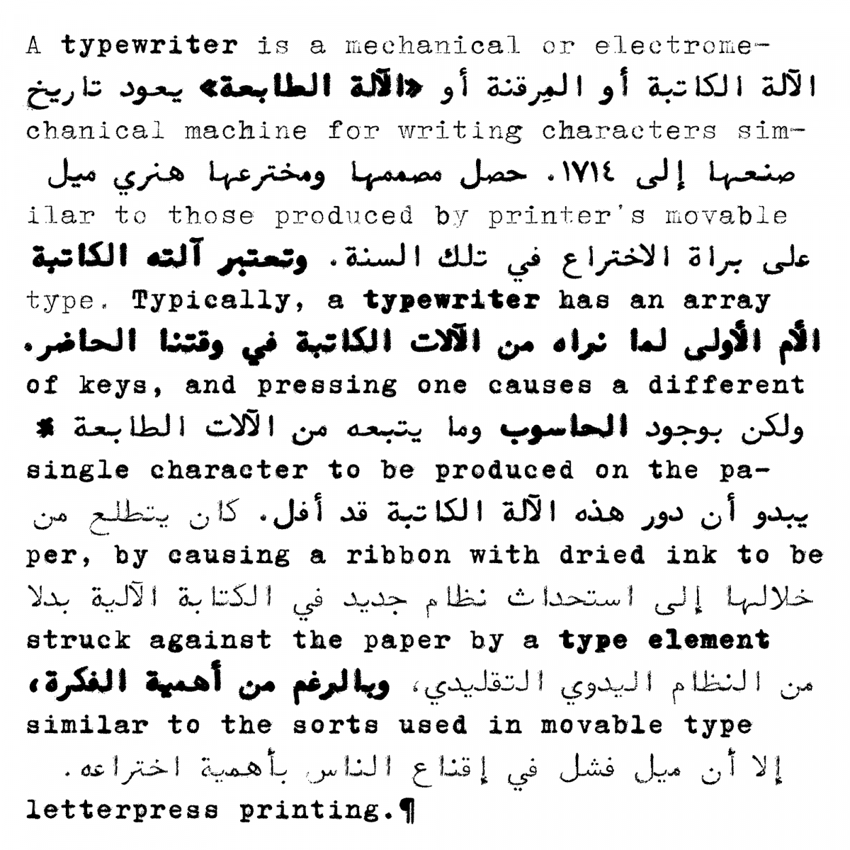
Zoghbi felt the need to further develop his type design skills professionally. Since there was no such course available in Lebanon, he enrolled in the Type & Media masters program at the Royal Academy of Art in the Hague (KABK), graduating in 2006. For his final project he designed the Massira font family based on the Ruqaa style used for informal writing on demonstration banners and petitions in Beirut at the time. The design was Zoghbi’s form of activism; the project consolidated his belief that letterforms can express a clear message and that “letters can start a revolution or stem from it, [and can] speak out the suffering and struggle of a nation.” Massira marked the beginning of his journey (or massira in Arabic) into designing Arabic fonts that are visually expressive, exploring various techniques and tools of writing (pen, spray paint, brush, lipstick…) and creating unexpected font families.
Right after his graduation he was invited to participate in the Khatt Foundation’s first Arabic type design research project, Typographic Matchmaking, which paired him with Martin Majoor to create an Arabic complement to Majoor’s Seria. Building on the work that began in Massira, they sought to harmonize Seria’s treatment of strokes with the conventional proportions and structures of Arabic characters. Zoghbi spent the next six years working as a freelance type designer producing custom fonts for various customers that ranged from museums and cultural institutions to commercial clients. The design briefs afforded him a range of possibilities for turning the complex structure of the traditional Arabic script into contemporary type.
For Pascal Zoghbi, sound type design practice requires several skills: a thorough knowledge of the written conventions of a script and its historical typographic development; understanding the challenges of creating multiscript type families and typesetting; the creativity to translate traditional scripts into modern typefaces; finding novel ways for creating typefaces and discovering new ideas; and finally, the mastering of font production and current technology.
Zoghbi’s experiences laid the groundwork for the philosophy of 29LT: creating innovative, high-quality contemporary fonts that respond to regional and international market needs, exploring the diversity and potential of the Arabic script, looking for harmony between scripts and gathering specialists in different scripts to create multiscript font families. At 29LT, the various scripts within a font family are designed collaboratively and simultaneously, as a conversation between two or more experienced designers, native users of their scripts, sensitive to their cultural implications. The overarching design is often based on research that explores each script’s parameters and the spectrum of possible shapes for one letterform or character. In the case of Arabic, it is particularly important to decide which script style to use as a base, since each has its own cultural implications, history and conventions of use. Other graphic or conceptual ideas are grafted onto this base to create unique designs whose form and concept fulfill their briefs.
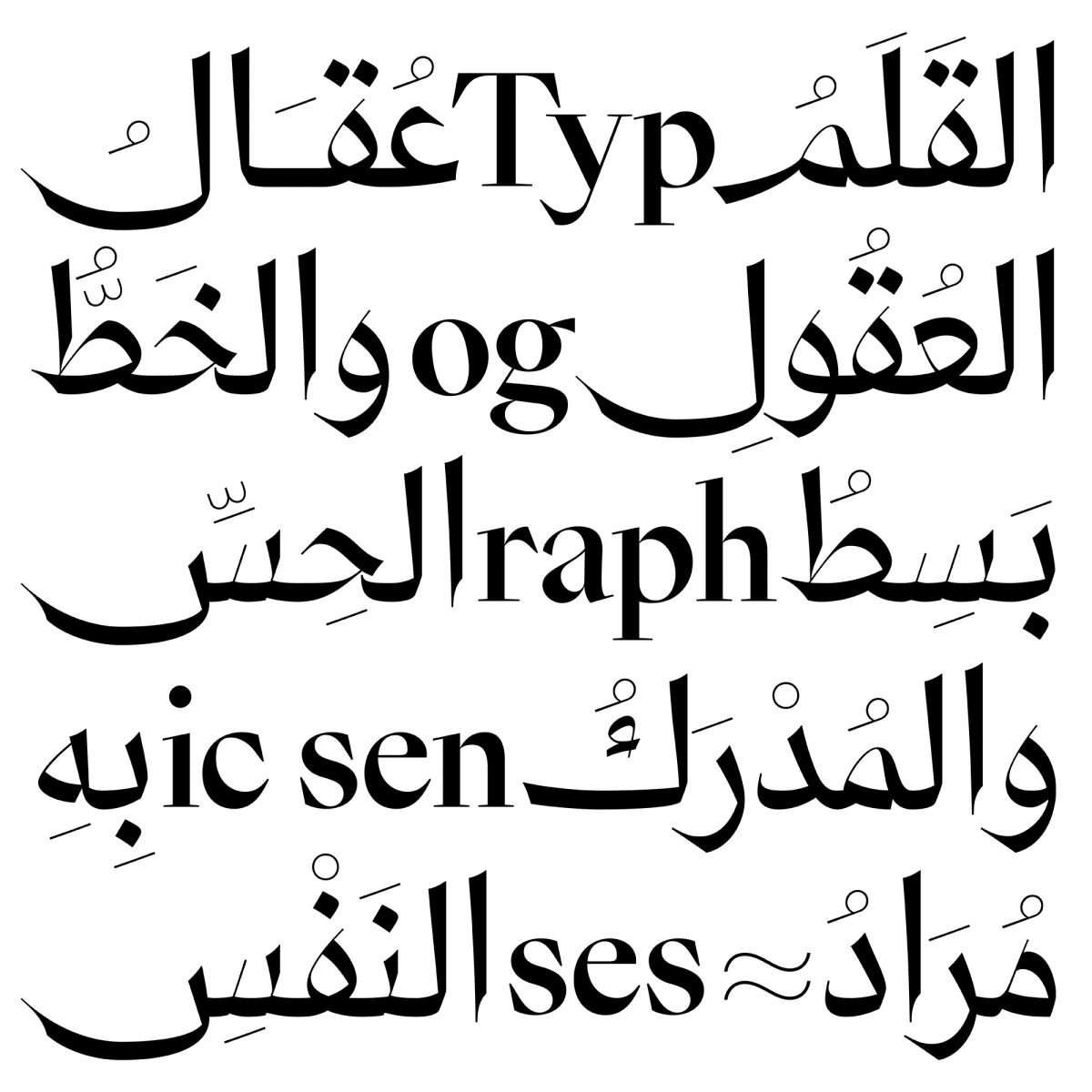
Zoghbi skillfully blends inspiration from the past — for example older Arabic calligraphic styles (see Zarid Text) or monospaced typewriter fonts (see Baseet, Makina and Zawi) — with risk-taking innovations, including slanted fonts among other. Although italics as such are not part of the Arabic script tradition, he has developed a unique approach to designing slanted versions of his typefaces, letterform variations that avoid distorting the curved strokes. Borrowing liberally from older calligraphic models and blending them into a balanced, seamless overall design, his upright and slanted forms work elegantly within the same visual language.
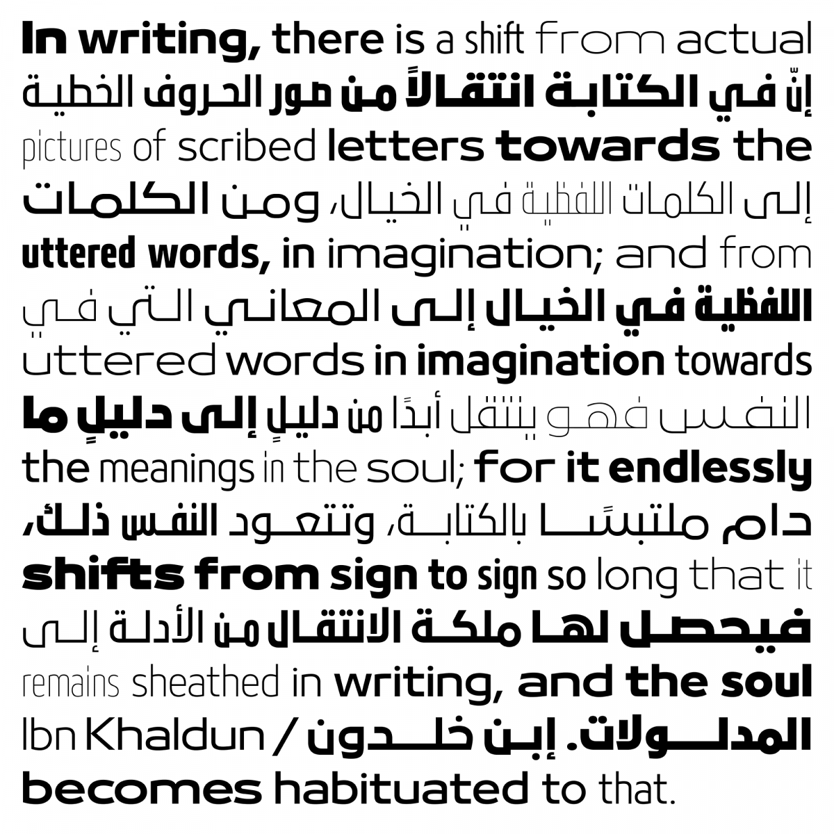
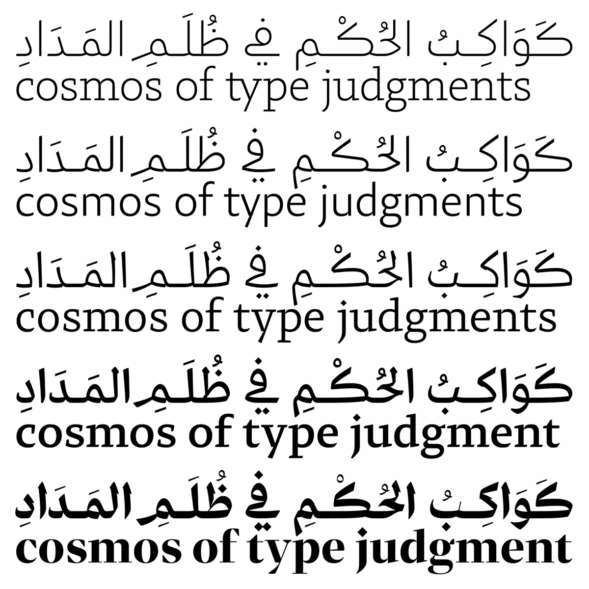
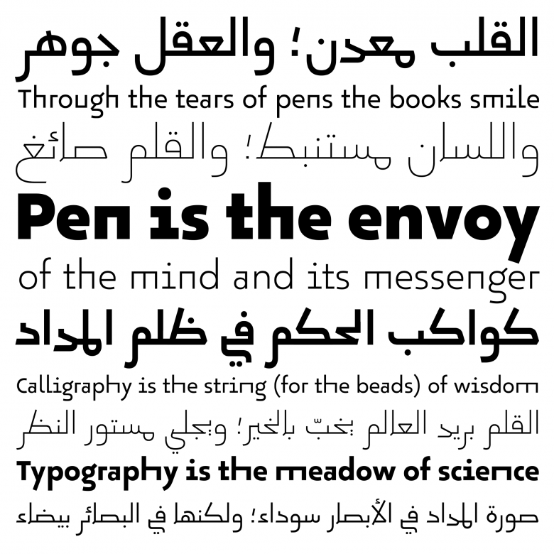
These slanted styles are an important feature of Bukra and Zarid, 29LT’s largest and most practical retail typefaces. Bukra, which began as a retail font for a commercial project, has evolved into a family that explores the limits of Arabic letter proportions. Vertically compact, it comes in five horizontal widths, nine weights and a slanted version. Zarid addresses a different set of criteria, building on the naskh calligraphic style to create new forms that can match the categorization and functions of Latin types; the ‘display’ style features extremely high contrast, while the ‘text’ style is more classical. The ‘serif’ has serifed terminals, the ‘slab’ is low-contrast with angular details, and the ‘sans’ is low-contrast with fluid and rounded strokes. Each style comes with a slanted version and between four and sixteen weights. The family will continue to grow in the future with more style variations and scripts; for example, Zarid Sans has been expanded to include next to Arabic and Latin, Cyrillic and Greek. The trend of expanding multiscript font families into various weights with a ‘slanted’ Arabic variant is very a useful development that allows for typographic subtleties, especially in complex publications and branding design projects.
Okaso
Pascal Zoghbi relocated to Madrid three years ago and became interested in the Islamic heritage in Spain. He discovered the Aljamiado manuscripts where the Morisco Spanish language is written with the Arabic script. After the fall of the last Muslim kingdom, writing with the Arabic script was banned and these manuscripts were secretly preserved and hidden. Zoghbi’s Aljamiado Project developed into a new and risk-taking design exploration. In this project Zoghbi draws inspiration from Aljamiado manuscripts and their vernacular interpretation of the late period of Andalusian Maghribi styles. He studied several manuscripts, extracted various examples of each letter, and reinterpreted the letters into an unusual set of glyphs, abstracting the simple and fluid forms into geometric shapes. This resulted in a large number of ligatures and stylistic sets that maintain the playfulness and the handwritten structure of the original manuscripts. Okaso is the first typeface of the family to be released and forms the base of the typefaces to follow. Its Latin character set, designed by Linda Hintz, emulates the vitality of the Arabic character set with uncommon contextual alternates and stylistic sets that allow letters to switch between short and long, or straight and round forms, or various widths that simulate ‘semitic justification’ or Arabic letter elongations. Oskura, the second typeface, will be the cursive version of Okaso and will act as Okaso’s upright italic, though it can also function on its own. Outline and Color versions of both Okaso and Oskura are planned as headline fonts in the spirit of the design conventions of Aljamiado manuscripts.
34
29Letters font families available to rent on Fontstand for a fraction of their retail price.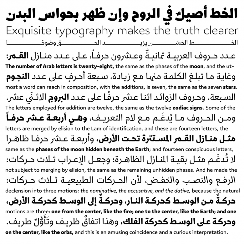
Azer
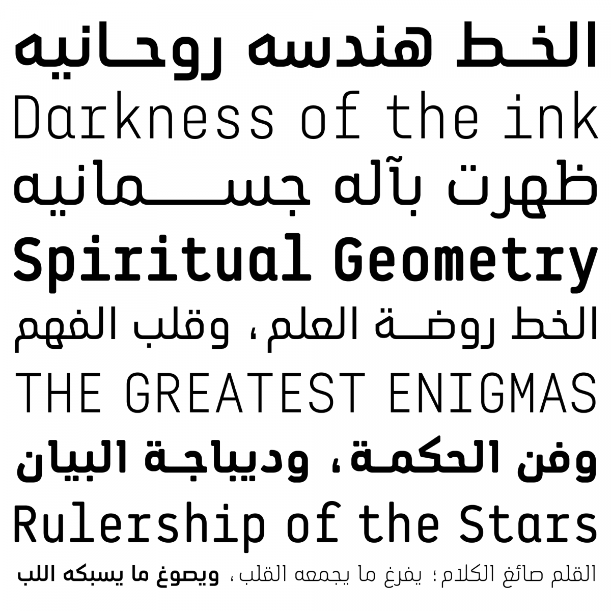
Zoghbi’s type design work and the broad range of design styles offered by 29LT’s team of independent designers — from the lightly calligraphic Azer, to the expressive and inventive Zeyn, and the historical revivals UA Neo N and UA Neo B (based on Khattar’s Unified Arabic fonts) — attest to the graphic potential of the Arabic script. 29LT has established a platform that gives voice to established and less-established designers from various parts of the world. The result is a dynamic and rich collection of type families that use the Arabic script as a point of departure for larger multiscript families.