When Martin Majoor ran into Jos Buivenga at a type design symposium in 2009 it was a reconnection of sorts. Buivenga had visited Majoor 20 years earlier to get some advice when he was just starting to explore type design, but they had not met since, even though both were living in the same city and had studied at the Academy of Fine Arts in Arnhem, albeit in different departments. When they met again in Dortmund, both were full-fledged type designers with several reputed font families to their names. They got along so well at the conference that they decided to explore ideas for a project they could work on together. Majoor expressed an interest in working on a classicist typeface, giving it a corresponding sans serif, then expanding the fonts into a broad, versatile family. Buivenga responded by showing Majoor the beginnings of a squarish, Didot-like display typeface in his sketch book. This second coincidence sealed the idea for their collaboration, and they embarked on a collaborative design adventure that would eventually be called Questa, (a name chosen for its sound, availability and the fact that it showcased the capital Q and the ‘st’ ligature).
Questa became a unique collaboration between two distinctly different designers with complimentary skills and philosophies. This pooling of their strengths resulted in a serious and surprisingly large family (serif, sans serif, slab serif, and display, each in five weights) that reflects both designers’ signatures and personalities.
Sign up for mailing
Get more typography articles straight to your mailbox. Sign up for our mailing list.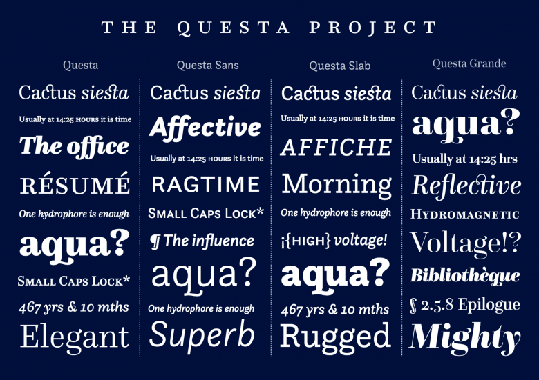
The four versions of Questa
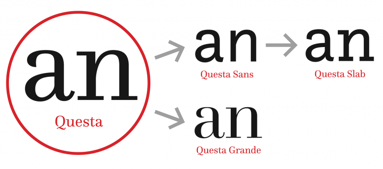
Design scheme for the Questa family
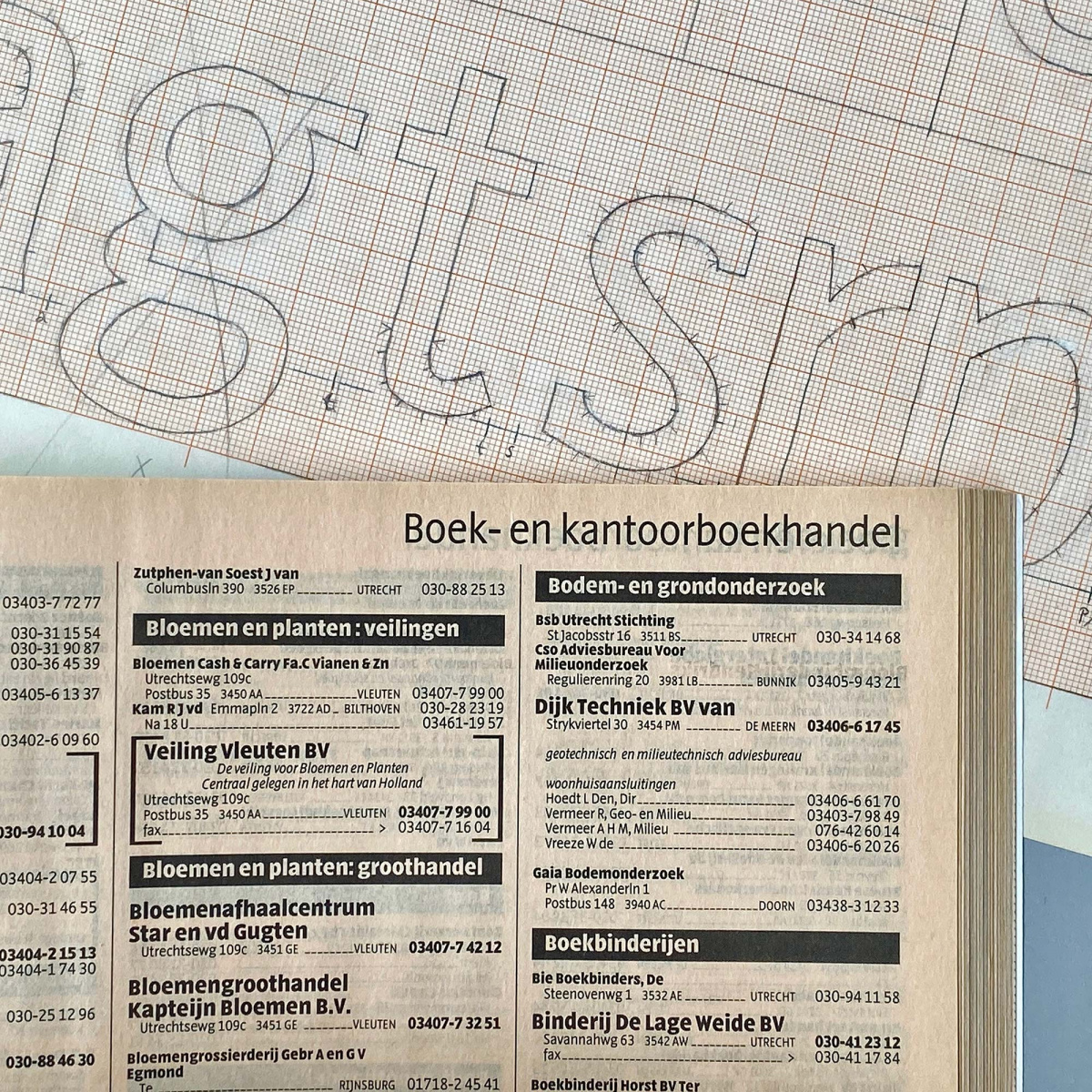
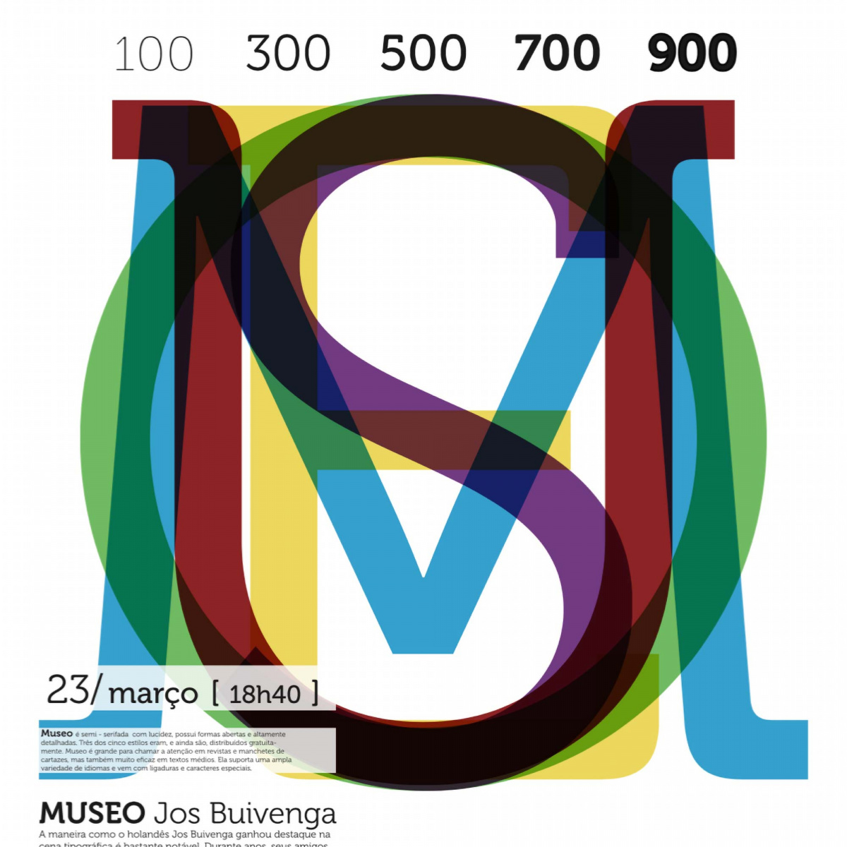
Majoor was one of the earliest pioneers of digital type design, but started his career as a book designer. In the early days of the transition to DTP he often had difficulty finding fonts with features such as old style numerals, ligatures and small caps, and it was also a challenge to find serif and sans serif fonts that worked well together. When the Vredenburg Music Centre in Utrecht commissioned a typeface that could handle complex typographic designs for print material ranging from programs to posters, it gave him an opportunity to produce the kind of typeface he had been looking for. The result was Scala, an elegant serif influenced by humanist typefaces such as Bembo, with italics inspired by the work of 16th century writing masters. Scala then served as the basis for Scala Sans, which had not only true italic faces instead of obliques, but also the same full-featured character set as its serif counterpart. When Scala was commercially released by FontShop in 1990 it became widely used by designers all over the world, and Majoor realized that many other designers had the same needs that he had. His next major font family, Seria (later selected by the Typographic Matchmaking project to be expanded with a companion Arabic version) followed in the same humanist style, but with elegant long ascenders and descenders that made it suitable for setting poetry and other literary texts. Majoor designed a sans counterpart as well as a version with more compact proportions which eventually turned into his third large font family Nexus (2004). Like Scala and Seria before it, Nexus began as a serif font, from which Nexus Sans was developed, but then Majoor went further, using Nexus Sans to develop Nexus Slab. (The family now also includes the calligraphic Nexus Swash and monospaced Nexus Typewriter styles.) Having developed three extensive humanist font families, Majoor wanted to explore a high-contrast classicist typeface. Questa presented itself as an opportunity for him to explore this new path in collaboration with Buivenga.
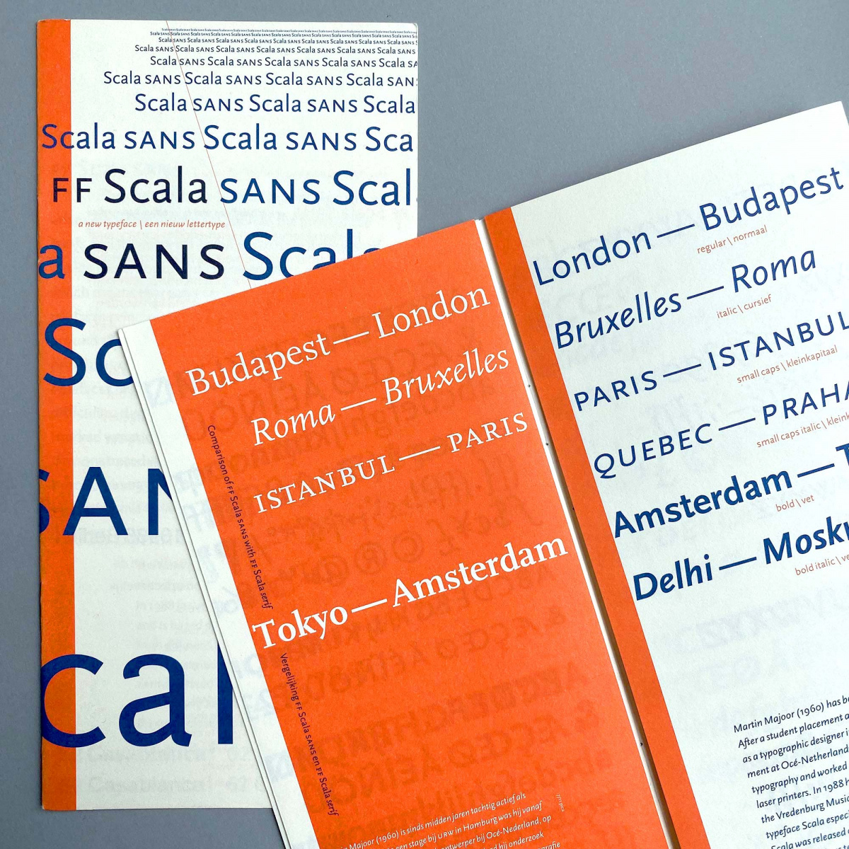
Scala, 1990
Telefont, 1994
Whereas Majoor originally trained as a book designer, Buivenga had wanted to become a painter. Following his father’s practical advice, he studied graphic design instead, but ended up leaving school after four years and started painting anyway. When that proved financially unsustainable he taught himself the basics of DTP and joined an advertising agency where he eventually became art director. His 15-year tenure in advertising included designing display typefaces for big brands, and he began experimenting with type design in earnest, posting fonts such as Delicious and Fontin on his website, where they began to attract attention. He founded his one-man font foundry, Exljbris in 2004 and released his first commercial typeface, the best-selling Museo, in 2008. While experimenting with adding serifs to Museo, Buivenga developed a new design with bracketed serifs and forward-facing directional flow. This led to his first serious text face, Calluna, a robust, contemporary design with enough interesting details to also function as a display font. Finding advertising less and less enjoyable, he decided to fully dedicate himself to type design.
For Buivenga, type design is an extension of his previous work and experience. “It’s like painting. You have to use your eyes and innate sensitivity to judge what works and what doesn’t.” Beginning with an idea for a single letterform, he develops a whole typeface from it one letter at a time. And although he finds type design a wonderfully solitary occupation, he discusses works in progress with other designers to get their feedback and also generously offers some of his fonts for free to see how they are used. His years in advertising have polished his innate feel for what typefaces work on the market.
Museo, 2008
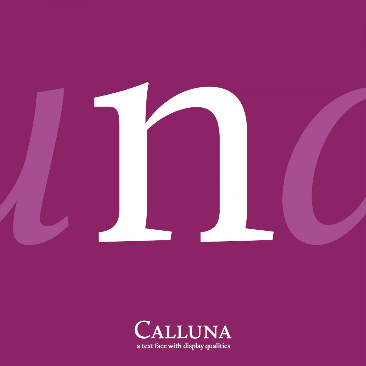
Calluna, 2009
“When you collaborate creatively on a typeface design don’t make compromises,” says Majoor.
Majoor and Buivenga developed a unique working process; they would draw letters separately, then come together, compare the results and select the best of each other’s work. They avoided making compromises, looking at each letter and deciding what shapes to use to build the basic character set that would determine the personality of the whole typeface. The first half year was the most important and decisive period for laying foundations like the lowercase “a,” “g” and “n” and the capitals, work that made it easier to complete the character set, derive the different weights and design the sans serif, slab serif and display versions. First, they designed the high contrast neo-classicist serif, followed by the the low-contrast sans serif (minus the contrast and the serifs), then the slab serif (the sans with thick slab serifs added), and finally the display version with high contrast and elegant details, thus exploring the history of modern Latin typography within one family. It took five years to complete the whole family, including a one-year hiatus that gave them a chance to reevaluate the whole project before making the final adjustments and finalizing the overall design. Based on Buivenga’s experience, they decided to publish Questa via its own website, and to offer the regular weights of its four styles for free. Of course they also see Fontstand as a good way to make the Questa font family available to as many designers as possible.
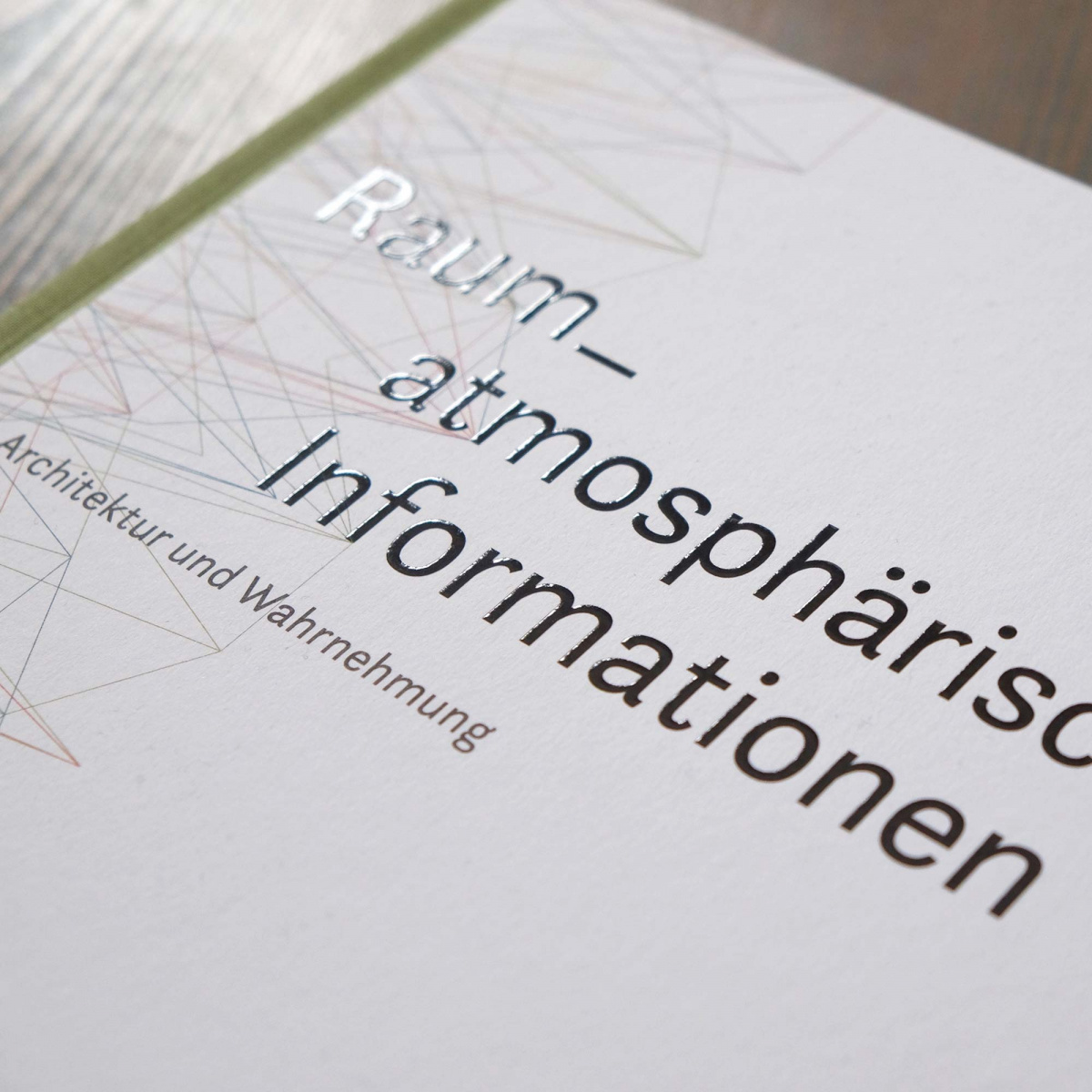
Raum-atmosphärische Informationen. Design: Bohatsch und Partner, Vienna 2015
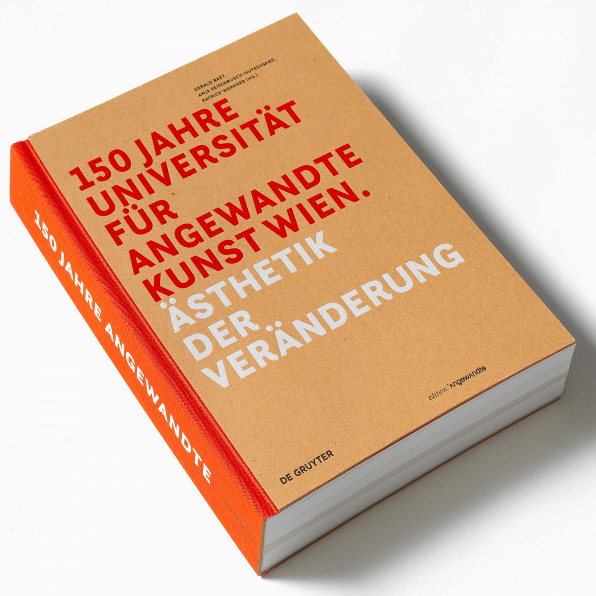
150 Jahre Angewandte. Design: Anita Kern, Vienna 2018
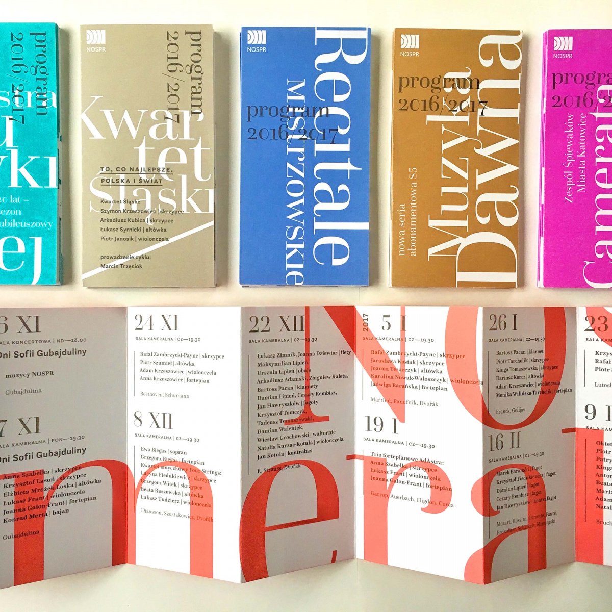
Leaflets for NOSPR orchestra. Design: Paulina Urbańska, Katowice 2016
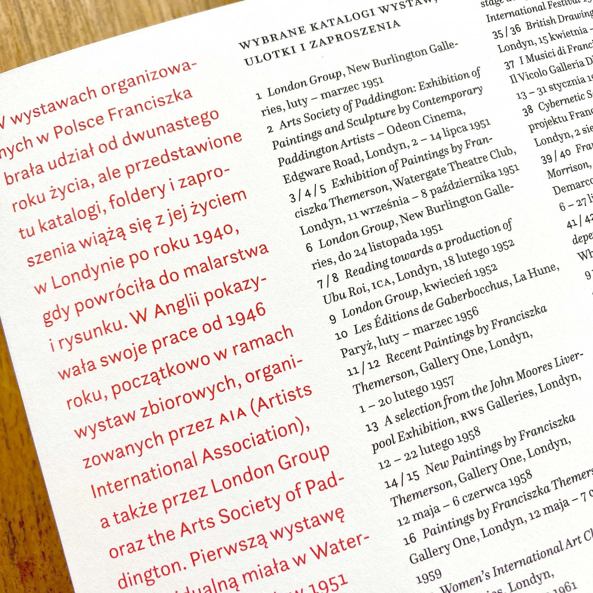
Franciszka Themerson. Design: Piet Gerards and Stephan de Smet, Amsterdam 2019
5
The Questa Project font families available to rent on Fontstand for a fraction of their retail price.To read more about the design features and delightful details of the Questa family, please visit the project’s website, where you can download the type specimen and the free fonts.
—