At the very core of The Pyte Foundry’s identity is the manipulation of words and the letters within them. The name itself suggests a typo conceived by fingers bounding across a keyboard, communicating confidently, already onto the next idea. The sole proprietor of the foundry is Stefan Ellmer. Or does he prefer Ellmer Stefan, aligning with an Austrian naming convention of times past? The ambiguity in how Stefan presents himself is just one example of his interest in embracing and reshaping heritage.
Sign up for mailing
Get more typography articles straight to your mailbox. Sign up for our mailing list.“I thought, it’s so easy to have two elements and swap them. The same with ‘type’. There are not many possibilities to combine these four letters. This is one of them.”
Unsurprisingly, this story begins in a print shop near Salzburg where Ellmer worked with type for half a decade before moving to Vienna to pursue graphic design. He came to terms with his fixation on typeface design in a school environment that took a much broader view. Stefan says, “You could take courses in art history, experimental film, conceptual art. There was everything in one house. I exposed myself to all kinds of culture, literature and artistic expressions.” While pursuing further education as an exchange student in both Arnhem and Leipzig, he still found the bulk of his type design education to be self-guided. However, reflection on all of these multifaceted environments reveals their value. “This fed very much into my graphic design thinking and working, even up until now. It was this notion that any one thing doesn’t have value in itself. In a bigger picture, it gains potential.”
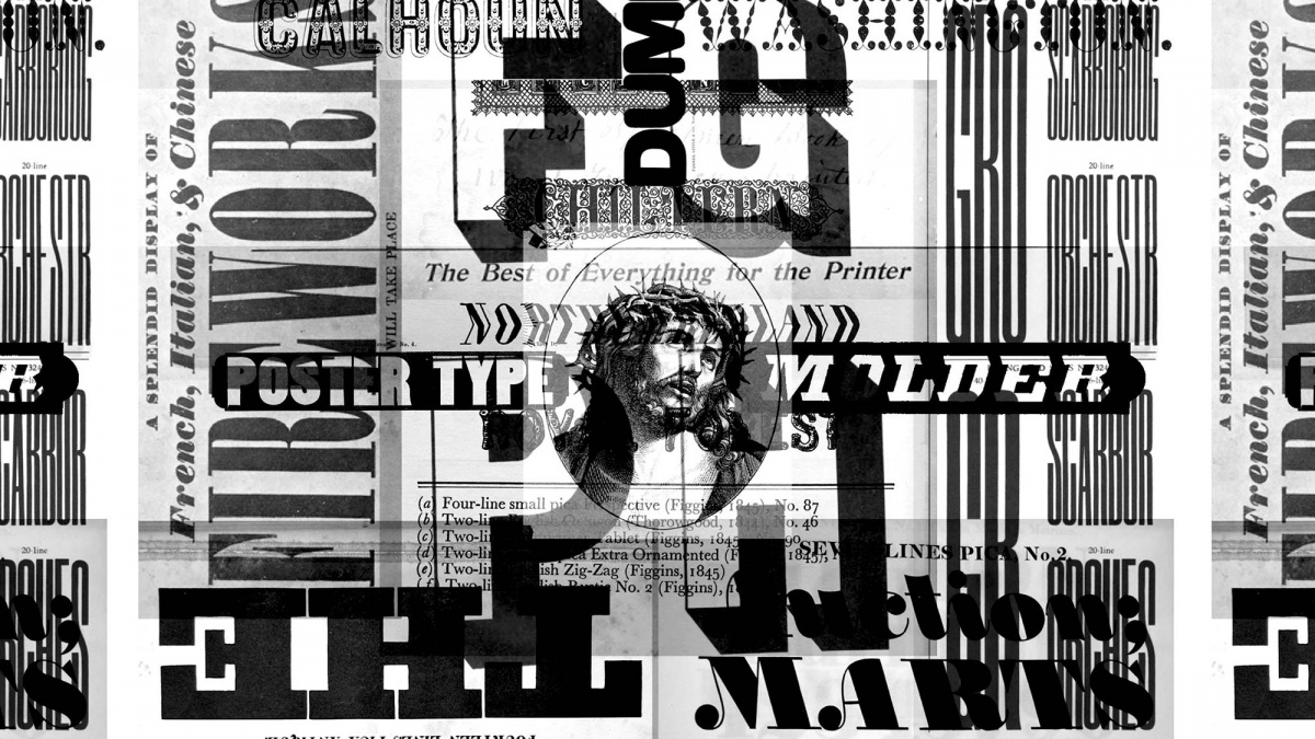
Ellmer developed these ideas into a body of work focused on context and purpose. Each piece was a poetic expression linking the past and the present, with Stefan studying how to shape and contort that link. In the summer of 2009, he became enamored by a poster with Dadaist poetry. Keeping that reference close, he sat down and drew his first typeface. “This one poster type is very close to what I’m doing now, but that’s already twelve years ago. It was an art-historic reference with poetry and a nonsense combinatory attitude. Somehow the seed was already there, and from there it grew.” Before long, Ellmer began plundering historical sources, opening a new stream of enthusiasm at every turn. He would subject himself to rigorous regimens in order to keep his exploration as diverse as possible. “There was so much to explore and so much to do, that it was really hard to sit still. I tried to start a new typeface every day. I didn’t have to finish it. Just start and figure out what a new expression could be that day,” Stefan says. In the midst of a bustle of diverging ideas, he decided to gather process sketches onto a microblog, a motley medley brimming with half-resolved letters, commanding headlines and quirky glitches, aiming not to advertise but to build an inventory of potential.
“It becomes this library of ideas that you have in your head. It somehow makes your culture, the cultural being that you are: what you have experienced, what you have looked at, what you have tried out but failed with.”
The Pyte Foundry’s Tumblr experiments
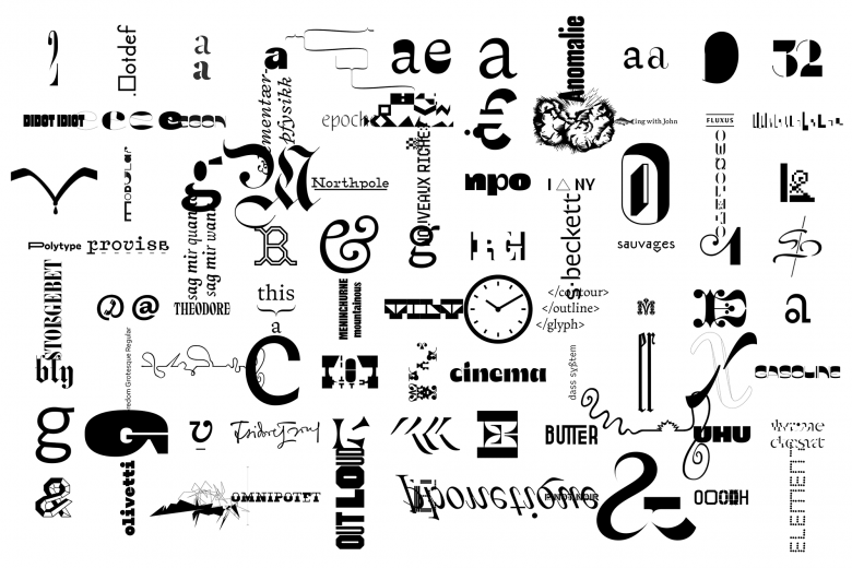
By late 2015, Ellmer had a goal locked in for the following year, to make one typeface per week and release it to the public for free. To call it ambitious would be an understatement, but he began by setting some ground rules: first, reduce the character set to not much more than capitals, and second, make those characters as modular as possible. He developed a design template almost completely comprised of a system of nested components. “For example, you modify the serif once and it’s applied to pretty much the whole set. This made permutations and sketching for new styles very easy.” He chose Rob Roy Kelly’s collection of American wood type of the 19th century as a reference and inspiration, and serendipitously, that type had been mostly conceived by means of a similarly modular stamping system. “It came together almost too nicely,” Stefan says. Throughout 2016, he pursued the project in addition to custom type work, appreciating the speed that this process demanded. “It made me produce stuff that I would not have done otherwise. If I hadn’t had Monday as a deadline, I wouldn’t have gone there. Doubt could not kick in within one week. Once you’re in the doubt phase, the problem starts.” The Pyte Foundry soon rose to prominence as the harbinger of a resurgence of display type, a cornucopia of outlandish contradictions. Flourished sans-serifs, fractured Bodonis, invisible grotesques. Every Monday, graphic designers awoke to Ellmer’s next audacious alphabet in the form of a one-line specimen delivered in a cryptic tweet reminiscent of a bite-sized Jorge Luis Borges poem.
“I had to make some kind of statement. This is not a business that I’m doing. This is something that I need to do. It’s good for the soul.”
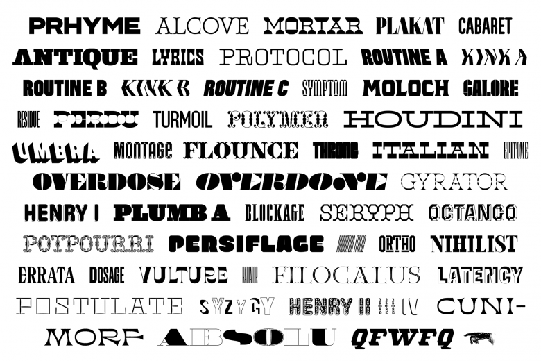
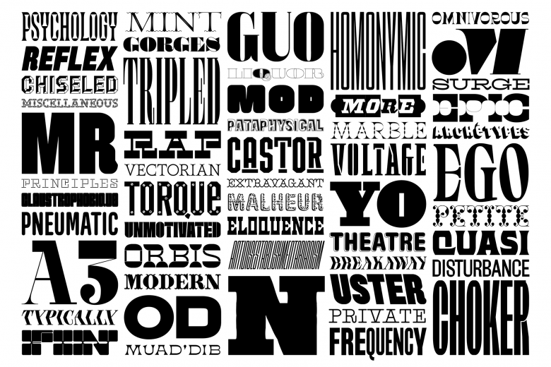
The Pyte Foundry’s 2016 catalog
Stefan’s Year of Intensity strove to make a palpable impact on the public’s perception of typography. Agility is not often on the list of preconceptions about type designers, but Ellmer says he “wanted to demystify this notion that type design is something that almost god-like creatures do that’s inaccessible and takes extremely long to execute. It’s just a set of decisions, and if you make the right decisions in the right order, in a certain amount of time you’re there.” By making it free and fast-paced, he helped make typefaces—and the process behind them—more approachable. But Stefan doesn’t live in a vacuum; something was in the air, and before long, the likes of Future Fonts and David Jonathan Ross’s Font of the Month Club were helping to flip the script on the rigorous discipline that is type design, sharing projects mid-completion, interacting with their audiences, and welcoming the weird. Ellmer adds, “This is not a dead-serious discipline. This is people having fun—they’re engaged with their material!” The outpouring of work that he highlights is not a movement characterized by rationalism, versatility and simplicity, it’s one of tension, specificity and expression. “We’re facing the end of the modernism that we all loved so much… I think it’s breaking down. It seems that it suddenly realized that it doesn’t have a core.“
“I think we can embrace individuality. We are much more complex beings than to be reduced to one human function. There is no ‘one thing’ that works for every occasion.”
The Pyte Foundry’s “Triptych”
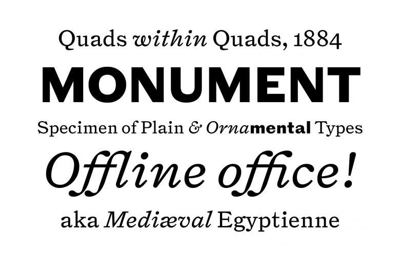
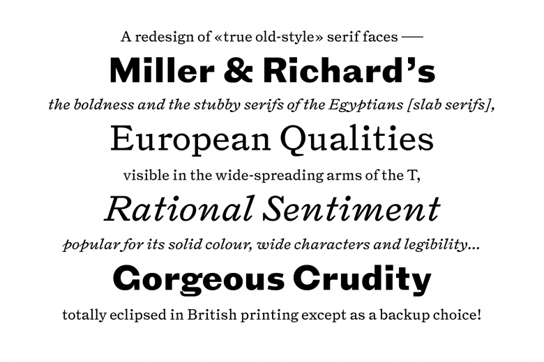
It’s with these thoughts in mind that Stefan continues to round out The Pyte Foundry’s perspective, now without the constraints of modularity and a tight deadline. While time brings with it a healthy dose of doubt and uncertainty, it also provides an opportunity for curation. In addition to carefully refining and re-releasing a portion of what is now called the Pyte Legacy library, Ellmer has already released his type family Triptych, a project that received as much consideration as his previous 52 works together. This peculiar type family contains only three styles, Roman, Italick (sic) and Grotesque, making it the antithesis of a “workhorse” family. By referencing antiquated dictionaries’ pairings of text faces and bold sans serifs, however, Stefan created each style with a larger function firmly in view. The faces themselves stand in stark contrast to each other, but all conspire to evoke a forgotten era. Even the naming of Italick is a nod to Joseph Moxson’s late 17th-century work Mechanick Exercises. Once again, Ellmer’s penchant for language transports us to another time.
“These contradictions somehow I’m still entangled with. Things don’t really know what they want to be. Do they want to be traditional or modern? This in-between—I like this state very much.”
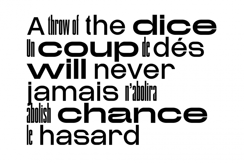
Compagnie, the Pyte Foundry’s latest grotesque release
7
The Pyte Foundry font families available to rent on Fontstand for a fraction of their retail price.Amidst the growing trends of interpolation, variable fonts, and glistening dynamic letters on social media, leave it to Ellmer to move against the grain. The latest endeavor for Pyte is a family of three absurd grotesques of drastically dissonant widths. Each is independently static, but the visual poetry lies in how they combine. One might call it a revival, but with Stefan, the source is not so clear-cut. He thoughtfully juxtaposes anachronistic quirks so that we in turn can gratifyingly mix his typefaces. Ellmer says, “There is so much good stuff that I looked at in the past five years. I have no idea where all of the influences come from. But I have all these influences, and now I’m doing something new. In literature, this is daily practice. You take words that others also have access to and combine them in new ways.” He observes intently but allows himself room for reinterpretation, acting as a translator not between languages but across time, mirroring old processes and delivering work that’s relevant today. He adds, “To imitate other techniques of letter-making is almost fundamental to typography. Respectful imitation is something I think we should engage in.” With this spirit, Stefan continues to diversify his input and output. He actively seeks the most compelling processes of making letterforms from the past, and whether he’ll look to typography, calligraphy, or perhaps signpainting, one thing’s certain: there’s more Pytography in our future.