A business hotel like Navis in Croatia may be primarily focused on repeat customers, benefiting most from a familiar look and feel. At Ama Stay, the hotel itself is hardly seen on the website. Instead, they deploy short copy and beautiful scenery photography. A few mountains away in Portugal, Hotel Minho is anything but ordinary. Across the ocean in Nashville, visitors are treated with a complete branding experience, with a custom typeface and color applied down to the smallest details.

AMA Stay website
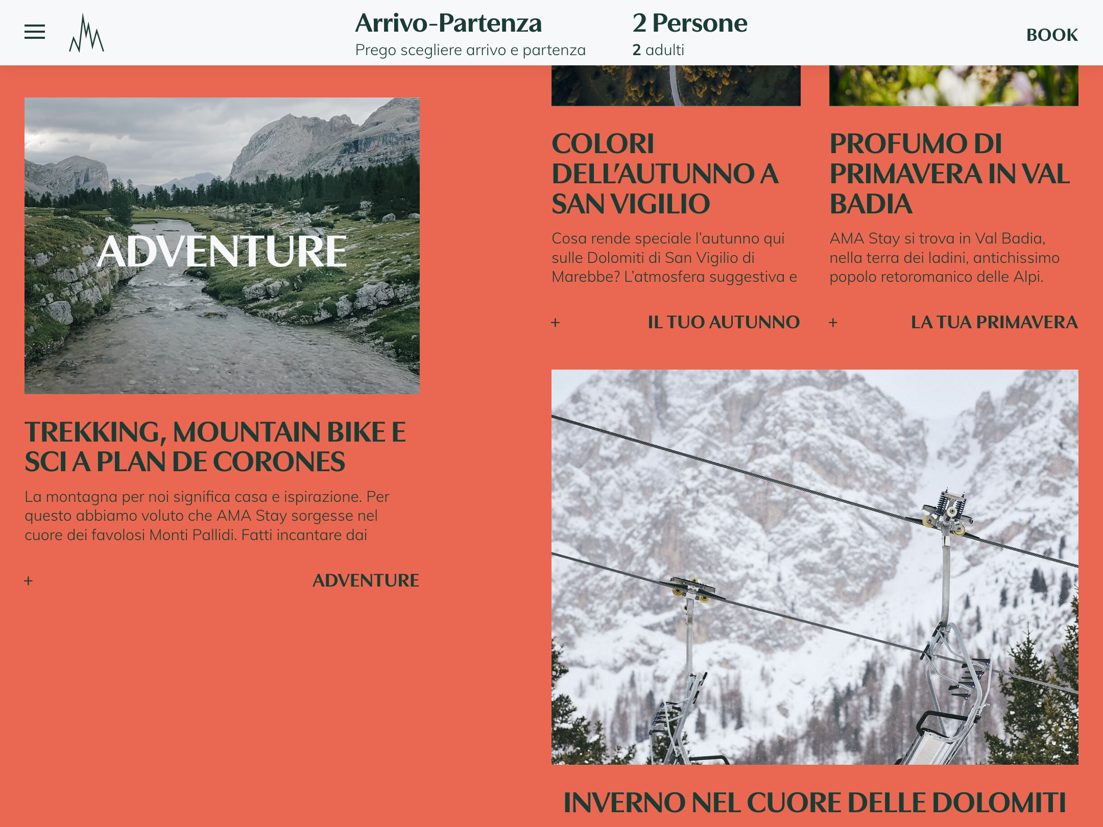
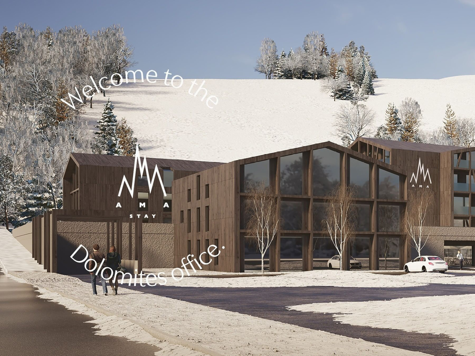
Looking at the photos of South Tyrol’s Plan de Corones, you’d almost think Ama Stay is a mountain lodge – but then the website probably wasn’t on Fonts In Use. This place is more urban. Its guests do not arrive carrying picks and crampons but instead rolling suitcases and laptops for a “working stay in the Dolomites for digital nomads and nature lovers.”
Local designer Samuel Clara, a.k.a. Meteorit, created a visual identity with the hotel’s trilingual website as the main brand-expression. The spacious pages with ample landscape photography suggest a mix of tranquility and adventure. Headlines in bold capitals ensure that website visitors don’t wander off into daydreaming but proceed to action and book one of the offerings.
For the headings, the designer chose Utile Display Bold – always set all caps. Subheads, in sentence case, use the Light style. In doing so, Samuel Clara cleverly applies one of the key features of Kontour’s typeface collection. Its lowercase letters are clearly ‘flared’, meaning that its strokes thicken slightly toward the end. In effect, the lowercase appears almost as a serif. In the uppercase, designer Sibylle Hagmann strikes a different note. On her website she describes it this way: “To keep reverberations of the pen at its lowest, the majority of uppercases are (...) mostly spared of glyphic details generally maintaining a sans identity”. For body copy, Utile is paired with Mulish, available from Google Fonts.
See the original version of this contribution on Fonts In Use, where it was contributed by Sibylle Hagman
Louise Reichardt Le Mée-sur-Seine 469 Big Round B-82 gartenschläuche
incapacitations Khartoum-Omdurman nepremišljenost Federico Chueca
Antonio Sacchini Colorado Springs Jakob-Baumann-Allee 43 rannsóknarréttur
Johanna Maitland EST. 1962 cortado technologickému schraubenzieher verkorting Dürer
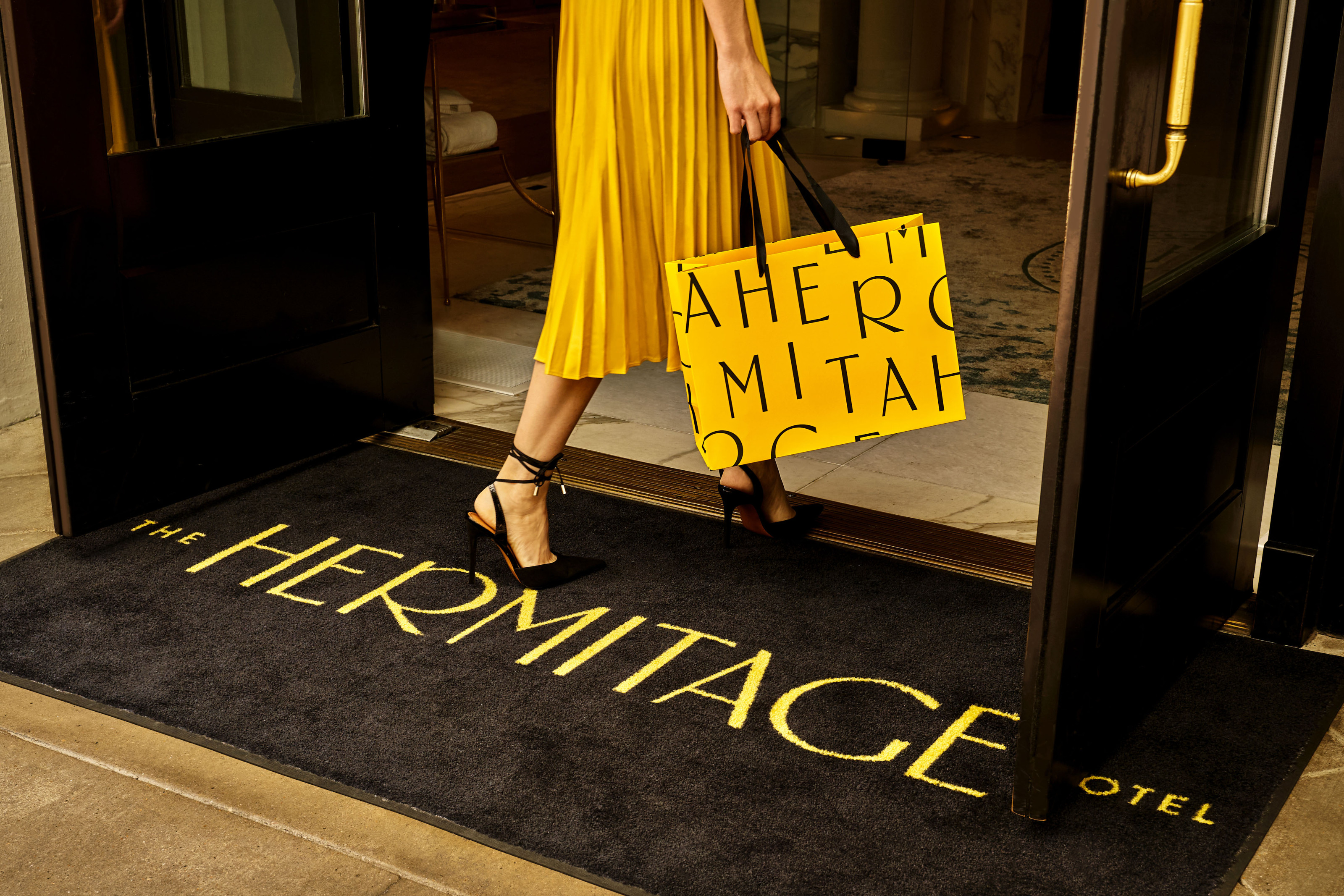
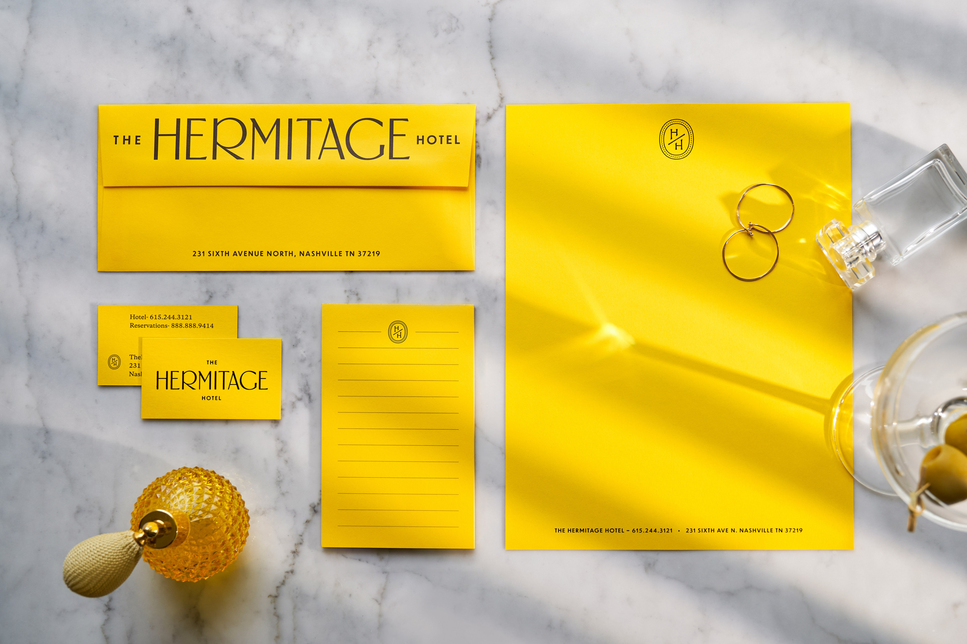
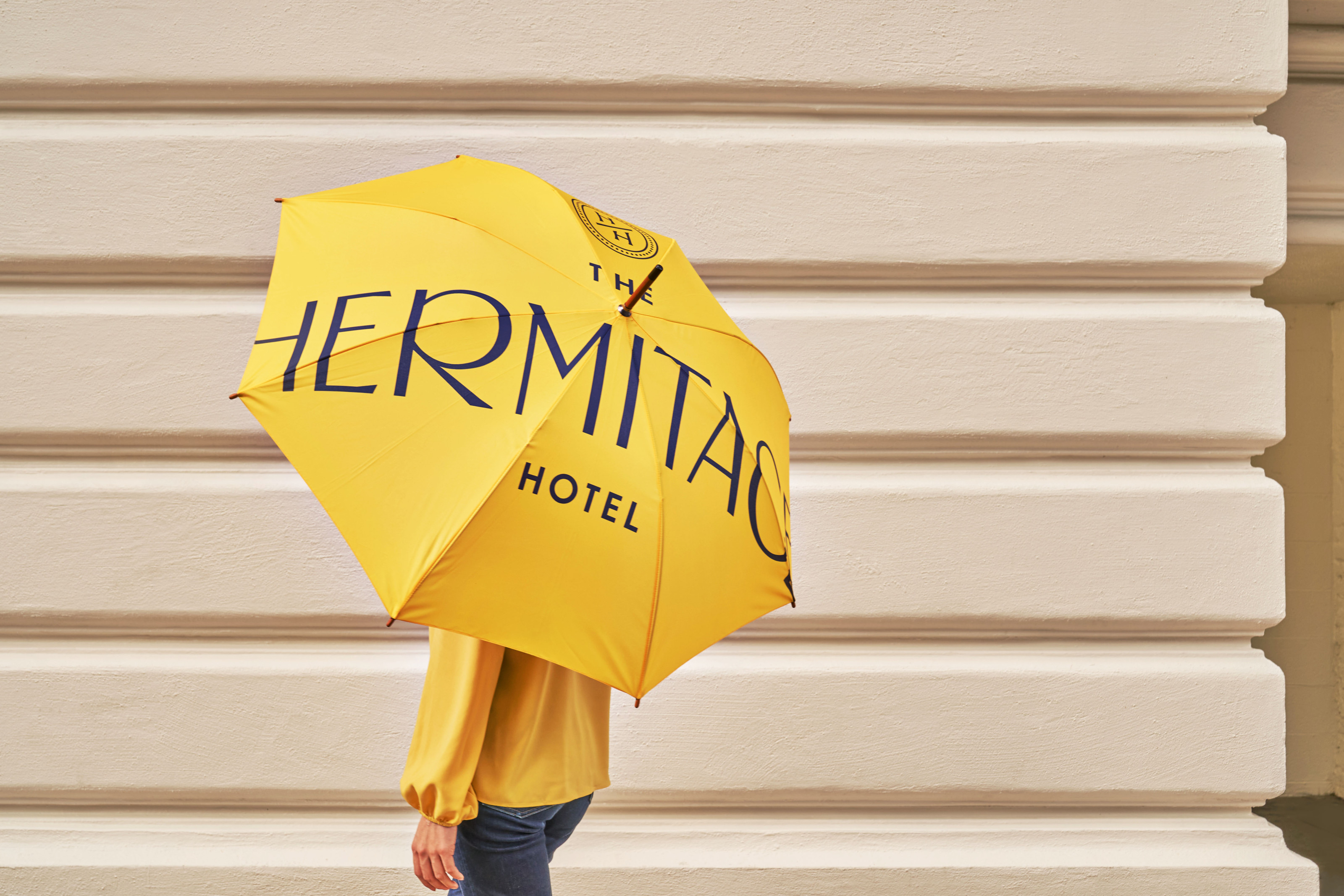
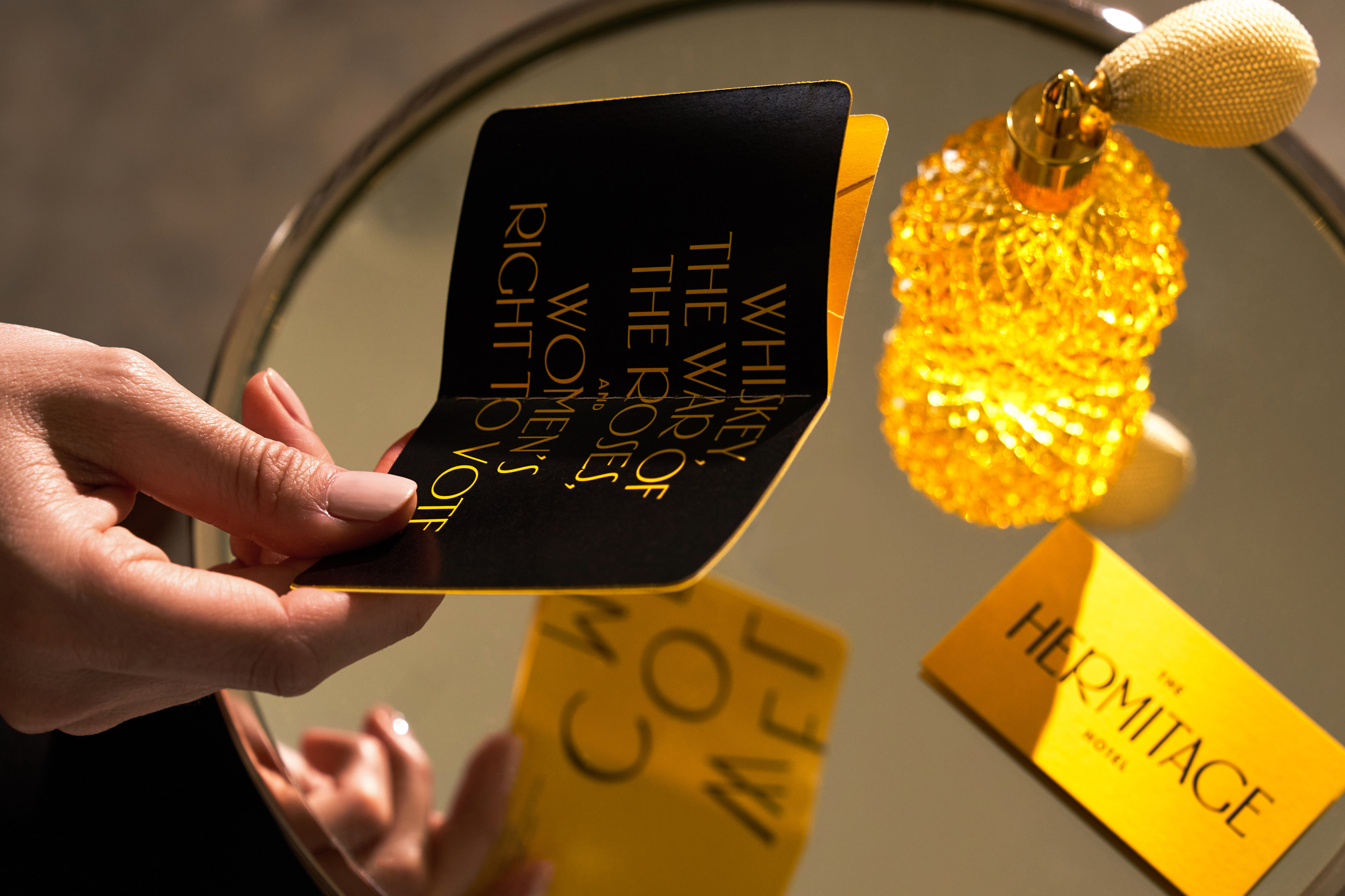
The Hermitage Hotel
The Hermitage Hotel opened its doors in 1910 as “Nashville’s first multimillion-dollar hotel.” Fast forward to one hundred and twelve years later: design firm Mucca is asked to undertake an overhaul of the hotel with today’s traveler in mind. With more than a century of history behind the facade, the designers found inspiration in abundance. The new identity was built around an old theme that is still relevant today, the suffragette movement. “The hotel’s opulent rooms famously hosted campaigners for (and against) women’s suffrage, with yellow rose suffrage advocates winning by a hair’s breadth.”
In honor of this pivotal event, Mucca’s rebranding leans on a bold signature yellow combined with its own font, Suffragette. This custom typeface, inspired by the hotel’s Beaux Arts interiors, was designed by the other end of the design studio: Sean O’Connor and Matteo Bologna of foundry Mucca Typo. The supporting role is played by Dunbar by CJ Dunn, like Suffragette set in capitals throughout.
See the original version of this contribution on Fonts In Use, where it was contributed by Sean O’Connor
Jetski tajine fez kanji #154 ALKALINE specialisme stekmenilja
Plaça Jorge QUAGGA Smørrebrød primordial Bernkastel-Kues HOLOGRAM
sonnenuntergang Habibi Novicija FORCE WIND saltvandsområde Franz Ignaz Beck
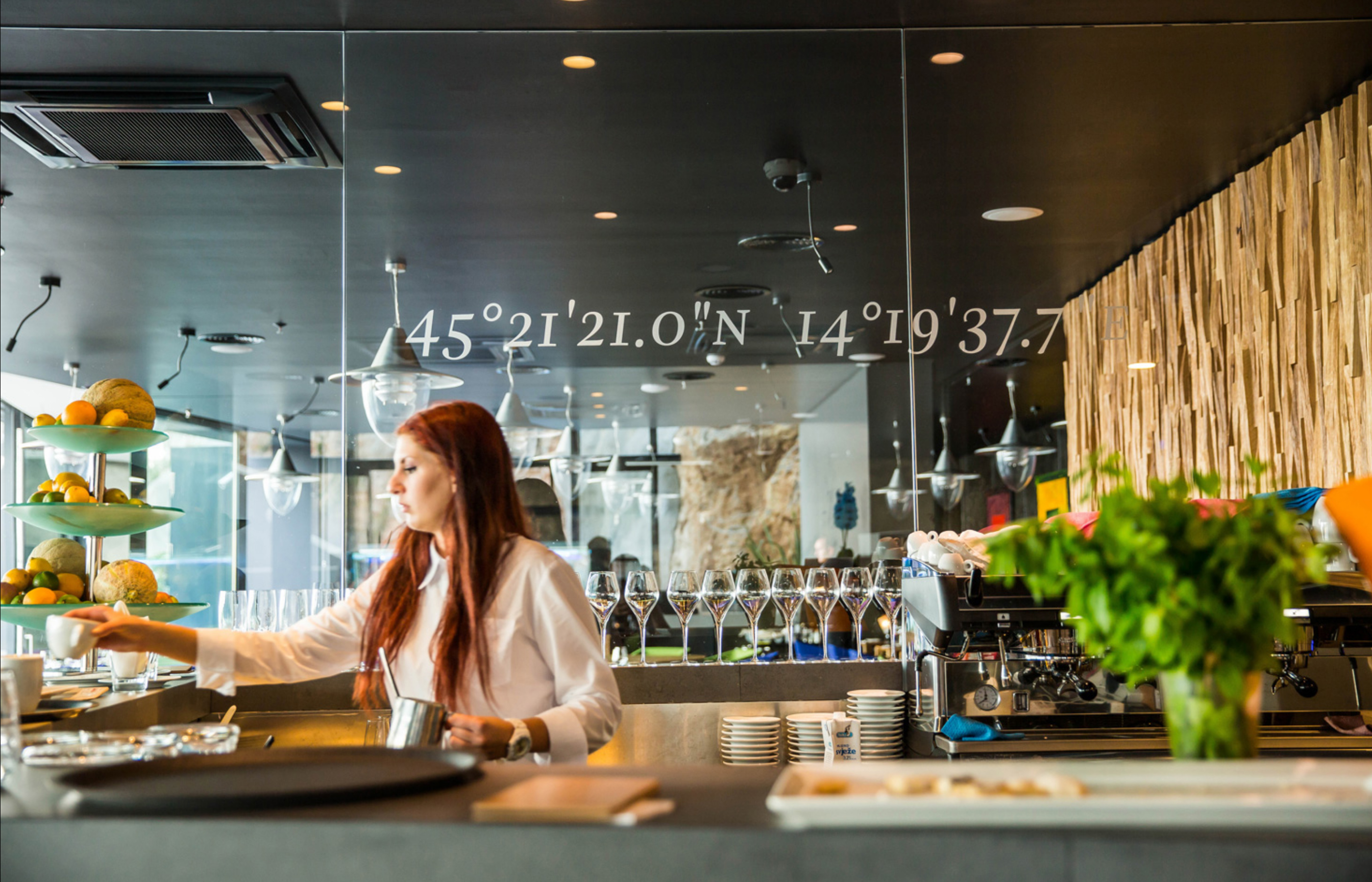
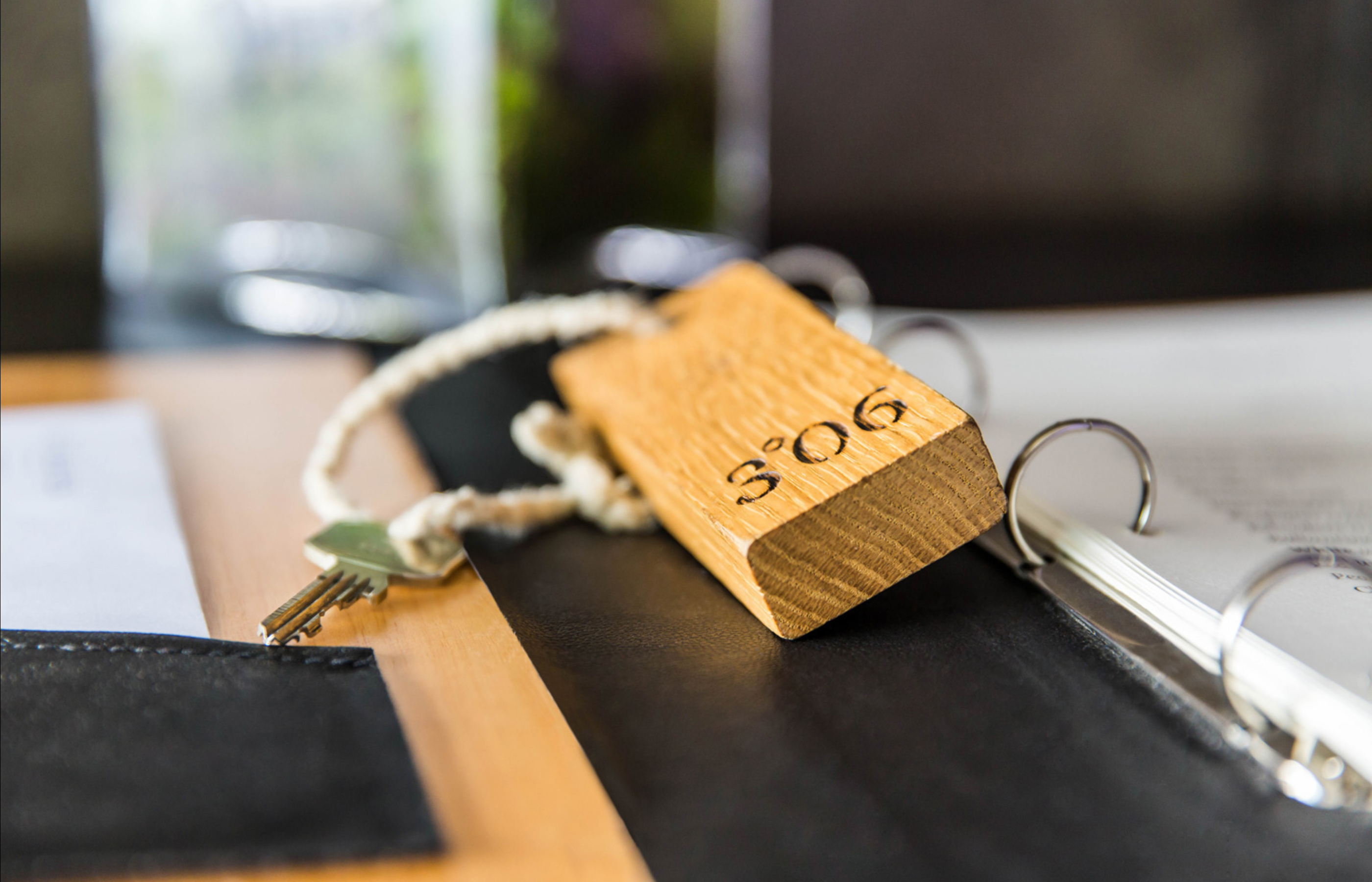
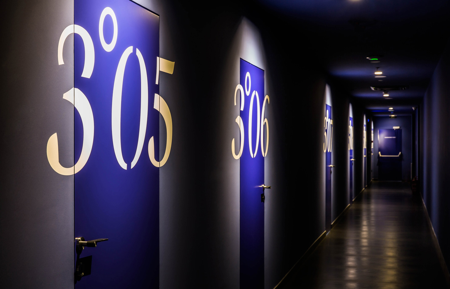
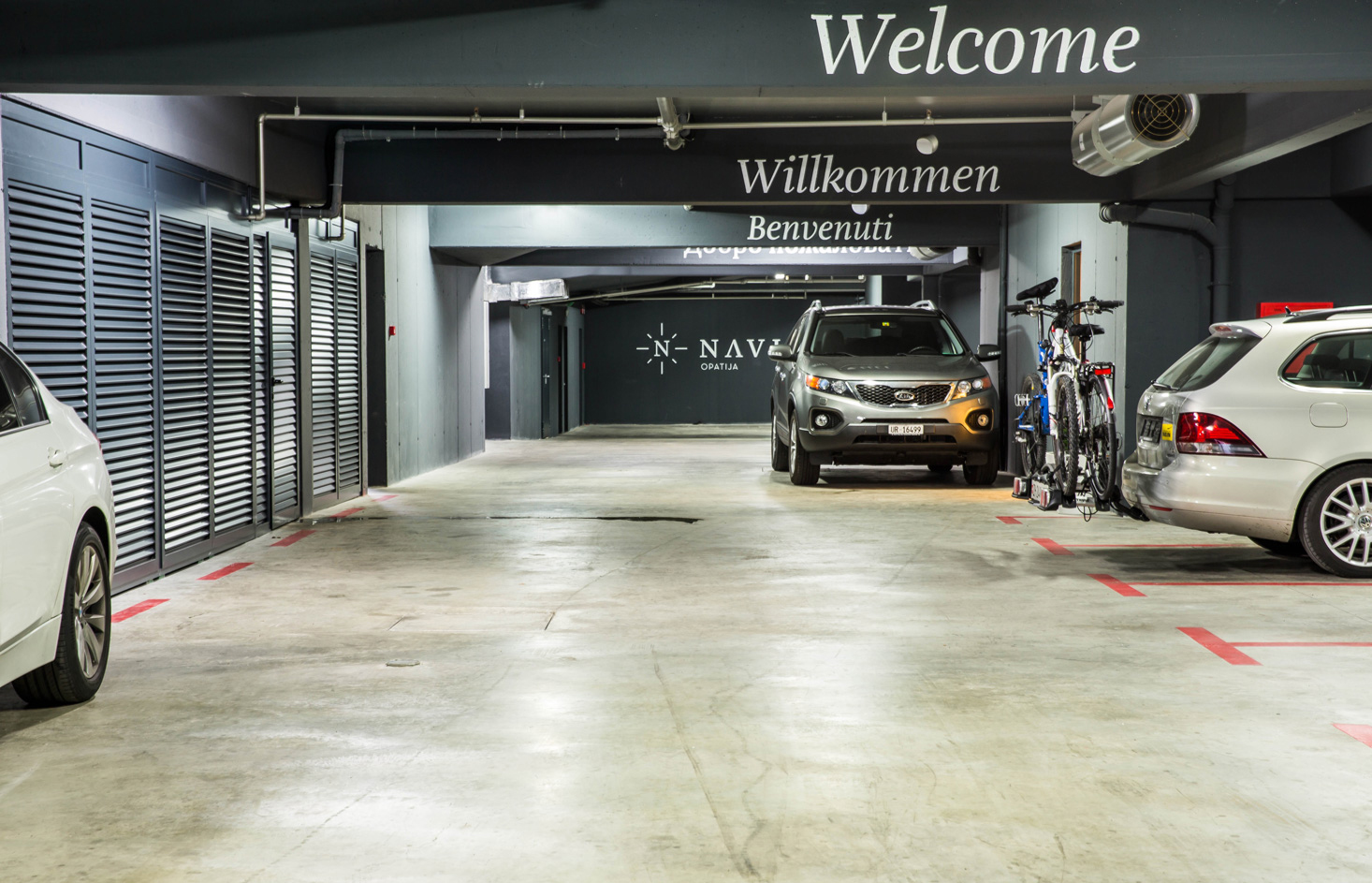
Hotel Navis
Hotel Navis is a 5-star design hotel in Opatija, Croatia. Their visual identity – a mix between feeling at home and corporate luxury – was designed by Croatian designer Ivan Dilberović. He used a compass and GPS coordinates as key elements of the hotel branding and combined them with natural materials such as wood and leather in their application.
For the typography, he chose Amalia by fellow Croatian designer Nikola Djurek, which plays a prominent role in the hotel's corporate identity. Amalia was originally designed as a pleasant reading letter for long-form text. The sturdy details that effortlessly guide a reader from one word to the next through the text for hours on end also prove an excellent anchor for hotel visitors looking for their room or meeting. A custom stencil version of Amalia Regular Italic was created for the signage on the doors.
See the original version of this contribution on Fonts In Use, where it was contributed by Typotheque.
Rillieux-la-Pape elfenbeinarbeit saltvandsområde Jean-Noël Hamal
Luigi Castellacci 1678 Villar de Olmos Sabrina-Heinrich-Markt 88 skeiðarársandur
saltvandsområde illiberalnesses Frederick Converse Gräfenhainichen
Stich Jardins Sisneros D-33 Jan Václav weltraumtechnik Bourg-en-Bresse
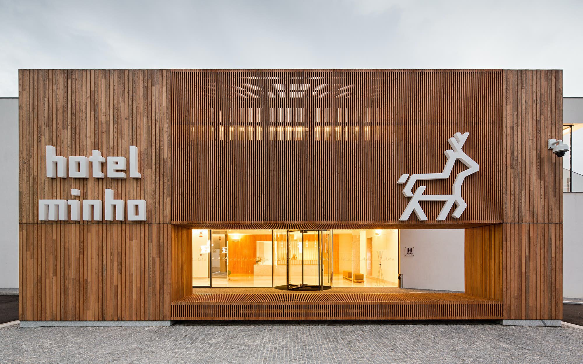
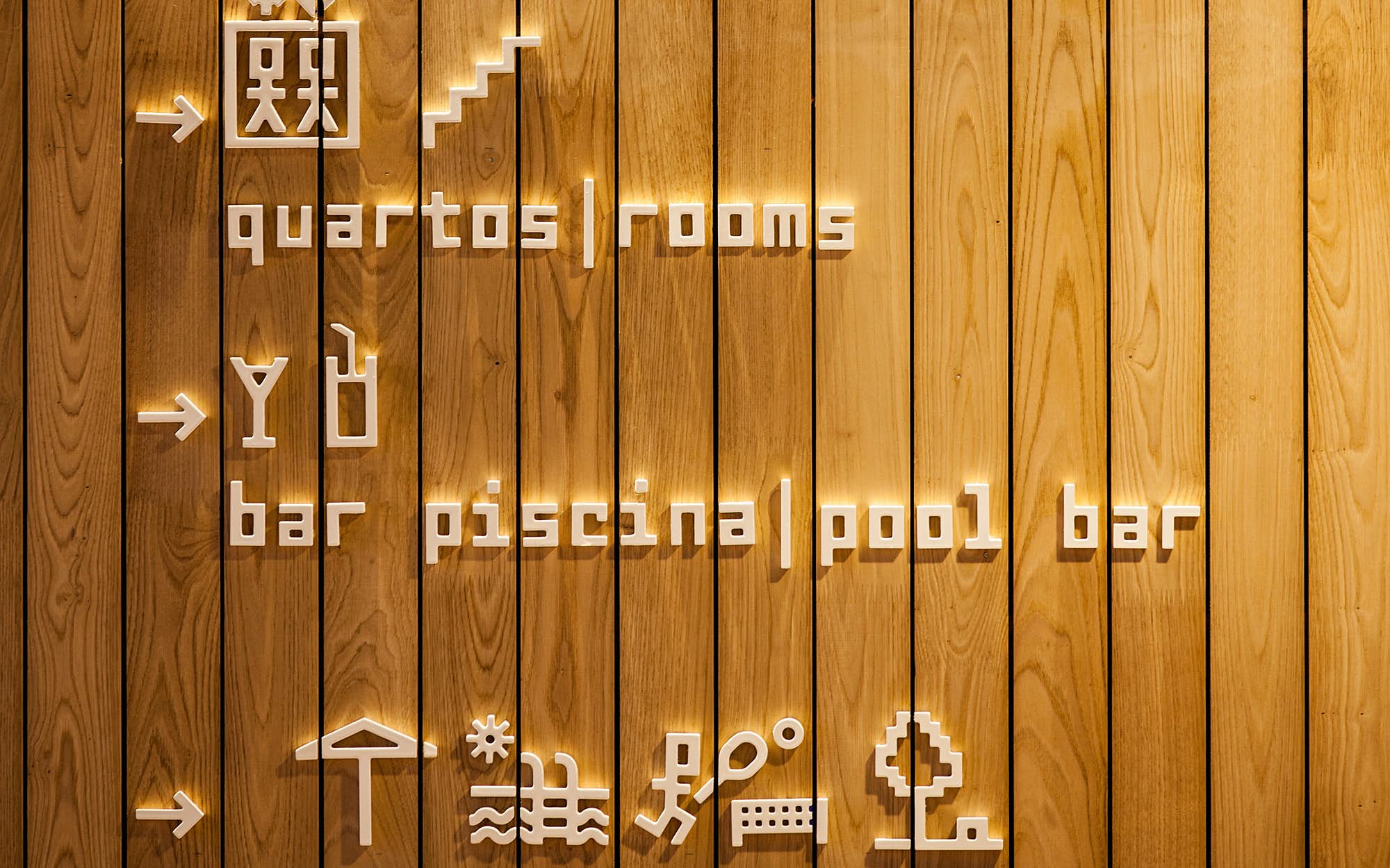
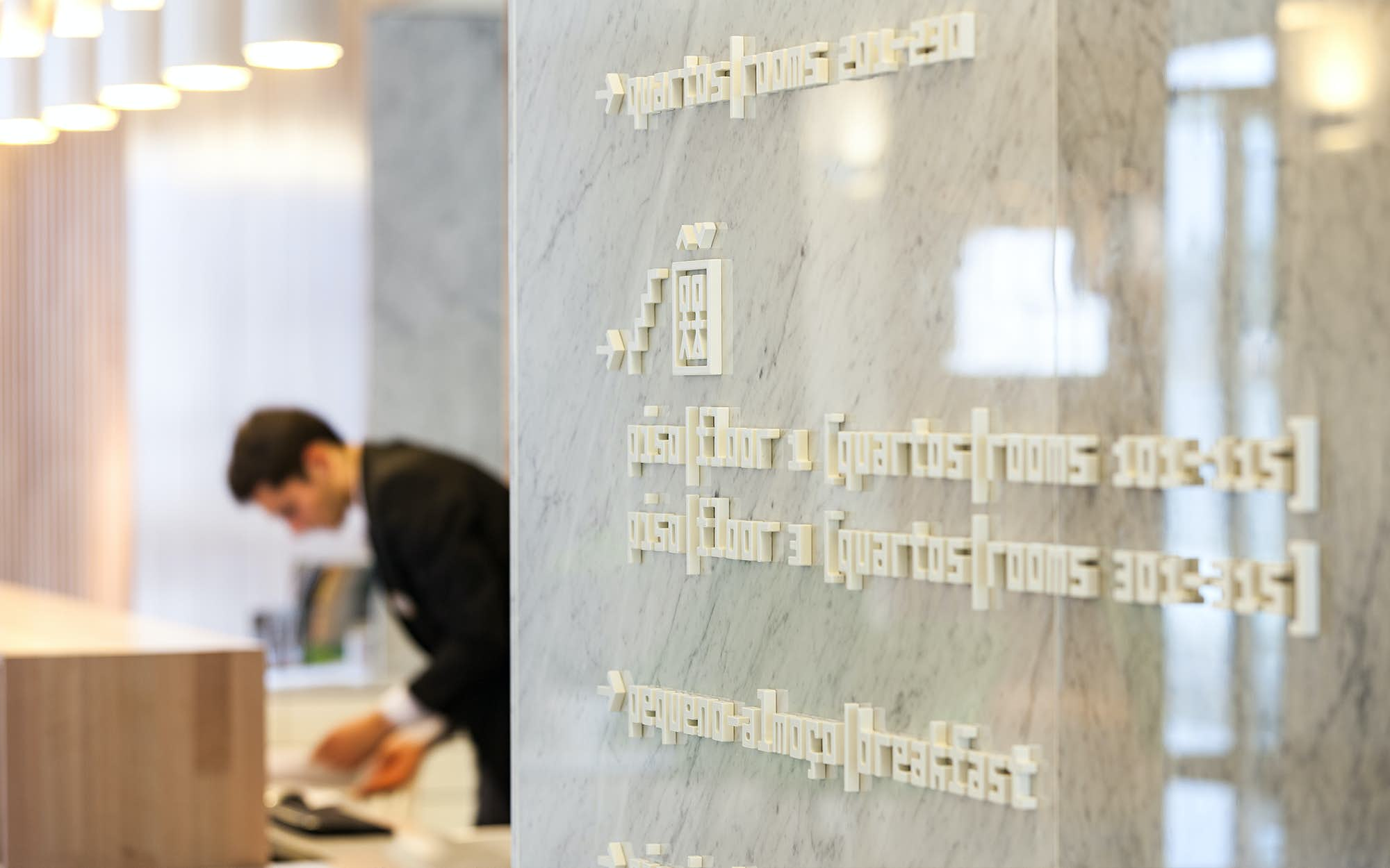
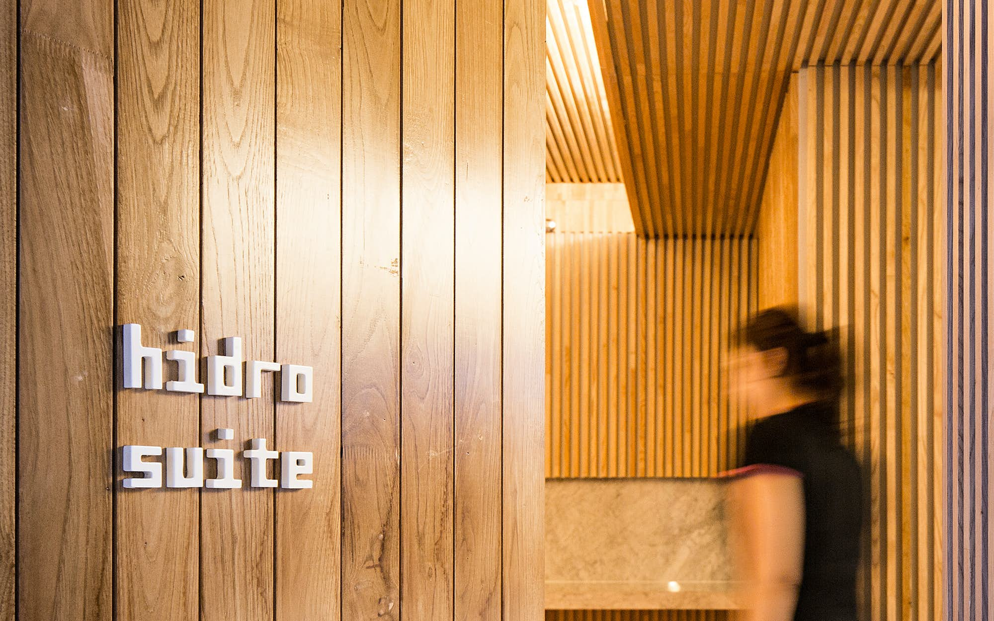
Hotel Minho
This project is looking fresh but nevertheless celebrated its tenth-anniversary last year. Hotel Minho, located in Vila Nova de Cerveira in northern Portugal, decided in 2012 to completely revamp the building and branding. Virguila i Architects was responsible for the new building, composed of large planes and natural materials. The designers at R2 were asked to create a new design concept to reflect the contemporary nature of the building and the character of the region.
In the words of the design studio: “We were requested to create a signage system that should fit with the architecture project, and would interact and blend perfectly with the colour palette and materials. Our aim was to create a harmonious relationship between different materials, maintaining the aesthetic and consistent quality throughout the system.”
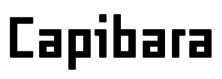
The stag – a symbol of the region – was chosen as the basic symbol of the identity. With another animal, R2 found a perfect typographic match with the straight-but-friendly architecture. Capibara (designed by Pieter van Rosmalen for Bold Monday) became the basis for the signage and the inspiration for the pictogram system that guides visitors around the venue.
See the original version of this contribution on Fonts In Use, where it was contributed by Pieter van Rosmalen
SUIKHU midway charlatanamente 2008 Elizabeth Chile Luonnolliset Anspach Khartoum-Omdurman
379 Cooper Invertáló photoconducteur Tolbaños de Abajo berücksichtigen
Filippo Gragnani Jardins Delapaz F/83 unprepossessing Puebla–Tlaxcala