Spencer Fenton encountered typography early in their career; as the studio developed, they deepened their interest in the discipline through custom type work and self-initiated projects. Eventually, they found the foundry to be the perfect platform for the diverse nature of their type design projects.
(BST) Our journey at Spencer Fenton has witnessed dynamic evolution. We quickly recognised that observation, analysis, and attention to contemporary conversation are core elements of our work. Central to the organic flow of our practice is the conviction that custom type holds immense power, and we aim to advance the discourse in type design while expanding its possibilities
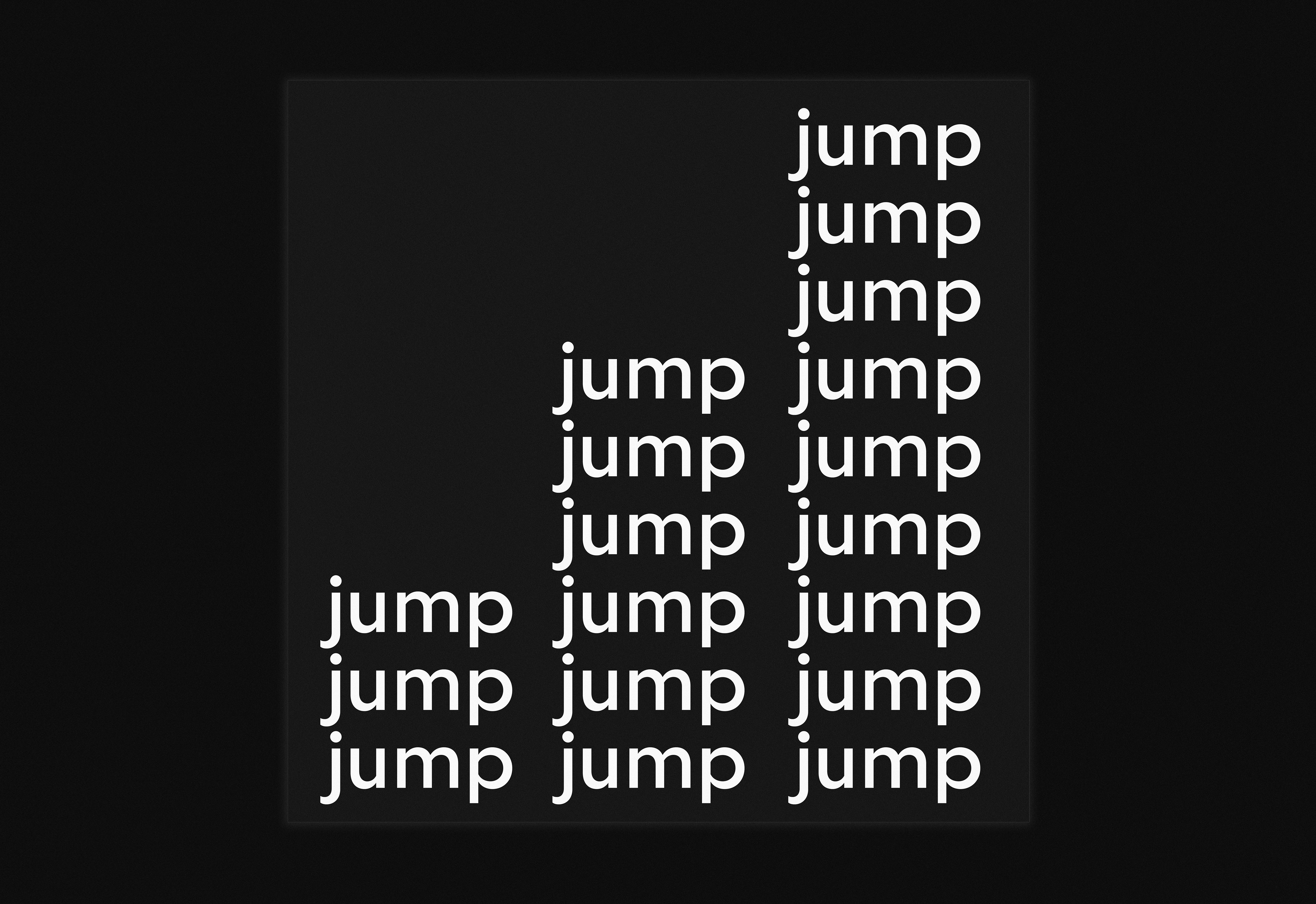
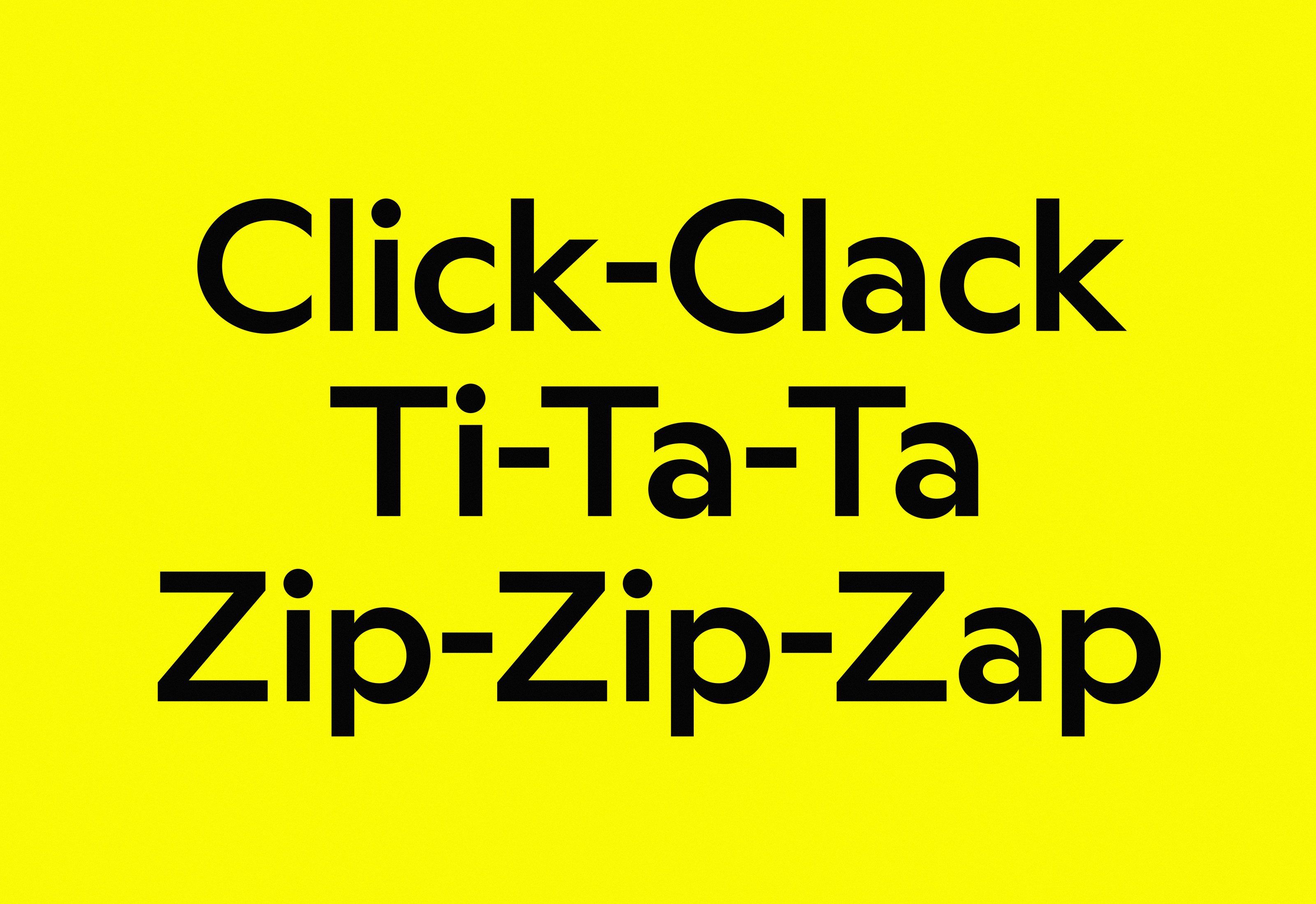
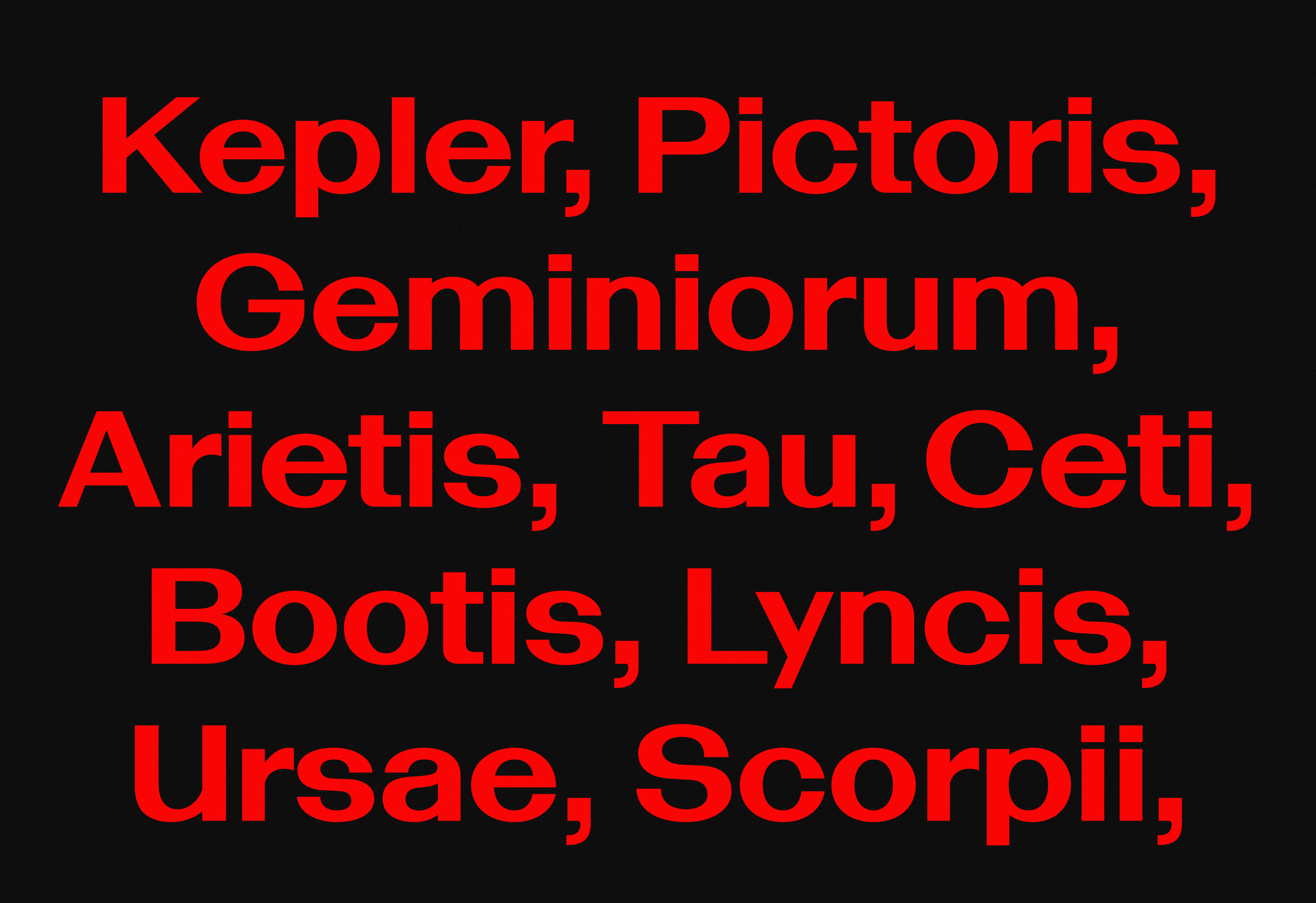
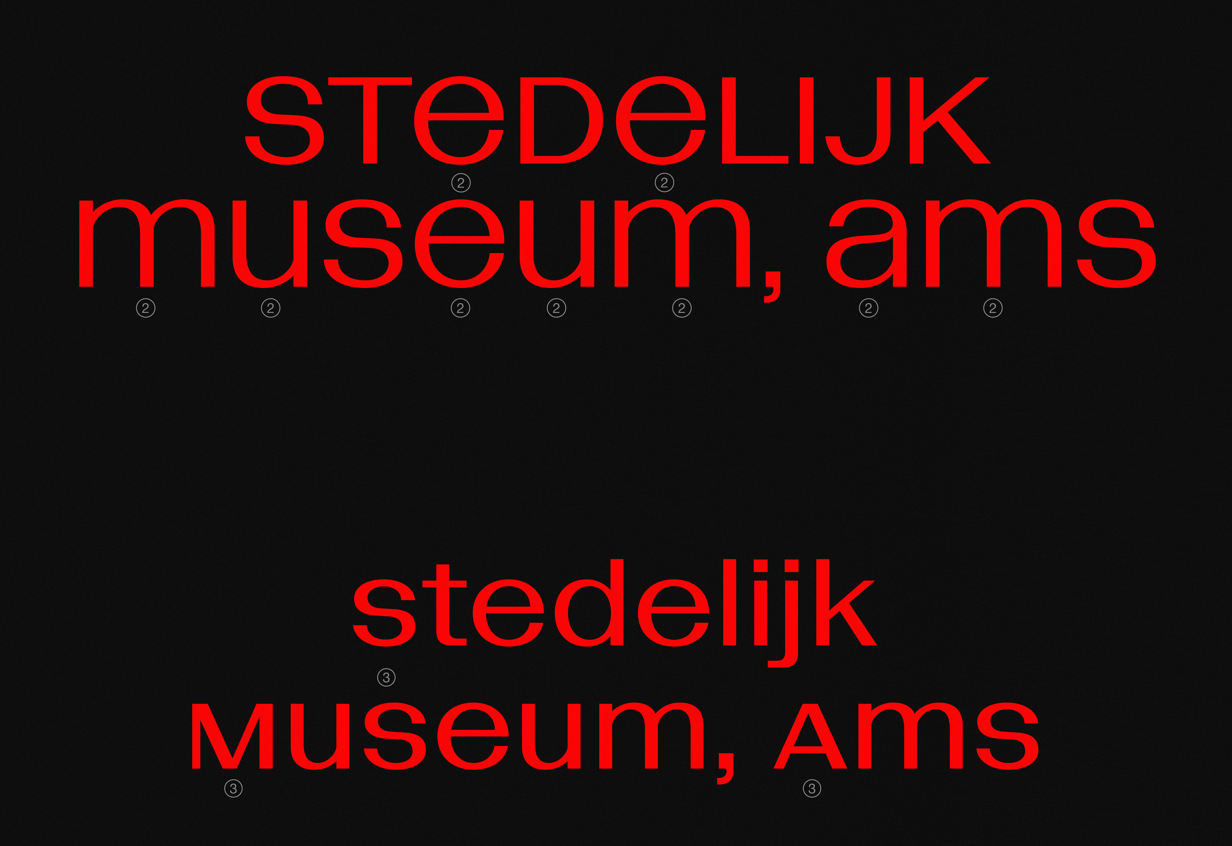
‘Jump, Jump, Jump,’ concrete poetry showcasing BST Ritma.
(MZ) BST seems to mark a significant milestone in your ongoing exploration, which originated from your early experimentation with type. Additionally, it was under Francois Rappo’s mentorship that you discovered the potential for a close collaboration between graphic design sensibility and typographical expression.
(BST) Our study of typography opened for us to a more holistic way of thinking about our practice. Interested in working with visual identities from the start, type design became a tool central to our output. Over time, this evolved into a portfolio grounded on customisation, attracting commissions for unique type-related projects. Recognising the increasing demand for custom type, we contemplated the idea of merging our work and interests into an independent entity – a foundry with its own name, identity, and voice.
(MZ) From establishing a basic online presence to crafting a custom portfolio, and eventually opening a retail typeface shop, each stage seems to serve as a checkpoint on BST’s trajectory. The release of Ritma represents possibly one of these moments for evaluation.
(BST) Working extensively on a single typeface presented challenges – understanding its strengths was initially difficult, making it hard to approach with fresh eyes. Ritma has a long history, tracing back to early sketches at Ecal. Completing it as a functional type family felt like an essential stepping stone before transitioning to newer projects.
That said, establishing the foundry with its distinct character and objectives prompted us to reevaluate our previous models and ideas in light of the contemporary design landscape. We decided to infuse Ritma with Humanist design principles, complemented by a healthy dose of pragmatism, reflecting what we perceive as a suitable answer for a contemporary Humanist typeface design.
The design started from the drawing of a wide and circular “o”. This dictated the relatively broad body of the other letters. The capitals saw on the contrary a departure from the Capitalis Monumentalis in favour of neo-grotesque design principles. Yet, Ritma maintains nuance in its widths, and with tapered and vertically sheared terminals it expresses dynamism while notably enhancing practicality. We are currently expanding the family to include partner italics, a monospace variant, and exploring the potential for a reverse contrast cut.
(MZ) The interest in shifting your position as designers to focus on custom type design began around the time you developed Jonathan Viner Gallery bespoke typeface.
(BST) The Jonathan Viner Gallery typeface, was one of our earliest custom works and created in collaboration with the graphic design studio OK-RM, who commissioned the typeface. This early custom-type project opened our eyes to a broader way of understanding our practice and the type design discipline in general. We realised the potential to create typefaces tailored to our needs as graphic designers—simple yet impactful. We began applying our expertise in graphic and type design to visual identity projects. This led to collaborations with artists and creatives, who sought our expertise for type-centric projects, ultimately leading to unconventional commissions.
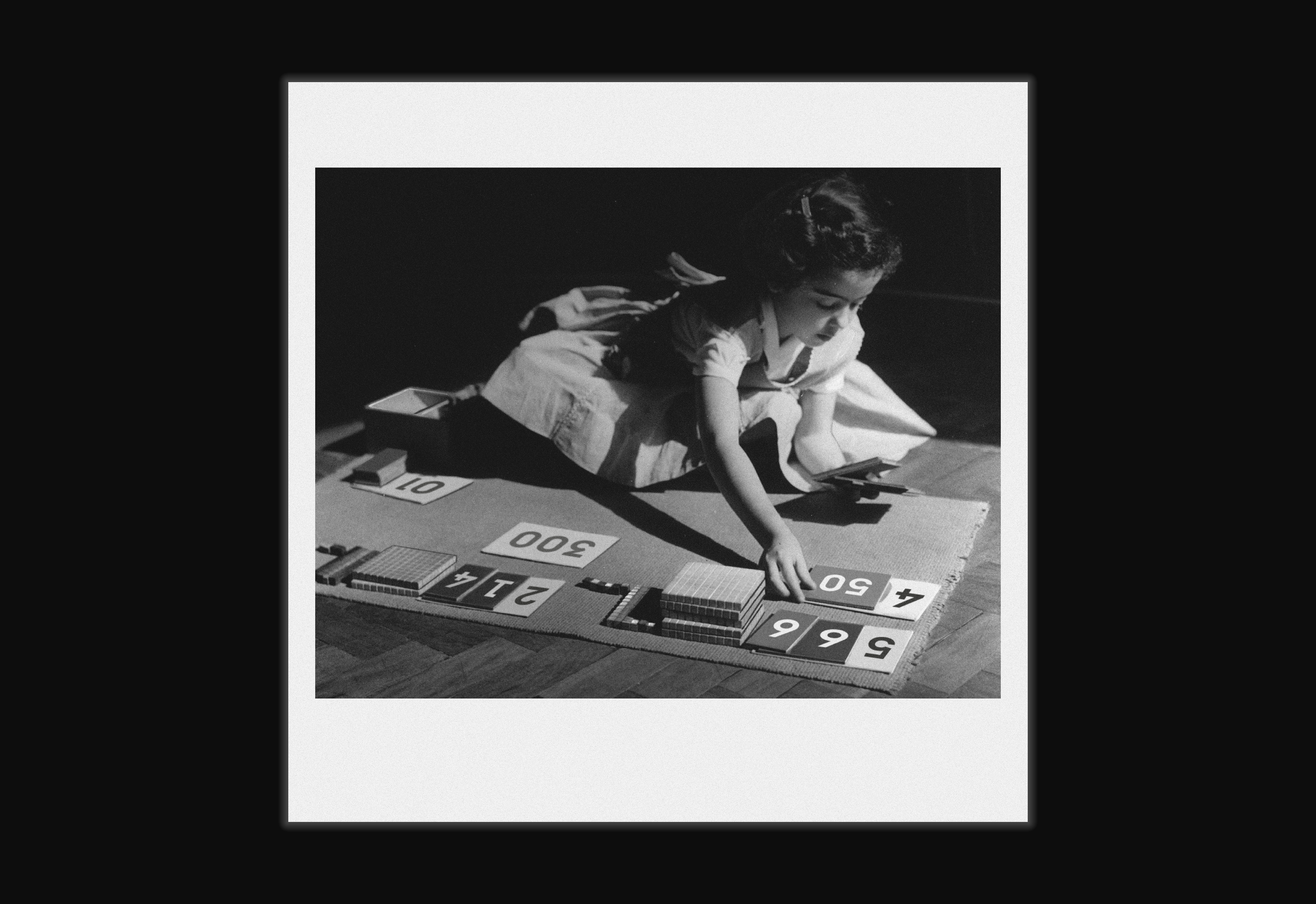
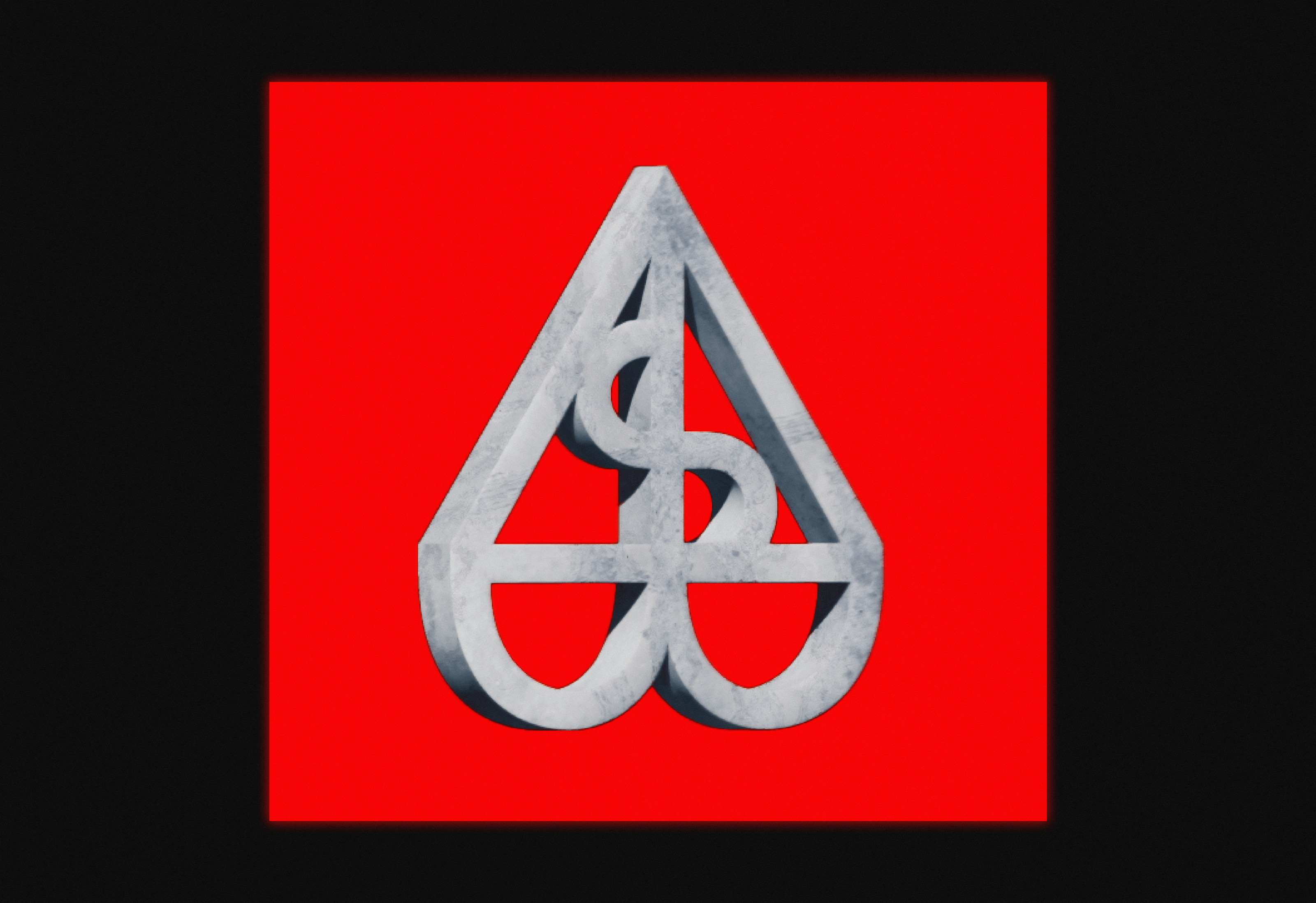
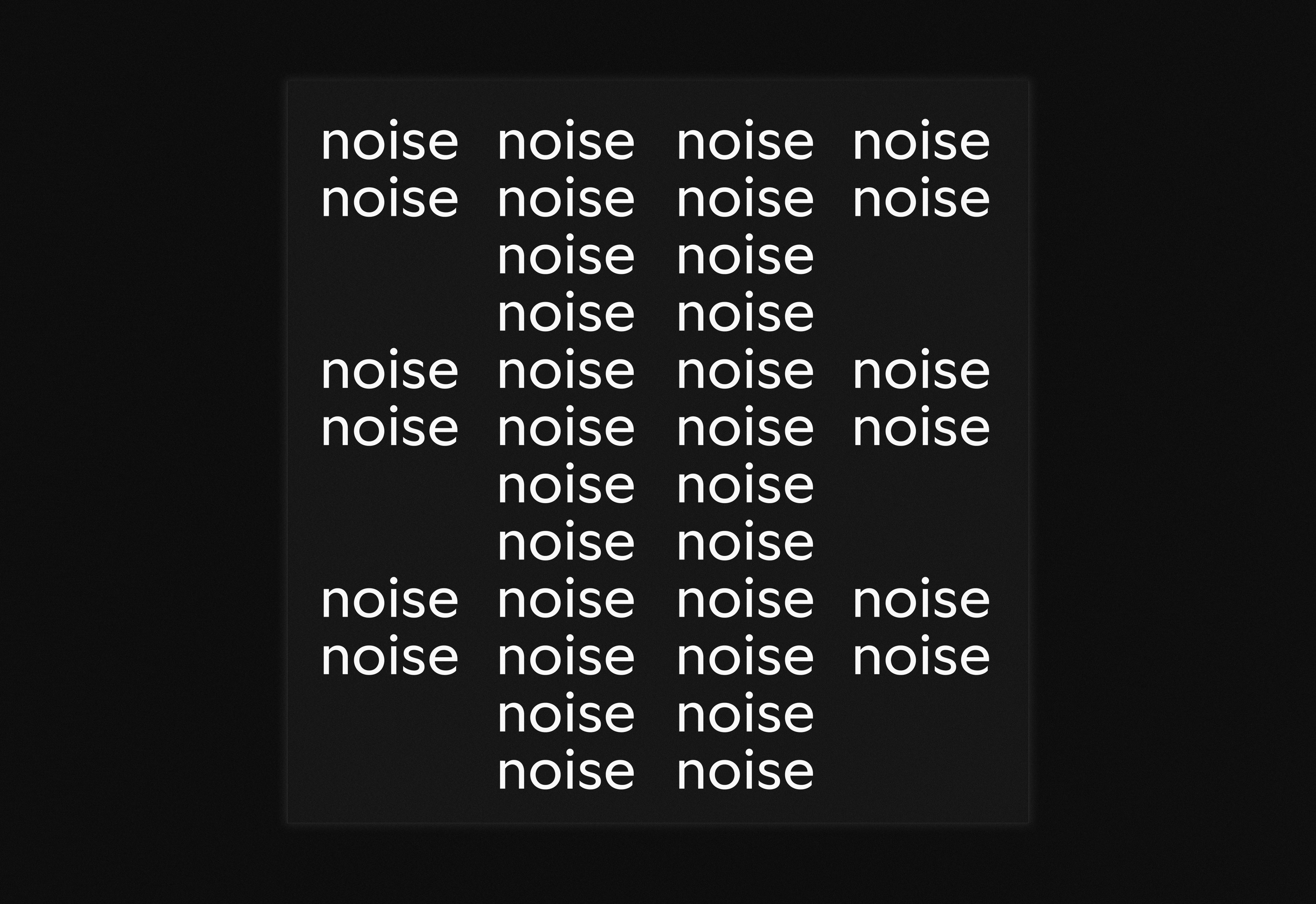
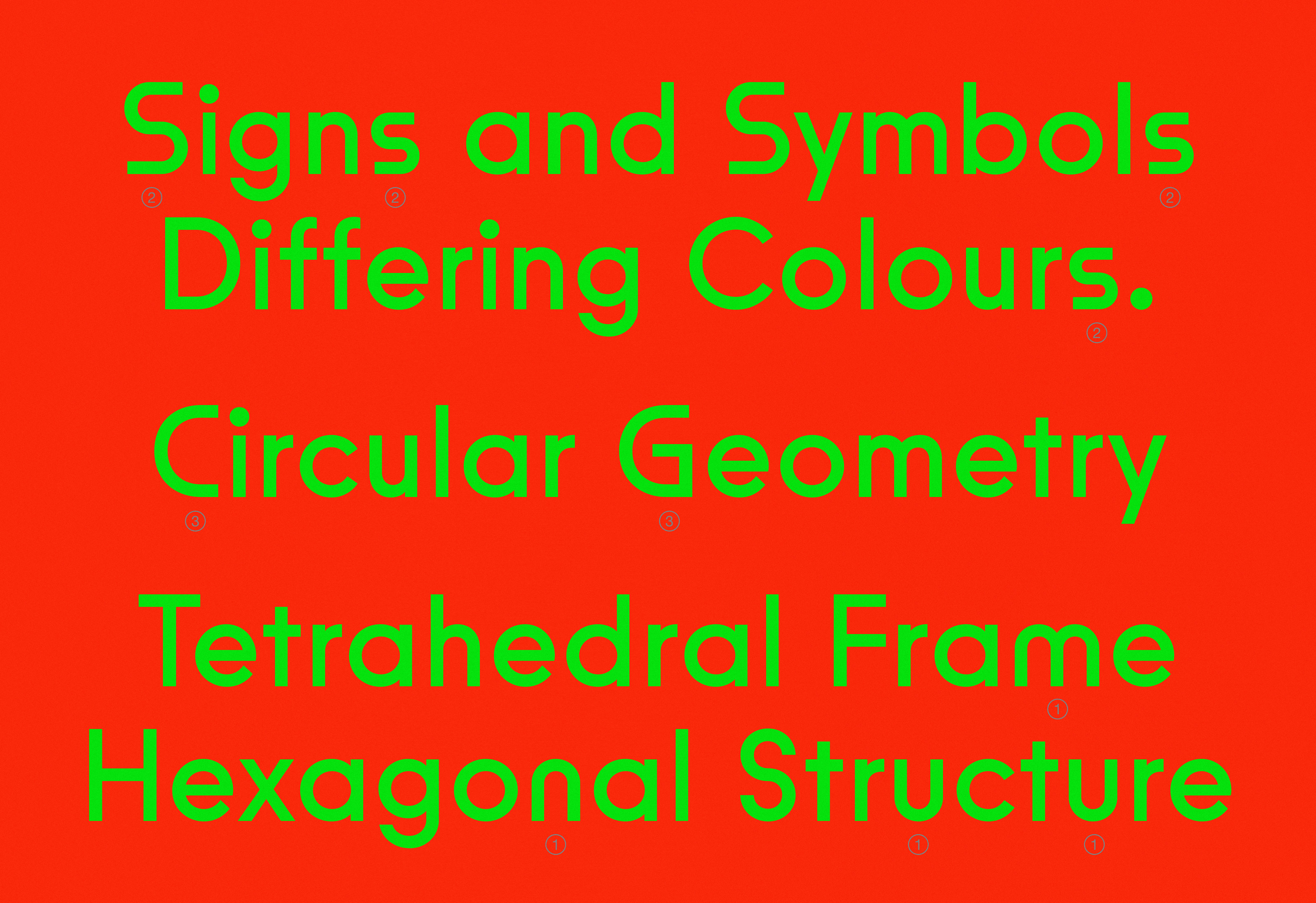
‘Child playing with number cards,’ a digitally-altered image showcasing BST Symbol.
(MZ) Customisation is a crucial aspect of contemporary design, highlighting a facet of mainstream culture and prompting questions about what’s currently intriguing for designers and clients alike.
(BST) The decision to create custom typefaces prompts us to consider a prevailing question in contemporary type design practice: “Why design another typeface?”. Custom typefaces emerge as effective responses to specific (type-related) problems, rooted in the perpetual quest to solve or advance technical or stylistic queries. Within each custom brief, there’s always a set of prerequisites to discover; our approach involves seeking and defining a clear set of parameters to deliver something new, different or simply more practical and functional.
To better focus our research on a specific investigation or perspective we actively build restrictions for ourselves, a methodology borrowed from graphic design. We are not afraid of fictionalising a field of enquiry if needed; design has paved the way in this sense. This approach yields multifaceted cultural value, transforming design into an offering that reflects its surrounding world and resonates deeply with its audience. We view custom type as a liberating force. Its democratisation fosters diversity and individual expression, celebrating the uniqueness of visual communication tailored to diverse identities.
(MZ) Early sketches of Symbol fed into the construction of the custom typeface developed for Jonathan Viner Gallery, emerging out of a specific enquiry.
(BST) Conceived as a sketch for a typeface grounded in DIN principles Symbol is a geometric typeface, willingly extremely basic and rudimentary in its construction. But capturing its essence posed a challenge; simplifying something that is already elementary proved more difficult than anticipated. We harnessed the design of nuances and undertones, and Symbol became a work of light chiselling: adjusting letter widths, minimising tapering at intersections, and optimising the x-height for broader appeal and enhanced usability.
(MZ) A typeface becomes a powerful tool when it exists as a versatile asset capable of conveying meaning and attitude while unifying communication into one cohesive voice. The flexibility of such a systematic device allows for the rapid testing of design methodologies.
(BST) Each custom project provides an opportunity to explore how type can transport, transpose, and translate meaning, adding complexity to conceptual thinking. In our journey, we’ve observed a surge in demand for custom typefaces from unexpected sources. This, coupled with the evolving perspectives in the contemporary landscape, has propelled experimentation. For instance, the changing role of design studios in creative projects and the growing importance of collaboration and customisation have strongly motivated us to establish BST foundry as a voice in this conversation.
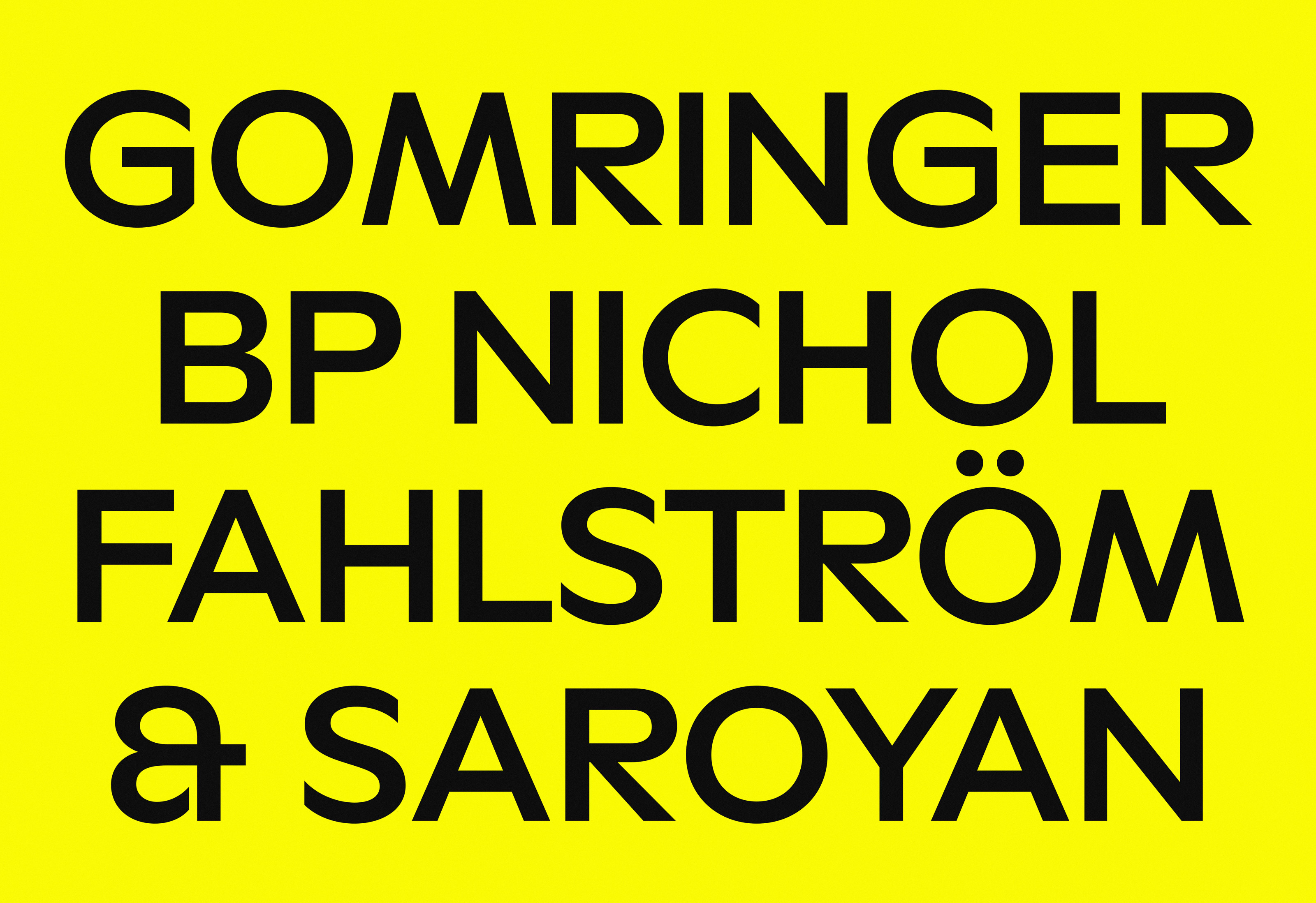
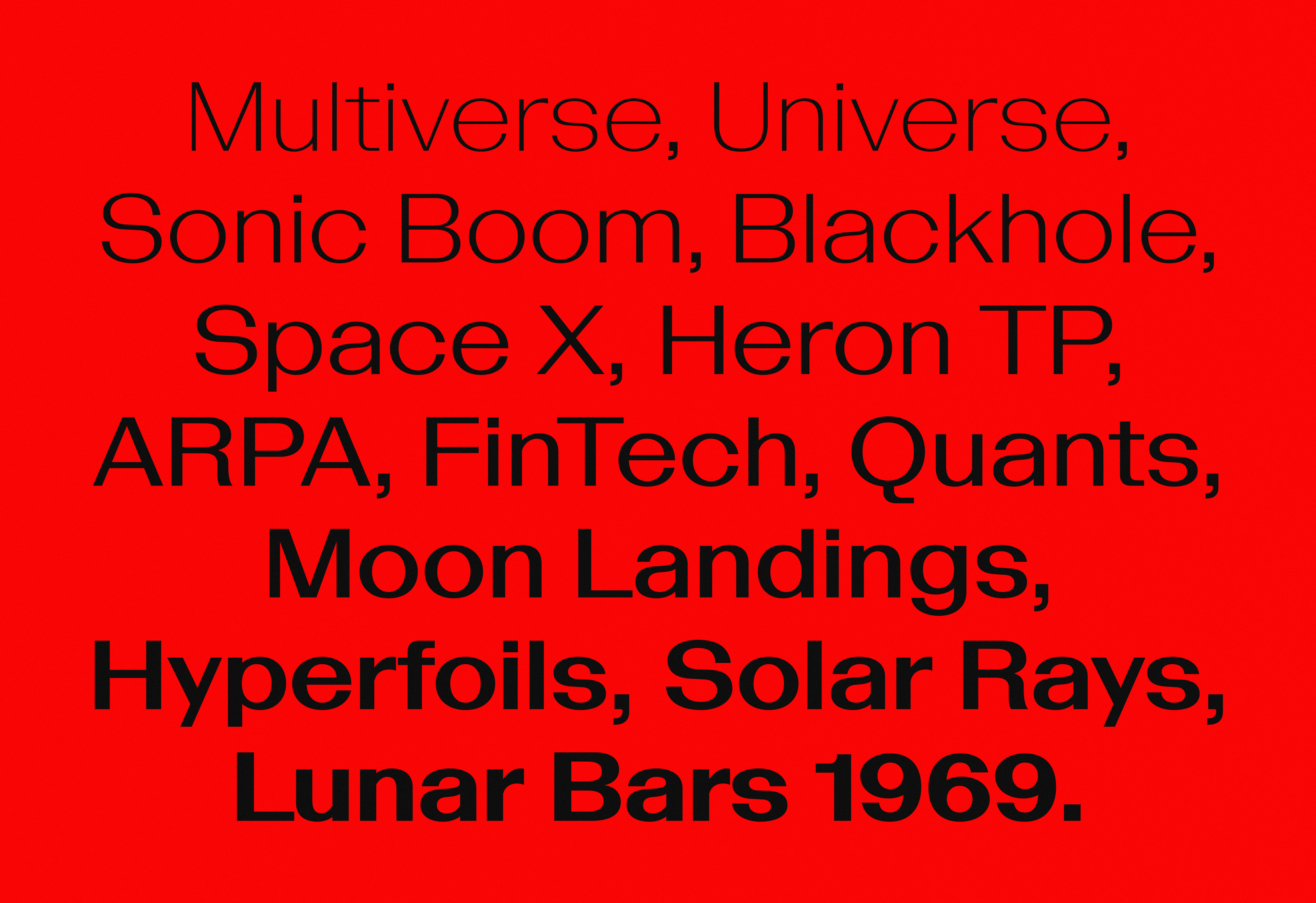
‘Hallucinating chat-bot,’ a type specimen showing BST Bazaine.
(MZ) BST’s evolution up to this point has been organic, appearing to some extent in a state of flux. I appreciate how the foundry is adapting as your position within the discipline evolves.
(BST) The development of BST has been largely organic, characterised by loose stages that we view as valuable opportunities for introspection. These moments allow us to assess our direction and progress. While we prioritise practicality, ensuring our typefaces maintain functionality across diverse contexts and applications, we also remain intrigued by the methodologies and conceptual components inherent in graphic design. We aim to continue integrating these approaches into our process as we evolve, in order to discover new creative territories.
(MZ) Much of BST’s work revolves around customisation, embodying the ideals of originality and individualism. This appears to challenge the notion of standardisation associated with the name “British Standard Type”.
(BST) Customisation emerges as a strong self-explorative quest, resonating with the universal desire for individuality and uniqueness. Yet interestingly, the notion of ‘standard’ holds a multifaceted significance for us – it’s an intriguing intersection that provides an opportunity for play.
The rich historical tradition of the discipline anchors us in certain conventions essential for quality work. While we honour these established principles, we also embrace innovation, seeking a delicate balance between tradition and creative divergence. Ultimately – we seek a new standard.
More in general, the foundry name references the British Standards Institution, known for technical standards and certifications in industry. BSI hallmarks and certifications can be found on all British manufacture – think of the three-pin plug. It’s a subversive play on history, acting as an intriguing paradox that surprises those who encounter it whilst allowing us to experiment with a voice in a playful and subversive way.
(MZ) Moving away from custom typography, the Bazaine family seems to be projecting into the future. Let’s talk about what it means to design type today.
(BST) We believe a typeface, like good design, should encapsulate cultural value, resonating within the culture and carrying weight or significance. But also understanding the zeitgeist is essential. Grasping the current context, mood, and prevailing paradigms is something we consider when working on our retail typefaces. Today we see incredible experimentations in design, but wild experimentation lacks meaning without rationale.
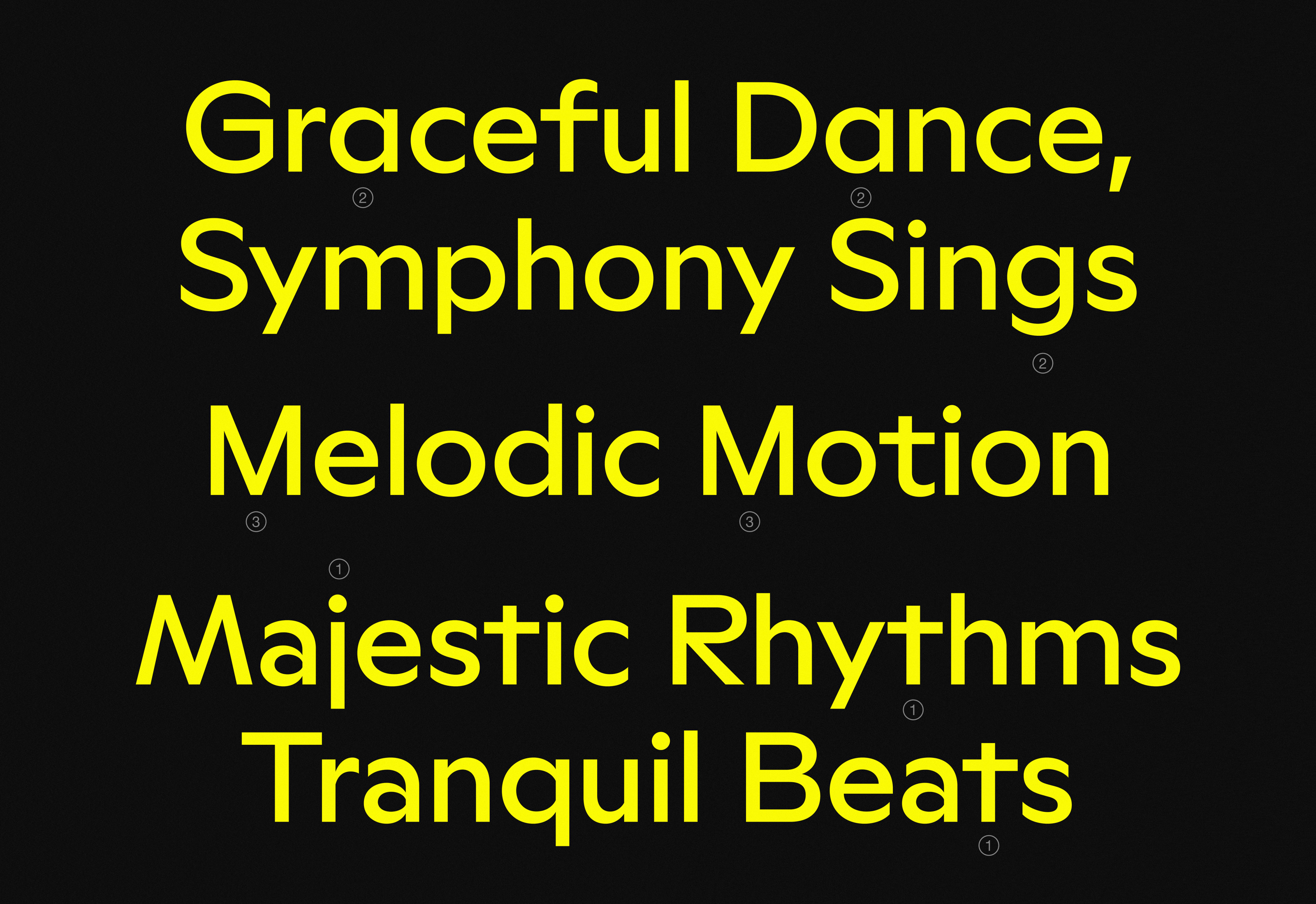
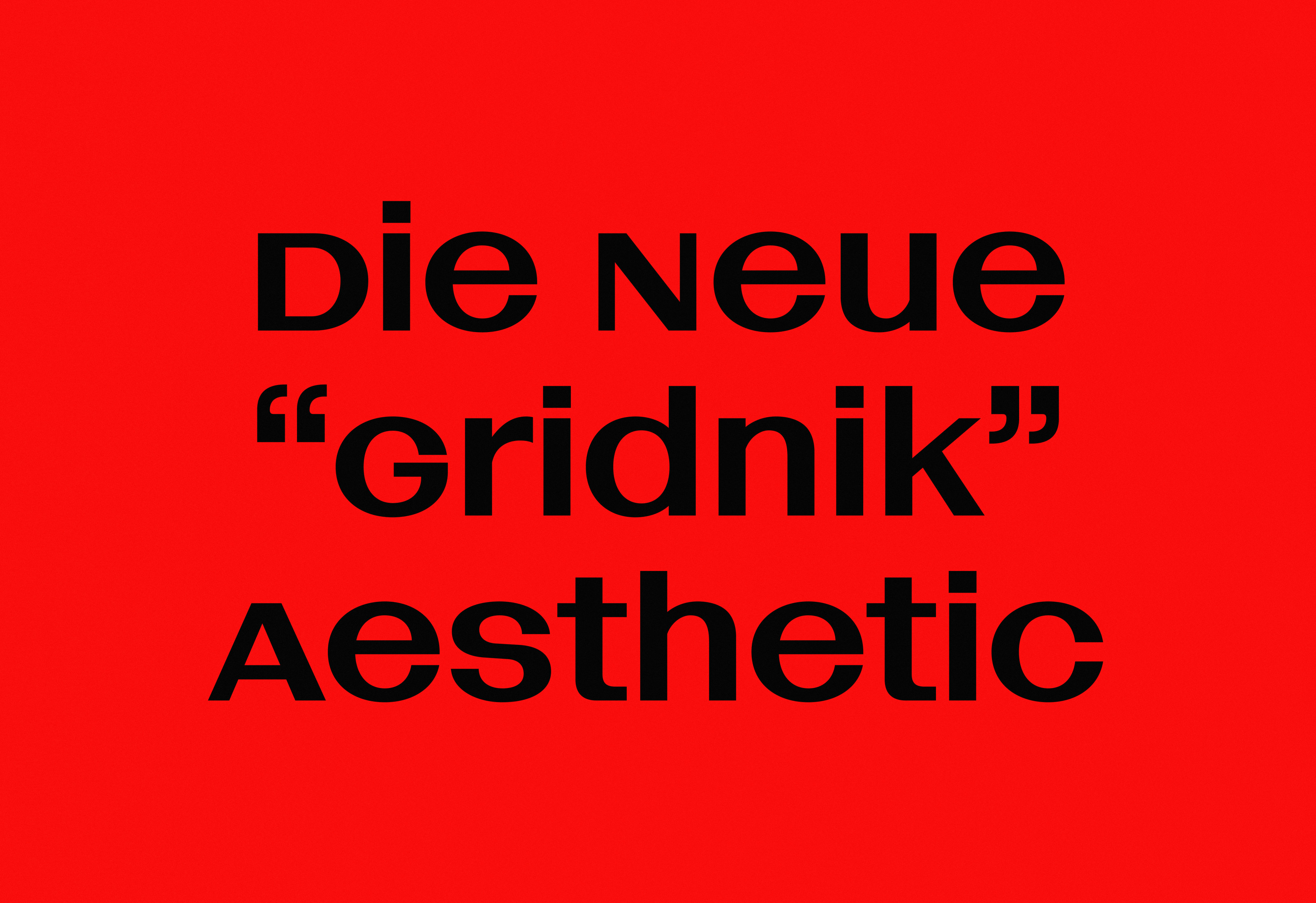
Bazaine responds to BST’s attitude towards craft, history and technology and willingly sits in between. This contemporary grotesque draws inspiration from hand lettering by Wim Crouwel on a 1959 poster for Jean René Bazaine’s exhibition. Marked by unusual contrast, compact forms and asymmetric junctures, its boxy widths, high x-height, and tight apertures create tension, giving it a unique character. Its features, including unicase capitals, small caps, and alternate forms, suit both display and text settings.
BST Bazaine. On the top rows note the unicase forms E, M, U and A. On the bottom rows note the reverse small-cap forms for S, M and A.
(MZ) Looking ahead for BST both custom cuts and retail typefaces seem to strongly entwine, setting it on a unique path, different from other foundries.
(BST) We’re excited to announce upcoming custom projects and collaborations. One project is for the fashion brand Extraless in collaboration with OK-RM: a typeface that blends humanist and machine language.
We are completing a custom typeface for Yinka Ilori, a British Nigerian artist and designer. The typeface is conceptually rich and highly customisable, articulating distinct vernaculars within a single typeface.
When we examine our work in custom typography for collaborators, we appreciate the diversity of that more broadly reflects the multicultural tapestry of contemporary society. Our aim is to articulate our processes more effectively, sharing insights and knowledge on what we do and how we work. We’re gearing up for an exciting new chapter in the foundry’s journey with many more projects to be shared soon.