Touching ground as autumn hits, Superposition presented its new issue, Workout, after a three-year hiatus. Founded in 2020, the periodical was born from the collective effort of architects and artists Leo Bettini Oberkalmsteiner, Tibor Bielicky, Max Creasy, Ellena Ehrl and Dominic Kim. To unveil “humanity in architecture”, Superposition orchestrates a shared dialogue through observations and storytelling, that could build cultural bridges but also ignite positive friction.
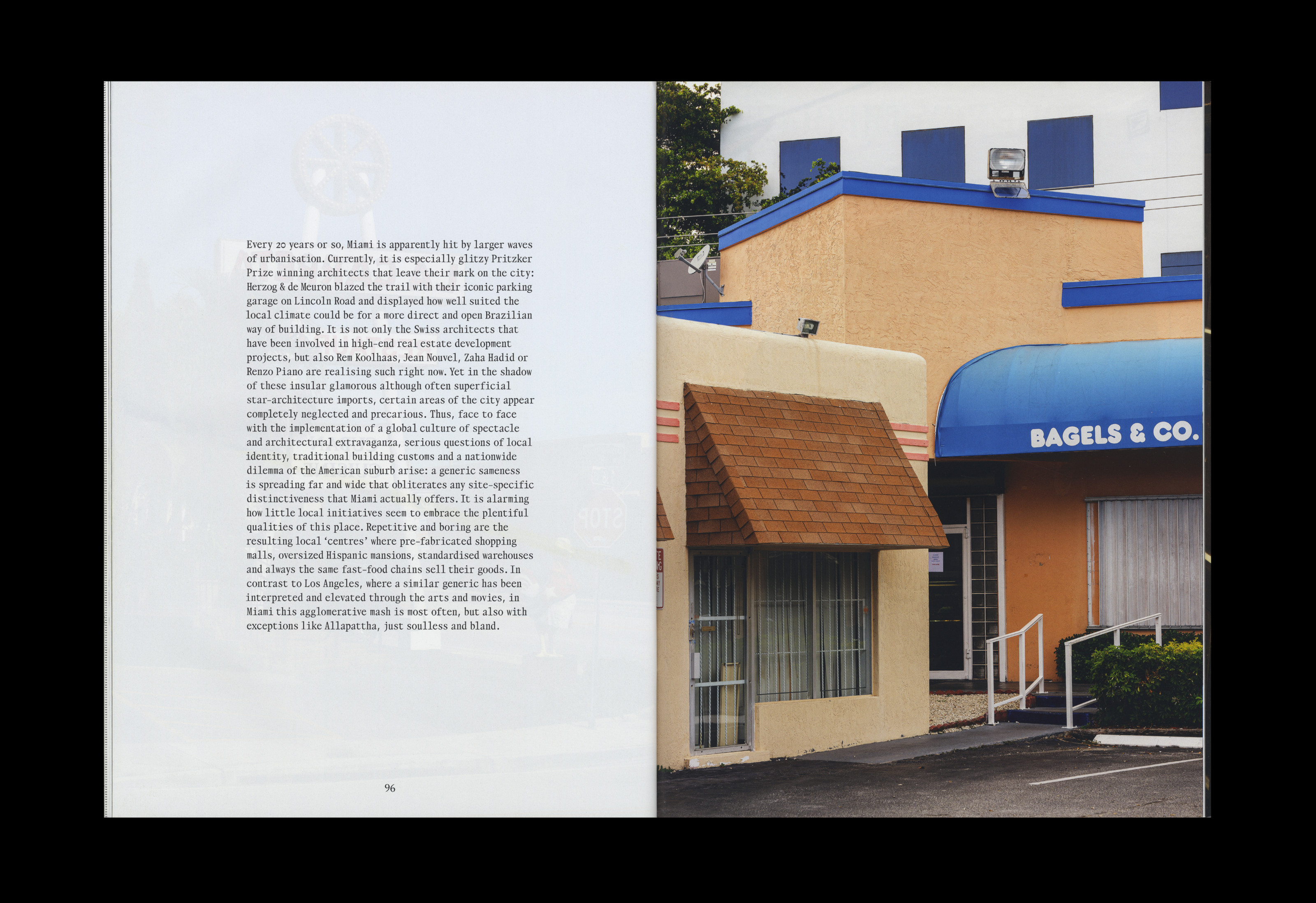
The first issue opened the conversation about humans and architecture with the theme Hardcore Home, and through a rich set of features: prisons, cut-through benches (no blood or bones inside), a bootlegged version of Arne Jacobsen's “Butterly” chair, iconic parking garages next to decadent bagel shops.
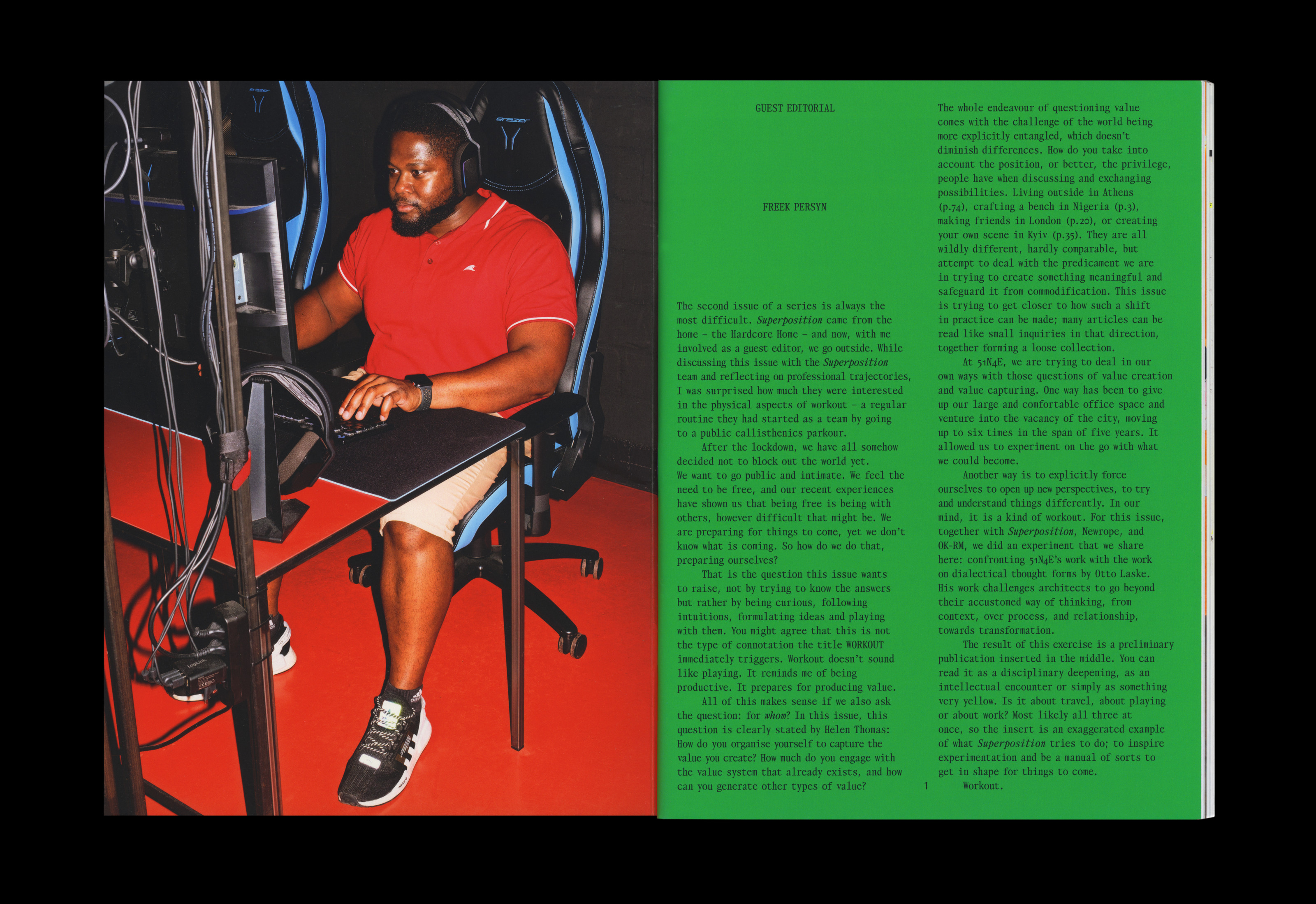
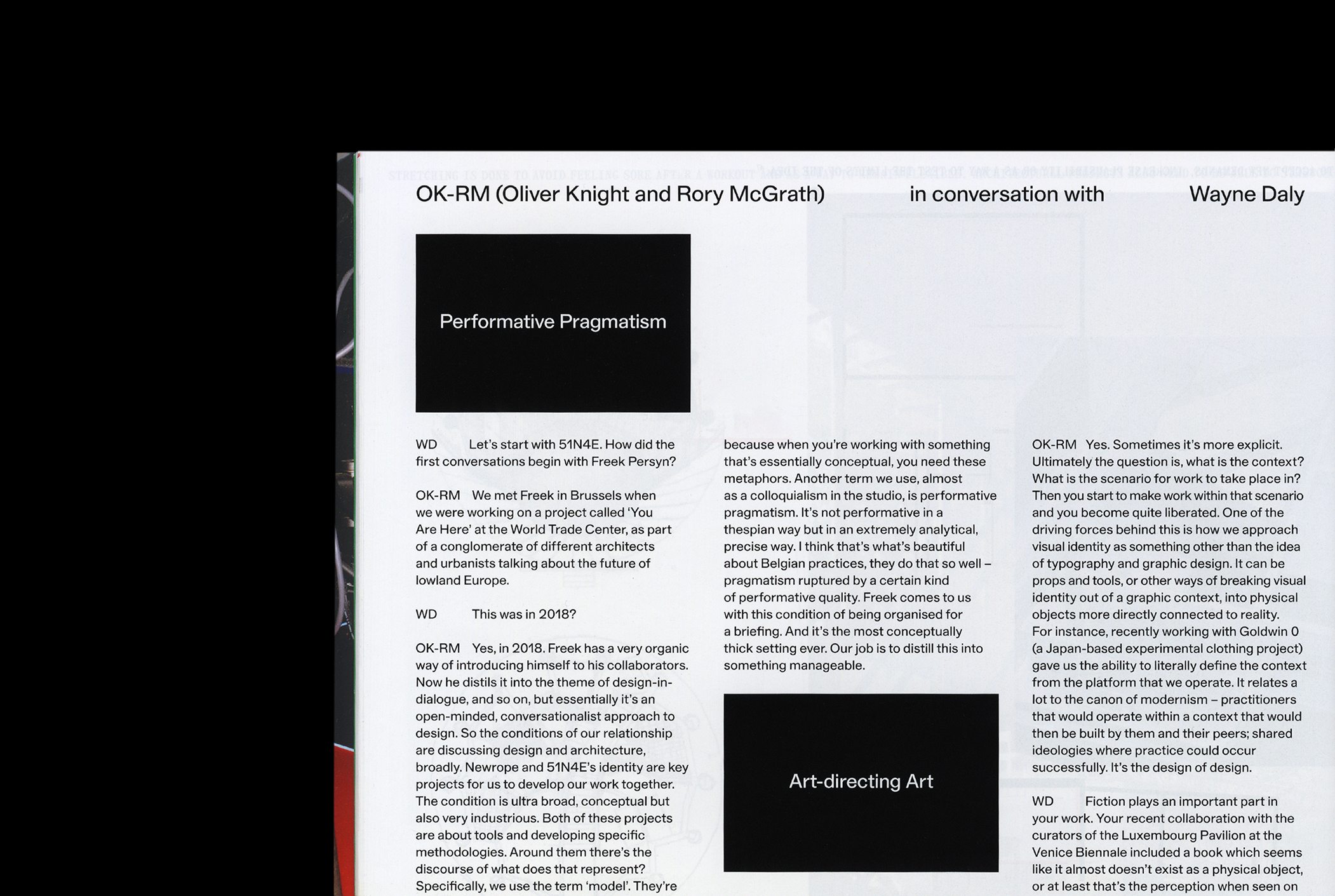
Under the art direction and design of Daly & Lyon, Superposition 2 reinforces its multiplicity of gazes, inviting the guest editor Freek Persyn to interpret the theme and to open a peephole into 51N4E studio.
We start from the beginning with Wayne (Daly & Lyon) by talking about what historically came before Superposition, where the periodical wanted to sit and why. Hoping to pinpoint where the magazine comes from ideologically, we discuss what influenced those early conversations.
(Wayne Daly) It’s worth saying first that Terrazzo, Barbara Radice and Ettore Sottsass’ seminal magazine published from 1988–96, was an important influence in many aspects. Particularly, the way that it was rigorous throughout its entire run (e.g. the same cover design for all ten issues – as Radice was once quoted as saying, ‘Same cover. Different colours.’), yet also elastic enough to introduce new design ideas with each issue, sometimes subtly, other times more explicitly. It was one of the shared references during those early conversations, and we were clear from the start that Superposition too needed continuity with the constituent parts – size, paper stock, binding, and fonts – while allowing latitude to adapt.
(Michela Zoppi) This must have streamlined parts of the process for issue 2: grids, type, cover …
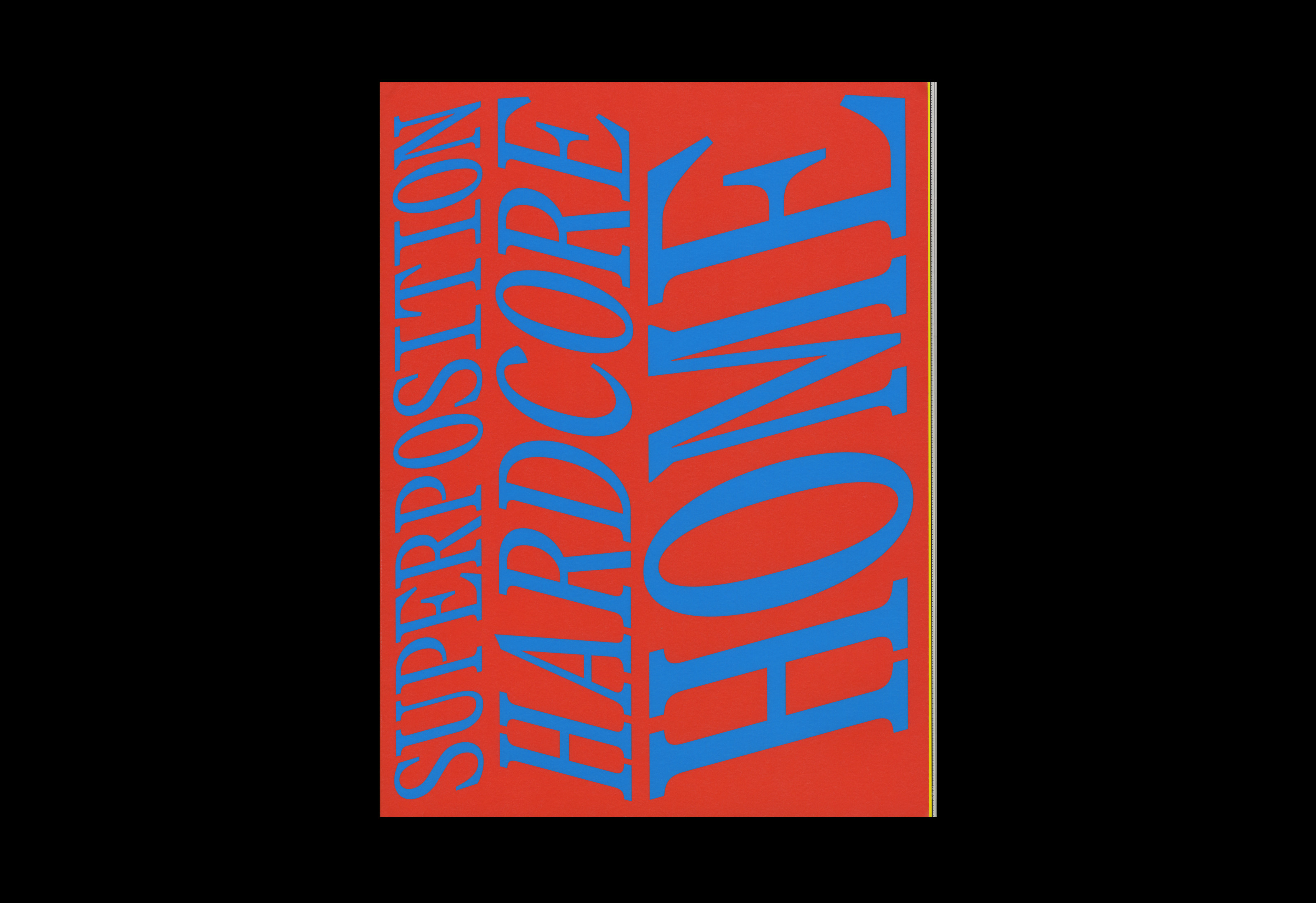
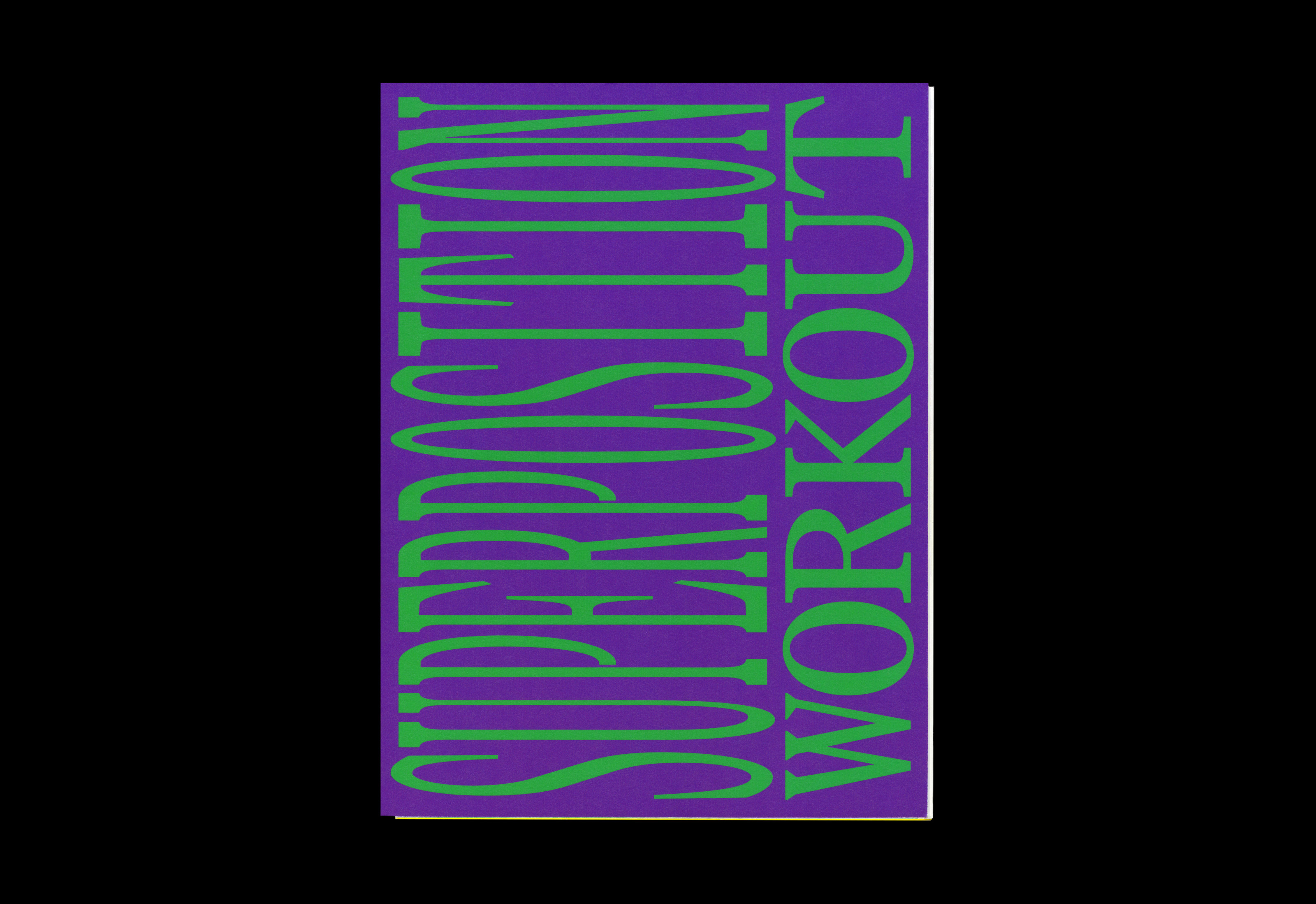
(WD) Some decisions were quicker to make, for example, the first element that was designed for issue 2 was the cover; the opposite of issue 1 where the cover was resolved right at the end. In an early meeting, Dominic, one of the editors, suggested that each cover ‘should hurt a little’; this comment resonated and gave us a good direction for the overall look and feel. The cover colours are chosen by the editors from a wide variety of options that we propose, and coincidentally, issue 1’s colours (red and blue) are primary, and issue 2’s (purple and green) are secondary.
(MZ) As the attention shifts from a space – the hardcore home – to a mental attitude or a way of doing things, the design organically evolves, being both rooted in its approach and untied in its iterations. How did the system evolve in issue 2 and what challenged the design?
(WD) Most of the design direction for this second issue is motivated by or responds to pragmatic limitations, economical choices and some intuition; in other words, not overreaching, or over-packaging the content. An inexpensive gloss art paper is used throughout, coupled with an off-the-shelf board stock for the cover. The size is a common magazine format and we print in CMYK throughout. This straightforwardness gets disrupted by one or two atypical material decisions: like the single signature with tapered fore-edge, and the loose 32-page contribution from 51N4E (included with issue 2).
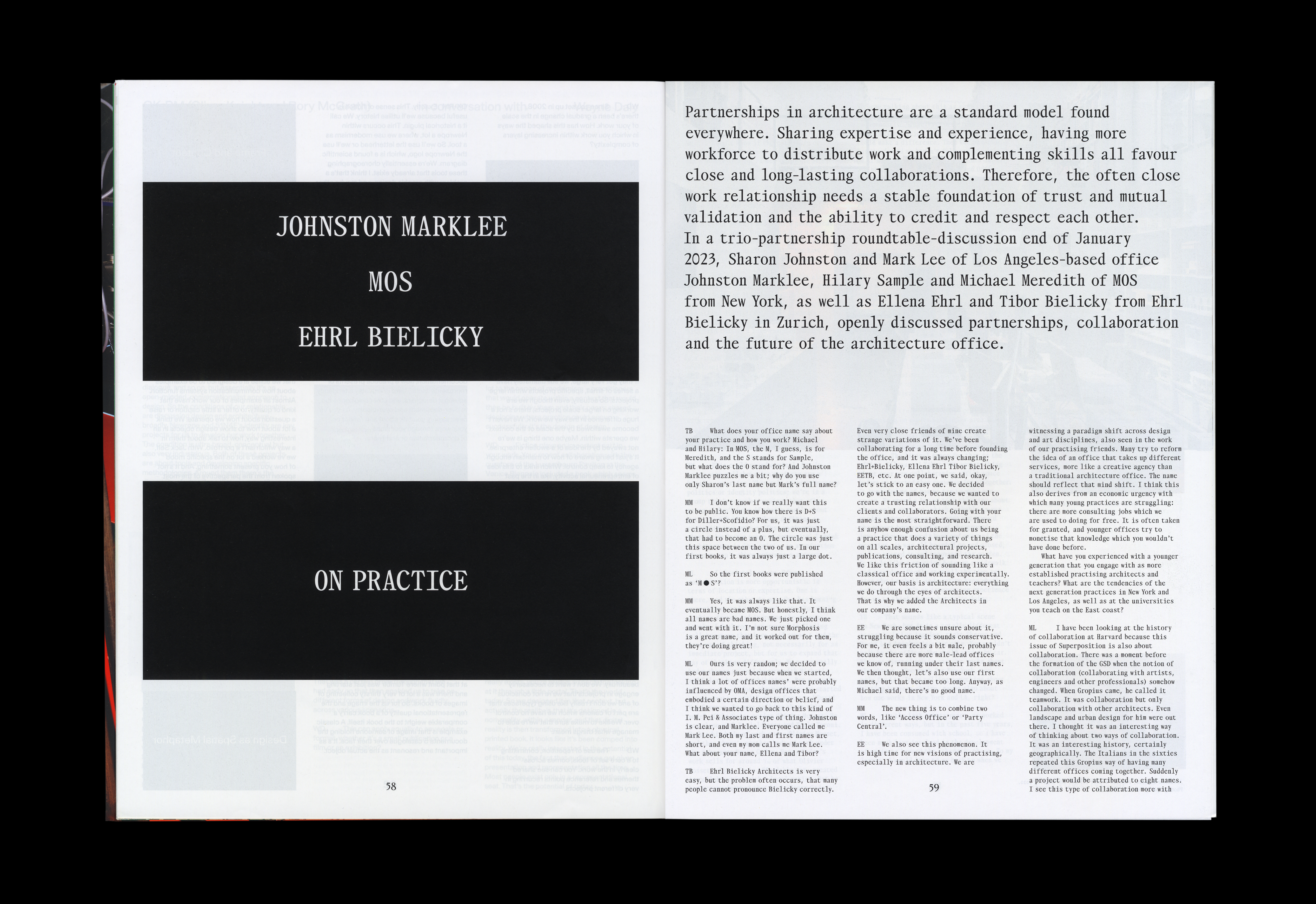
Opening spread from Johnston Marklee, MOS, Ehrl Bielicky: On Practice, issue 2.
The layout uses visual devices that have carried over, like the black title boxes at the start of each article, but also responds to practical challenges, finding a way to fit an abundance of content within a fixed page count and print budget. The longer articles in the second issue meant an increase of 16 pages and some adjustments to the standard column treatment and body text size. This fluidity is an innate part of the magazine’s design rationale.
(MZ) Negotiations are intrinsic to any design work, but when it comes to cost-engineering the printed world is where the numbers can shift from impossibility to success. But mediations are most poignant when they affect the identity of the object, allowing it to defy consolidated meaning, to hop in and out of contextual frames.
(WD) The layout lives in the liminal space between a book and a magazine. Superposition’s outlook is interdisciplinary, and extends across many layers of time, with recent work rubbing up against historical material – multiple states existing at the same time, like strata. So it’s not a magazine which is concerned only with the current and new but casts itself wider, and the design responds to this.
(MZ) It raises important considerations on the scope of a publication: to present an architecture magazine that counter-acts its own definition by wearing many outfits – A Marcel Marceau mimetic performance. The content must be the driving force here, celebrating the expressed diversity of each piece.
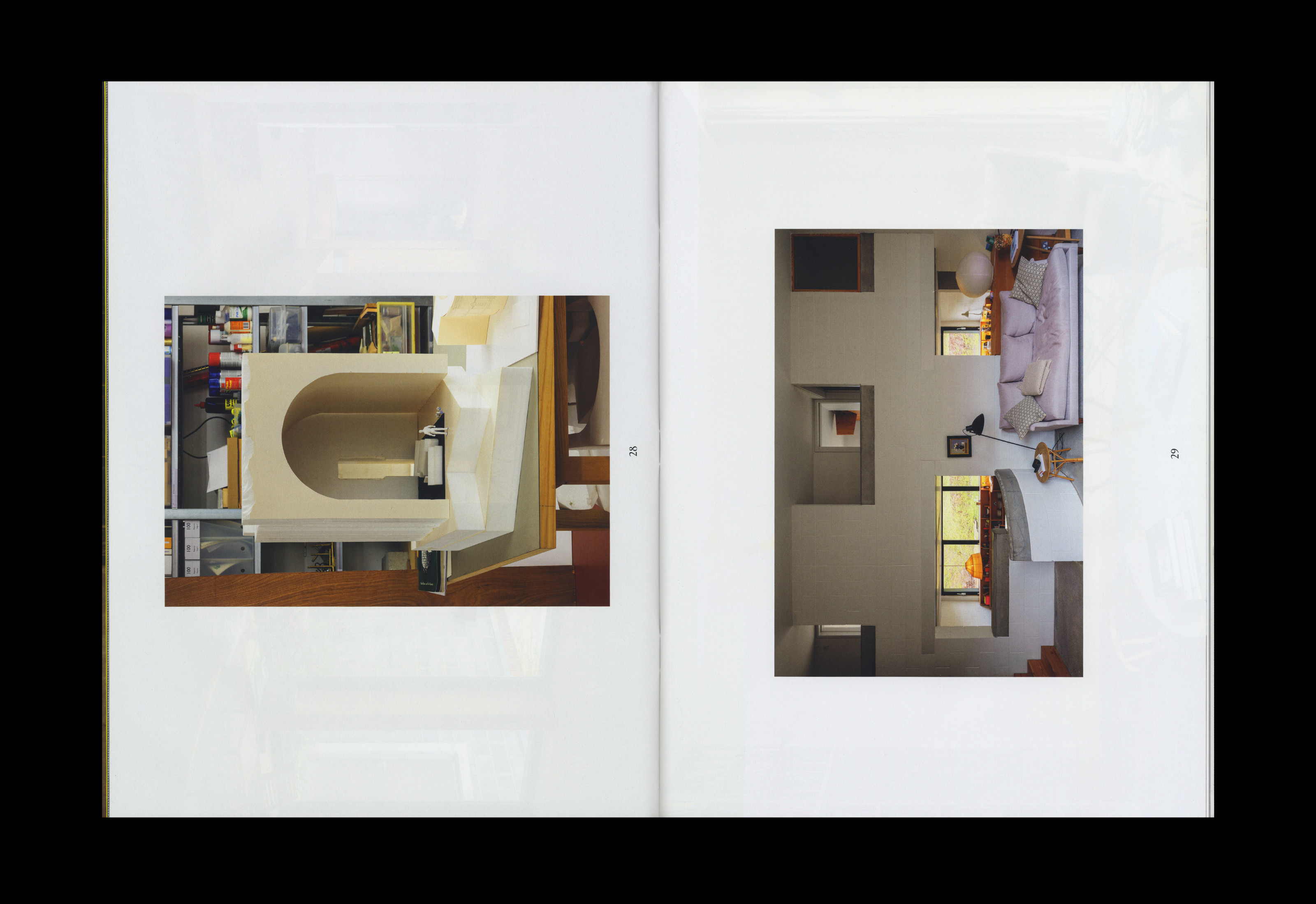
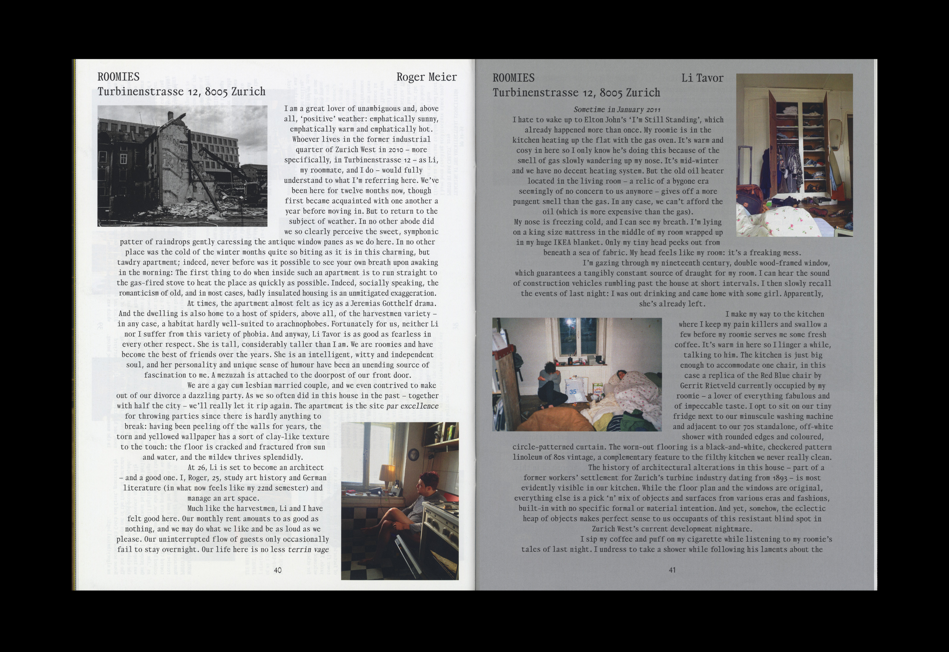
(WD) The content always directs the complexion of an issue, and as mentioned, Workout is purposefully different to Hardcore Home, albeit within a loosely shared framework. Nothing gets to the layout stage without being read first; the understanding of each piece is necessary to form an idea for the structure and the design. It also happens that contributors have particular requests or want to explore different treatments. This works especially well with someone like Max Creasy, who has a strong sense of the mise-en-page of his photography and, being part of the editorial team is familiar with the magazine’s pace.
We consciously attempt to counterweight contributions which are in some way autonomous or self-contained, with those that fit a more systematic, regular treatment. The infrequent publishing schedule helps with design thinking – there is breathing space around each issue which allows us time to develop ideas with the editors.
(MZ) Time is also the fundamental fabric of the reading experience of a magazine. Big periodicals are frequent, almost frenzy, and skimming through becomes the necessary way to experience one release before the next comes out.
(WD) When we started on the first issue three years ago, my first question was ‘Why make a print magazine at all?’. For me, the success of a periodical relies on the reader’s experience of time, and how the printed magazine focuses reading in specific ways. Architects like Cedric Price and François Dallegret often emphasised the role of magazines and newspapers in their practices, as more urgent formats (compared to books, say) that allowed them to absorb ideas on the go. These reading habits were fundamental to their practices and I think magazines today can still exert that kind of power.
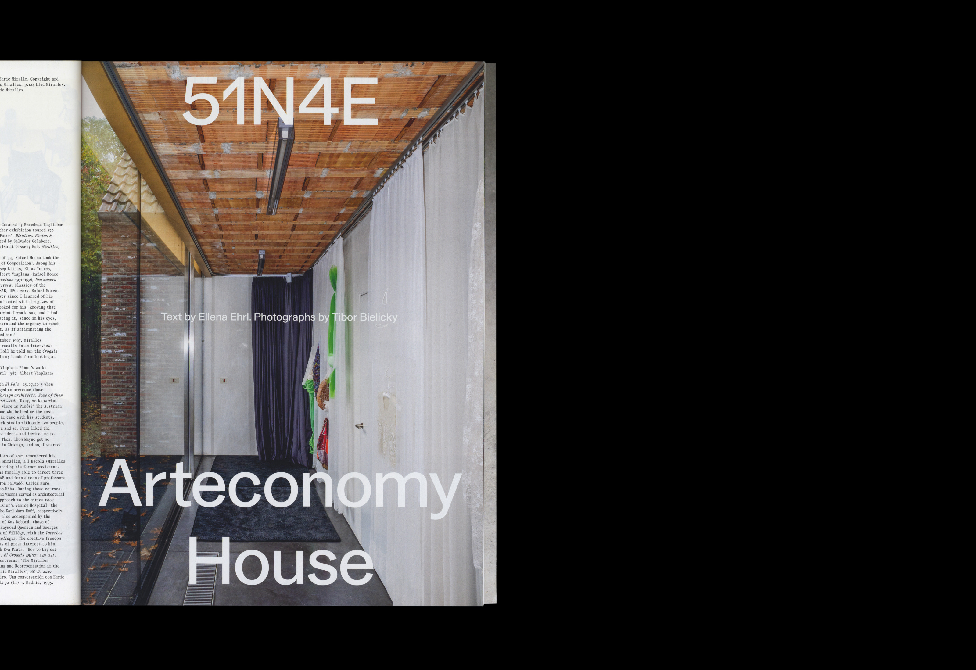
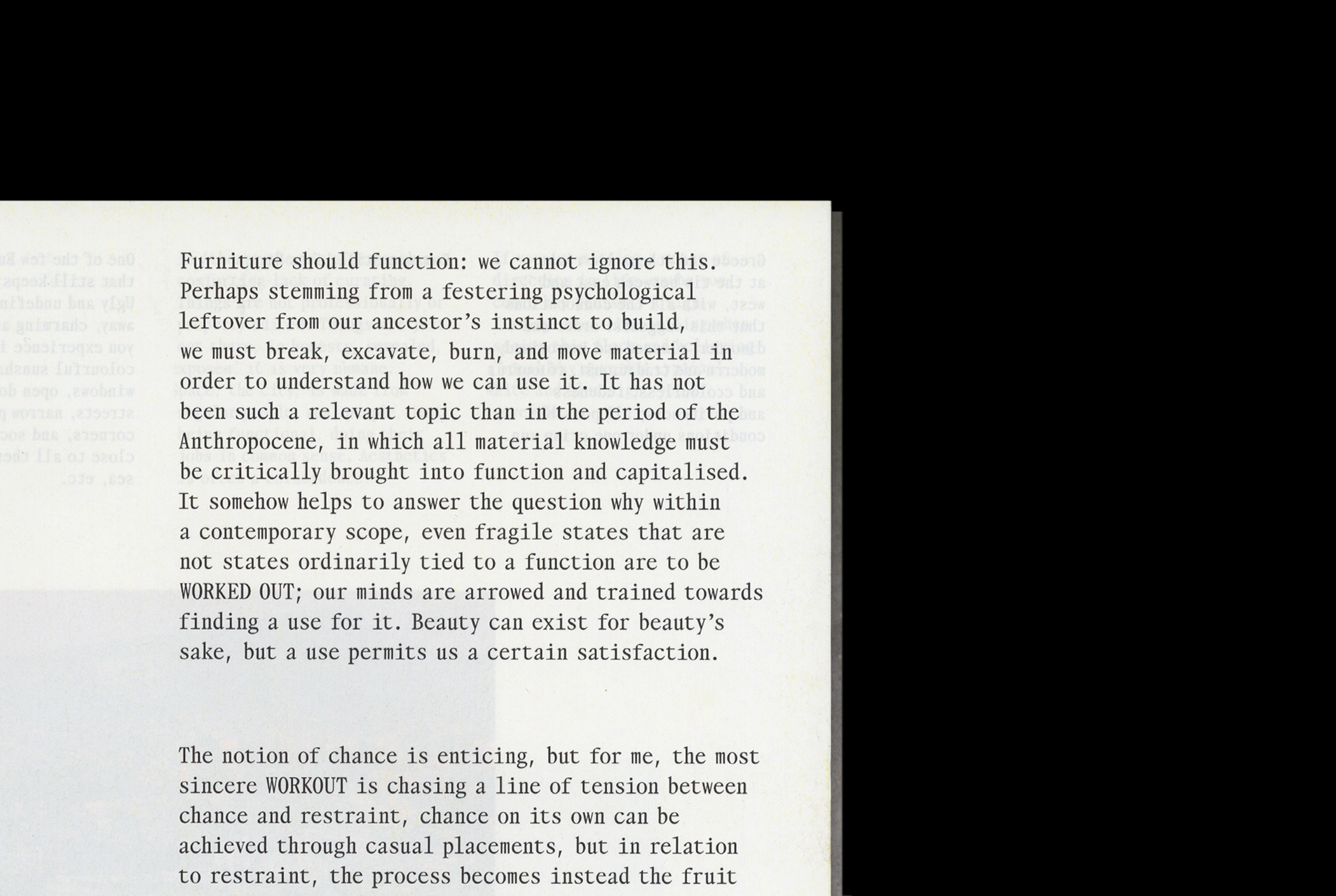
Insert by 51N4E and OK-RM, issue 2.
(MZ) When we talk about reading experience typography is under the spotlight too. This volitional departure from the canonical forms of the magazine merged with recognisable tropes used in periodicals, the like of gloss paper, generous format, playful titling in big typography, and so forth, seem to really inform Superposition’s lively yet very structured typography.
(WD) Lively yet structured is a great way to put it! There are varying degrees of trial and error in the process of putting the issues together; some articles come together more easily than others, but generally, there’s a lot of testing and iterations while establishing a certain measure or cadence, and assembling the right combination of text-led and image-led stories – most of that work is done early on with great precision by the editors when planning the issue and inviting contributors.
(MZ) The typeface brings on its vibrant character too, strongly defining the Superposition’s voice.
(WD) We consciously set out to work with young type designers and support emergent voices. The main font is Takt, designed by Janis Gildein. More than any other element, I think it’s what gives the magazine its identity. It hangs everything together. Janis was one of my students at ECAL; I first saw an early version of Takt around the time we got commissioned for Superposition and was instantly drawn to it. It felt contemporary then and still does now. It even looks a little awkward, a bit uneasy. Its design is based on a Caslon source from the mid-1700s, which Janis adapted into a monospace grid, amplifying the spikier details and triangular serifs.
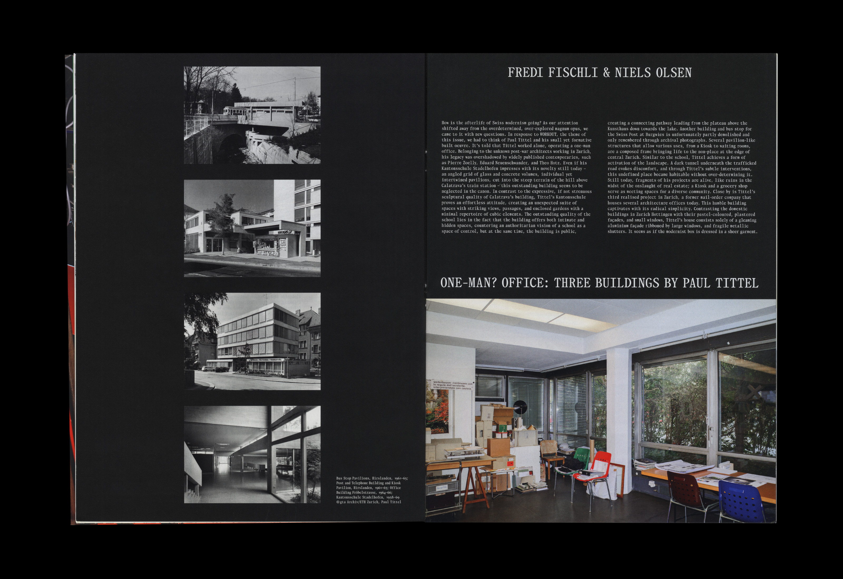
As part of our ambition to bring historical variation to the design, we decided to pair the 18th-century mood of Takt with a more recent counterpart, and one which has a connection to magazine and newspaper typography. We chose Alpha by the brilliant Omnitype (aka Leonardo Azzolini and Simon Mager), which is rooted in a lead type sample found in early issues of the concrete art magazine Spirale (established in the early 50s by Dieter Roth, Marcel Wyss and Eugen Gomringer). This typeface turned out to be Square Gothic, released by the American Foundry Ludlow, and most likely drawn in the 1920s by the German designer Robert Wiebking. We like how Alpha also bring influences from Akzidenz Grotesk, GGK’s Berthold, and Karl Gerstner’s Programm, and we decided to use it for specific article types, e.g. in issue 1 for the ‘Home Stories’ features dotted throughout the magazine, and in issue 2 for the 51N4E pages.
(MZ) Lastly, the theme: Workout.
(WD) As with the decisions about cover colours, it’s a word that sounds tough and has more than one meaning. I think we mainly interpreted it as a way of being exact, whether that’s in working out an idea or process or working out as physical exertion. A precise toughness.