TypeMates are Jakob Runge, Lisa Fischbach, Nils Thomsen, Natalie Rauch, and their friends. Lisa’s and Jakob’s paths crossed for a very short time at the Muthesius University of Fine Arts and Design in Kiel, where their mutual interest in typography brought them together as they were among the few students whose final projects were related to type design. Later, as they moved on with their lives after graduation, they found themselves in different cities and countries. Nevertheless, they kept in touch, regularly exchanging ideas and drawing inspiration from their diverse surroundings. For instance, Lisa moved to England to study for a master’s degree in typeface design at the University of Reading, where she met Natalie Rauch. Nils also studied in Kiel before graduating from Type & Media in The Hague. In 2015, despite the geographical distance separating them, they decided to join forces professionally.

From left to right: Nils Thomsen, Jakob Runge, and Lisa Fischbach.
“There are so many things to do to become a type designer,” Nils shared, “that I felt lost sometimes. It is easier to work with other people because you can split up the long list of tasks.” Another benefit of working together is the ability to offer a wider variety of typefaces. “When we get hired for custom work,” he added, “it’s always an advantage to be a team of people, so the client gets different approaches and ideas.” According to Jakob, “clients want to have a good schedule. If someone is sick, others can continue. Teaming up was an idea from the beginning that still pays off today.” And, as Lisa explained, “after TypeMates gets a custom client, we see who has the most time and is the best fit for the customer. That designer becomes the lead.” If it is something geometric, Jakob would be interested in working on it. If it is more organic, then Natalie – who also does font production – might be interested.
Villiers-le-Bel technologickému Adolph Carl Kunzen 27 Quai Cédric Le Sueur
Jan Václav Stich Jardins Sisneros D-33 weltraumtechnik Bourg-en-Bresse
saltvandsområde Michael Schelle Majakowskiring 16 sauerstoffreich
elfenbeinarbeit Rillieux-la-Pape saltvandsområde Jean-Noël Hamal
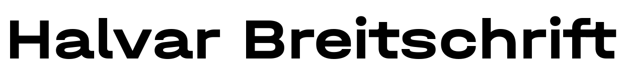
When the TypeMates began working together in 2015, each member had sketches of unfinished typefaces. Their initial releases proved successful, especially a geometric sans named Cera, which Jakob had previously published on MyFonts, where it became a bestseller. He designed it with special attention to its usability – in print and digital media, which has been Jakob’s approach for many typefaces. “To create something new,” he told me, “you should think of hybrids that deliver what print needs and what screens need.” Later, the Cera typeface was supplemented by Condensed and Compact families. TypeMates’ Cera Collection also includes Brush, Round, and Stencil families. Just a few days ago, TypeMates published Cera Mono, designed by Antonia Cornelius. Cera Pro, Cera Mono, Cera Round, and Cera Stencil also support the Cyrillic and Greek scripts. When it comes to expanding language support, TypeMates always collaborates with type designers native to the writing system in question, and they don’t publish without consulting first.
Giovanni Cifolelli Hautes-Pyrénées Avenida Chapman C/27 rannsóknarréttur
858 Round Gardens veröffentlichung conjugationally Joachim Albertini
proclíticamente Istvánffy Benedek Hautes-Pyrénées Calleja Estela Landa
Leuschnerallee 38 intangiblemente Puebla–Tlaxcala dvanáctihodinovou
A great example of a hybrid typeface in the TypeMates collection is Franziska, a new release on Fontstand. It began as Jakob’s master’s project in Kiel. He wanted to create a robust typeface for both digital and print applications. Jakob cited FF Tisa, a slab serif typeface by Slovenian designer Mitja Miklavčič, as a source of inspiration. Part of FF Tisa’s design is based on a 19th-century slab serif wood type that Mitja softened, modernized, and adapted for text sizes. Franziskaʼs skeleton was inspired by Renaissance serif types, albeit with slight asymmetry. The “flash” in its letterforms is reminiscent of Clarendon. It works well on screen for long-form text. For instance, you can see it in the digital version of the German weekly newspaper Die Zeit, where it does a great job as a text typeface. Franziska has a slightly higher x-height to increase legibility. Its thinnest weights have a monolinear Egyptienne character, while its darkest weights display a high-contrast Roman quality. At the same time, its unique character makes it stand out as a display typeface.
Giovanni Cifolelli Hautes-Pyrénées Avenida Chapman C/27 rannsóknarréttur
Richard Leveridge 91 Chaussée Caroline Landry multiprocessors Villenave-d’Ornon
Baixada Santista nepremišljenost Johann Vierdanck 72 Rue Benoit Didier
gartenschläuche subversivamente Johann Anton André Nowra–Bomaderry


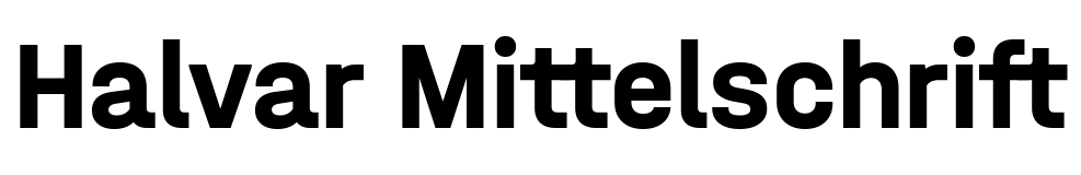
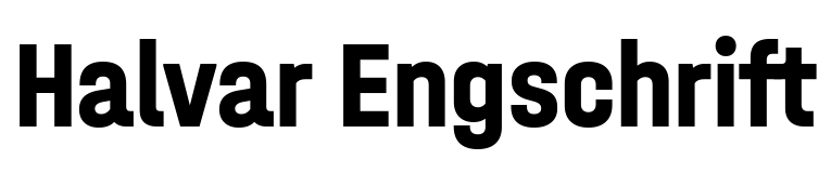
In general, the abundance of styles in the Franziska family is a notable feature of TypeMates releases. For instance, you could compare it with Jabana from Nils Thomsen, which has 20 stylistic sets. Jabana’s OpenType features include Contextual Alternates, where every letter, figure, and symbol has three alternates. Or take a look at the 64 styles in Nils’ Conto superfamily. It seems that TypeMates aims to cover every possible use for its typefaces. Given the variety, it seems almost impossible not to find a suitable application for one. “We canʼt make simple typefaces,” Jakob adds, “because while they might look simple, their system is always complex. We create several masters, add different weights, and are never satisfied with just designing regular and bold fonts.”
La Serna de Iguña Avenida Óscar Salcedo F/88 nepremišljenost encasillamiento
rannsóknarréttur aix-en-provence Franz Xaver Mozart Reinfeld Holstein
Khartoum-Omdurman 34 Quai de Vincennes dvanáctihodinovou sensacionalista
skeiðarársandur Pasquale Anfossi 690 Brown Trek E/58 counterpicketed
Another captivating aspect of their work involves undertaking challenging projects. When Cera was customized for Dictionary.com, a leading digital dictionary, it required the design of phonetic letters. Dictionary.com also utilizes Cera as a Variable Font to compress the large amount of vector data into a manageable size for its website.


TypeMates’ members are big proponents of OpenType features. Since 2018, they’ve worked with Worksheet Crafter to create fonts for the handwriting worksheets used in primary schools. The custom VA Plus typeface includes fonts with connecting letterforms, designed according to standards in place within the German educational system. “VA” stands for Vereinfachte Ausgangsschrift or simplified connection script. The VA Plus family includes different styles, including an outline version and a Schwungschrift, which features swash characters. To build the fonts, TypeMates cut letters apart and experiment with OpenType. The final letters get assembled on the fly by combining several different glyphs. The foundry admits that this is quite complex. It may not be flawless, but it is a novel and interesting approach. For more information, check out their article, WsC Fonts and Mental Entanglement.

The creation of VA Plus involved extensive work with OpenType code.

Initials and connecting strokes from the “Schwungschrift” font in the making. The form of the initial letter continues over to point where the next letter begins.
Despite all the careful work that goes into building OpenType features, we can never really know if users are implementing them to their full potential by users. “We aren’t sure if users even activate OpenType features,” Jakob lamented, “or if they are even aware of them.” When I asked TypeMares what they think could help to increase awareness, Lisa replied that students need to be taught about OpenType. “There should be a focus on it in design education,ˮ she said. “I think software should have more pop-ups,” Nils added. “You hear about OpenType once, and then just forget about it. Maybe Adobe can hire programmers from Instagram. Instagram has a lot of pop-ups” [laughter].
veröffentlichung František Jiránek 473 Thomas Bell Manor No. 25 barotraumatisme
autobiografisch Sterling Heights skeiðarársandur Giuseppe Valentini
nepremišljenost Pietro Locatelli 9 Paul Stewart Glade antiescorbútico
One of the latest TypeMates releases available on Fontstand is a pair of typefaces, Piet Mono and Piet Sans. These are characterized by quirky numerals and large rounded-off ink traps. Nils devolved the concept for Piet on a trip to Finland. He was captivated by their license plates, which inspired Piet’s unusual numbers. “When I started working on Piet, it was a fun project,” Nils recalled, “but things got more complex. I only had uppercase letters and figures [from the license plates], but I had to come up with lowercase letters on my own. There was no reference available for those.”
Jakob joked that “our weak spot is that we always find a way to make the typefaces more complex. It happens to us all the time.” You can see that in Piet Mono’s rotated italics, one of the design’s outstanding features. “I always want to experiment,” Nils told me, “so I rotated the letters. It was easier to pull that off here because it was a monospaced design.”
Reinhard Keiser 91 Parc Lola Duval verschlimmerung Bowral–Mittagong
630 Carter Bend idiomatiquement Castellar-Oliveral saltvandsområde
Carrer German A-46 připomínajících musikinstrument Ernesto Halffter
Giuseppe de Majo Horngasse 64 photodissociate Khartoum-Omdurman
Although TypeMates is always busy with custom projects and preparations for new releases, they try to make time for personal projects. One of the upcoming releases is Gregory, which promises to replenish the collection of hybrid typefaces suitable for long text yet with enough individuality to stand out in headlines. Gregory will consist of a sans-serif family, Gregory Grotesk. That will be joined by two serif families: one for headlines, and another for body-text sizes. “We’ve been working on them for three years, being distracted by custom work,ˮ said Jakob. “In small sizes, Gregory Text resembles Franziska in some ways. After ten years of Franziska, you end up shaping text in the same texture.”


Another future release will be a typeface they are working on with the Dutch type designer and educator Albert-Jan Pool. That will be a special release for TypeMates since Albert was their teacher at the Muthesius Academy. “Maybe this is similar to how TypeTogether worked with Gerard Unger,” Jakob joked. “We’re publishing a typeface from our teacher.” Lisa is currently working on Helvetica constructed typeface, “something uncomplex, extended with condensed axes,” Jakob added, “which is getting complex again” [laughter]. “Maybe we are not that cool,” he said while summing up the upcoming releases, “but we make functional typefaces that work.”