In November, the BBC science fiction program Doctor Who celebrated its 60th birthday. On the air from 1963 through 1989, the show was shelved – with a few exceptions – until it returned in 2005. Doctor Who is the longest-running science-fiction property on television. Its central character is a humanoid alien who travels through time and space. Most of the companions who join him are humans from Earth – usually from Britain – and his ship is camouflaged as an old blue police box. Created to fill a lull in the television schedule with something that could teach children about science and history, the show has “regenerated” many times over the years. At times, it has been inspired by James Bond, Sherlock Holmes, the Hammer horror films, pantomime, other science fiction properties like The Quatermass Experiment and Alien, or all of those at once and more. From the first episode that was transmitted, its opening title sequences have combined sound and image in unique ways. While never the main focus, typography has always played an important part in those sequences’ design.
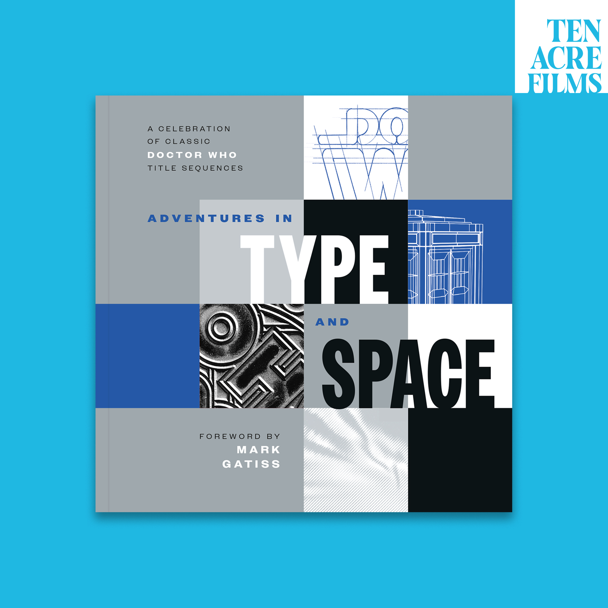
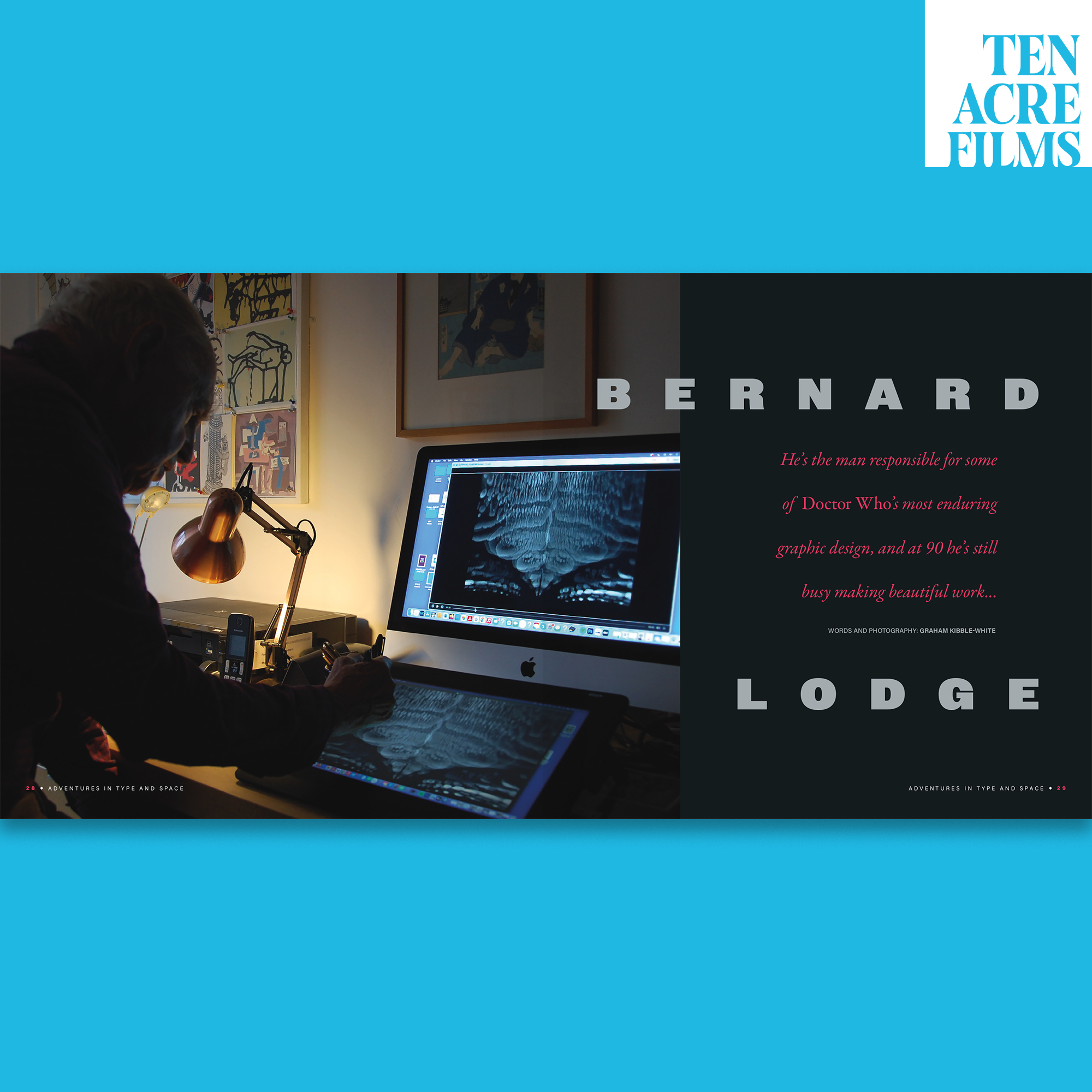
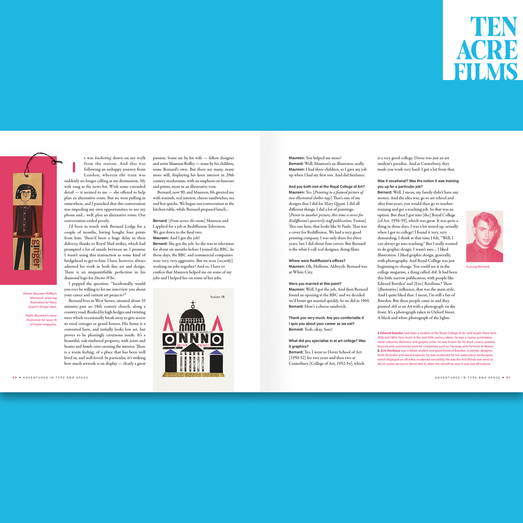
Adventures in Type and Space: A Celebration of Classic Doctor Who Title Sequences was created by Graham Kibble-White, Jack Kibble-White, and Stuart Manning. It shines a light on design for television during the 1960s, ’70s, and ’80s. A number voices are featured, including a foreword from Mark Gatiss. An actor and screenwriter, Gatiss has penned screenplays for multiple 21st-century Doctor Who episodes and, as an actor, he has guest starred in several more. Published by Ten Acre Films in London, the book discusses the work of multiple designers. Aside from design itself, its protagonist is probably Bernard Lodge, a BBC graphic designer during the 1960s and ’70s who first worked on Doctor Who while it was still in development.
Growing up in Baltimore in the 1980s and ’90s, I began watching Doctor Who on television regularly when I was about eight years old. The show ran on Maryland Public Television, although the episodes started around 11:30 p.m. on Saturday nights, so I must have seen more beginnings than endings. I followed Doctor Who religiously until I was about 13, and even over the next few years, I continued to watch the program if I was home, and I did not like the Saturday Night Live hosts or musical guests. I started rewatching the “classic series” in 2004, just before Doctor Who came back on air in the UK. I bought as many of the DVDs as I could before it was possible to stream episodes or purchase them on iTunes. Since podcasts became available, Doctor Who fan shows have always been in my feed. And it was through an interview on Radio Free Skaro that I heard about this book. I pre-ordered it immediately, and it arrived last week.
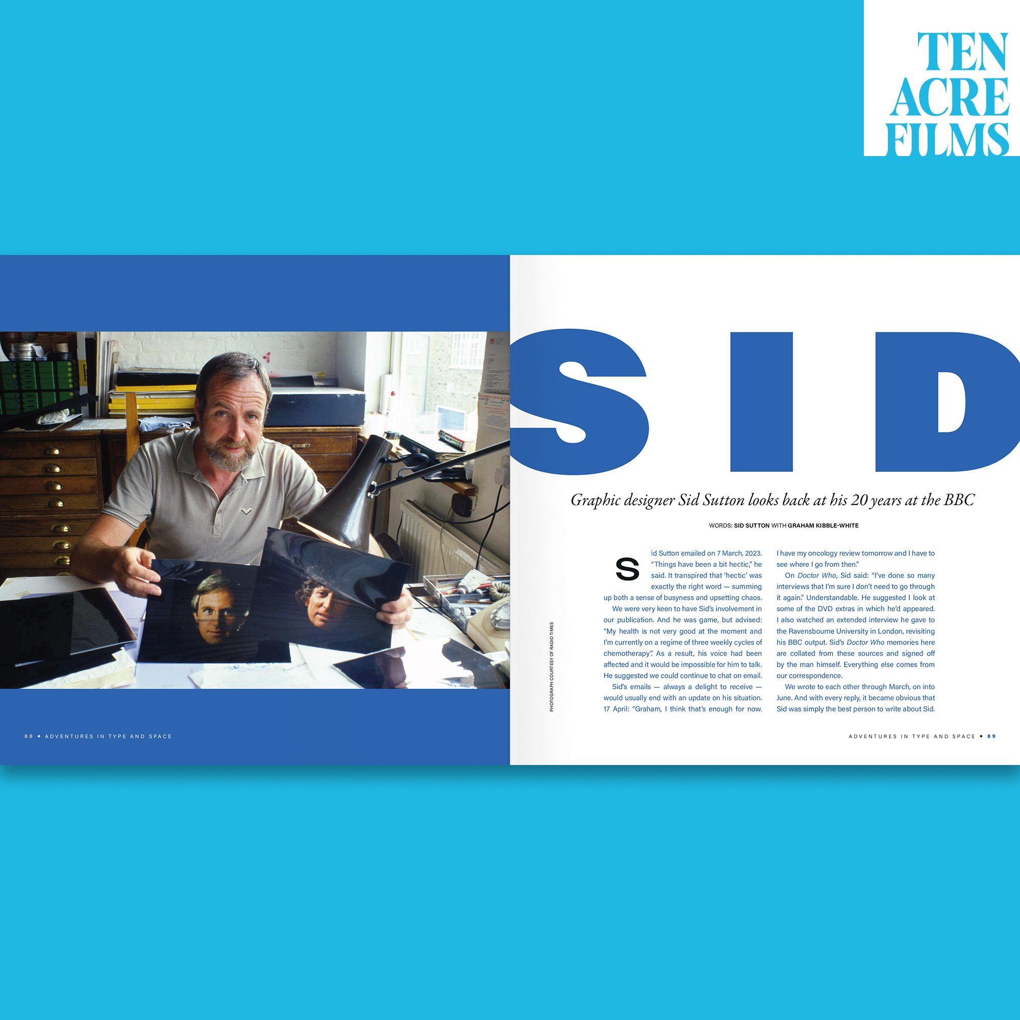
Adventures in Type and Space includes interviews with Lodge and Sid Sutton, another former BBC graphic designer, who passed away last year. An interview with Oliver Elmes’ daughters is also in the book; their father designed the last classic-series Doctor Who logo, introduced in 1987. Readers will also find an interview with Gareth Edwards, who programmed the last of the nine opening title sequences created before Doctor Who went off the air in 1989. Still more chapters focus on the above-mentioned designers’ other work; references to other programs’ opening title sequences can also be found, and Lodge explains some of his effects for Ridley Scott’s Alien and Blade Runner. Adventures in Type and Space also has a text from Peter Govey, who was responsible for the first of the sequences embedding into this post. Additional chapters detail the creation of the BBC’s design department, and describe two filming techniques used to create early Doctor Who title sequences: howlaround and slit-scan.
Even if you aren’t a Doctor Who fan, the book includes chapters you may still appreciate, such as one dedicated to the design and production of end credits through the 1980s. These were initially printed – before being replaced by photo-typesetting and eventually by digital composition. While they were still made via letterpress, the designers had to make do with a relatively limited palette of foundry-type font from Stephenson Blake and brass type from Masseeley. There’s also a chapter about Futura and type designer Rian Hughes is interviewed about it – an interesting external voice in the book, as he has no connection with the program. Other typefaces get a mention throughout the book, including Stephenson Blake’s Condensed Sans No. 7, Eurostile Condensed, Helvetica Rounded, and Microgramma. There were other typefaces used in the classic series that are not explicitly mentioned in the book, like Della Robbia Bold, VAG Rounded Bold, and Univers 59 Ultra Condensed.
While the book does not mention the typefaces used to set it, Owners – from Jeremy Mickel – is used (see Owners and Owners Text).
When William Hartnell, the first actor to play Doctor Who’s titular role, was unable to continue acting due to ill health in 1966, producers cast Patrick Troughton to take over. The in-show explanation for switching actors was that The Doctor could regenerate their body, essentially becoming a new person with a different appearance and attitude while retaining previous memories. During the 1970s, when the third actor to play The Doctor was replaced by the fourth, the show dubbed this process “regeneration.” Almost all aspects of the show regenerate as well, including the opening title sequence. Nevertheless, some aspects remained in place from one sequence to another. The opening titles at the top of this post, which ran during the second half of the 1970s, still essentially used Delia Derbyshire’s 1963 arrangement of Ron Grainer’s composition for the theme. Yet, in 1980, even that would change – although the theme’s subsequent arrangements always kept aspects of the original composition. You can hear an example in the sequence below.
I’ve only been able to highlight a few aspects of Adventures in Type and Space in this post. There is much more to discover in its pages, including Herb Lubalin references, a logo designed by Lodge that Doctor Who used before and after his diamond-shaped creation, and more of Sid Sutton’s 1980s designs for the program. Adventures in Type and Space barely addresses other ways that type was used on screen in the program; that contrasts it with Dave Addey’s Typeset in the Future: Typography and Design in Science Fiction Movies, which goes into depth about the typography of film props, too. On the other hand, there isn’t a Doctor Who chapter in Addey’s book, as the property has mostly been limited to television, audio plays, books, stage performances, and comics. Two Doctor Who films starring Peter Cushing were made in the 1960s, but typography did not play as noteworthy a role there as it did on the small screen.
As of this writing, Adventures in Type and Space is sold out. Hopefully, its popularity will prove cause enough for a reprinting. As for Doctor Who, it returns to BBC One and the BBC iPlayer in the UK and Disney+ in most of the rest of the world this May.
Summary
Adventures in Type and Space: A Celebration of Classic Doctor Who Title Sequences, created by Graham Kibble-White, Jack Kibble-White, and Stuart Manning
Published by Ten Acre Films in 2024. 156 pages. English language, 21 cm (8 inches) tall. Perfect bound.
The authors call it a “bookazine.” Proceeds from sales will be donated to Unicef, Bernard Lodge’s chosen charity.