Aeroplan’s letters are sturdy in their construction, and there is a good deal of variation between the lowercase letters’ widths. The vertical serifs on the capital letters are scalloped, which feels like a nice echo of Johann Michael Fleischmann’s 18th-century serif types. You can see what I mean by looking at the “G” and “E” in the first two lines of the specimen below.
The family discussed here is Nina Faulhaber’s first release. She began designing Aeroplan as a student in the design department at Augsburg, Germany, where Maurice Göldner is a type-design professor. Typographically speaking, Augsburg has been in the design press a few times lately, most recently because of typography professor Michael Wörgötter’s facsimile edition of a West-German specimen-card collection. At the moment, Nina is studying on the typemedia master’s degree course at KABK in The Hague.
TypeTogether published Nina’s typeface because she entered it into that foundry’s Gerard Unger Scholarship competition, and she won. Several more of TypeTogether’s scholarship-winning typefaces are on Fontstand, too, including Bely, Noort, Lektorat, and Rezak.
Gutachten und Urteile die Schriften Romanisch von Schelter & Giesecke, Mediäval-Antiqua von Riegerl, Weissenborn & Co. und Lateinisch von H. Berthold betreffend hervorgegangen aus den Musterschutz-Prozessen der Firma Schelter & Giesecke
Elzevir letters are too tall. The Dutch type was presently to take its turn as the prevailing fashion. Previous to that, however, we must notice that the Parisian fashion had been adopted in England with conspicuous success by
on parvient facilement à se convaincre que les mêmes caractères ont été employés pour les unes et pour les autres. Ces caractères sont de la dimension connue en typographie sous la désignation de petit-texte
suo nipote. In tal anno pare morisse o si ritirasse Luigi, il cui emblema era: Concordia res parvae crescunt, e lasciò quattro figli, due dei quali Arnoldo e Joost, o Giusto, non seguirono la professione paterna
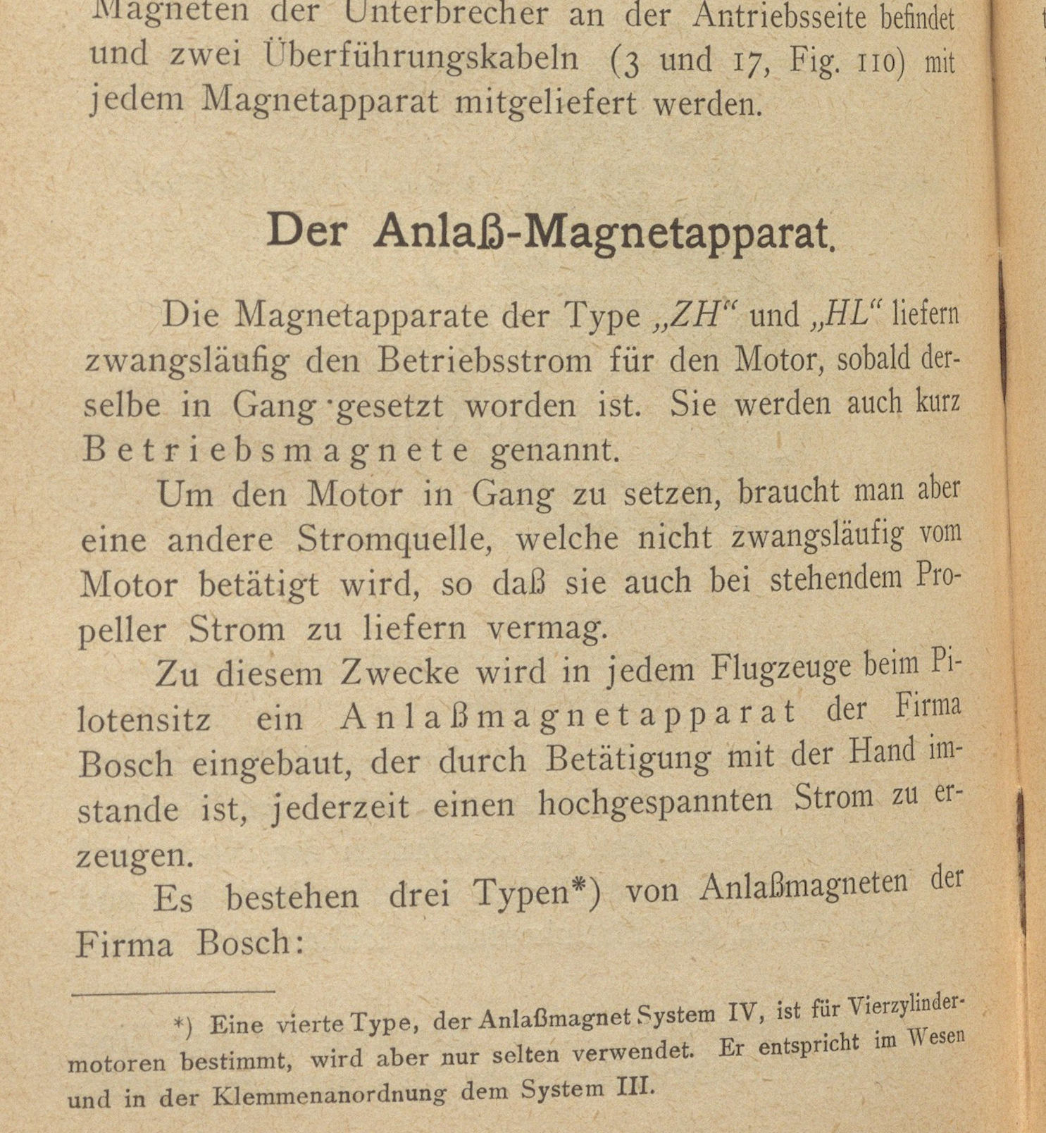
For decades, typeface reviving has been a popular exercise for students in type design classes. Aeroplan’s design is influenced by letterforms Nina found in a small manual printed in 1916, Motorschule für Flieger, an early book on aviation mechanics. She began creating a series of fonts under the working title of Flieger, a German term for an airplane. In an interview with TypeTogether, Nina mentioned that her design was “similar to the body types distributed at that time by many foundries as ‘Mediäval Antiqua.’”
Nina also mentions that she was not “able to determine the exact origin of the typeface. However, the publishing house, Waldheim-Eberle A.G. Wien-Leipzig, had its own foundry that produced type for in-house use only.” She reasonably concludes “that the typeface [could have been] produced there [but that it] was never advertised outside the publishing house, and has since been forgotten.”
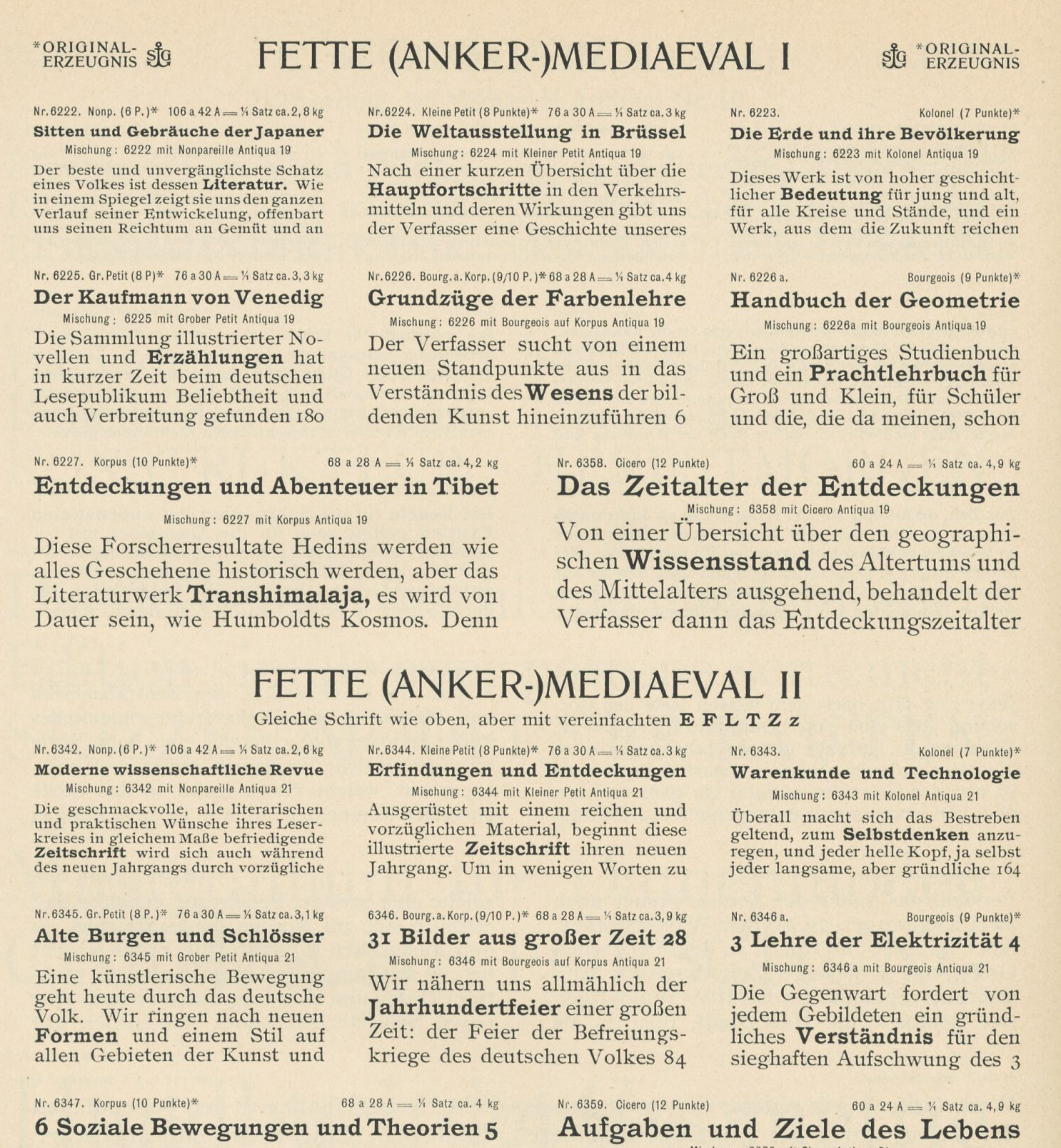
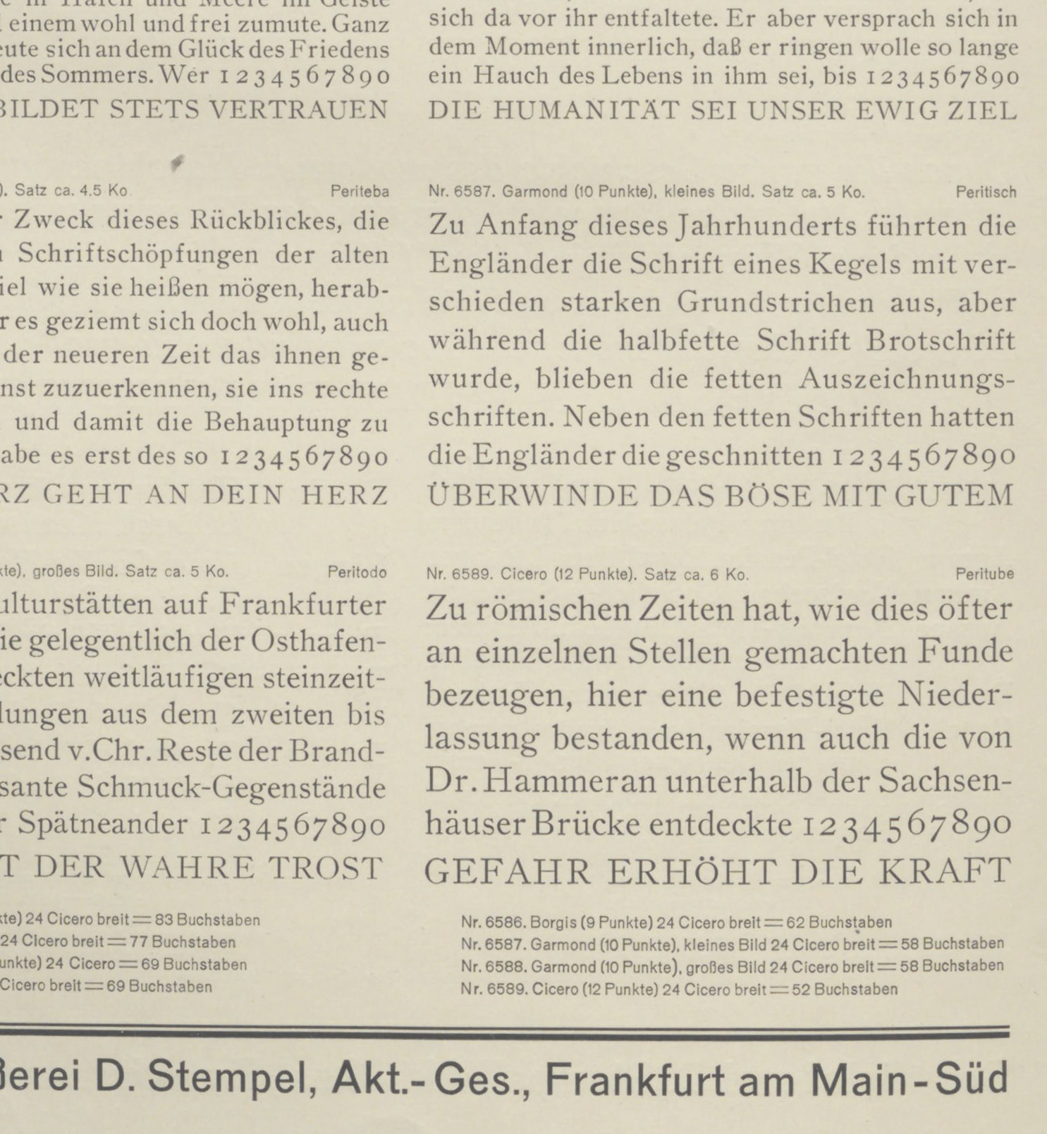
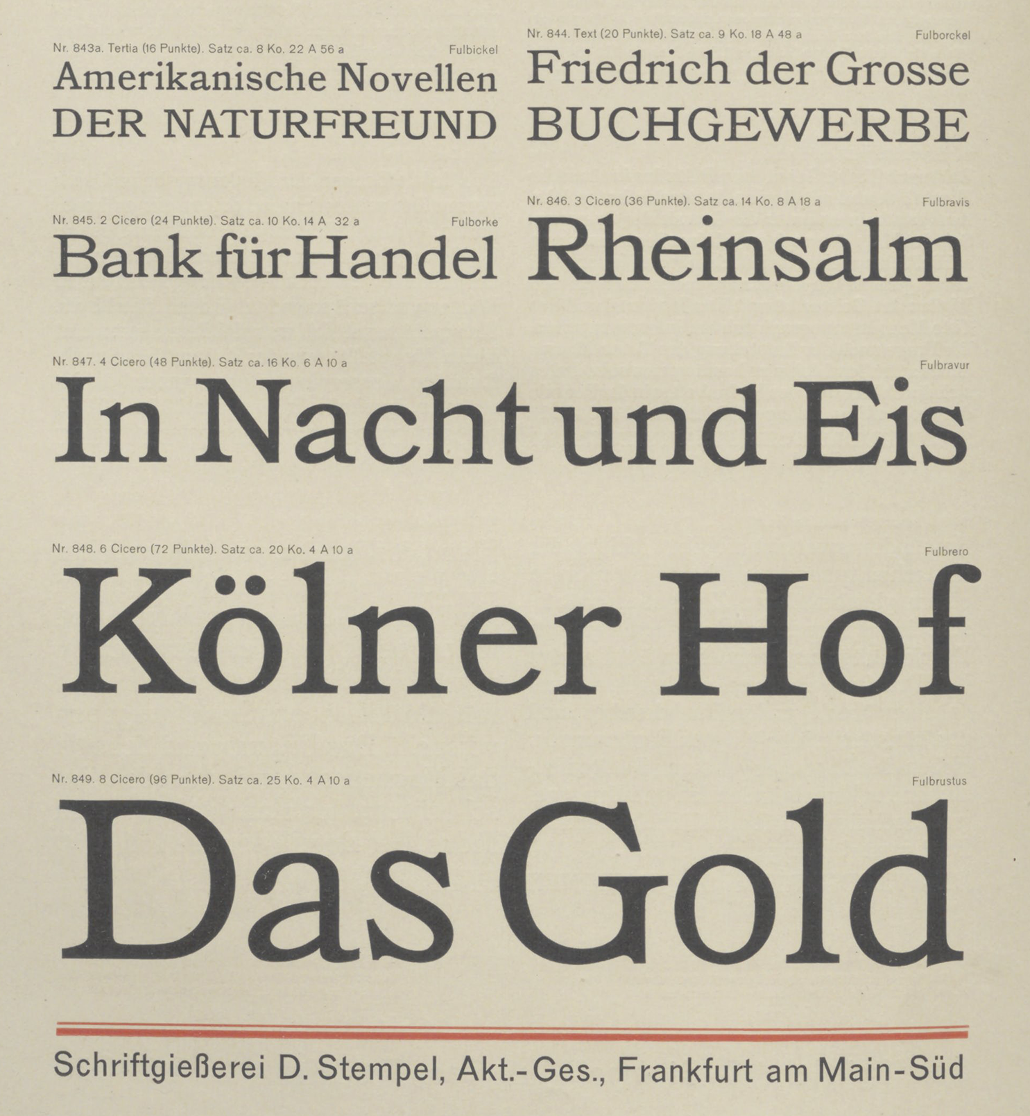
In late 19th and early 20th century German typography, Mediäval-Antiqua was not quite a specific term. Instead, typefoundries applied it to a broad range of designs. Strictly translated, it means medieval roman. But a better English translation is old-style serif. The term was initially applied to German castings of mid-19th-century British old-style revivals. One 1926 source suggests that letterforms similar to Aeroplan’s bolder weights originated in Italy during the 1870s, although I suspect those chunkier types reflected American trends instead.
At the beginning of the year, I asked fellow Fontstand News author Indra Kupferschmid which typefaces from 2023 she’d found particularly noteworthy and should be reviewed. I think that “Aeroplan” came back as a single-word text message. Indeed, Aeroplan is a good typeface, especially it is especially remarkable as a type designer’s first release. Its quality speaks both to the underlying skills of its designer, her teachers, and the coaching and mentoring that TypeTogether provided.
Being a good first release, though, isn’t usually one of the grounds designers consider while they are selecting a typeface. So, let me provide additional reasons, relevant for practical work. Aeroplan is a robust serif design for text composition. Obviously, all typefaces are intended for use in texts of some kind, but with “text-setting,” I mean longer text passages, as in book design or editorial design (I gotta be honest with you, dear readers, I absolutely hate the term “editorial design.” As shorthand for all the kinds of online and print publications it covers, I think it is pretty lacking). You could use Aeroplan for all the text on a website that needs several kinds of fonts – bigger, cooler-looking fonts for headlines, smaller and bolder fonts for subheadlines, and fonts for reading-text sizes. Aeroplan could just as easily find a home in a magazine, an exhibition catalog, an annual report, or literally any conceivable advertising and marketing pamphlet.
Most designers make their final font selections based on some kind of “vibe.” Aeroplan references a less common text-typeface style from the early 20th century. Like, maybe this should be the pick for museum labels in an exhibition about early-twentieth-century painting. Or a book typeface for short stories written around that time. Maybe you’ve already picked an art-nouveau style headline for a project – because plenty of designers have been doing that for years now, and Aeroplan could be a good candidate to pair that (you’re probably not going to set whole paragraphs of text in Eckmannpsych…). Or maybe you don’t care about history at all – but you just love the long connecting strokes on Aeroplan’s italics. You wouldn’t be wrong. We could all think of worse reasons to select a typeface, too. If you’ve read this far and you’re considering Aeroplan for a project, I hope you find a completely unexpected place and way to use it. Surprises like that wouldn’t just please me. I’m sure that they would surely delight everyone who had a hand in the typeface’s design process, too.


