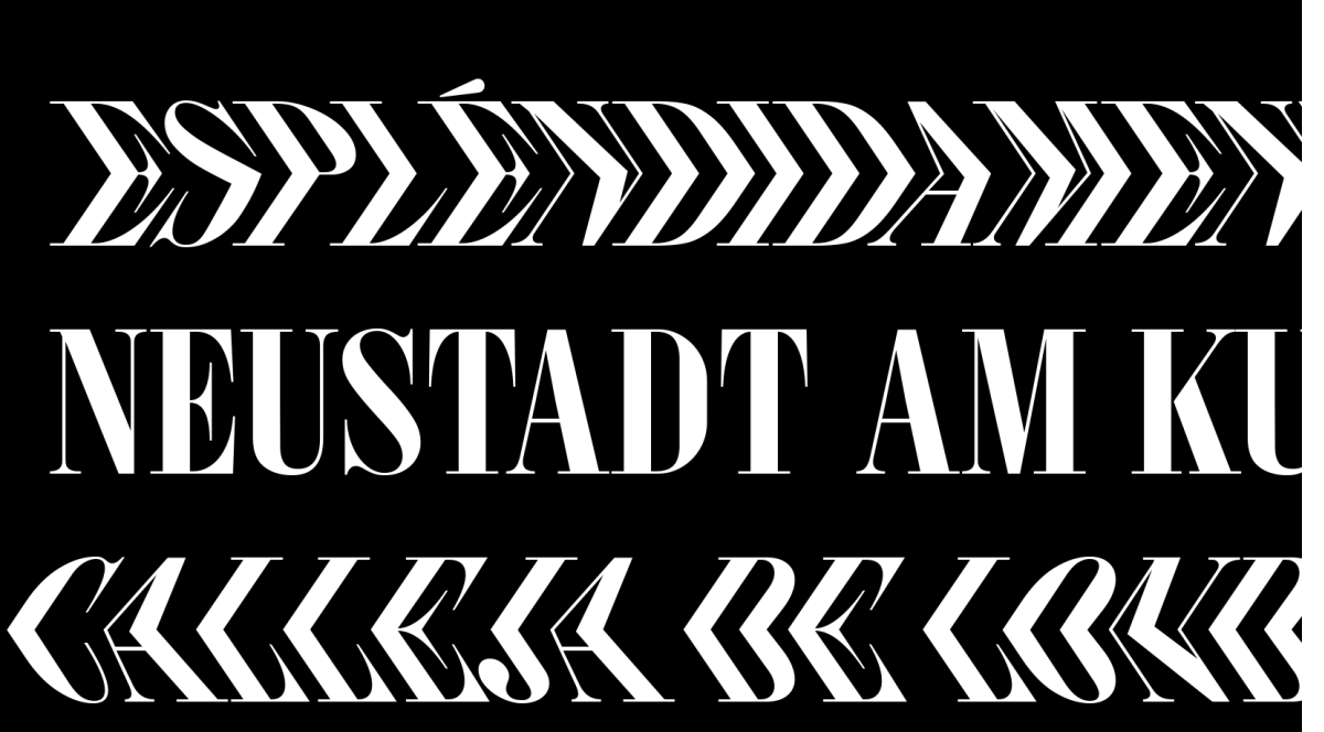
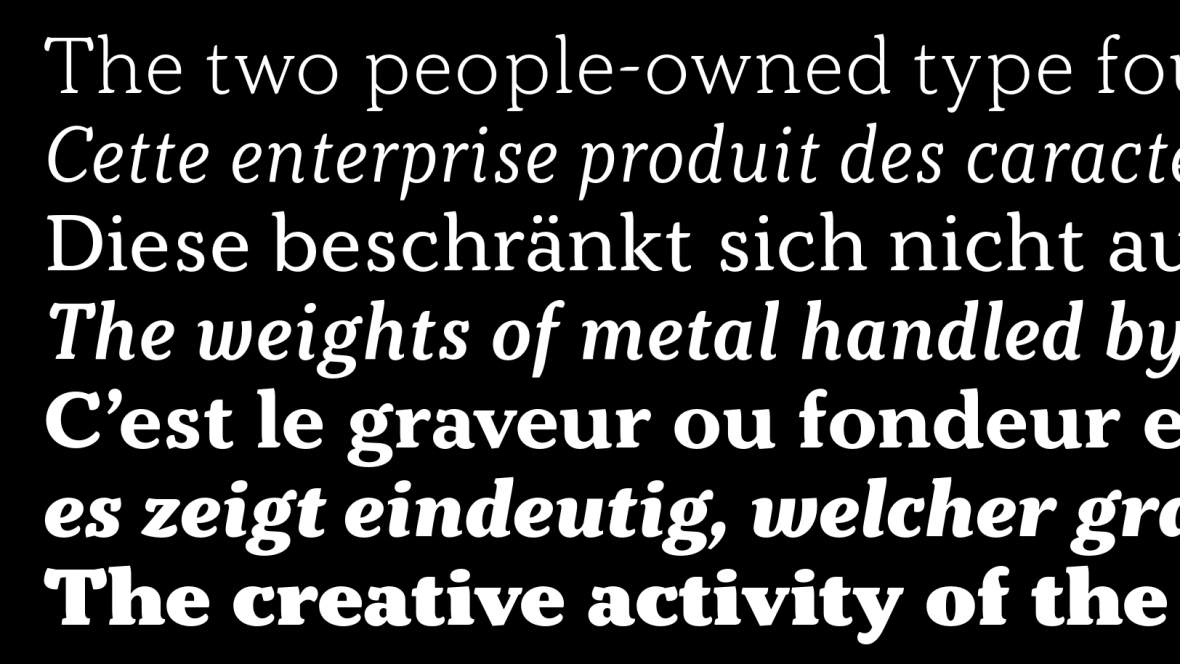
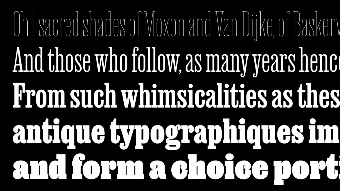
Dan Reynolds writes copy about type and is a design historian with a focus on late-19th century typefounding. He teaches typography in the design department at the Hochschule Niederrhein in Krefeld, Germany.
Michael Hochleitner explains how the latest Typejockeys typeface was developed. Like Anika, many of the foundry’s typefaces have grown out of custom projects.
David Shields’s book is out! The Rob Roy Kelly American Wood Type Collection: A History and Catalog. It is not just a must-have for any wood-type aficionados. The book sets a new typographic history bar.
On September 9th and 10th, Fontstand organized its third conference in The Hague. After years of necessary Covid restrictions, many community members were thrilled to gather together in person again.
This variable design turns its back on a common tendency of adopting Clarendon-style letters to text-typeface proportions. David Jonathan Ross and Bethany Heck returned Clarendon to its more condensed 19th-century roots.
Typotheque extended eight of its typefaces to support the Canadian Syllabics used to write many of the Ingenious languages in Canada. Along the way, it expanded their Unicode encoding, too.
Fonts inspired by Claude Garamond, Robert Granjon and Jean Jannon are the backdrop to many of the books we read, as well as websites like this one. Just how many typefaces based on the work of French Renaissance punchcutters can you find on Fontstand?