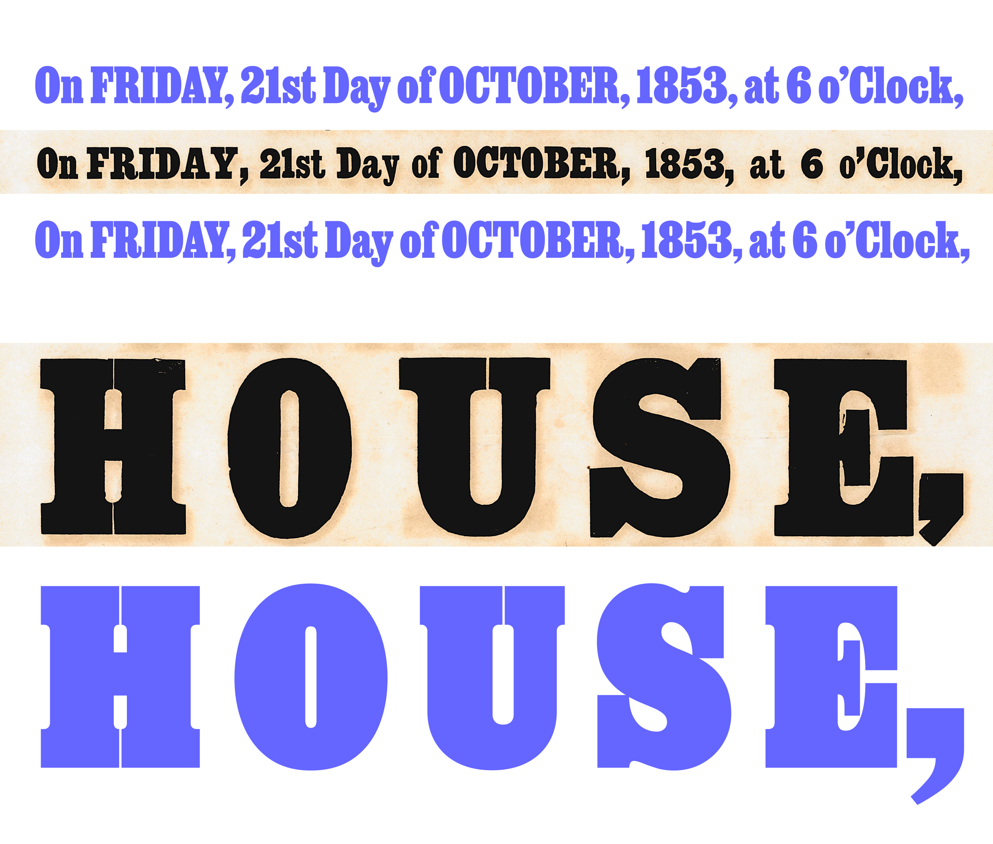
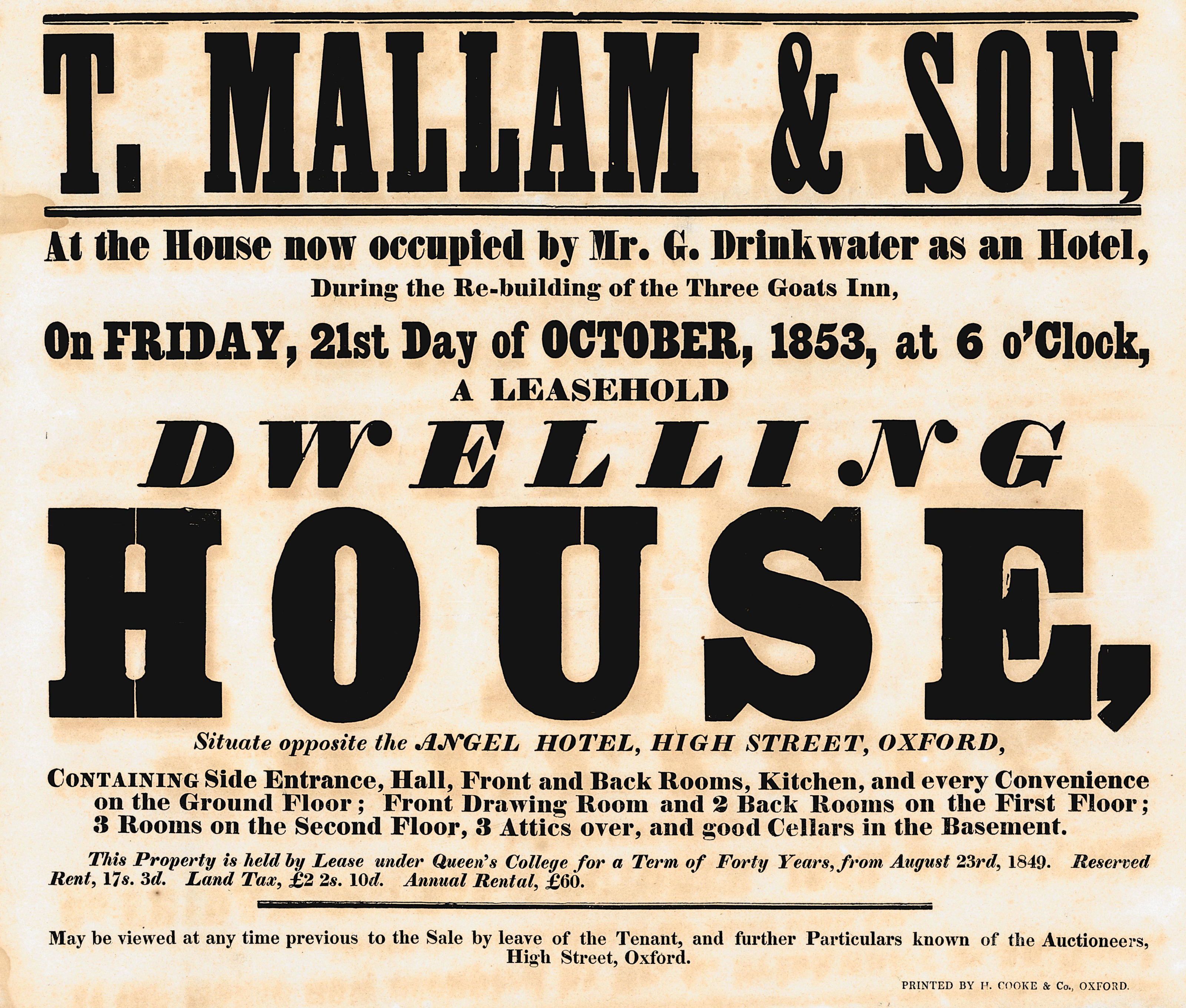
David Jonathan Ross designed Job Clarendon in collaboration with Bethany Heck. He published the first part of the typeface under the name Heckendon by sending a Hairline-weight font to his Font of the Month Club subscribers in August 2020. By March 2021, when Club members received several weights and a Variable Font file, Ross had renamed the design Job Clarendon. The term “Job” comes from “jobbing printing” (Akzidenzdruck in German), which encompasses everyday kinds of printed pieces like advertisements, business cards, invitations, etc. During the 19th century, jobbing printing grew and flourished in many parts of the world, just like printing itself. Clarendon-style typefaces were one of several typographic innovations pioneered in Britain during the 19th century. While it was probably not introduced into printing explicitly for the jobbing market, Clarendon and typefaces like it quickly joined other varieties of slab-serifs, fat faces, and sans serifs there.
Job Clarendon is a display Clarendon design. Regular Fontstand News readers might remember it. A few weeks ago, Matthijs Sluiter described an Austrian campaign promoting the play Tennessee Blend it in Fonts In Use: Variable Fonts. That campaign was designed with the typeface.
What are Clarendon-style typefaces?
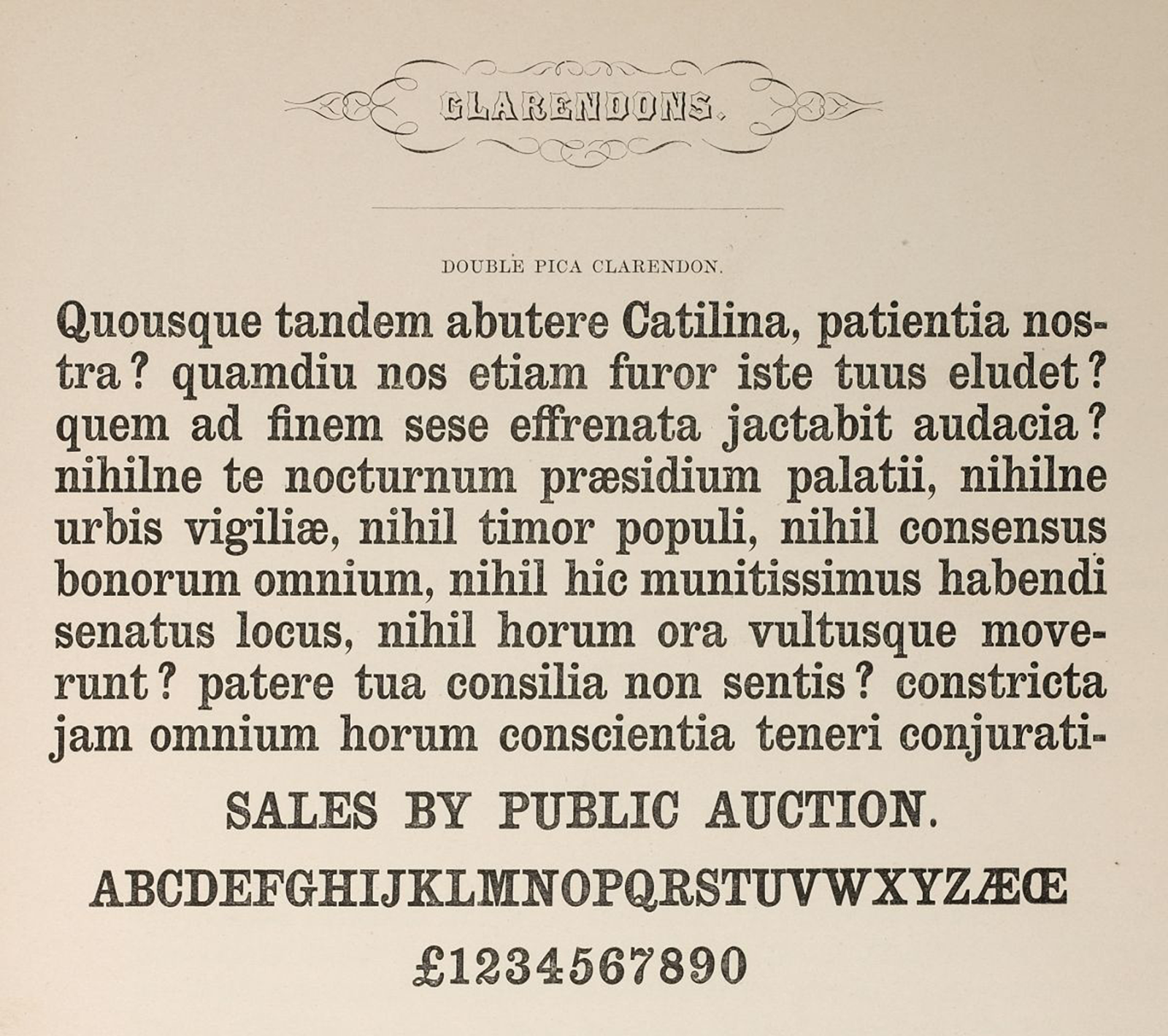
Typeface classification uses terms that are not necessarily universally understood. Even looking at 19th-century typefaces, the term “Antique” might mean different things to different people today. But, we need some classification terminology to have good discussions about typefaces. Clarendons are a subcategory of slab serif typefaces named after a specific progenitor cast in London in 1844 (more on that below). The most defining feature of this style of typeface is that its serifs are bracketed to its letters’ vertical stems. “Bracketing” describes a curved transition between stems and serifs. Most earlier slab serif typefaces did not feature bracketing. It is possible that many designers today, when they think about slab serif typefaces, only imagine un-bracketed examples like Akkordeon Slab, Farao, Mortise, or Muriza.
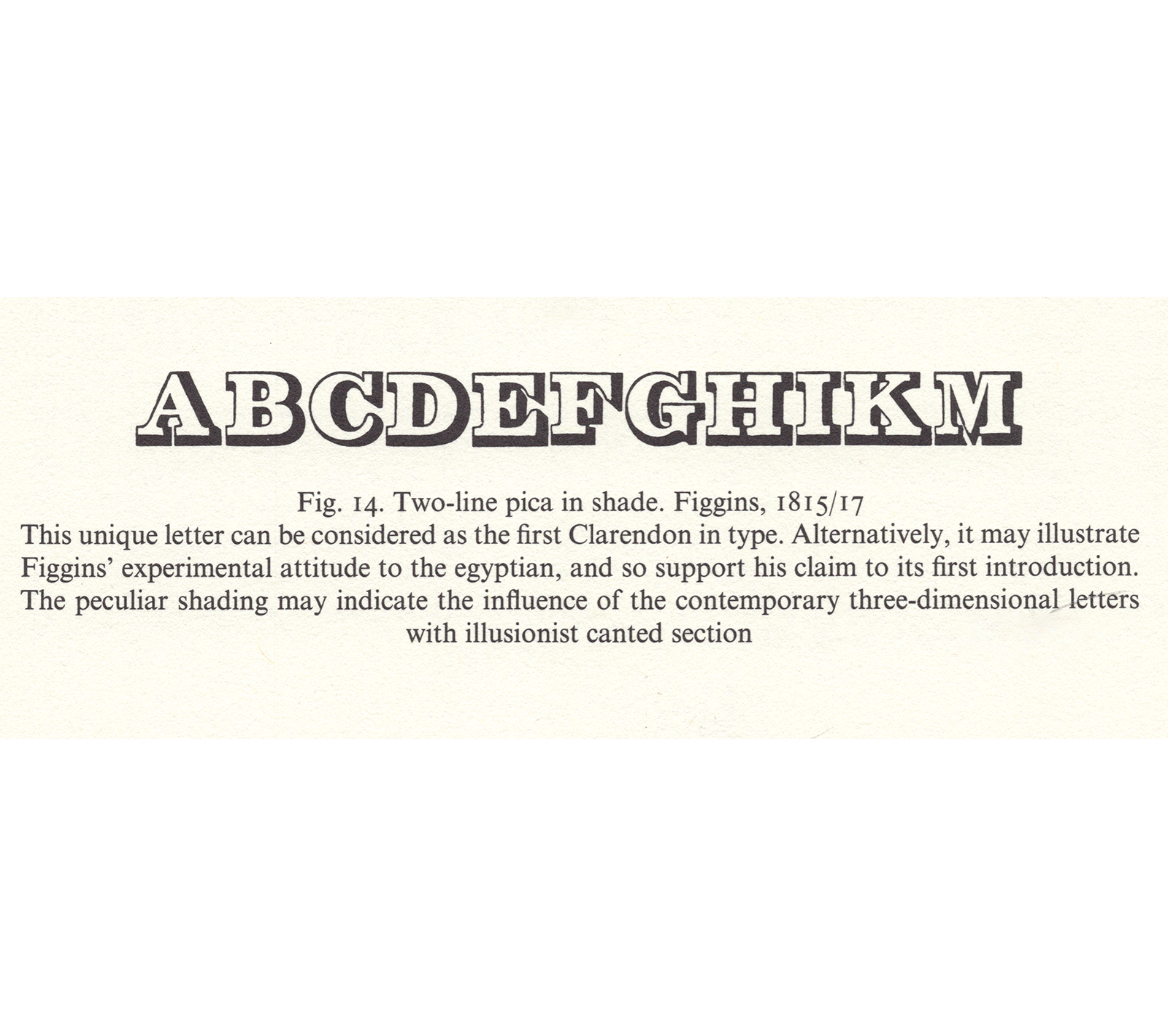
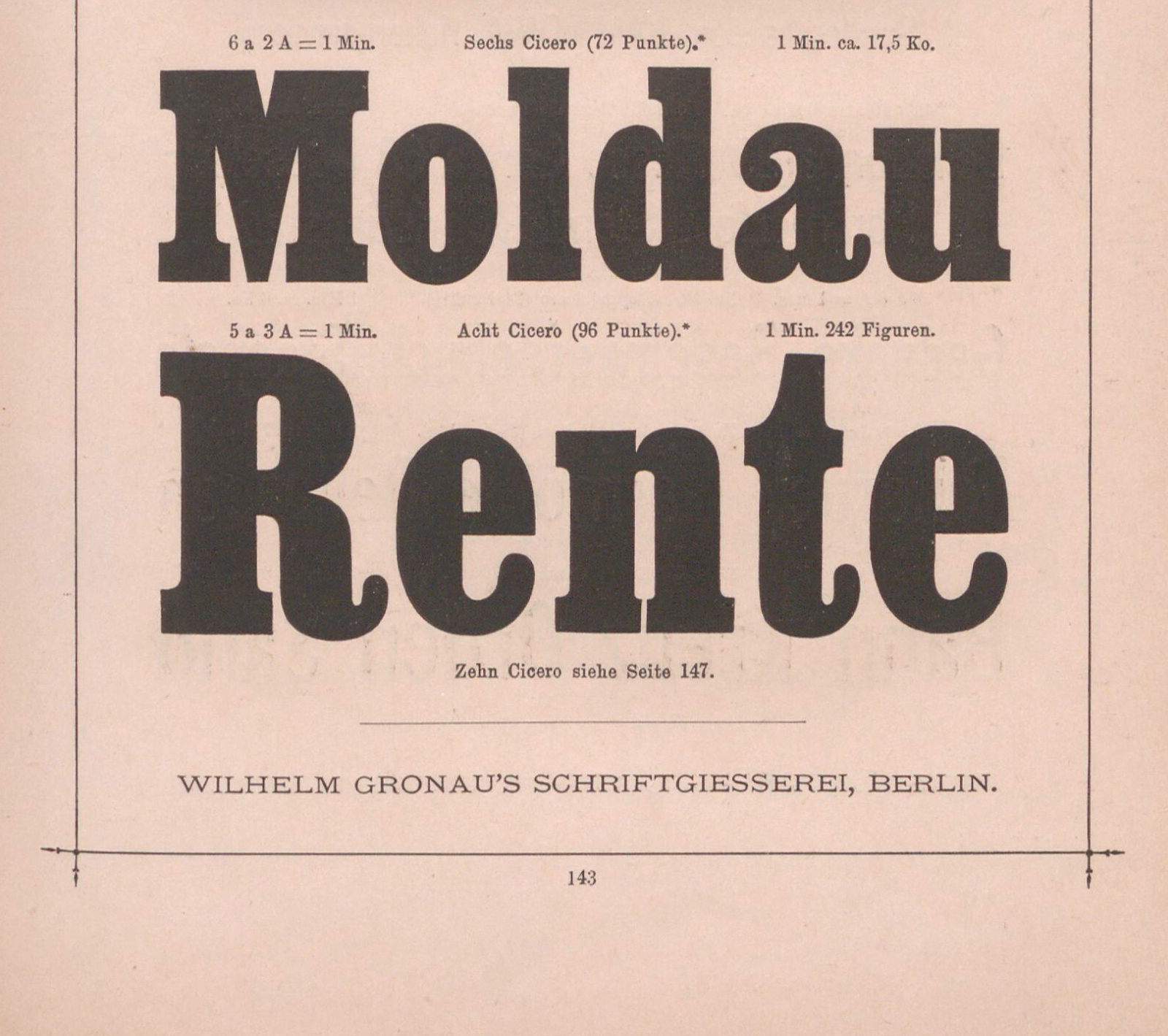
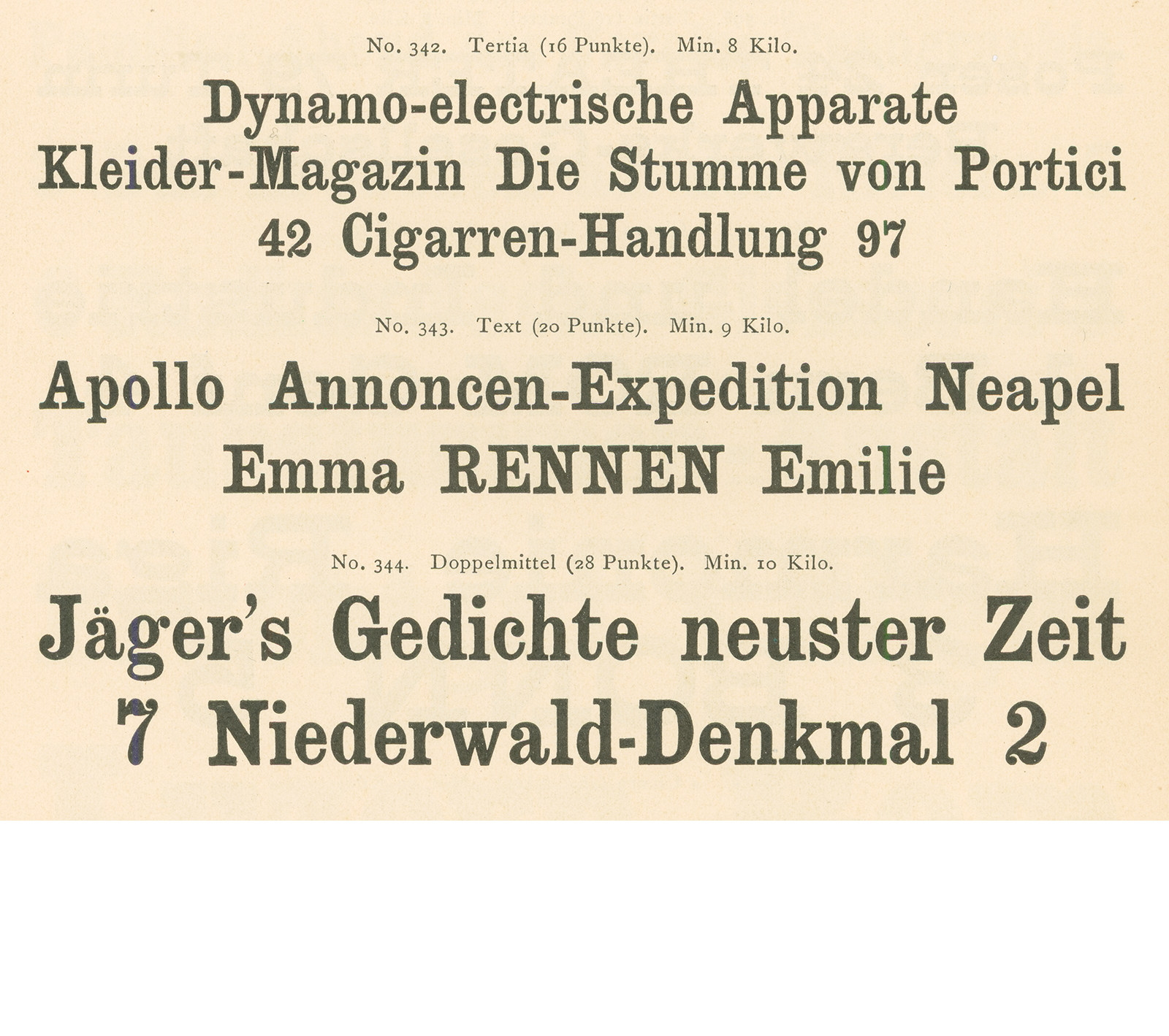
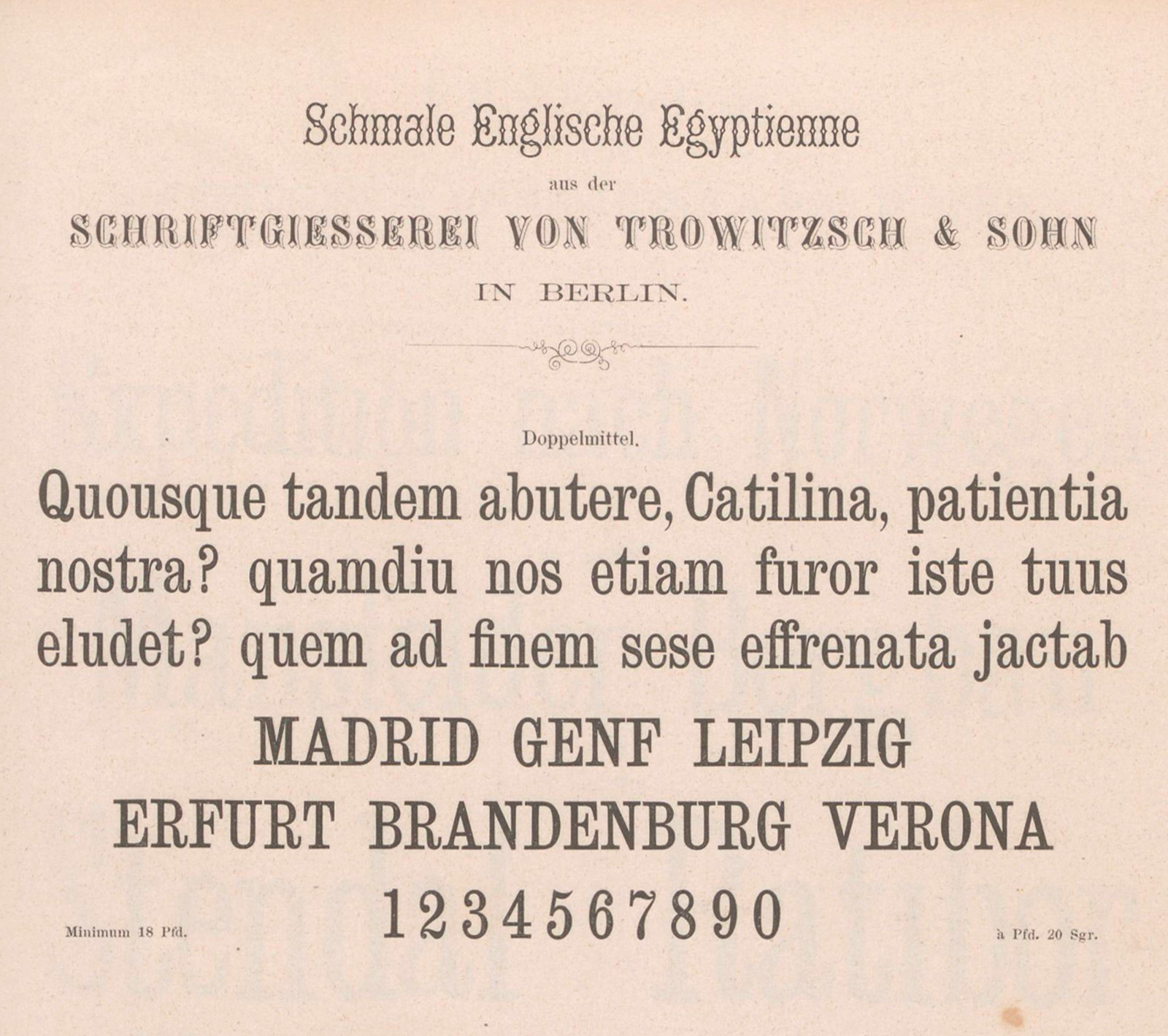
The first typeface named Clarendon was published by the Thorowgood & Co./Fann Street Foundry in the mid-1840s. Robert Besley designed it, and Benjamin Fox cut its punches. While Besley’s company introduced us to the typographic term “Clarendon,” it was not exactly the first type maker to produce a bracketed slab serif typeface containing lowercase as well as uppercase letters. As Commercial Classics explains, the Caslon foundry – also based in London – published its Ionic typeface a few years earlier. And Nicolete Gray, in her seminal book Nineteenth Century Ornamented Type Faces, wrote that a third London-based foundry was responsible for the introduction of heavy display capitals with bracketed serifs. According to her, Vincent Figgins had published “Outlined” and “Shadowed” typefaces by 1817.
Oh ! sacred shades of Moxon and Van Dijke, of Baskerville and Bodoni ! what would ye have said of the typographic monstrosities here exhibited, which Fashion in our age has produced ?
And those who follow, as many years hence as you have preceded us, to what age or beings will they ascribe the marks here exhibited as a specimen ?
From such whimsicalities as these, after-times may fall into many a whimsical illusion ; and it is not impossible but unique
antique typographiques imprinted in “London City,” may be sold to the best bidder as genuine Egyptian relics of antediluvian origin,
and form a choice portion of the treasures in the museums of the virtuosi !! With respect to the colour of printing-ink, a difference of opinion certainly exists ;
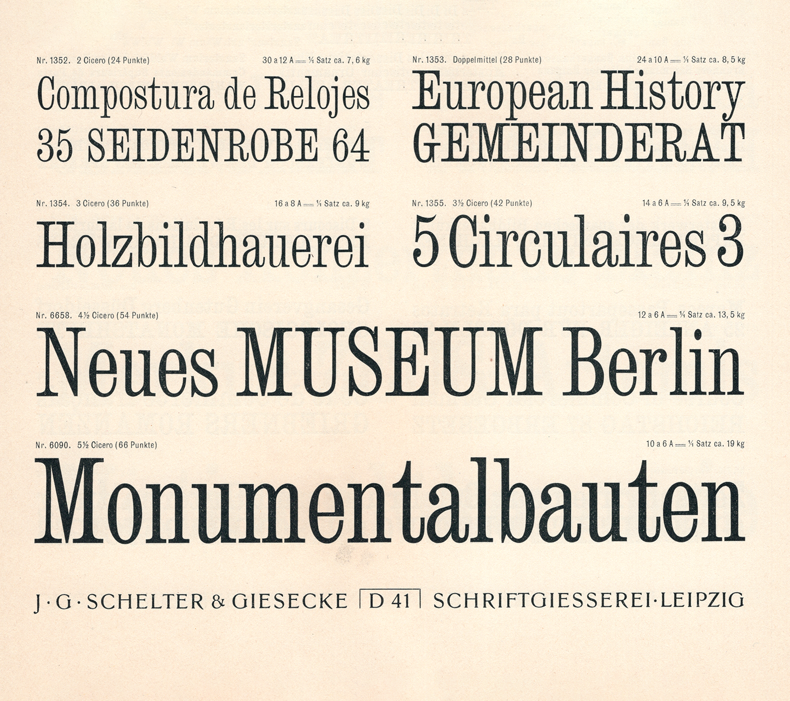
In the 19th century, many Clarendon-style typefaces tended to be condensed (the very similar “Ionics” perhaps less so). Clarendon and Ionics’ bracketed serifs were one thing they had in common with their contemporary text typefaces, and their letterforms also had stroke contrast, as text faces did. Some strokes were thick, while others were thin. In the mid-20th century, typefounders began reviving Clarendons. That new wave of products, including the Haas typefoundry’s Clarendon and Stephenson, Blake & Co.’s Consort, were not condensed. As a result, many designers working today probably don’t associate the term Clarendon with condensedness. But Job Clarendon brings narrow letterforms back to the Clarendon fore.
While the first Clarendon typeface was not cut for display use per se, it was intended to create for emphasis. The 1840s were still decades before type families became common. While plenty of foundries offered typefaces with a common design across a range of sizes, Besley and his colleagues did not sell typographic systems of regular and bold interpretations of an overarching system. Instead, printers could drop words set in Clarendon into lines and paragraphs of text otherwise composed with the normal serif typefaces of the day. The text in Clarendon would be darker and bolder, bringing the readers' attention to it. But, seeing the potential the Clarendon style had for display typography, other punchcutters and typefounders adopted the model for that purpose. Relatively soon, large fonts of type interpreting the Clarendon style in wood and metal.
Currently, Job Clarendon is available in ten weights, as well as a variable font with a weight axis. While the family interpolates between hairline and heavy styles, Job Clarendon also gives the impression of providing multiple widths. The hairline weight of the weight axis presents very condensed letters. While the heavy letters are slightly condensed in the grand scheme of things, they are still much wider than the condensed hairline letterforms. In practice, many designers using Job Clarendon will select the exact weight-axis interpolation based on the width that instance provides.
Job Clarendon is probably the first explicit Clarendon-style variable font. However, other variable fonts released so far or currently in production can likely produce similar letterforms. One concrete example that comes to mind is VARIANZ, a project developed by Viktor Zumegen for his degree project at the FH Münster in Germany. These days, Zumegen is studying on the postgraduate type design course at ÉSAD in Amiens, so who knows what he will cook up next. VARIANZ’s design includes a serif and an expression axis, allowing for several kinds of sans or serif typefaces to be interpolated. I mentioned above that the defining feature of the Clarendon style is probably the bracketing between the vertical stems and slab-formed serifs, and VARIANZ produces that kind of letterform when the mid-range of the expression axis is combined with the high-end of the serif axis.
There are a few more Clarendon-style typefaces on Fontstand, including Duplicate Ionic, NN Colroy, and Passenger Serif. Each of those families includes italic fonts. Passenger Serif is the design most optimized for setting long passages of texts intended for immersive reading. I can certainly imagine designs that might use it, combined with Job Clarendon for texts set at larger sizes.

