You can raise a glass to success, friendship, and love, propose a toast to a god or destiny to give a blessing for an upcoming adventure or celebrate the support of friends and family in reaching a milestone. (And for those who prefer not to mix meanings with drinks, there's the biological explanation that we toast because it involves all the senses.) Searching for the stories behind these four drink-related designs, it turned out that for half of them, the bond between brewer and designer existed long before the commission. Cheers to family ties, health, and typography!
Ferraria D’Alge
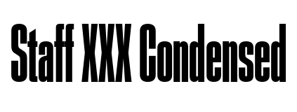
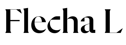
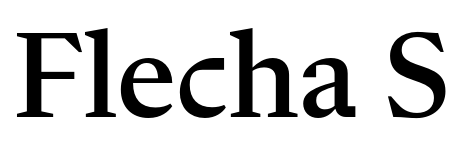
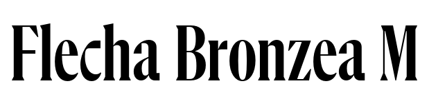
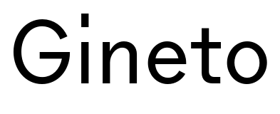
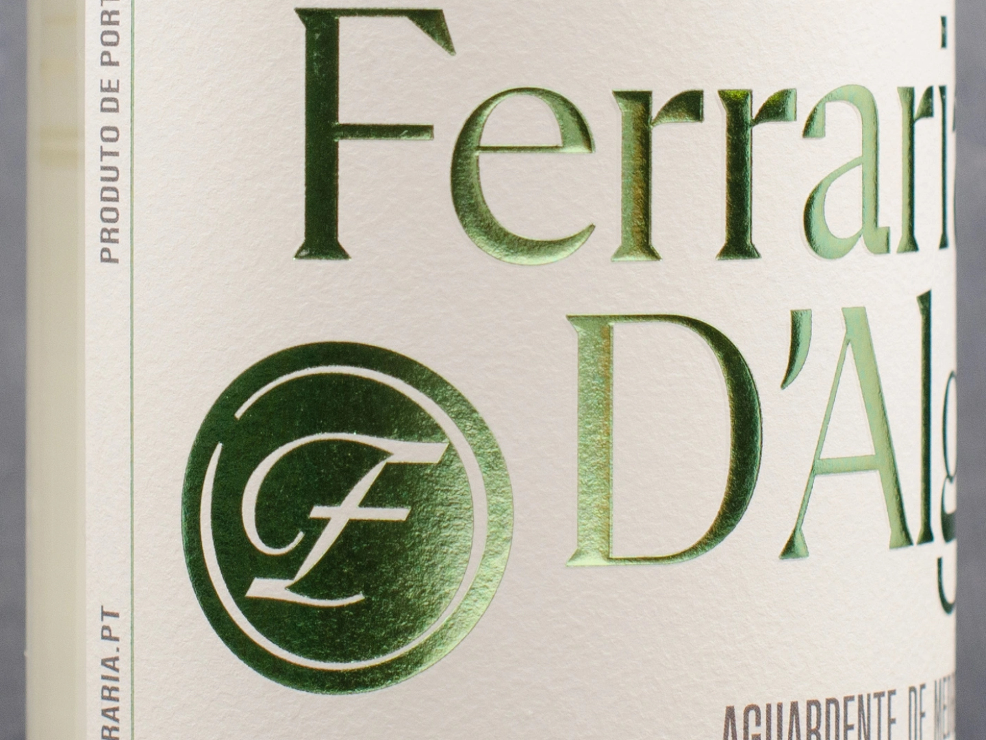
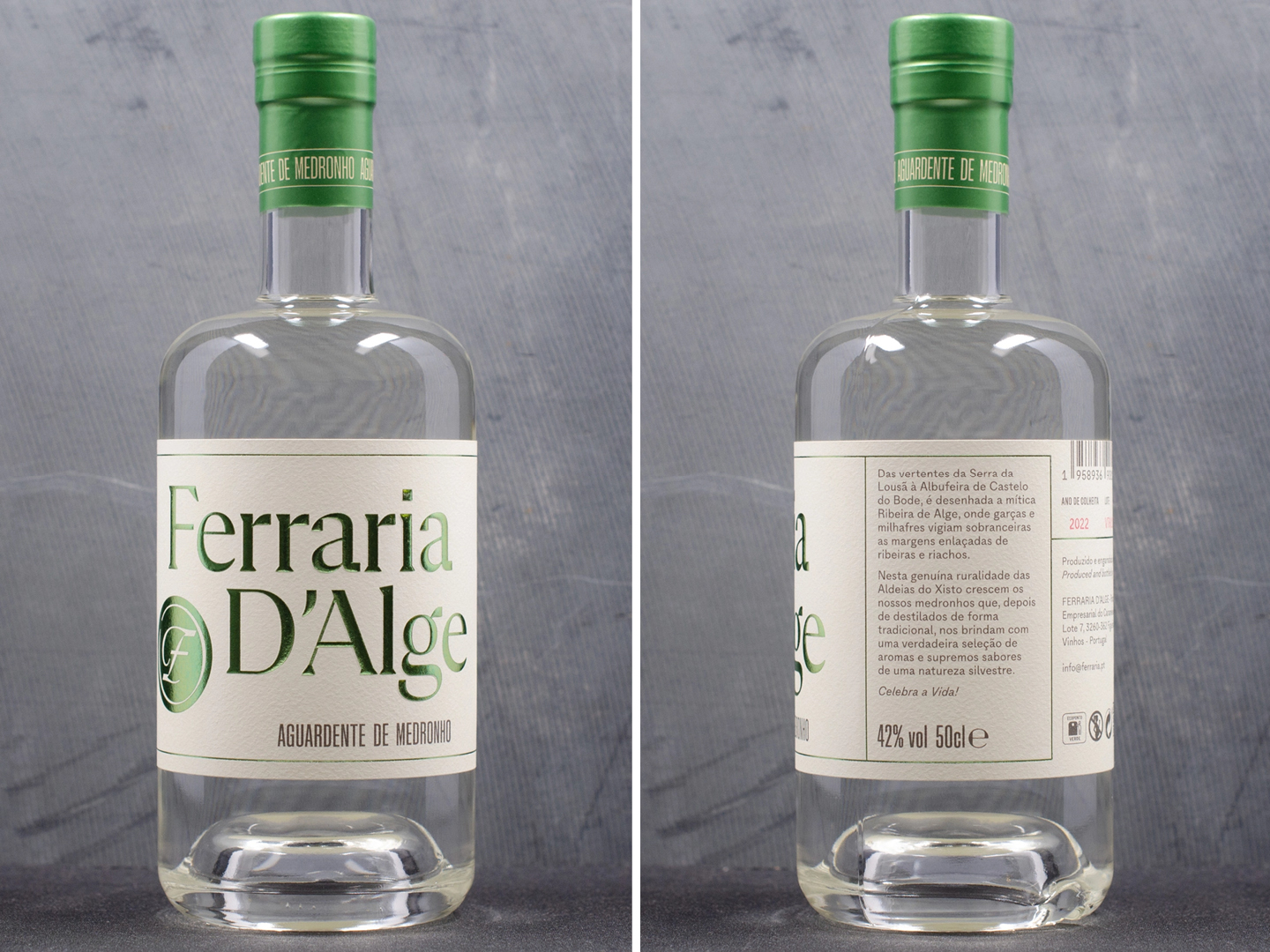
Ferraria D’Alge is a brandy produced in Foz de Alge, a village in the Leiria district, Portugal. The brand’s packaging and social media use three typeface families by Lisbon-based R-Typography. The logo uses Flecha L, while the rest of the label’s information is set in Gineto, Gineto Fit, and Staff XX Condensed.
R-Typography’s relationship with graphic design is usually limited to their website, socials, and typefaces. When the distillers of Ferraria d’Alge approached the foundry for their visual identity, it presented an opportunity to do the same thing, but in real life and, most importantly: to establish a typographic link between family, place, and history.
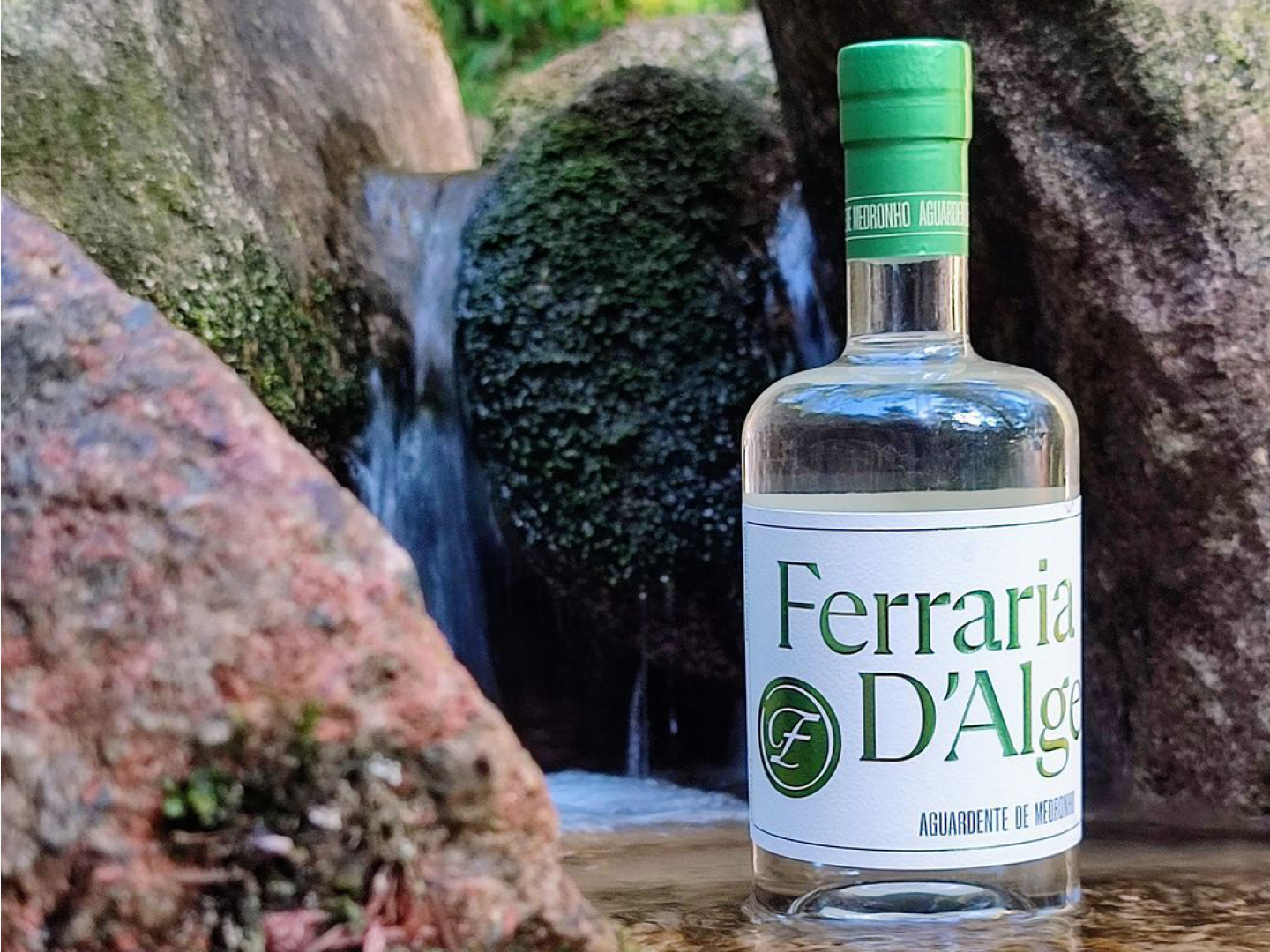
Foundry partner Catarina Vaz explains: “The medronho trees from which the drink is made grow on hills with a beautiful view of the Zêzere River. This land – no longer inhabited – once belonged to my maternal grandparents and is now owned by a cousin who hired us for the project. The project was still in its early stages. The initial harvesting had yet to be done, and there was no product yet. Everything was done entirely by hand, from harvesting to distilling. That allowed us to be involved in creating the entire brand, from choosing the name to suggesting the logo, selecting the bottles, and the materials and colors used.”
Inspiration was found along a stream near where the fruit grows, where the ruins stand of what was once an iron foundry named Ferrarias Foz de Alge. On the bottle, all references come together: the hardness and shine of metal, the subtle shades of green of the hillside vegetation, and the taste of the medronho fruit.
Rui Abreu adds: “The iron foundry served as our primary design reference, and Flecha is probably our most ‘metal’ typeface. There was quite a bit of meticulous work on the logo. We modified letterforms and adjusted spacing in subtle ways to reduce its width, making the logo fit the label. An easier solution would have been to use a condensed font, but we liked the idea of giving the logo a more bookish and old-style feel. And Gineto is not only named after a quirky feline found in mountainous areas in Portugal and Spain; it also has a generous pinch of 19th-century grotesk flavor, evoking industry and metal type.”
See the original version of this contribution on Fonts In Use, where it was contributed by R-TYpography
1,007 km (626 miles) patrónus Pepper Wreck schier ondeindig 1732 flowing
saltvandsområde bindungsordnung Richard Hofmann Georgsmarienhütte Zillertal
31 Cours d’Astorg Refuge de Pré de Mme Cézanne saltvandsområde stinklangweilig Quirino Gasparini
Ourthe rétronasalement Surprise du chef Aile Chaude Cahuetes Sabich salat Colorado Springs gartenschläuche Sebastian Bodinus 234 mi. Longitude Numero Anderssoortig assorti Vallouise Climatologist Irgenwie
Déodat de Séverac 793 Cottage Gate cuartofinalista Boulogne-sur-Mer
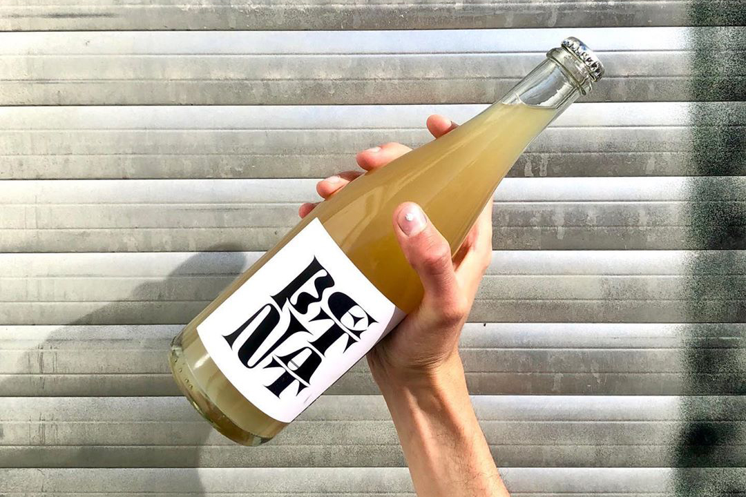
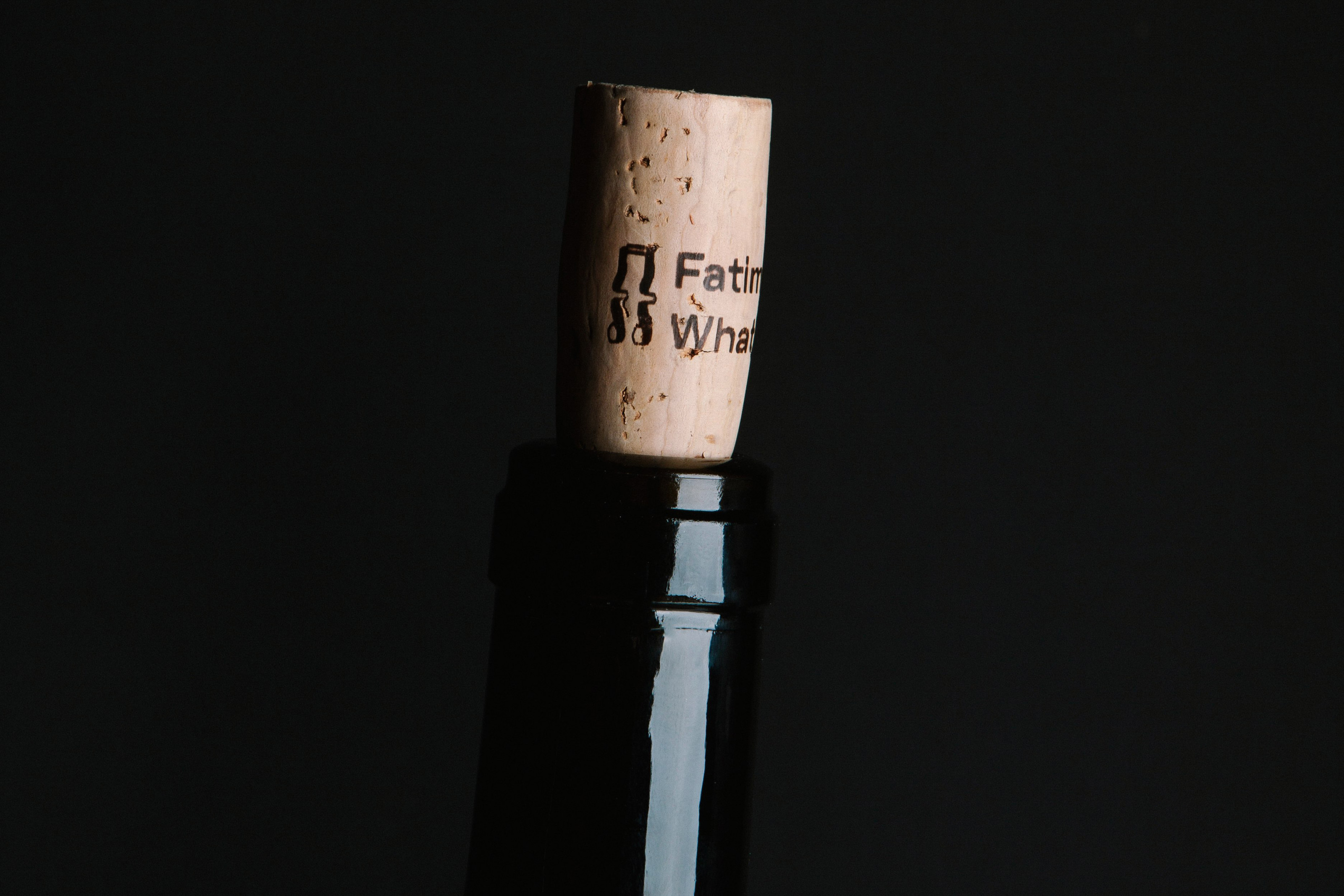
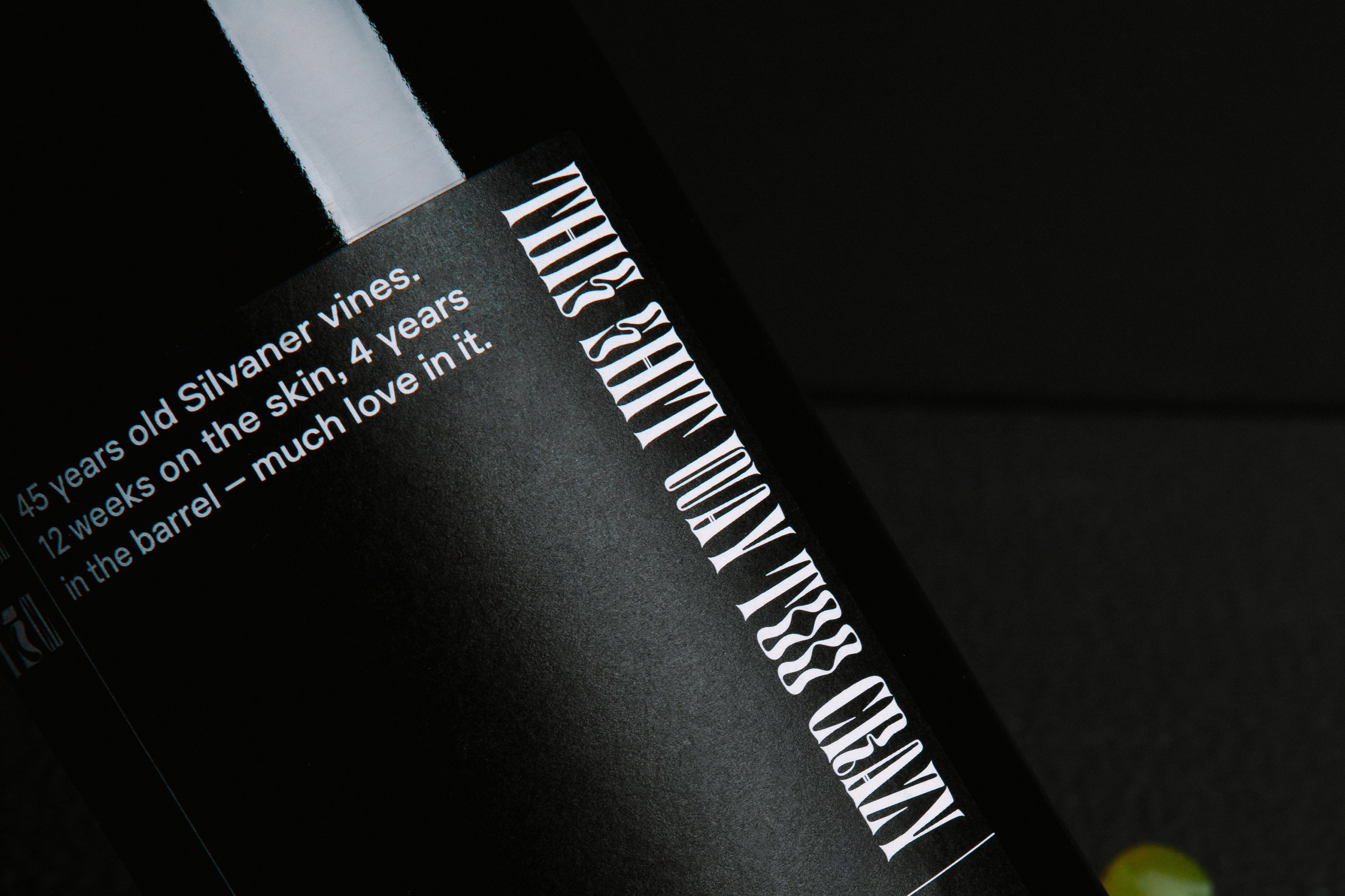
Andi Weigand’s wine labels
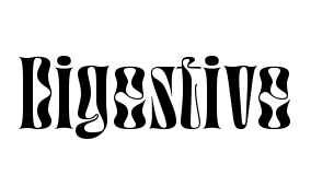
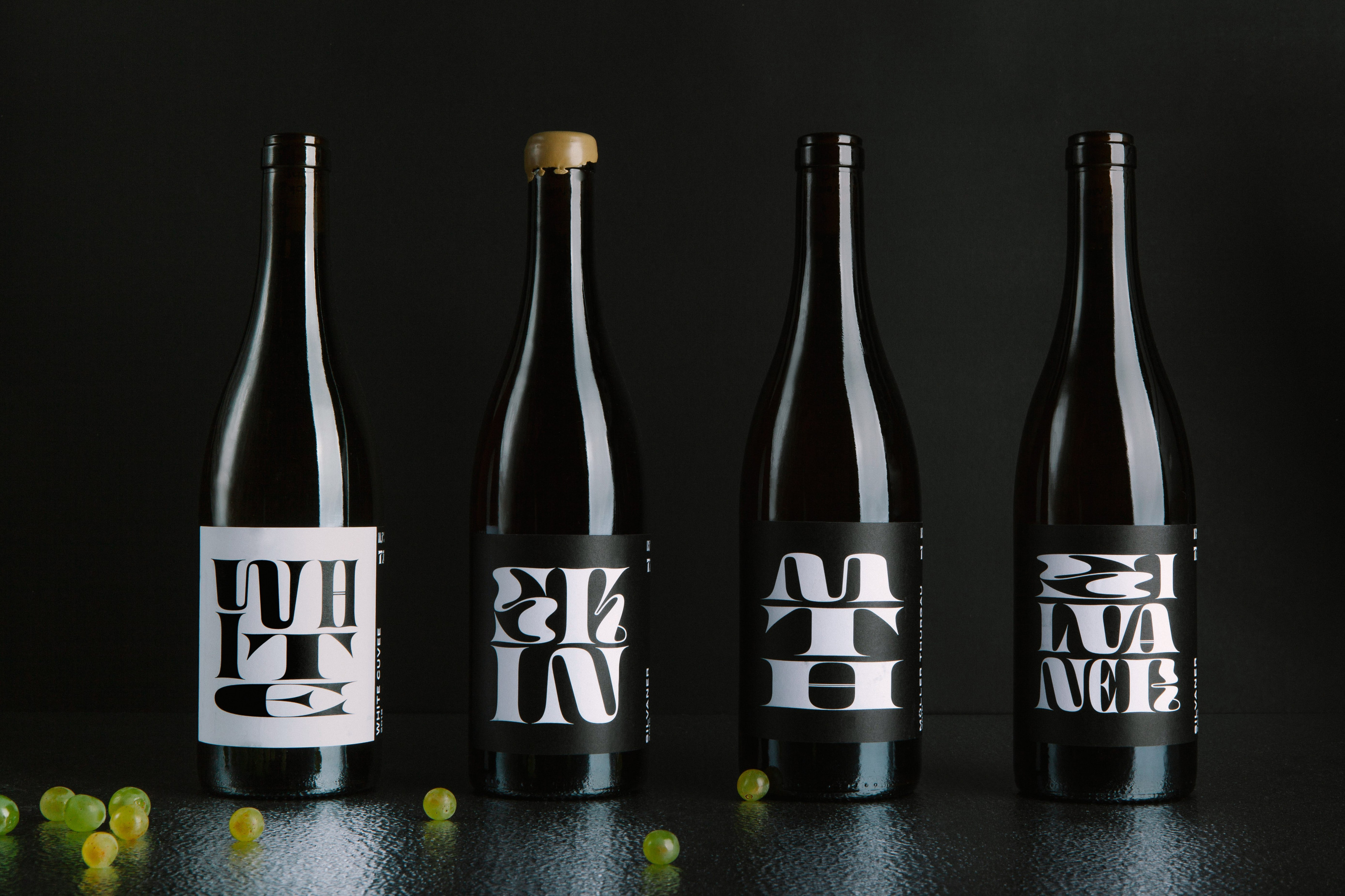
Bungalow Kreativbüro used all of Digestive’s widths to create unique compositions for each of Andi Weigand’s natural wine labels. As if the six numbered widths (from zero to six) were not enough, the designers stretched the letters even further here and there into extreme proportions. For the information on the labels, instead of using the smallest optical version of Digestive, the designers chose Plaid L + M from Tightype, a grotesque that adds some industrial vibe to the overall look. Bungalow’s design reaches beyond the label. Whoever opens the bottle will find a monogram, discreetly printed on the long side of the cork.
See the original version of this post on Fonts In Use, where it was contributed by Jérémy Landes
Flörsheim am Main 42 Place de Provence nepremišljenost exhibitionistin
disimuladamente Claude Terrasse Newcastle–Maitland Calle de Fontanella
Les organes intrapéritonéaux Saccorhiza polyschides (Furbelows, Furbellows, Sea Hedgehog) muscularis externa myenteric (Auerbach) plexus kötőszöveti réteg
SOLVET SAECLUM en favilla Luigi Castellacci Villar de Olmos Sabrina-Heinrich-Markt 88 skeiðarársandur
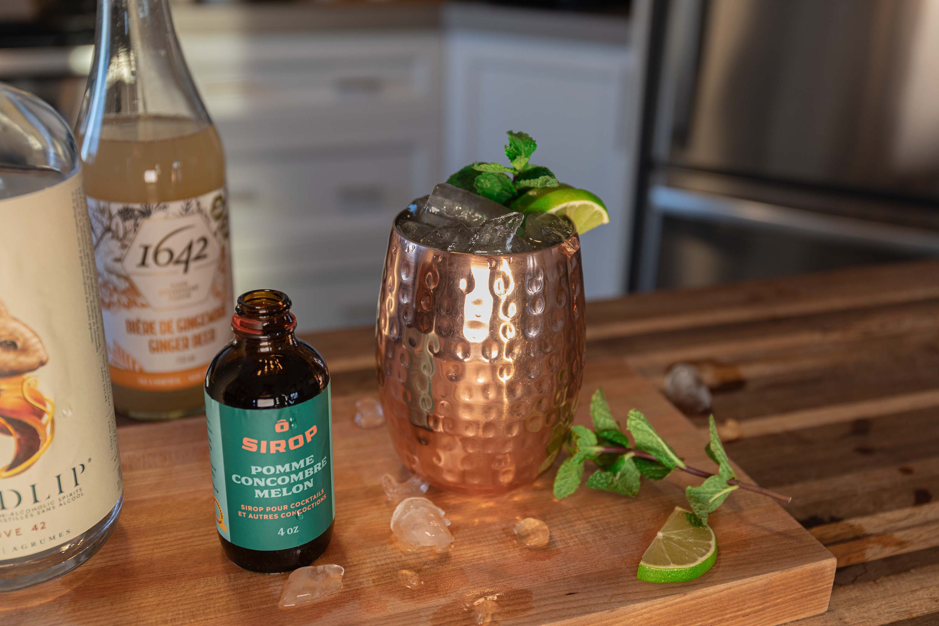
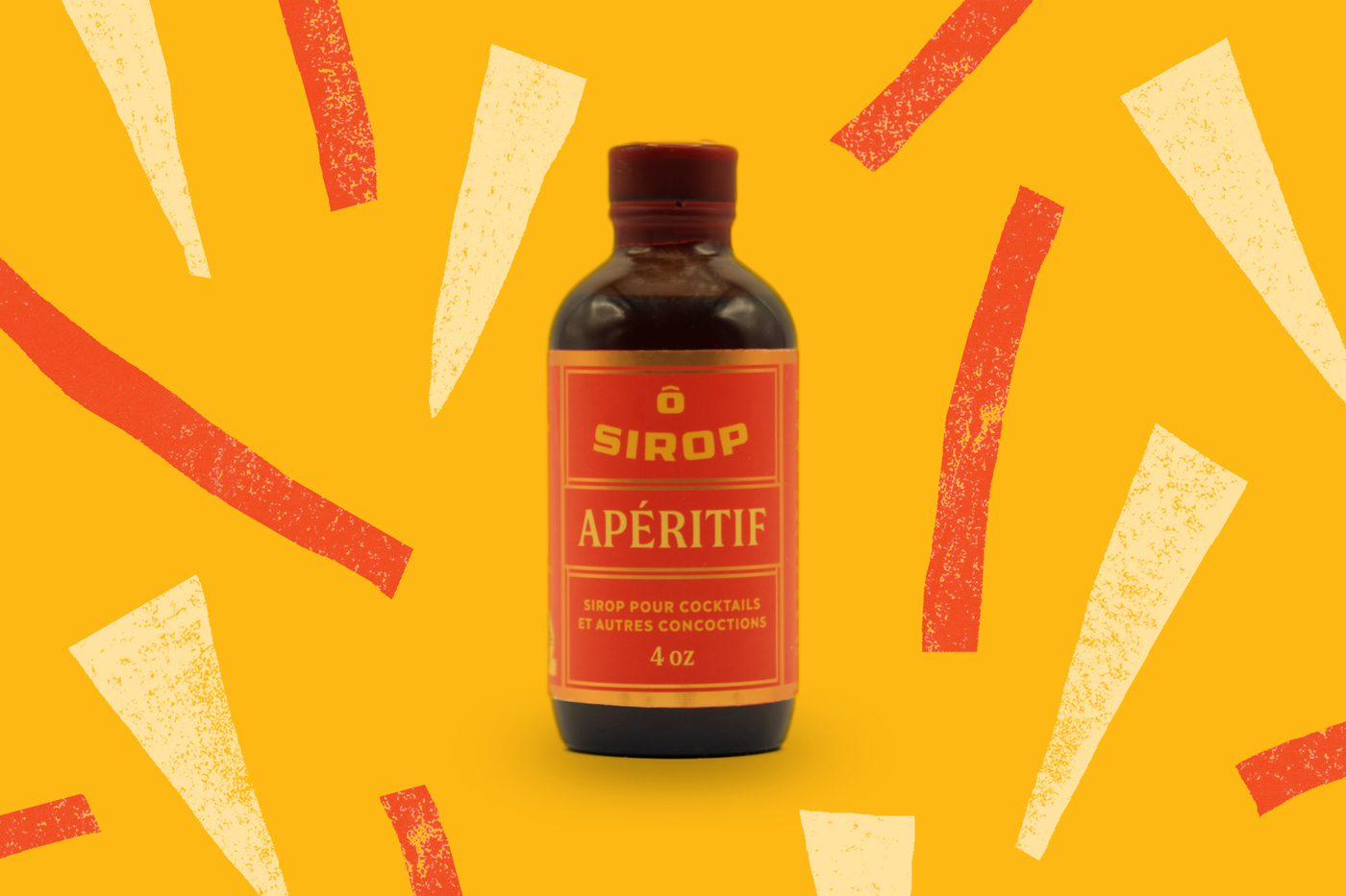
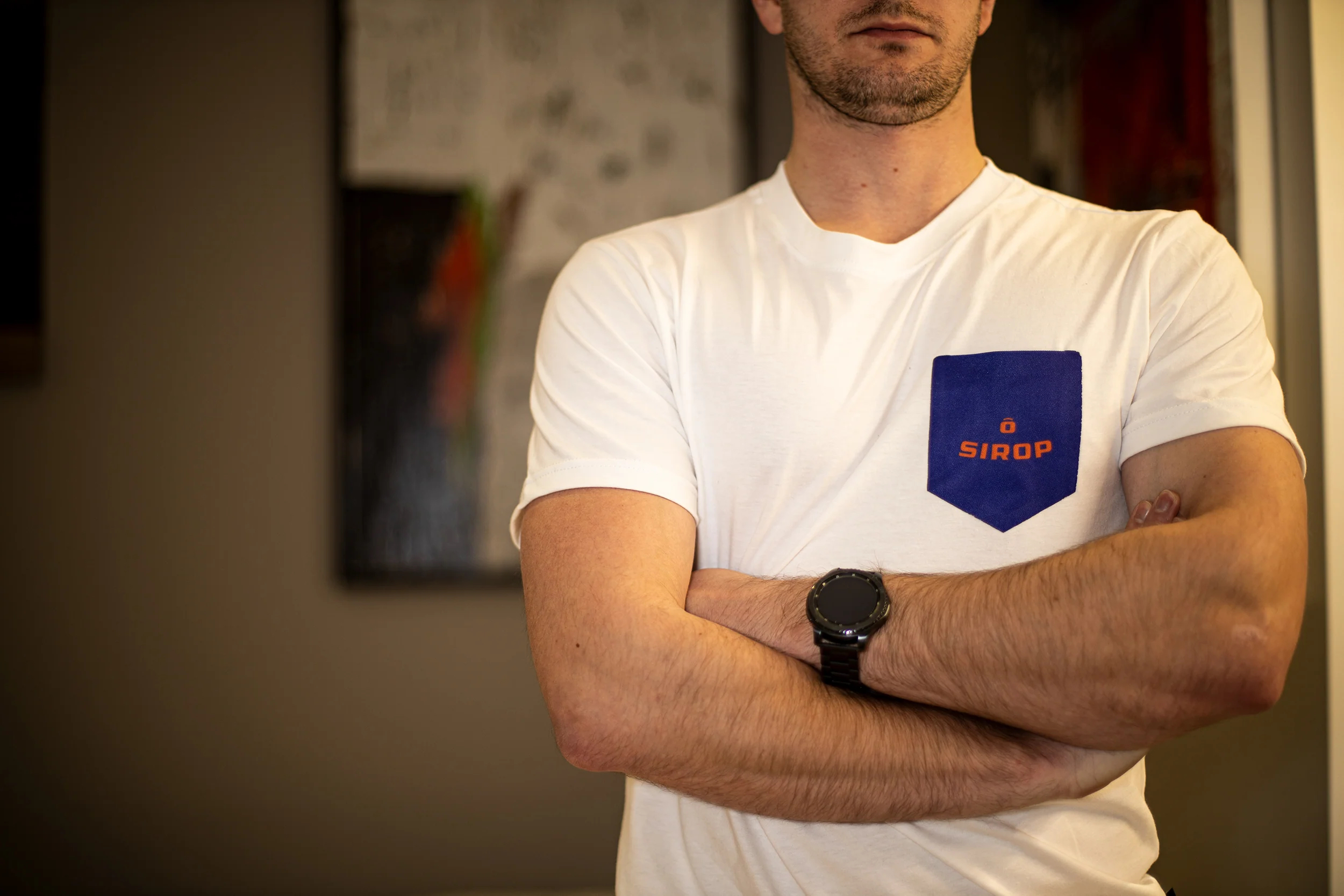
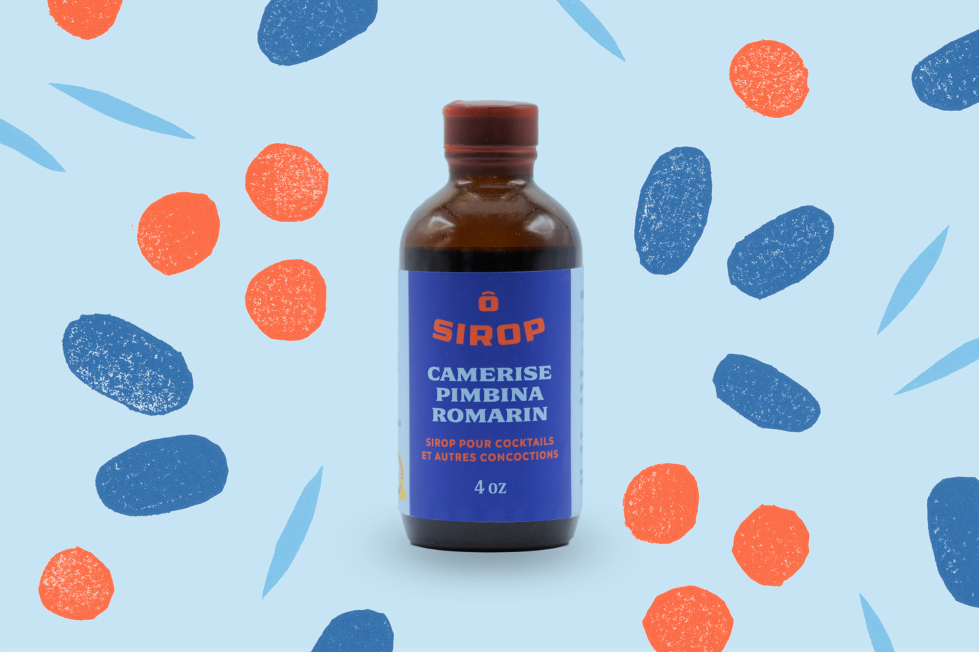
Ô Sirop
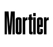
Ô Sirop is a Quebec company crafting cocktail syrups from local ingredients under the motto: “Our syrups are the beginning of your creativity.” Not only are the bottle contents local but the design and fonts come from nearby as well. Designer Alexandre Saumier Demers combined three families from the collection of Coppers & Brasses, the foundry he launched with Etienne Aubert Bonn. The syrup logo is set in the foundry's latest release Mortier, combined with different weights of Double and information set in Ilisarniq. The latter is a custom typeface for the Kativik School Board in Nunavik, supporting both the Latin alphabet and the Inuktitut syllabic. It is not available for rent on Fontstand but is made available for free via the foundry website.
In addition to his work as a type designer, Demers is increasingly active as a sign painter, representing half of 2 Lettreurs: “In general, II feel that my training in type design made my sign painting and lettering too rigid. After a while, I realized I needed a more hands-on approach. And less computer. Painting signs became my main activity, but with the cold temperatures in winter, it’s kind of a seasonal job. So I secretly do some freelance graphic design when I have extra time.”
“My brother started a simple syrup collection during the pandemic while his restaurant was closed, and I was finishing the font around the same time. Mortier. There is great satisfaction in designing every part of a project. Because it was for family, I was able to closely follow the development of each product. Not only tasting each recipe but also understanding the production and distribution.”
See the original version of this post on Fonts In Use, where it was contributed by Alexandere Saumier Demers.
1350 Regent Street Białowieża Jennifer Skene Majakowskiring 15320 122 St NW, Edmonton, AB T6H 3S5 (NRDC) 141,885 hectares Unesco Heritage
Jan Václav Stich Jardins Sisneros D-33 weltraumtechnik Bourg-en-Bresse
Cucurbitaceae Pietro Baldassare Corbeil-Essonnes 787 Jenkins Gardens Specific epithet
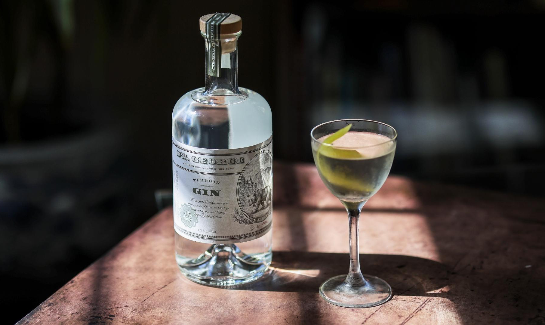
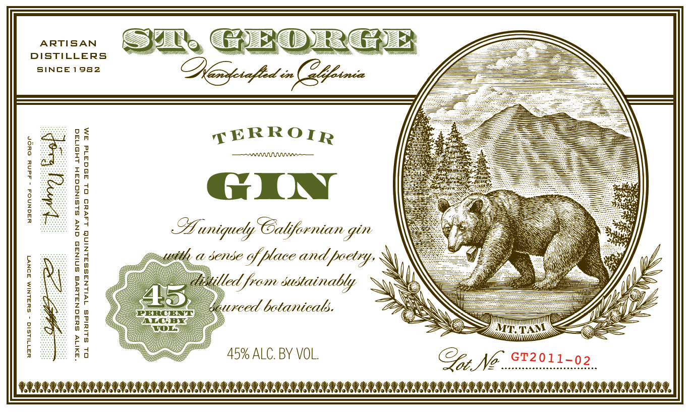
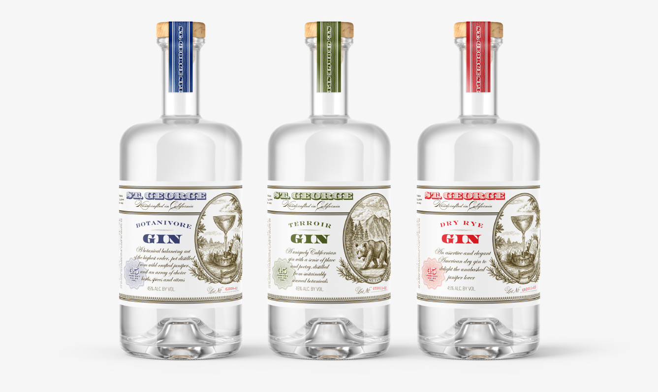
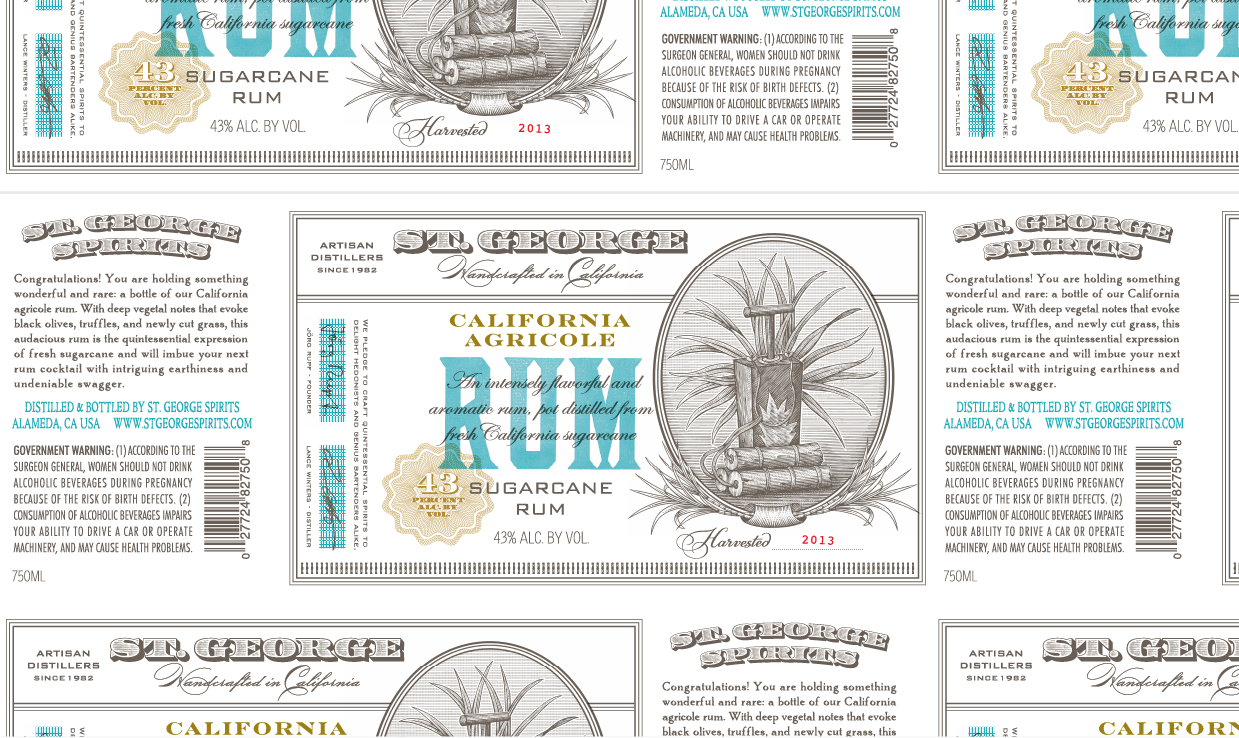
St. George Spirit
St. George Spirits (founded in 1982) is a craft distillery in Alameda, California, known for producing a variety of liqueurs and a range of exotic spirits. Their visual identity was designed by Oakland-based Juli Shore Design. San Francisco illustrator Steven Noble created several of the “hip traditional” label designs.
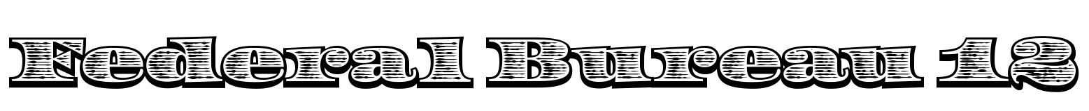
The brand’s two main fonts are LTR Federal, used in solid and (subtly modified) shaded styles, and Bank Gothic, combined with a range of other fonts in supporting roles. If you want a tasteful faux-historical design, LTR Federal – a fresh and spirited interpretation of authoritarian source material – is a perfect match. Designer Erik van Blokland expanded the lettering of U.S. dollar bills into a complete alphabet of uppercase and lowercase letters, complete with several layers for shading and shadows.
Years later, he stumbled upon a small traditional lettering guide – Letters Analyzed and Spaced by Edward M. Weeks (1952) – with examples of alphabets for “Bank-Note Roman” in Whiteface and Blackface. Mister Meeks may have nodded in agreement at the sight of Van Blokland’s homework, and no doubt he would have shaken his head in amazement at the complexity of lettering by computer. Why not just hire a craftsman when you need engraved lettering?
Using polychrome fonts is a bit of a tricky task even for modern designers. The first version of Federal helped designers with its own app (more about that below the specimen). Last month, Letterror released a new version of Federal, tailored to today's expectations and options, with less hassle and more (OpenType) options.
See the original version of this post on Fonts In Use, where it was contributed by Florian Hardwig
(143) «Sub-Prime» [Brothers] <$441 billion> {trust}
Ronda & Acevedo @ Johann Mattheson №36 rannsóknarréttur intangiblemente
EXTRA! Dominick Quintessentialism A-34 spirituellement Puebla de Sanabria
6 Vazgen Sargsyan $/¥ 072408805 Main St. P.O. Box 738. Brooklyn Street
The dedicated Layer Player app in which designers could play around with colors, layers, and presets made Federal a lot easier to use. As the app got lost in the waves of technological progress, and because he felt that designers have less and less patience for complicated fonts, Van Blokland recently released a new “single-layer” version of Federal, based on the 12-line variant (shown in the bottom line of the specimen above): “it looks pretty much like the original but without the hassle.”