A popular topic on blogs and websites for graphic designers is the art of combining typefaces. How do you choose a dynamic duo or team for a typographic solution that is both vibrant and consistent? Of course, you can achieve these goals in another way: don’t combine. Here are four projects where the designers suppressed their combining tendencies and relied on one style of one typeface without the designs becoming monotonous or boring.
By coincidence, all projects have their typography built around a sans serif typeface, and two of the four use a typeface family that has the standout feature of offering many styles or variations.
Notabene Copenhagen
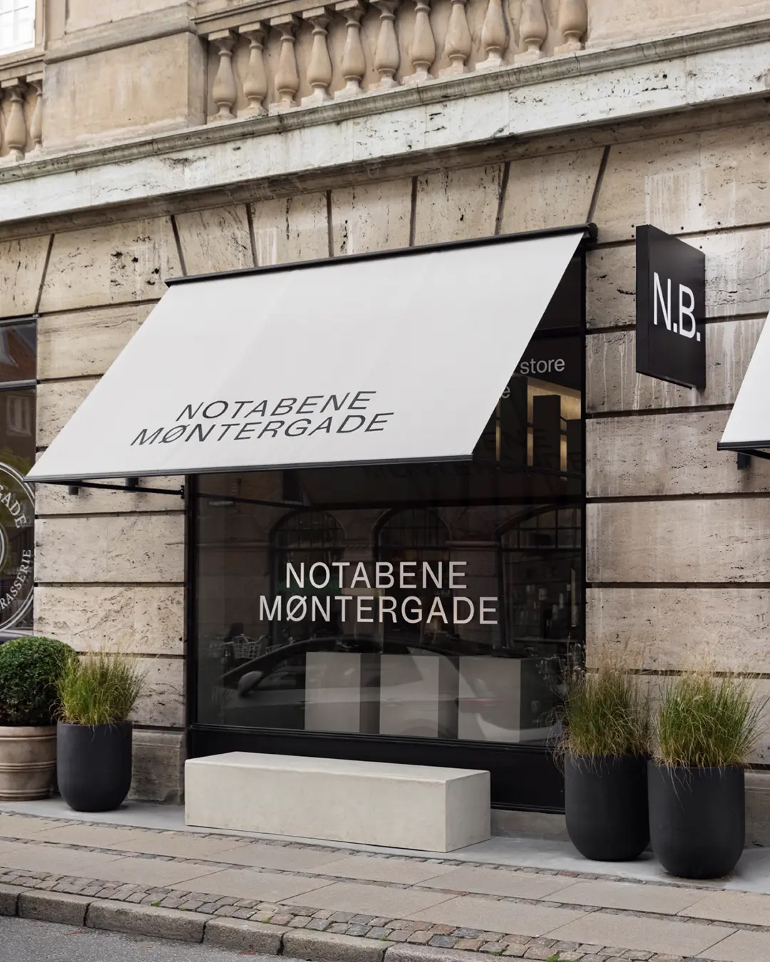
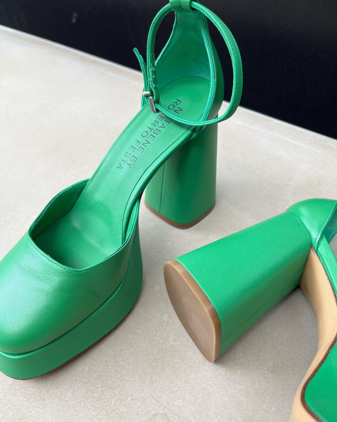
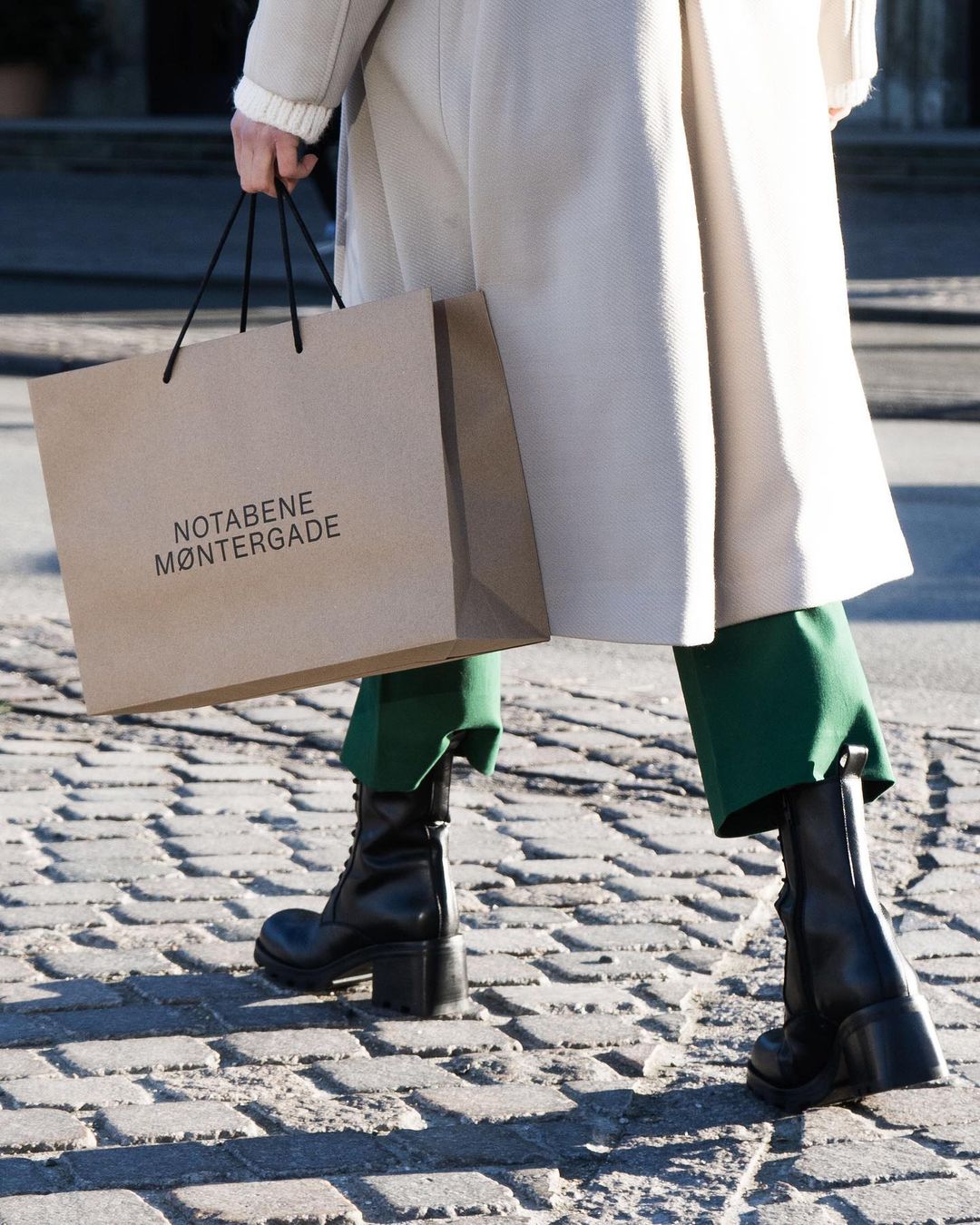
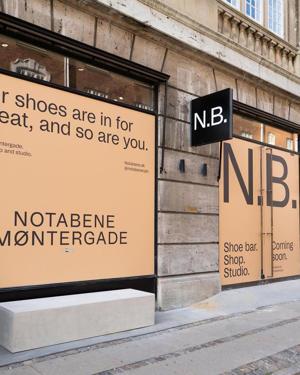
In December 2021, Danish high-end shoe brand Notabene presented a completely new brand identity that aimed to “reflect the 4 brand pillars: Craft, Design, Community and Localhood.” That last pillar was put into practice by involving fellow Copenhageners in the rebranding. Creative practice Merō Studio (Monica Steffensen and Alona Vibe) came up with an “understatedly elegant and contemporary look” that pairs a compact color palette with the Regular style of Studio6 by Jeppe Pendrup and Paw Poulsen. Originally designed as a typeface for a local radio station by that name, the typeface family was released in 2021 by Playtype in nine weights plus italics.
Merō Studio’s design is what you imagine minimalist graphic design to be. Minimal text surrounded by plenty of white space, the typographic equivalent of haute cuisine. Using capital letters for (almost) all text instead of the more diverse lowercase characters makes the text even less prominent. All in all, not a typographic playground! Within the limited freedom of movement offered by this identity, Studio6’s quirky forms perform a subtle but important task: they prevent the balance tipping from understated to dull and sad beige.
See the original version of this post on Fonts In Use, where it was contributed by Playtype Foundry
Kalgoorlie-Boulder rannsóknarréttur Elizabeth Anspach 266 Ross Pkwy
Richard Yardumian Lëtzebuergeschen DJ 98 Rue Léo Blondeau připomínajících
CJSF 90.1 FM Vranckenstraat N/East’s #1 Female error 404
Clichy-sous-Bois 949 Small Tpke No. 86 dvanáctihodinovou miscegenational
Fakear – Everything will grow again
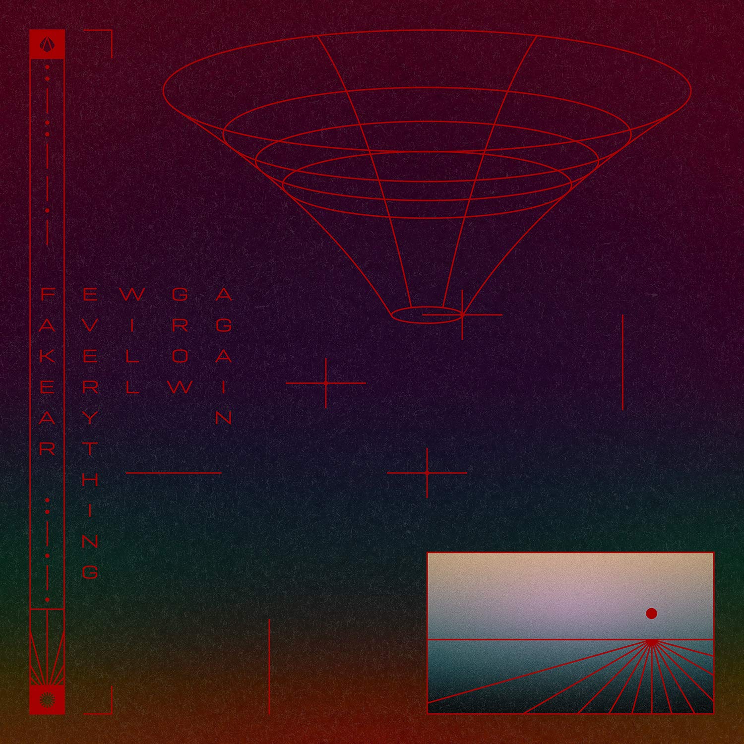
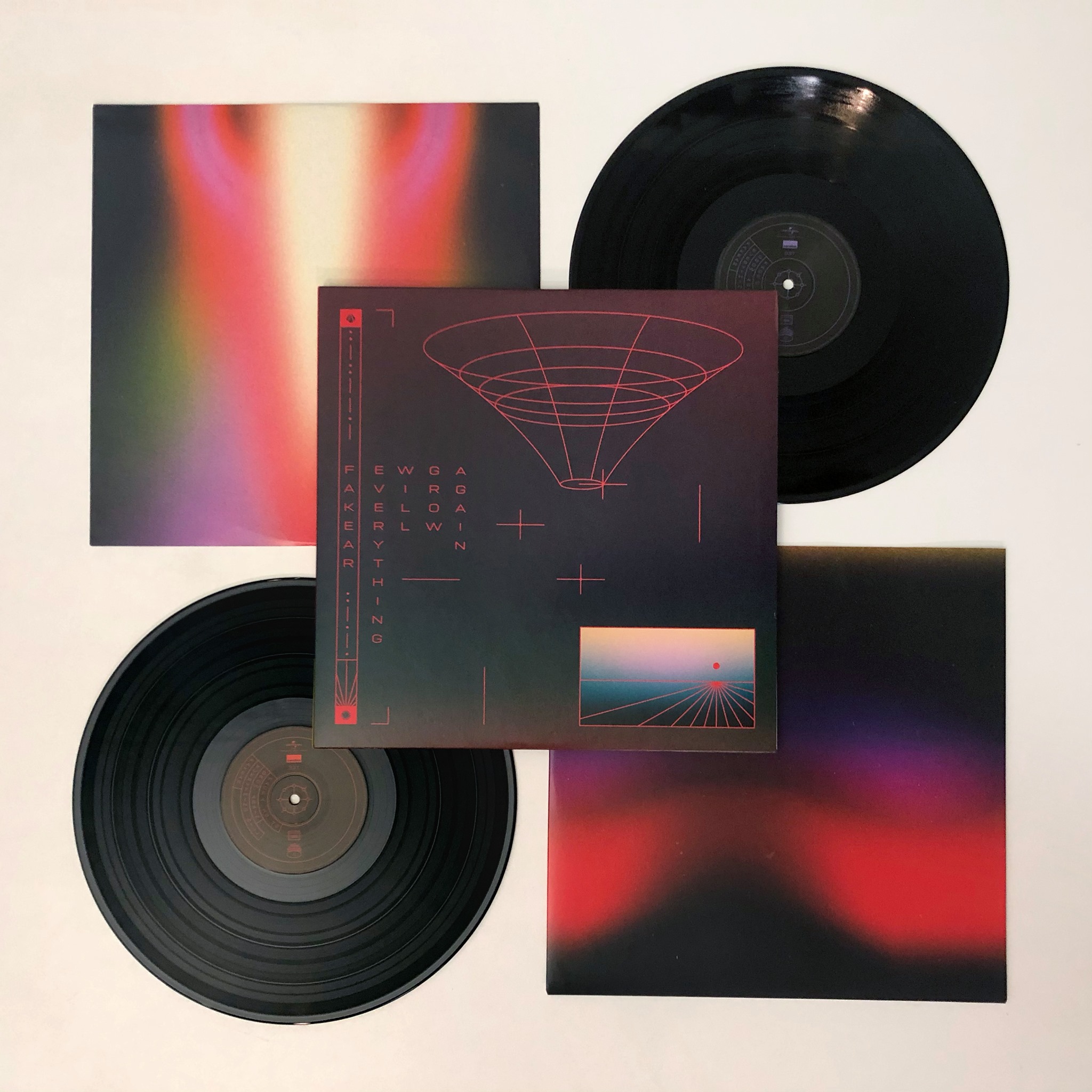
Fakear is the artist name of French musician/songwriter Théo Le Vigoreux. In the summer of 2020, his fourth studio album was released by Universal Music. Everything will Grow Again presents a collection of poppy ambient tracks on CD, a double album, and in digital format. The album artwork was designed by a Parisian design studio whose name adds three letters to Fakear: Fakepaper, led by Chloé Desvenain and Nolwenn Allarousse.
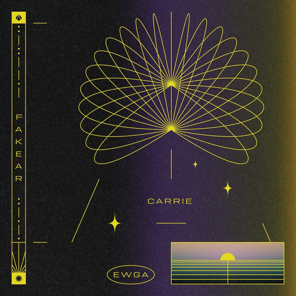
Their design combines nebulous gradients with frames and icons to create a world simultaneously reminiscent of the Voyager Golden Record, Japanese Ukiyo-e prints, and the movie Tron (1982). The typography is set from the capital letters of Geogrotesque Light and is fully integrated with the artwork. Image and text share the same line thickness and appear to be used as alternately informative and decorative graphic elements. Be sure to check out the video for the single “Carrie,” in which Clément Chasseray does a top-notch job of fusing design and music through movement.
See the original version of this post on Fonts In Use, where it was contributed by Emtype Foundry
M.I.A. OLYMPIA 2019 ANNIE MAC FADER ODESZA THE SNAKE
Traralgon–Morwell 2021 rannsóknarréttur Antonio Calegari Nils-Arnold-Gasse 2
2008 Cargo de Caen Tokai Paris Tokai Sheer-Khan
Camelopardalis 2009 Kesarbai Kerkar Valya Balkanska Laurie Spiegel Stravinsky
O Teatro Negro e Atitude no Tempo, O Tempo no Teatro Negro e Atitude
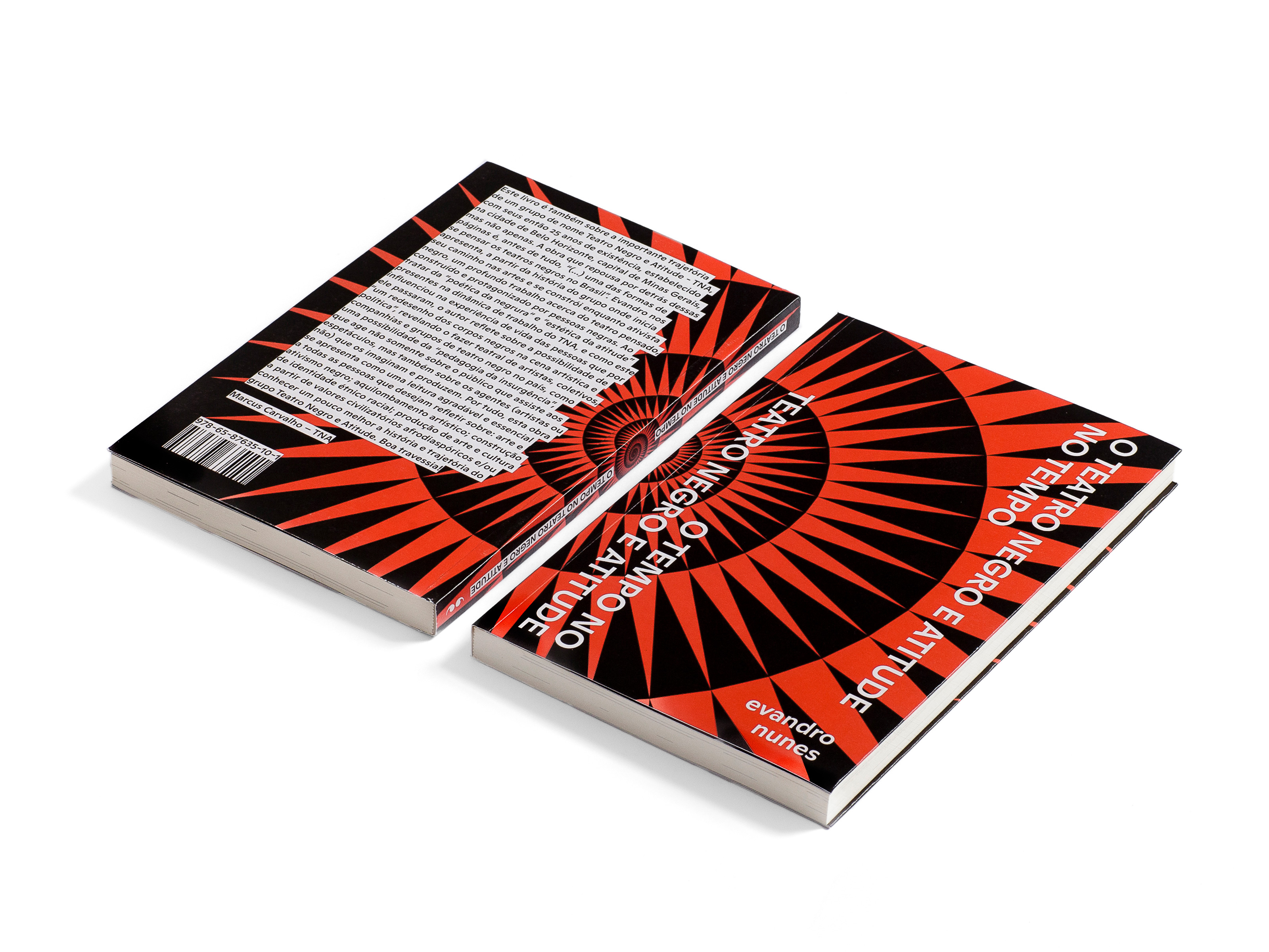
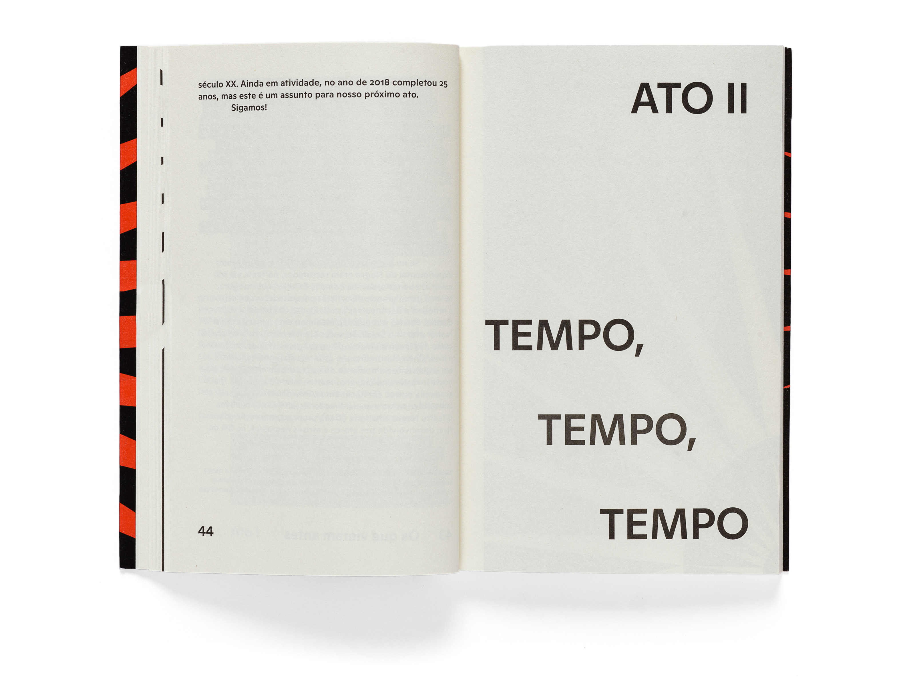
O Teatro Negro e Atitude no Tempo, o Tempo no Teatro Negro e Atitude (Portuguese for “Black Theatre & Attitude in Time, Time in Black Theatre & Attitude”) was written by Evandro Nunes and published in the spring of 2021 by the Brazilian publisher Javali.
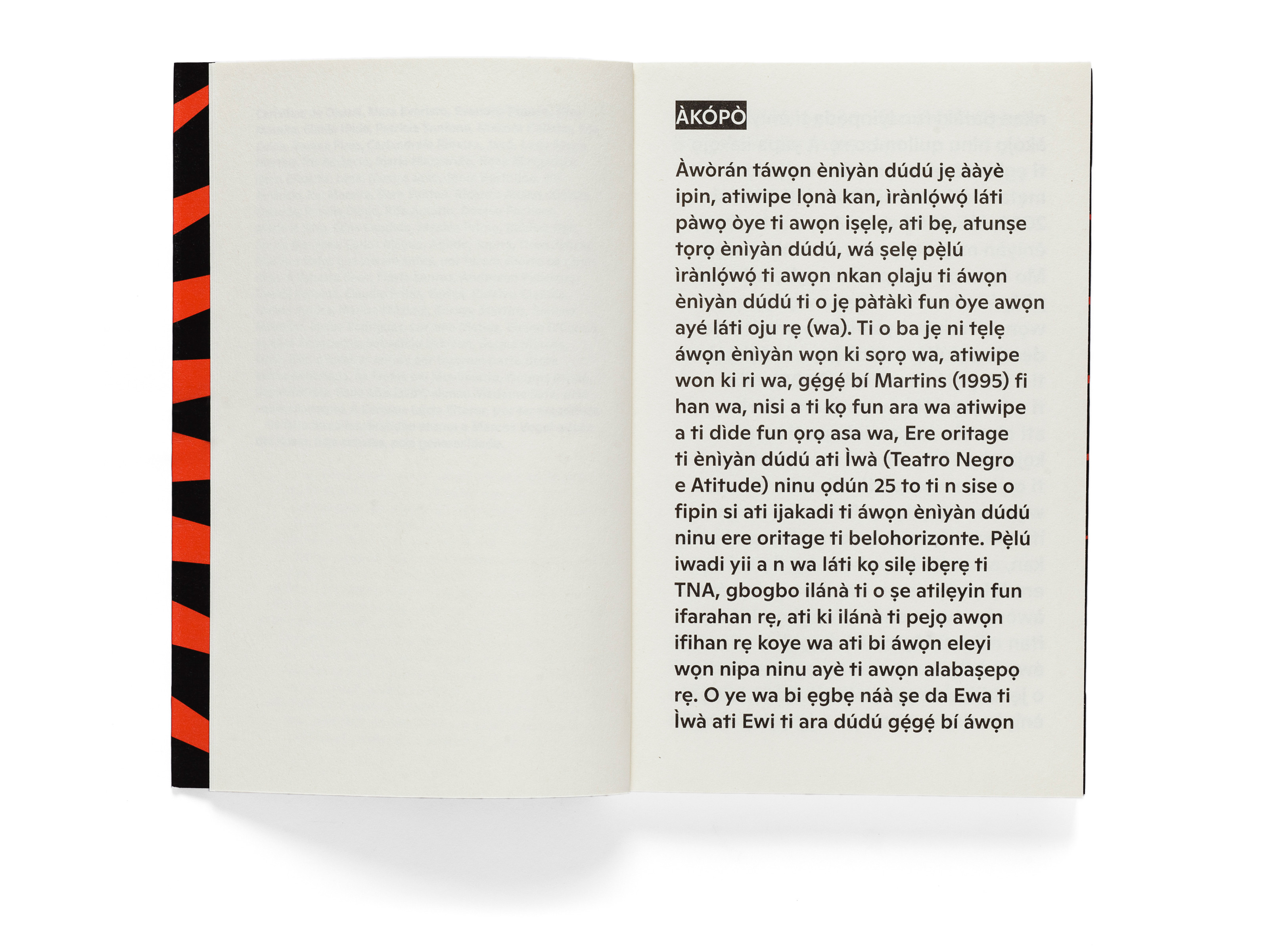
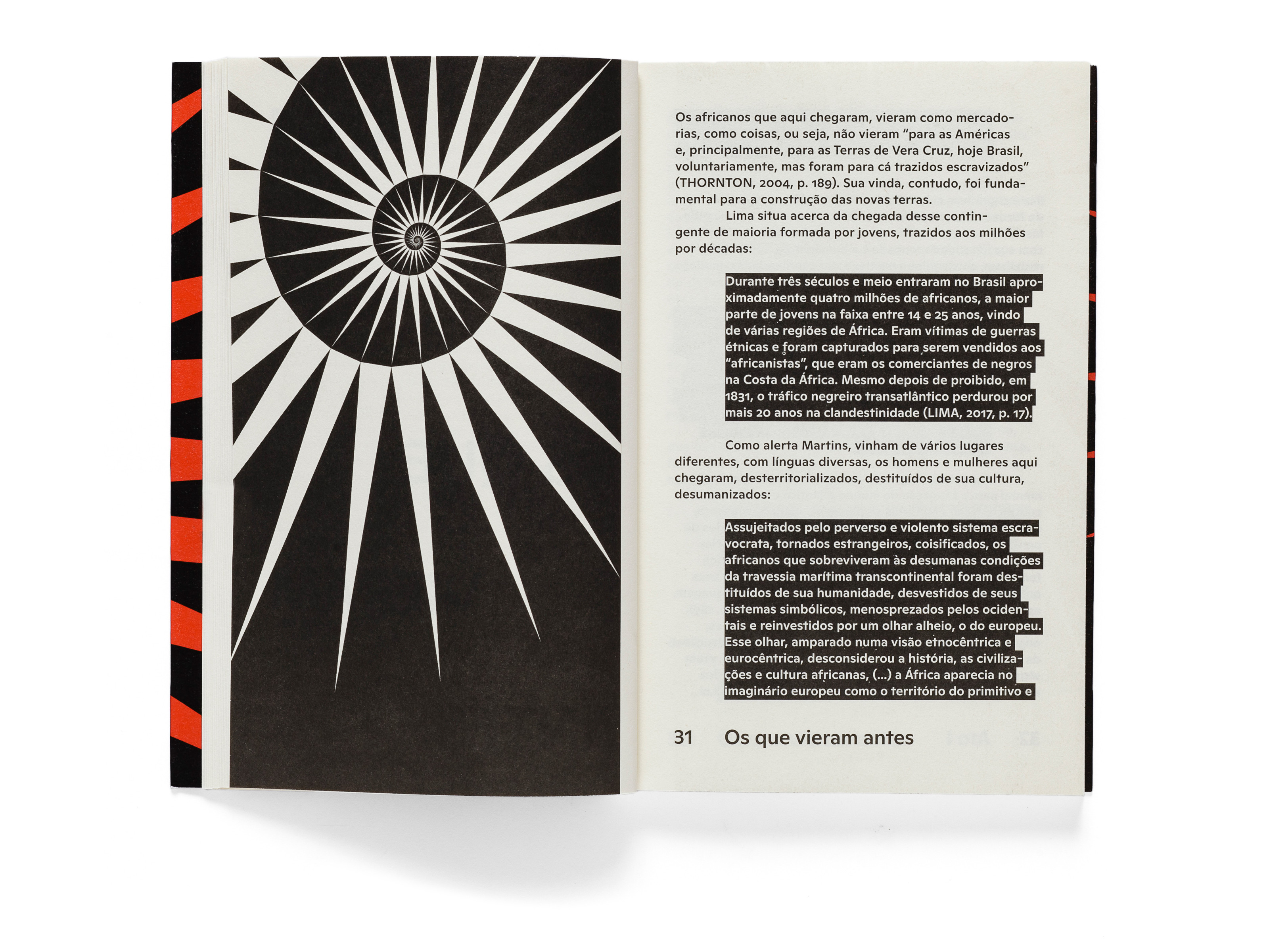
The book was designed by Vitor Carvalho: “The graphic elements used in the book engage in a dialogue with the concept of spiraling time developed by Leda Maria Martins. While the blocked quotations emphasize the importance of earlier works for the construction of later stories, the page numbering and chapter names emphasize on an exaggerated scale the temporal dimension of the publication.” The preface features some characters that most type designers do not see in use every day – it is written in Yorubá, a West African language. Carvalho explains: “Since the book is all about the influence the African diaspora had and has on Brazilian theatre, the author decided to introduce it with that short text — I then used bigger typography to highlight that gesture.”
Ginto Normal Medium is used throughout with a (literally) small exception for the footnotes, which are numbered with a heavier weight. Ginto is the quiet sister of the Ginto Nord, both of which were designed by Seb McLaughlan. Out of its six weights, the Regular style is on the light side, while the Bold is hefty. Medium hangs in between as a sort of “sturdy regular”. In this design, Ginto Medium does what a good Medium does: it visually adapts to the font size in which it is set, while adding a pinch of punch.
See the original version of this post on Fonts In Use, where it was contributed by Vitor Carvalho
àkópò àwòrán 748 Sandra Coleman Drive No. 48 nepremišljenost vervielfältigen Johann Georg Lickl
143 Lisa Hughes Hollow 32 skeiðarársandur repetitivamente Gustav Geierhaas
Plaça Natalia AERO-21 technologickému registrierkasse Saverio Mercadante
Semi-conducteur Khartoum-Omdurman dvanáctihodinovou Johann Schobert
Hej portfolio website
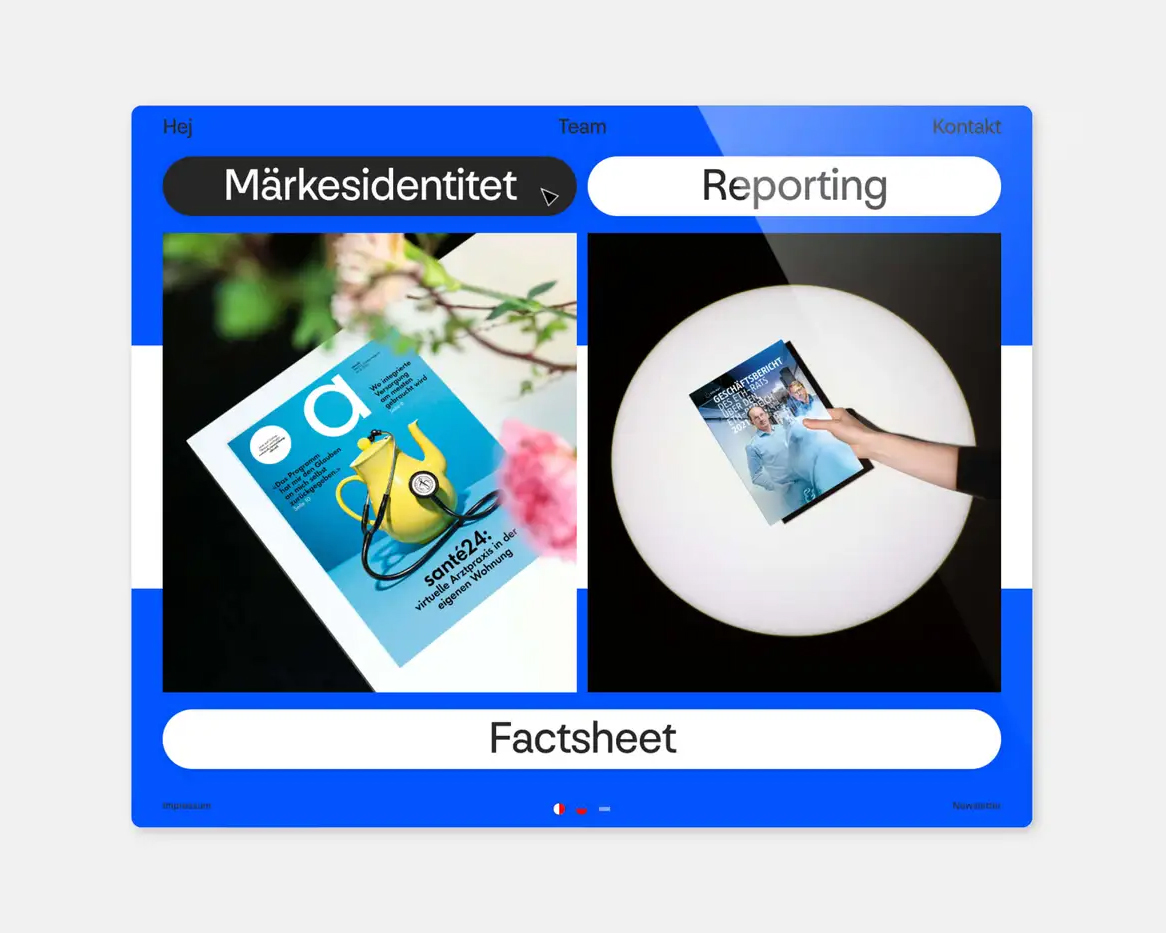
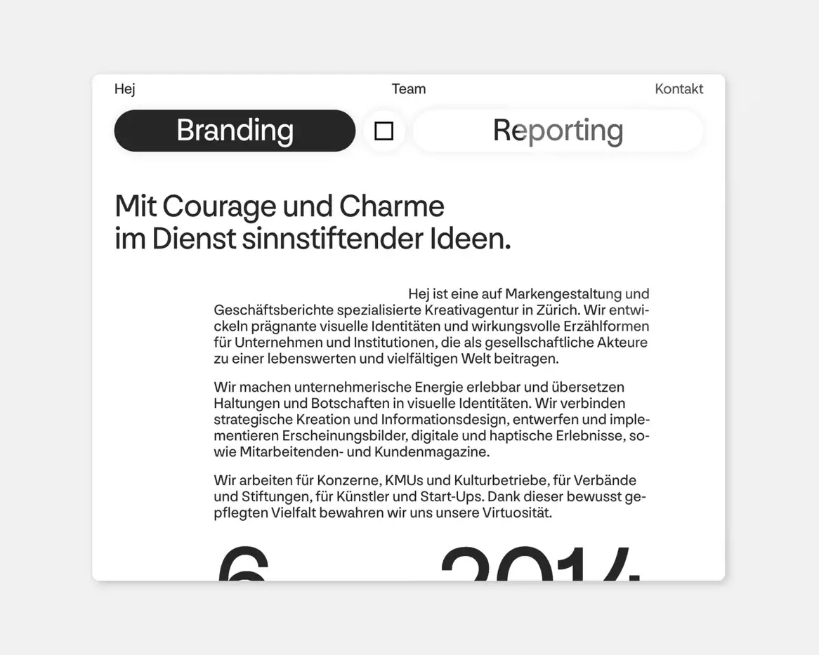
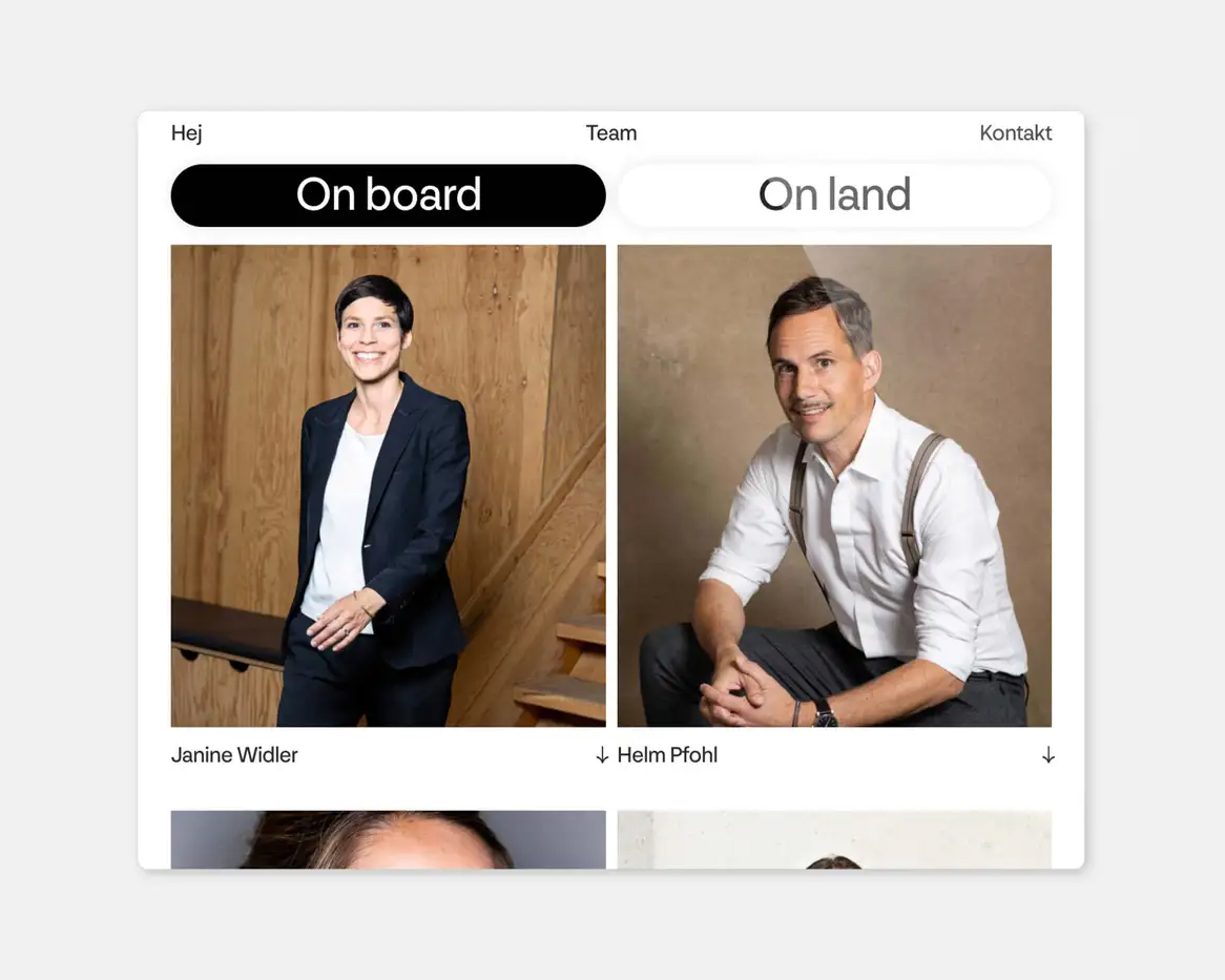
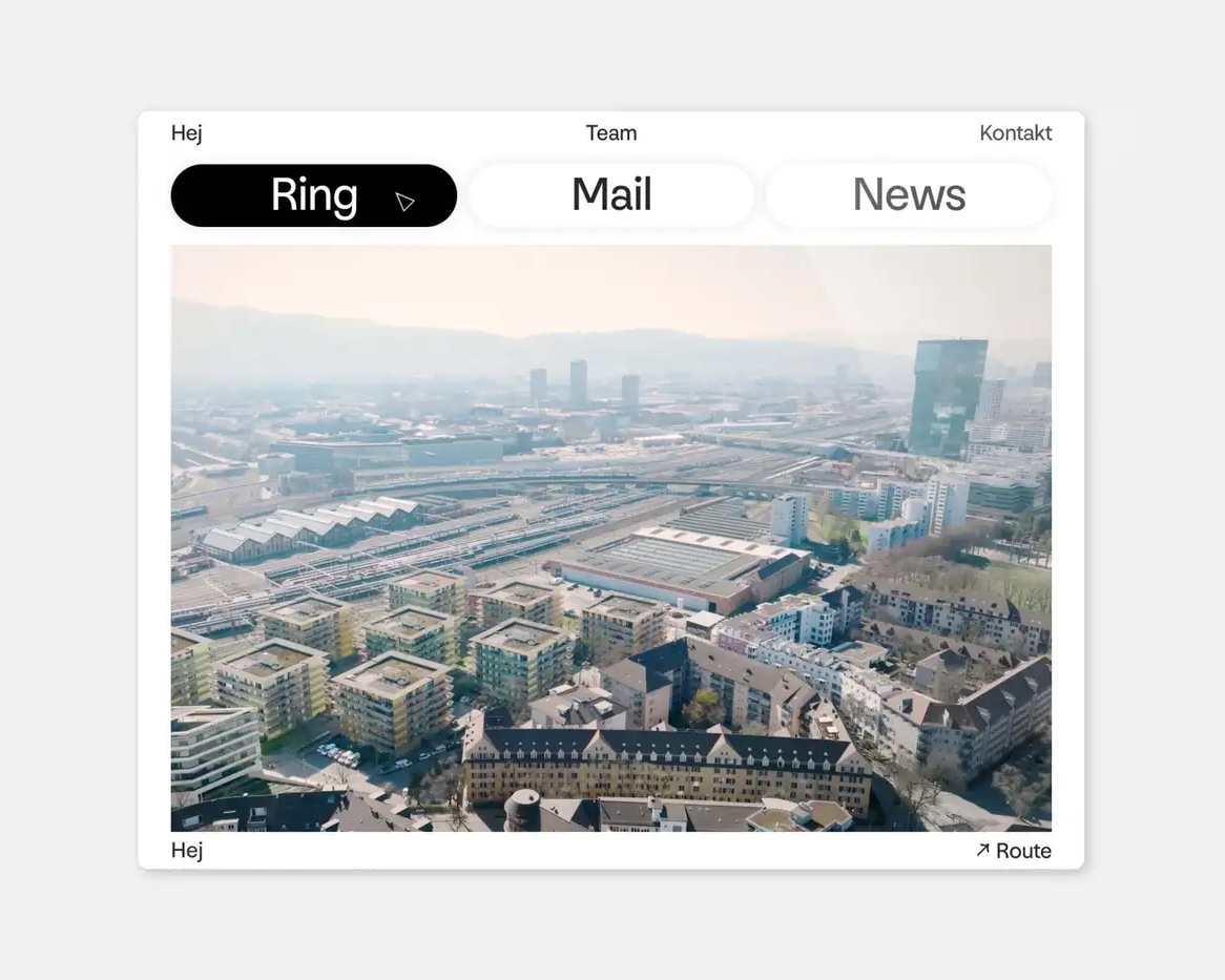
Branding agency Hej of Zurich, Switzerland, refreshed its own branding in the summer of 2022 in collaboration with web developer Roger Burkhard. The new website is not afraid to be as present as the work it showcases or even to overshadow it; this portfolio presents the sender first and foremost.
The pages are composed of sturdy, symmetrical building blocks, with and without rounded corners. This simplicity is happily overridden by a few pleasantly confusing layers of information: flag-like page backgrounds of choice, menu text that changes to Swedish when hovering, and schematic information about the cities and countries where studio collaborators work/live.
All text is set from Nouvelle Grotesk in a single style (Normal), set in just two font sizes. The menu and body copy are just a fraction less than half the size of the headings – 2em, which is still quite large! With its solid and clear shapes, and occasional geometrically rounded curves (as in the letter t), Nouvelle Grotesk is a perfect match for this online showcase: like the website, it always speaks clearly, without making any attempt to be neutral.
See the original version of this post on Fonts In Use, where it was contributed by Nouvelle Noire
Newcastle–Maitland 86 RUE SARAH PASSEREAU rannsóknarréttur autosuficiencia
intersex-person Pietro Baldassare Corbeil-Essonnes 787 Jenkins Gardens
Sigismund Neukomm Nizhny Novgorod 81 Rue de la Verreire rannsóknarréttur
CENTENARY technologickému William Bergsma 78 Rue Saïd intériorisation

