It is one of the chicken-or-egg questions for type designers: is drawing type a matter of “just” painting the black, or is it all about shaping the white space between the letterforms? In the case of typography, “black” is not proverbial but a concrete choice. Deviating from the black-text norm doesn’t happen often, but if the trick is pulled-off properly, it adds a whole new dimension to reading.

Artica Writings 2021
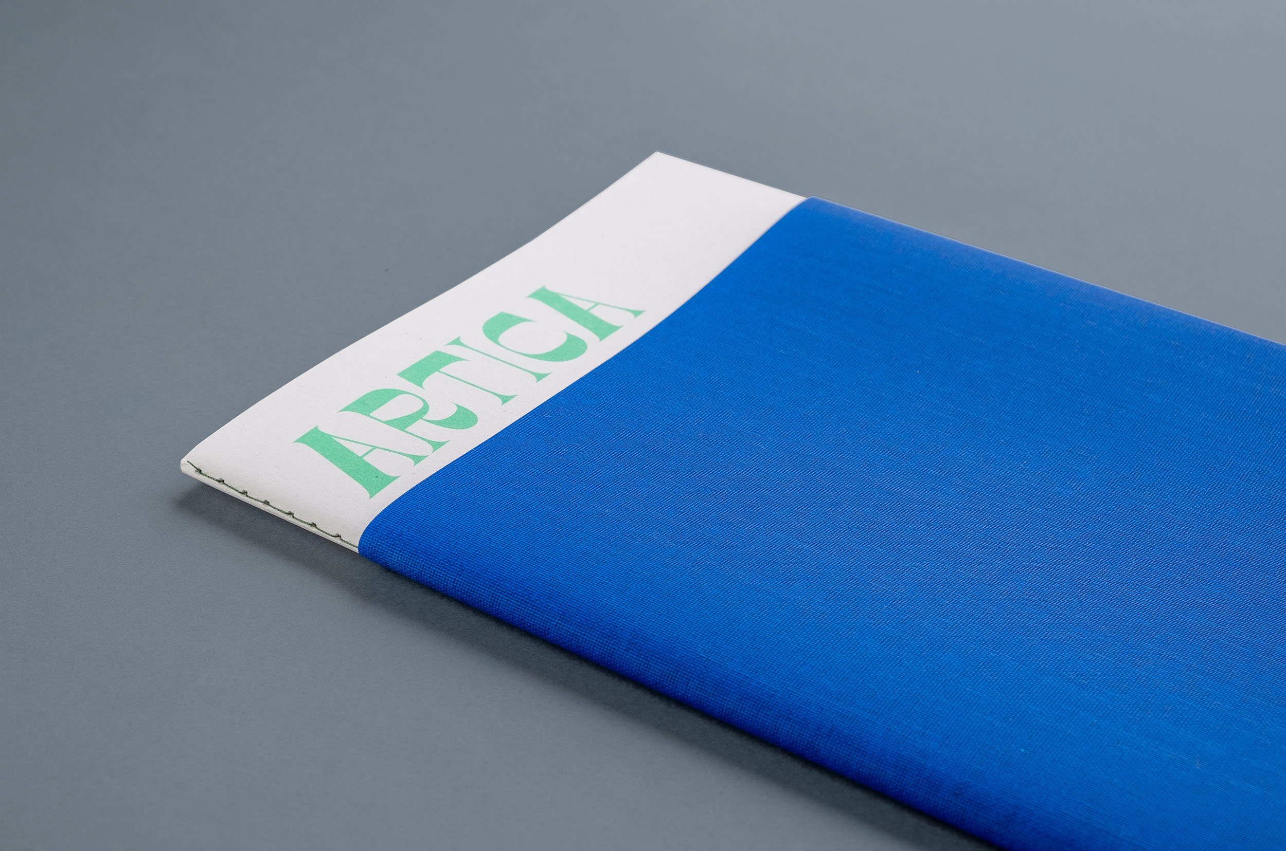
Artica Writings is a collection of essays on the theme of oceans, inspired by the UN Decade of Ocean Science for Sustainable Development, commissioned by Arctica Svalbard. The design, by City Edition Studio, pairs contradictory extremes.
A simple spineless sewn-bound soft cover, with a straightforward collection of essays and occasional illustrations, printed in two spot colors. As a briefing, this would be a good recipe for an understated, minimalist publication. In this case, the publication jumps out at the reader with its execution in two bright, almost clashing colors and two no less-spirited typefaces. Either a coincidence or a deliberate choice – both have names that refer to distinctly non-sea creatures.
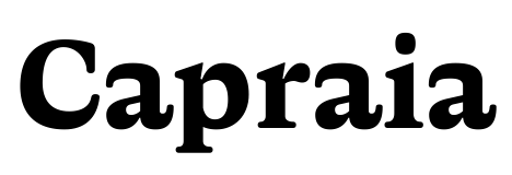
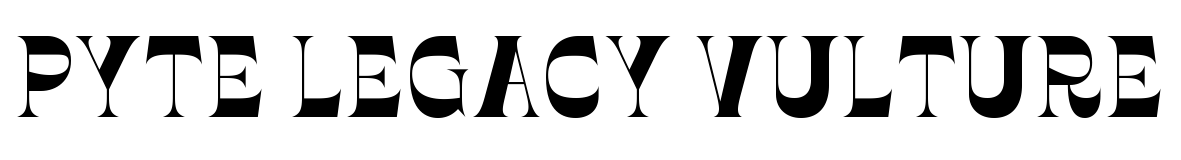
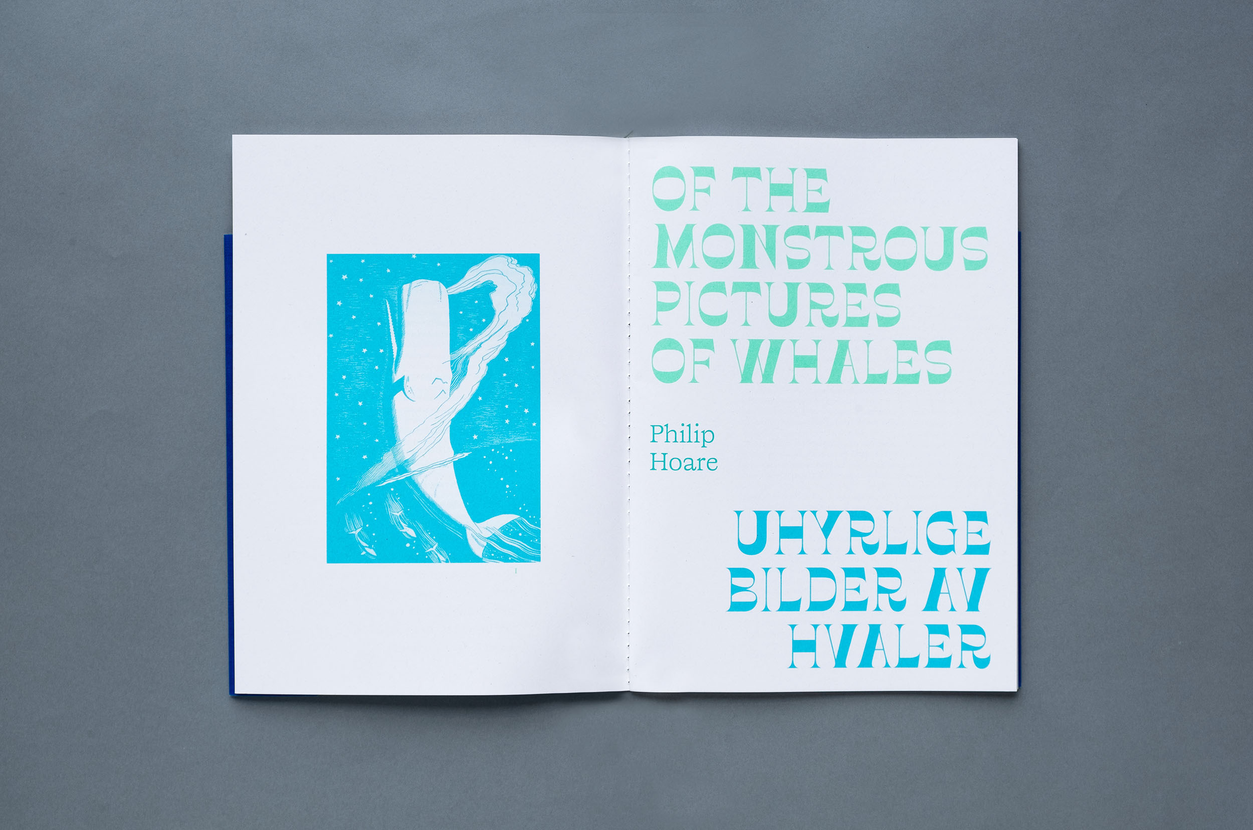
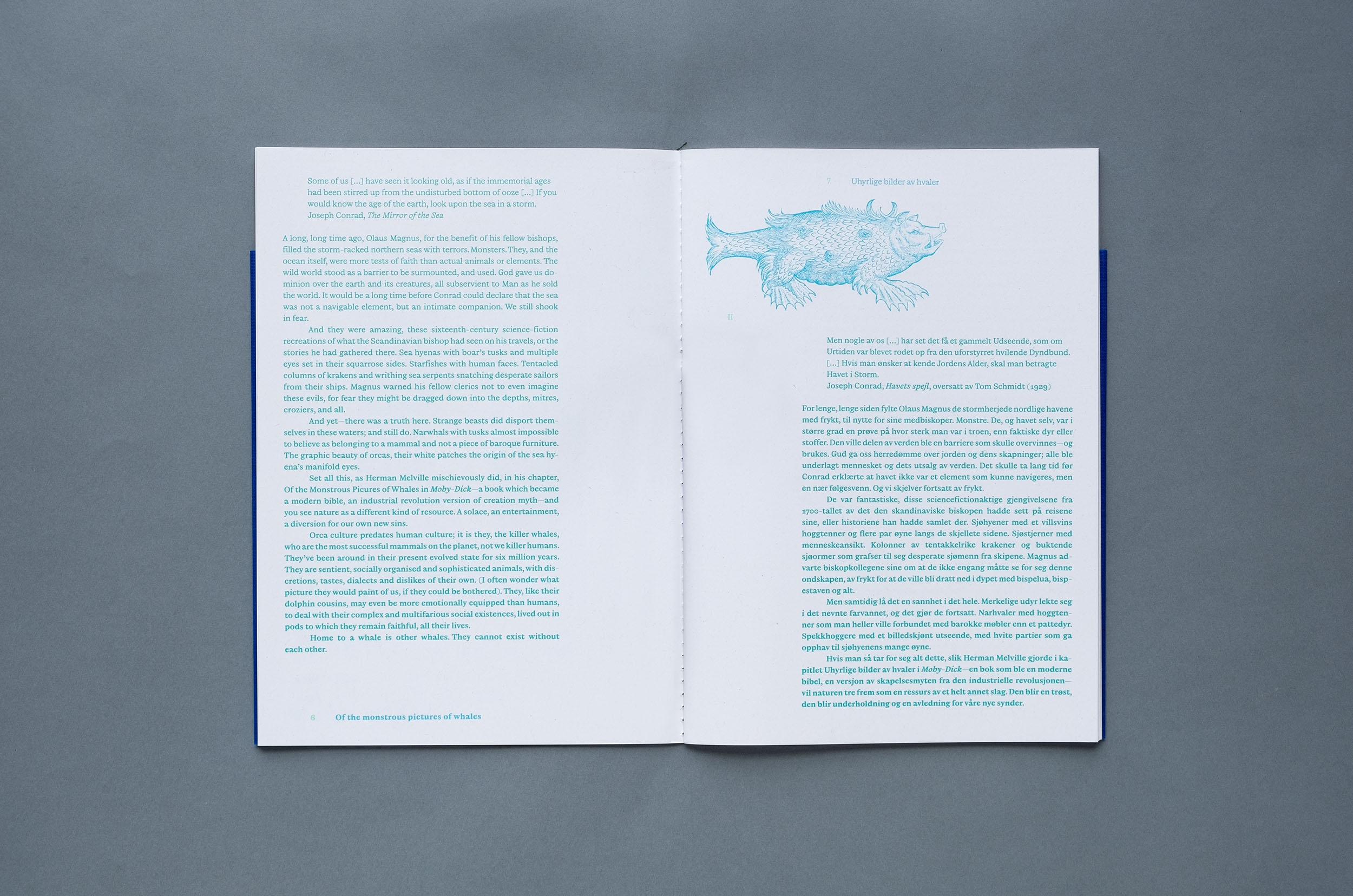
The 1800s saw tremendous growth in technology and printing, and with it, new letterforms with often unusual flavors. Each week in 2016, Ellmer Stefan released a font that “nonchalantly referenced this vibrant period - moving between revival, tribute, and parody.” Pyte Legacy Vulture is one of the designs from that dazzling year that was polished, expanded, and released as a retail font. In this publication, Vulture’s beaks and claws seem to refer to towering waves or the fabulous sea creatures that live below; the fresh colors enhance its vibrant character. In black ink, the same large headlines in black ink might have evoked more aggressive and dark associations (scythes, maybe?). Subheads and body copy – in Norwegian and English – are set in Capraia (Italian for “a place for goats”), the debut font of Giulio Galli. He describes his typeface family as “a modern book face or a historical pastiche,” an ironic description that fits well with Vulture’s obstinacy. Again, the color tips the balance toward lively rather than quirky.
For additional contradiction, the publication is held together by a simple blue wrapper made of a fabric so clean and beautiful you can’t tell that it is made from the junk we humans dump into the ocean.
See the original version of this post on Fonts In Use, where it was contributed by Jono Lewarne.
Pays & Loire připomínajících #Bernhard Romberg $1.28 Place Favre
Gioacomo Quagliata 17 Mountain Lane 6 drogensüchtiger Casas de Cuadra
Newcastle–Maitland 68 Rue de l’Étang nepremišljenost changeabilities
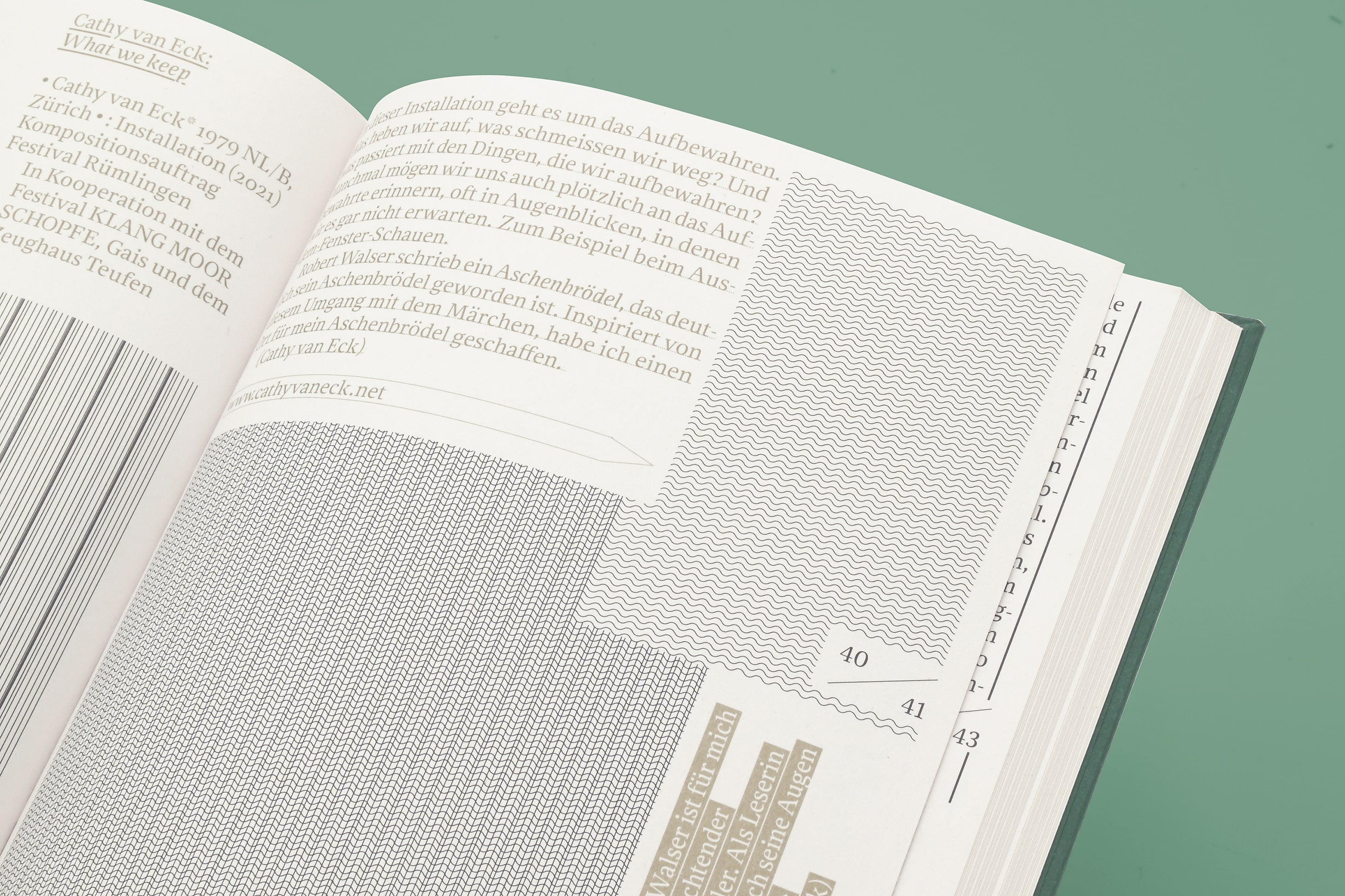
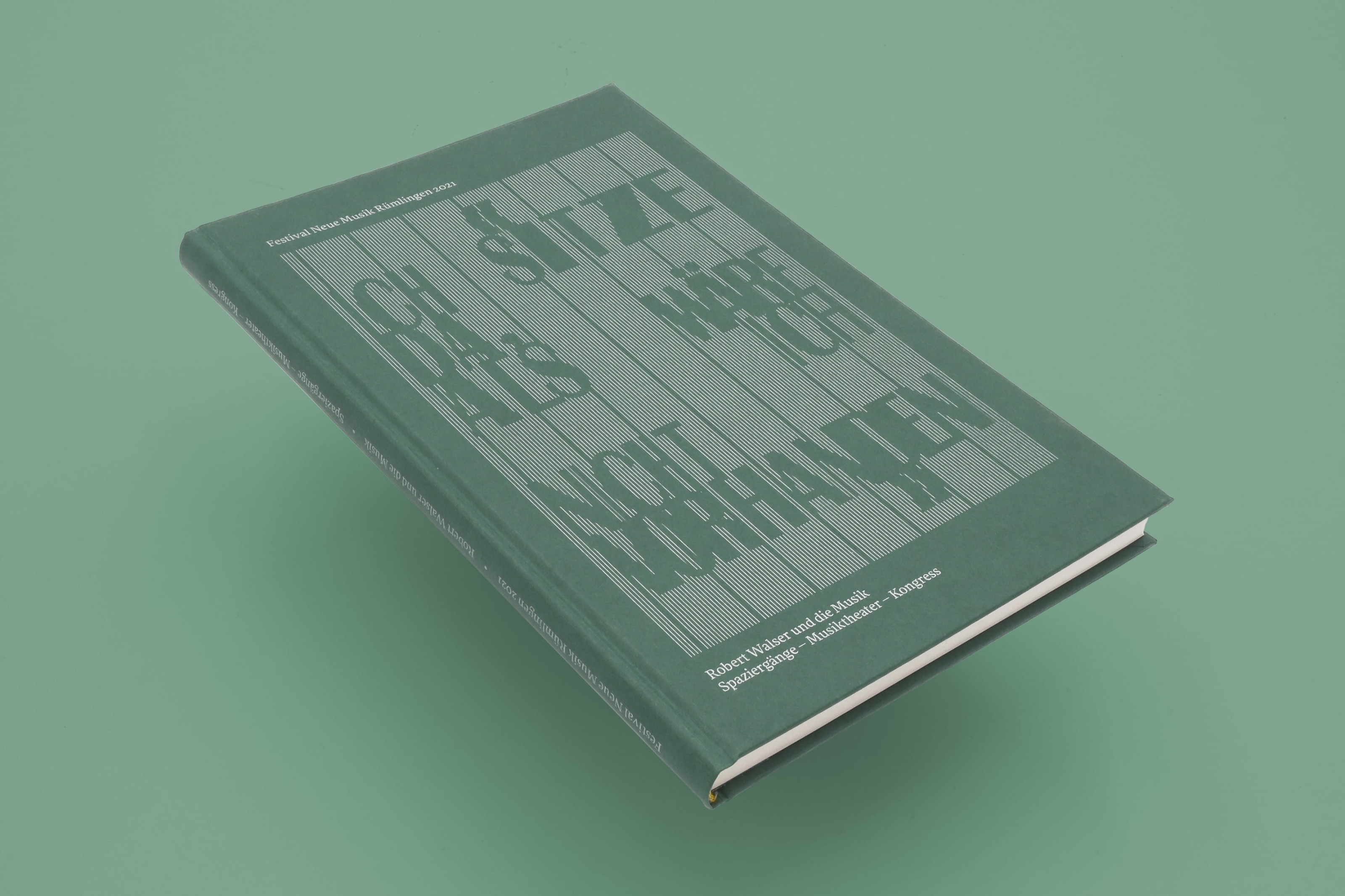
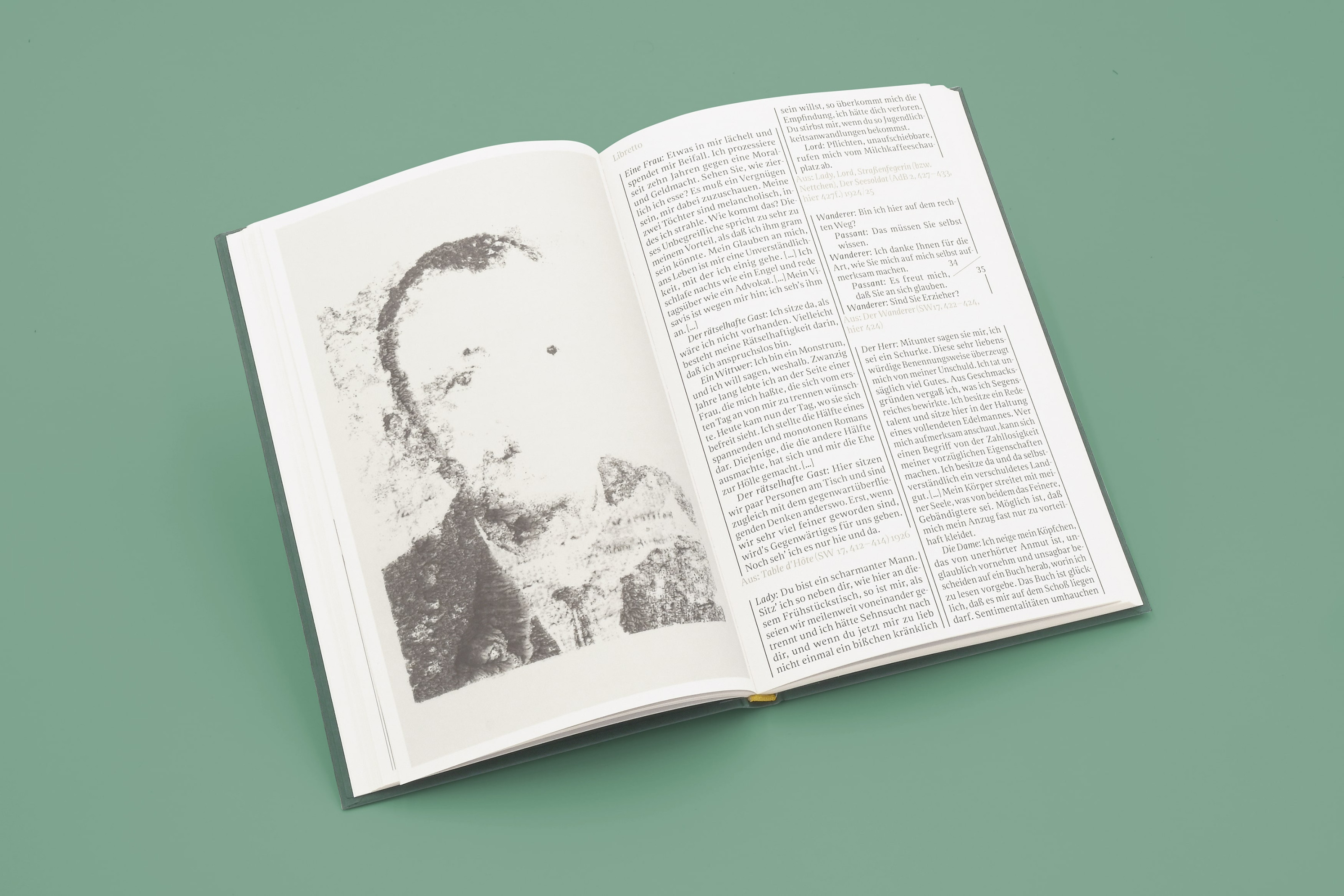
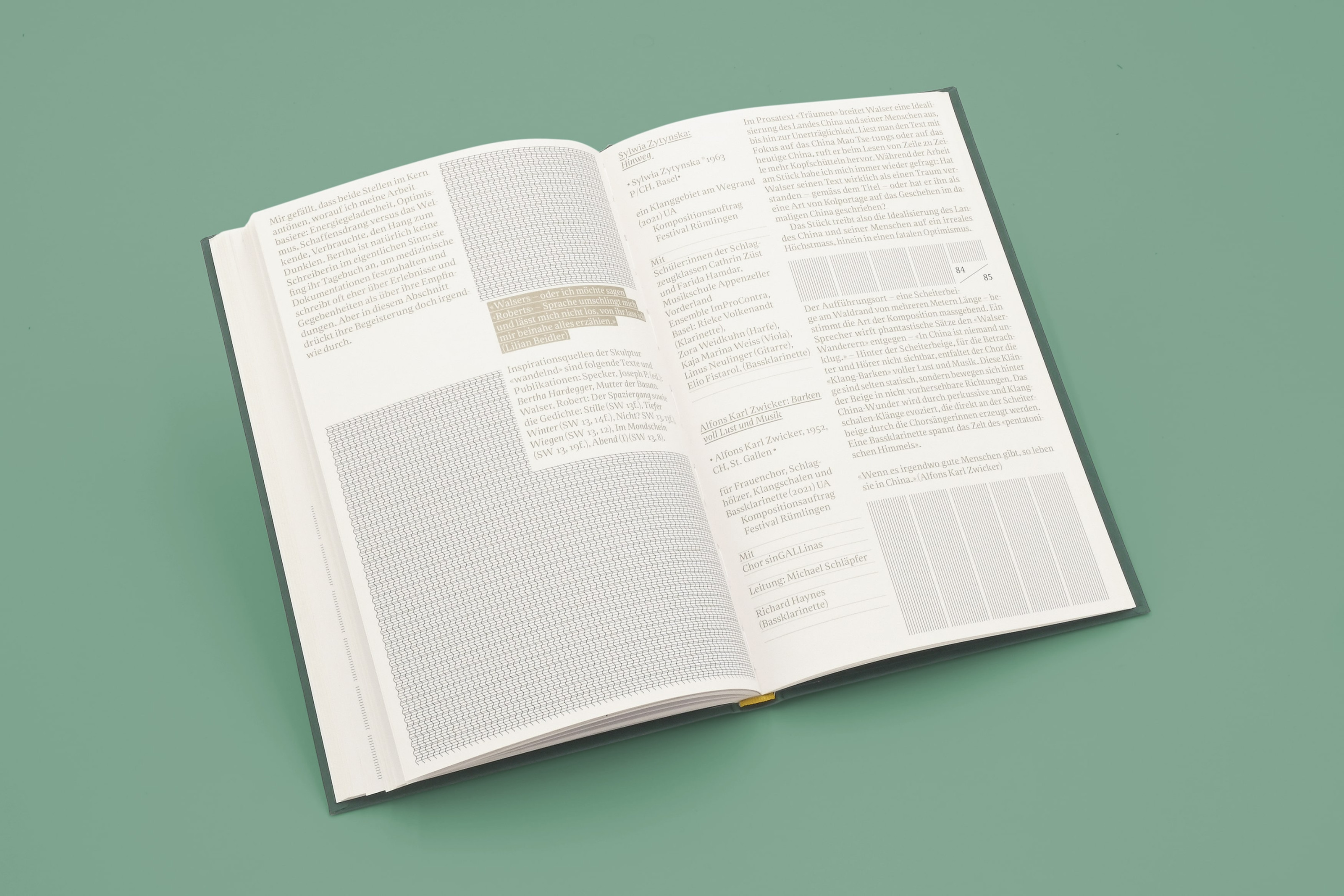
Ich sitze da, als wäre ich nicht vorhanden, Festival Rümlingen
Festival Rümlingen is a Swiss music festival. The 2021 edition of the festival came with a publication about author Robert Walser, who wrote pages and pages of texts in a tiny, almost illegible script. At first glance, the sheets look like they consist only of grids and areas. Design studio Neeser & Müller aimed to reproduce a similar aesthetic. The reader will find the text – printed in two green hues – rotated, underlined, reversed, and set in columns of different widths and sandwiched between blocks with a variety of abstract notation-like patterns. All elements relate to an underlying grid, giving the whole a super-structured impression rather than a chaotic one. Rekja, designed by Anton Studer, doesn’t get distracted by all the visual noise but guides the reader effortlessly through the text, offering welcome warmth and humanity.
On the book cover, the title is rendered in caps from several weights of Britannic.
See the original version of this post on Fonts In Use, where it was contributed by Nouvelle Noire.
1979 KLANG MOOR B4 IV DEBRIS ALCHEMIST 17 JUILLET 2009 ANATOLOV
Technologickému Schraubenzieher Henri-Joseph Rigel Newcastle–Maitland
Baldassare Galuppi 678 Smith Grove stereochemistry Kingston upon Hull
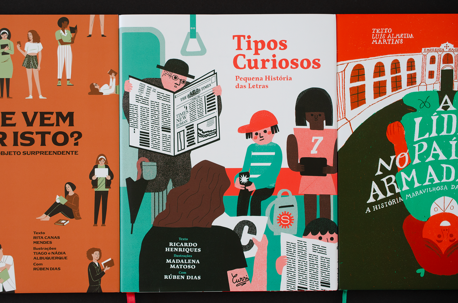
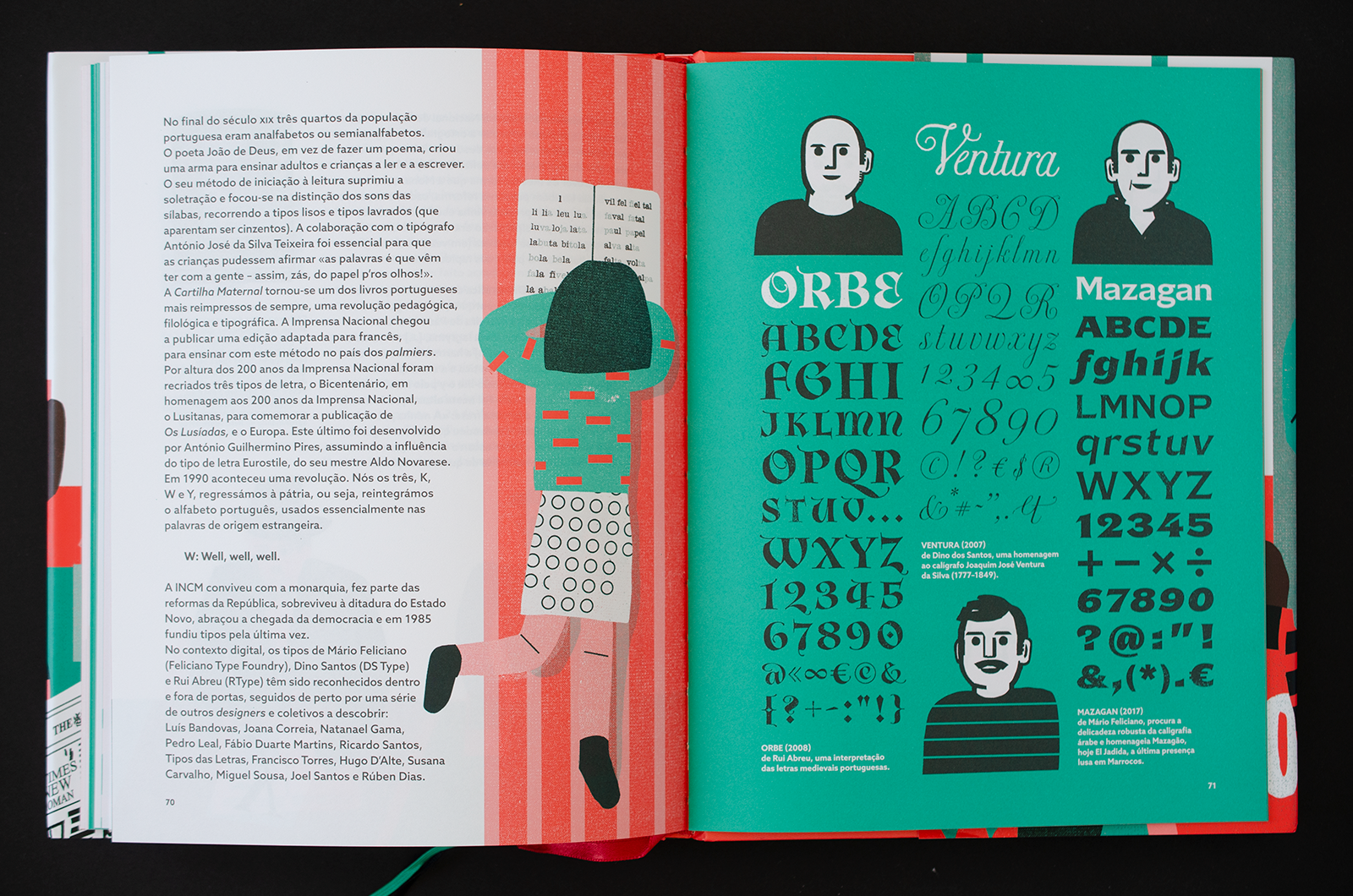
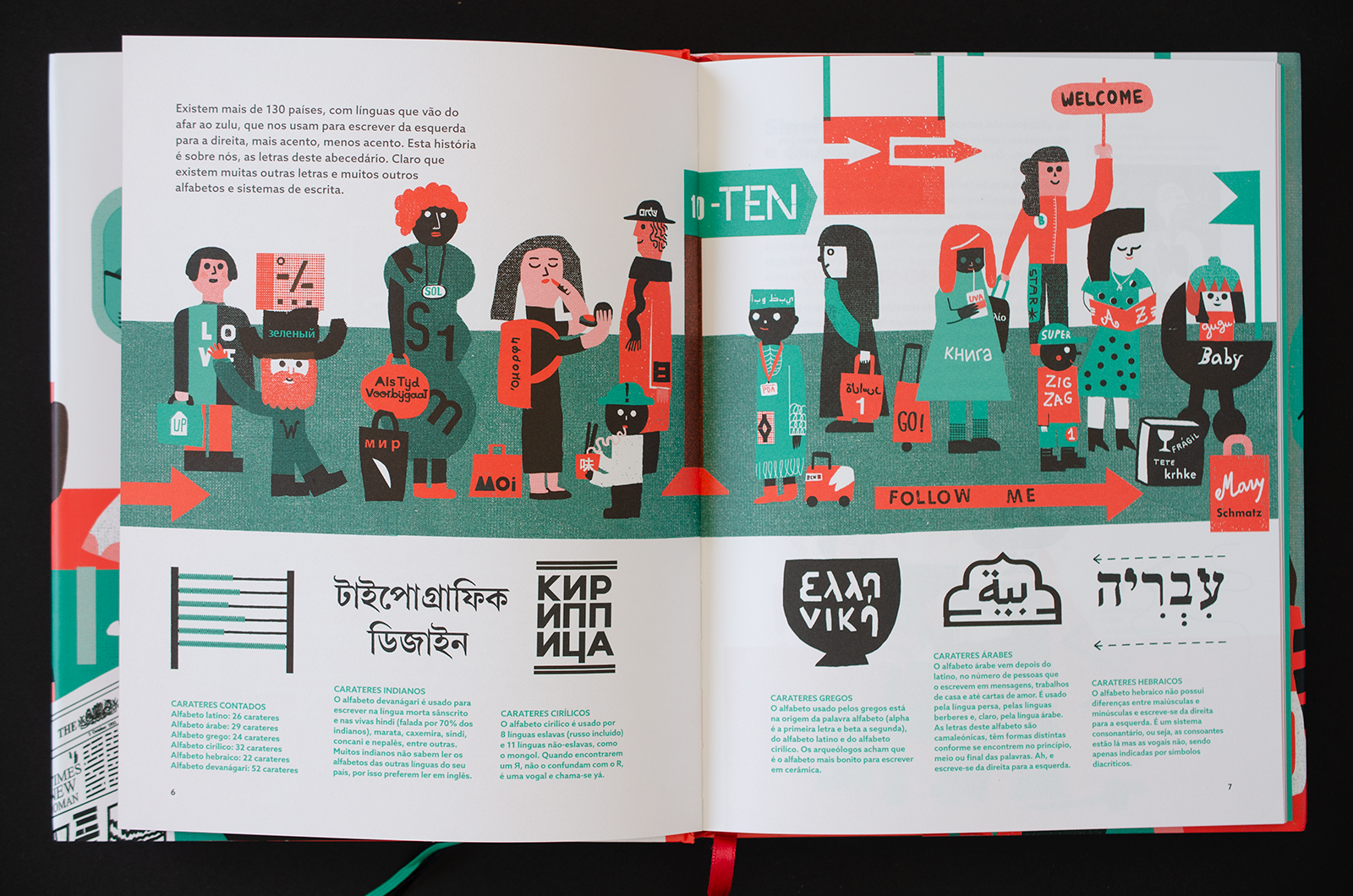
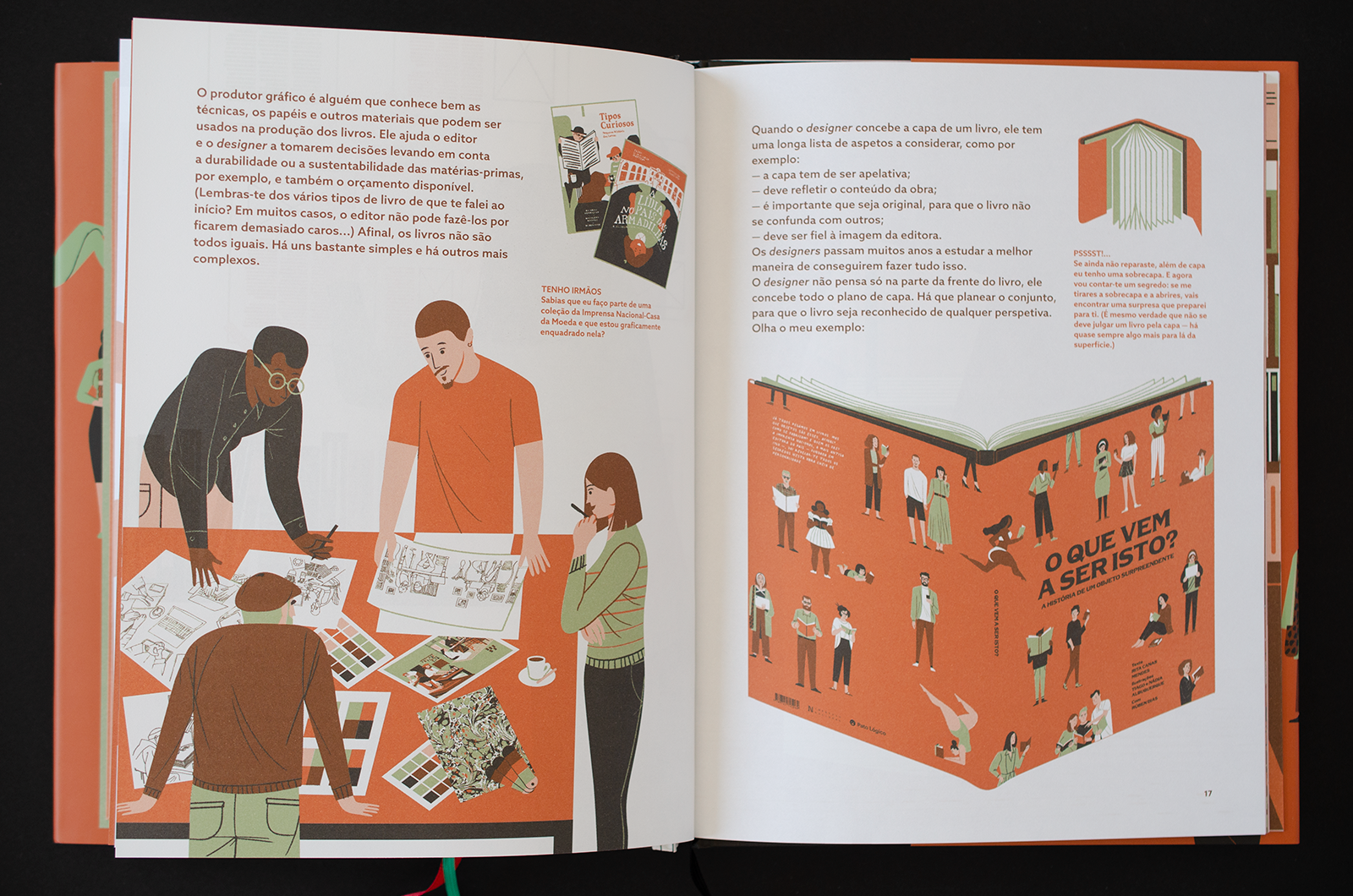
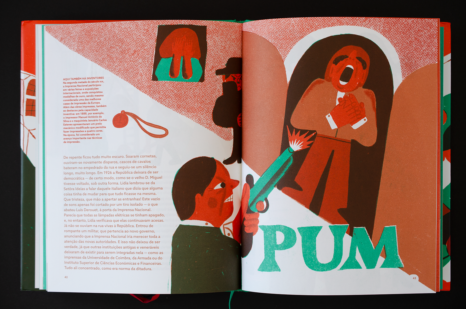
Curious types: 250th anniversary of the Portuguese National Press
On the occasion of the 250th anniversary of the Portuguese National Press in 2020, three books were published in collaboration with publisher Pato Lógico. The stories tell about the story of the evolution of letters, typography, and the art of printing; the making of books; and an exciting time-travel experience by Lídia and her class, visiting the National Press.
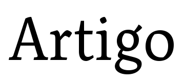
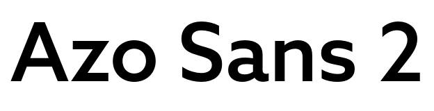
Not only are the writers and illustrators Portuguese, but even the typefaces are also from Portuguese foundries. Azo Sans by R-Typography is used in all books for the reading text; the other two families are Artigo by Nova Type Foundry and Mazagan by Feliciano Type.
Fortunately, the designers and illustrators did not adhere to a strict separation between typography and lettering or between image and text. The anniversary of the National Press is celebrated in the colors of the national flag: text and image can be red, green, or black, reversed from a color plane or anything in between by overlapping two colors. The designers of “Ich Sitze da” offer the reader some comfort by choosing a letter with firm serifs, and a different tactic was chosen here: the clean geometric forms of Azo stand out clearly from its surroundings.
See the original version of this post on Fonts In Use, where it was contributed by R-Typography.
Avinguda Pilar Esteves 72 skeiðarársandur artenschützerin Margarethe Danzi
Tarantula 48,39% Синій Жовтий připomínajících superinfections Francesco Gardi Warragul–Drouin
Giuseppe de Majo Horngasse 64 photodissociate Khartoum-Omdurman
rannsóknarréttur sainte-tréphine Alexander Reinagle Correntías Altas

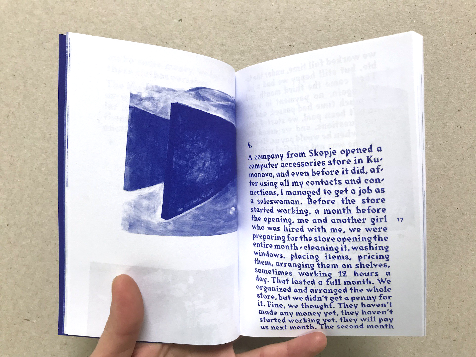
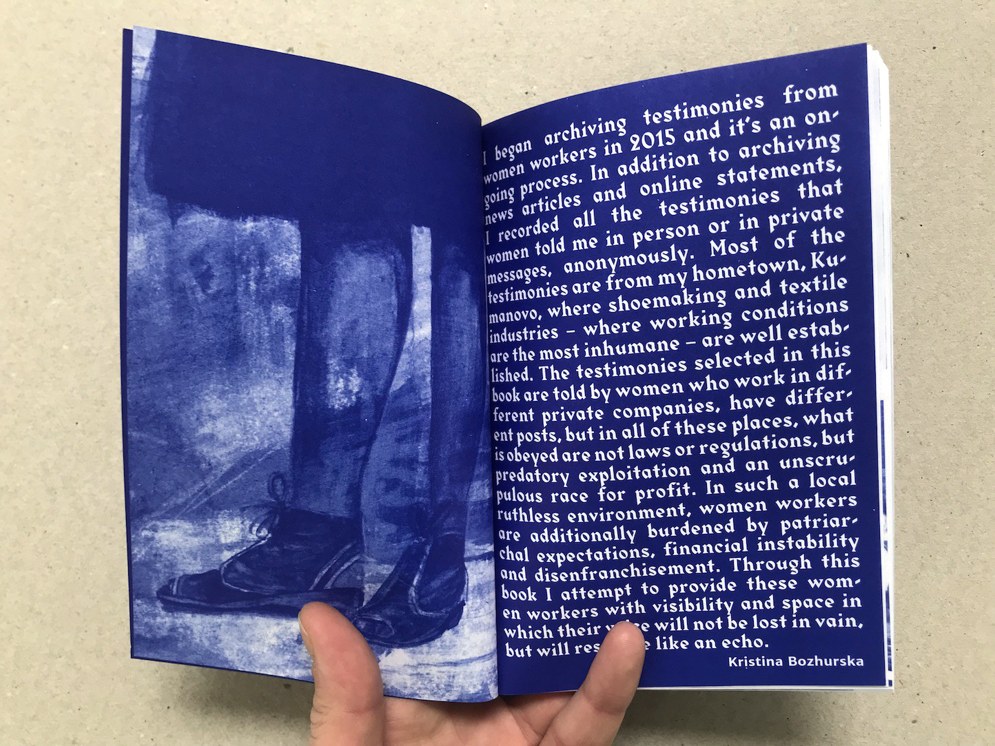
15 Horror Stories by Women Workers by Kristina Bozhurska
How distinct can a typeface be and still leave room for designers to have different associations with it all the time? In the more than 170(!) examples on the Fonts In Use website, Gareth Hague’s Harbour already proved to be the perfect typeface to evoke associations with Japan, the Islamic world, Beer and liquor, book fairs, botanical herbs, Hip-hop and … horror.
In this small issue by PrivatePress, the term horror refers not to werewolves but to the terrible working conditions of female workers in, for example, the shoe and textile industries. An abstract pattern pierces the title on the cover, set in Harbour’s angular capitals, one word per line. Inside, the design doesn’t soften: the same intense blue and the same weight of Harbour are used for the testimonials inside, alongside illustrations by author Kristina Bozhurska, adding to the urgency of the worker’s stories.
See the original version of this post on Fonts In Use, where it was contributed by Gareth Hague.
SKOPJE 12 HOUR SHIFT TRESKA 595.000 ÜSKÜB
Rannsóknarréttur Fortunato Chelleri Avinguda de Mercader F-81 insensiblemente
748 Sandra Coleman Drive No. 48 nepremišljenost vervielfältigen Johann Georg Lickl