Photo: Christian Pitschl
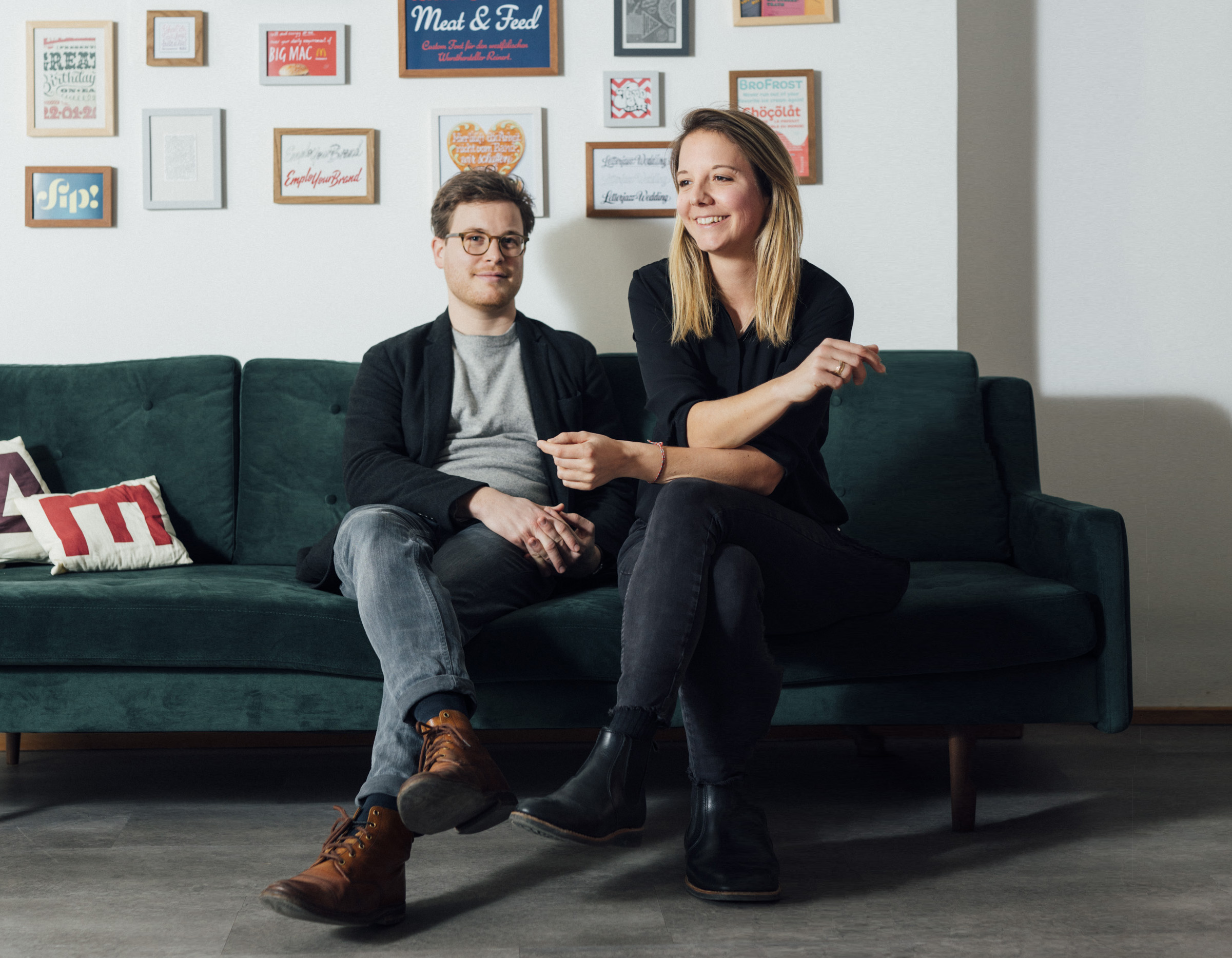
Anna Fahrmaier and Michael Hochleitner are Typejockeys, a Viennese graphic design, type design, and lettering studio. Originally a trio, the company was founded in 2008. The team met each other during their years at Die Graphische, a design school in Vienna. After graduating, Michael headed to England, where we were both part of the 2007–8 class at the University of Reading’s Master of Arts in Typeface Design program. Last week, I spoke with him about his foundry’s recent typefaces, especially Arnika.
Dan Reynolds: We haven’t seen each other since the Fontstand Conference in September. Tell me about your most recent release.
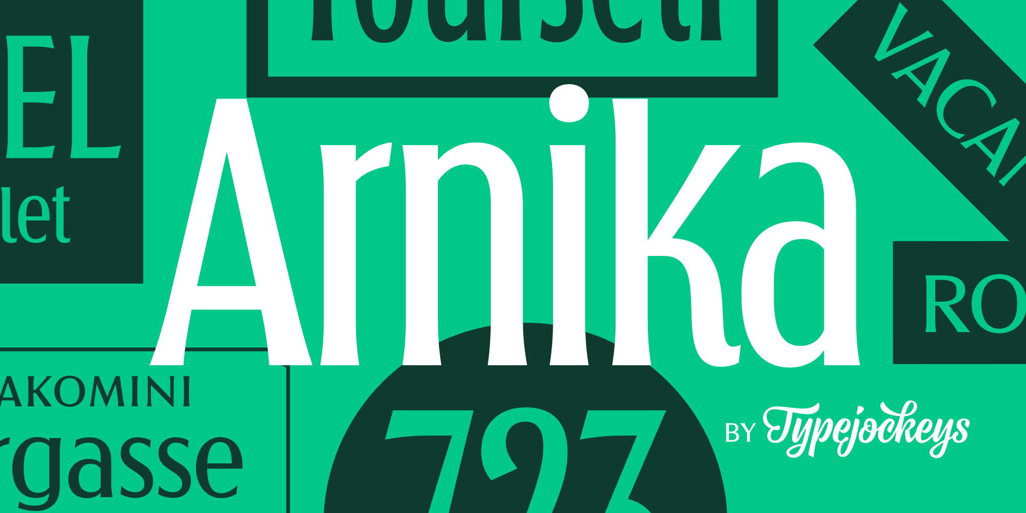
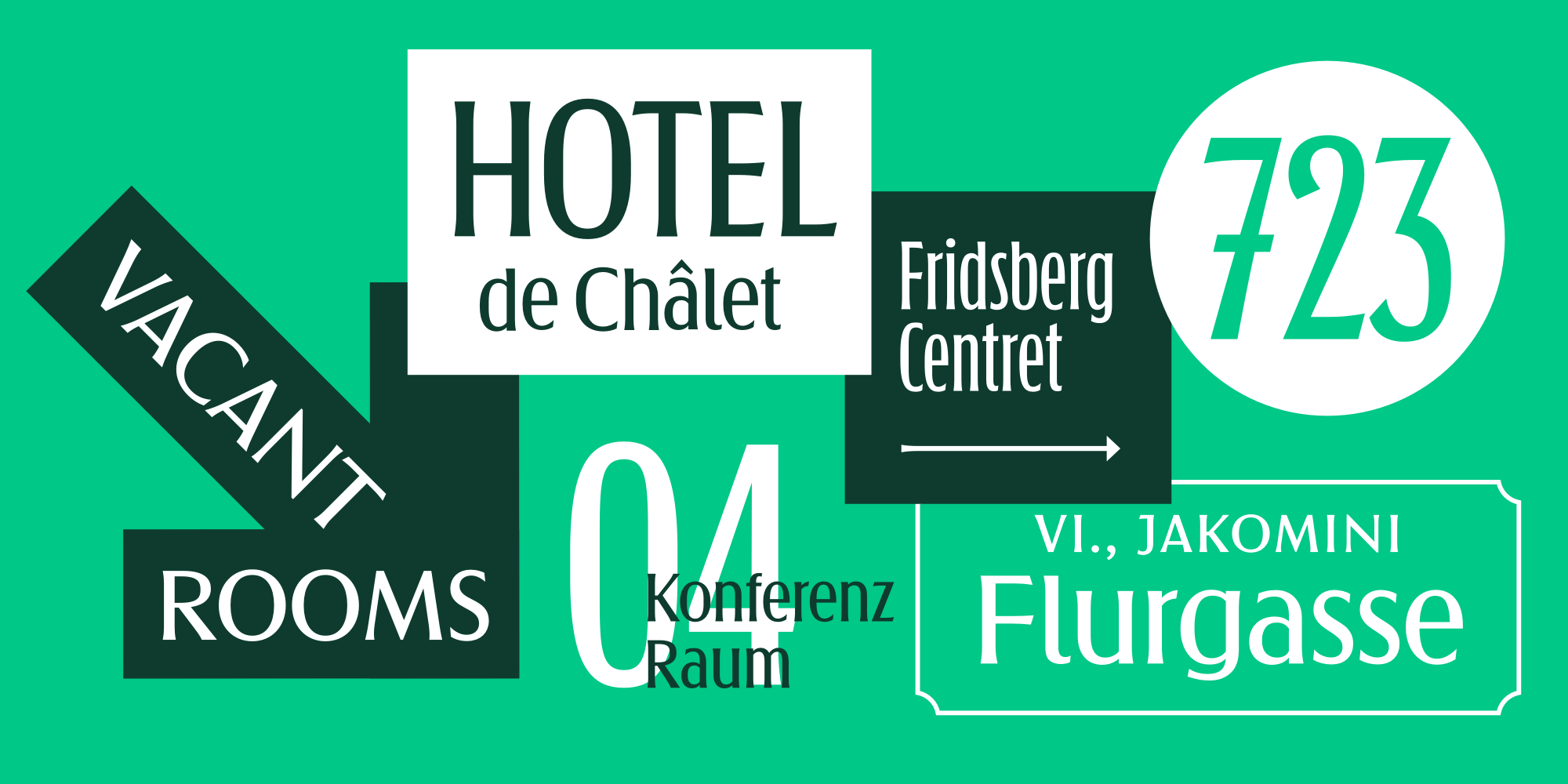
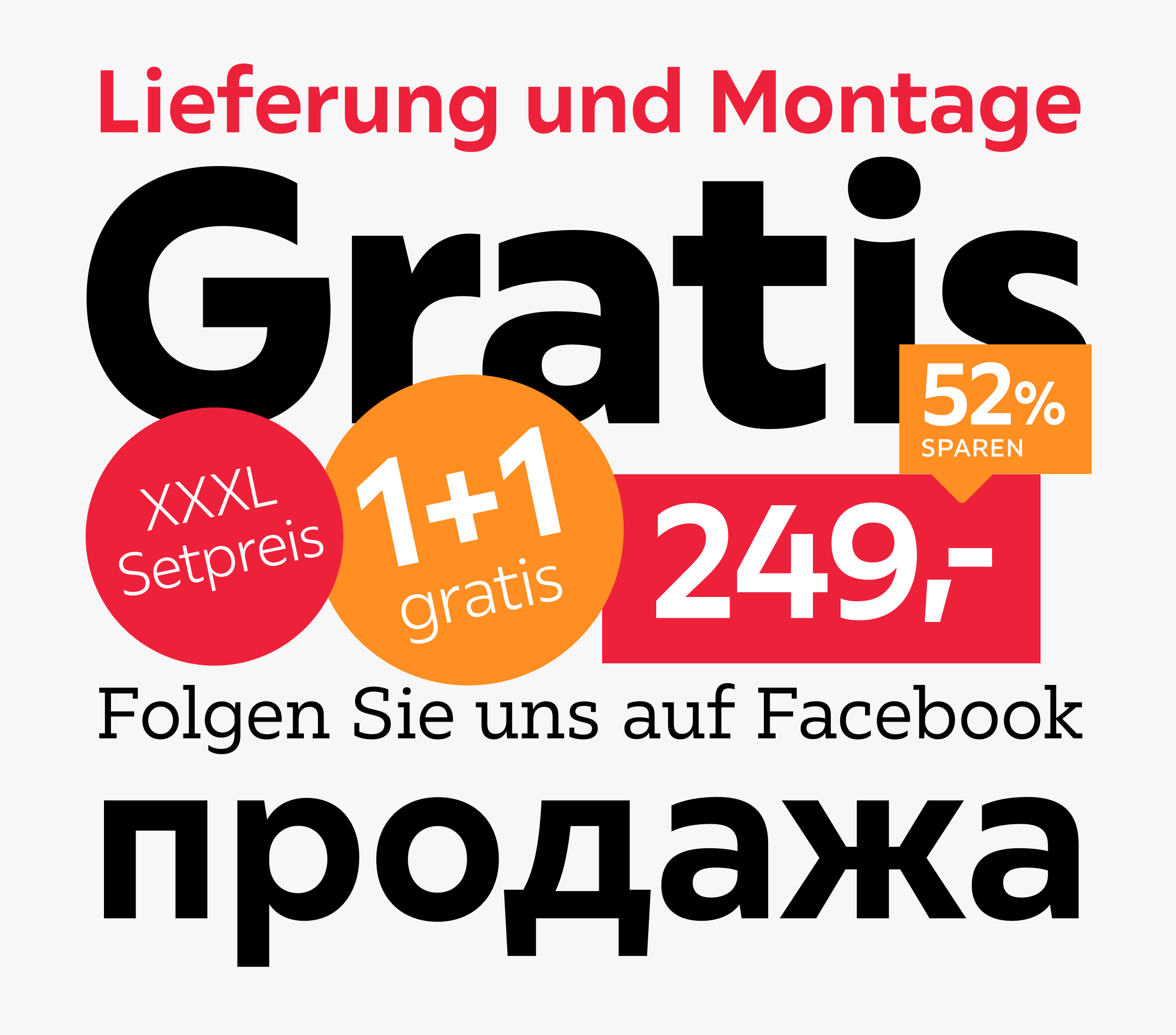
Michael Hochleitner: Well, we don’t have a very high frequency of commercial releases! [laughs] We originally designed the fonts that became Arnika for Graz, Austria’s second-largest city. The family represents a synthesis of the fonts previously used to manufacture Graz’s street signs. Arnika is very much like Henriette, a Typejockeys family that was inspired by Vienna’s street-sign types. Graz approached us because of Henriette.
The problem with street signage is, that very long or very short street names have to fit on the same plate. So it makes a lot of sense to use typefaces with multiple widths. We prepared templates for them, using Arnika as a variable font. The system is very flexible. They appreciate that, and the templates work just fine.
DR: That is a good use of variable-font technology.
MH: It really is. The street signs in Austria are enamel, and there are not a lot of producers who can still provide them. The predominant producer has its own versions of city-street typefaces, which it digitized internally. These fonts weren’t made by type designers, and there are a lot of things in them that need improvement. And the fonts aren’t publicly available, making cities reliant on their business. Graz did not want this kind of dependency.
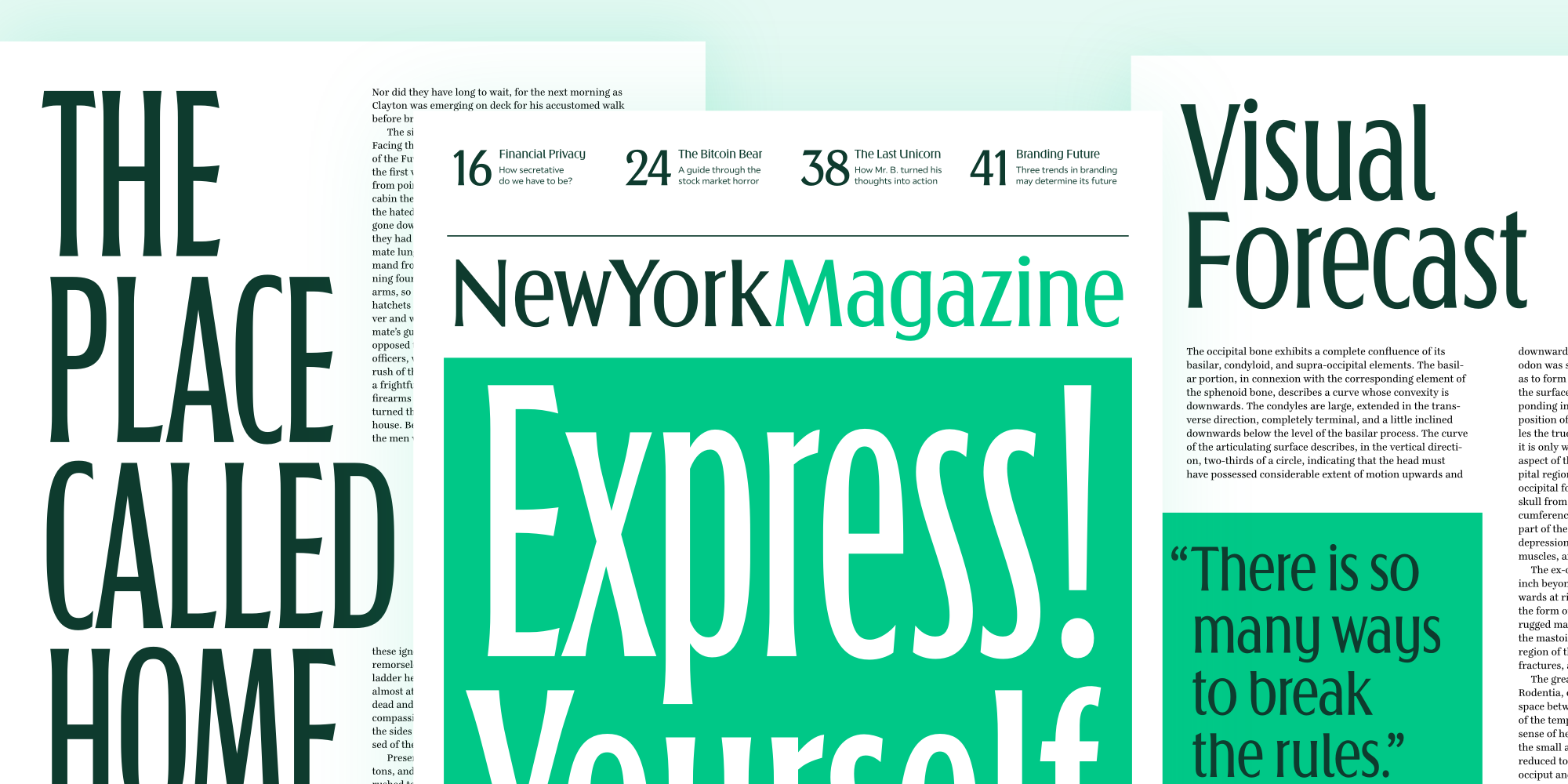
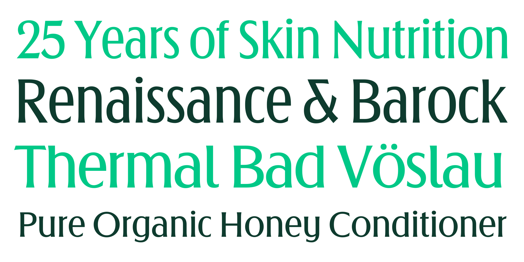
I tried to improve on the previous templates, making a narrower version that is a proper condensed, so no more squeezing around fonts! Since we created Arnika for that initial purpose, it has four widths but only one weight. Graz did not need exclusive rights to the design, so were able to also release it publicly. We think that the style isn’t just appropriate for street signs. It is a delicate design, which works really well for editorial purposes. And for packaging as well.

Arnika is based on what Graz street signs were using already. Graz is a big city. Over time, there have been several producers who made its street signs. The typefaces they used varied a lot. The people who drew them tried to do the same thing, but only sort of. For instance, some drew a straight-legged K, while other times, the leg was curved. I decided that the curved option works best in condensed widths, but I like the straight leg better when the letters are wider. My research process involved taking photographs, evaluating the different letter shapes, and trying to improve things. There are some things I kicked out and completely changed. I went to the workshop where they built the signs. It was interesting, and I enjoyed the project a lot.
We decided not to market Arnika as “the Graz typeface.” Naming typefaces is hard. We searched for a name for a very long time. Every typeface name you could imagine is usually already taken. Someone makes a display typeface overnight and calles it “Graz”, for instance. Name taken. We decided to use the word Arnika because there is a street with that name in Graz. We were also thinking of Arnold Schwarzenegger, who comes from Graz (or Styria, anyway). Strictly speaking, there is a healing plant – if you are into homeopathy – named Arnika. Our design reminded us of health products and cosmetics. The letters have a clean and healthy touch. Also, when a name starts with an A, that’s not a mistake.
Until the beginning of the 20th century, Vienna was the largest German-speaking city in the world, and before the splitting of the Austro-Hungarian Empire in World War I, the city had two million inhabitants. Today, it is the second-largest German-speaking city after Berlin.
Livskvaliteten for beboerne er steget markant startende i mellemkrigstidens “Røde Wien”, hvor standarden for en stor del af befolkningen gik fra knebne boligforhold og småhandel til at bo anstændigt og have gode muligheder for uddannelse (blandt andet på Wien Universitet, der er et af Europas ældste), kultur og natur. Befolkningssammensætningen er efterhånden indgroet “wiensk”: med basis i mange forskellige folkeslag fra det multietniske Østrig-ungarske rige.
Architektonisch ist Wien bis heute vor allem von den Bauwerken um die Wiener Ringstraße aus der Gründerzeit, aber auch von Barock und Jugendstil (Wiener Moderne bzw. Wiener Secessionsstil) geprägt. Durch seine Rolle als kaiserliche Reichshaupt- und Residenzstadt des Kaisertums Österreich ab 1804 wurde Wien zu einem kulturellen und politischen Zentrum Europas.
La Mechitaristenkirche si trova sulla Neustiftgasse, N°4. Nel 1773 una parte dei padri Mechitaristi, che si erano separati dalla comunità di San Lazzaro (Venezia). Con il tempo, il Monastero Mechitarista di Vienna, parallelamente a quello di San Lazzaro a Venezia, si afferma quale centro di grande rilievo e punto di riferimento della cultura armena nel mondo. Il monastero ospita raccolte numismatiche (10 000 monete armene e 20 000 extra-armene); ceramiche artistiche caucasiche, argenterie sacre appartenenti alla Chiesa autocefala armena. La Pinacoteca raccoglie tele di pittori armeni (tra i quali quelli della famiglie di Naghash e Ayvazovski); è presente anche un'importantissima biblioteca formata da manoscritti armeni (antichi e preziosi), andando a formare una delle più grandi collezioni del mondo; tra le opere antiche e moderne la biblioteca della Mechitaristenkirche conta più di 170 000 libri, inoltre conserva giornali e periodici armeni. Dal 1889 il Monastero di Vienna, inoltre, è sede di una distilleria nota per il famoso Mechitharine (liquore alle erbe), si dice che la ricetta originale sia stata portata dallo stesso Mechitar in persona.
DR: Henriette is a typeface you designed based on existing street signs in Vienna. It didn’t replace what was being used for street-sign production, right?
MH: The Vienna street signs only use a heavy weight, in several widths. I extended the design to have several weights and italics, but Vienna does not use them officially. I mean, the city of Vienna does use the free version – the black weight, which has been a free font since the beginning. Not for the street signs, though. I guess that’s how things go!
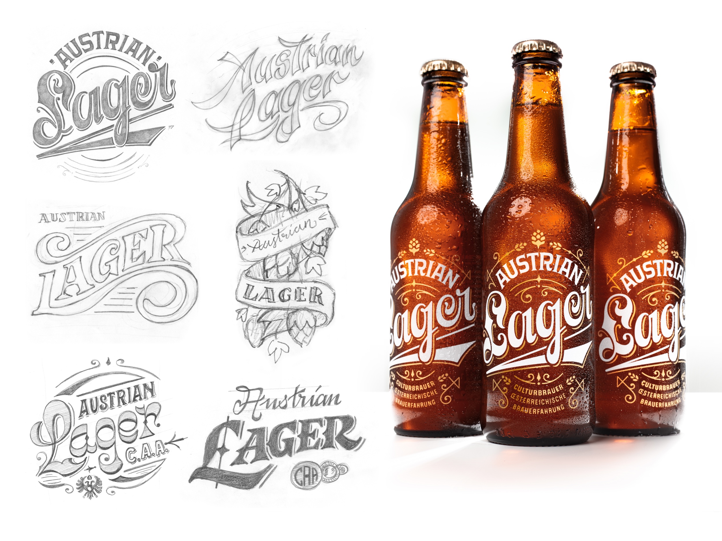
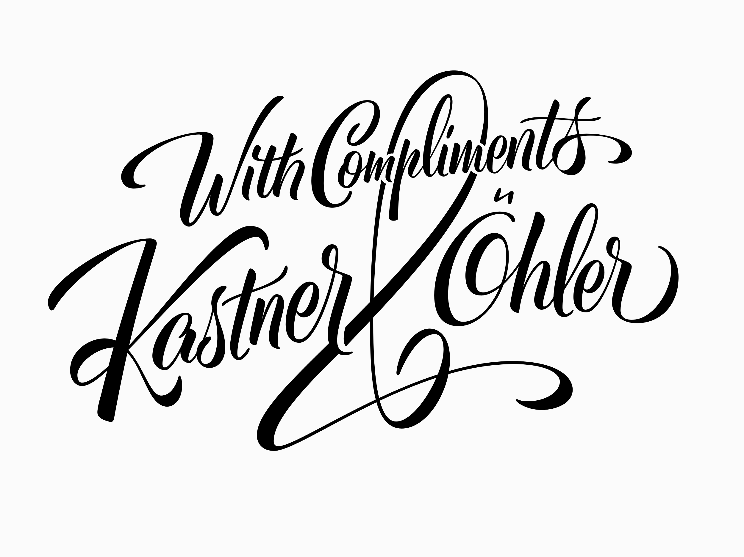
A crucial part of Typejockeys, when it comes to custom work, is lettering. I really enjoy that, and I think it is an important feature of our company. Some of the ideas could become typefaces at some point, but for most of these, it does not make sense to do that. It is also nice to do something that is just for one purpose.
DR: You mention that you don’t release new typefaces very often. I don’t think that’s a problem at all. How do you develop your typefaces? Do most of them grow out of custom projects, like Arnika?
MH: Custom work is what we pay out our bills with. If clients don’t want exclusive rights, we are open to releasing the typefaces at some point for the public. And we’ve made some large custom families. The work that we did for XXXLutz is a great example. I’m proud of Post Sans. For people who live in Austria, this typeface is everywhere. They use it well. It is one of the most satisfying projects I’ve ever worked on. What the Austrian Post does with the typeface and the icons we designed for them is beautiful. They use it for everything. Every stamp and all the pieces of paper they leave in your mailbox. For instance, they use it on the slip they leave behind when you miss a package delivery. I’m happy when I miss a package now! But that’s only me.
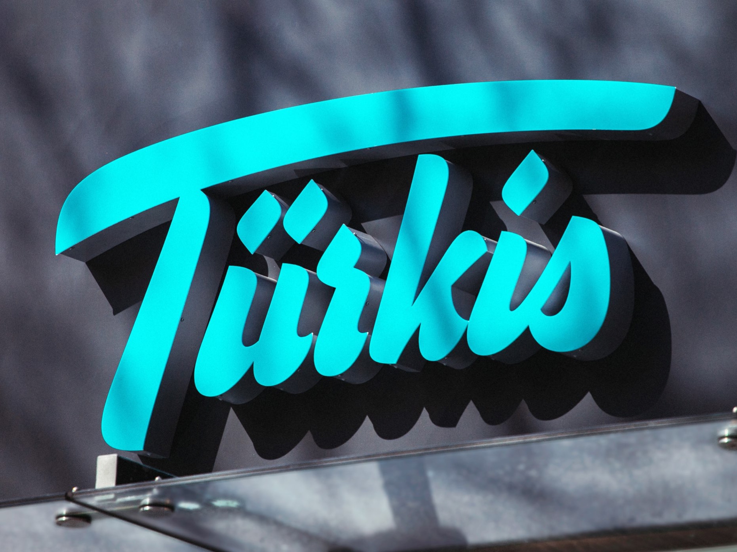
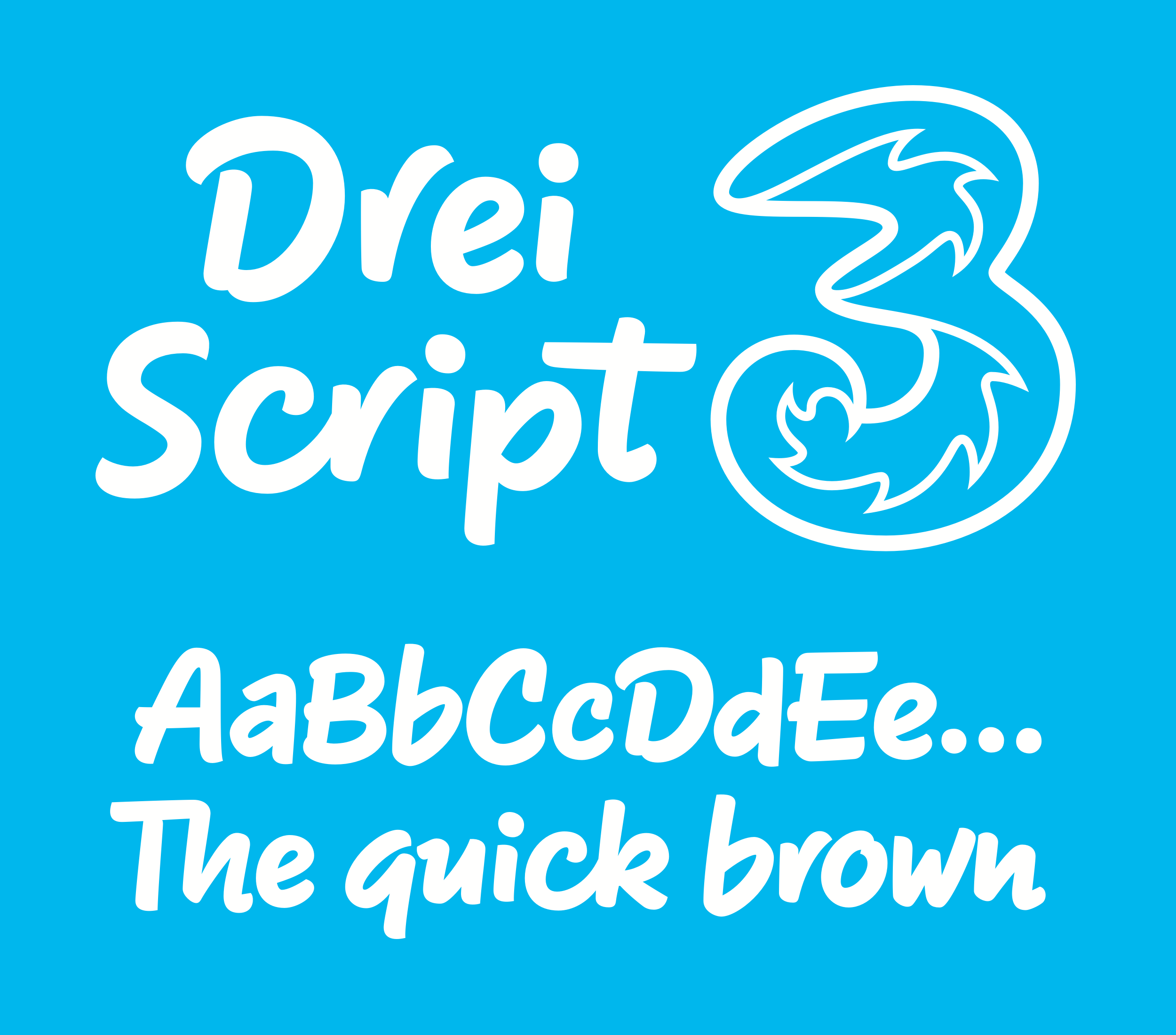
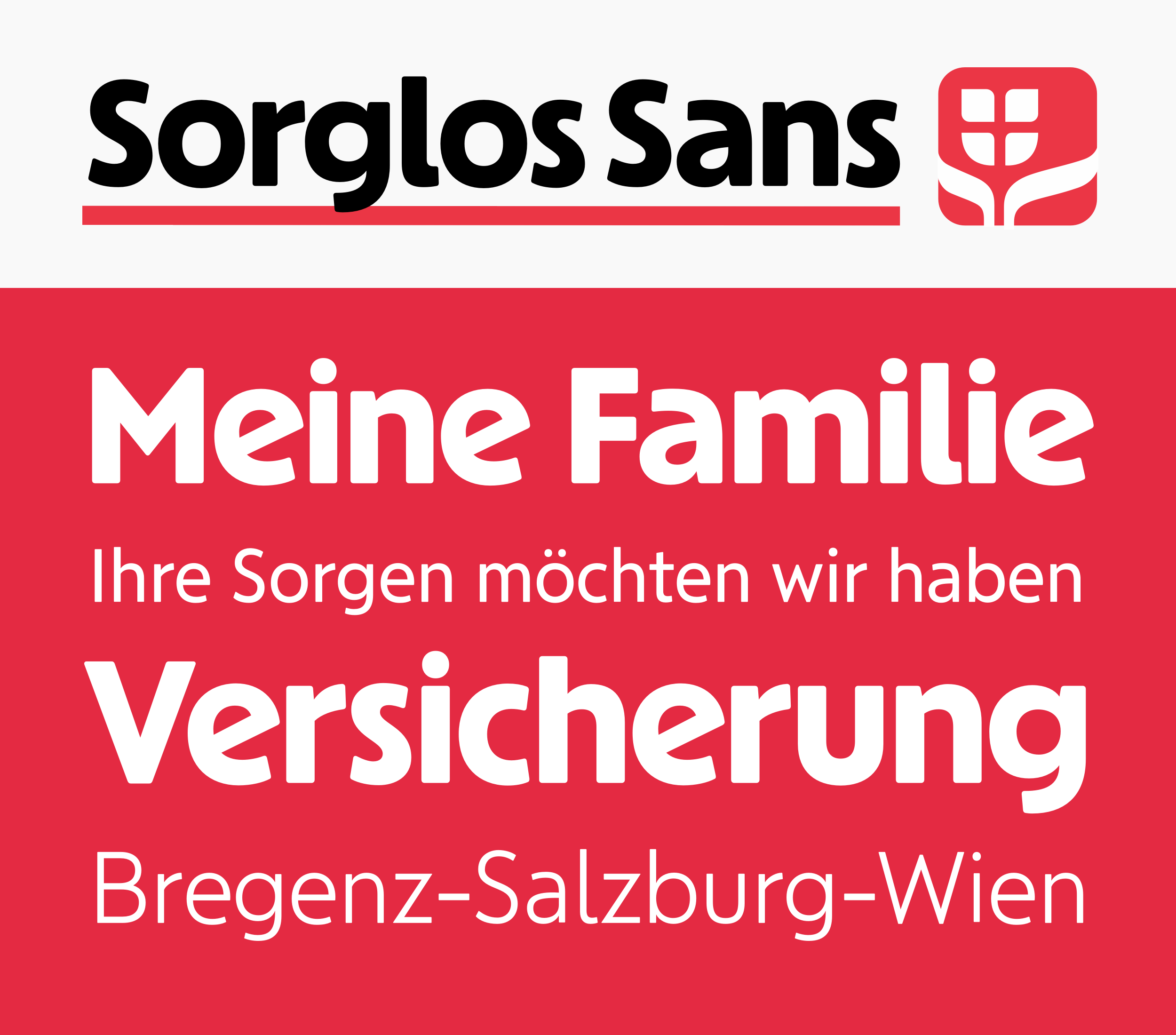
There is also the Drei Script typeface. Drei have been using it for years. They use it for all their advertising. When it comes to custom projects, most companies will want a generic sans serif. I guess we have gotten lucky with our clients. Consider the typeface we designed for Wiener Städtische, a huge insurance company. I’m very happy with the design, which does not look generic. It is exclusive, though.
DR: Switching gears, I think that Antonia is great. It has a novel design, and the way its optical sizes are named is also innovative. Some other type designers also told me back then that they were annoyed not to have come up with the idea of calling optical sizes H1, H2, H3, and Text.
MH: But the people who notice that are fellow type designers!
DR: Yeah, they don’t license the fonts.
Boarisch bzw. Bairisch is a Sproch im Siidostn vom deitschn Sprochraum. Zamma midm Alemannischn, Sidfränkischn und Ostfränkischn buidns de obadeitschn Sprochn. Es Vabroadungsgebiet vom Boarischn is da oidboarische Tei vom Freistoot Bayern, es aissaste Sidvogdland in Saxn, Östareich (estli vom Arlberg), Sidtirol und de zimbrisch-karnischn Sprochinsln in Obaitalien.
Nicknames different from the family name exist for almost all families, especially in small villages. They consist largely of their profession, names or professions of deceased inhabitants of their homes or the site where their homes are located.
Il n’existe pas d’orthographe officielle et unifiée pour le bavarois et les différences régionales peuvent être très importantes. Il existe cependant certaines tendances, notamment dans la poésie et la littérature. L’orthographe bavaroise est généralement fortement inspirée de l’orthographe allemande, avec cependant quelques conventions supplémentaires. De plus amples détails sur l’écriture utilisée, notamment dans cet article, et la prononciation associée sont fournis plus bas.
Las diferencias son claramente perceptibles dentro de esos tres subgrupos, los cuales coinciden en Austria con las fronteras de sus estados. Por ejemplo, los acentos de Carintia, Estiria y Tirol pueden ser fácilmente reconocibles. Igualmente hay una diferencia marcada entre el bávaro central oriental y occidental, coincidiendo aproximadamente con la frontera entre Austria y Baviera. Además, el dialecto de Viena tiene algunas características que lo distinguen de otros dialectos. En Viena, menor pero reconocible, las variaciones caracterizan los distintos distritos de la ciudad. La variedad que se habla en el Tirol del Sur ha asimilado muchas palabras del italiano, especialmente en el campo de los términos administrativos y los alimentos.
MH: You know, Antonia also derived out of a custom project. It was for the linguistic department at the University of Innsbruck. Since the ’70s, they have collected information about the Tyrolean and South Bavarian dialects. They archived it in an analog way. They needed a method to transcribe the sounds and built a system to solve that. Later, they got funding to create a proper typeface – but they only needed a regular style. We came up with a way for the diacritical marks to be typed, enabling them to create a searchable database.
DR: I knew about the linguistic font, but I did not realize that it had been the impetus for the entire typeface.
MH: They just needed a regular style, not optical sizes or weights. So we said, “OK, we just made another serif typeface. Nobody wants to buy serif typefaces. What can we do it? Let’s turn it into a huge family with optical sizes and weights because we are stupid.” And we did, and that’s how it came out. I did this together with Franziska Weitgruber.
DR: What about your other typefaces, like Ingeborg?
MH: Ingeborg still gets some attention, together with Aniuk. But there is a lot more competition in that sector now. I often find books that are printed in Ingeborg, which is beautiful.
We are in a niche area when it comes to the design world. I am not picky when it comes to style. The fun in the whole thing is covering all these different areas. I like making display typefaces. I think I’m rather good at script typefaces.
Larissa-Weber-Ring 65 aufstandsfläche Tabernas Desert veröffentlichung Speciallægepraksisplanlægningsstabiliseringsperiode Databasesystemshåndteringsprotokol
Newcastle–Maitland 68 Rue de l’Étang nepremišljenost changeabilities
neutralisierung Dallas–Fort Worth technologickému Karl von Ordóñez Restaurationsdriftsegnethedsattest
I think Gretel Script is a well-working typeface. There are a lot of typefaces that are in the same genre. We worked on the typeface for three years, and during that time, it felt like every other week, a typeface with a similar look would be released. We worked together with a calligrapher, who helped us to get the connections and the forms right. We also thought hard about how to digitize it. You know, whether to go with a rough look or with clean curves. There are different approaches to these kinds of typefaces.
We also added optical sizes. Gretel Script was our first typeface to have them. It is arguable if you need optical sizes for script typefaces, but I think you do. Often, it annoys me if I use Sauber Script, for example. If I put a headline and a subheadline next to each other and both are in Sauber Script, it is obvious that the smaller setting is just scaled down. Optical sizes solve that. But this is a niche thing. You need to find a designer to values quality and wants a typeface in that style. There are probably only a handful of people in the world matching this profile, but I guess, that’s how we roll [laughs]

