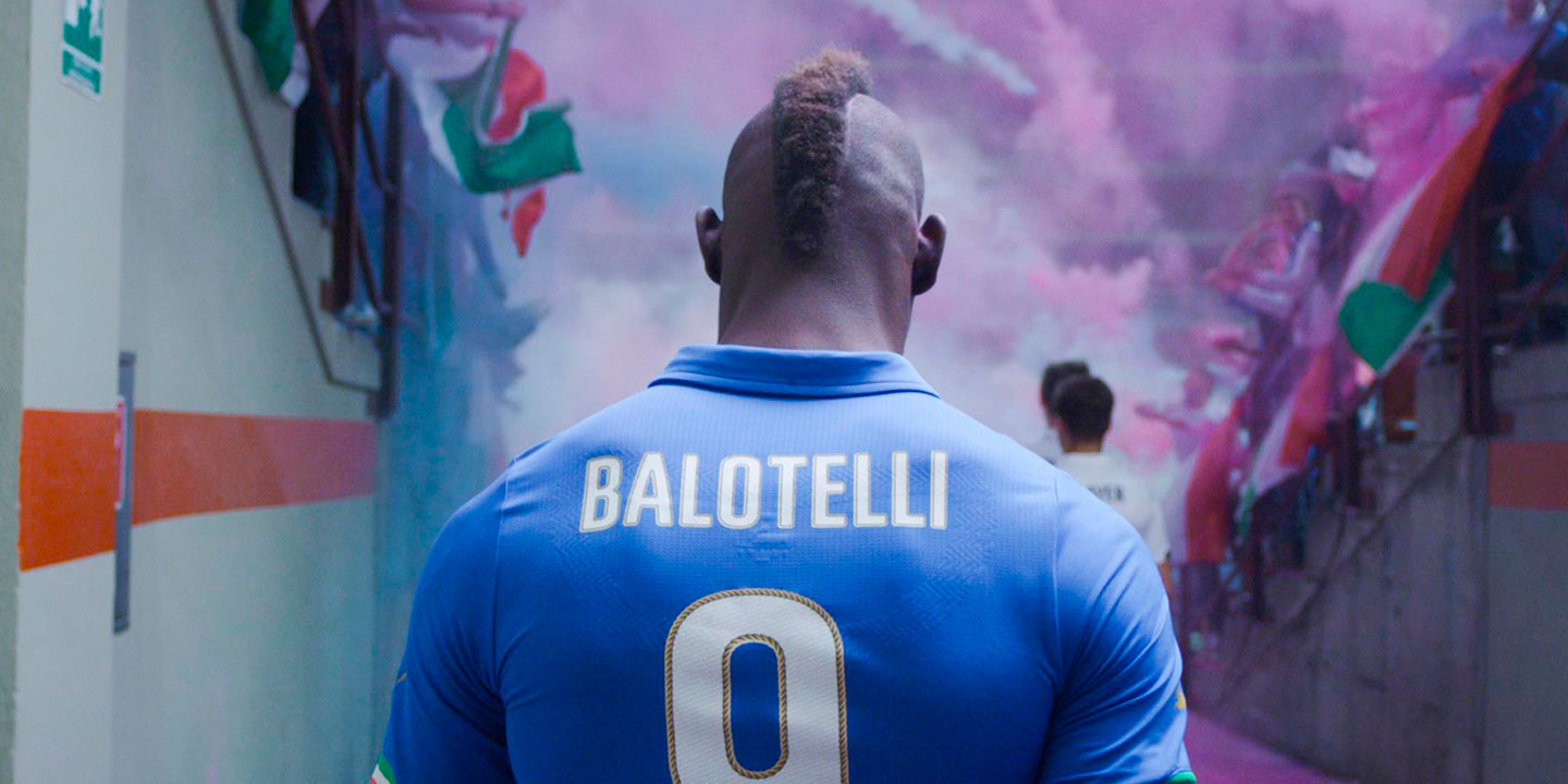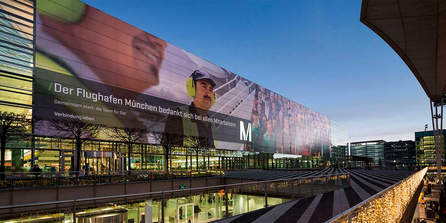
Photo: Eduardo Manso
Barcelona is the city with the highest number of type designers in Spain. When we think of Spanish design, it’s the place that comes to mind as the hub of the whole state. It’s perhaps the only place in Spain that has a recognisable design history as such. This has made the city a focus of attraction for designers and those interested in design for more than a century.
Prestigious type designers such as Andreu Balius (Typerepublic) or Laura Meseguer and José Manuel Urós (Typ-ø-Tones), among many others, live, work or have studied in Barcelona. That was the main reason that attracted the Argentinian Eduardo Manso, who arrived in Barcelona in 2000 with the intention of staying for just a couple of years.
His love of typography arose during his studies in graphic design, where he focused all his interest on the typographic aspects of his academic projects. In his own words, he was “a bit of a micro-typography freak”, to the point of designing his own typefaces, “always at a very amateurish level.” But from that moment on, there was no turning back. “It’s almost inevitable,” he declares, “when a graphic designer puts too much interest in letters, sooner or later he ends up crossing the line and tries to design letters himself.” It was a glorious time for him, given that it was a time of constant research, when “almost everything was still to be done in the digital realm.”
As in other parts of the world, “it was extremely complex to find information on typeface design in Argentina. You had to reverse engineering to understand the most basic topics. In this sense, Tipográfica magazine played an important role in my education, along with emigre magazine, Gustavo Gili's books and Gunnlaugur Briem’s Notes on type design (1998).”
In order to grow as a graphic designer and get seriously involved in type design, he left a good job in advertising in his home country. He had already made his first typeface in a completely self-taught way. So, when he arrived in Barcelona, he felt that everything clicked for him. He says that he “worked in a design studio (together with Laura Messeguer) and in my free time, weekends and evenings I continued to make typefaces, to which I dedicated many hours, even sacrificing family time.”
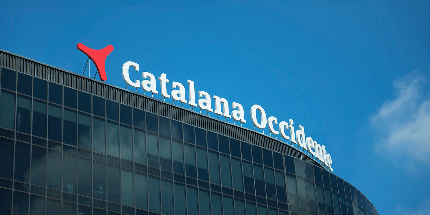
There, he immediately came in contact with “designers and collectives such as Type-ø-Tones, García Fonts and Catalana de Tipos.” It was an environment that breathed typography, in which knowledge and experiences were shared among the few who were dedicated to it, “but we did it better and better and obtained international recognition that put Barcelona on the map of world typography.”
He immediately became interested in type technology. He had already used Multiple Master in 1996 when, during his university days in Argentina, he designed a magazine called elHuevo, for which he made a version of Myriad with a special width using MM. “Everything was new and better to me. I was aware that my environment didn’t get excited at the same level for trifles like that.” Eduardo doesn’t think it’s a bad thing “to be a weirdo; somehow it makes you feel special.” He even became obsessed “with recognising all the typefaces published”, something he was quite skilled at the time, but which he would find impossible today.
This obsession for the detail, his hunger for knowledge and his hard-working spirit have sometimes led him to wonder whether he wasted his time experimenting. He is quick to answer himself by stating that “if I hadn’t, I wouldn’t have evolved. Doubting is part of the designer’s job, and great ideas come from working.”
His hard-working nature, as an almost obsessive perfectionist, is what prompted him to take the leap as a type designer. “When I was doing Bohemia in 2000, I understood that quality typography was a process of months or years. Even so, there was a moment when something clicked in my head and it was clear to me that I wanted to do this, but also that I wanted to do it well. It was an eye-opening moment. It was hard work but I was enjoying it and I didn’t want it to stop.” It was then when he made the decision to become a professional, dedicating all his efforts to achieve it. So he founded Emtype in 2002, with the clear idea that everything he published from then on “would be quality typography, even if it was a pixel font like Dixplay. Then came Relato and Relato Sans, Geogrotesque, Ciutadella, and so on.”
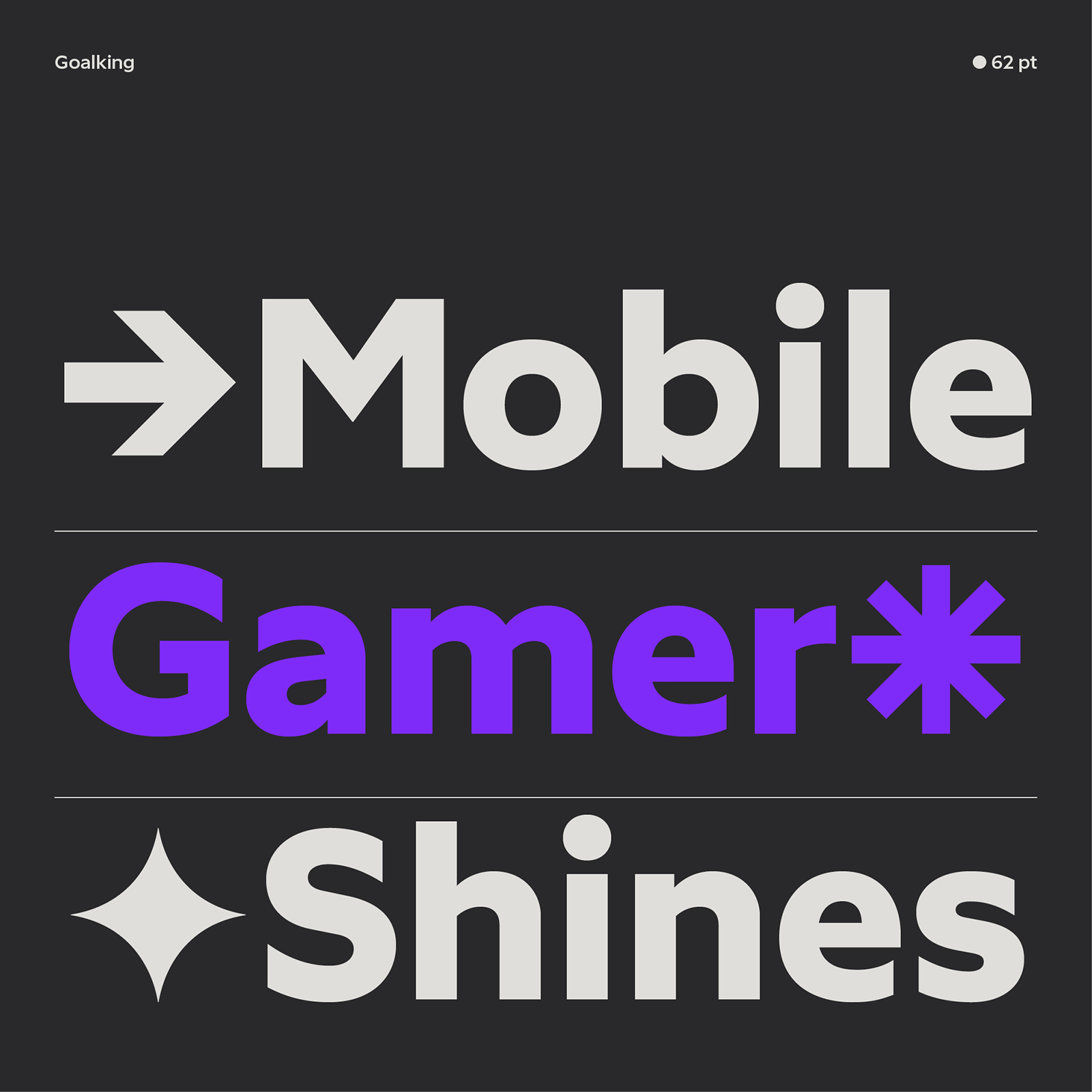
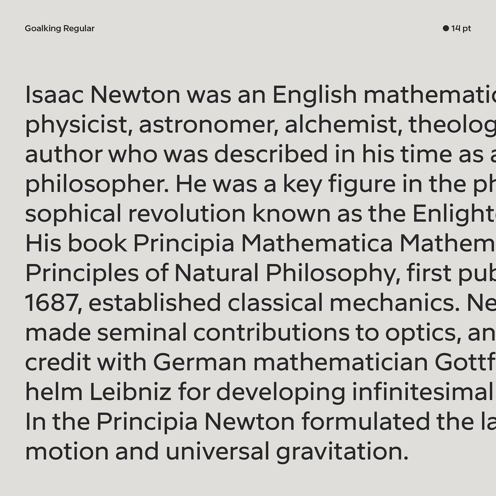
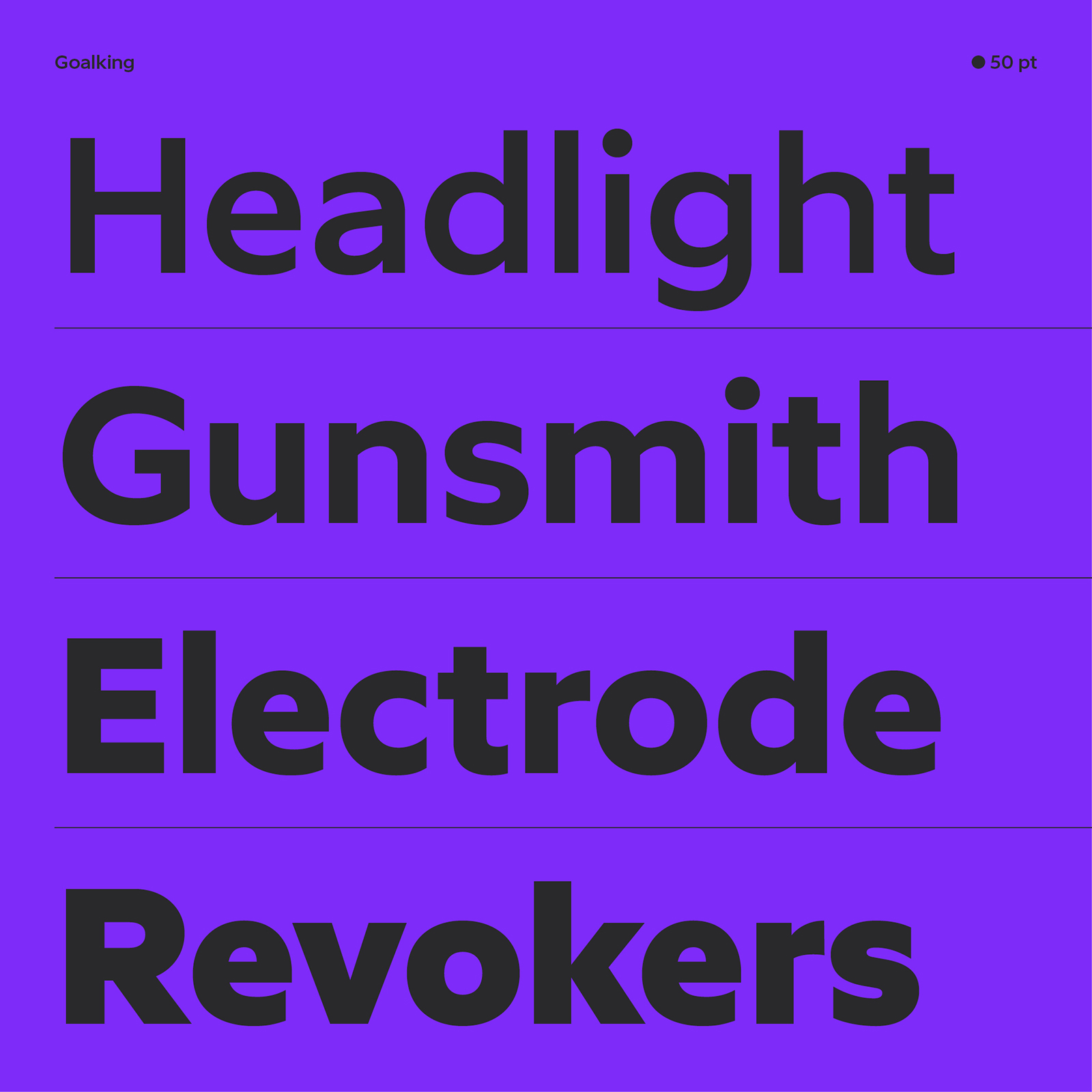
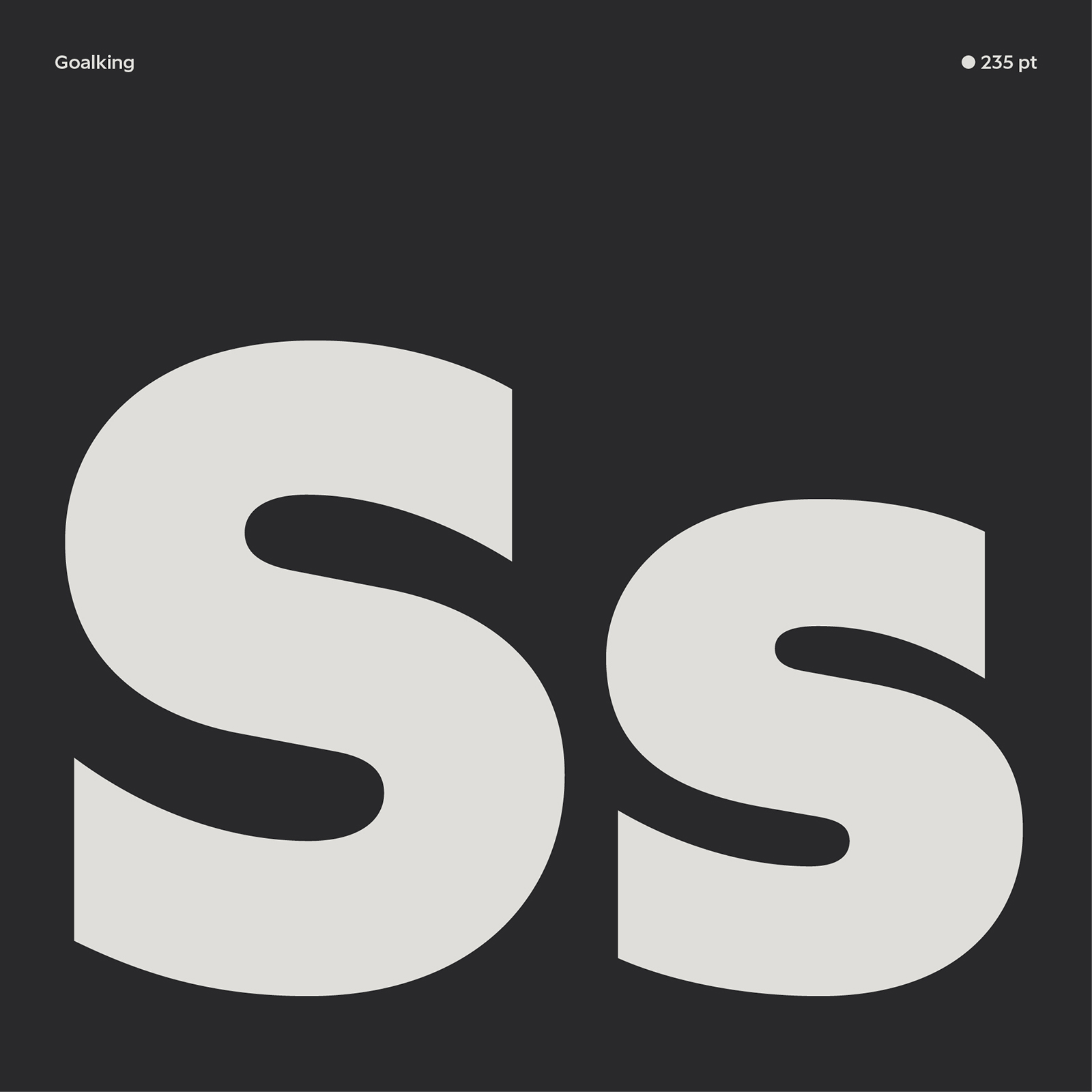
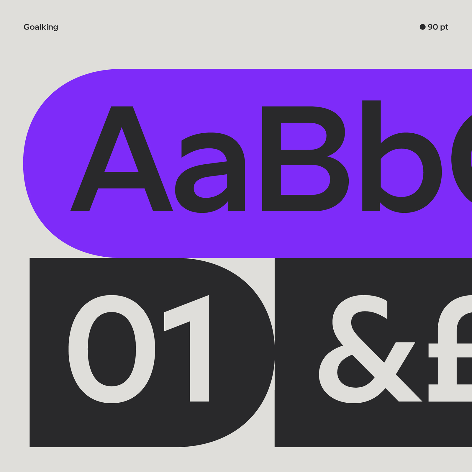
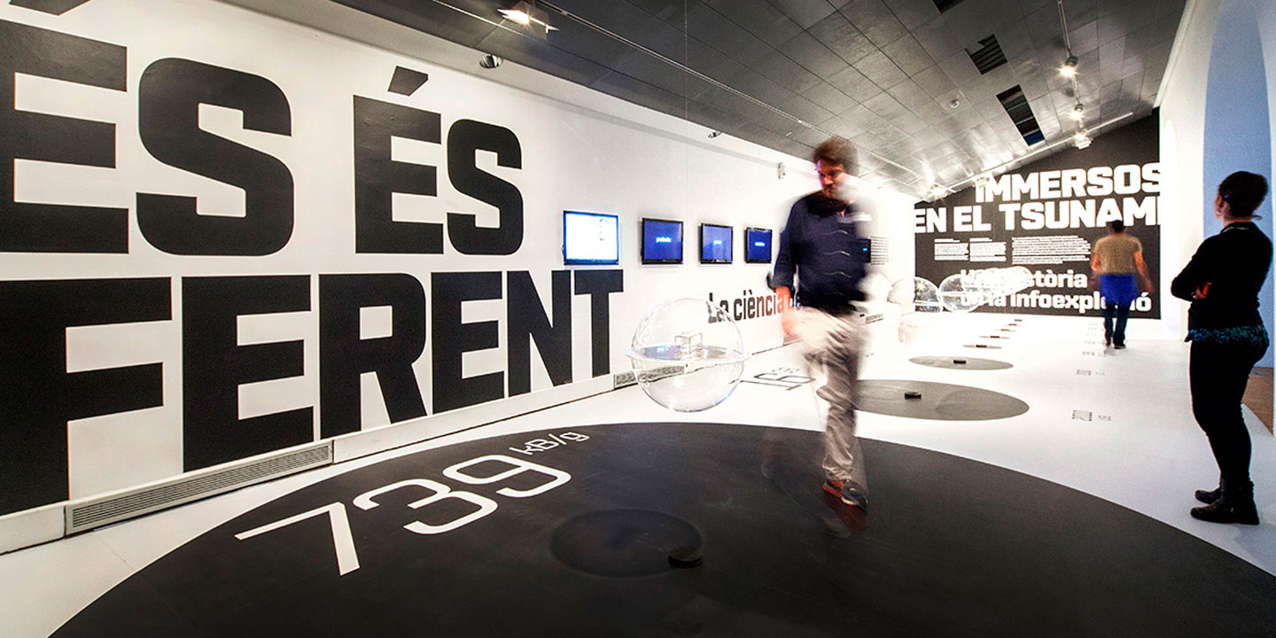
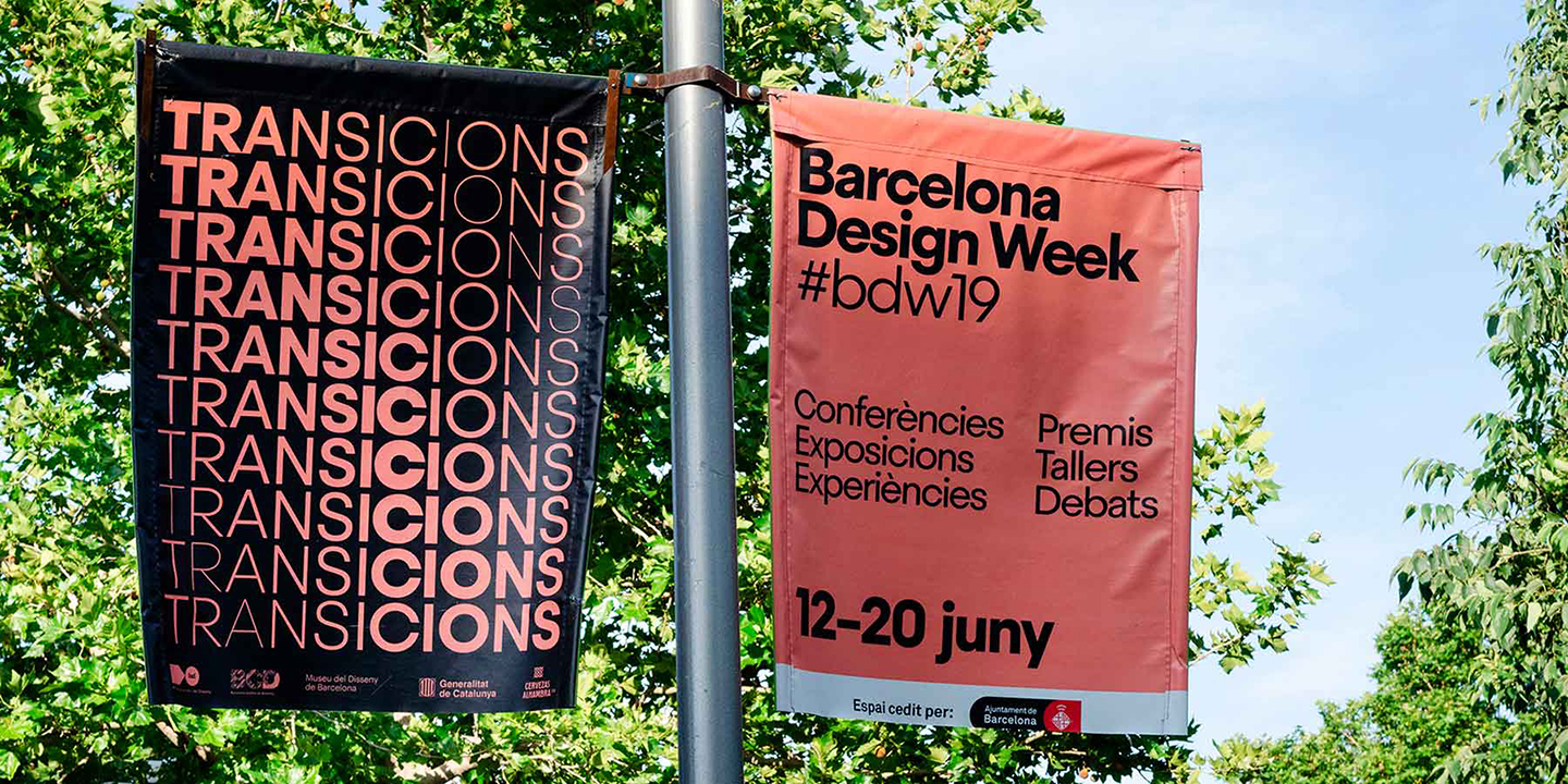
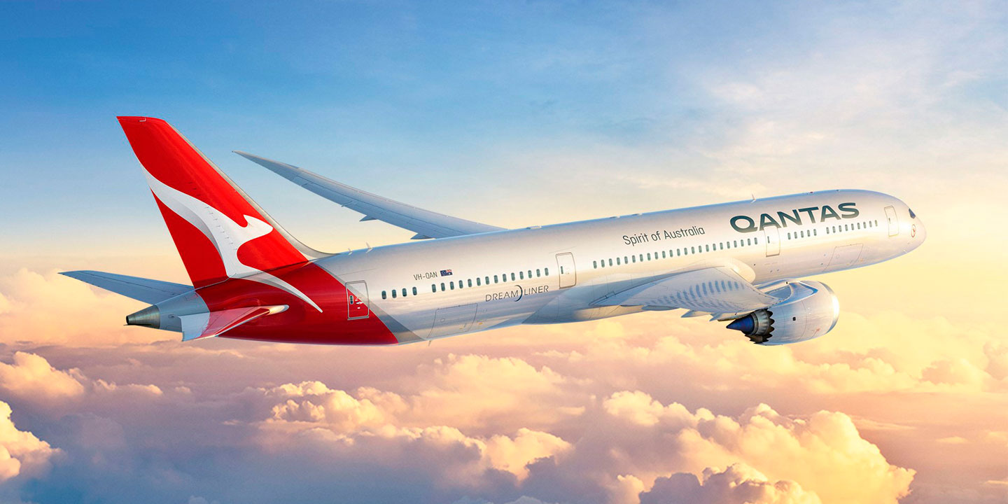
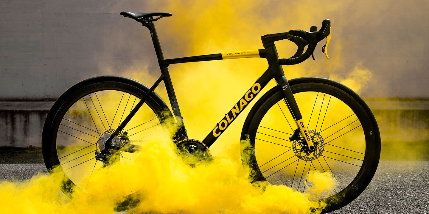
Eduardo has always liked “the simplest and most functional fonts. In fact, that is how Geogrotesque was born, a simple and versatile typeface” in response to his own needs. For him, there are only two types of typefaces: those that can be used on multiple occasions and those that can be used on few occasions, because they are too special. As a graphic designer, he prefers the first ones, because he dislikes the fact that typography imposes itself on the message and ends up doing all the work that corresponds to the graphic designer. And that is precisely what motivates him when designing a typeface, since the challenge is to innovate in the field of functional typefaces, which “has more value when you achieve it.” Quoting Jonathan Ive (“It’s very easy to be different, but very hard to be better”), he states that he tries to be “humbly both, not always successfully.”
As a type designer, he always keeps the graphic designer in mind, as he is ultimately the user of the typefaces he designs. Eduardo believes that “type designers should talk more with graphic designers.” Those conversations have always been very inspiring for him. A type designer should keep the user in mind. It should ideally be a specific client with a specific project. However, “you can really design whatever you want and nobody has to tell you anything. It’s another thing if someone buys your font. That’s his way of expressing his opinion on the matter, in a lapidary way.
Eduardo is optimistic about the future of type design. He’s convinced that, despite of a saturated market, the wild discounts or free fonts, good typography will always prevail, the one which is well worked and stands out for its quality. In this field we will continue to find Eduardo Manso, a tireless type designer who considers himself a privileged person, who enjoys his work, and therefore gives the best of himself in each project.

