David R. Godine published Mark Argetsinger’s extensive new A Grammar of Typography: Classical Book Design in the Digital Age last year. This is a large volume. It is hardbound, measuring 31 cm tall, 22.5 cm wide and 5.5 cm deep (12.2 × 8.8 × 2.16 inches), it has 511 numbered pages. Those dimensions make it at least three times larger than Robert Bringhurst’s The Elements of Typographic Style by volume. Bringhurst’s book, of which Argetsinger writes in Grammar’s annotated bibliography, “carries on the important work of printing grammarians into the digital age.” I think Elements did a great deal more than that. Especially in North America, Bringhurst’s book has been the primary introduction to what Argetsinger calls classic typography for multiple generations of students and designers now (myself included). Elements is mostly a theoretical text that imparts how (especially traditional serif) typography can thoughtfully be employed to honor the context of the text being designed. Bringhurst does not get into the details of how to create paragraph and character styles in page-layout applications, nor does he explain how OpenType features work. While Elements is well printed, it does not include many illustrations of typography in practice, either from the past 570 years of western printing or contemporary books.
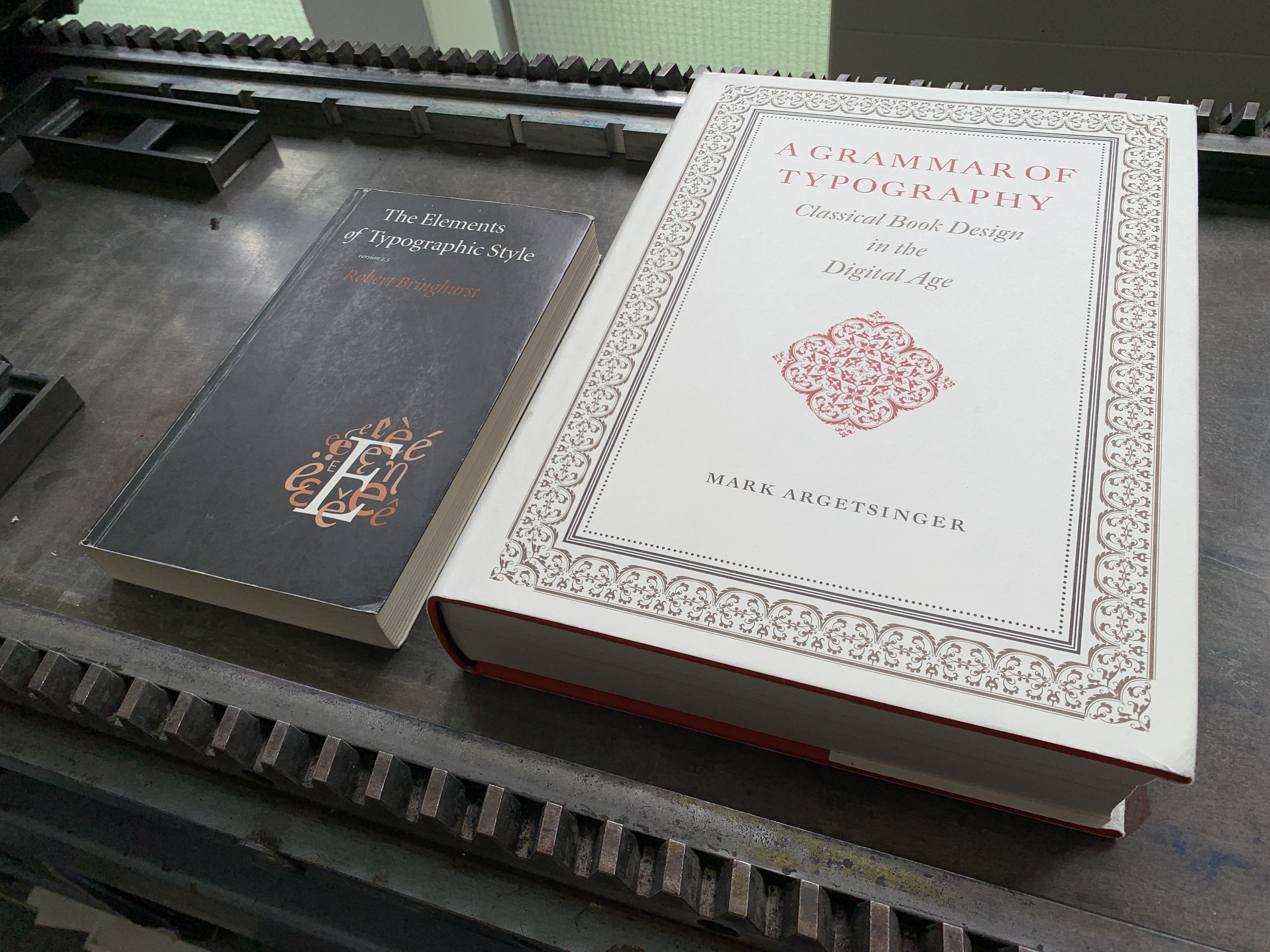
A comparison of my well-worn paperback copy of Robert Bringhurst’s The Elements of Typographic Style and Mark Argetsinger’s Grammar of Typography: Classical Book Design in the Digital Age.
I keep interchanging “typography” and “books” because Elements—like so many twentieth-century texts about typography—is explicitly about book typography, even though that is not always made clear. Not all typographic conventions for books are necessarily applicable to other forms of media, although one can certainly draw parallels (in 2005, Richard Rutter even created a website that went through some of the points that comprise the first three chapters of Bringhurst, from a web-typography perspective. This was The Elements of Typographic Style Applied to the Web. Argetsinger is straightforward regarding is book’s content: book design is mentioned in the title. At various points in the text, he also points out what his book does not do. Two examples selected for this post suffice to repeat almost all Argetsinger has to say about sans serif typefaces in Grammar. “I have never employed bold or sans serif type in my book work,” Argetsinger states on page 116, note 62, which can be read as a follow-up to this passage from page 104: “One can indeed read sans serif in a book, but it is rather like living in the glass box of the modern architect: it is sterile and cold, devoid of the resonances of history and the warmth of craftsmanship, which in its elaborations endeavors to impart the grace and beauty that artistry can lend to the making of the form.”
In Argetsinger’s description of the book on his website, he writes that “book design—emerging from the aesthetic blight of the nineteenth century—renewed itself both along traditional lines as well as being influenced by the general trends in art, particularly by the Modernist Movement.” By this, he refers to figures from the history of typography I would describe as traditionalist: Daniel Berkeley Updike, Bruce Rogers, Stanley Morison, Beatrice Warde, Frederic Warde, Jan Tschichold and Hermann Zapf. I guess that one could argue about certain individuals from that same era: is the work of Eric Gill and William Addison Dwiggins, for instance, more in the traditional camp, or it is Modernist? Perhaps the answer for each man would be different in Europe and North America. Excluding the Renaissance, Argetsinger’s account spends much of its time in English-speaking countries. While other designers commonly mentioned in accounts of this sort of typography appear as well—Giovanni Mardersteig is there, as is Georg Trump—I miss the work of others. Neither Albert Kapr, Jost Hochuli, nor Hans Peter Willberg are mentioned, despite their great practical and theoretical contributions to typographic discourse in German. Hochuli, in particular, is still alive today and some of his writing has been published in English.
Although containing a wealth of information, Grammar’s layout makes generous use of white space. The text’s setting is easy to read. If I could wish for one change to the book, it would be for Argetsinger to swap the main typeface—DTL Fleischmann—out for any other digital interpretation of Johann Michael Fleischmann’s work. Or, for that matter, for any of the other great serif typefaces published by the Dutch Type Library. With what we know about DTL Fleischmann’s designer, I cannot recommend that the typeface be used any longer.
Despite my above-mentioned quibbles, I heartily recommend this book. It is an excellent resource. In addition to its liberal quotes from historical texts—Argetsinger summarizes the essential works on practical typography published in English from Joseph Moxon (late seventeenth century) to Theodore Low De Vinne (late nineteenth and early twentieth centuries)—Grammar is lavishly illustrated. Argetsinger draws his typographic reproductions not only from Renaissance books but also from contemporary classical-style typography, and all the centuries in between. Aside from images of Argetsinger’s work, readers will find excellent examples from other living designers, like Jerry Kelly. Grammar’s raison d’être, however, is that Argetsinger explains to the reader how classical book design is to be made today, in InDesign and with digital fonts. That information is not presented anywhere else in the English language in anywhere near the amount of depth Grammar provides. One can easily predict that hundreds of typography instructors will add this book to their university courses’ syllabi. Even for designers who have been digitally setting classical-style book typography for decades, Grammar will surely provide new insights. Like the best historical texts on typography, lettering and calligraphy, the book does not stop at the two-page spread. Argetsinger also provides a chapter on proof-reading and copy-editing, another on paper, and a third on bookbinding. Then there are the appendices, each over two-dozen pages in length. The first is a deep dive into typographic ornaments in classical book design. The second is about the history of Greek typefaces and their use by the same protagonists named earlier in the text.
A Grammar of Typography: Classical Book Design in the Digital Age
Mark Argetsinger
David R. Godine, Publisher
2020
511 pages