Establishing itself as a focal point in the conversation around contemporary photography, True Photo-journal presents the viewer with a landscape of original upcoming and well-known photographic voices.
The editing and art direction of Peter Hughes and Luke Gaffney (Assembly) guided the magazine through a series of six successful issues, preserving its intent of gathering authentic responses to the questions posed by the shifting and unfolding present. Every issue is developed around a curated sequence of narratives, bringing together uncommon and unique angles. Through its big format, the paper stocks (leading with a glossy material) and the visual sequence, the work is placed in conversation with the page, each contribution – be it imagery or writing – pacing the reading.
The recently launched Issue 7, is published after a longer break forced by the “pandemic.” The extended phase of conception and design allowed it to shift the attention towards new topics and themes. It becomes central in this new issue the discovery of Publishing as a fundamental medium of photography.
The new issue explores photography within the frame of the book, lending its space to a series of uncommon artist–publisher relationships, opening for the readers, pathways through recently – or jet to be published works. Personal storytelling and visual experience entwined in the sequence of contributions presented by True 7. The seemingly encyclopaedic approach brings to the reader conversations around the making of the books; fundamental insights to understand their conception and meaning. Additionally, it unfolds true stories of dynamic relationships between authors and publishers.
Issue 7 navigates six international realities where these close-knit relationships, have generated publications with a multitude of themes; extending the gaze from the very personal – like Peggy Nolan’s Juggling is Easy (TBW Books, 2022), to the infinite of existence and its unknown – as Kirstine Roepstorff presents in The Archive of Dark (InOtherWords, 2021).
Peggy Nolan and Paul Schiek (TBW books) tell a very intimate story of a family life and their way of remembering through photography. For Peggy making a book out of her archive the necessary way to place back these fragments of living into a meaningful tale. It’s interesting to learn that Peggy Nolan fell into photography “sort of by accident”; because of the need to document the reality immediately around her she collected a huge archive of experiences. This seemingly improvised, organic approach reverberates through the image sequence; to the reader is left to observe from a voyeuristic angle frozen-in-time snippets of memories. The sequence conceals the complete story, it’s left to the viewer the difficult task of reconstructing a meaningful narrative.
But memories could hardly be absolutely trustworthy. They can only present stories that are post-products of our memory. It’s interesting how in the conversations around The Last Survivor is the First Suspect we lose the sense of what is true and what fiction.
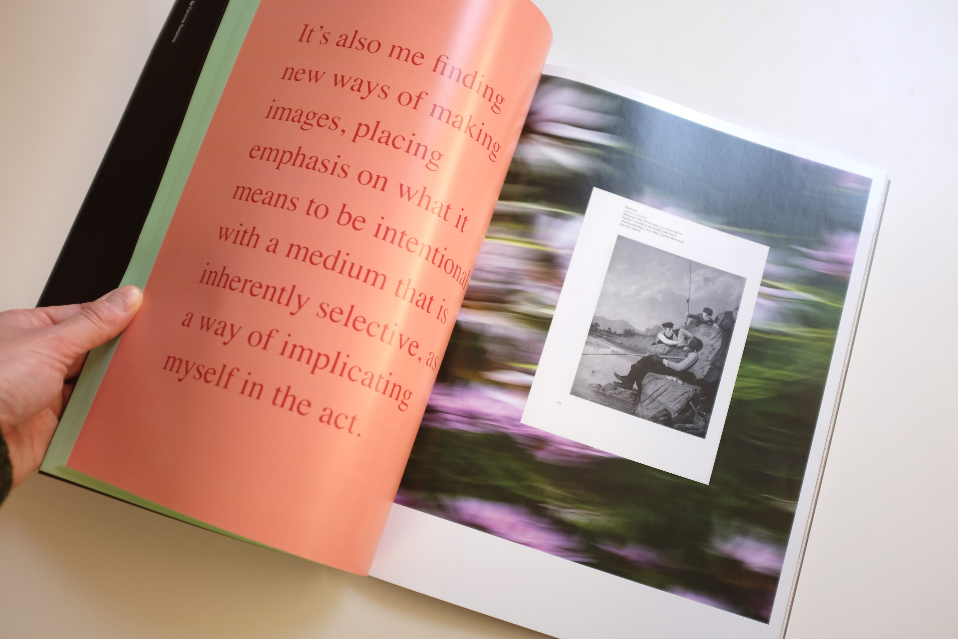
Published by Kodoji Press in 2021, The Last Survivor is the First Suspect is in some respect a child of the publishing world and the book fairs. Connected for years by only "an idea for a project", the book emanates an intensity and deepness that reflect and transfer the long period of time passed in between the first shoots and the printed object. In The Last Survivor is the First Suspect Nick Haymes purposefully mixes analogue and digital imagery with the clarity and chaos of the age (the pre-digital time) he’s photography presents. Captured by the insider-outsider eye of a growing-up photographer, every page is a snap of (real? Fictional?) memories of what looks like the everyday life of a stray, parent-less group of friends. Feelings are given to the reader somehow softened, the erotical and the dramatic are halos through the documentation of the everyday.
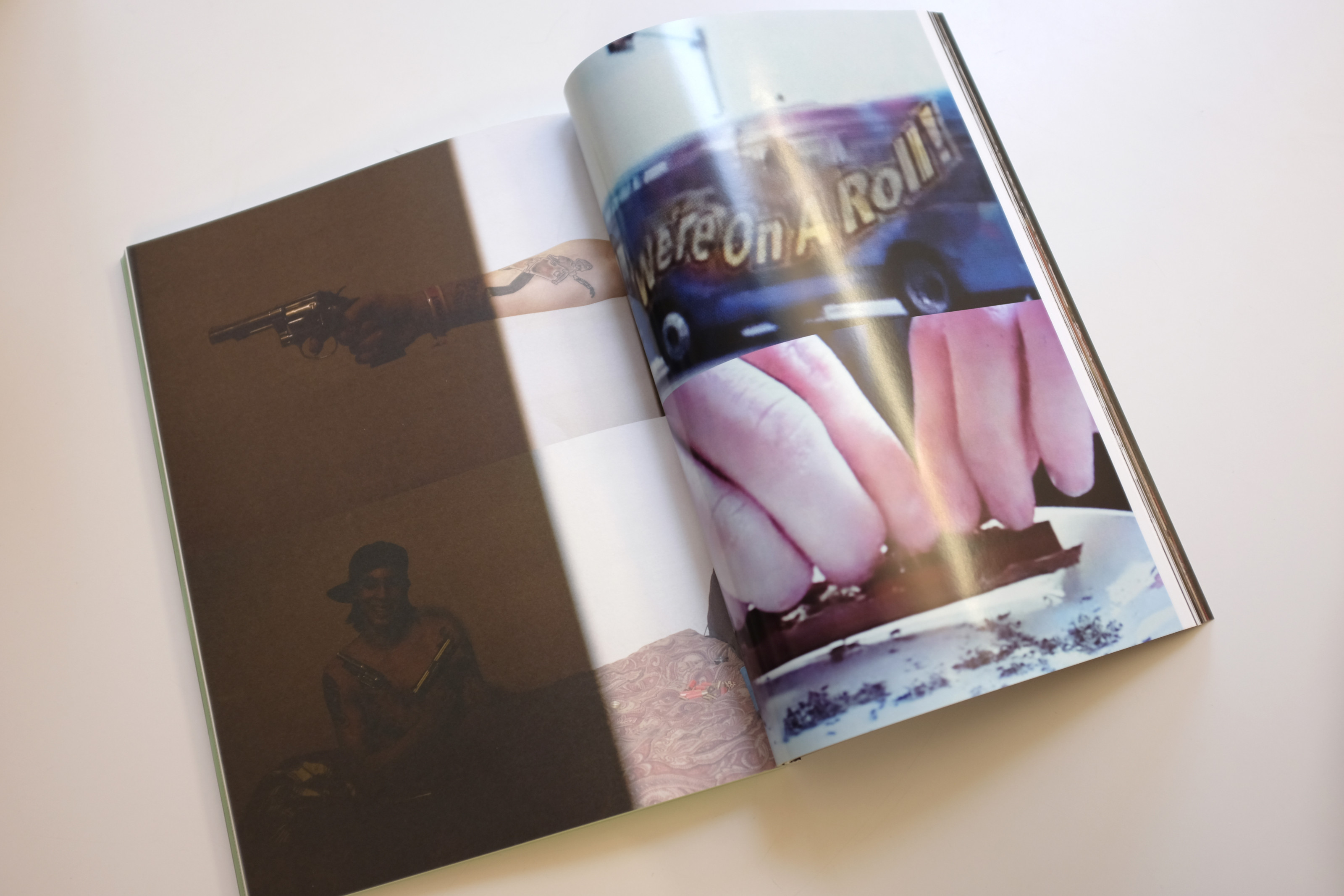
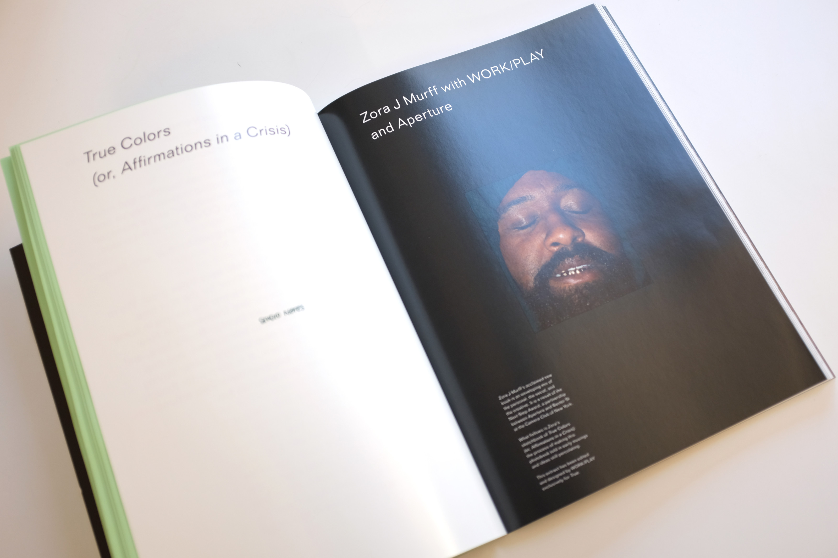
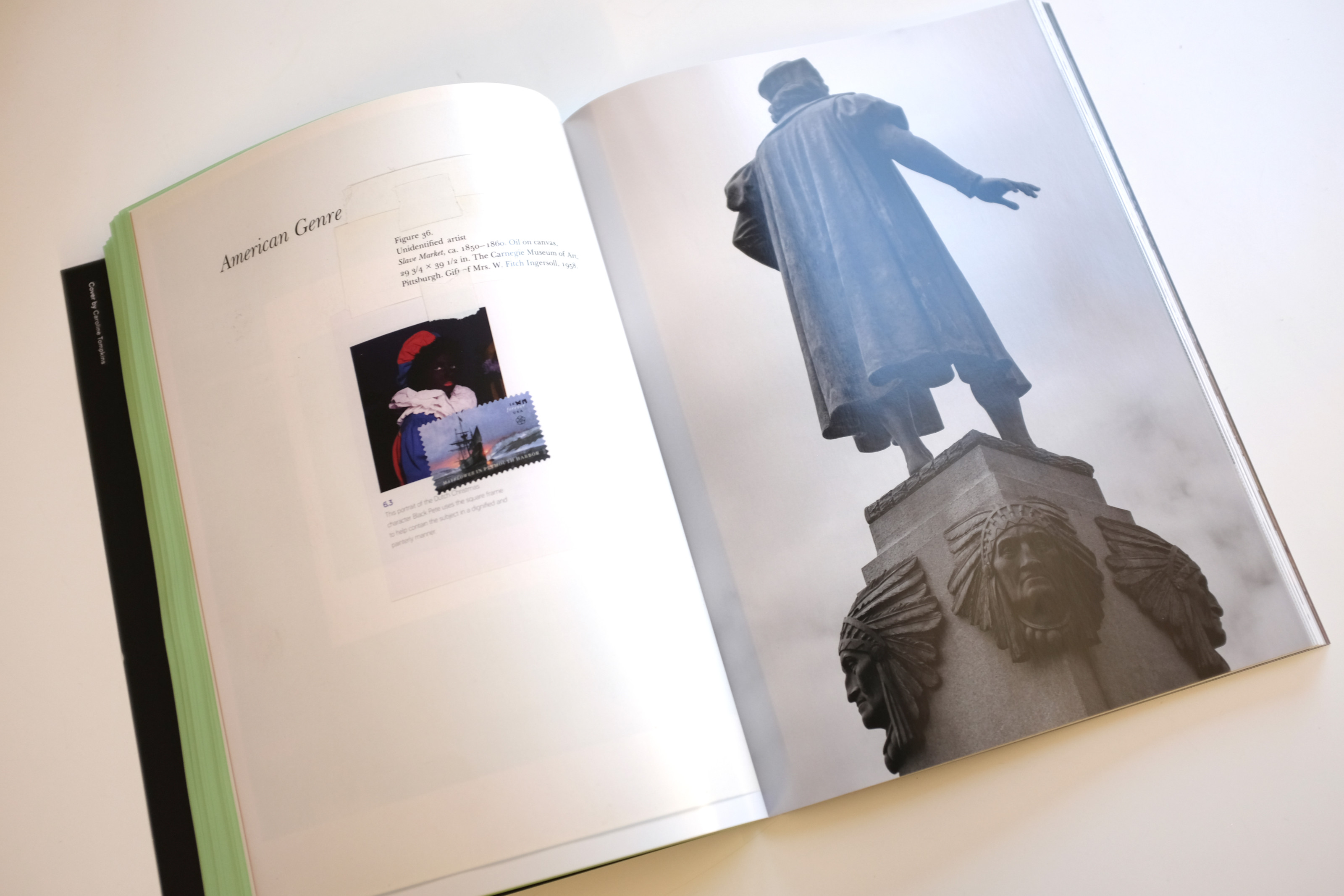
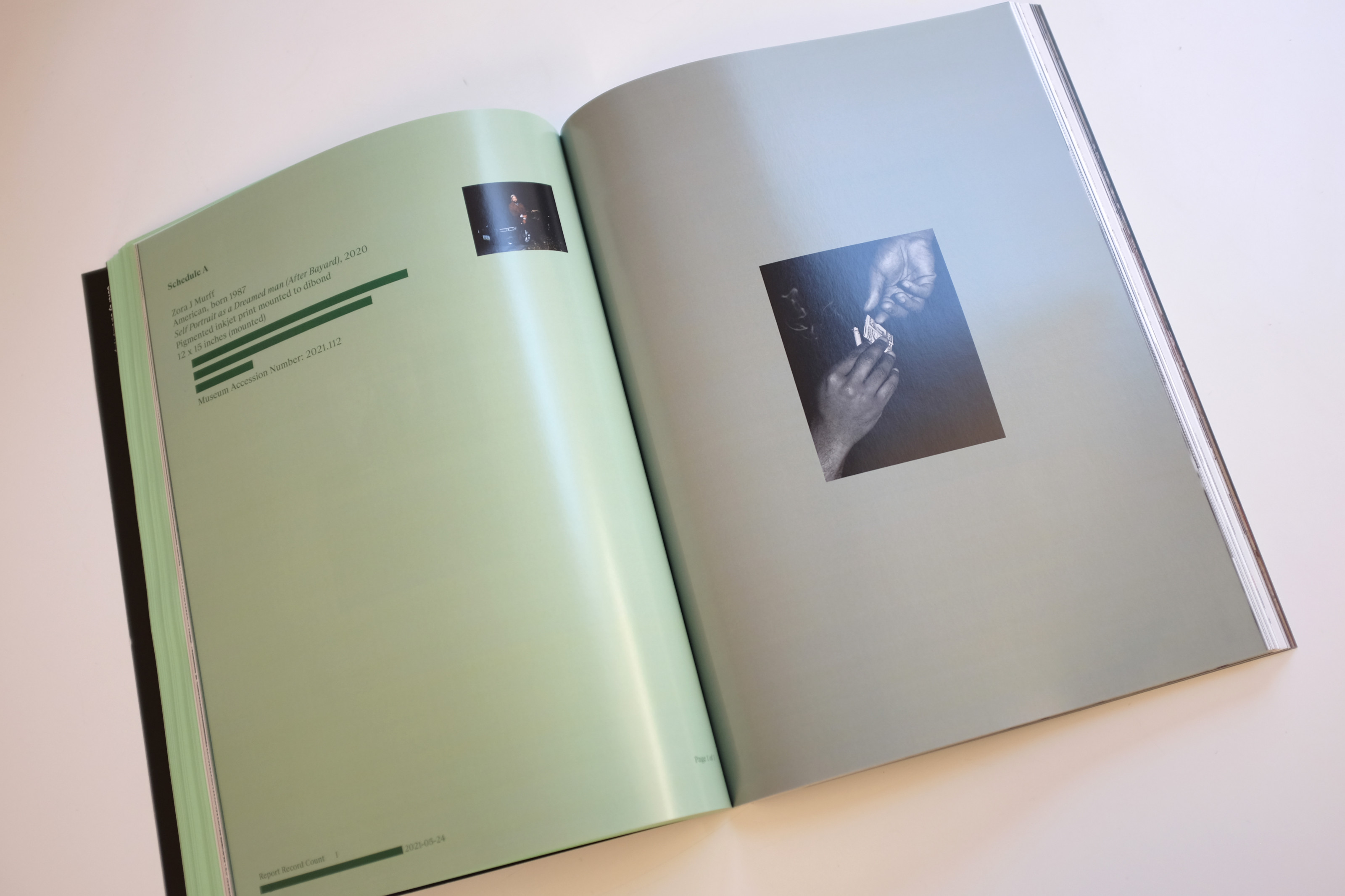
Zora J Murff tells a story where the halos of the past are still dangerous ghosts. With the intention of exposing and unfolding the visual narratives that support systemic racism, True Colors (or, Affirmations in a Crisis), is Zora J Murff's new work published by Aperture and designed by WORK/PLAY.
The book asks the reader some hard questions aimed to uncover how it feels to “survive behind the enemy line.” The visual sequence assembled for True reflects this questioning and discovering, and presents a clear picture of how systemic racism clasps society in the hetero-white historical symbolism, and use the repetition of stereotypical imagery throughout the centuries to consolidate a system of belief. Looking like a personal travel log or diary, the textual becomes visual and the imagery speaks in plain words, with documents and found images that expose Zora’s unfiltered perspective on the shared historical narrative.
There are also some interactive objects in the book designed to slow down the reading process, “gestures intended to pique your interest”; these elements are architected in the main sequence to show or hide content, highlighting in the process certain feelings Zora’s wanted to translate in the book.
Amongst the narratives and stories, there are also some that have blossomed by the instinct of making work and “putting it out there.” Nick Waplington Anaglypta (Jesus Blue, 2020) tell us that ongoing rhizomatic conversations between friends can leverage the energies of a moment to consolidate into physically meaningful objects.
Jesus Blue is in this sense a child of pub talks. With their first book for a mutual friend, the photographer Vava Ribeiro, Jonny and Nick set on a long successful publishing journey. As the duo tells True, one project organically fed into the other, especially when it came to big bodies of work like Hackney Riviera, where Nick, taking pictures for nearly 30 years, continued through the design process to produce material.
Anaglypta was instead a product of remote work, during the two years of lockdown. The editing was “brutal,” in the way Nick manipulated the digital and physical material and left nothing out of re-contextualisation. In tandem with this intense creative process, the design of the sequence was taking place.
This very personal way of working on the sequence is employed for the spreads of True, mixing outtakes from the book and unpublished shots. Cities and years are buzzing back and forth presenting the complexity of reality, from nature to urban landscape, and from the happiness of a mindless childhood through thoughtful, at times darkening images of adult life.
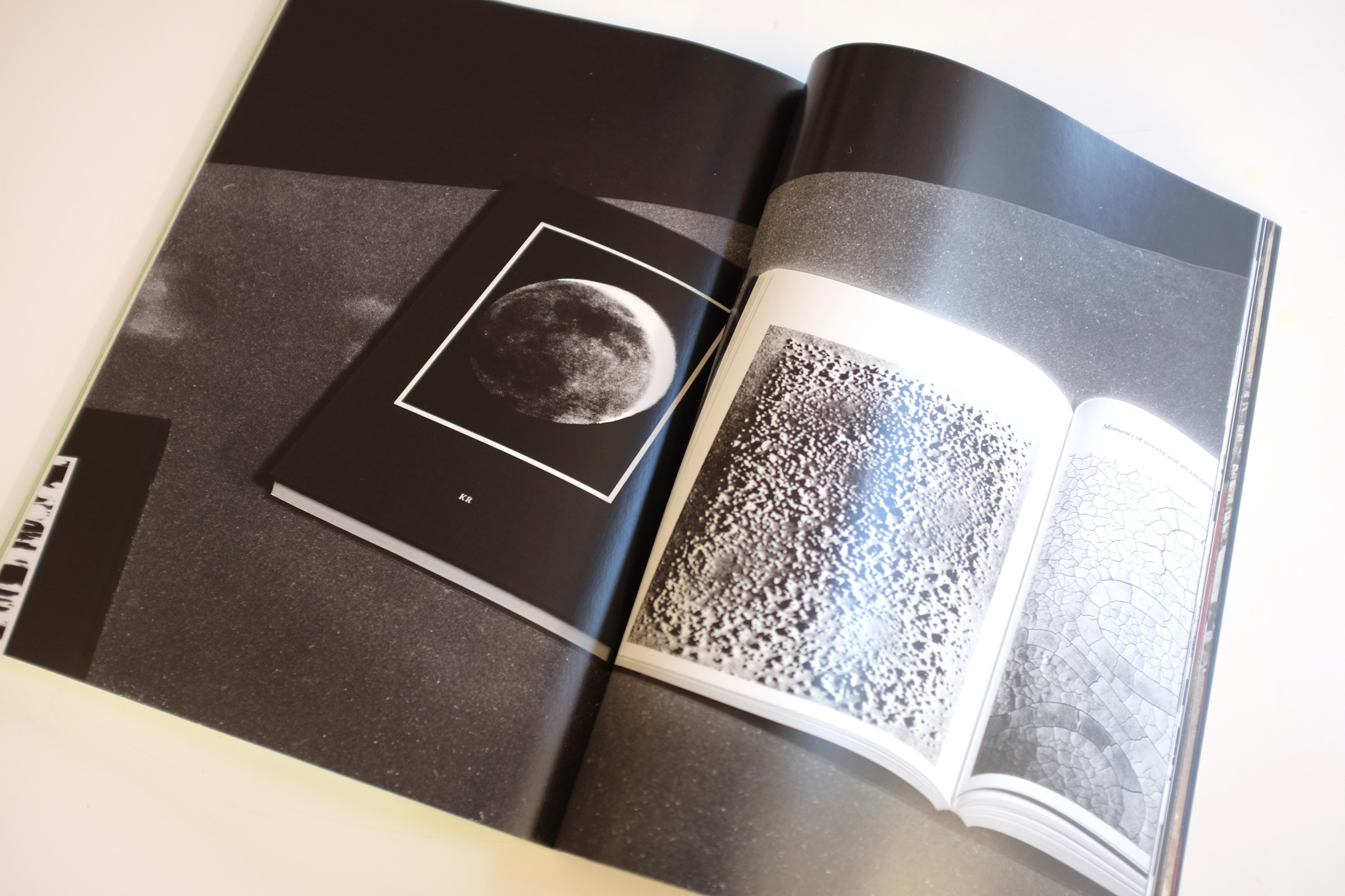
A complex tapestry of human history displayed through an organic movement of text and image defines also The Archive of Dark. Representing an encyclopaedia of the unknown, unspoken, and unseen, the book is the product of the intense, fruitful work relationship and friendship between danish artist Kirstine Roepstorff and OK-RM.
Published by OK-RM imprint InOtherWords, the blue clothed-hardback volume takes the reader on a voyage. As Kristine explains, “there was good electricity in the room” when they first meet. These energies are what stimulated OK-RM to dive deep into the project and keep searching and exploring for nearly two years. Because of this generosity, the book ended up looking very different from what the artist initially thought.
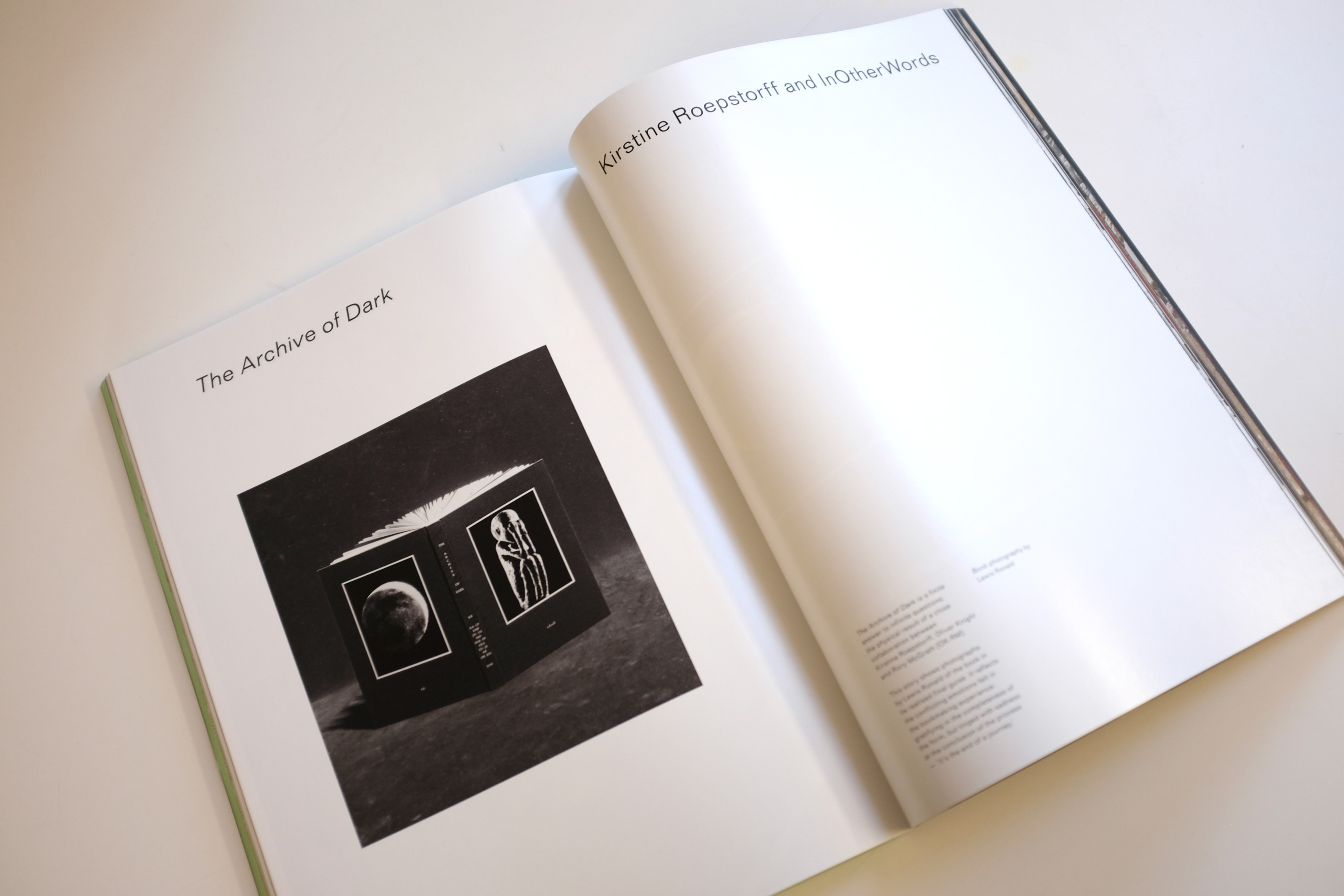
As Roepstorff tells in the interview conducted for True, the task she gave to the London-based studio, was in retrospect “insanely difficult”; she gave them a huge amount of content and context and asked, with total trust in the process, to make the frame for it all. This process, repaid Kirstine and OK-Rm with a unique teamwork and strong bond, which is in some respect what the artist treasured the most about the book.
For True, tAoD is presented through the hazy and somehow romantic image sequence by photographer Lewis Ronald, assembled by OK-RM. Unlike the other contributions, the angle here is widened to enclose in the pages not only the artists found-imagery but the book itself, leaving the reader almost dazed by the Russian doll experience and these beautiful shots of spread after spread after spread.
The action of following the paintbrush black strokes printed on the pages, become like a symbolic thread through the artist's thoughts and meanings, connecting an image to another in the complex network of stories which is tAoD.
The series of interrelations created around the reality of book publishing with launches, fairs and exhibitions, have thrived on the energy of these moments of collective sharing of works and ideas. Collaborations like the ones True presents in this new issue are successful because of the proximity of creative figures to the belief that the printed matter allows ideas to permeate through culture more than the digital image. It’s fascinating to learn how so many of these projects have overcome moments of physical impossibility and kept the conversation going, documenting the process along the way.
Out of this shared love for books, Bedfellow (Palm* Studios, 2022) was born out of causal encounters at book fairs in London and New York.
The curiosity towards the hidden pathways and powers of book-making allowed the author and publisher to take their time and keep talking about the work as the design was taking shape.
For True, Bedfellow is presenting the main themes with absolute clarity. Sex, violence, society and fear are mixed in a body of images perfectly balancing its aesthetic between the advert-like hyper-gloss editorial and the roughness of found imagery. It becomes impossible to tell if the reader is invited into the every day of the photographer or a set of performed situations. As Caroline Tompkins and Lola Paprika (Palm* Studios) explain, their will is to make a “statement that stays forever,” where the sequence of images remains unchangeable from the first finished copies, and the viewer can still see their thought process. With this in mind Bedfellow becomes then “a love letter to the audience.”
With an acute wide eye over contemporary photography, True presents with images and words the energy in publishing, opening an insightful view of bookmaking. It initiates a journey through fascinating stories of collaborations across countries, where the resultant projects are motivated by the shared passion for good objects, work that permeates and books able to circulate stories and narratives in space and time.