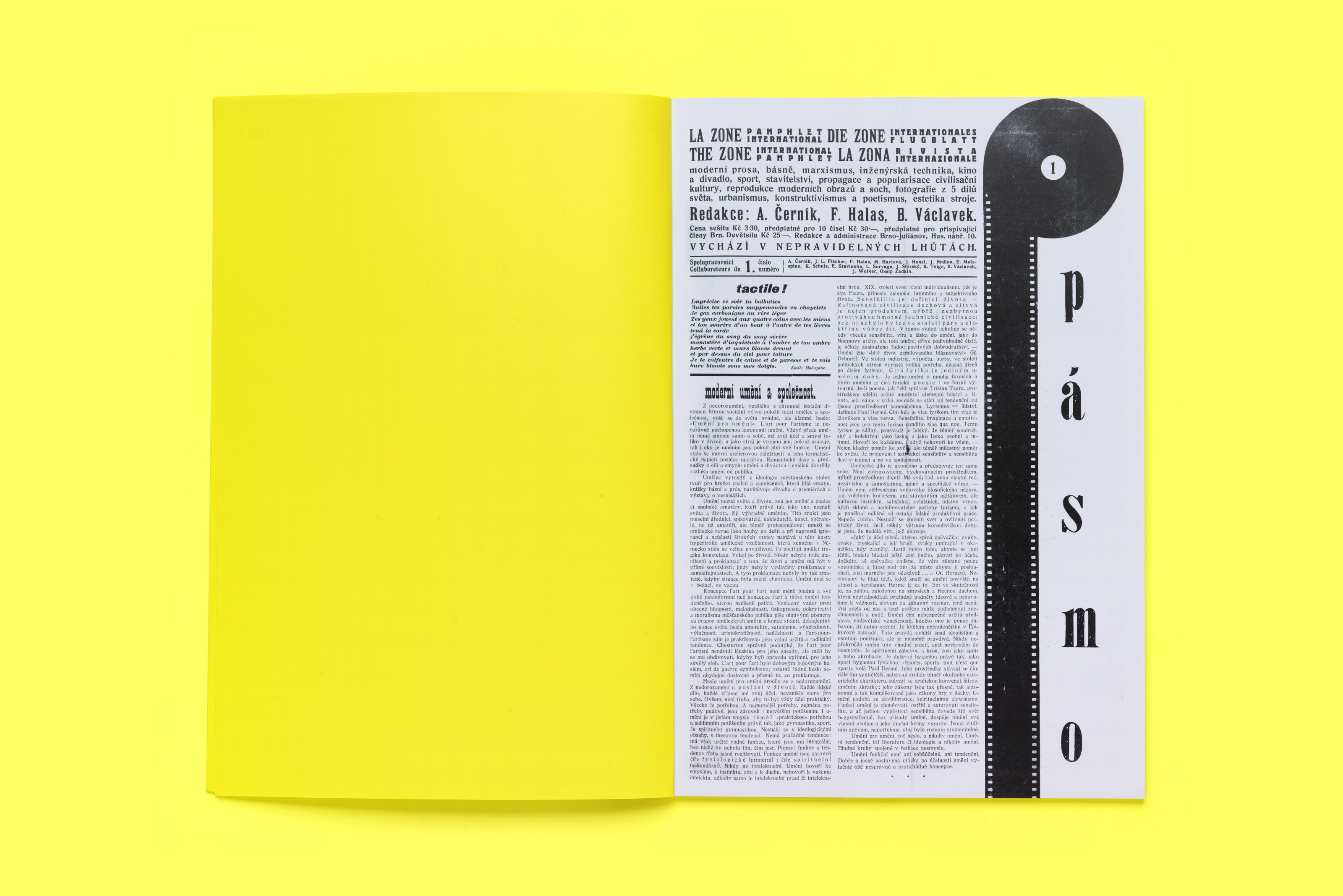
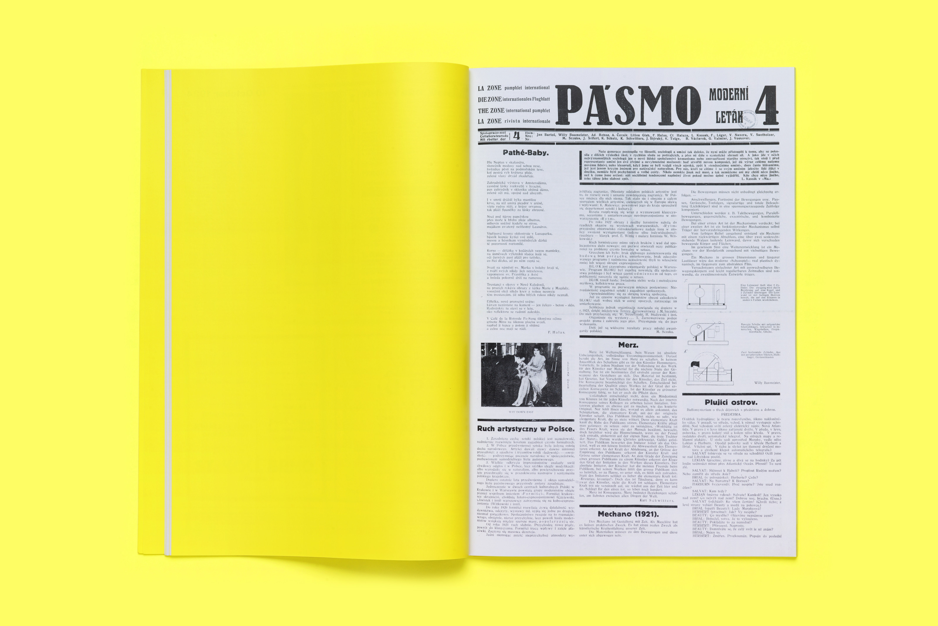
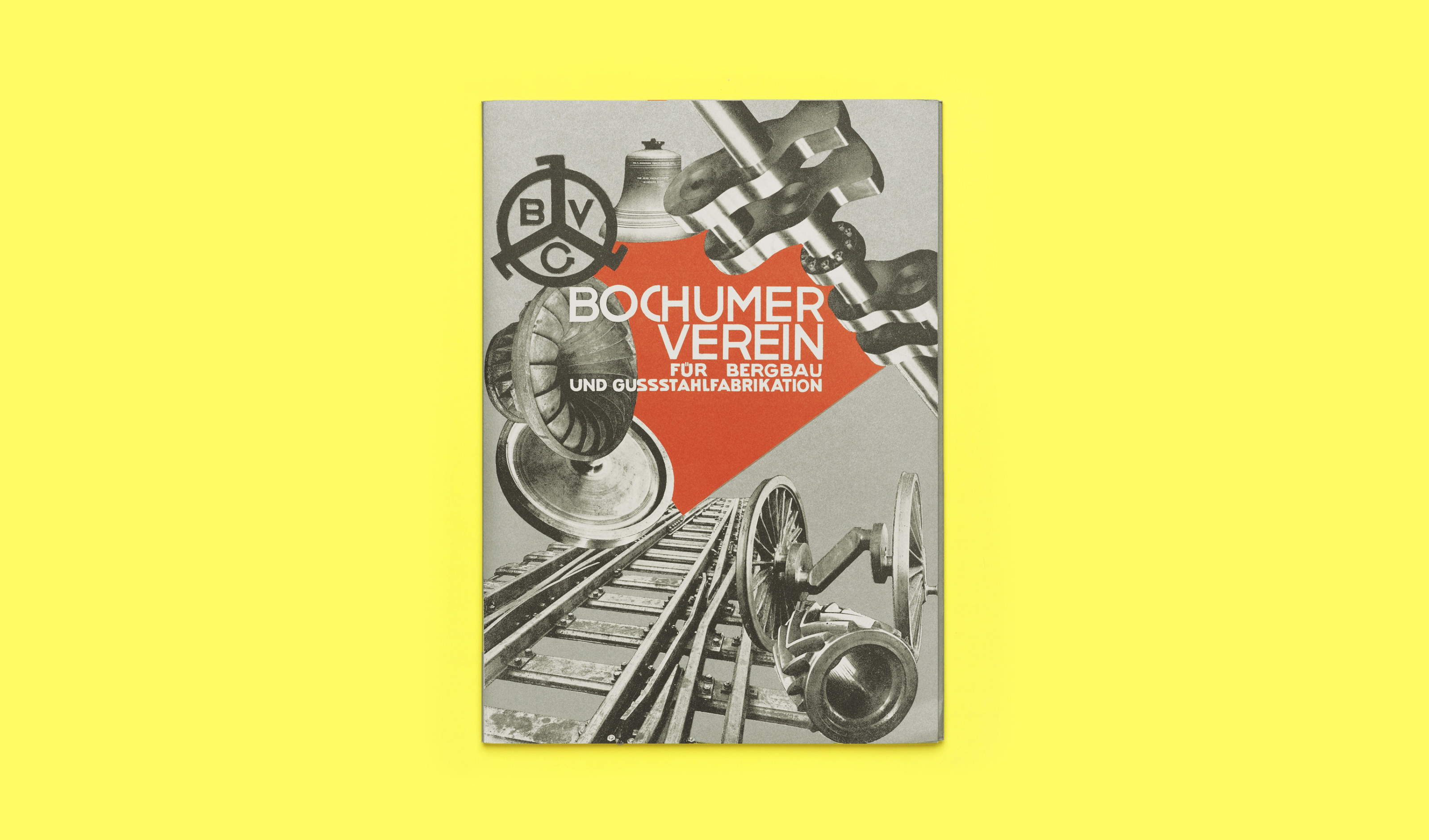
Is it still possible to say something new and relevant about Jan Tschichold’s Die neue Typographie, almost 100 years from its original publication? The debate that has developed in the last decades around design history has shown how historical studies and books have, until recently, been often uncritical and primarily served to support a specific idea of design practice. Within this frame, Die neue Typographie has often been treated more as a typography manual to refer to than as a historically situated document. While this view on graphic design history and its uses has not disappeared, contemporary critical approaches are, on the one side, opening new and necessary areas of research and, on the other side, reassessing well-known subjects with updated methods.
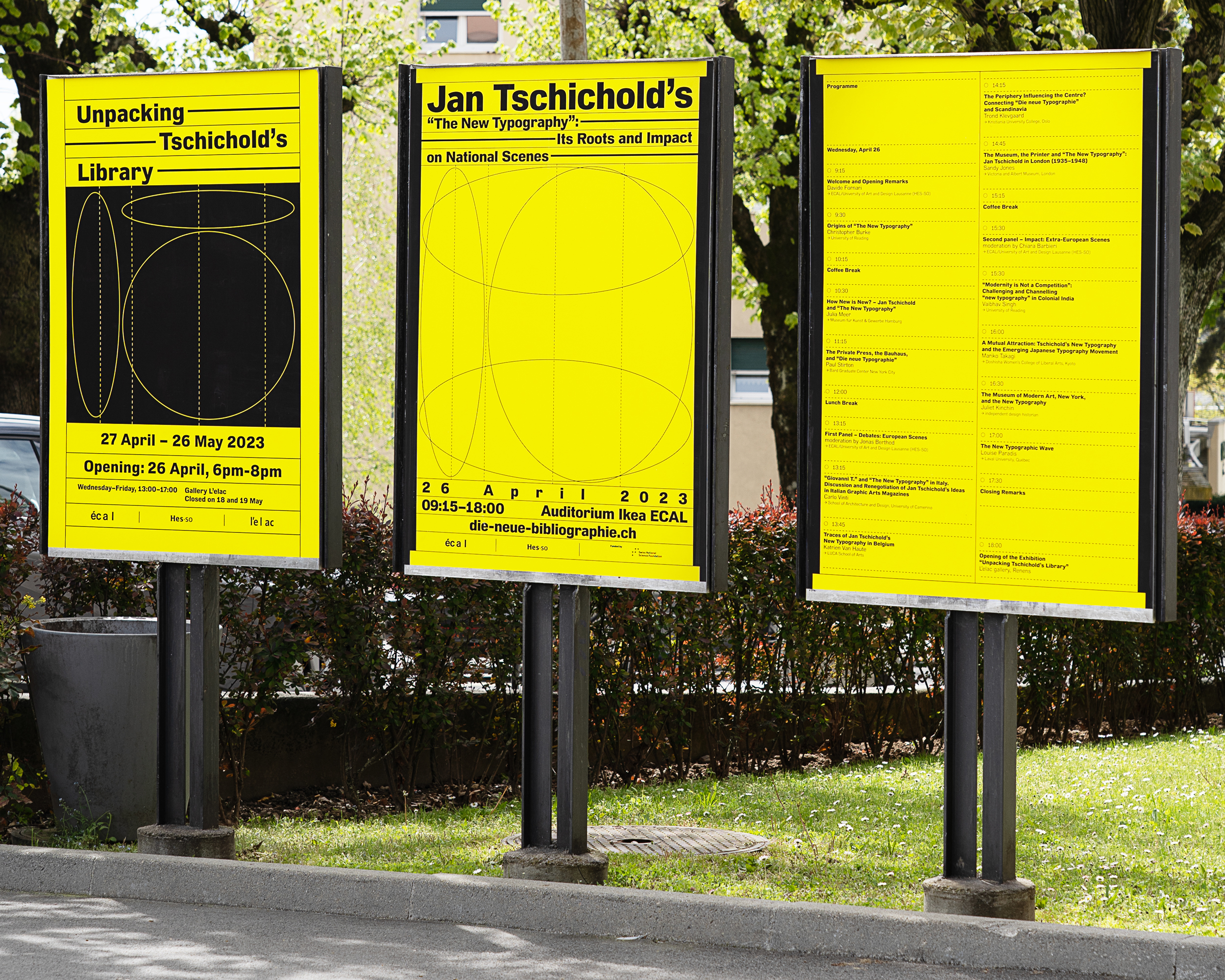
That is the case of ECAL’s research project, The Sources of Jan Tschichold’s “The New Typography”, led by Matthieu Cortat and Davide Fornari, which uses the most venerated – but rarely critically examined – in texts of modernist typography to discuss issues that go beyond the book’s original scope. As part of it, a conference was held in Lausanne on 26 April 2023, Jan Tschichold’s The New Typography: Its Roots and Impact on National Scenes, chaired by Davide Fornari, Chiara Barbieri, and Jonas Berthod. The keynote speakers were Christopher Burke, Julia Meer, and Paul Stirton; the afternoon sessions included presentations by Carlo Vinti, Katrien Van Haute, Trond Klevgaard, Sandy Jones (Debates: European Scenes) and Vaibhav Singh, Mariko Takagi, Juliet Kinchin, Louise Paradis (Impact: Extra-European Scenes). In these contributions, quite different in scope and approach, Die neue Typographie became a lens to look at typographic modernism or a starting point to discuss other relevant topics.
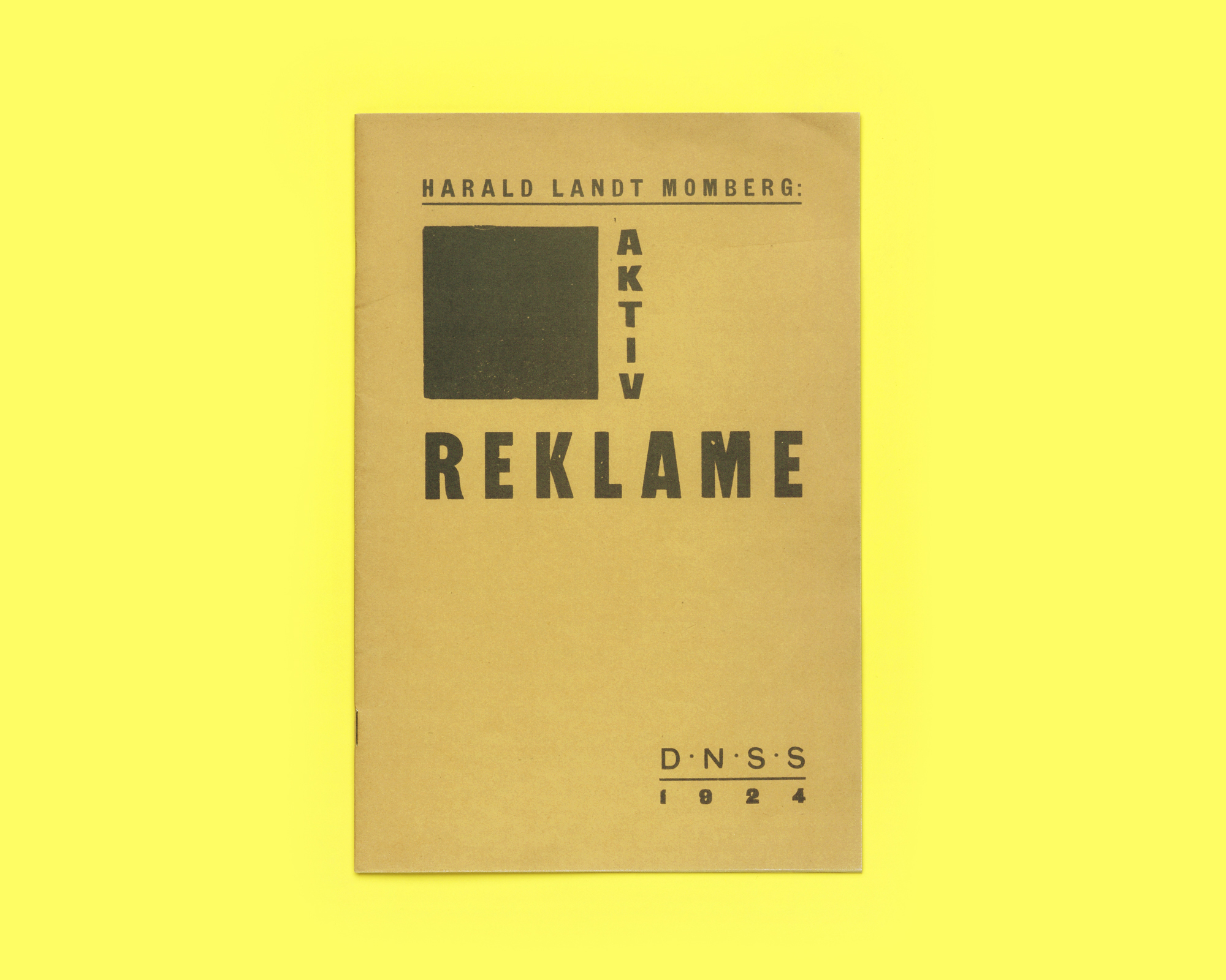
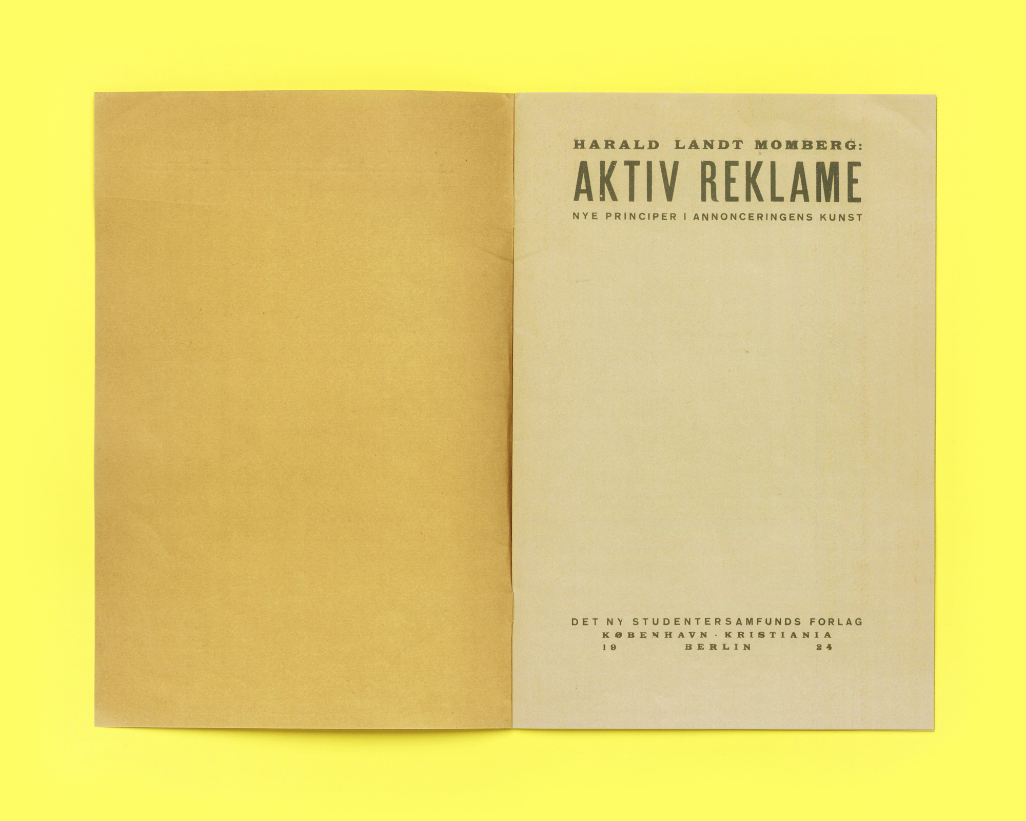
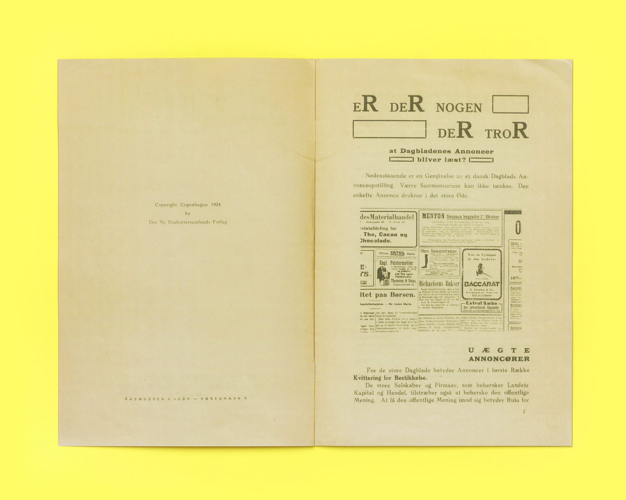
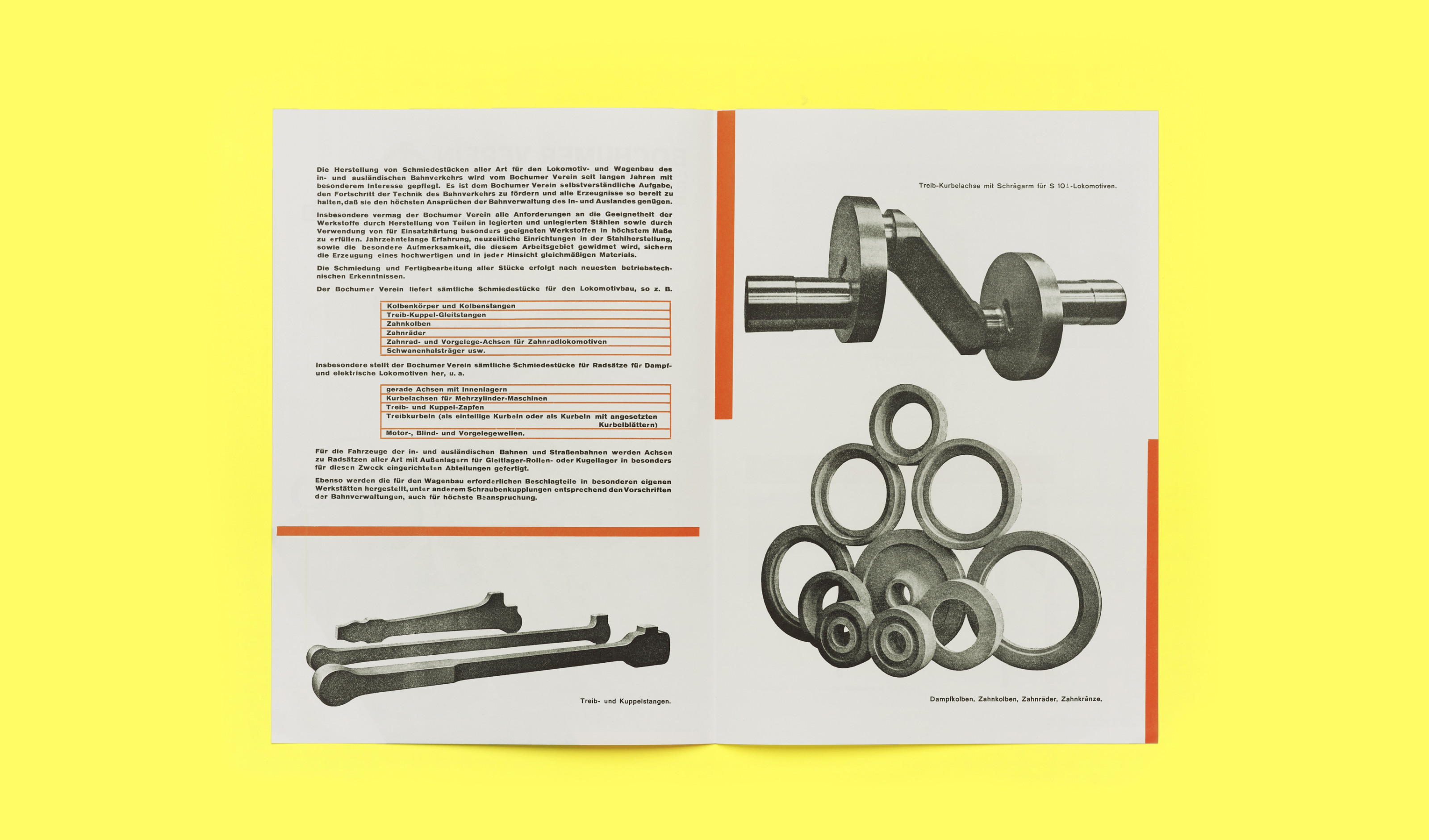
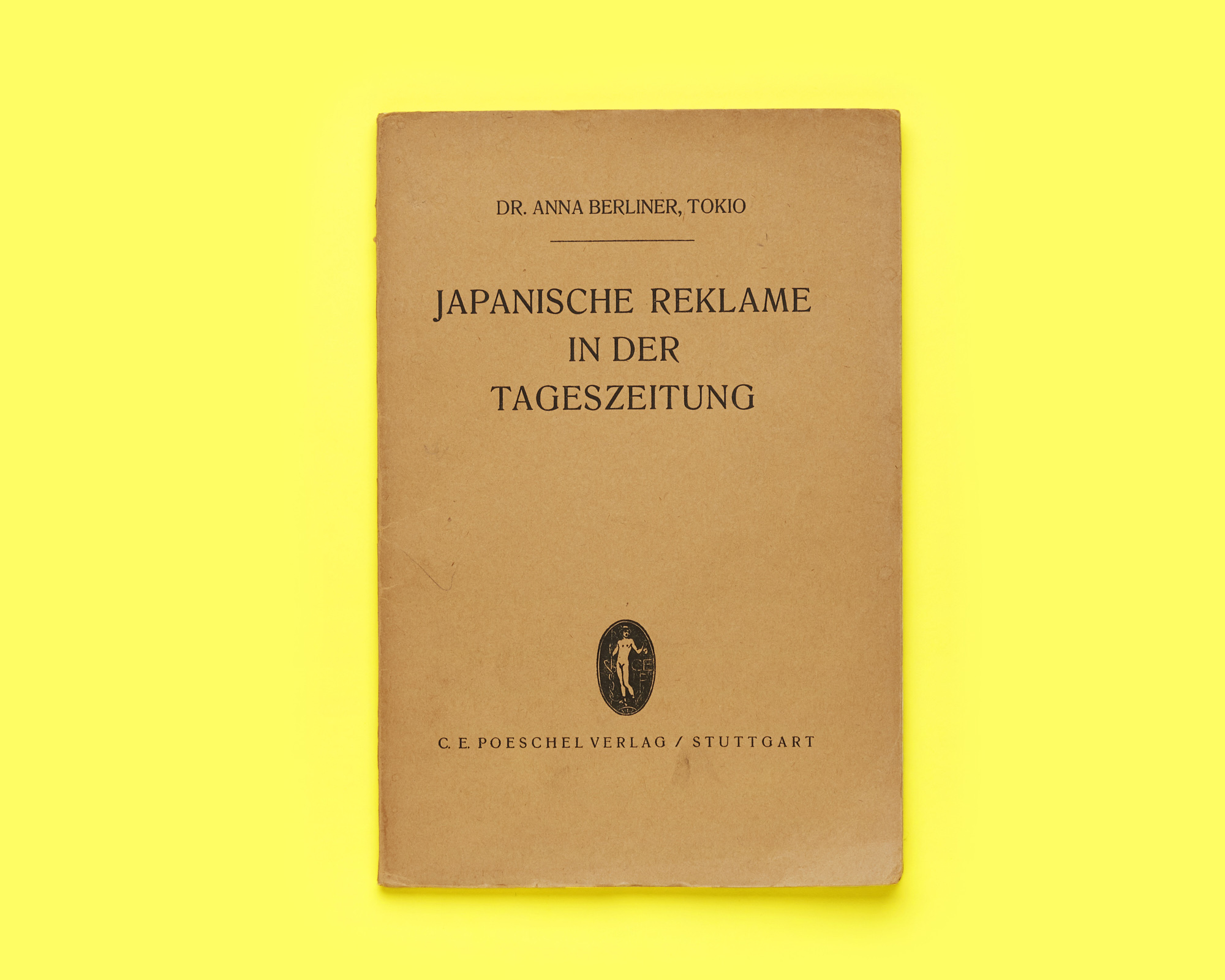
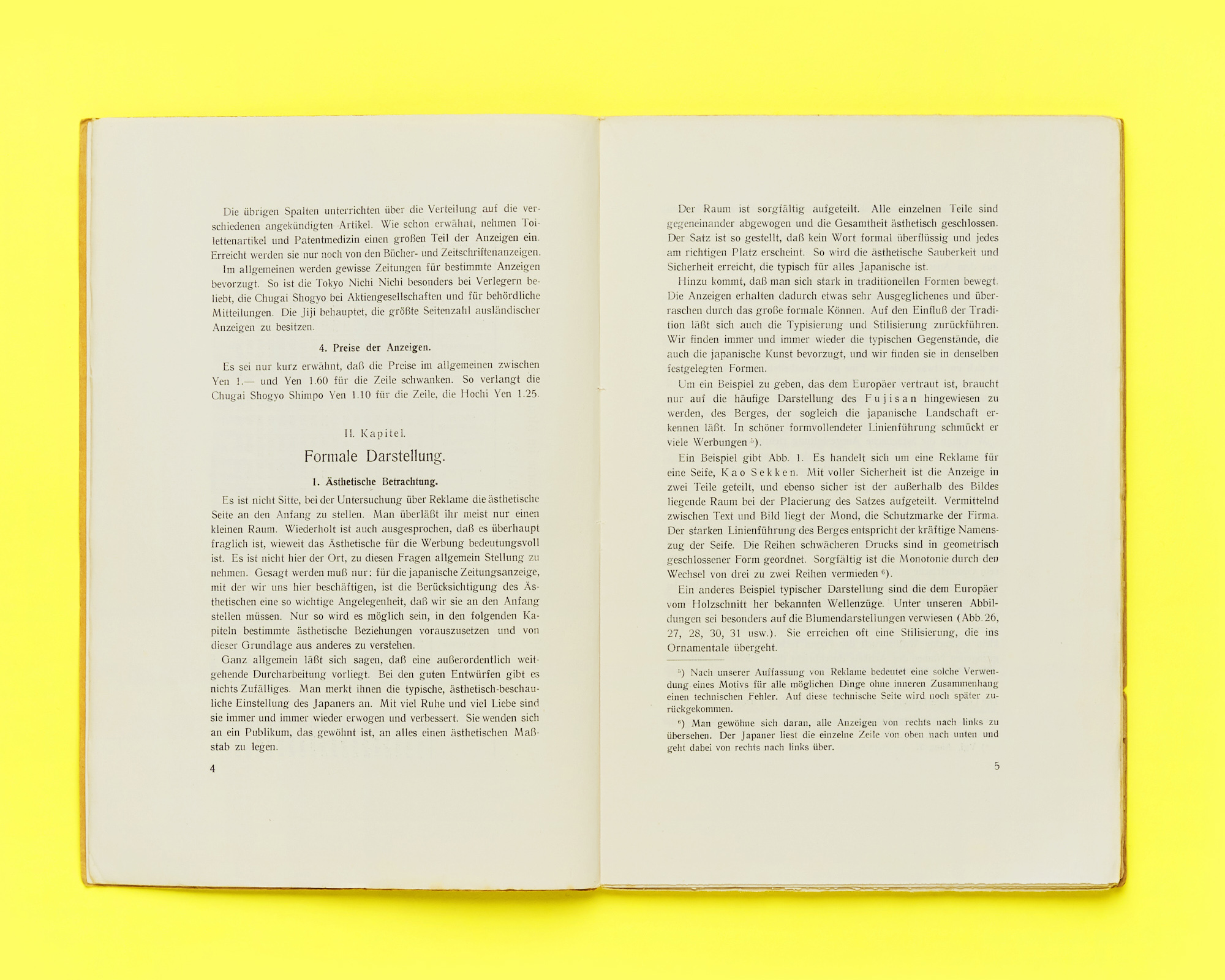
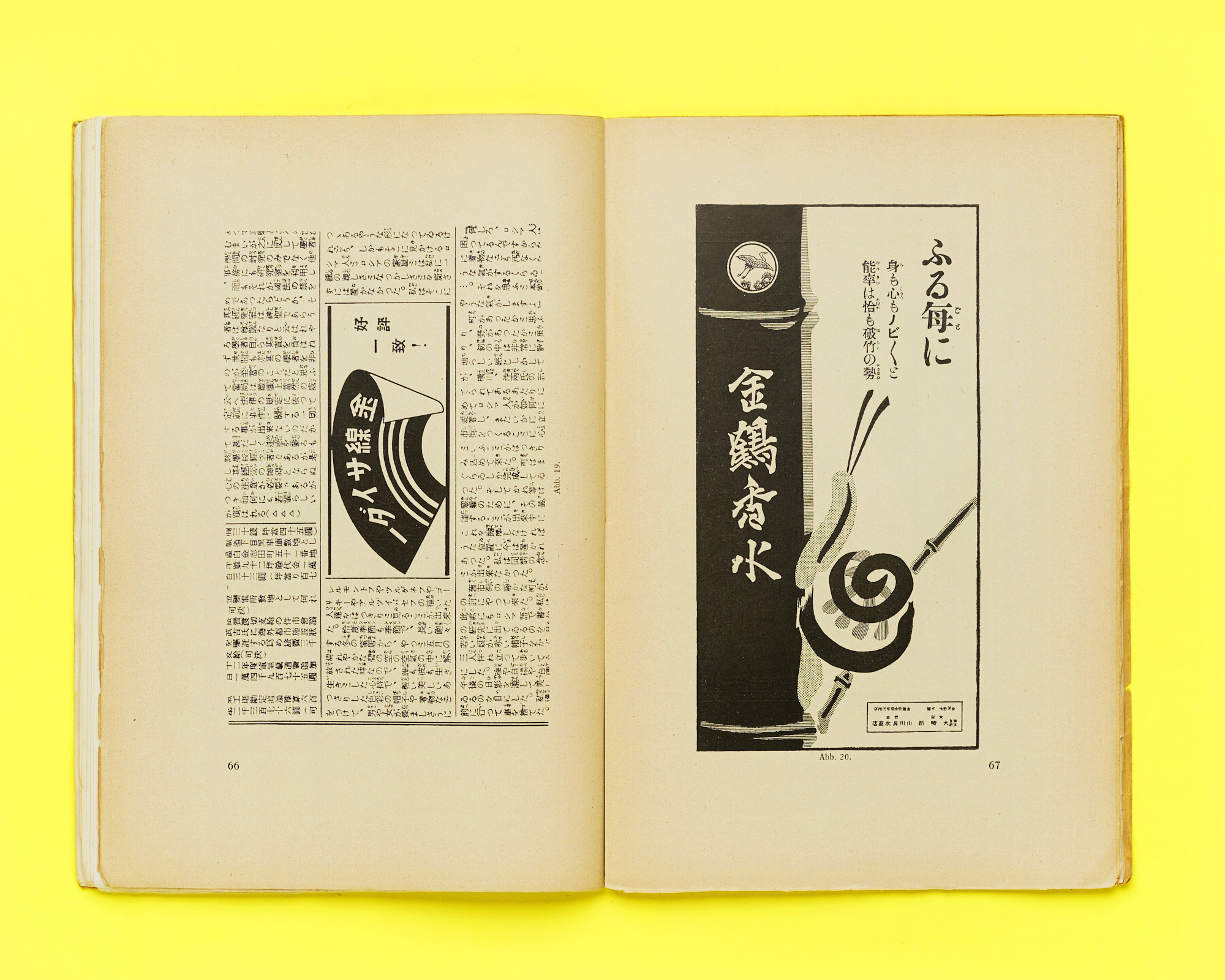
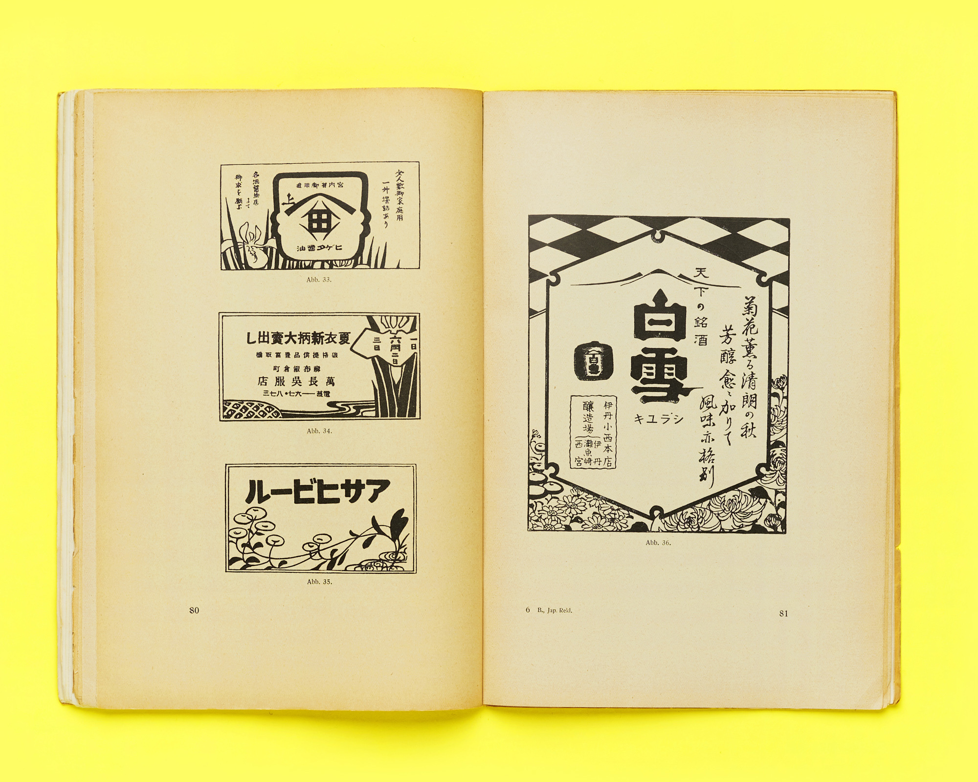
The presentations responded to the conference title. On the one hand, they expanded the references Die neue Typographie drew from – beyond the ones Tschichold explicitly mentioned. On the other, they framed the book’s impact in a dialogical way. They acknowledged how other countries and cultures were not simply influenced by it but developed their own approach to modernism. Speakers also noted the many local factors that influenced the book’s reception. Besides this, several “minor” figures were brought to the fore for their contributions to the development of (typographic) modernism: from Anna Berliner’s in-depth studies of Japanese advertising (Japanische Reklame in der Tageszeitung, 1925), to Harald Landt Momberg’s Aktiv Reklame (1924), with a socialist, progressive view on advertising, to Hara Hiromu, Japan’s earliest exponent of graphic modernism.
The first keynote speech, by Christopher Burke, framed Tschichold and his work in the context of European avant-gardes and his extensive international network. A recurring thread in many presentations was the attempt to show the diversity and complexity of factors that supported the development and acceptance of the new typography in different areas. As Julia Meer argued, for instance, the German printing industry, far from being stuck in traditional values, was keen to adopt it: Die neue Typographie was, in fact, published by the Bildungsverband der Deutschen Buchdrucker (Educational Association of German Letterpress Printers). Carlo Vinti showed how printing magazines in Italy were also key in spreading these ideas. As they both mentioned, the new typography came to be accepted in the printing field through its “domestication”: in Italy, this meant adapting it to the political situation under the fascist regime and to the local taste, while in Germany, it meant adapting it to the higher standards set by the printing industry, which struggled to accept it not because it was “too new” but because it was often produced by artists who had no typographic training.
Meer also highlighted the role of skillful storytelling in the successful spread of these ideas, mentioning how Tschichold and others often showed examples of their new typography in contrast with 19th-century works, thus making it stand out as “new” – while concepts such as simplicity and clarity were already applied in early 20th-century advertising.
Paul Stirton’s presentation downplayed the role of the Bauhaus in Tschichold’s modernist turn, pointing out how at the time of his visit to Weimar in 1923, the school was still a long way from adopting the new typography and suggesting that other local ventures might have influenced him, such as the Cranach Press, which had collaborated with Edward Gordon Craig, a modernist theatre director and set designer.
Sandy Jones discussed Tschichold’s connections with Britain at the time of his trips to London in the 1930s. Two important local supporters of modernism were Lund Humphries, a printer and publisher promoting modernist art and design through exhibitions, and Philip James, who, since 1936, started the Jobbing Printing collection at V&A’s National Art Library, gathering examples of British and “continental” commercial works.
As an example of how local politics and culture could affect the reception of Die neue Typographie, Katrien Van Haute presented the case of the Catholic Kunstdrukschool Sint-Lucas in Ghent and its Grafiek magazine, where the religious beliefs made it difficult to entirely accept a modernist approach and the leftist views of the book’s author.
Trond Klevgaard presented an overview of Scandinavian modernism; work by Tschichold and the Ring “neue Werbegestalter” was known in the Nordic area through exhibitions, translations, reviews, and also thanks to Tschichold’s visit to Copenhagen in 1935. Scandinavia was dependent on Germany’s typefoundries, which can explain the attention given to typographic trends from that country. But Tschichold was also aware of the work of some Scandinavian designers that he mentions in his book: the influence might have been reciprocal, as Klevgaard suggested.
Language was, of course, an issue in the spread of Tschichold’s book. While his articles were published in several countries, Die neue Typographie was only officially translated after its author’s death. It is somehow intriguing to notice how the book still had a faithful readership at a time when Tschichold radically changed his views on typography. Christopher Burke mentioned an unofficially translated copy of the book was reportedly deposited at the St Bride Library and read with reverence by British admirers of modernism.
Moving away from a European perspective, the presentations by Vaibhav Singh and Mariko Takagi reminded us how some modernist tenets only make sense in their original cultural and linguistic context: this is the case, for instance, of the debates around Kleinschreibung or the use of sans serif typefaces, which are typical of Central European modernism but are not relevant to the Japanese context, as Takagi noted. In Colonial India, the subject of Singh’s presentation, modernity in typography was more a question of adapting Devanagari and Gujarati scripts to Linotype composition: this brought several attempts at the rationalization of characters and accents to make them more compatible with hot-metal typesetting.
Finally, the North-American context was analyzed by Juliet Kinchin and Louise Paradis. Kinchin presented the Museum of Modern Art as a case study for its promotion of modernism – not only in its choice of exhibitions and acquisitions but also in its approach to visual communication. Alfred H. Barr – as the museum’s director and Philip Johnson and Ernestine Fantl as heads of the Department of Architecture, respectively, from 1932 to 1934 and 1935 to 1937 – had a key role in this positioning. Johnson also funded the acquisition of a part of Jan Tschichold’s collection in 1950.
This collection, which Tschichold used to support his own books and articles with examples, and his papers are now spread across several locations across Europe and North America, as Louise Paradis mentioned in her presentation. Just to mention a few, Philip James acquired part of his materials for the Jobbing Printing Collection at the V&A. Also, the Jan and Edith Tschichold papers are now at The Getty Research Institute in Los Angeles, and the Deutsches Buch- und Schriftmuseum was gifted a substantial section of his work in 2015. The latter items were recently digitized by the Deutsche Nationalbibliothek. Somehow, this dispersion of materials seems to reflect the complexity of its author’s legacy and impact.
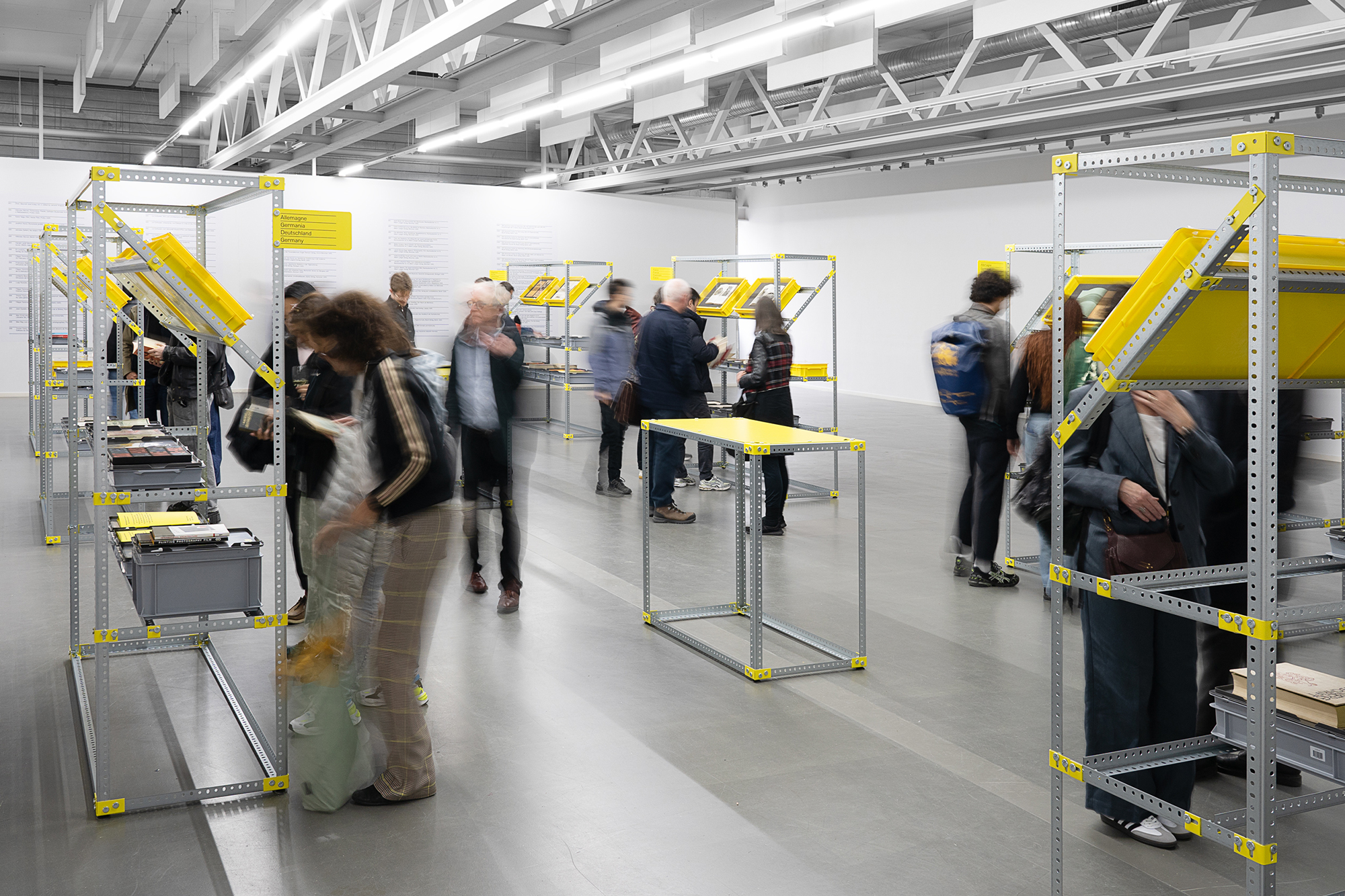
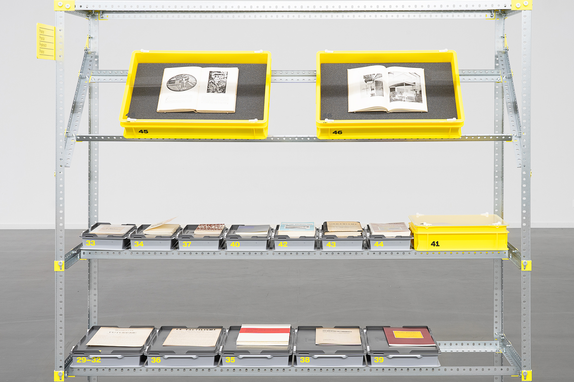
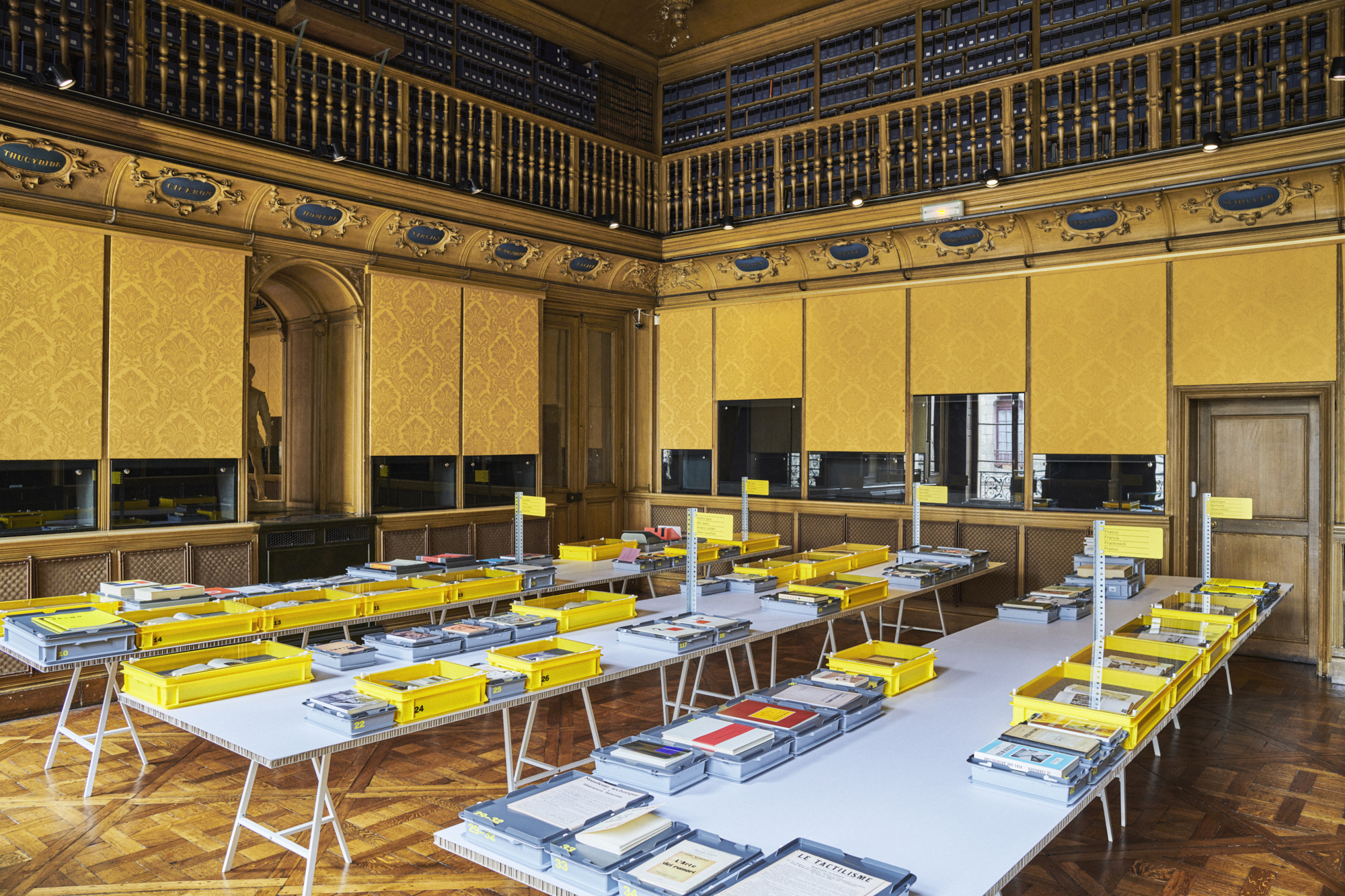
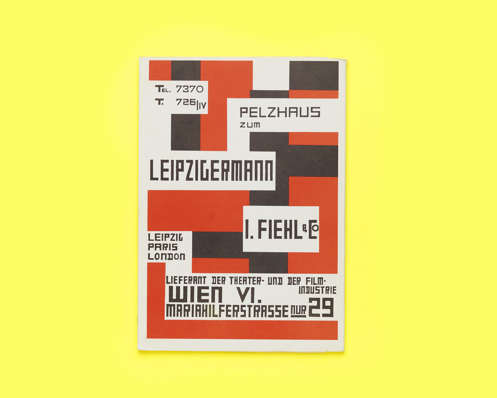
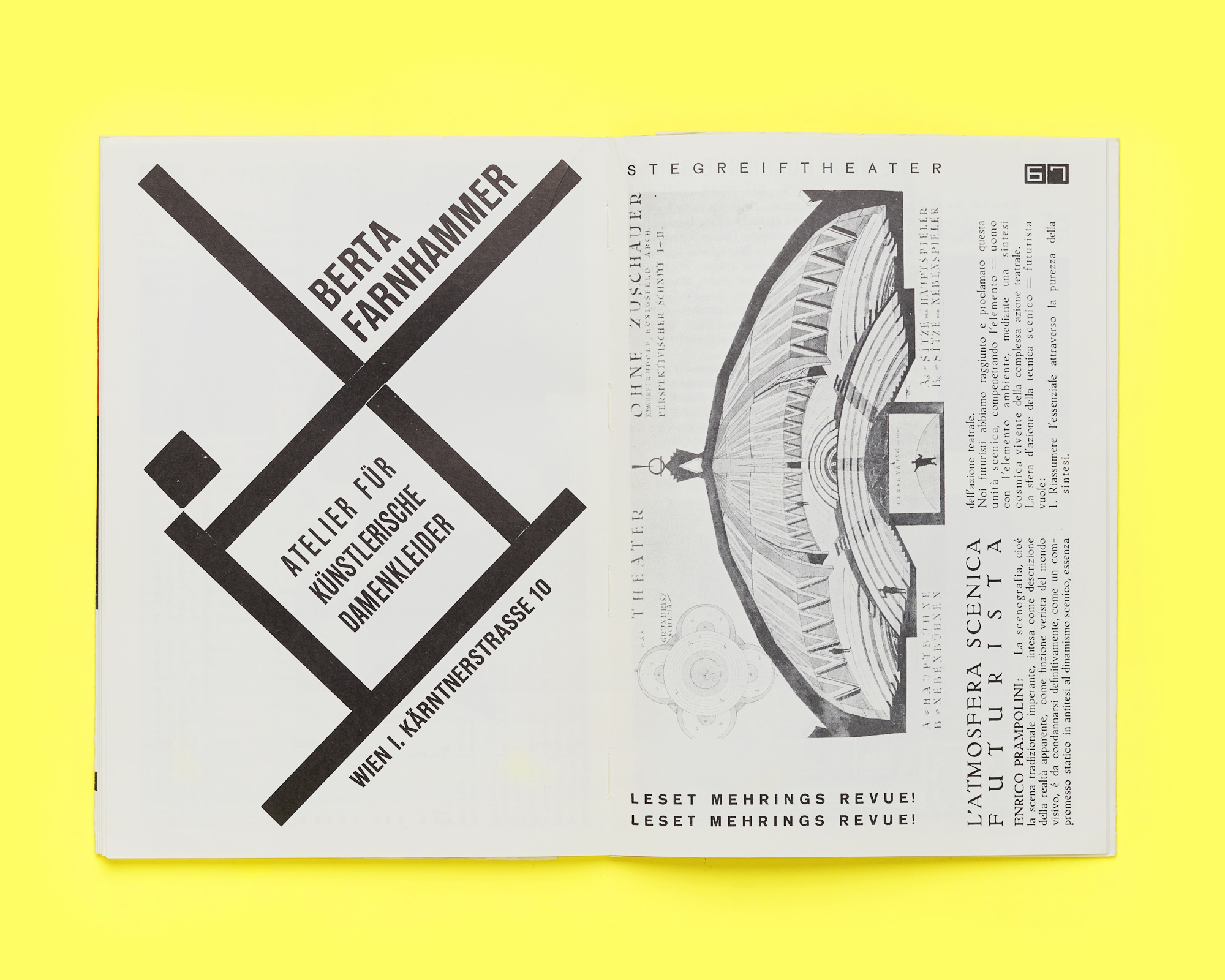
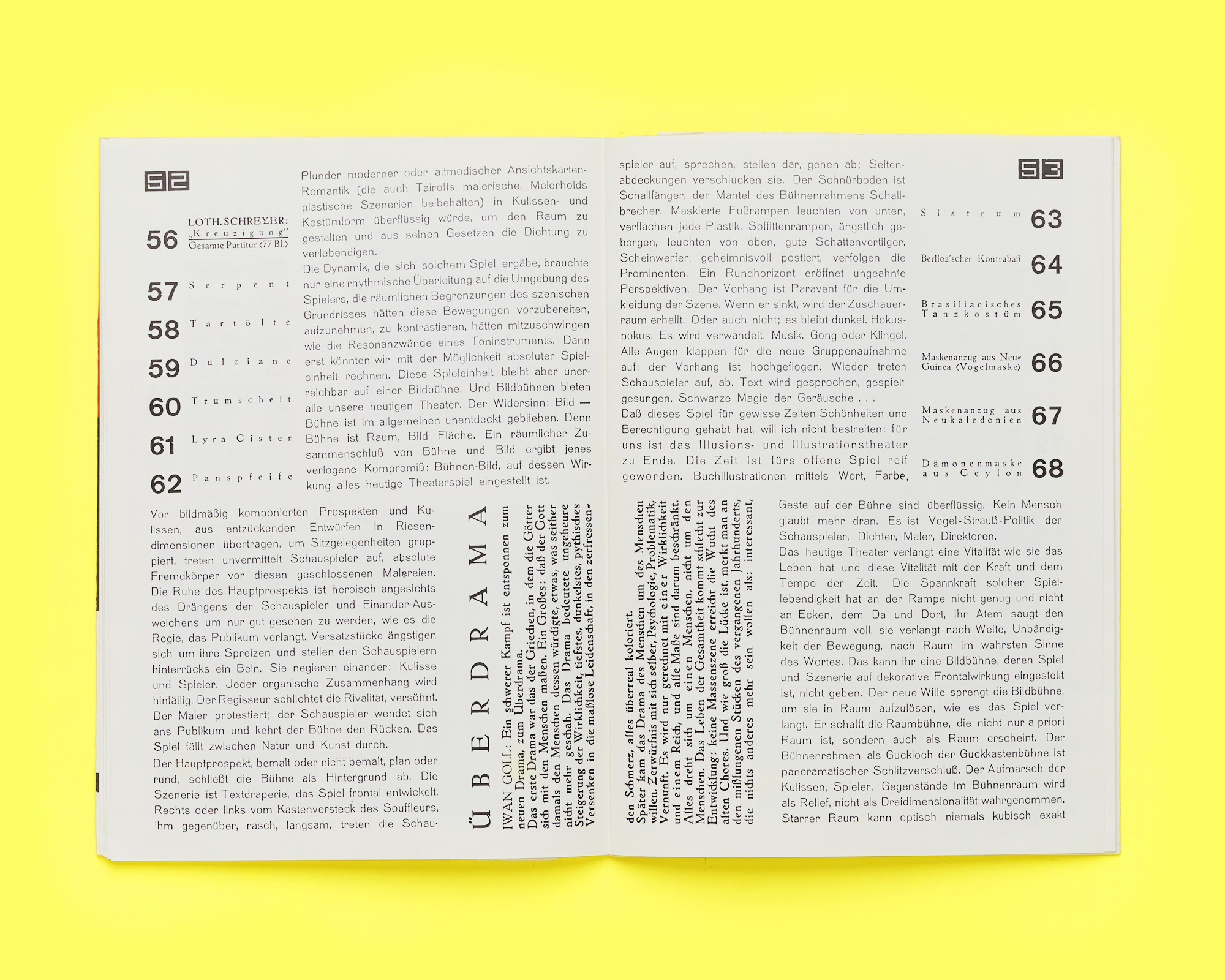
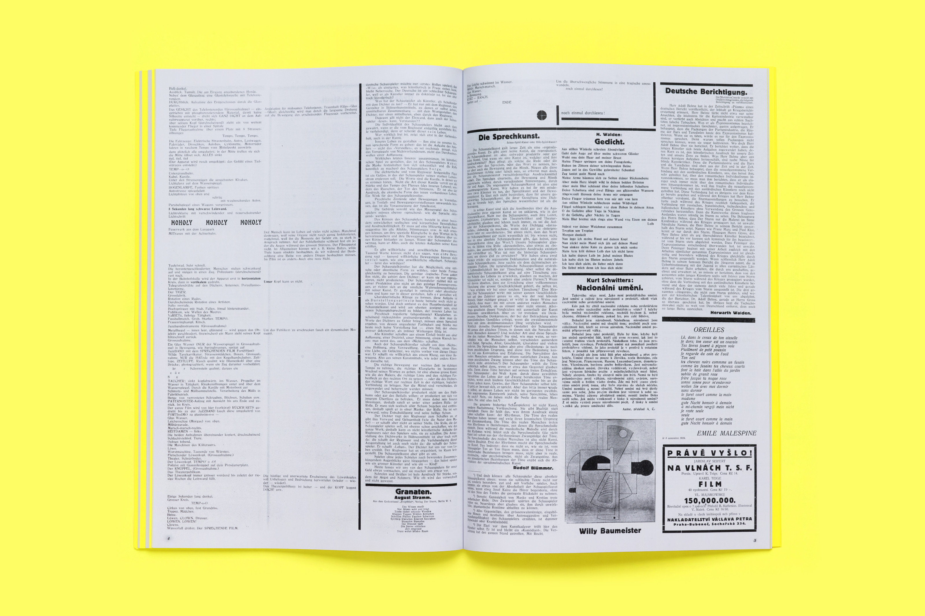
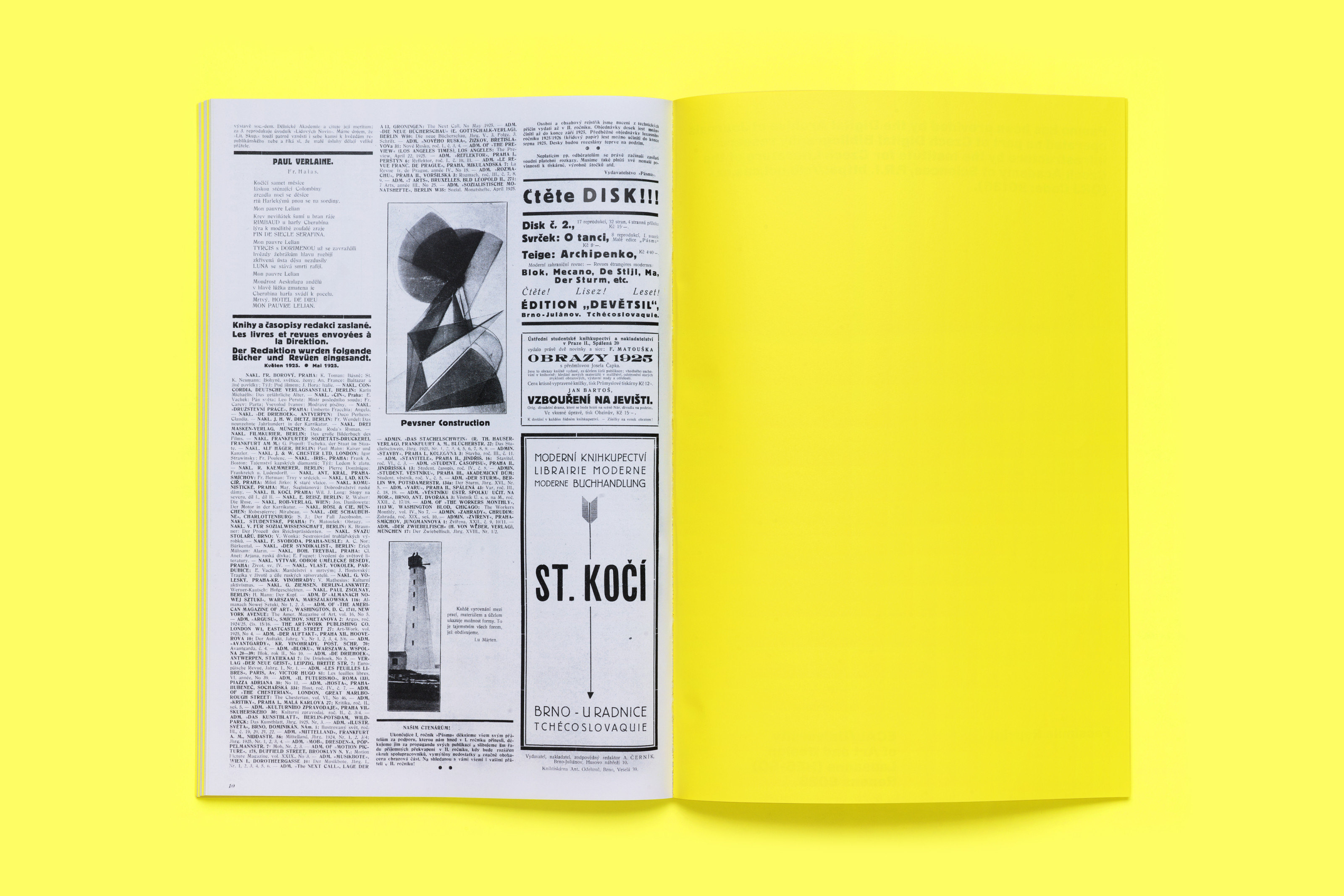
The exhibition Unpacking Tschichold’s Library and the website Sources of “The New Typography” are also part of the research project: the choice of these formats for the dissemination of the results makes them accessible to different audiences, a refreshing approach when compared to more traditional examples of academic research. Both website and exhibition originate from the desire to reconstruct and make accessible the vast bibliography that Jan Tschichold included in his book. Some works were acquired in the original editions, others are reprints, and certain items are specially-made facsimiles. The website lists all the publications, describing their features and connections with the original book. The traveling exhibition, designed in a compact and efficient, if somewhat algid way, allows visitors to leaf through most of the items, thus presenting them as references instead of inaccessible collector’s objects. Finally, a book with essays by the conference’s curators and speakers – and by other authors – is due to be published in Spring 2024 by Triest Verlag.
The Sources of Jan Tschichold’s “The New Typography” succeeds in the paradoxical task of de-centering Die neue Typographie despite it being the project’s starting point.