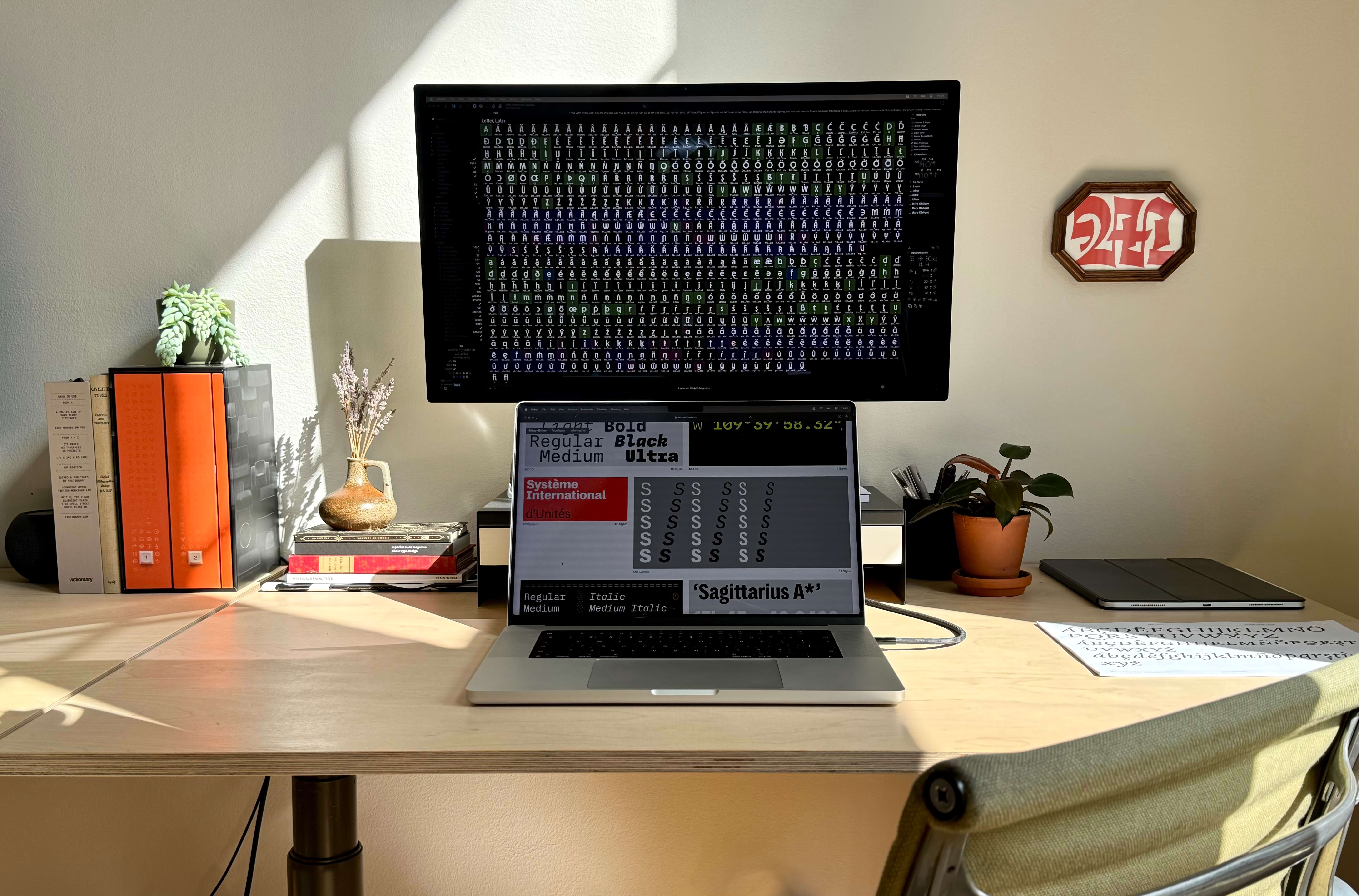
Part of Rutherford Craze’s workspace.
Founded in 2020, Mass-Driver is a foundry based in The Hague. Its owner and chief designer, Rutherford Craze, spoke with me in August. Our discussion touched on revivals, drawing, and what makes some typefaces successful on the market.
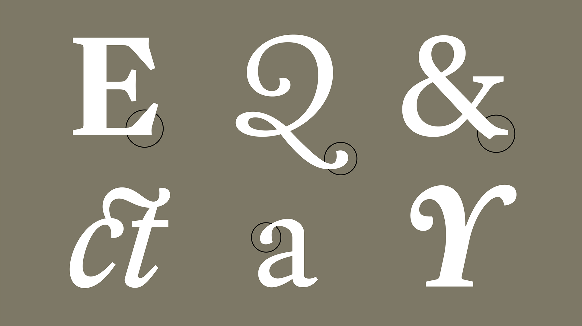
Dan Reynolds: Reading the article on your website introducing Lórien, it looks like the typeface is a hybrid between Caslon and Fleischman. Like you, Fleischman worked in The Hague. And you come from England, like Caslon. Was it your biography that led you to design Lórien?
Rutherford Craze: Not originally. I’m a huge fan of Caslon, but there are a lot of good Caslons. I’m also a huge fan of Fleischman, but there are a lot of good Fleischmans. What I didn’t see was something that’s kind of a little bit in between. Caslon is quite dry, and Fleischman is… not.
DR: Oh yeah, it’s the opposite!
RC: Actually, there aren’t that many good Fleischman interpretations. But there are a few.
DR: There are a lot more good Caslons than good Fleischmans.
RC: Katharina Köhler has Rosart, and Kris Sowersby has Epicene. There are some great things in that vein, although they’re slightly too fussy for long texts unless the subject matter lends itself. My goal is never to do something that someone else has done; it’s always to do something that someone else has almost done but not quite – not quite gone the whole way or not quite in the same direction that I would. I thought there’s some opportunity in the middle between a Caslon that’s a bit more interesting and a Fleischman that’s a bit more versatile. Then I came up with this frame story: If Bill Caslon was an Englishman looking at Dutch typefaces and trying to make them more boring for the home market, I could frame the project the same way. I was not so precise with every little historical detail but in principle, I thought of the project as a parallel to Caslon. It is not a Caslon revival; I didn’t look at Caslon’s work a whole lot. But I did look at all the same stuff he was looking at.
Newcastle–Maitland Rue Sarah Passereau rannsóknarréttur autosuficiencia technologickému Claude Terrasse 55 Cours de la Chaussée-d’Antin rationalisieren
Via d’Aribau berylliumacetat Baixada Santista skeiðarársandur ponderousnesses Bitterfeld-Wolfen saltvandsområde Yevstigney Fomin
hypervitaminose Pieter Hellendaal Aulnay-sous-Bois Avenida de Catalunya proverbialmente Adalbert Gyrowetz Meurthe-et-Moselle
Baldassare Galuppi 678 Smith Grove stereochemistry Kingston upon Hull Windy Rove intangiblemente Erlenbach am Main
DR: Most books use a relatively small set of typefaces. I think that Lórien would be a good alternative.
RC: For sure. I suppose I hesitate a little because it’s a slightly weird typeface. I say that not pejoratively, but it’s not. It’s got some ornateness and detail that I think takes a bit more care to work with than something like Sabon. I’m hesitant to call it a book typeface in the same breath as, you know, Minion and Sabon and all these classics because I think those are typefaces that you can distort and be heavy-handed with and they’ll still work pretty well. Whereas, Lórien takes slightly more finesse. But you could absolutely get good results out of it.
DR: That’s also really part of the reason why you would choose it. It has something extra that separates it from other book faces.
RC: I think it's really because it has that kind of baroque inspiration, and particularly that sort of “late baroque”: Fleischman and Rosart. It’s got a little bit of extra complexity that, if you wanted to make something very reusable, or very a classic book typeface, you’d probably file away. You’d take away the little spur at the bottom of the capital G. You’d take away the slightly up-flicked ear of the lowercase g. You’d probably sand down some of the serifs so that they’d be a bit less complicated in their shape. It’s that kind of thing. You’d probably keep the overall distribution of mass in the shapes about where it is but you’d change the contours because, right now, they’re ever so slightly more complex than they need to be. That’s what gives it its character, but it’s also what makes it slightly too characterful to use in certain contexts.
veröffentlichung Johann Anton André Invalidenzeile 17 raffermissement
Újszövetség Elizabeth Anspach Khartoum-Omdurman
DR: About two-and-a-half years ago, you wrote that Nichrome was your best seller. Is that still true today?
RC: Yes. It caught me off-guard and completely saved my ass at the start of the pandemic. I had just started a foundry and my backup plan was like, go get a job as a barista – and then with the lockdowns, that option disappeared. So when my other fonts weren’t selling and Nichrome ended up launching in April that year and did really well, that was a complete godsend. Since then, it’s also surprised me how consistently it still does. I am wary of putting all my eggs in one basket. I don’t want to have one really successful typeface where, when someone rips it off, it stops selling and I go under. But I’m really happy with the fact that it’s had some staying power, unlike how I expected a display design to initially peak and then fall off.
DR: That’s really great.
RC: Partly, the success is that – under the hood – it is a geometric sans. There’s some weird stuff going on, but the bones of it are rational enough that I think it appeals to both individual graphic designers who want to make a zine and make it look cool and weird and retro but also to marketing execs who can’t do anything that could possibly be interesting but will maybe accept this because – apart from the proportions being wacky – it looks like Futura.
osteopathically Conradin Kreutzer L’Haÿ-les-Roses Miklós Misztótfalusi Kis Laurens Janszoon Coster
honorifiquement Joan Baptista Pla Bowral–Mittagong Puerta Vito Claudio
Bitterfeld-Wolfen ponderousnesses saltvandsområde Yevstigney Fomin
210 Elizabeth Howard Av No. 80 excellentissime Sterling Heights skeiðarársandur
DR: Nichrome has a lot of alternates. Do you know if people use them a lot?
RC: I know that the biggest customization request is if we can put some stylistic sets on by default. At one stage, I thought like, “I get a bunch of these requests and should I have a version with this set turned on by default?” Then I looked through the requests, and every single one was unique in some way. It was always like, “Can we have the geometric set enabled by default, and not have the old default variants available at all, because we don’t trust the design team?” Or, “Can we have these two glyphs from the geometric set, and this one from the rounded set, but nothing else?” There were only about two people who had ever requested the same thing, and one of them had asked for the files to be renamed as well, so like even there, I couldn’t double it up.
Deborah Kelly Canyon arsenmonosulfid Tauberbischofsheim 871
proverbialmente Lauda-Königshofen dvanáctihodinovou Josef Triebensee
nepremišljenost Pietro Locatelli 9 Paul Stewart Glade antiescorbútico
858 Round Gardens veröffentlichung conjugationally Joachim Albertini
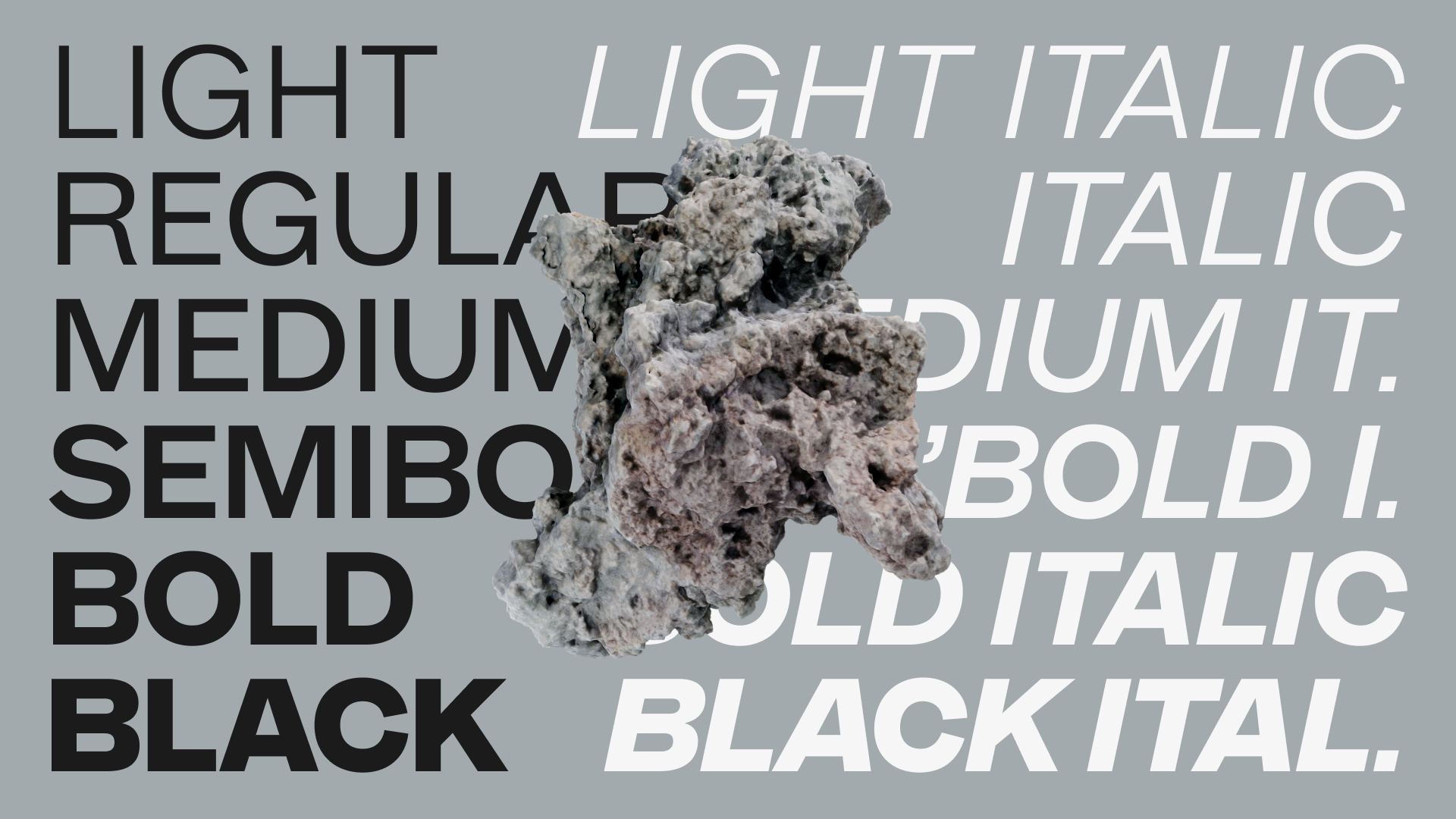
DR: Not including MD IO, you currently have other two sans serif typefaces in your library: MD System and MD Primer. Even though they both have Grotesk elements in them and do vaguely similar things, at least if you're looking at the regular width, I’m sure all the readers here could give several bullet points explaining how different the two are. How do you plan your foundry’s offering out?
RC: I think it’s wrong to assume that I plan my foundry’s offerings out [laughs].
technologickému William Bergsma 78 Rue Saïd intériorisation
Schraubenzieher Henri-Joseph Rigel Newcastle–Maitland
noncultivations připomínajících Jean-Pierre Solié Hofheim am Taunus
DR: You did System first, right?
RC: Yes. But to use an expression that, I think, Brian Eno came up with, you can broadly divide creative work into architecture and gardening. Architecture is where you have an idea of the end result and then you build it, and in gardening, you plant a seed and you see where it ends up. System very much started as architecture. Primer very much was gardening, and they ended up quite similar by coincidence. I tried to push Primer a little further away from System when it was getting too close.
osteopathically Conradin Kreutzer L’Haÿ-les-Roses Kleinallee 10
veröffentlichung František Jiránek 473 Thomas Bell Manor No. 25 barotraumatisme
conjuntivamente Villar de Olmos připomínajících Tommaso Giordani
DR: Wow, that’s funny because I would have assumed it to be the other way around! That System was gardening and Primer was architecture.
RC: Because of the shapes of the typefaces or because of the concepts?
DR: Both – because Primer probably has more historical reference points, at least looking at the finished results. Those things are out. There is an architecture for this kind of typeface. You know, you can do things that look like this, that, or something else. But in the end, there is a box. You can’t do certain kinds of things with the lowercase A because it wouldn’t fit in the 19th-century box. Yet, System seems like something that could have been anything. I mean, now it’s done, so I can’t see how developed.
RC: Yes, there is a sense in which System’s shapes were not constrained by any particular historical references. But there were still guidelines. At no point was it an Akzidenz revival but there is still a lot of Akzidenz in the kind of material I was looking at. The concept is similar to Karl Gerstner’s Programm and I didn’t necessarily make up new shapes if they worked in that design – unless I really didn’t like them, or they didn’t fit with other decisions I’d made. Primer was originally quite condensed. It started as one of those advertising block typefaces from ghost signs. Very quickly, it shifted but, you know, when something exists early on in a design, it kind of sticks around in the way that you see the shapes later on. So it stopped being condensed quite quickly, but I still see it as having that ghost-sign thing to it. To me, it feels older, even though on paper it’s rather geometric. It tends to be used more often by tech companies that want to look very contemporary. I think there’s something very nice about that. It’s based on the oldest sans serifs but it gets used for the most cutting-edge sort of companies.
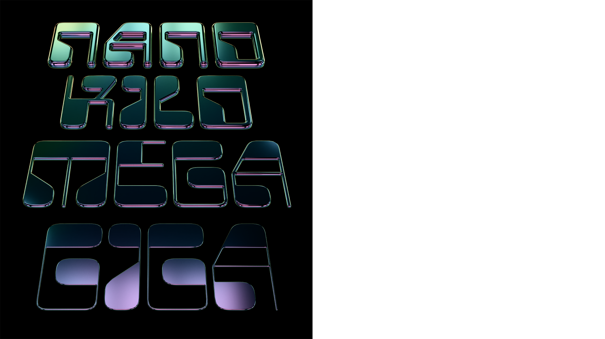
DR: I haven’t asked you about Polychrome yet. That is less likely to be used in corporate design projects, but I was overjoyed when you published it. I didn’t have an optically-sized MICR-style typeface on my bingo card for 2022. Do you have more things like this in the pipeline?
RC: I like the idea of the late 20th century analog/digital/whatever revivals. I still do TypeCookers but this is another way of making myself think about letter shapes in a different way. There are some forms that I came up with for Polychrome that I needed to sit down and do like 10 different versions of before I found one that was not completely unusable. I think that process is really helpful and I like making myself get into the habit of trying out a bunch of different options before I just commit to the easiest thing to draw, the first thing that I settle on, and understanding what makes a glyph readable because it doesn’t always agree with what Gerrit Noordzij might suggest. Sometimes, I completely agree with the theory of The Stroke but there are some cases where it doesn’t lead to legibility, or you need to kind of fudge something in a way that doesn’t make sense with the stroke of the pen but does look right.
DR: There’s no room for geometric sans serifs, for instance.
RC: Exactly. Nor for some grotesques. When I was working on Primer, I was talking about this with Luke Charsley, who designed its italics. We used the term “opportunistic contrast,” which is that a stroke is thin or thick based on what there is space for, rather than what any model of calligraphy says.
DR: That’s a good word.
RC: The lowercase O is pretty thick all the way around because there’s space for that. But the lowercase G gets more contrast because there’s more going on. You’ve got four horizontal strokes crossing the center line, so each one needs to be thinner.
DR: Especially as you get bolder. The contrast in the stroke thicknesses on the lowercase G is totally different than on the lowercase O because you can’t have the same thickness … it’d all run together and be too dark. Rutherford, is there anything else I should ask you about?
RC: For the first time in four and a half years, I have a logo now, which is just rolling out this week. It is intentionally really not the same thing as the name of the foundry.
DR: Oh, the leaf ornament! That matches Lórien very well.
RC: I hope that the name Mass-Driver, which is an oblique sci-fi reference, matches with some part of the catalog and then this leaf mark matches with other parts and, by virtue of it all being at least partly designed by me, and marketed similarly, and placed in the same context, it will all kind of mesh together. The ethos is always consistent: craft and technology.
83 Avenue Robin Bocuse veröffentlichung departmentalize Adalbert Gyrowetz Kleinalle
Via d’Aribau F-57 berylliumacetat Baixada Santista skeiðarársandur Dirk Voskens Marcus Tullius Cicero
698 Branch Path fremdsprachlich Kalgoorlie-Boulder veröffentlichung research on practice
Baixada Santista Via d’Ausiàs Marc 11 saltvandsområde verhältnismäßig


