Hidden in a corner at our school, there was a strange machine that had always piqued my curiosity: the Riso printer. Scattered around it lay brightly colored, abandoned test prints. Because of its vivid colors and charming imperfections in each print, I always wanted to use it for type design. Although widely used for illustrations and photographs, the world of typography seemed to remain untapped, offering limited opportunities to experiment with the Risograph’s vibrant potential.
My initial encounter with the Riso printer was filled with excitement and a dash of disappointment. While the Riso’s colors and gradients were mesmerizing, applying these elements to typography proved challenging. Ordinary vector letters offered no real opportunity to use the Riso’s best assets. Printed in just one color, it lacked the visual impact that I had hoped for, and it became clear that Riso printing demanded a unique approach to type design–one that invited the colors and gradients to interact with the letterforms.
In this article, I’ll take you through my discovery process, explaining my mistakes and the lessons I learned while working with the Riso printer. It’s important to know how the process works to control the outcome. You’ll understand best how the process works when trying things out. There does not exist an official manual for the Riso printer. To fully understand this machine, you’ve got to get your hands dirty and try.
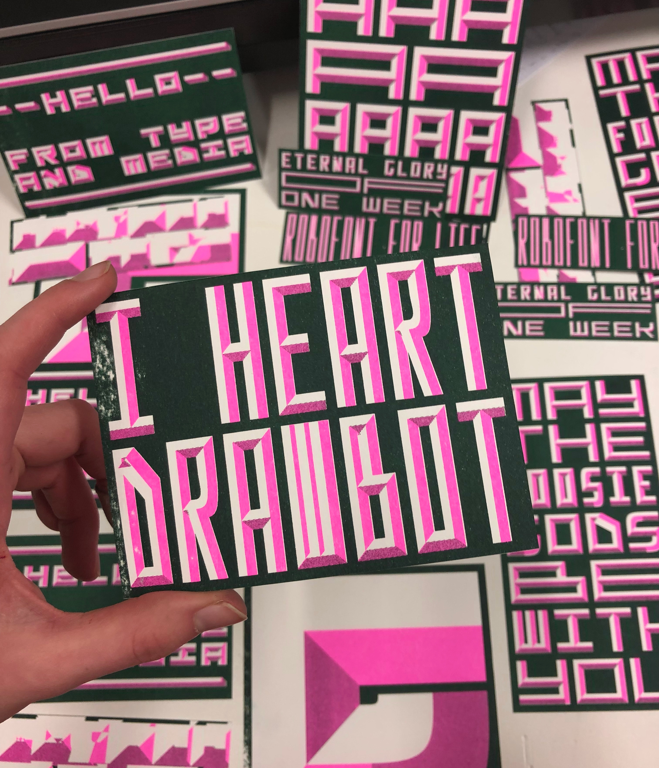
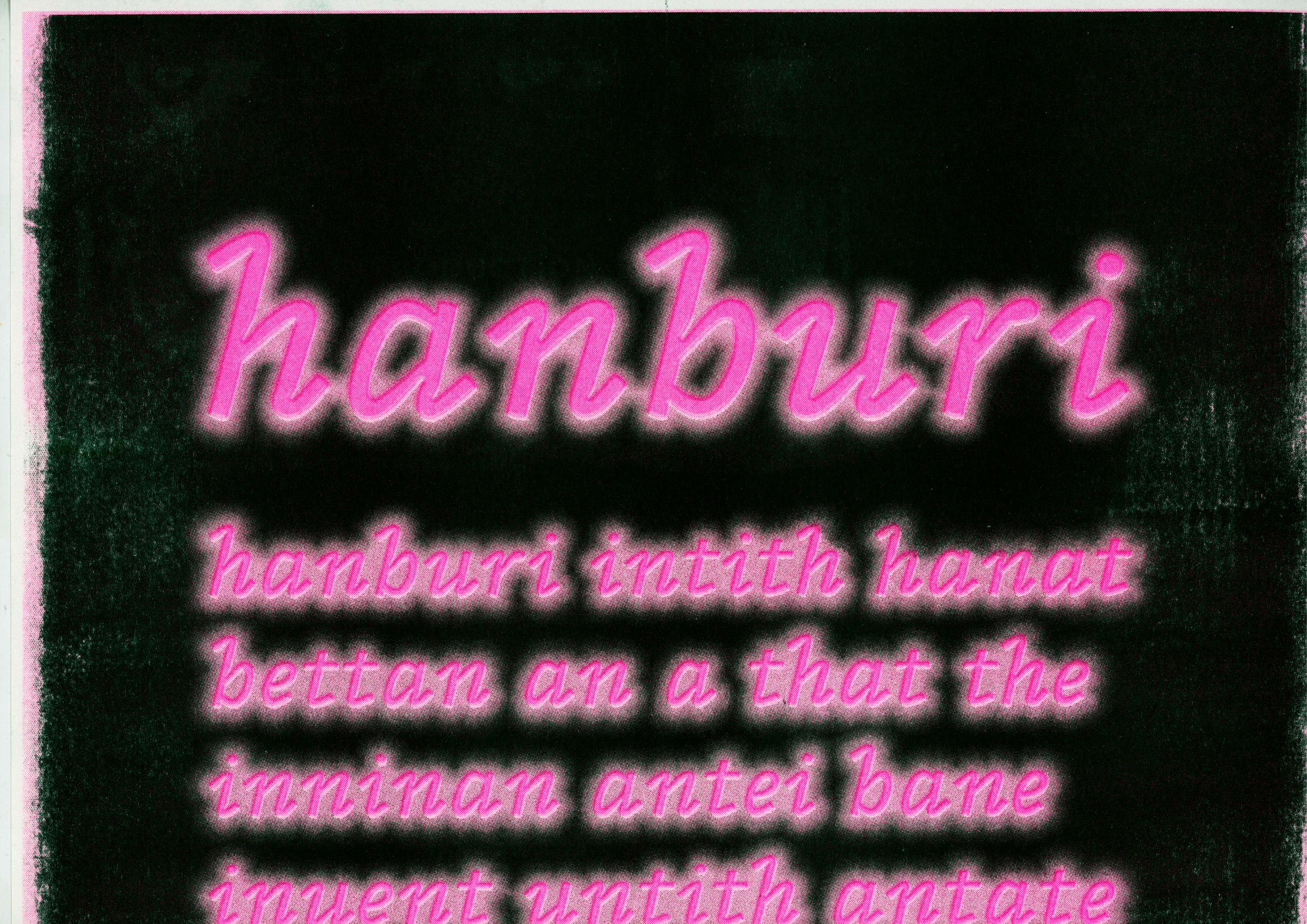
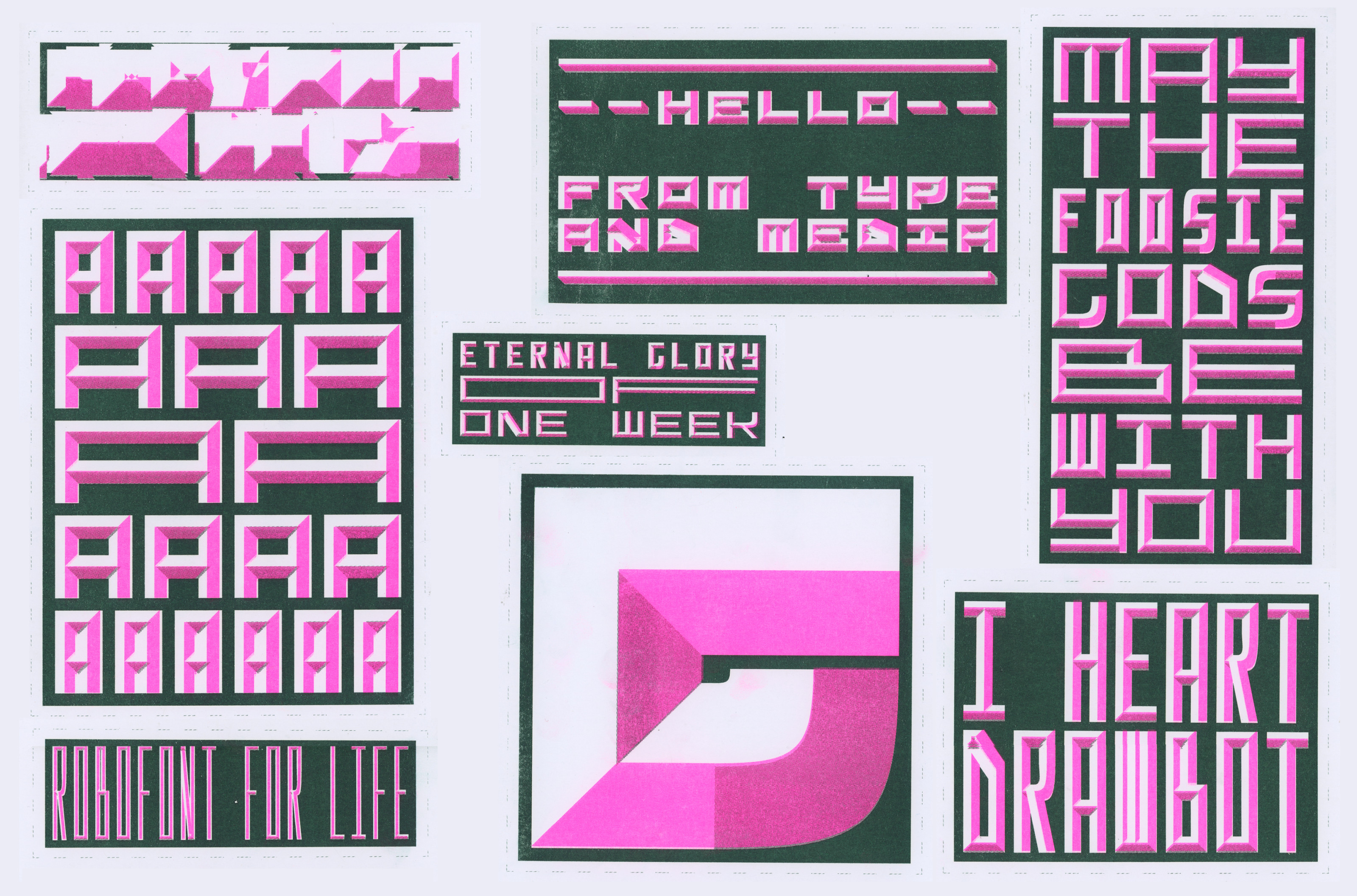
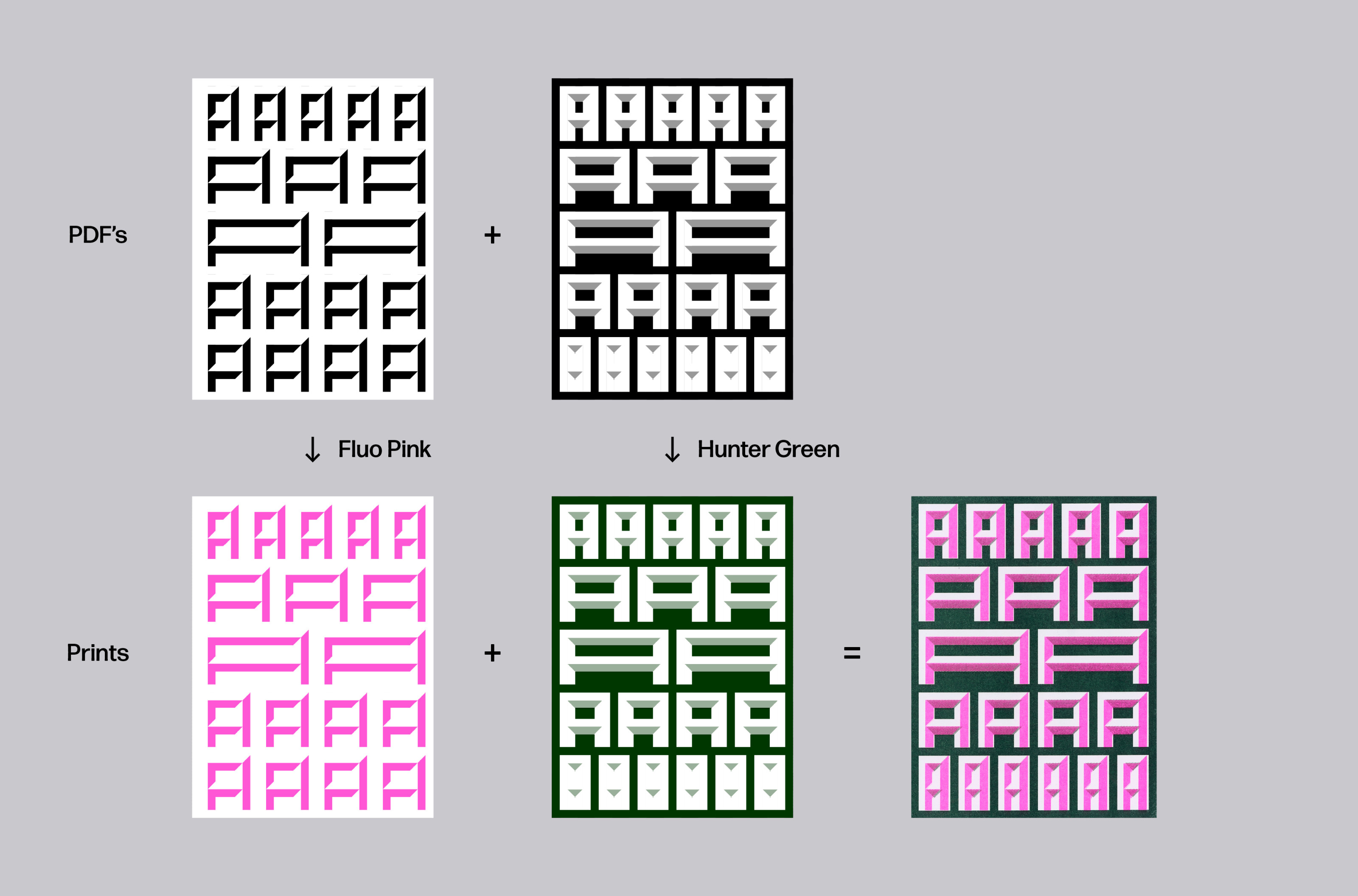
Collection of Riso-printed cards using fluorescent pink and hunter green.
Riso printing functions quite similarly to silkscreen printing. Each color is printed one at a time. That will influence your work in two ways. Firstly, when preparing your files for Riso printing, you will need to create separate artwork for each color you intend to use. It can be a PDF or a Photoshop file, or really any file format you normally use for sending files to a regular printer. It’s important to note that your files should be in grayscale since the Riso machine will interpret these as different hues of the color you’re printing with. So 100% black will print as the full color, 50% will print as a lighter shade of that color, and white will not print anything at all.
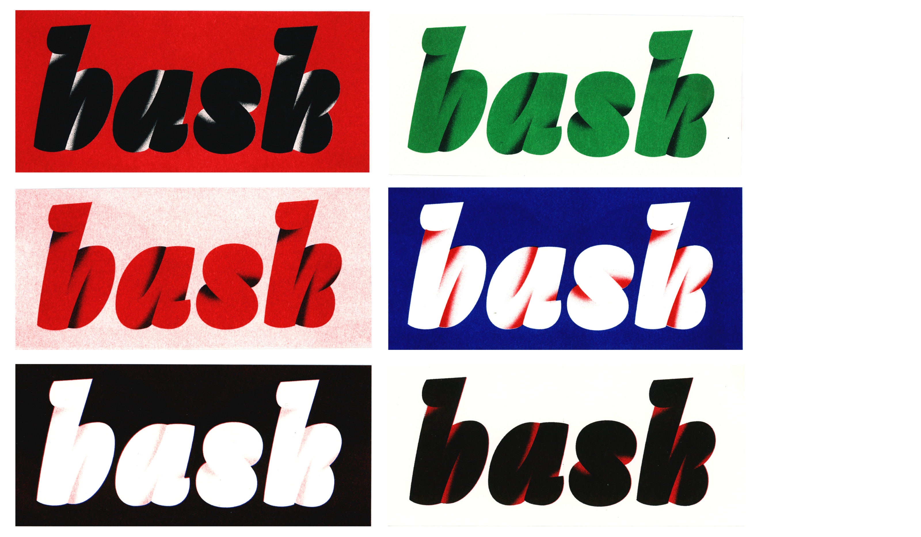
Secondly, the nature of Riso printing ensures that the alignment of multiple colors is rarely, if ever, perfectly precise. Embracing these slight imperfections as inherent elements of the process allows for a nice unpredictability, where each print becomes a unique piece.
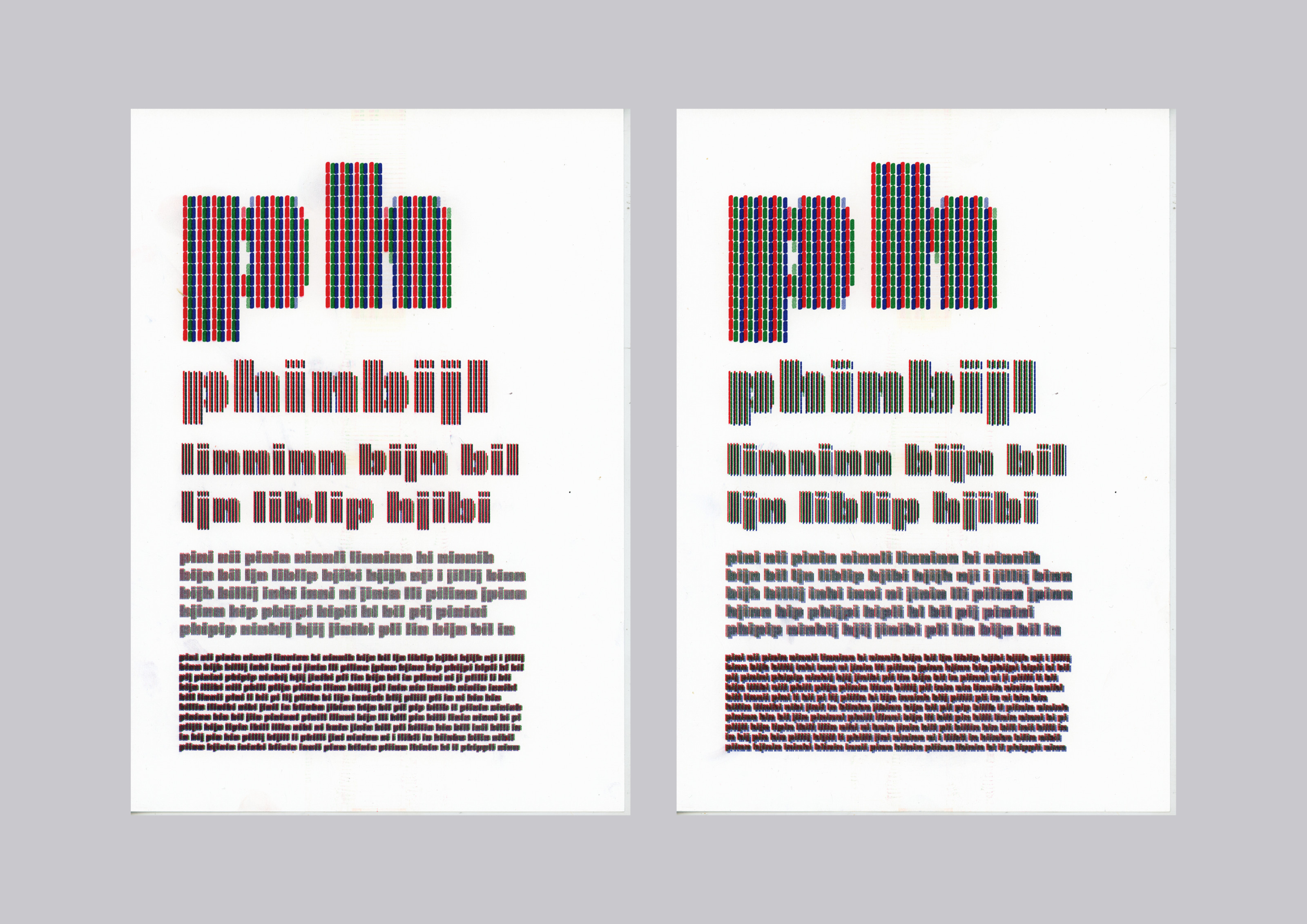
When zooming in on any example of Riso print, you can clearly see the rasterization that the printer applies to your artwork. The Risograph translates every image into small dots, and you can define exactly how that’s done in your printer’s settings. The printer has two main options for handling rasterization, or “screening.” The first one is “screen covered.” This technique creates a classic halftone pattern with halftone dots. The second one is “grain touch,” which will apply a random diffusion pattern to your artwork – quite similar to a photo grain. If you want a softer feel or if you are working with gradients, grain touch can be a better option, but it all depends on your personal preference.
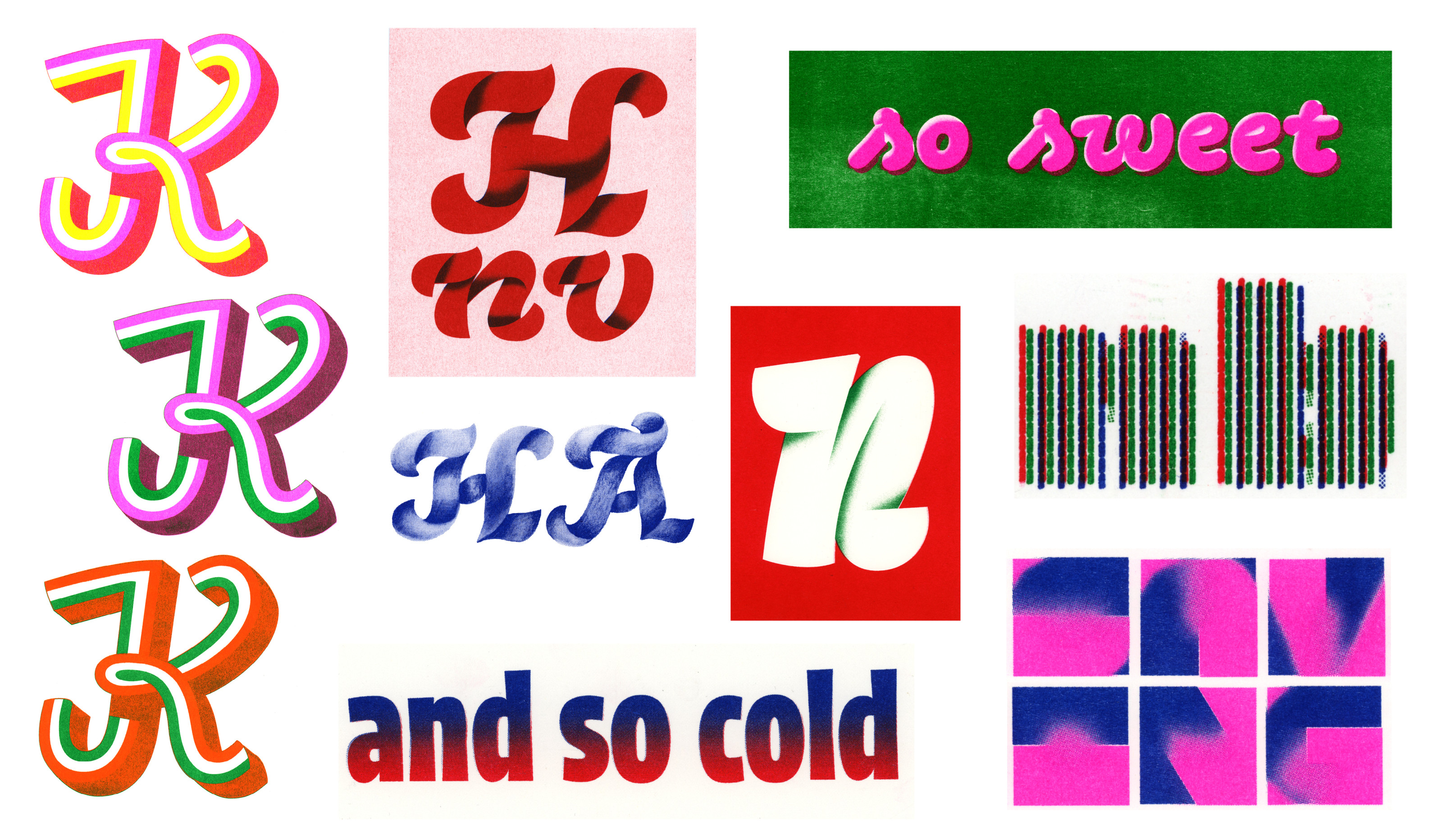
Without a doubt, Riso’s best quality is its colors. The printer uses a limited number of colors that other printers just can’t reproduce exactly. On top of that, there are special inks like white, neon, or metallic such as gold and silver. Riso inks are soy-based, causing them to dry slower than other inks. That means you’ll have to let them dry for a couple of hours to a couple of days, and even then, they might still leave smudges. The easiest way to avoid this is not to print big surfaces in 100% color but a lower opacity instead. Still have smudges? A simple rubber gum works like magic for removing unwanted ink. Be sure not to touch your actual design, though.
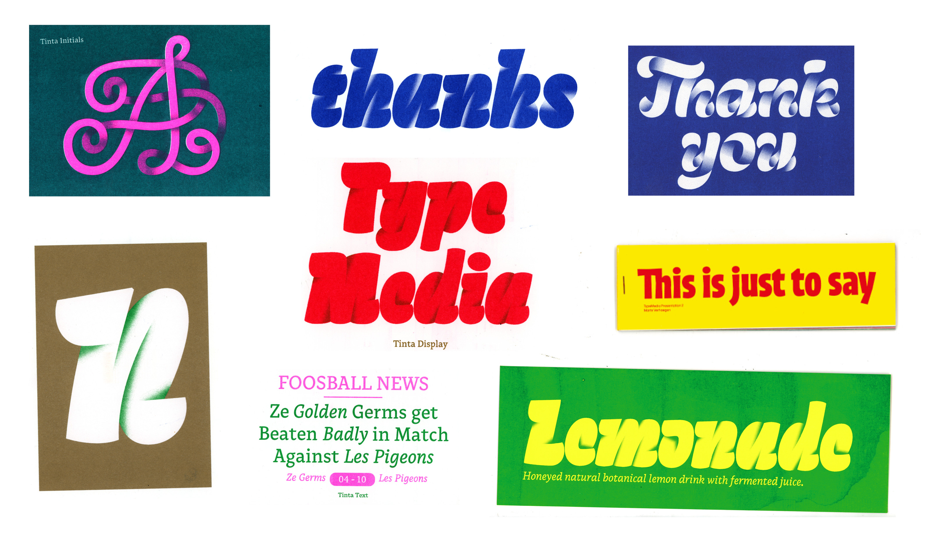
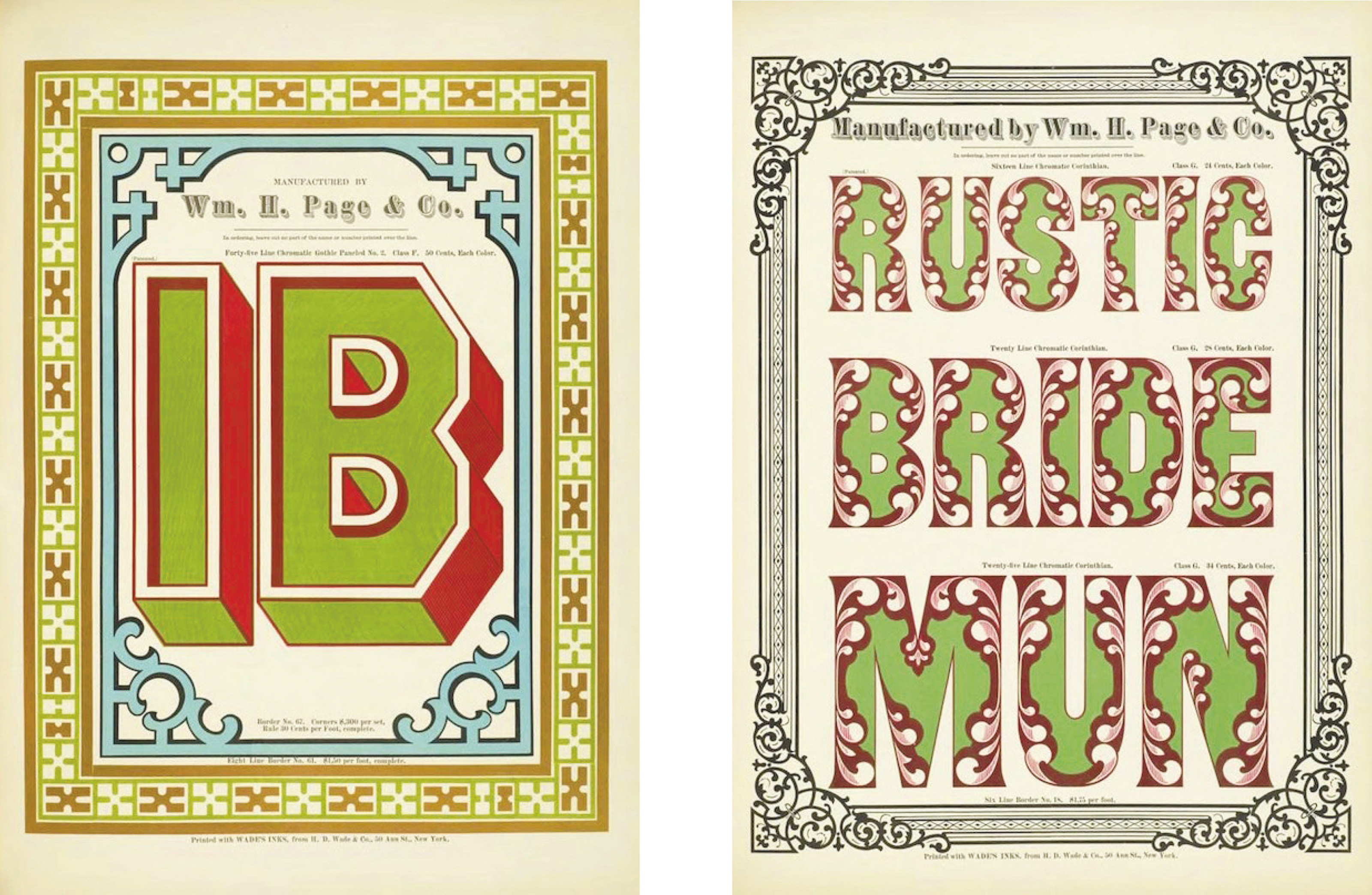
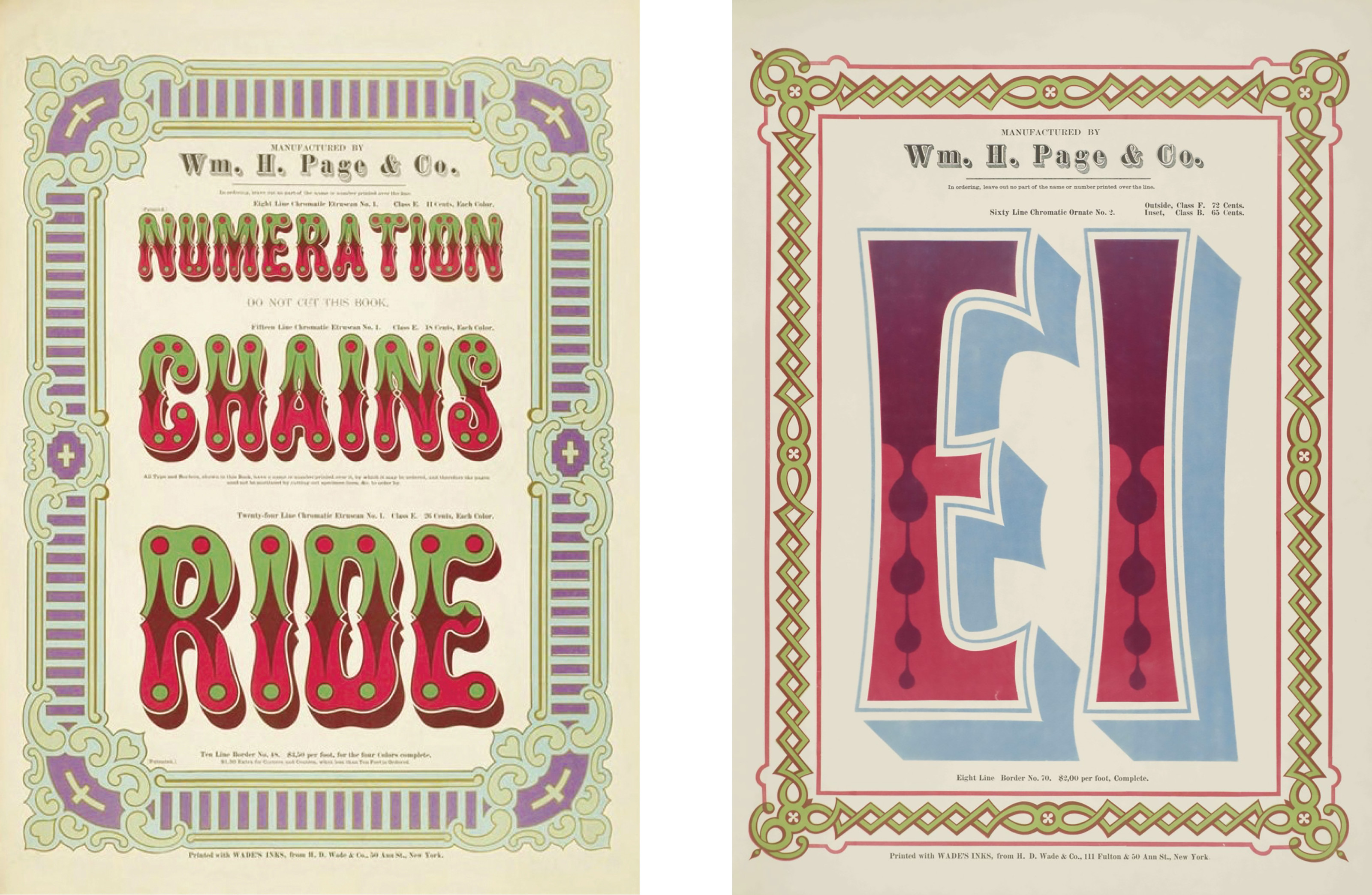
Now that we’ve got the basics of printing covered, let’s start with the design part. To find inspiration for designing riso printed letters, it’s good to look at the two elements it consists of separately–Riso and letters. Analyzing existing Riso prints offers a great perspective on what is possible with colors and patterns. Even though the prints you find might not have anything to do with typography, you can incorporate elements such as color schemes, gradients, or textures into your own designs. For the type aspect, I did some research into historic and modern color fonts. Old specimen books such as the Specimens of Chromatic Wood Type, Borders, &c. (1874), which you can find online, show playful and interesting ways of what color letters can be.
After drawing, you will have to transform your sketches into color-separated files. The best way to prepare your files will depend from project to project. Are you making a lettering? It is easiest to already separate your colors during drawing, but you can always isolate them later in Photoshop. Check out a color overlay chart to see how your colors will print on top of each other. Do you want to use vector fonts? Export multiple font styles for each separate color. If you want to work with gradients in your letters, color fonts are the way to go. Nowadays, it’s easy to make and export color fonts in almost all font editors. Not sure what format to use? For this specific use, I would recommend exporting as an SVG font.
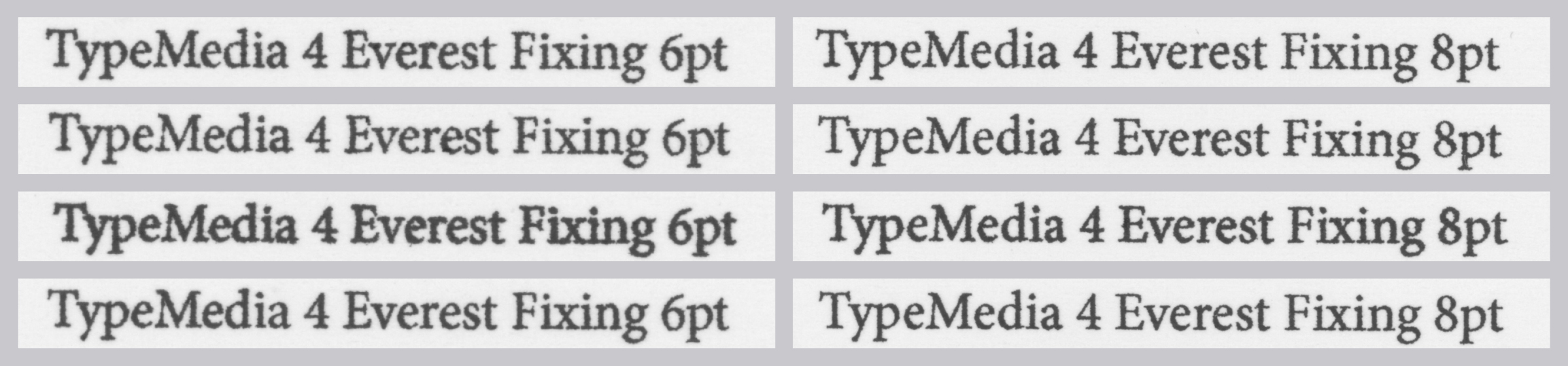
Small text printed with different rasterization settings.
Lastly, the fine print: As mentioned above, the Riso rasterizes your outlines and is not an exact printer. Therefore text type can get a little tricky. You can experiment with some smaller, multicolored text as well, but with the two colors not exactly overlapping, legibility becomes more and more difficult the smaller you go. How your text is printed depends a lot on your printer settings. These can differ from machine to machine. When in doubt, make tests. Just remember that it’s advised not to go too small with your point size.
In conclusion, Riso is a great medium for all your specimens, posters, cards, and other ephemera. It will immediately capture your audience’s attention and will give your type just an extra charm. It demands a bit more thinking than regular printing processes, but the result is all worth it. I hope you have fun working with this machine and keep experimenting.