In order of appearance on Fontstand, these are typefaces that didn’t get rented by anyone in 2023. I think they are worth a look and consideration for your next design projects. Have a good 2024, font lovers! And go by train more! So many beautiful places to see and lettering styles to explore. You may want to stop at any of these, my 25 favourite train stations.
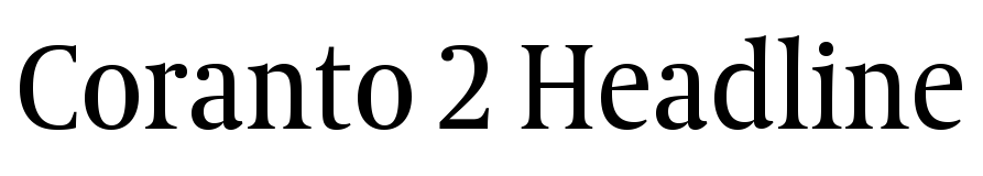
Coranto 2 Headline
Gerard Unger, Type Together
Coranto is based on Gerard Unger’s 1997 typeface Paradox but adapted for newsprint, with narrower letterforms and a larger x-height. The Headline version is even more compact and space-saving for expressiveness and good legibility.
Station Rotterdam Centraal, Rotterdam, The Netherlands, completely newly built after the old modernist box was torn down
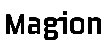
Magion
Tomáš Brousil, Suitcase Type Foundry
A rectangular typeface with closed-shaped capitals, open apertures in lowercase letters and interesting notches/ink-traps. The tight spacing comes to life in large display applications.
Praha Masarykovo Nádraží, Prague, Czech Republic, almost as beautiful as Praha Hlavni Nádraží
Pancho Devanagari
Lipi Raval, Indian Type Foundry
Pancho pays tribute to the work of Roger Excoffon with top-heavy letterforms and a lot of character. Shiva Nallaperumal designed a matching Latin. The round and slightly bouncy letterforms give it an informal feel.
छत्रपति शिवाजी महाराज टर्मिनस, मुंबई, भारत
Relato Sans
Eduardo Manso, Emtype
A humanistic typefaces with a wonderfully calligraphic italic created for general use in texts. Six weights make it a versatile family matching its serif companion in proportions and features.
Estación de Atocha, Madrid, Spain. Renfe stations may be a pain to use but this one is really beautiful
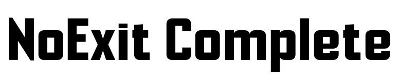
NoExit
Matteo Bologna, Mucca
NoExit is a vernacular type system with multiple widths and unexpected triangular shapes. It is based on an old STAIRWAY sign whose pointed uppercase letter ‘A’ stood out against the rest of the letters. From magazine titles to street signage, this font will support anything that needs strength and straightforwardness.
Stazione di Taormina-Giardini Naxos, Taormina, Sicily, Italy
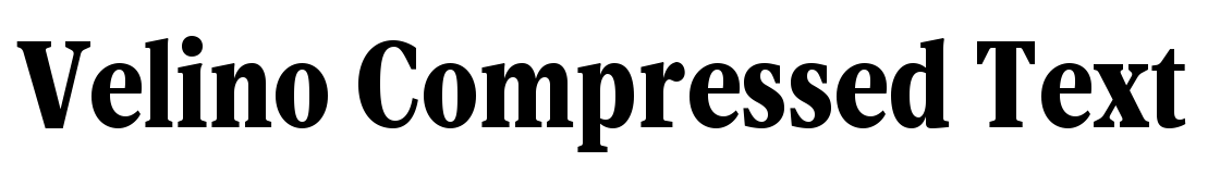
Velino Compressed Text
Dino dos Santos, DSType
Velino is a high-contrast type series with a modern flair designed for editorial design and big text sizes. With matching Text and Display styles, a Poster Slab and an extensive Sans Serif family it provides everything a designer may need for print and screen.
Estação de São Bento, Porto, Portugal. Formerly Estação Central do Porto. Just look at the tiles!!!
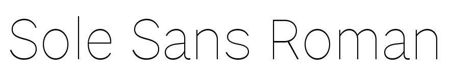
Sole Sans
Luciano Perondi, Riccardo Olocco, CAST
Sole Sans is a newspaper sans available in a wide range of weights and styles especially suitable for headlines, diagrams, graphics or tables. It was originally designed for the leading Italian financial newspaper Il Sole 24 ore.
Stazione di Milano Centrale, Milan, Italy. The ultimate palace of train travel. Don’t miss their food court
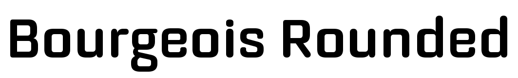
Bourgeois Rounded
Jonathan Barnbrook, Julián Moncada, Barnbrook
Bourgeois Rounded echos a late 20th century modernism: clean and sleek, ephemeral and dynamic – good for short pieces of text requiring a sense of urgency or playfulness.
Wemyss Bay railway station, Wemyss Bay, Inverclyde, Scotland, UK
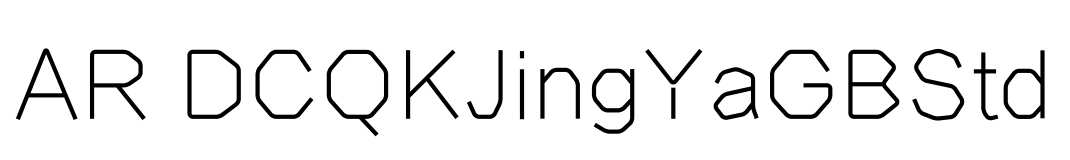
AR DCQKJingYaGB
Arphic Design Team, Arphic
AR DCQKJingYaGB is a combination of the gothic style and art style, available in lots of weights. The simple, geometric letterforms feel clean, constructed and unusual. Fits slightly informal, modern display applications.
北京西站 Beijing West railway station, China
29LT Zarid Sans LC
Jan Fromm, Krista Radoeva, 29Letters
Zarid Sans is a humanist low-contrast typeface with warm characteristics that distinguish it from other sans serif fonts. Suitable for literature, educational publications, branding as well as way-finding and screen design, it is also available in the Arabic Neo Naskh and Greek scripts.
Залізнична вокзал Жмеринка, Mala Zhmerinka, Ukraine, built in 1865
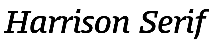
Harrison Serif
Jakob Runge, Lisa Fischbach, Type Mates
A sturdy slab-serif with a warm voice and distinctive italics. The generous x-height makes it a good choice for reading on screen or in small sizes. A variety of figures, small caps and lots of symbols round out the character-set.
Leipzig Hauptbahnhof, Leipzig, Germany, though Bremen is the most beautiful German station
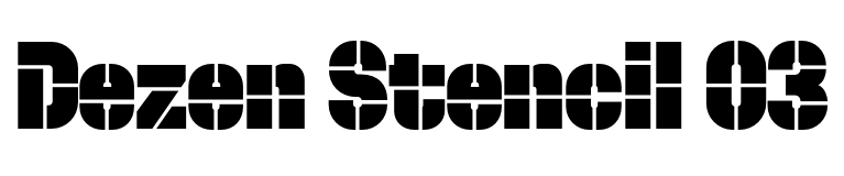
Dezen Stencil 03
Ján Filípek, DizajnDesign
Dezen Stencil is a fun mechanical grotesque constructed from individual modules, then optically refined to enhance its rhythm. The tight letter spacing and narrow proportions make it best suited for display sizes and headlines. Add some spacing when used in medium small sizes. (I added a tiny bit here.)
Tartu raudteejaam, Tartu, Estonia, a wooden villa as station like so many cute buildings in the region
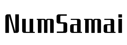
NumSamai
Stawix Ruecha, Sasikarn Vongin, Cadson Demak
A revival of an old condensed, geometric display face from the 1970s. NamSamai captures the flavour of retro fashion and tailor-made suites shops of the Cold War period, reshaped to work better for the contemporary typography.
สถานีรถไฟหัวหิน Hua Hin railway station, Hua Hin, Thailand
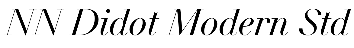
NN Didot Modern Std
Arnaud Chemin, Nouvelle Noire
A Didone from the French printing tradition mixed with expressive features invoking geometry and minimalism. Flat endings, sharp triangular serifs, and a multitude of stylistic features bring the Didot legacy into the digital era. Super high stroke contrast, so best use super large.
Gare de Metz-Ville, Metz, France. Lots of art and nice seating areas in the station, too.
Profile
Martin Wenzel, Supertype
Not your clunky 19th-century grot or cool geometrical sans-serifs but a friendly sans suitable for reading text, signage, headlines or anything where a warm atmosphere is required.
Station Antwerpen-Centraal, Antwerp, Belgium. Stony grey cathedral! Waffels! Biertjes!
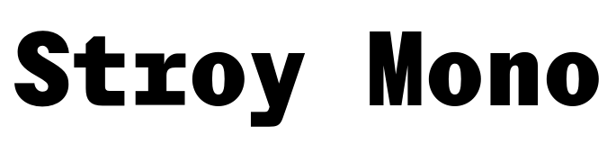
Stroy Mono
Marko Hrastovec, Hot Type
A monospaced relative of Stroy Grotesk with sharp terminals, machined curves and uniform spacing that bring out a raw look. The style range spans from Thin to Black, complimented by corresponding Italics for a wide variety of applications.
Keleti pályaudvar Budapest, Budapest, Hungary. Nyugati is super beautiful, too, though
Router
Jeremy Mickel, MCKL
Router is inspired by the movement of a rotating engraver carving into plastic with round shapes and terminals. When the router starts or stops, there can be a slight swelling of the stroke, now made the central feature of the typeface and giving it (ironically) a very human touch.
Union Station, Los Angeles, USA. Not many trains there despite it being such a gorgeous station
MD System Narrow
Rutherford Craze, Mass-Driver
MD System is a classic workhorse grotesque, combining a rational design with a warm appearance that embraces the human hand. Designed for versatility across a broad range of applications, without resorting to blandness or neutrality.
St Pancras International railway station, London, UK. Home of Betjeman and Eurostar
Rigby
Pieter van Rosmalen, Bold Monday
A small but unique 4-style family that started as a custom typeface developed for NTR, a Dutch public broadcaster. Letterforms like lowercase g and e give Rigby a very personable feel. Use it where your standard text-editor font is too boring but a 80-style family would be too overwhelming.
Gare de Liège-Guillemins, Liège, Belgium. Calatrava! Waffels! Bières!
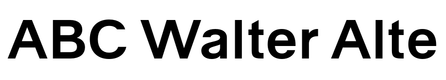
ABC Walter Alte
Omnigroup, Johannes Breyer, Fabian Harb, Dinamo
Walter Alte and Walter Neue are two related yet ideologically opposed families celebrating wiss author and design educator Walter Käch. Alte is less refined than your standard Swiss grotesk, for when you want your design to be less sleek and mainstream than everyone else’s.
Zürich Hauptbahnhof, Zurich, Switzerland. Spröde Schönheit, Vermicelli as Proviant
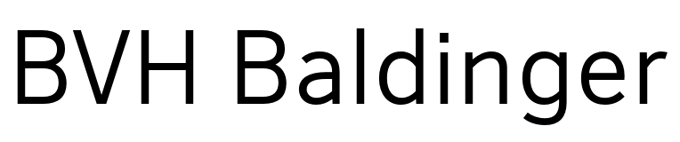
BVH Baldinger
André Baldinger, BVH Type
Another vision of a contemporary grotesque connected to the Swiss school and the international style movement but landing at a different result – more open letterforms/apertures, less wide and less round shapes, more personality. Perfect for signage and where good legibility with a neutral tone is required.
Stockholms Centralbangård, Stockholm, Sweden. Take the night train to the north!
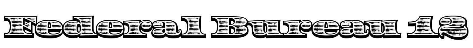
Federal Bureau 12
Erik van Blokland, Letterror
Federal Bureau is your very US-American display font in three different ornate versions: horizontal shading, diagonal shading, and no fill. Use them to add gravitas to all your documents and signs 💸
Grand Central Station, New York City, United States of America. What you could have had …
North East Condensed
Jonas Hecksher, Playtime
A versatile sans-serif suitable for a wide range of design applications. Despite its rationality and cohesive detailing, North East Condensed carries a warmth and friendliness that makes it approachable and not as rigid as other classic neo-grotesque typefaces.
Københavns Hovedbanegård, Copenhagen, Denmark. Check for North–East connections from here
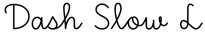
Dash Slow L
Petra Dočekalová, Typotheque
Dash is a connected script that comes in four writing speeds. Dash Slow is the most restrained version, based on Typotheque’s research carried out into educational handwriting models. It is a carefully written form, and an expression of universality and collective memory. And also just a cute script font.
Makslas stacija Dubulti, Jūrmala, Latvia. Art space and train station at the same time
Basilar Mono
Rui Abreu R-Typography
Basilar draws inspiration from the early 20th-century German typeface Venus. Slightly condensed letterforms and rather eccentric proportions such as the generously sized bowl of the letter ‘a’ contribute to a a nuanced vintage charm with rigorous precision and accuracy.
Gara Timișoara Nord, Timișoara-Iosefin, Romania. Arad is also a really nice one (for real)