Since the 1970s, “Introduction to typography” has been an iconic course for first-year design students at the Bezalel Academy of Arts and Design in Jerusalem. Through the years, the academy grew from 20 graphic design students per year to more than 120; the building moved (twice), and technology has changed multiple times. But the song remains the same, and so do the core values behind typography teaching in Israel.
Hebrew Typography: A Catalog of Useful Letters
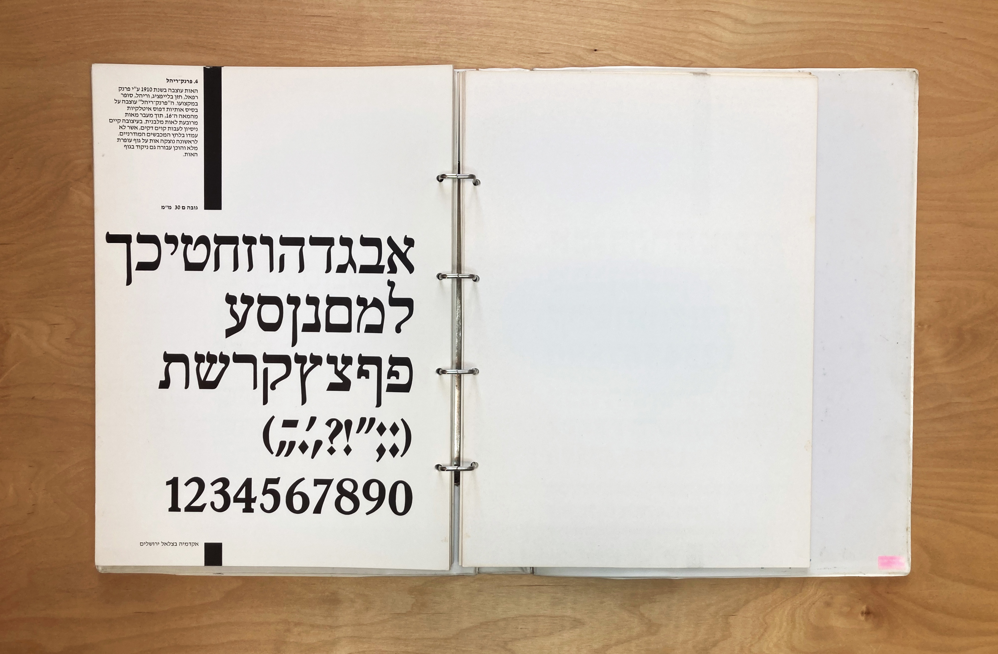
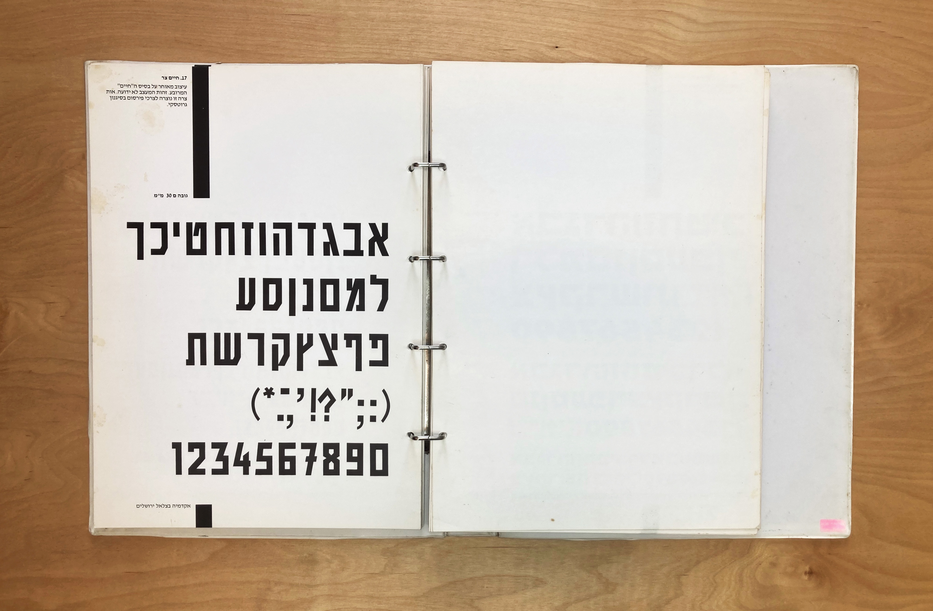
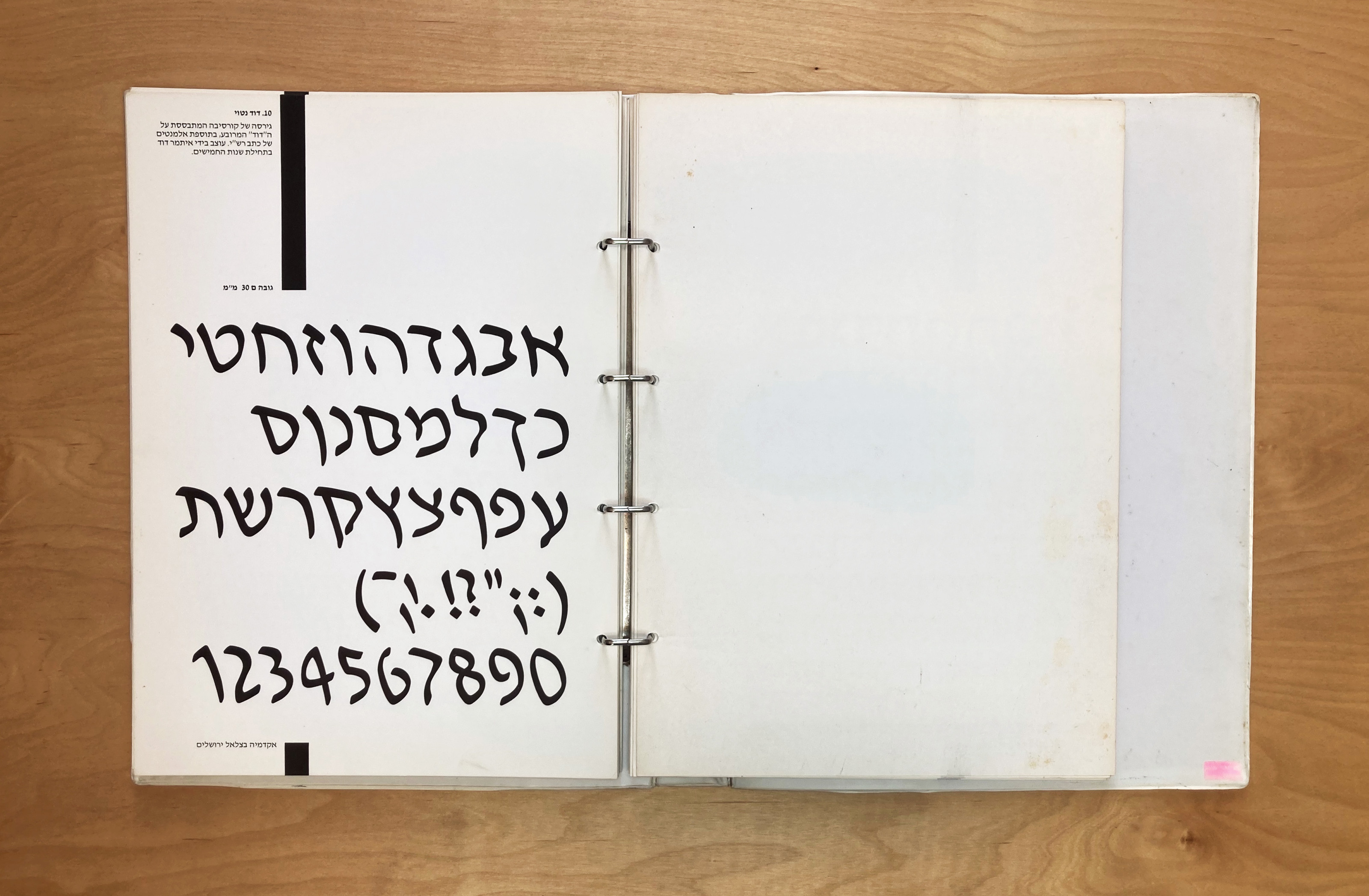
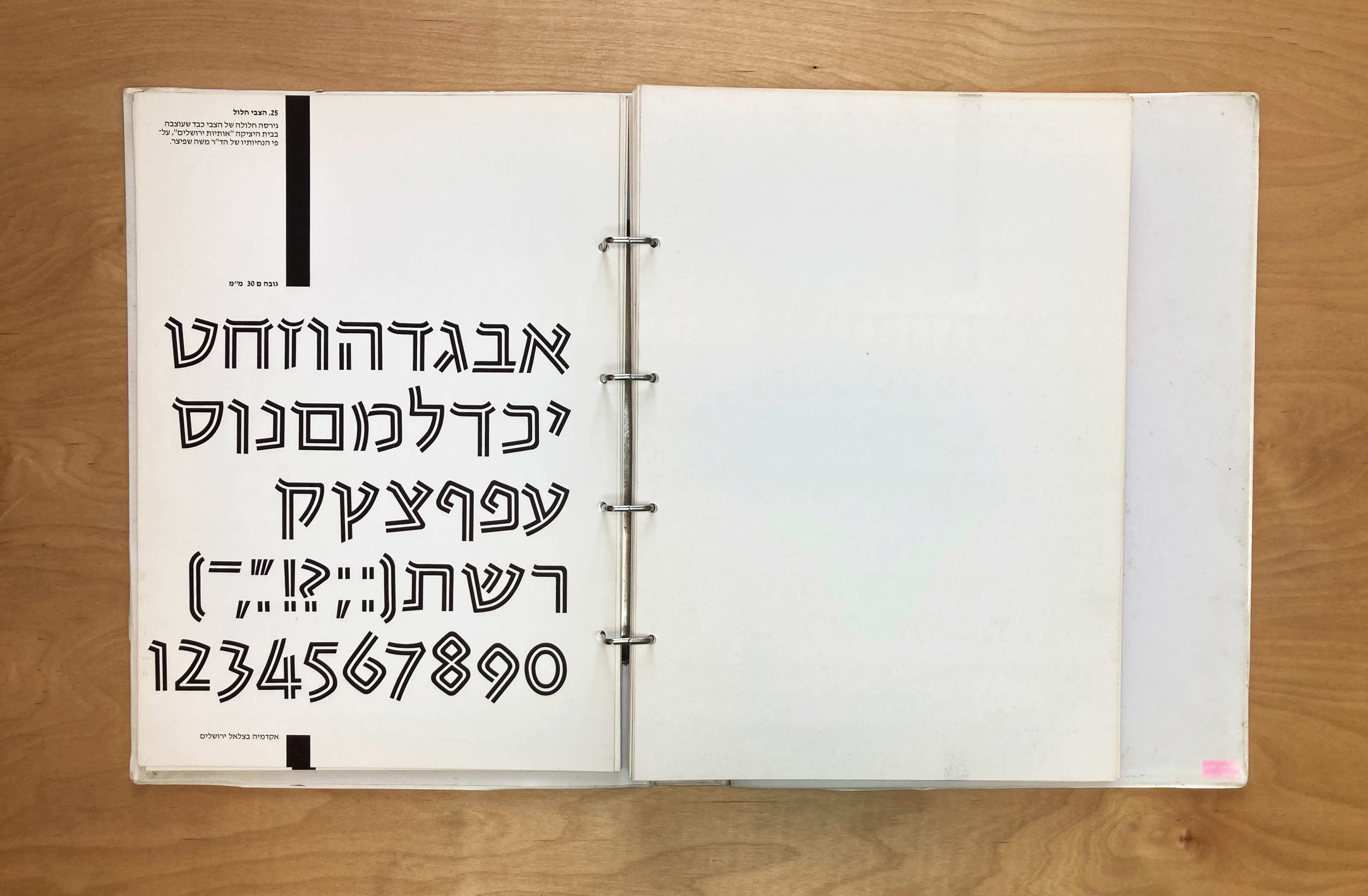
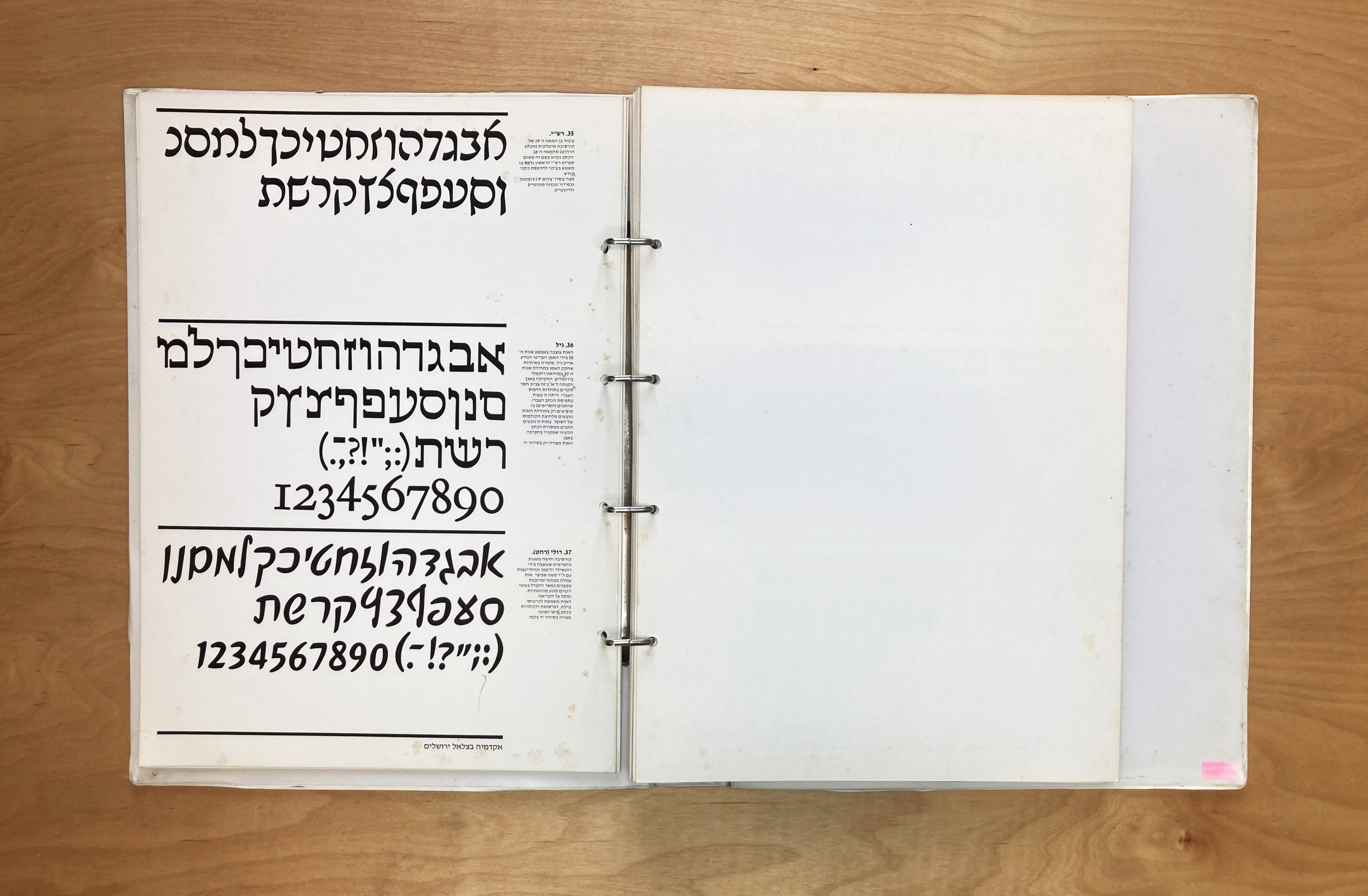
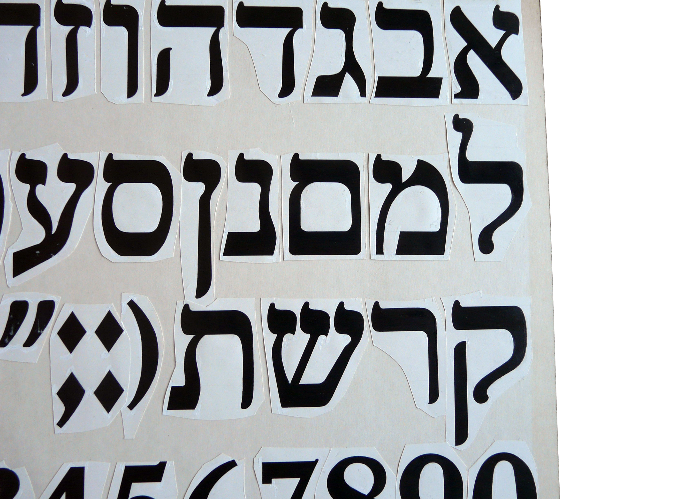
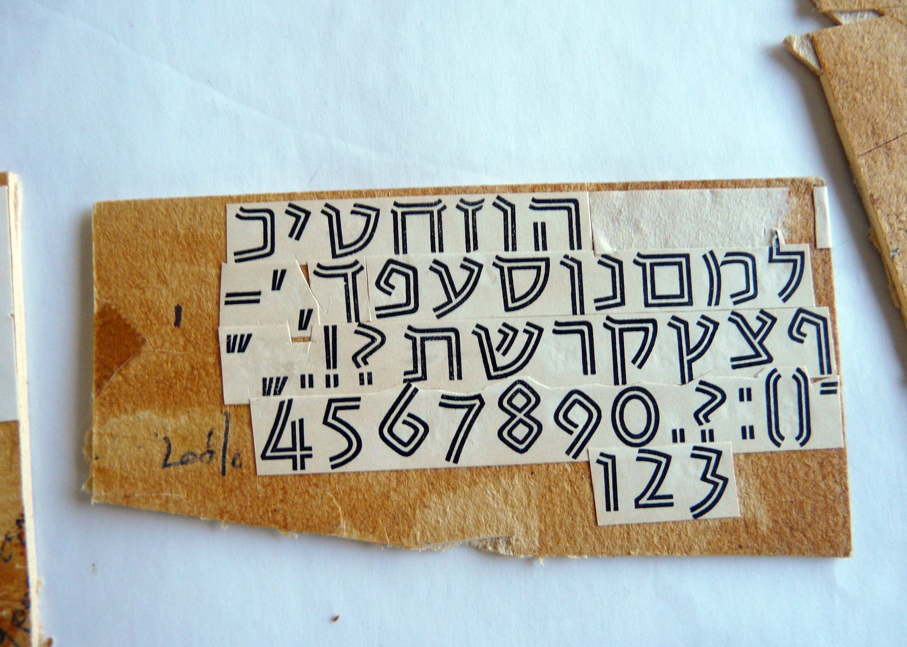
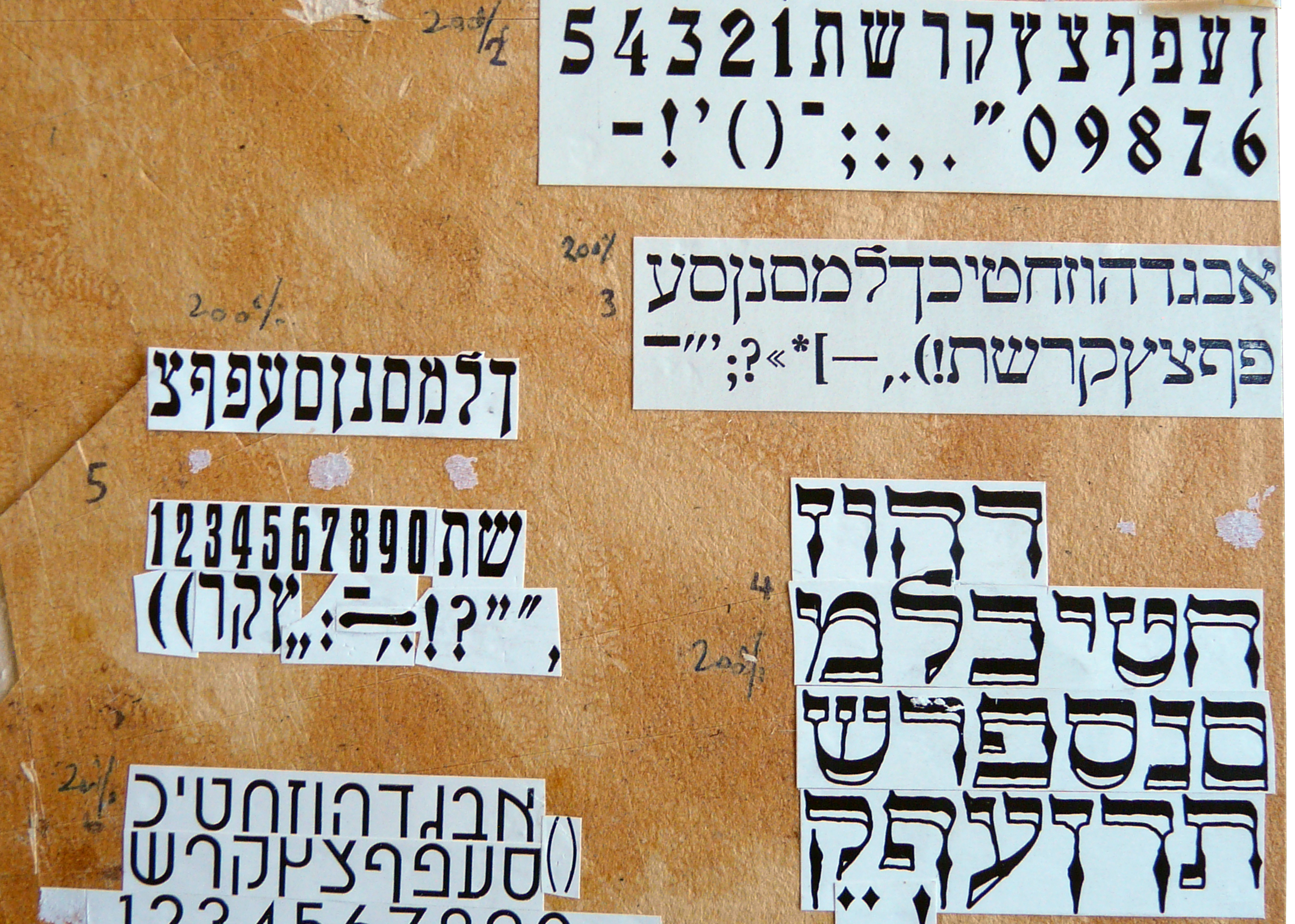
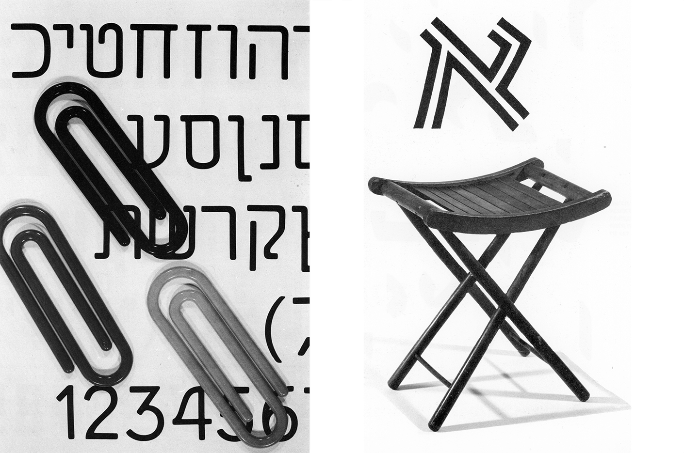
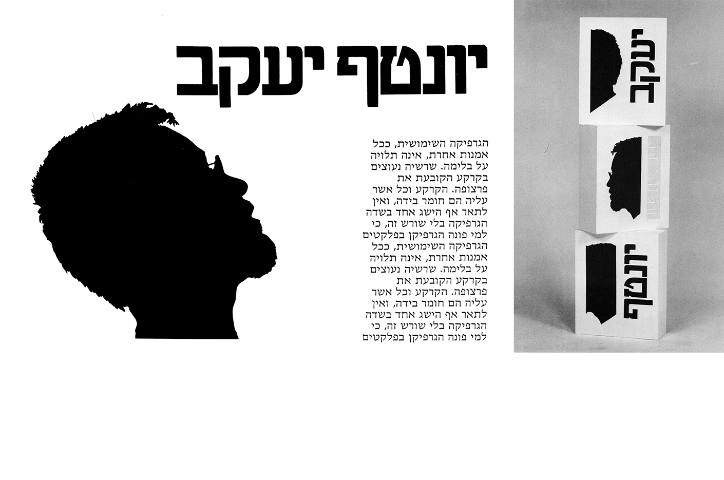
Our story begins with an iconic A3 ring binder, Hebrew Typography: A catalog of Useful Letters, published by Bezalel Academy of Arts and Design in Jerusalem. It was created by Ilan Molcho in 1980 and used by design students in Israel for 40 years. Its informal name is “Bezalel Catalog,” and original copies can be found in second-hand bookstores.
This catalog represented the first time that all classic Hebrew-script typefaces were collected in a single volume. It immediately became popular with design and advertising agencies, as well as typesetting providers.
Ilan Molcho – The Creator of the Catalog
This type specimen catalog was created by Ilan Molcho and published in 1980. When it was released, it was so popular that the national news even covered it on television. Unlike what the rumors say, the catalog was NOT Molcho’s graduation project, but a project he started in his third year (out of four) and completed two years later, after he graduated.
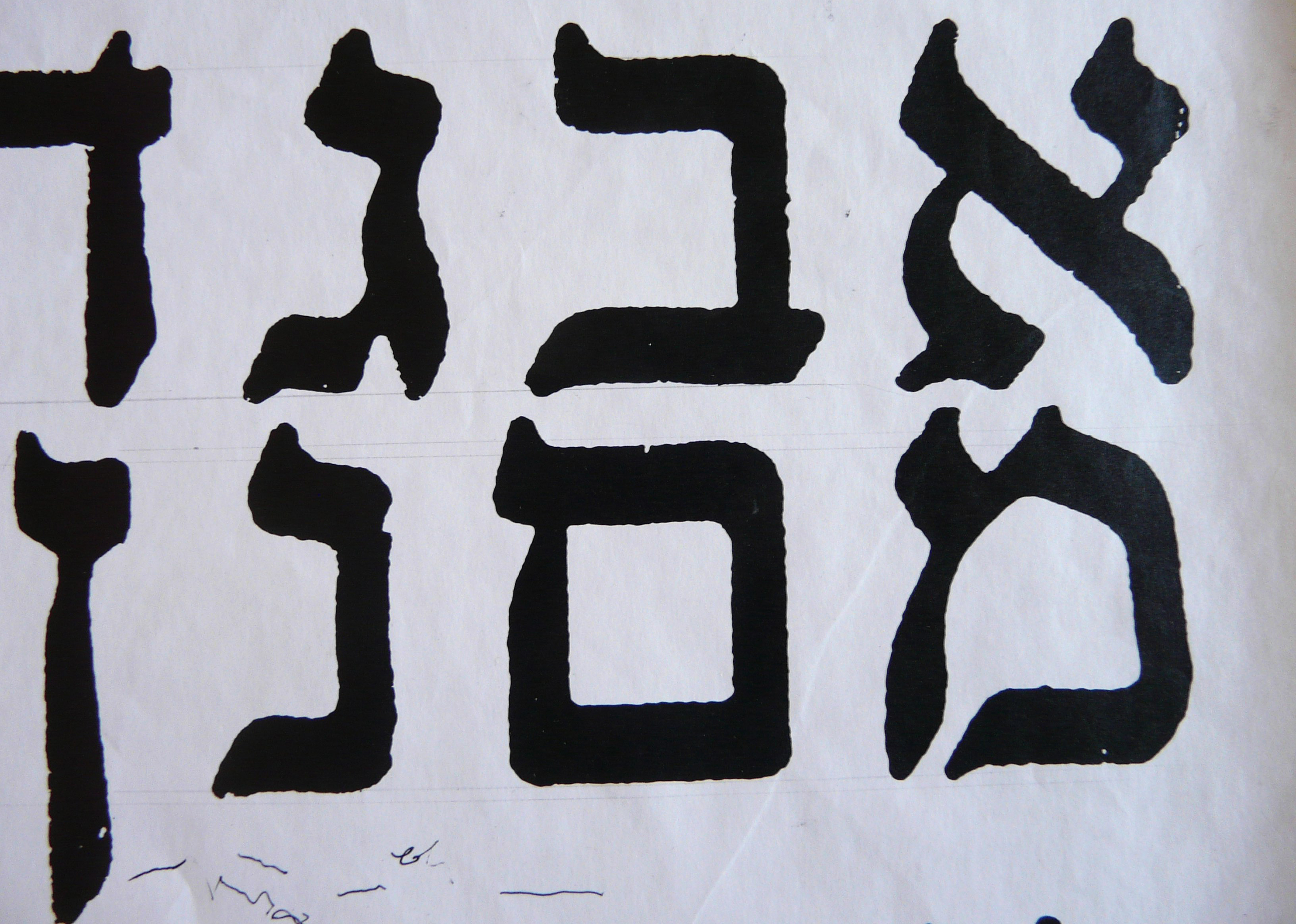
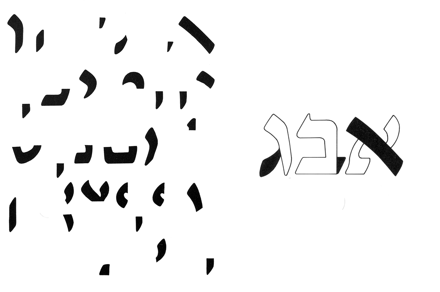
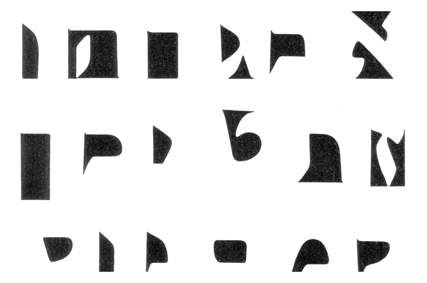
The entire catalog was made by hand, using wood and metal types collected from different printers. Letters were set, printed, scaled, and retouched by hand, using white gouache and rapidograph pens.
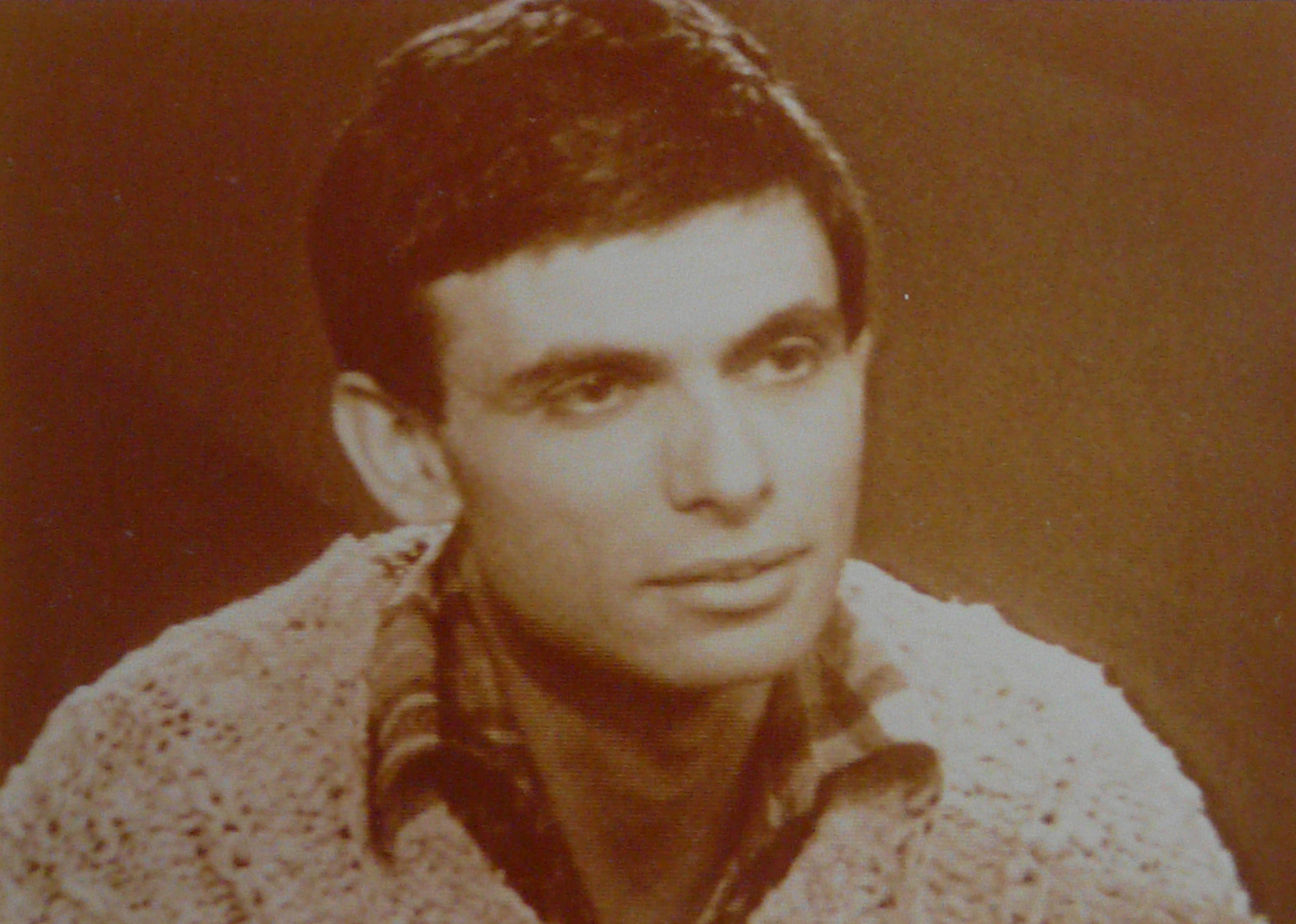
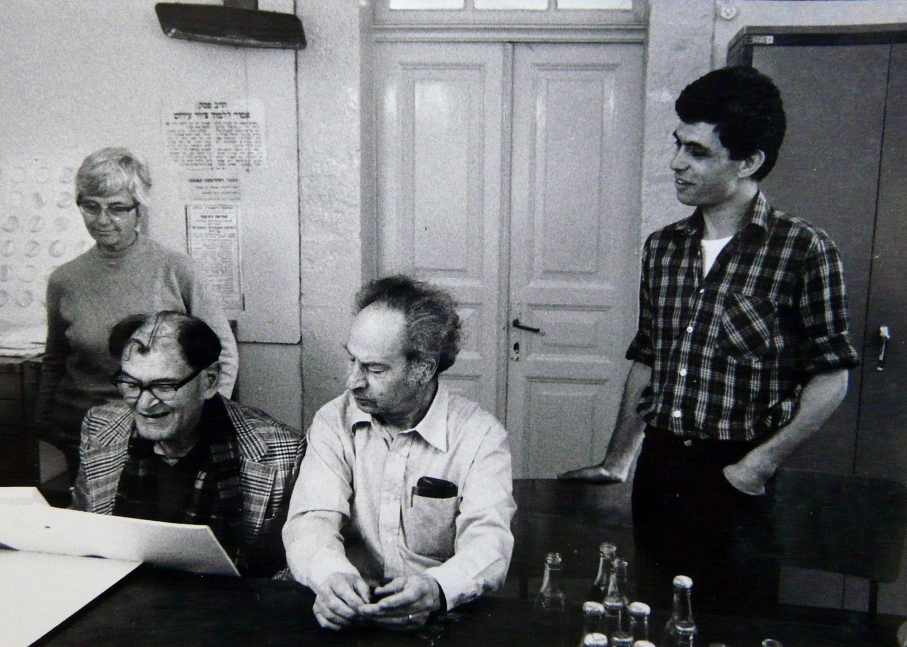
From Molcho, who created the catalog, we continue to Professor Avi Eisenstein, who created the imitable Hebrew typography course at Bezalel.
Prof. Avi Eisenstein – the illustrious typography teacher
Prof. Avi Eisenstein (1946) taught typography for 45 years, from 1973 to 2018. Yanek and I were each his students, and if you have Israeli friends that are graphic designers, he probably taught them as well. For many years, Avi encouraged students to do crazy things with type. His approach was expressive, intuitive, and artistic.
Prof. Avi Eisenstein, typography teacher at Bezalel from 1973 until 2018.
His typography course was not only a framework for imparting knowledge but is a formative meeting between first-year students and the world of design. A small detail like a countershape, or even a surprising choice of a pushpin, could trigger rich, descriptive poetic monologues full of inspiration and imagination. In his presence, his language, his totality, and his passion for beauty, Avi demonstrated the essence of what being a designer means.
Typography Coursework
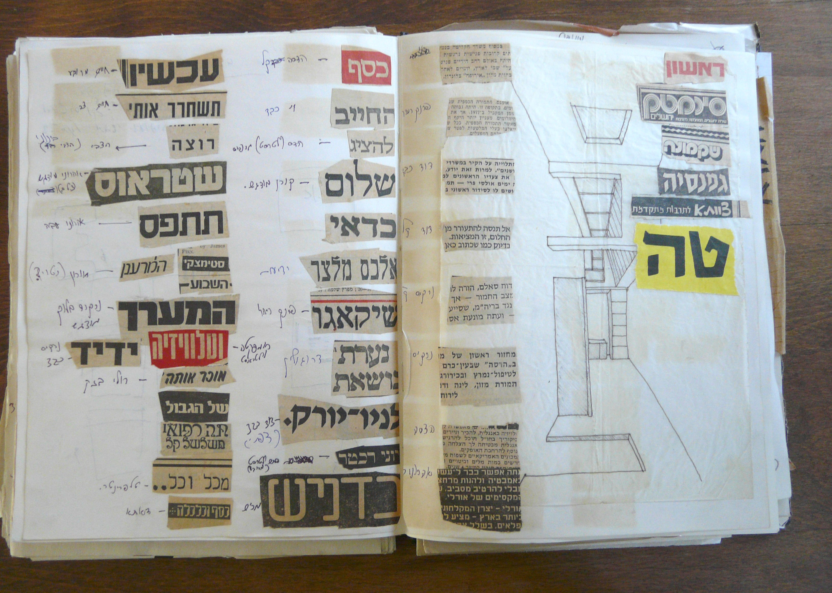
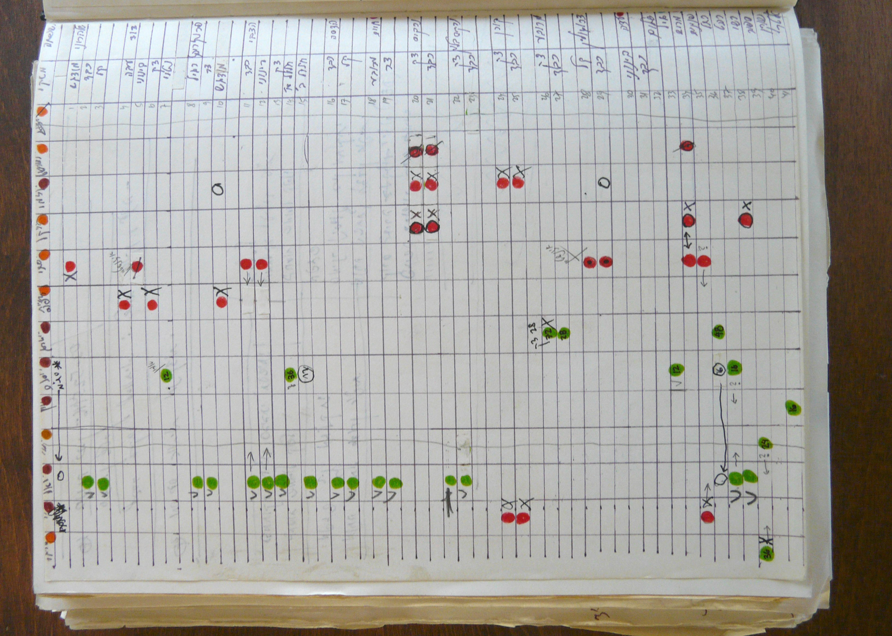
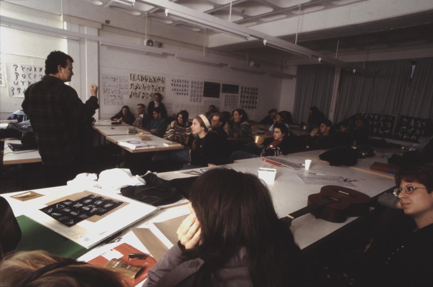
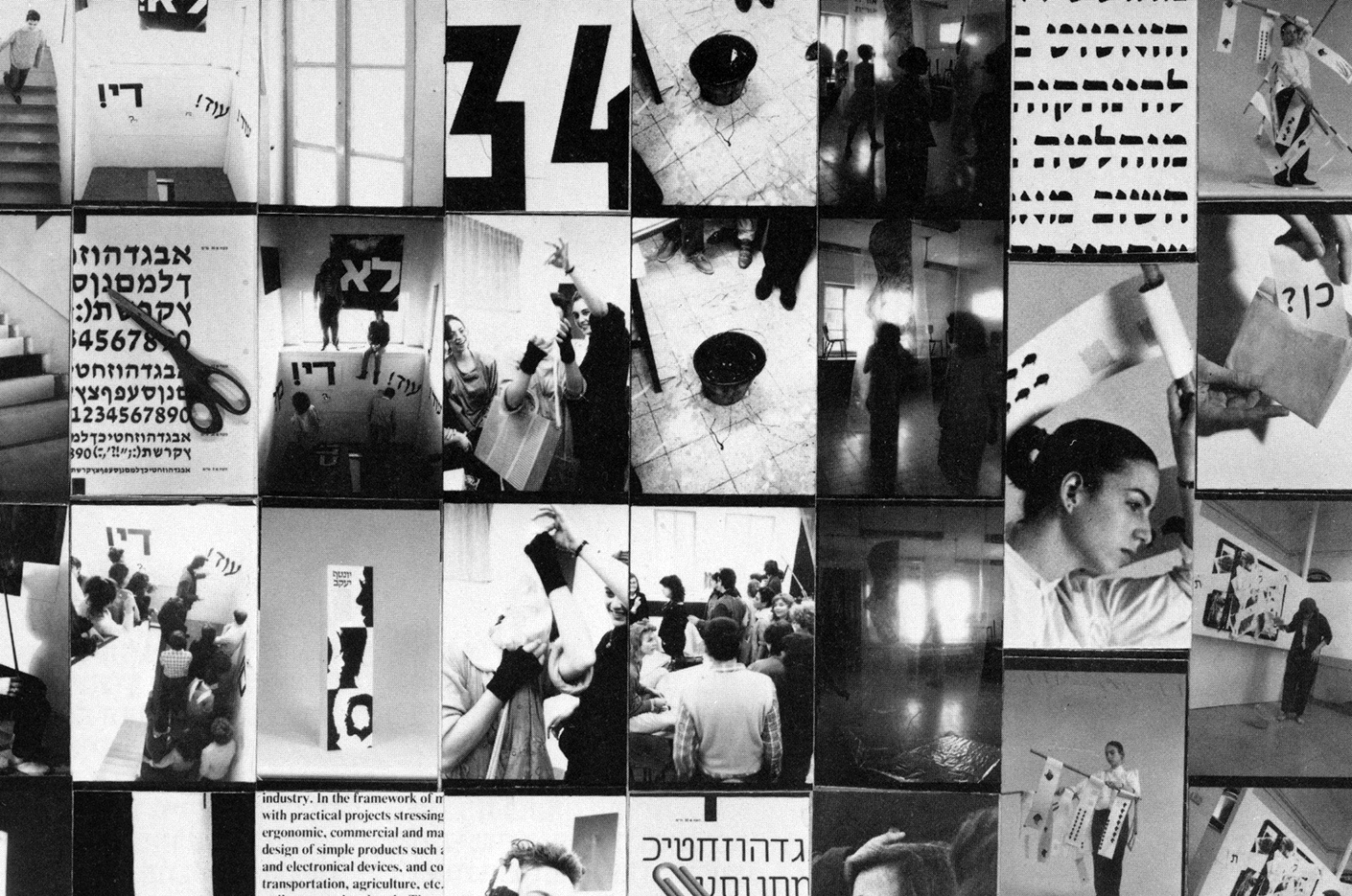
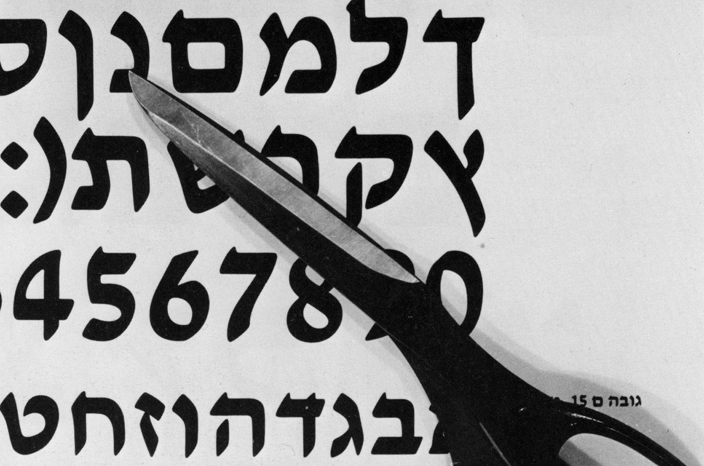
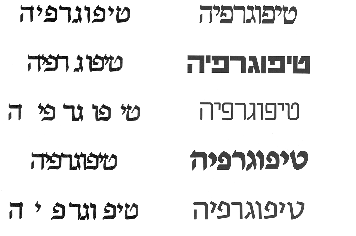
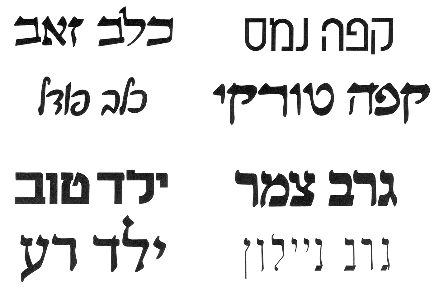
The “Introduction to Typography” course for first-year design students is divided into two semesters. Each semester is 12 to 14 lessons (depending on holidays), and each lesson is three hours long. A classic lesson starts with all the students putting their assignments on the wall, and most of the teaching is done by giving critiques. Many assignments are drawn by hand and letters from the printed catalog.
The exercises in this article are taken from a book by Avi Eisenstein himself, called Basics in Typographic Design and Teaching Method, published by Bezalel Publishing 1986.
These iconic black-and-white assignments are passed from generation to generation. They were given to Bezalel students before I was born, I got them as a student, and now I give them to my students as well. It sometimes feels like I’m playing my own cover versions for songs I like that already have many different versions. In 2018, I joined the team of six lecturers that simultaneously teach this course to more than 120 students, divided into six different classes. Naturally, with new personnel comes new ideas.
New Digital Catalog
In 2020 – exactly 40 years after the release of the original catalog shown at the beginning of this article – the academy issued a new edition of the type specimen. This time, it included digital font files. Michal Sahar, a well-known Israeli type and graphic designer, led this educational project. Together with her type-design students, Sahar created new digital versions of the catalog’s typefaces.
The new type specimen catalog bundled with digital fonts was a development made possible thanks to technology. It was especially necessary because most of the typefaces from the original catalog were no longer available in good digital versions.
From Tracing Papers to Calligraphy
Another recent change to the way we teach our typography students was the move from copying shapes with rapidograph pens and tracing paper to writing calligraphy. That is something that I helped introduce, and I was directly inspired by the type-design education I received at Type and Media, an MA program in The Hague.
When students write letters with a calligraphic writing tool (like the 3.8 mm Pilot Parallel Pen), they can better understand the origin of these shapes. That includes the distribution of typographic contrast, which elements are similar and which are unique, and how every little nuance affects the composition’s overall look.
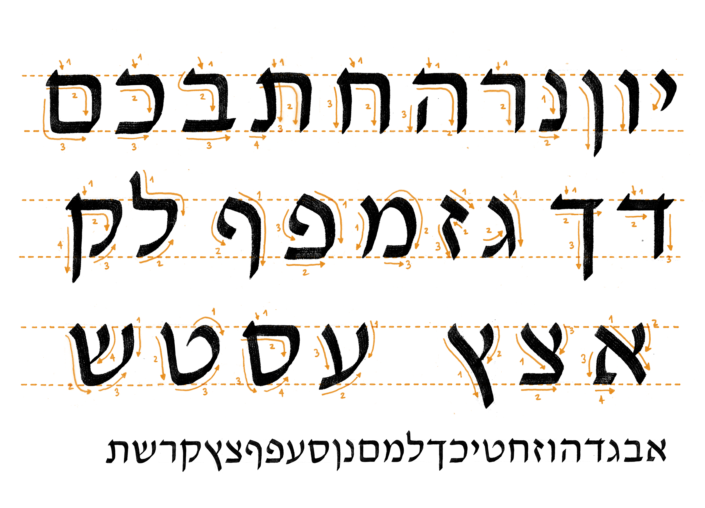
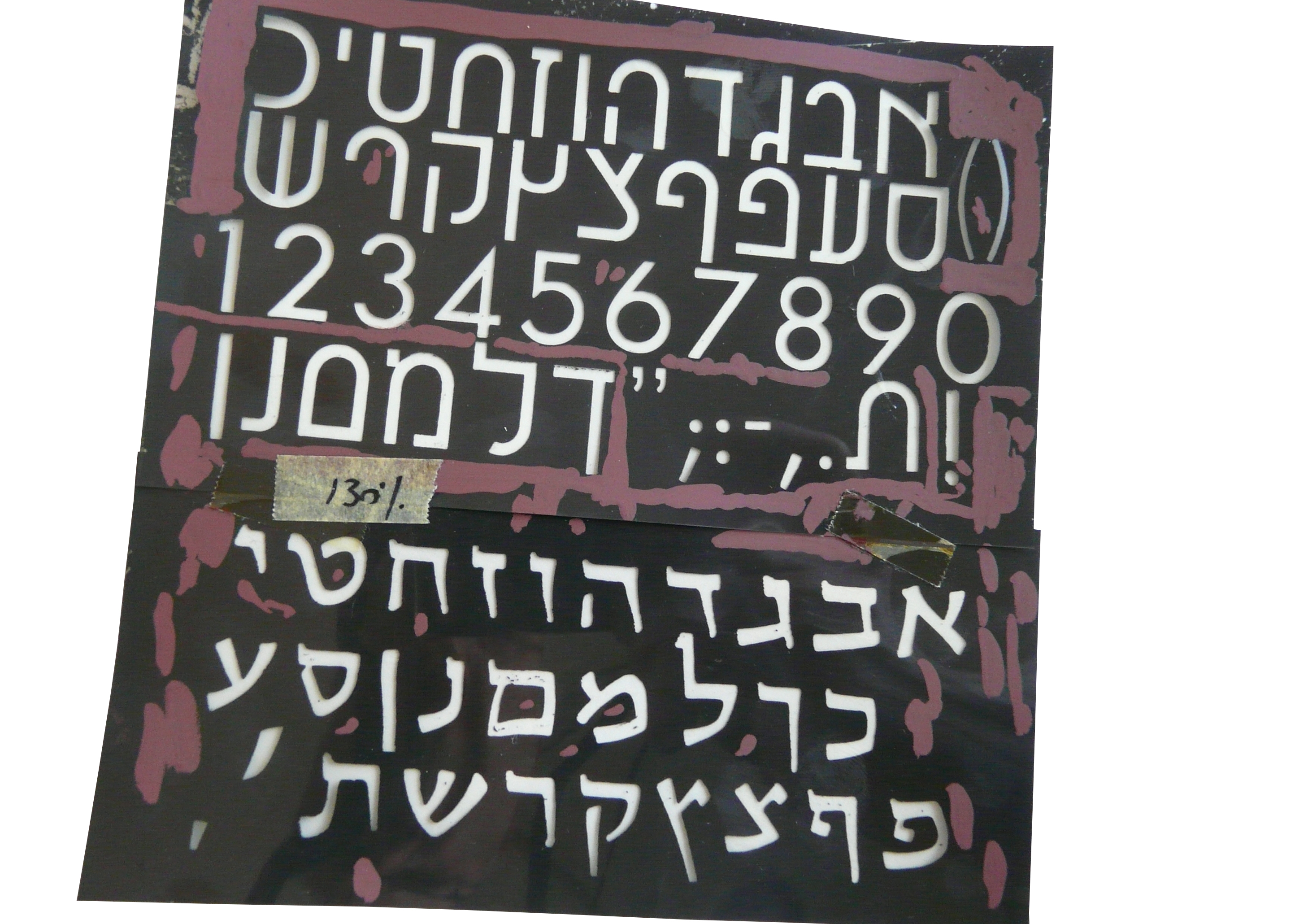
Stroke models for writing David-style letterforms with a broad nib.
For our calligraphy workshops, we use a typeface called David as a model, which was originally designed by Itamar David (1954). We chose this because it offers a good balance between traditional and contemporary hebrew. It is a classic but still neutral and not associated with religion.
Next Step – Arabic
The next development we are currently planning will be the addition of Arabic. In the past six years, the academy made beautiful efforts to open its doors to a wider variety of students from more areas of the country. In our presentation at the Fontstand Conference in September 2022, we shared the first draft of a work-in-progress Arabic catalog with seven Arabic typefaces. The current plan is that by the beginning of next year, our syllabus will also include Arabic typography materials. But this is going to be the subject of another article. Stay tuned!