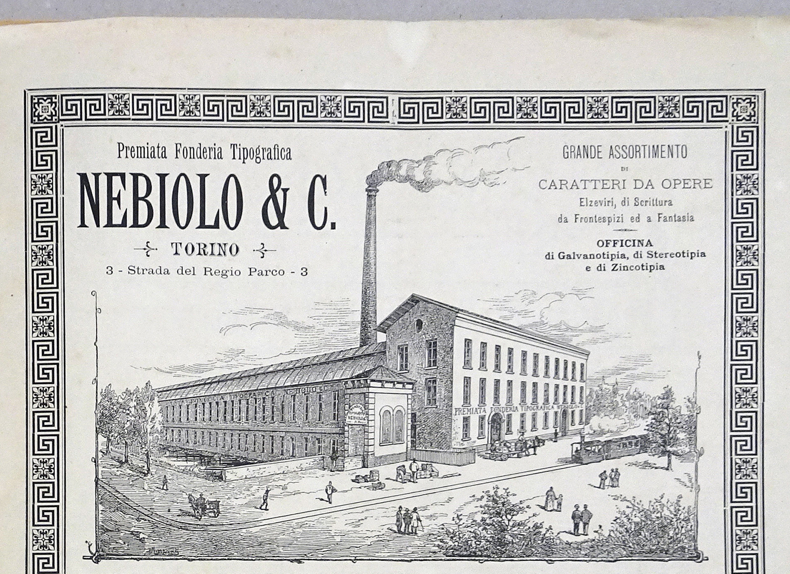
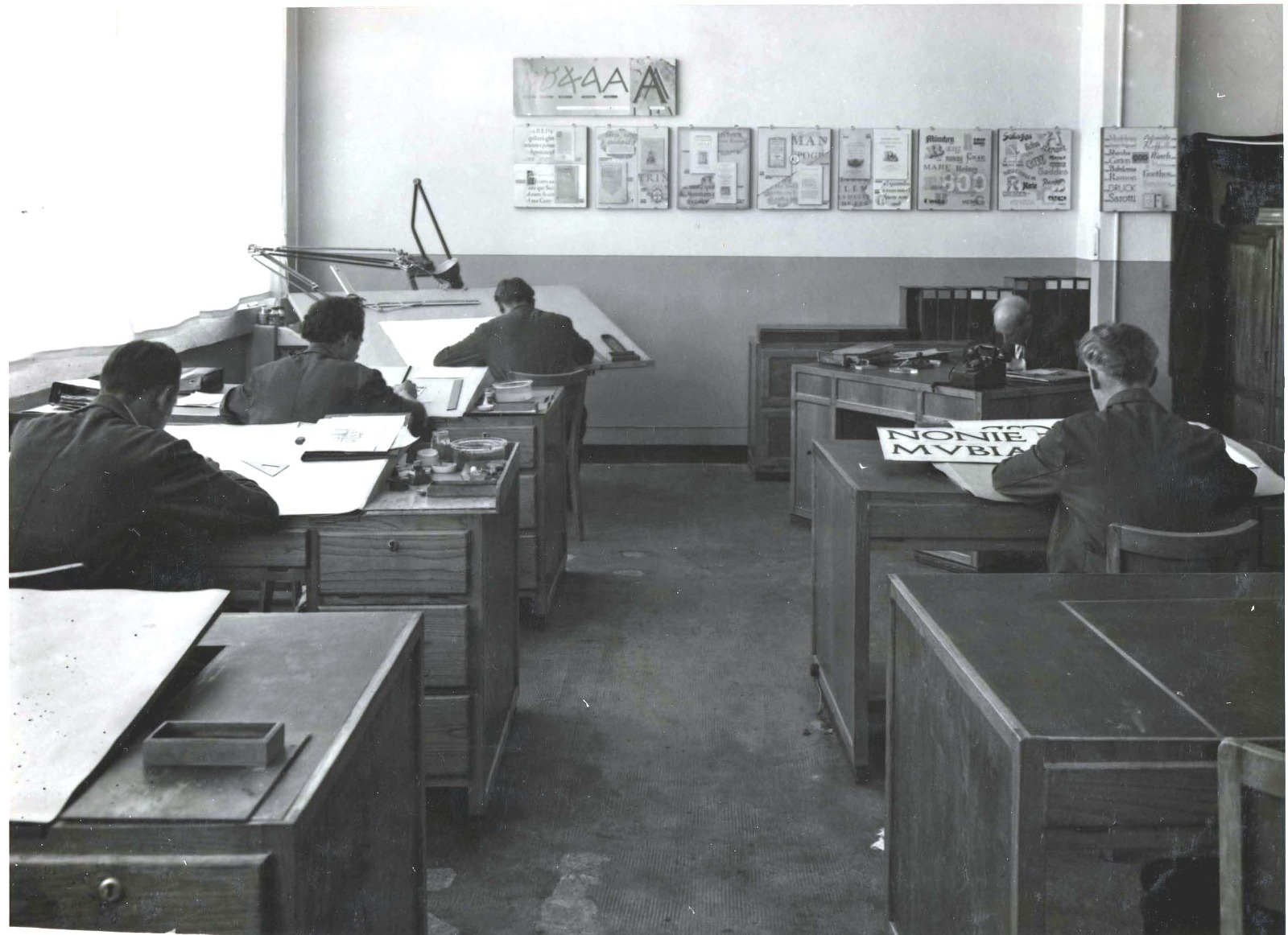
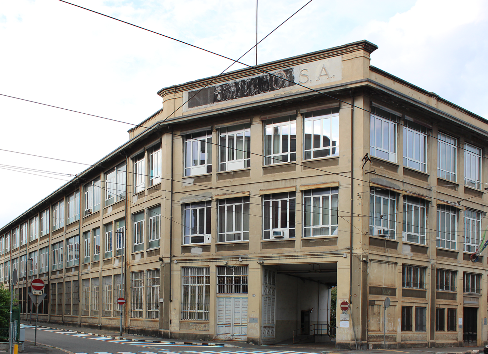
While Nebiolo’s core business was the manufacture of printing presses, today the company is especially remembered for its contributions in the field of typeface design. Its type design office (later called Studio Artistico) was set up in the early 1930s and in the following decades released influential typefaces that shaped the history of Italian typography. The name of Aldo Novarese, who headed the studio from 1952 to 1972 after Alessando Butti (1936–1952) and Giulio Da Milano (c. 1933–1936), is almost synonymous with Nebiolo. Being its last leading figure, Novarese remained the only source for historians after the foundry’s demise in 1978 and the ensuing dispersion of its archives.
The seeds of the Nebiolo History Project
Manuela Rattin and Matteo Ricci are the authors of Questioni di carattere (Stampa Alternativa / Graffiti, 1997), the most complete work to date covering Italian typography from 1861 to the 1970s. Though they were also the first to attempt a summary of the history of the Turin type foundry they were aware of this lack of archival information on the Studio Artistico: ‘Spesso ci si è dovuti basare sul ricordo, a volte sbiadito, delle persone che lo hanno vissuto; in particolare è stata la testimonianza di Aldo Novarese ad aiutare la ricostruzione delle vicende [Often we had to rely on the memory, sometimes faded, of the people who worked for Nebiolo; in particular it was the testimony of Aldo Novarese that helped reconstruct the events]’ (pp. 95, 97).
Realisation that a thorough critical assessment of Nebiolo’s heritage was needed prompted Alessandro Colizzi, Riccardo Olocco, James Clough, Riccardo De Franceschi, Marta Bernstein, and myself to set up the Nebiolo History Project (NHP). Our intention was to gather the archival evidence as well as the oral history of the foundry. The seeds of our research work started to germinate in Amsterdam, at the ATypI Conference that most of us attended in 2013.
Colizzi, at the time professor at the École de design of UQAM (Montréal), gave a talk on the convoluted story that led up to Forma and Dattilo, the last original type families released by the foundry, designed by Novarese and a group of Milanese designers. Colizzi gained first-hand information concerning the story of Forma and Dattilo in discussions with Gianni Parlacino and Luciano Agosto, the last draftsmen to work under Novarese’s direction, as well as from Nebiolo’s advertising manager Maria Grazia Schenone.
With help from a few beers in an Amsterdam pub, the group of researchers realised that Nebiolo was their common interest and within a few years their efforts led them to give a more detailed account of Nebiolo’s history and legacy.
New evidence, new assessments
The NHP is currently managing the publication of the Turin 2021 conference proceedings for publication by the end of 2022. Planning for a more complete monograph on the Nebiolo type foundry is also underway, ideally with support at an institutional level as well as from the design community. In the meantime, it might be of interest to know how the NHP research developed during the eight years that led up to the symposium.
Among several unpublished documents there is a typewritten memoir by Ennio Lavagno, draftsman under Butti from 1942 to 1952, who was asked by Enrico Tallone to write down his memories of his time in Nebiolo. Found in the Tipoteca archive by Olocco and myself while working on No. 3 of the magazine “Tipoitalia” (issued in December 2015), the memoir was discussed publicly for the first time by Colizzi in his article Butti and the Nebiolo Art Studio. A story to be (re)written (pp. 62–64). That issue gathered some key contributions including Clough on Eurostile, De Franceschi on Veltro, Luciano Perondi on Fregio Razionale and Fregio Mecano, Michele Patané on Nebiolo digital type revivals, and Enrico Tallone on Butti. Besides revealing new information on Nebiolo, work on “Tipoitalia” also consolidated the collaborative spirit underpinning the NHP.
The search for Nebiolo’s history
In the wake of that experience Olocco and I set up CAST Articles. From 2017 to 2018 three articles related to Nebiolo were published: Novarese and Butti, a story to be (re)written in which Colizzi and Olocco added new details to the ins and outs of the Nebiolo Studio Artistico. These concerned the workflow under Butti’s direction and the true story of Recta; De Franceschi’s Veltro, the greyhound’s chase, an expanded version of his contribution to “TipoItalia 3”, discussing the features of Nebiolo’s first original script and its use in Italian commercial printing; Colizzi’s The final act at Nebiolo: the quest for a ‘universal’ typeface. Forma, Dattilo & Modulo, an updated version of an unpublished article and an in-depth account of the Turin type foundry from 1965 to the late 1970s.
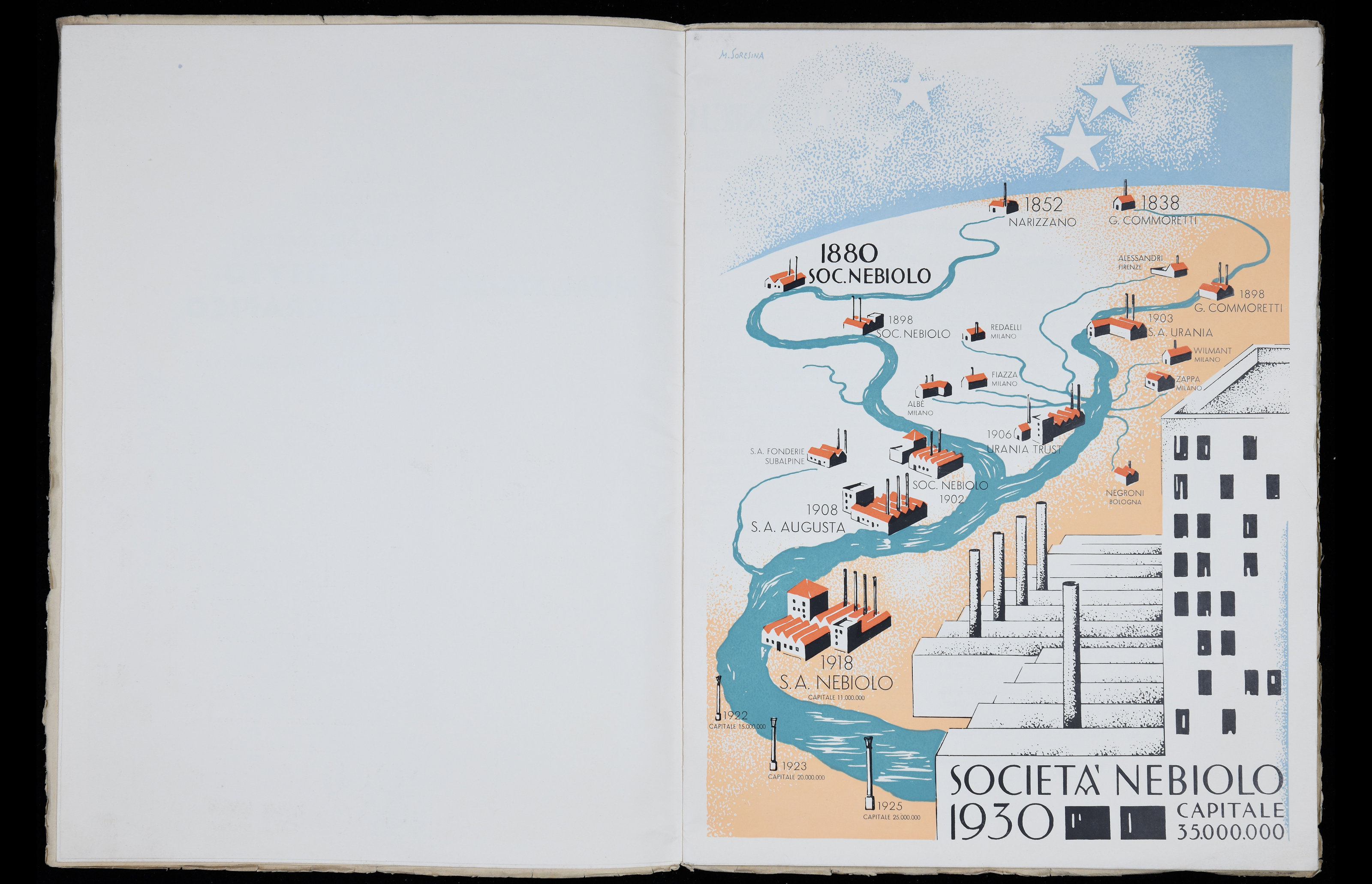
Since the mid-2000s Marta Bernstein has been studying the 19th-century Italian type foundries and her research would prove crucial to the reconstruction of the early decades of the Nebiolo story. Her contribution to the ATypI 2018 Conference in Antwerp From Bodoni to Nebiolo: The lost hundred years of Italian type coincided with the launching of the NHP as announced to the Conference.
In late 2019 Colizzi was appointed professor of design at the Politecnico di Milano and decided to settle in Turin, to be able to access materials in archives and private collections and continue interviewing former Nebiolo personnel. At this point, the NHP embarked on plans for an international symposium to be held in Turin. In October 2020, despite the pandemic, a round table on Nebiolo was actually held at the Graphic Days festival although the ‘main event’ was postponed to autumn 2021. Meanwhile, in November, Colizzi gave an online talk on Nebiolo at the annual WayzGoose of the Hamilton Wood Type & Printing Museum. Later, in March 2021, the NHP was invited by the Cooper Union to deliver A curtain-raiser for the Nebiolo story, a joint lecture which for the first time outlined different but related strains of research on Nebiolo.
The Turin conference
Finally, on 16–17 September 2021, thanks to support from the Politecnico di Milano and the Politecnico di Torino, the Nebiolo conference was held at the Valentino Castle in Turin – both face-to-face and online. The two-day programme featured 27 talks regarding various aspects of the company, from its industrial history to the origin of the Studio Artistico, with a special focus on the studio directors, their designs, and the contextual status of the graphic arts in Italy and abroad.
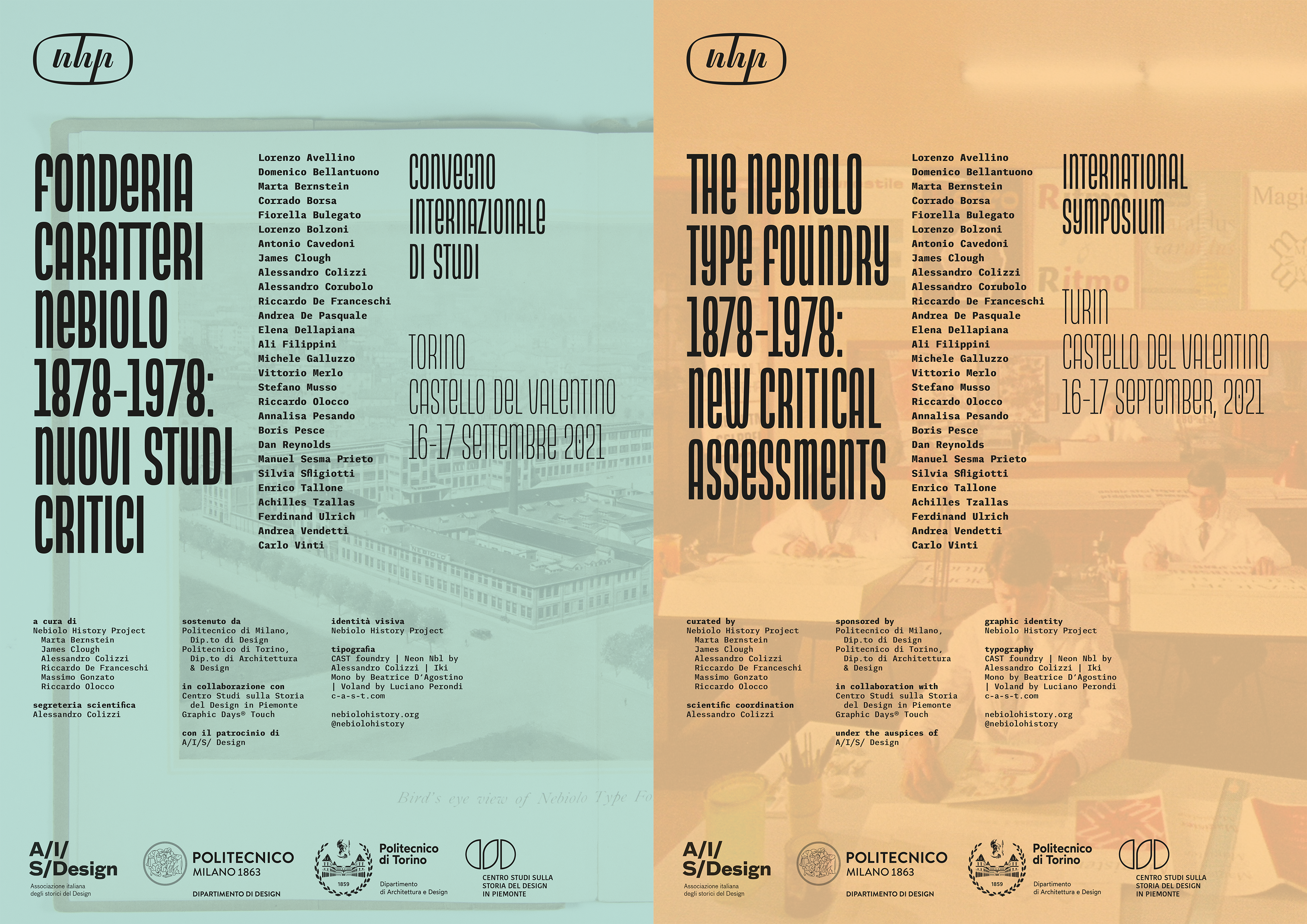
Italian and English-language posters for the Nebiolo History Project’s September 2020 conference in Turin, Italy.
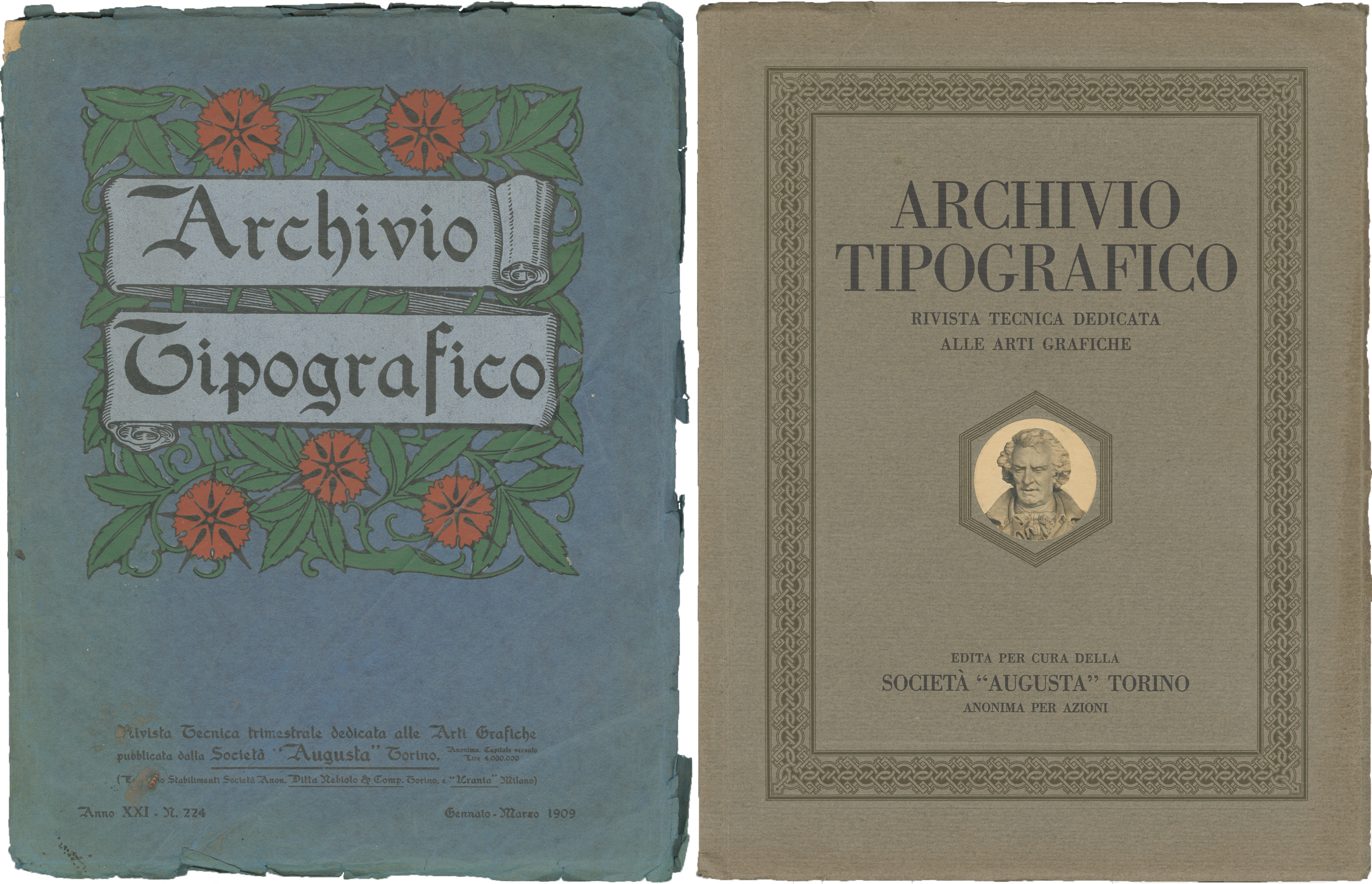
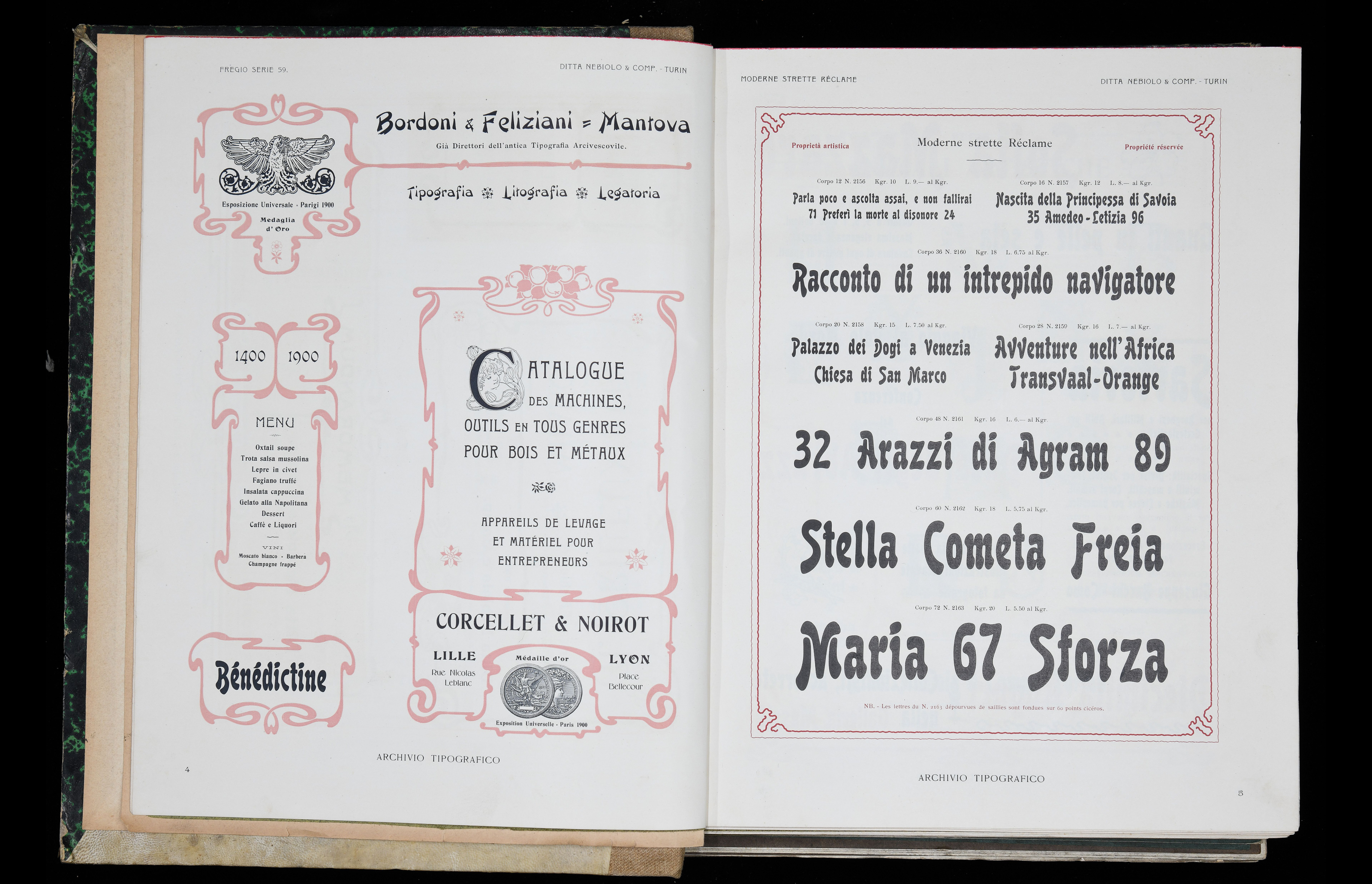
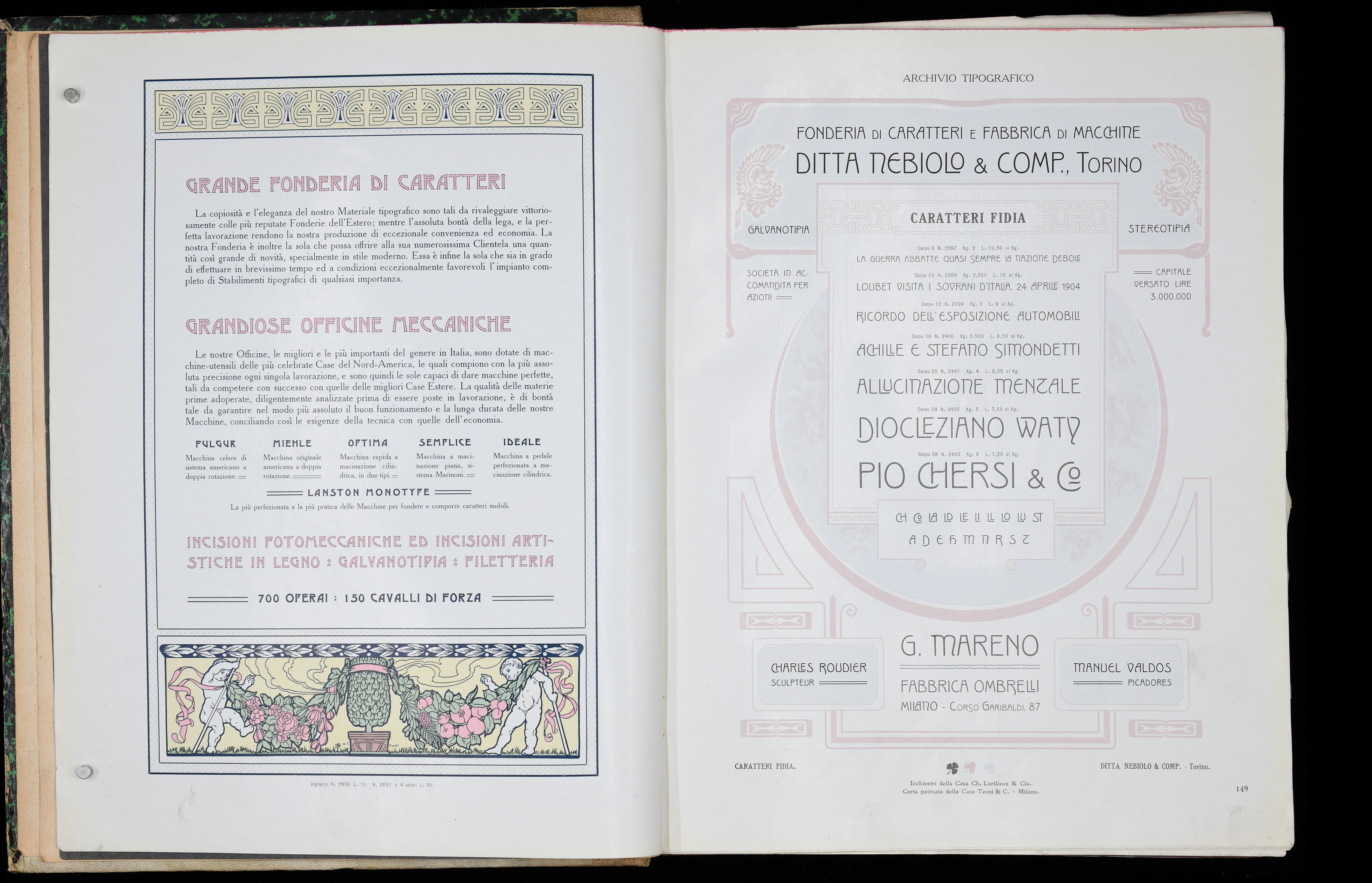
Dan Reynolds covered the matrix trade in 19th-century Germany and the spread of the same type designs under different names from different foundries across Europe and the US. His illuminating analysis of “Archivio Tipografico” (a technical periodical published by Nebiolo from 1889 until 1933) gave us a deeper understanding of the early Nebiolo type production and market in those years. Building on her investigation of 19th-century Italian type foundries, Marta Bernstein showed how she is piecing together Nebiolo's first 30 years: its acquisitions of local foundries, the competition with its Milanese rival Urania, its relationship with American foundries. Achille Tzallas dealt with the theme of Nebiolo's penetration in the Greek market informing us that for much of the 20th century the Italian foundry was one of the most important manufacturers of Greek type in Europe. Turning to the company’s final days, Ferdinand Ulrich retraced (and showed) how most Nebiolo matrices were sold off in the 1980s to end up at the Haus für Industriekultur in Darmstadt. He then explored the years after Nebiolo’s bankruptcy and the adaptation of some of its typefaces for photosetting as well as the new digital technologies.
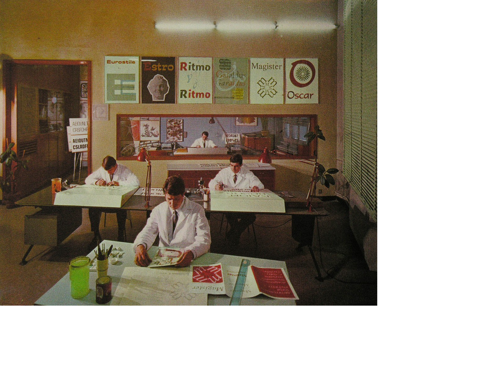
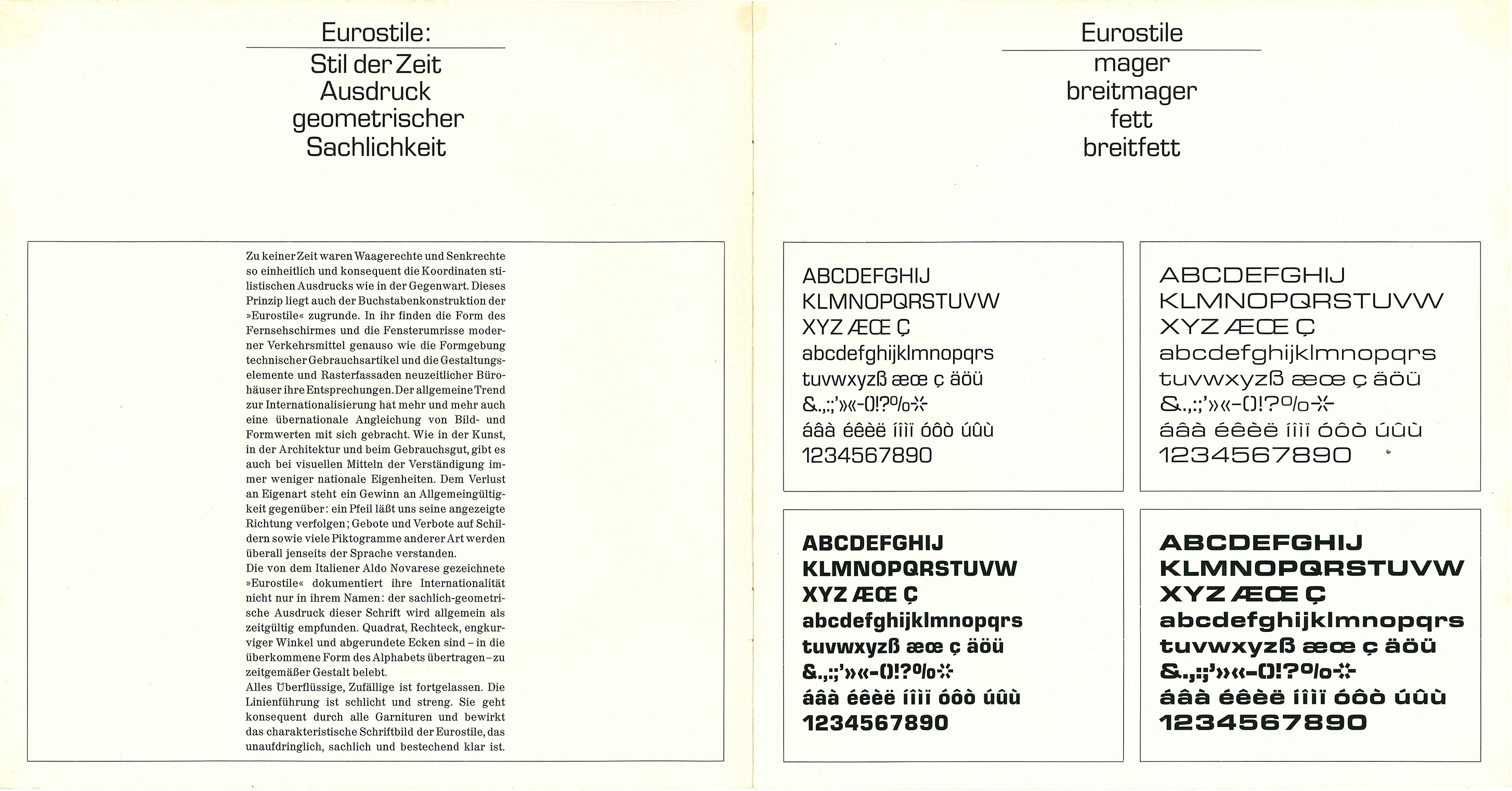
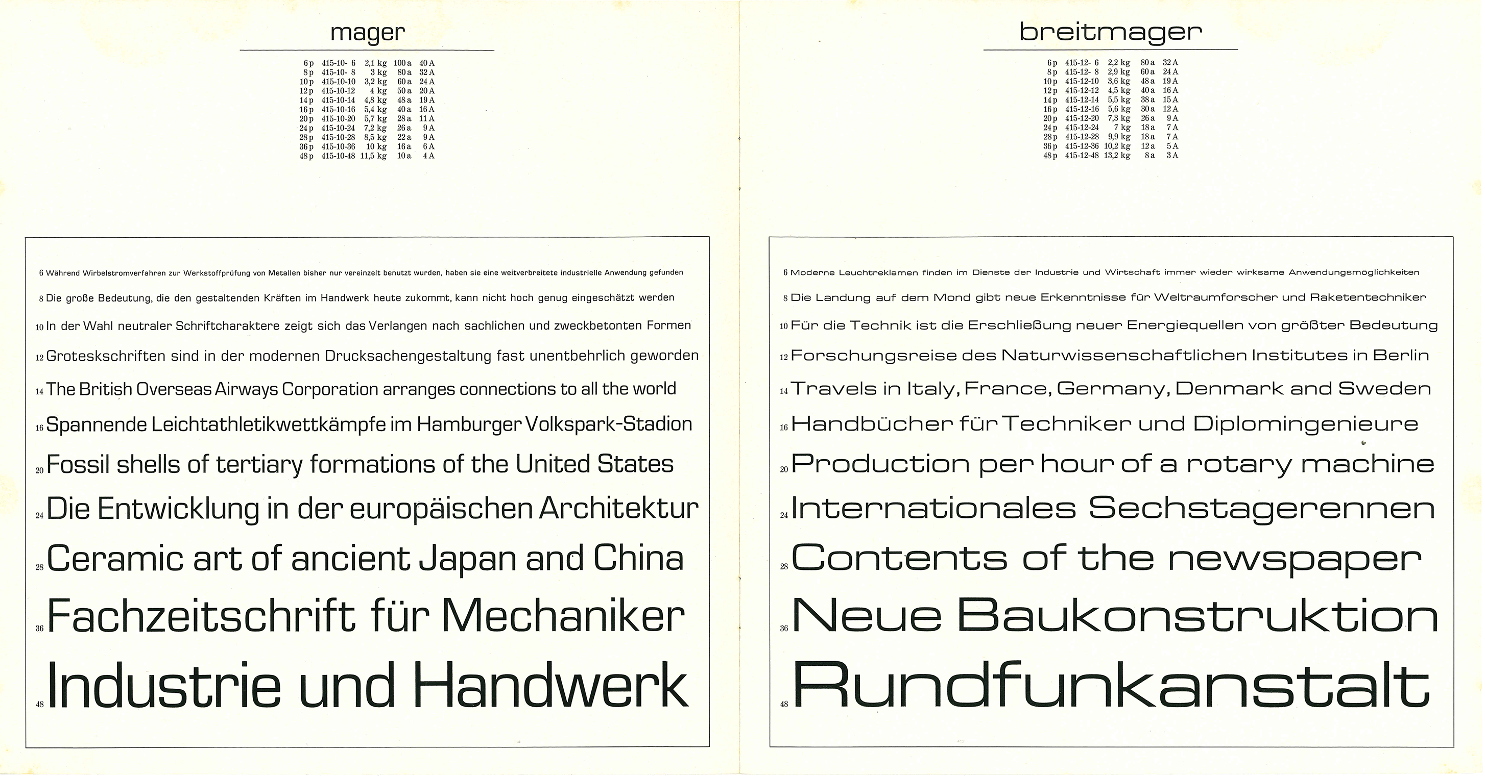
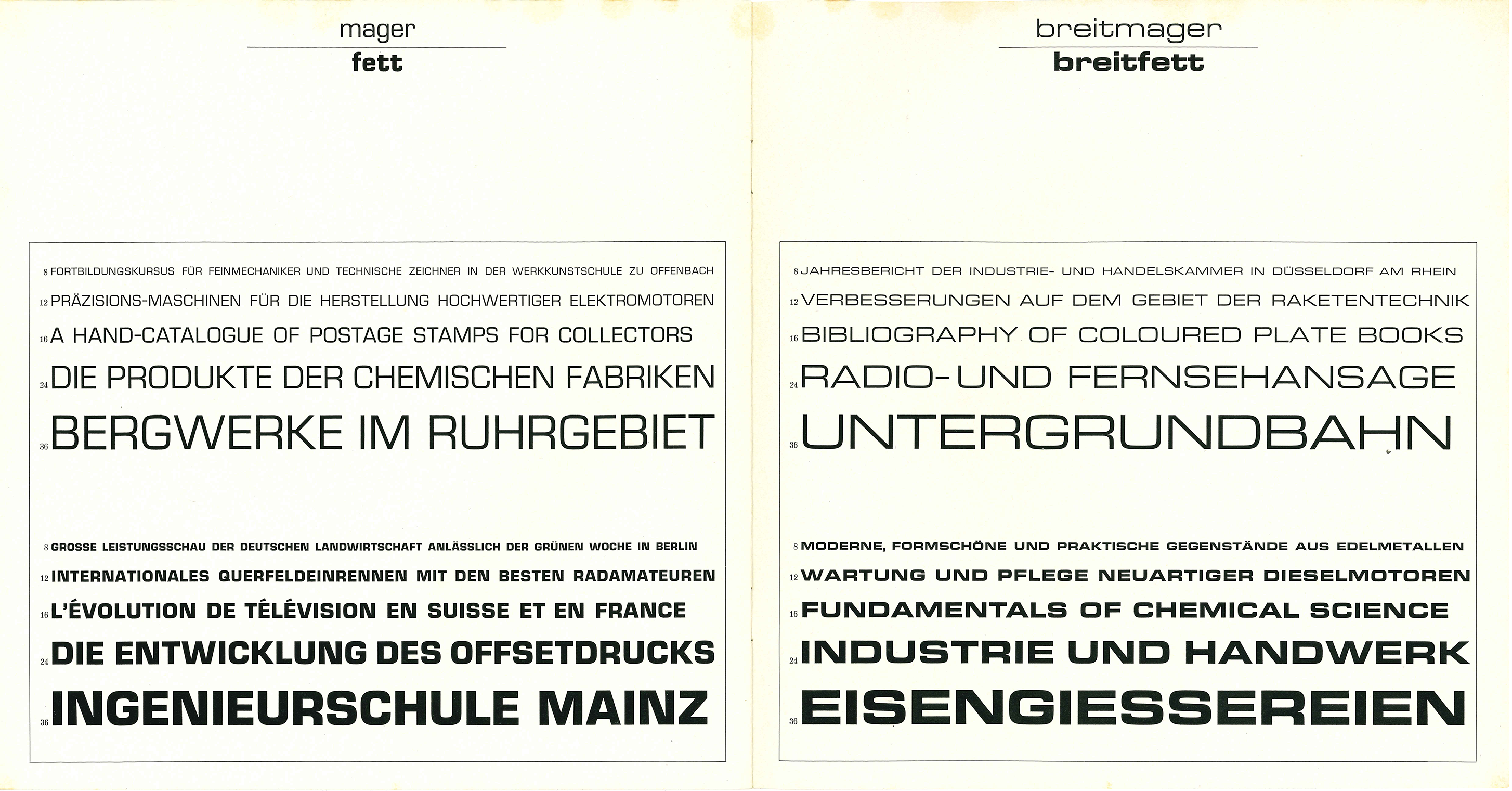
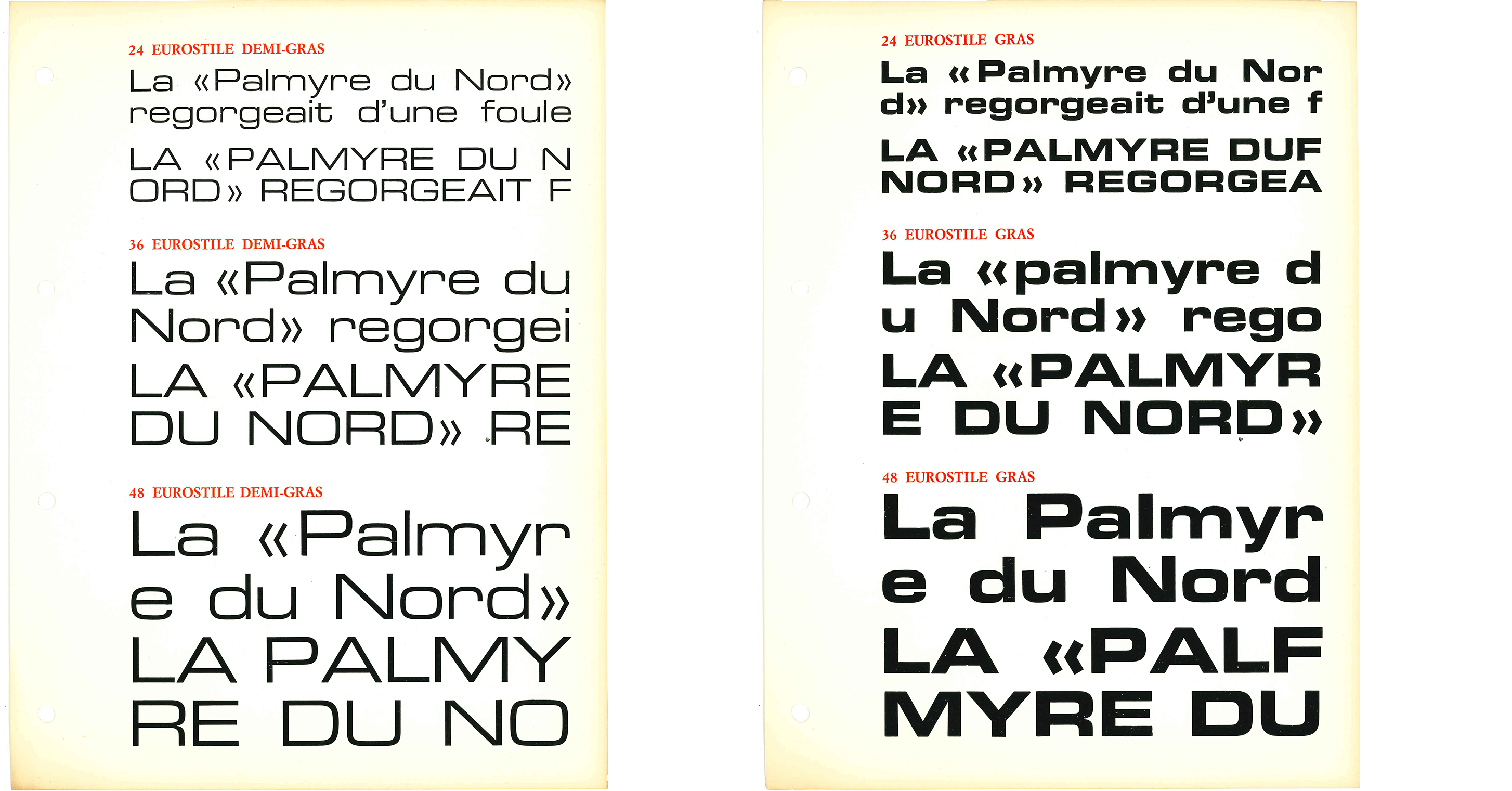
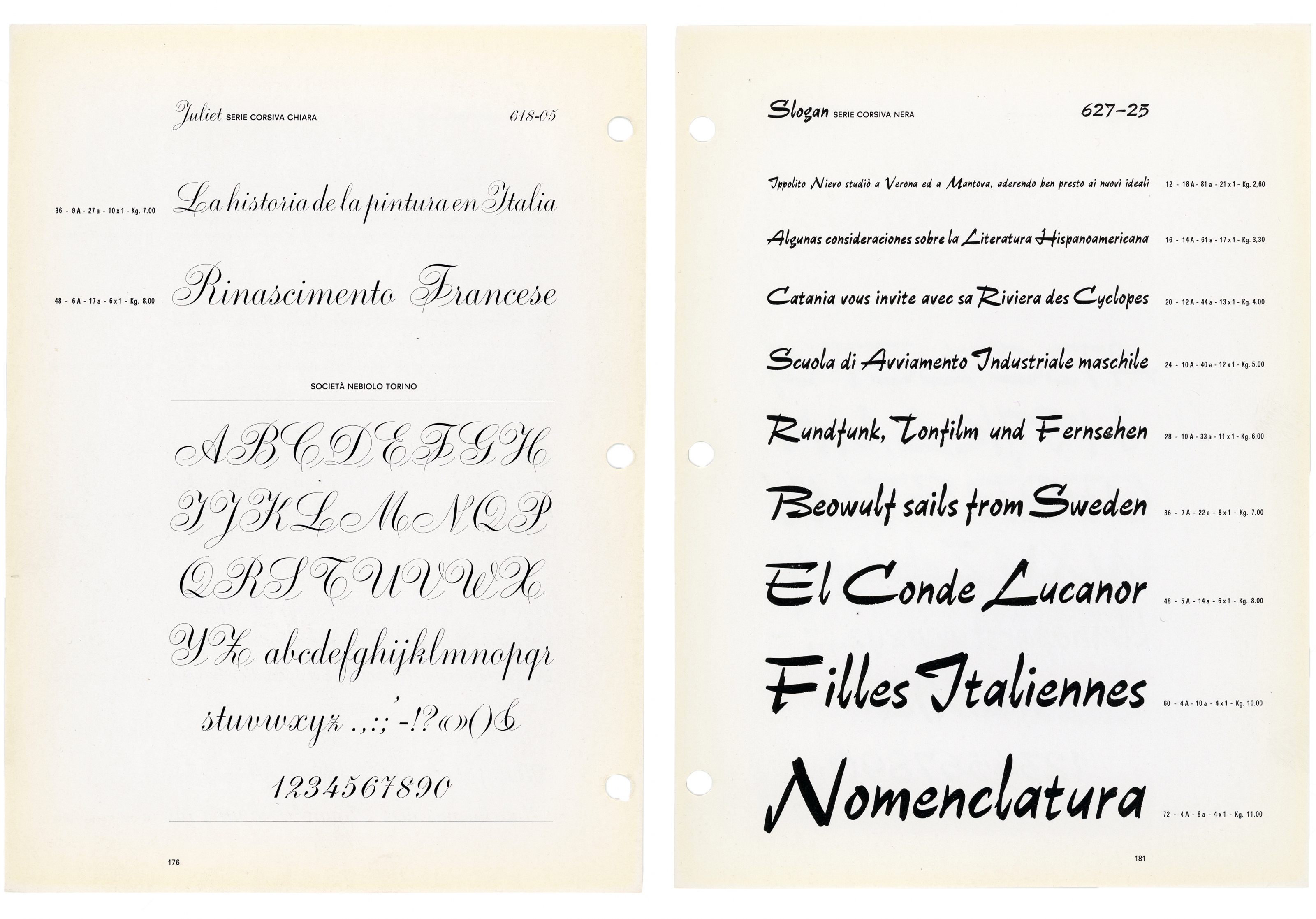
Much appreciated were the reviews of iconic Nebiolo typefaces by Antonio Cavedoni, James Clough and Riccardo De Franceschi. Cavedoni analysed Stop and some of its forerunners, and provided a convincing reconstruction of the design development of some of its basic letterforms. Clough discussed how Eurostile (1962) owes its worldwide popularity to a particularly successful design developed from the squared letters of Butti’s Microgramma (1952). He went on to show some 19th- and 20th-century precursors of the ‘square idea’ in typeface design. De Franceschi presented his study of the original script typefaces designed under the direction of Da Milano, Butti and Novarese from the 1930s to the 1960s, focusing on two of the most technically interesting and commercially successful – Juliet and Slogan.

An all-round investigation to be published in 2022
Other contributions to the Turin symposium include those by Alessandro Corubolo, on the role played by Raffaello Bertieri (1875–1941) the influential printer, scholar, and editor of “Risorgimento Grafico”; Carlo Vinti spoke on the influence of the Neue Typographie in Italy in the 1930s, and its followers (“Campo Grafico”) and detractors (“Risorgimento Grafico”); Ali Filippini focused on the Turin magazine “Graphicus” from the 1910s to the present; Silvia Sfligiotti and Andrea Vendetti covered the promotion of Nebiolo typefaces from the 1920s to the early 1950s; Michele Galluzzo introduced Maria Grazia Schenone as the Nebiolo advertising manager from the mid-sixties onwards.
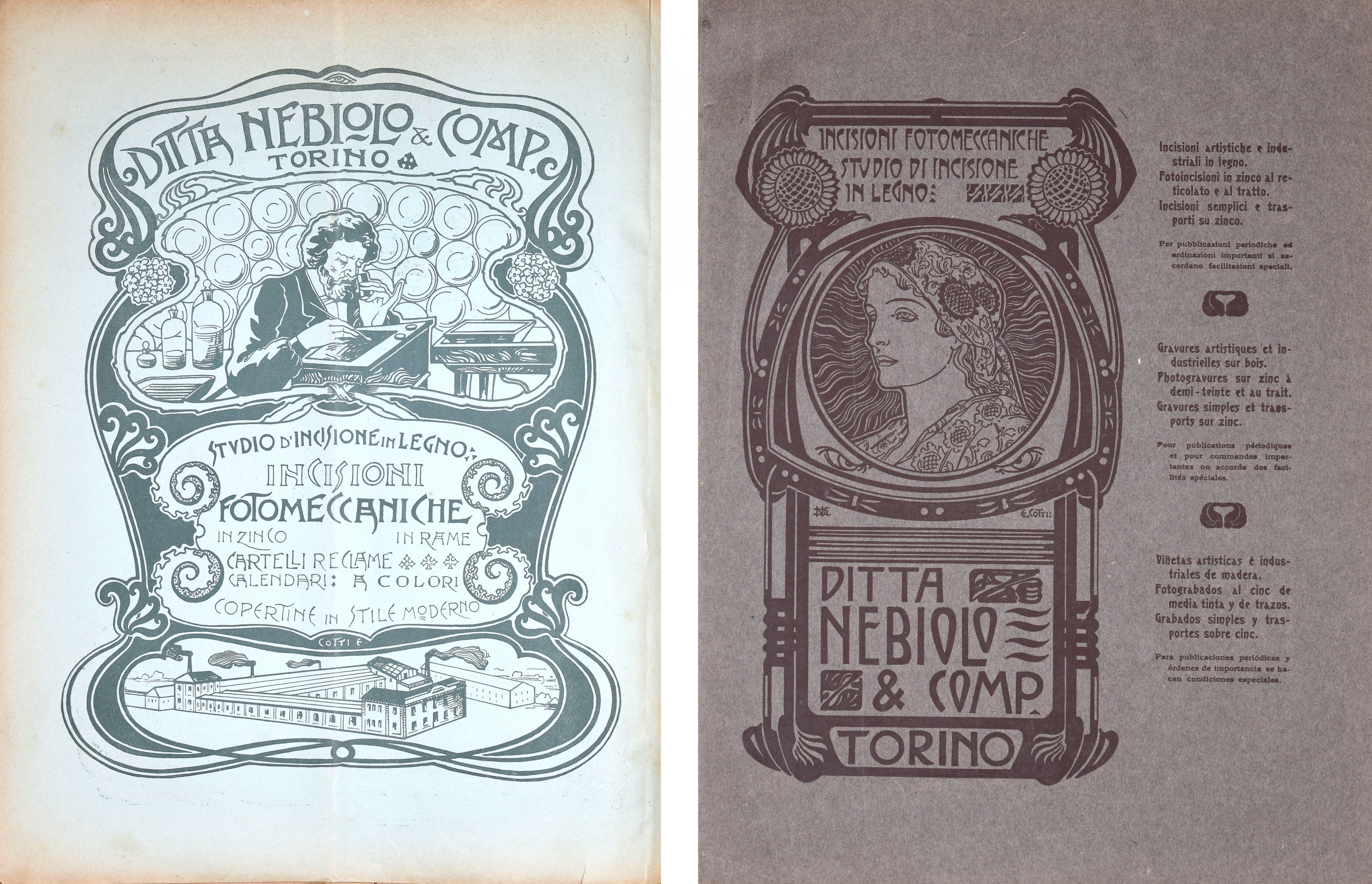
Among talks addressing Novarese’s work, Manuel Sesma Prieto shed light on Novarese’s connection with the Rencontres de Lure, organised by theorist and historian of French typography Maximilien Vox and other supporters of the Graphie Latine movement; Fiorella Bulegato discussed Novarese’s side activity as a graphic designer, Lorenzo Bolzoni focused on his manual Alfa-beta and Domenico Bellantuono investigated his post-Nebiolo collaboration with the Haas foundry. Colizzi and Olocco added new elements to the Studio Artistico story, with Colizzi highlighting the role played by Raffaello Bertieri before Giulio Da Milano’s tenure with further discussion on lesser-known individuals such as Dalmazzo Gianolio and Edoardo Cotti. Olocco pointed out more indications challenging Novarese’s account in Questioni di carattere and Alfa-beta and provided further details on Butti’s work before his dismissal.
The Conference proceedings are expected to be published by Lazy Dog Press by autumn 2022. In the meantime, I recommend all Nebiolo fans to visit nebiolohistory.org and follow @nebiolohistory on Instagram.