Restaurante Inito
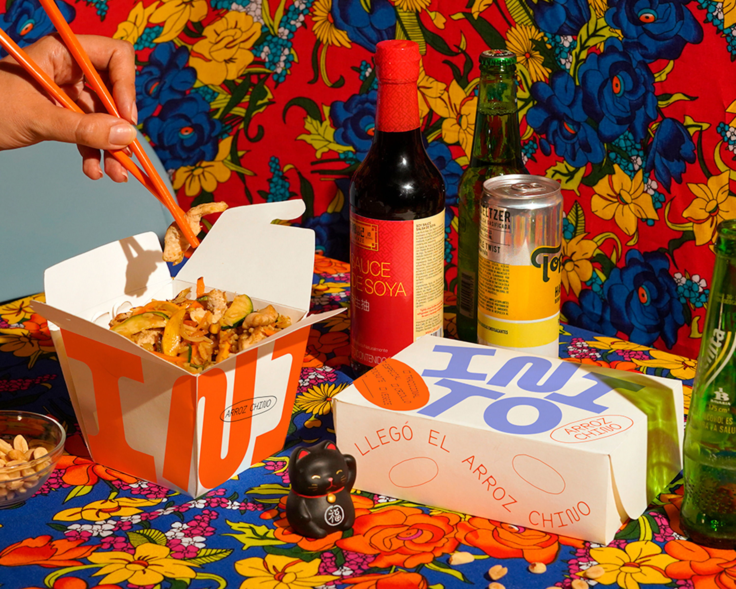
Inito is a new tropical Asian rice takeout and delivery service in Bogotá, Colombia. The company’s modest size does not deter the owners from setting high ambitions. The owners want to “change the way we eat Asian food, with new and fresh flavors, combinations and textures.”
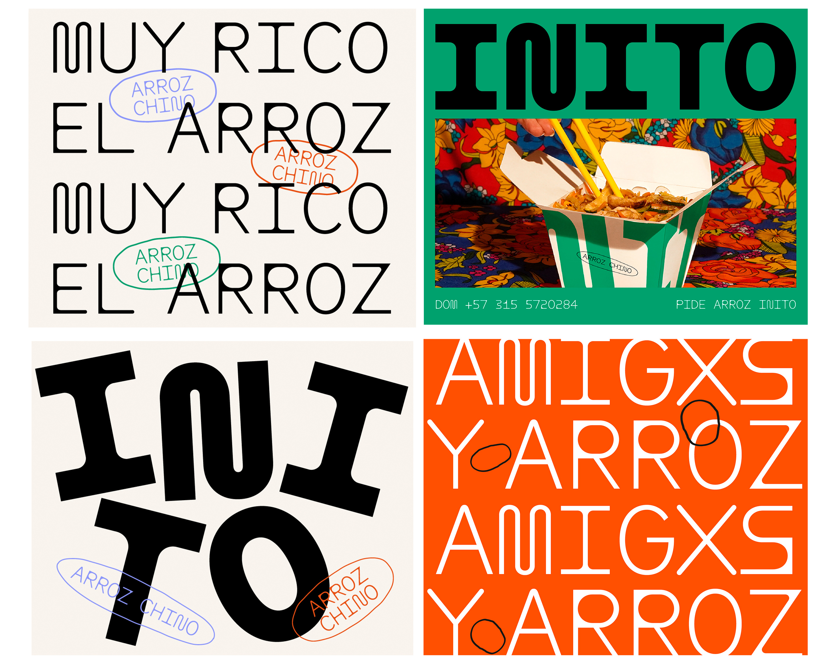
Different and fresh is also their new look and feel, designed by design collective Sola. The new packaging and social media posts are in no way reminiscent of the usually traditional look of Asian food. Still, the designers started with the traditionally most important ingredient of Asian cuisine: “Thinking of rice, with typographic compositions that mimic the movement of the grains as they are prepared. Accompanied by a fresh color palette and short sentences, this conveys how fun and easy it is to eat rice.”
Lun–Dom: 11:30 am–7:00 pm
¡PEDÍ TODO EN EL MISMO LUGAR!
Caluire-et-Cuire Avenida de Valeri Serra F-6 skeiðarársandur counterargument
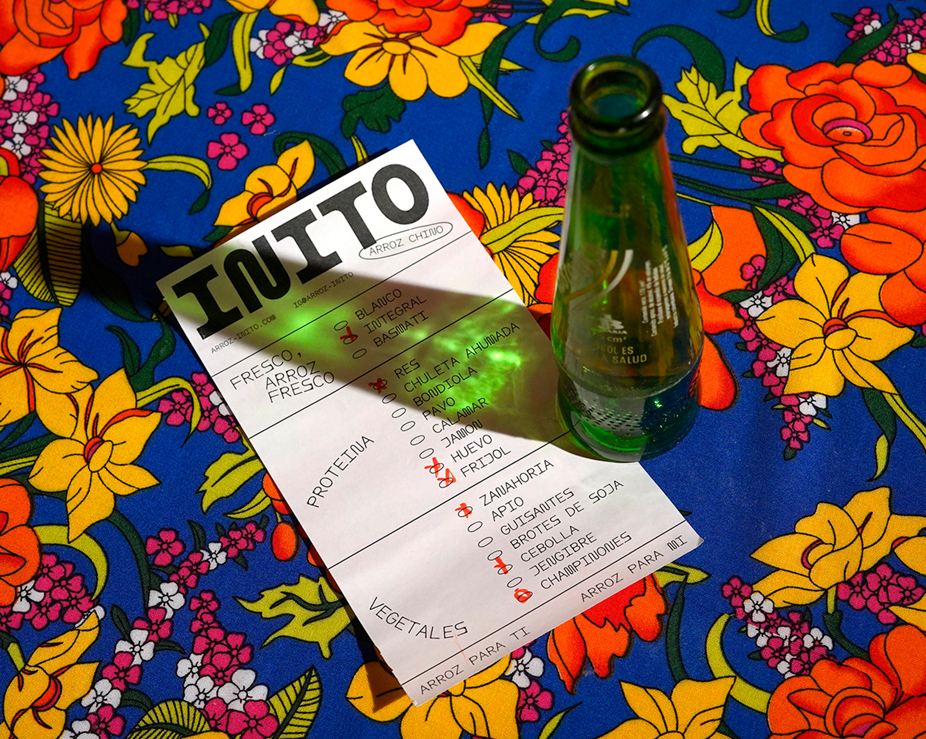
All typography uses ABC Maxi Round Mono from Swiss foundry Dinamo. Two of its three weights are combined with a vibrant color palette and rice-shaped checkboxes. The Maxi letter collection, designed by Johannes Breyer and Fabian Harb with Andree Paat, is a collection of unobtrusive sans serif characters that cannot stop to seemingly randomly pop out with “spaghetti movements and angular lines.”
For an extra high fun-factor, Maxi offers quirky heavy alternatives for many characters. These were not used in the design for Inito. Intentional or not, it’s a decision that makes it a lot easier for clients to keep a corporate identity alive after the designers have delivered the visual identity.
You can check out the original version of this entry on Fonts In Use, where it was contributed by Nathalia Jaramillo.
Between Harlem and Heaven
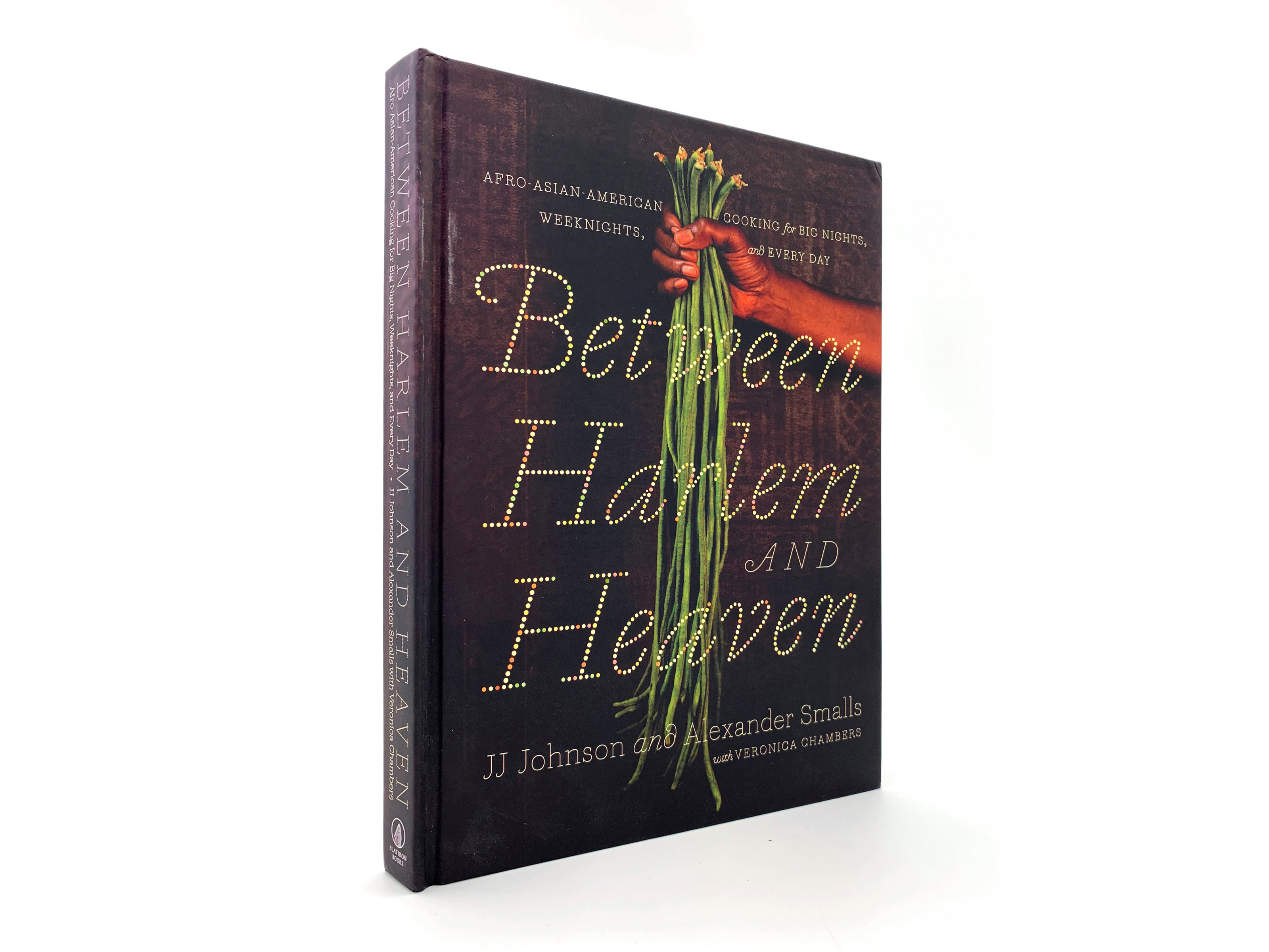
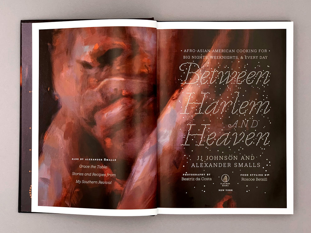
Between Harlem and Heaven is more than a cookbook. It connects the places where restaurateur Alexander Smalls and chef JJ Johnson worked together in New York City, with their love for the Afro-Asian-American cuisine, a kitchen as rich in recipes, histories and stories as that other diaspora cuisine, the Jewish one. The book, published by McMillan, is designed by Roberto deVicq, with photography by Beatriz da Costa and food styling by Roscoe Betsill. Like the authors, none of them adhere to the “less is more” design ideals. On the contrary, the three leave no opportunity wasted to evoke tastes and smells through visual and typographic stimuli.
On the cover, deVicq combines a hand holding a bunch of asparagus beans with information set in two styles of Marian – a collection of equally thin, monolinear renderings of classic typeface designs, published by Commercial Type (design by Paul Barnes, Jonas Hecksher a.o.). The style used here is Marian 1800 – revealing Bodoni’s bare bones. The book title seems to be lettered with peppercorns. It’s Tanja, a variant of Marian 1554, designed by Christian Schwartz and Paul Barnes and based on Robert Granjon’s Paragon Italic.
Blaka rowsu 25 september Okrosoepoe Srefidensi No njang alla njang
Vigna Unguiculata Sesquipedalis; long-podded cowpea, Chinese long bean, snake bean, kouseband
St Clair Place and W 135th Street New York, NY 10027
Carolina ➸ Southern Kingfish Grill BBQ flavors upon flavors Calypso
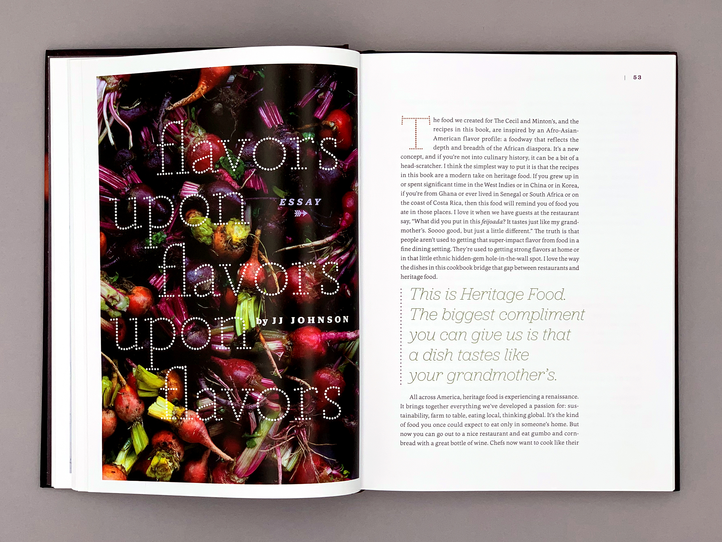
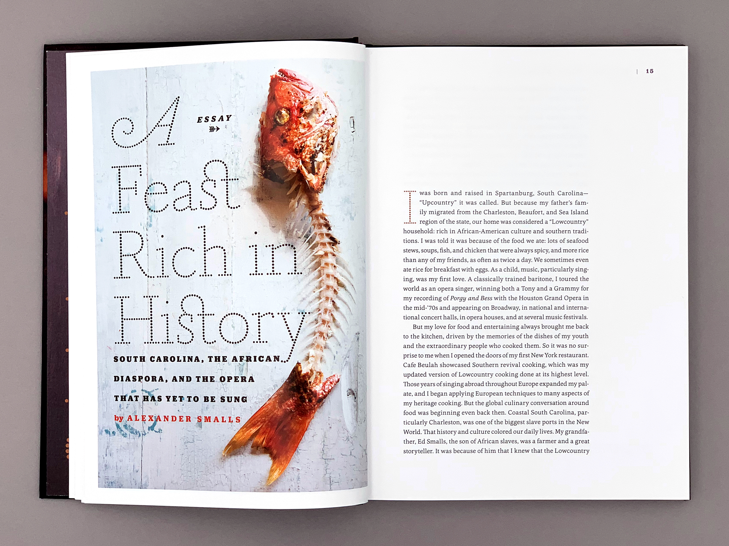
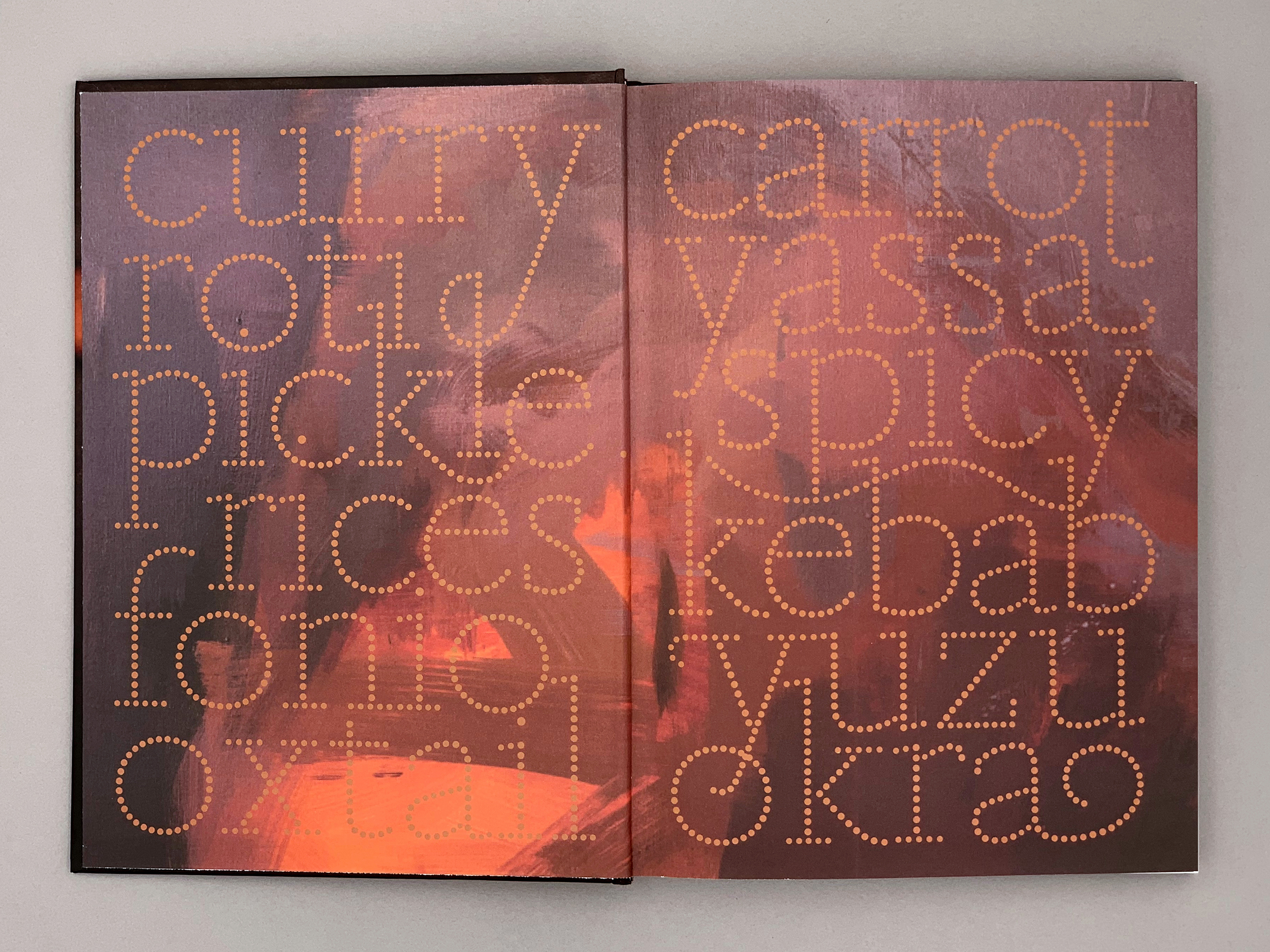
DeVicq conjures up a world of scents and associations on the first few pages of the inside work by giving Tanja extra swashes, sprinkling her dots across a title page, or placed as a template on a crate of fresh okra. Once the reader gets to the stories and recipes, Tanja is increasingly combined with Jubilat to introduce recipes and stories. This cheerful slab serif by fellow New Yorker Joshua Darden (Darden Studio) is deployed in two distinct weights: Bold and chunky at one page, Thin and elegant in the next use. The main text is set in Cassia by Dieter Hoffrichter (Hoftype), the only moderate typefaces in the typographic palette.
You can check out the original version of this entry on Fonts In Use, where it was contributed by Matthijs Sluiter.
Bucket Fermentation
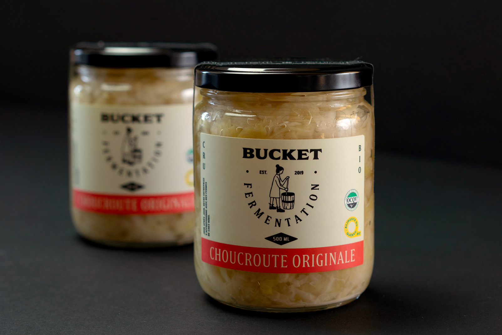
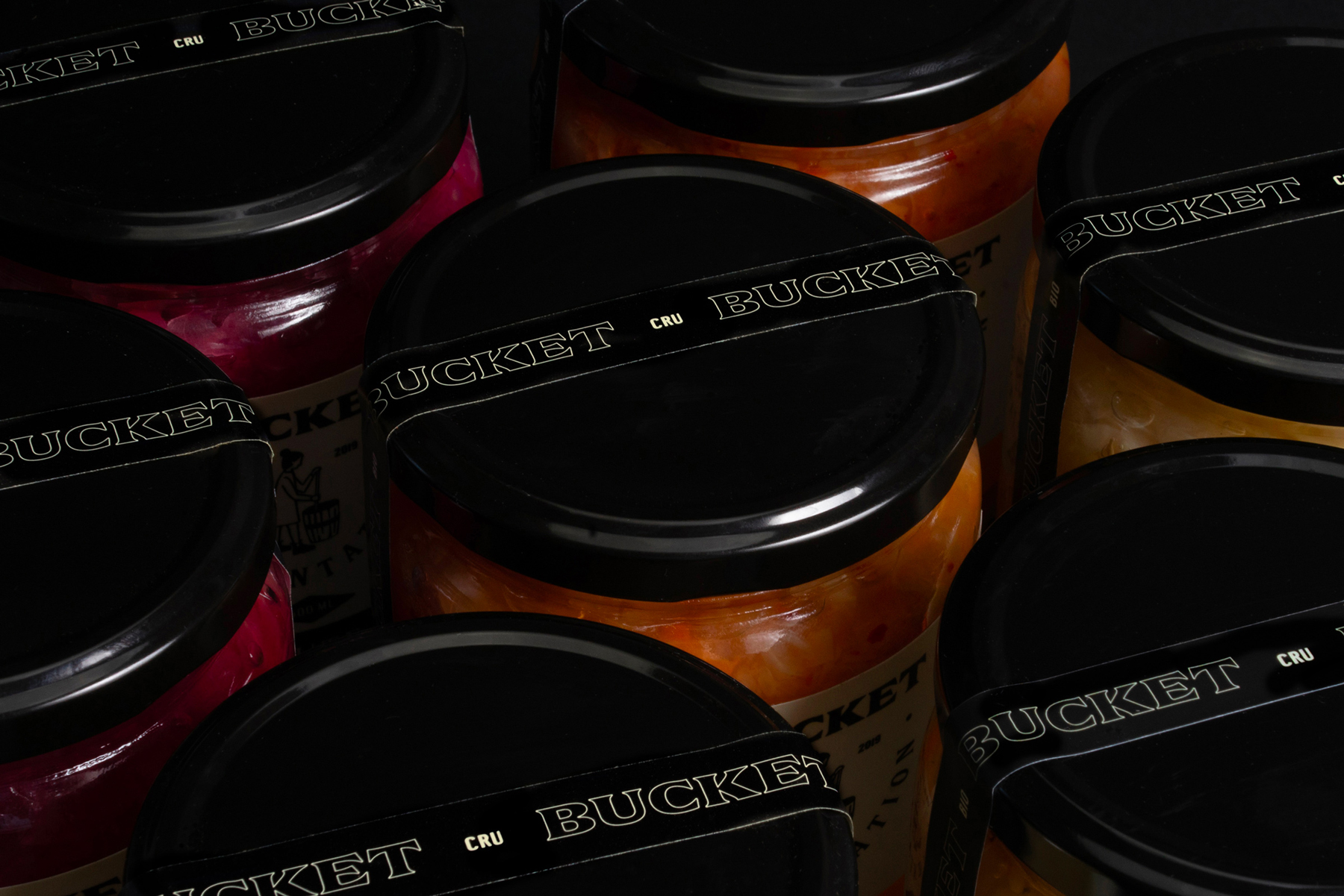
Bucket Fermentation is a Québec company specializing in lacto-fermentation. Their name, branding and packaging were handled by Studio Miles: “The owners wanted to market products made from organic and local ingredients. We have created a range of labels whose aesthetics reflect a craftsman and human side.”
The visual identity is built around Double, a typeface family from Coppers and Brasses with a related source of inspiration: painted advertisements found on buildings in Old Montreal, Canada. The name does not refer to its number of styles (there’s five of them), but to its structure: “The family evolves in a linear way but on two axis at the same time. The heavier it gets, the wider it gets.” Its five subsequent steps toward heaviness indicated as sizes, from X Small to X Large. Studio Miles didn’t let the unusual naming scheme confuse them. Their design combines three styles of Double, all in capitals and at more or less the same font size. The logo pairs Small with Large, the second heaviest/largest style. Product names are set in the narrowest cut, X Small. The complementary condensed sans serif is Central Avenue (Colophon).
1885 Flour, Feed, Hay, & Grain Nova Scotia railway station
Lactobacillus Mesenteroides and Streptococcus faecalis
Pédaler dans la “cabbage-cabbage”. Sauerkraut soup 1000gr finely chopped
Confédération des travailleurs catholiques du Canada
You can check out the original version of this entry on Fonts In Use, where it was contributed by Étienne Aubert Bonn.
Homemade birthday cakes
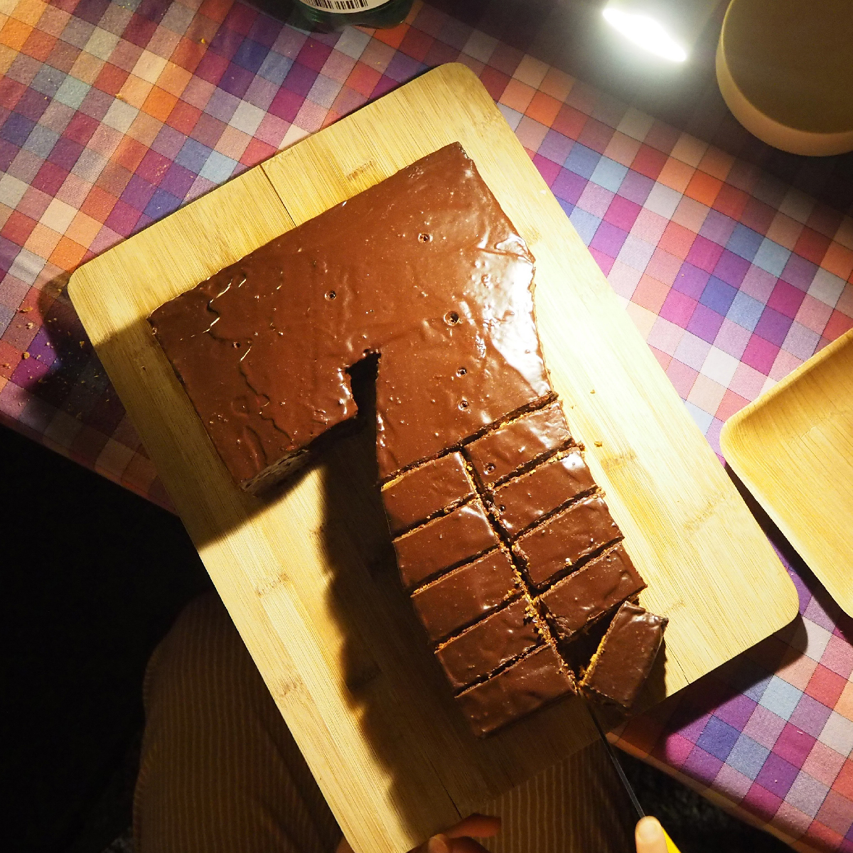
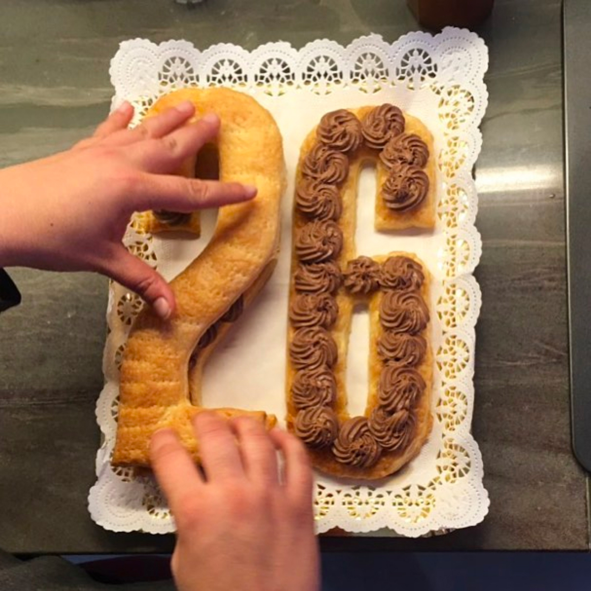
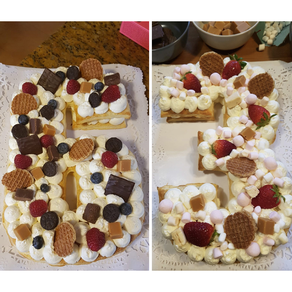
The numerals of Akkordeon by Emtype already look good as a typeface, but turn out to look delicious when they come out of the oven. These cakes from Spain were baked and decorated by Mireia Sais Pelaez and Nose Riu Serra, and contributed to Fonts In Use by graphic designer Lluís Serra who adds an educated guess as to why Eduardo Manso’s condensed sans serif is an ideal model for cakes: “Akkordeon is a typeface that allows the number to be easily adapted to the size of the oven plate.”
Akkordeon is a typeface family for editorial use, “roughly inspired by grotesques from the nineteenth and twentieth centuries. It is not conceived as a family of constant width but has a variable breadth from narrow to expanded, offering a wide gradation of weights.” Its fourteen numbered styles expand from extr anarrow and monolinear to black and massive, with weight growing at a slightly different pace than its width.
Pastel cordobés y Mantecadas de Astorga Lunes a domingo, de 9.00 h a 20.30 h
huevos, azúcar, almendras, ralladura de limón, canela, mantequilla, harina helado de almendra y ralladura de la piel de un limón
ISO/TC 136 STATUS: PUBLISHED 1–2”/2.5–5CM EQUIPMENT STANDARD SIZE
the robots need to be carefully designed so that they do not bruise the fruit while picking. One solution is the use of suction grippers, used on automated fruit picking machines manufactured, for example, by ACRO.
You can check out the original version of this entry on Fonts In Use, where it was contributed by Lluís Serra.

