There is still a long way to go before equality between writing systems in the (design) world is achieved, but the following projects are living proof that things are moving forward. Users and designers of type are meeting more easily than ever. There are collaborations between graphic designers and type designers, for instance, but also radically-open design processes. CSTM Type designed a type family over live-streamed sessions and got advice from a native designer for the Georgian set.
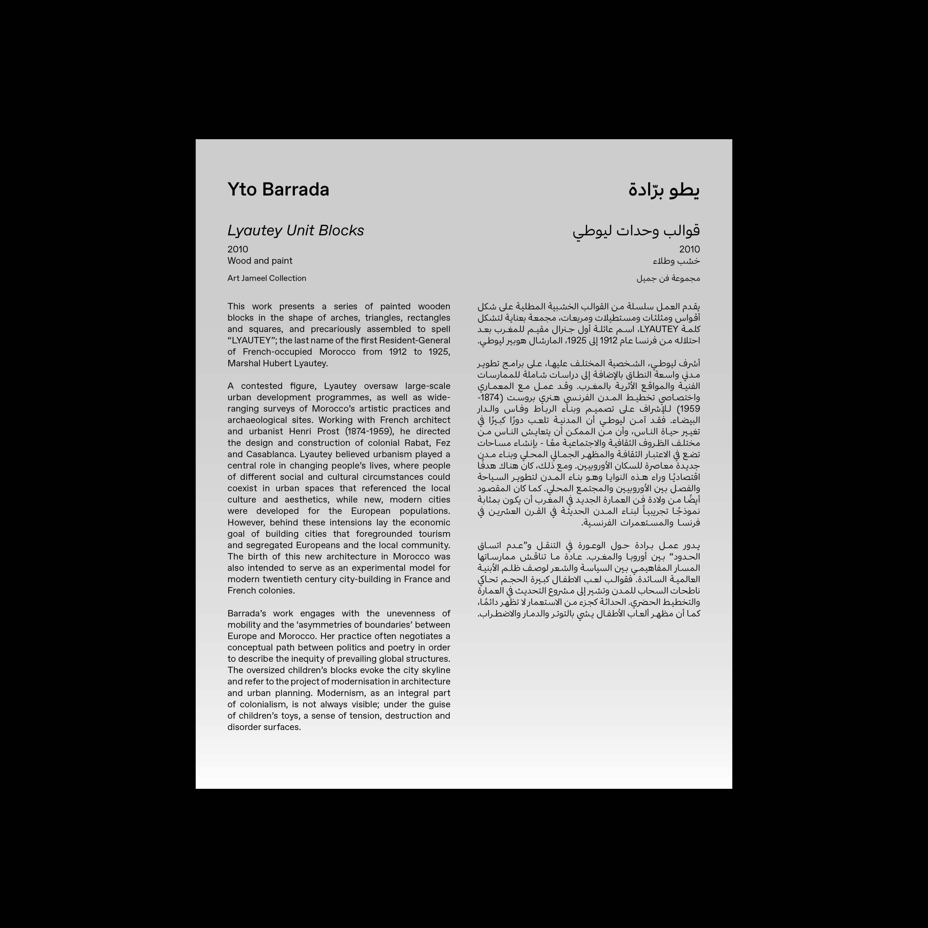
The boost in options allows for multi-color typography. Maria Nicholas designed a book in which her native script – Greek – is visually dominant, with English subtly in second place. The removal of technical constraints makes it more important than ever to understand all writing systems and languages in a project. Sarah Chehab of waiwai writes, “I think it’s crucial to have someone native on both the client and design team. Otherwise, you’re looking at the form without understanding how it will be experienced.”
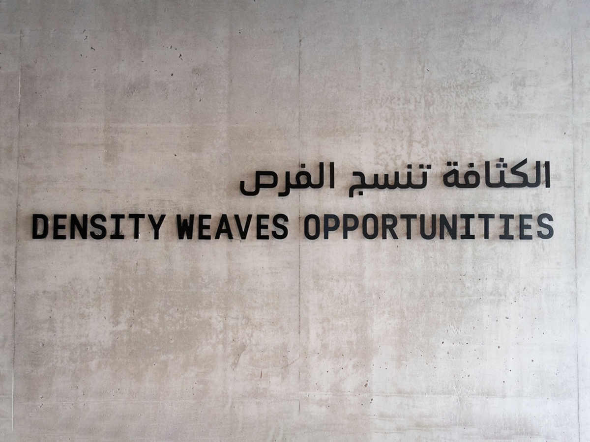
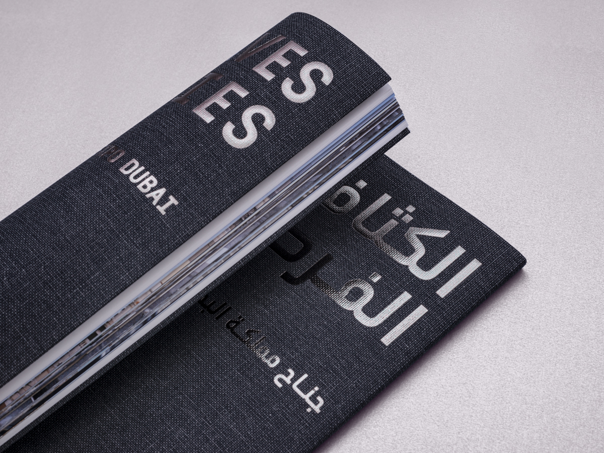
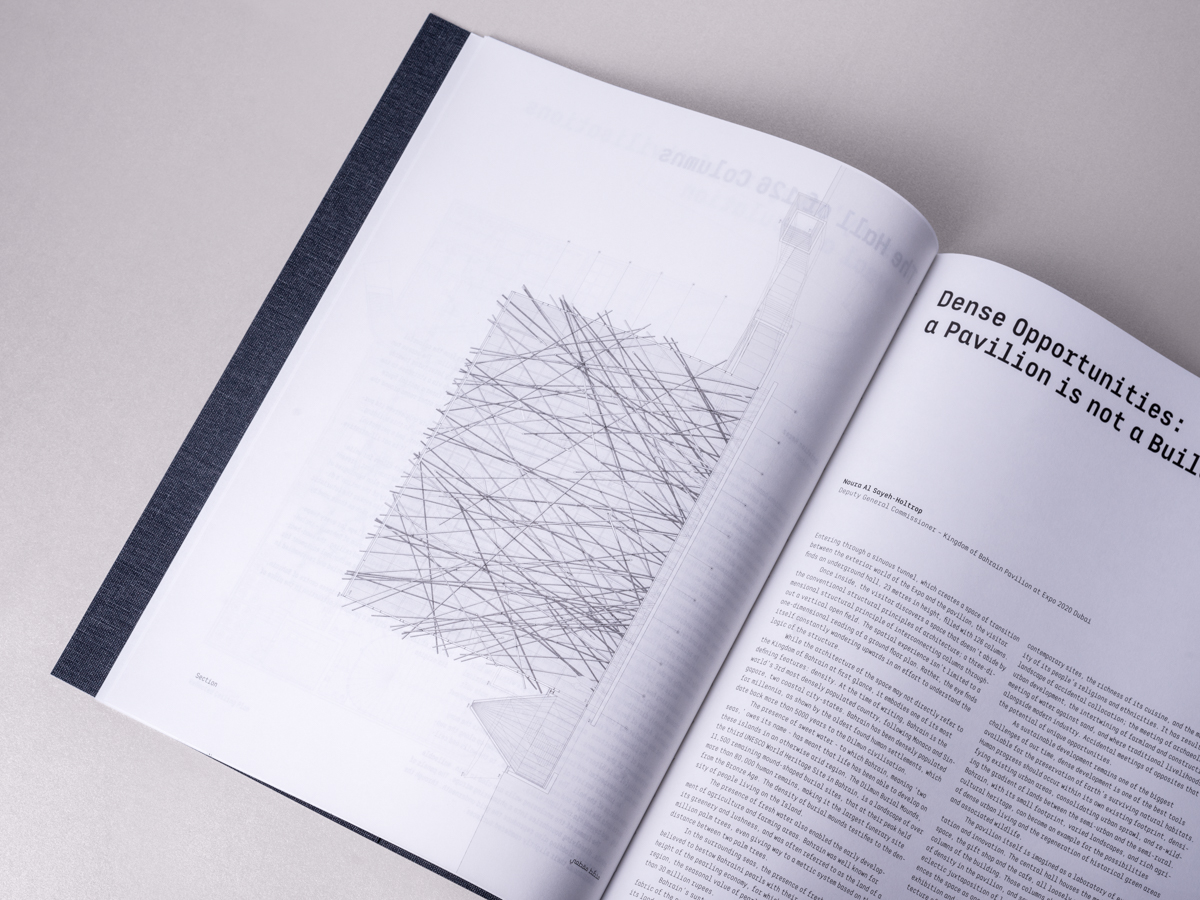
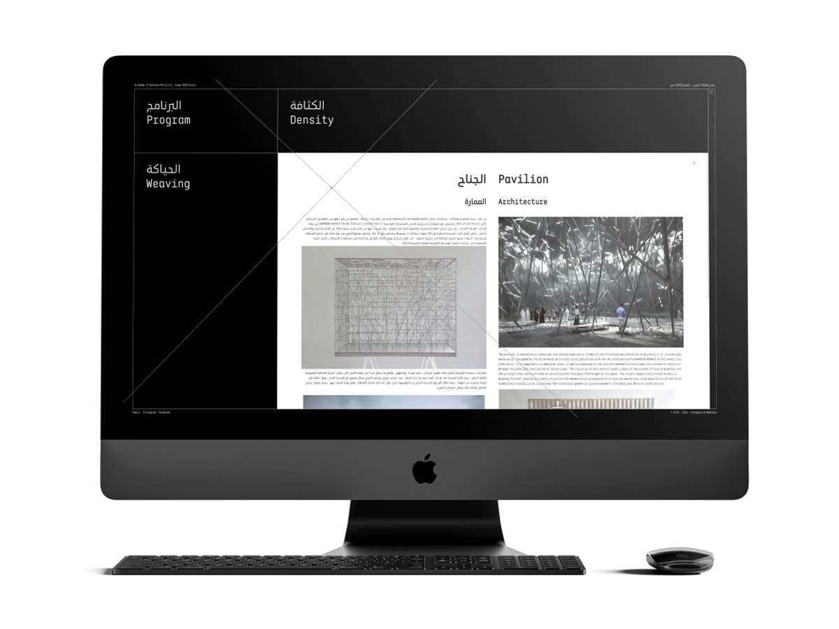
Density Weaves Opportunities, Bahrain Pavilion at Expo Dubai
Graphic designer Clara Sancho and type designer Pascal Zoghbi (29LT) are two independent designers who often collaborate, depending on the scale and nature of a project. When Arabic is involved, those collaborations often make use of Zoghbi’s 29LT type library. “Clara often has first access to all new 29LT releases,” Zoghbi explains, “And I’m always happy to see her choose one of them for her projects. From my end, I always use the 29LT fonts since it gives me the opportunity to put the fonts into action, instead of only creating them.”
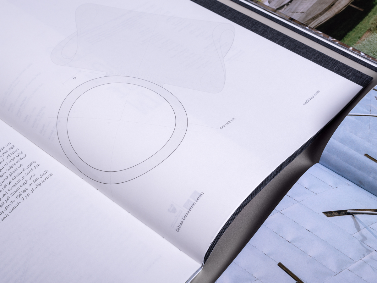
An example of their collaboration is the visual identity for the Bahrain Pavilion at the 2020 World Expo in Dubai, themed “Density Weaves Opportunities.” The eye-catcher of the project was a pavilion by architect Christian Kerez, pairing an enigmatic facade with a dramatic interior. For the design, from signage to website and publication, an understated typography was chosen with a custom version of Zoghbi’s retail typeface 29LT Baseet, named 29LT Zawi (meaning “angular/corner”).
At first glance, both Baseet and Zawi are monospaced typefaces – with the same width for each character. The Latin part is a true monospaced, but there is no such thing as monospaced Arabic so far (although designer Eli Heuer is developing one). But what about Arabic typewriters? Sure, they exist, but “since the days of typewriters, engineers and designers who worked on creating the Arabic typewriter found out that they needed to have three of four different widths.” That is the same concept used for the typeface of the Bahrain Pavilion: a monospaced Latin plus a multi-width Arabic.See the original version of this post on Fonts In Use, contributed by Clara Sancho.
Ronda Acevedo B-33 rannsóknarréttur intangiblemente Johann Mattheson
بافيليون Avenue 83 BOCUSE veröffentlichung departmentalize Adalbert Gyrowetz
připomínající العربي. دي چاي وليبل في برلين aggregatenesses Mary Ann Wrighten Los Caños de Meca
حبيبي فنك Alhaurin el Grande 504 Birch Farms No. 37 rannsóknarréttur
Depo (დეპო) restaurant, Tbilisi
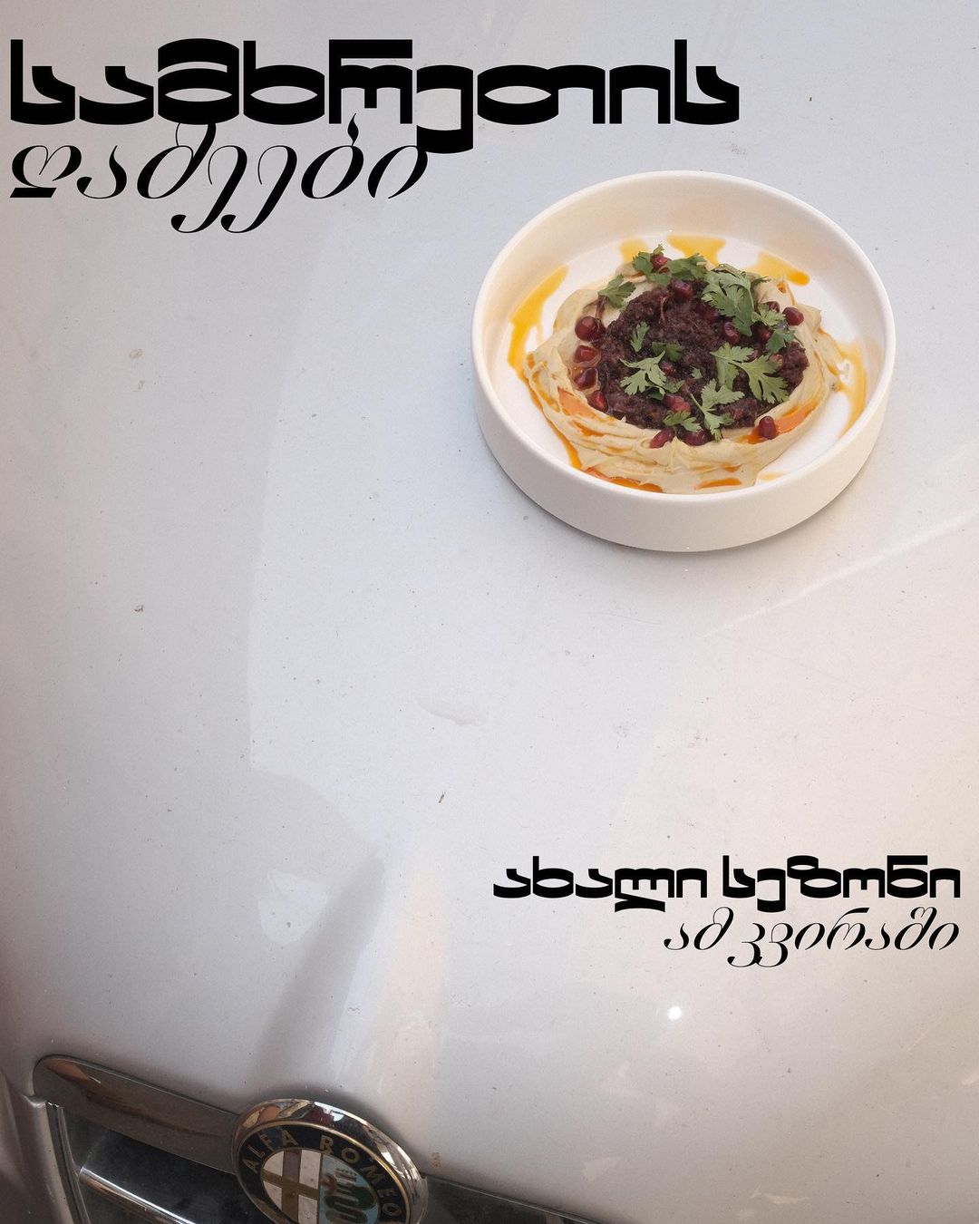
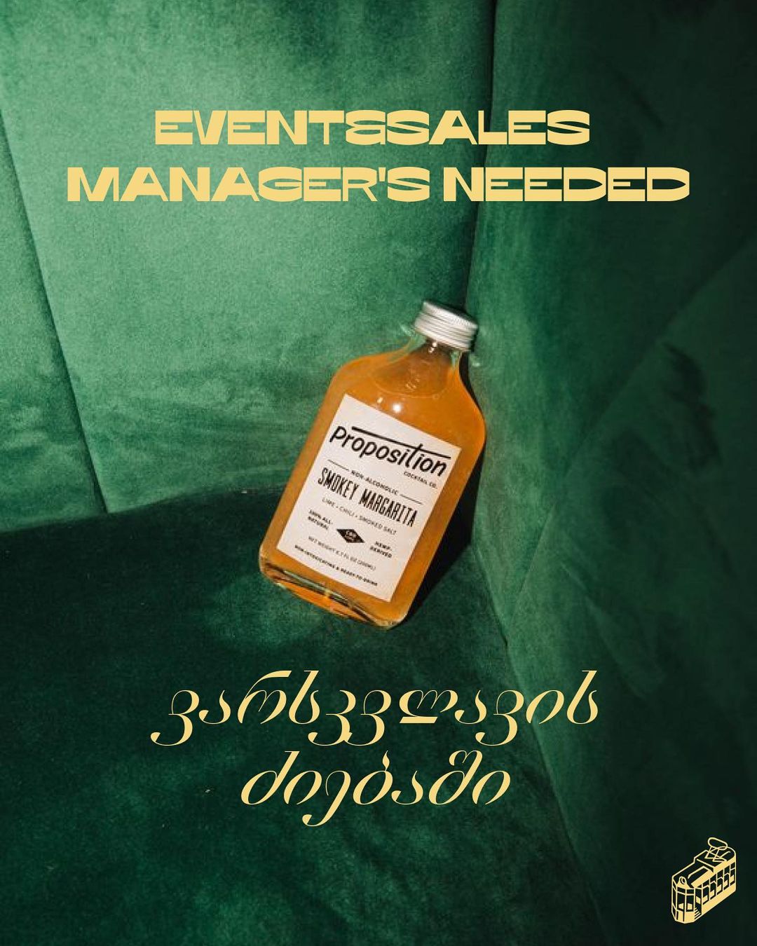
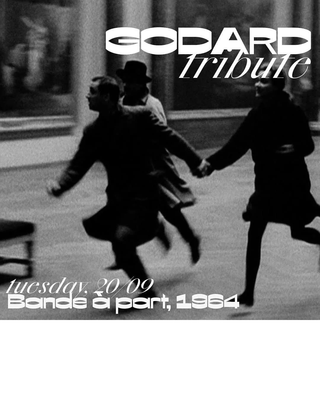
Depo is a restaurant in Tbilisi, the capital of Georgia, with a constantly changing menu, regular music nights, and film screenings. On its social media, Depot uses a mix of Georgian and English and two styles from the Xprmntal 02 family, Bold, and Italic. Entering the restaurant, guests see the logo set in Loos (not available via Fontstand). The restaurant’s identity was designed by one of its founders, Grigory Samgin, and the logo is from Yuri Ostromentsky, who is a co-designer of both Xprmntal and Loos.
Nonchalance – or at least its suggestion – is the common thread running through the restaurant’s presence on social media. Seemingly casual photos show a dish casually hanging on a car hood while waiting to be brought to a table; a forgotten bottle of liquor is found on a plush couch. The typography fits seamlessly with the cowboy chic vibe, not just in its looks. The type designers cold-bloodily ignored the classic idea that the “magic” of design is hidden from the public eye.
All styles of Xprmntal (a numbered series of “fast typefaces”) were designed by Yuri Ostromensky and Ilya Ruderman over a very short period in live sessions on the CSTM Telegram channel, where subscribers had unfiltered access to the design process. The Xprmntal 02 series is the foundry’s first-ever type family with support for the Georgian alphabet, thanks to the advice of Tbilisi-based designer Alexander Sukiasov.
See the original version of this post on Fonts In Use, contributed by Adelina Shaydulina.
Красномовно Olivier Messiaen 8 Villa Saint-Lazare limpiachimeneas Baixada Santista
ბადრიჯანი Willem de Fesch перемога 748 Tabernas Desert Lonely Round
143 კონცერტი Tengiz Abuladze cocktails Jean-Luc Gustav Geierhaas Skeiðarársandur repetitivamente
330 parametric Прогноз погоды Quevilly Supermercados Mederos Balkan comercializador
The Distance From Here exhibition at Jameel Arts Centre
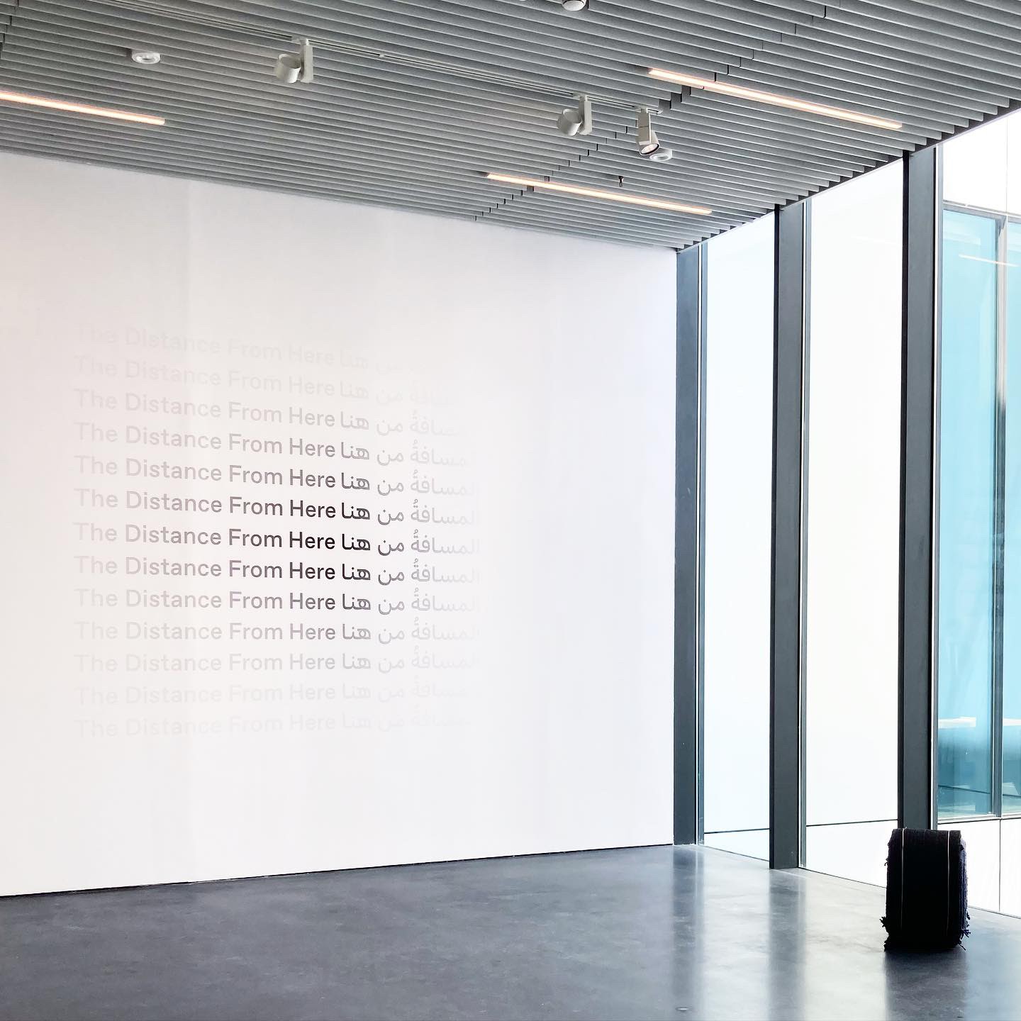
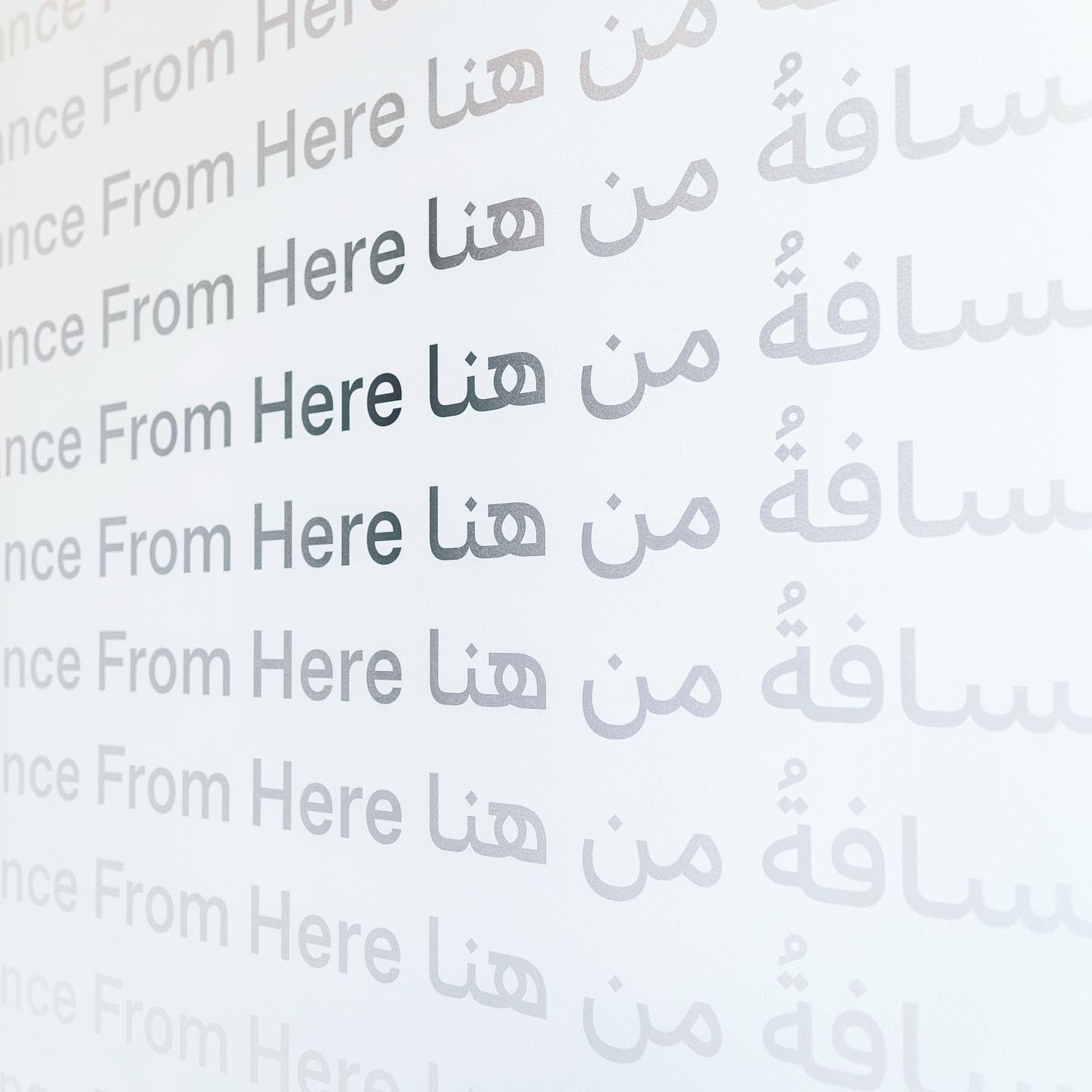
The Distance from Here was a group exhibition held in and drawn largely from the Art Jameel Collection. The exhibition explores “how our bodies become an essential material for our daily navigation through the space we live in, and how the body is connected to space through touch, language, movement, and memory.”
Sarah Chehab of waiwai, was responsible for designing the exhibition title and information panels. A design studio with offices in Tokyo and Dubai, waiwai is not an agency focused on those two local markets but rather internationally. As the same goes for their clients, projects often involve more than one language or script. Ideally, a team’s language skills align with the job at hand. “I think it’s crucial to have someone native on both the client and design team to make decisions about the use of a script/language,” Sarah explains. “Otherwise, you’re looking at the form without understanding how it will be experienced.”
Once the concept is established – in this case, a visual that uses English and Arabic text to express the idea of distance in time and space – Chehab’s initial focus is usually on Arabic “because there are fewer options, but also because there are so many exciting, very well-designed typefaces coming out.”
For The distance from here, the chosen type combination was Favorit Arabic (designed by Khajag Apelian and Wael Morcos in 2021), plus its Latin counterpart Favorit (Johannes Breyer and Fabian Harb, 2016). “It was necessary that the Latin and Arabic matched seamlessly. It was also important that the typeface chosen (for both) was monolinear and had an upright axis as it worked better with a gradient.”
See the original version of this post on Fonts In Use, contributed by Sarah Chebab.
أنا أكتر واحد بحبــك Ruby 1978 في الدنيا و طول عمري بحبـك Fel donia we tool omri bahebak.
Galuppi 678 كاظم الساهر, حبيبتي والمطر - قولي أحبك
Ferdinando marginalia gránátalma 422 Uptown Shadow Path No. 71
Sigismund Neukomm Nizhny Novgorod 81 Rue de la Verreire rannsóknarréttur
Apostolos Nikolaidis: The Authentic Laïká Singer Who Was Never Censored
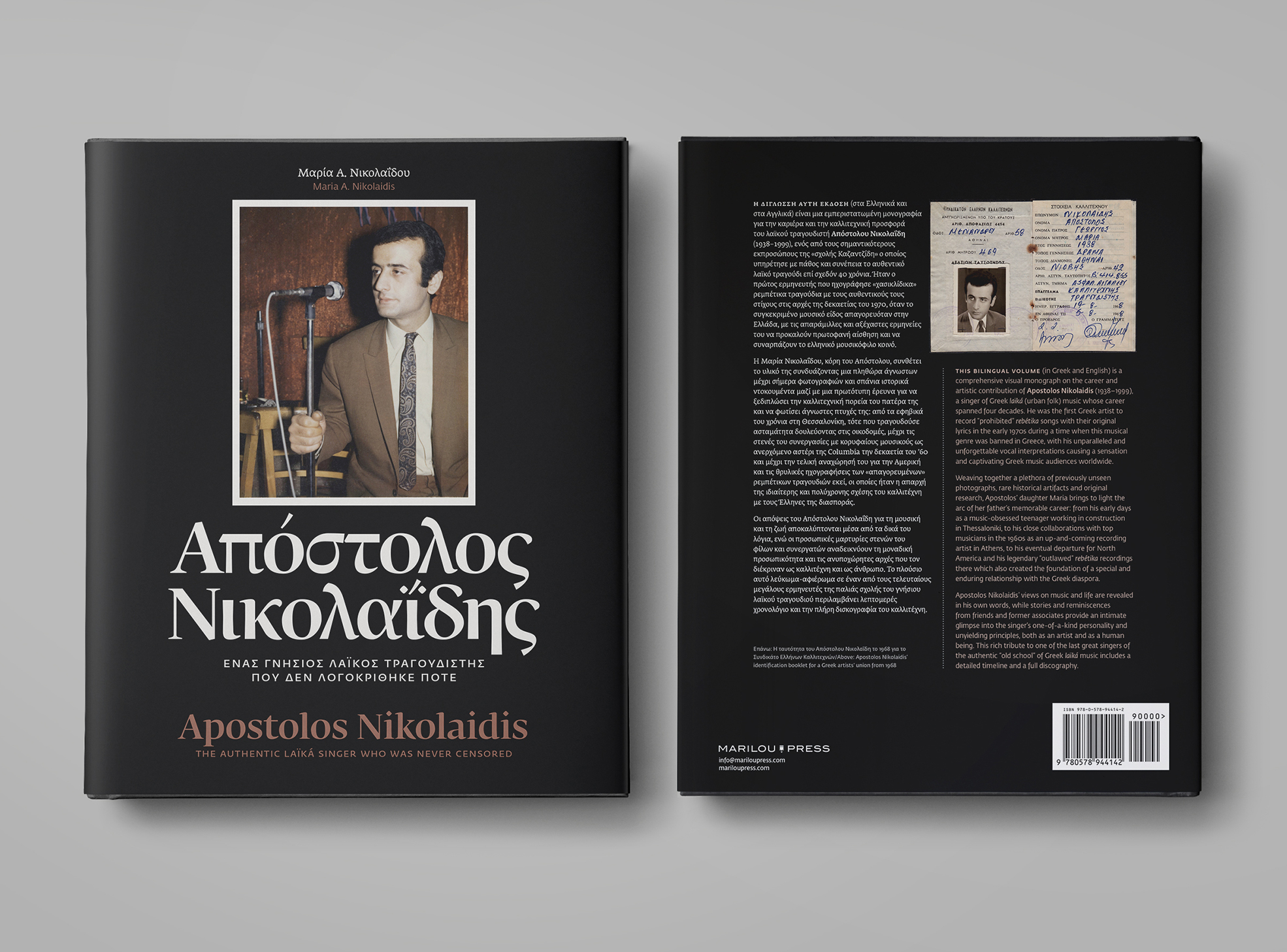
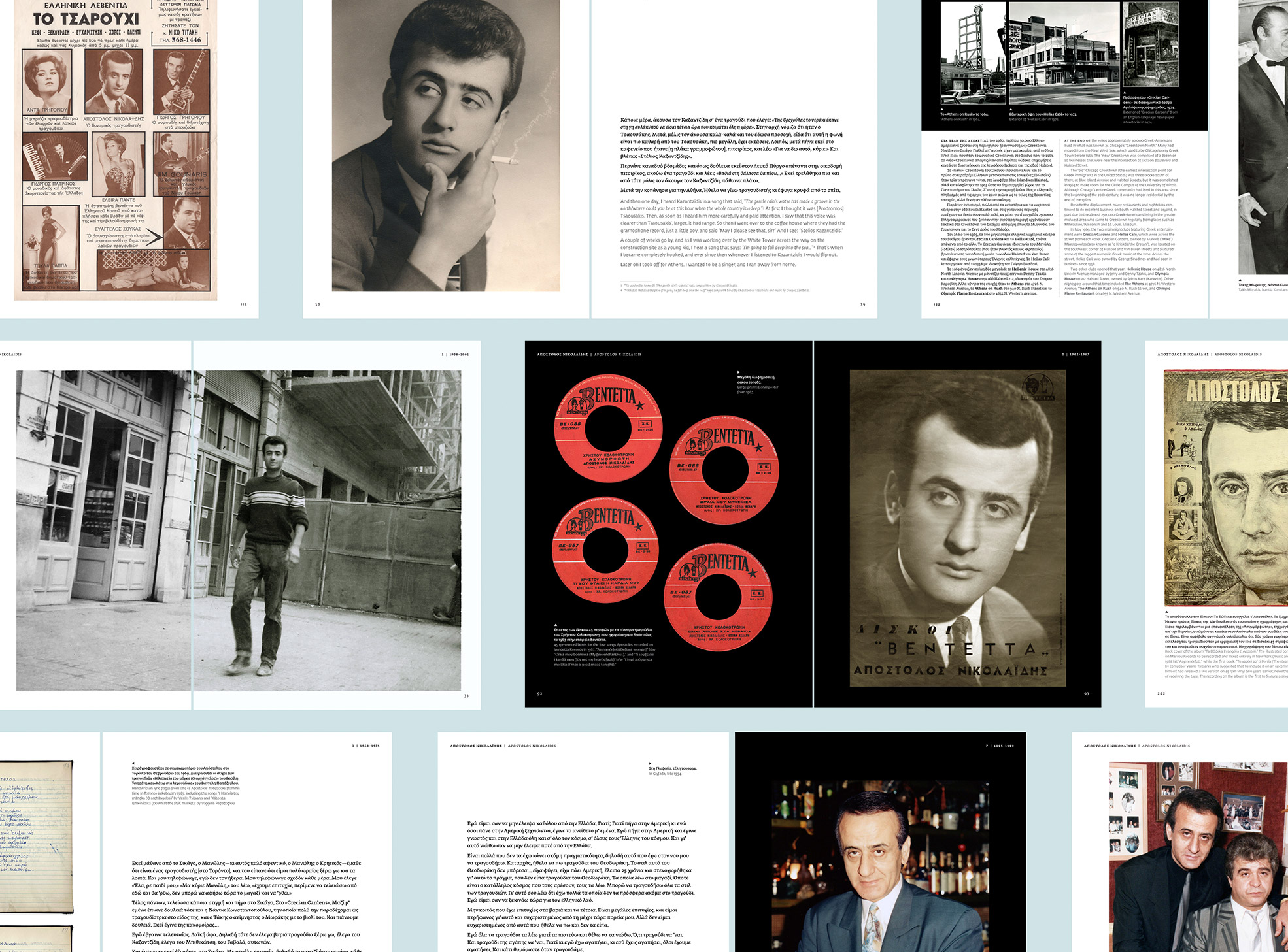
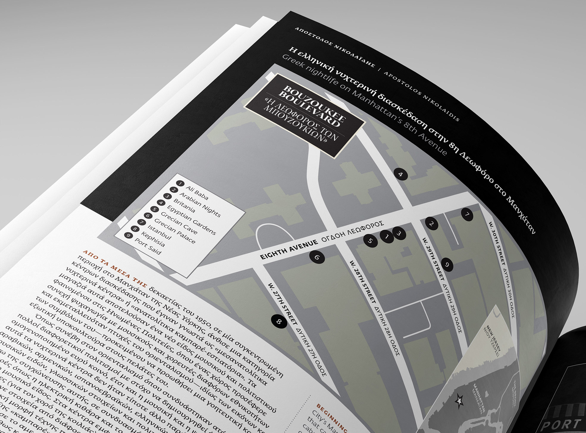
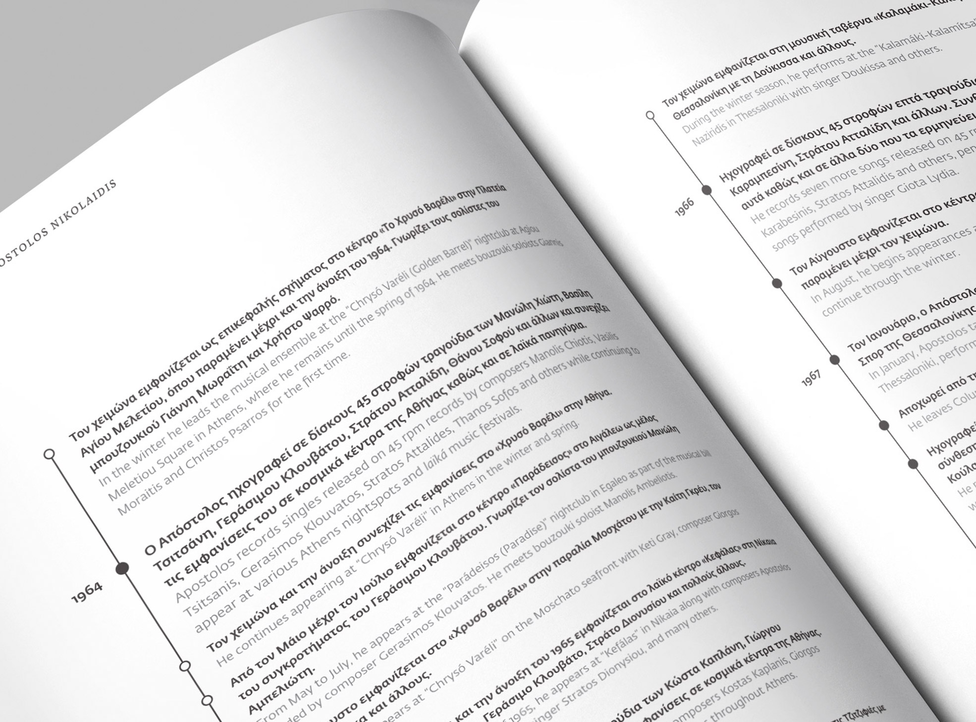
Apostolos Nikolaidis: The Authentic Laïká Singer Who Was Never Censored is a comprehensive visual monograph on the career and artistic contribution of Apostolos Nikolaidis (1938–1999), a singer of Greek laïká (urban folk music) whose career spanned four decades. He was the first Greek artist to record “prohibited” rebétika songs with their original lyrics in the early 1970s when this musical genre was banned in Greece. His vocal interpretations caused a stir and delighted Greek music audiences worldwide. The bilingual book (Greek and English) was researched, written, and designed by the late artist’s daughter Maria Nicholas and published by Marilou Press in 2022.
Typographical considerations weighed particularly heavily, not least because one of the book’s main objectives was to be fully bilingual. Fedra was strongly considered from the start; several other families were evaluated as possible choices. Besides its versatility, extensive stylistic sets, and readability at small sizes, Fedra’s visual temperament suited the book’s content well.Fedra Serif A was used for the Greek text and Fedra Sans for English. Fedra Sans was also used for the many captions in the book (both Greek and English), whileFedra Serif Display was used for the cover titling.
Although the book is fully bilingual, Greek is the visually dominant language. The designer chose bold weights where necessary and a 70% black shade for English to make it easy for Greek readers to peruse the content while keeping it accessible to English readers.
See the original version of this contribution on Fonts In Use, contributed by Maria Nicholas.
Dmitro Bortniansky Fürstenberg/Havel Tauentzienallee 39 připomínajících
Jan Václav Stich Jardins Sisneros D-33 weltraumtechnik Bourg-en-Bresse
prodigieusement Saint Petersburg skeiðarársandur Hyacinthe Jadin
Απόστολου Νικολαΐδη (1938–1999) saltvandsområde preponderations Puebla–Tlaxcala
Know your character, show your character
Together, the typefaces on Fontstand support the use of a huge number of languages, symbols, and characters. When searching for typefaces that support your project’s typography, the Fontstand app offers helpful filters, such as “language support.” Not sure what language you’re looking for, or looking for a font with a non-language character such as a ☛ manicule or → arrow? Also possible. Simply type “char:” plus the character (or its Unicode value) in the search bar and hit enter. The app now filters all fonts for the presence of that character.
The combination of machine-imposed restrictions and a writing system with multiple shapes per letter is enough for a separate blog post, and Zoghbi luckily wrote it. In 2014, he dug deep into the history of Arabic typewriters resulting in a grungy typewriter face, and a readworthy blog post that presents a quest for machines in Syria and Lebanon, plus artifacts, ideas, and technical constraints for turning mechanical lettering into a digital font.
Like borders, writing systems are human inventions. Any script history encompasses individual lives and geopolitics. On their Instagram channel, Type.today (re)writes the history of Cyrillic. Hopefully, the posts will soon be compiled on their website. Until then, read individual posts on Soviet Cyrillization or Bulgarian Cyrillics.