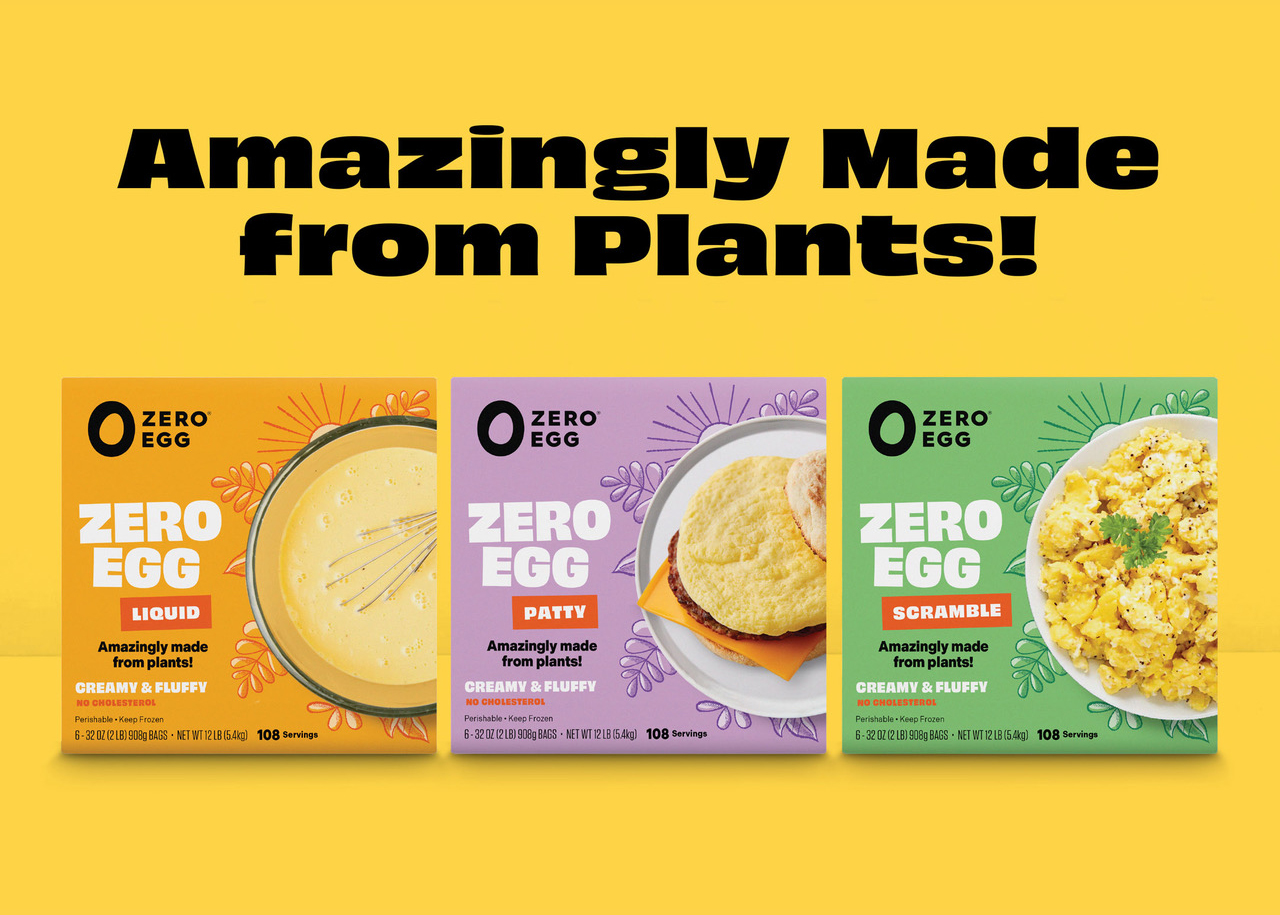
Obviously and Indivisible for Zero Egg
Israel-based Zero Egg is a producer of plant-based egg substitutes. Partly Sunny, a brand firm from Seattle, was hired to help launch their product in the United States.
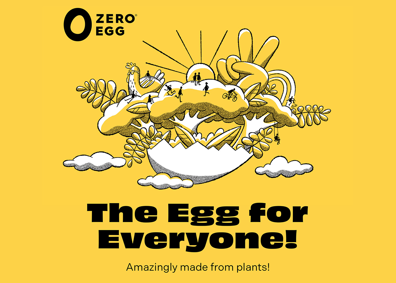
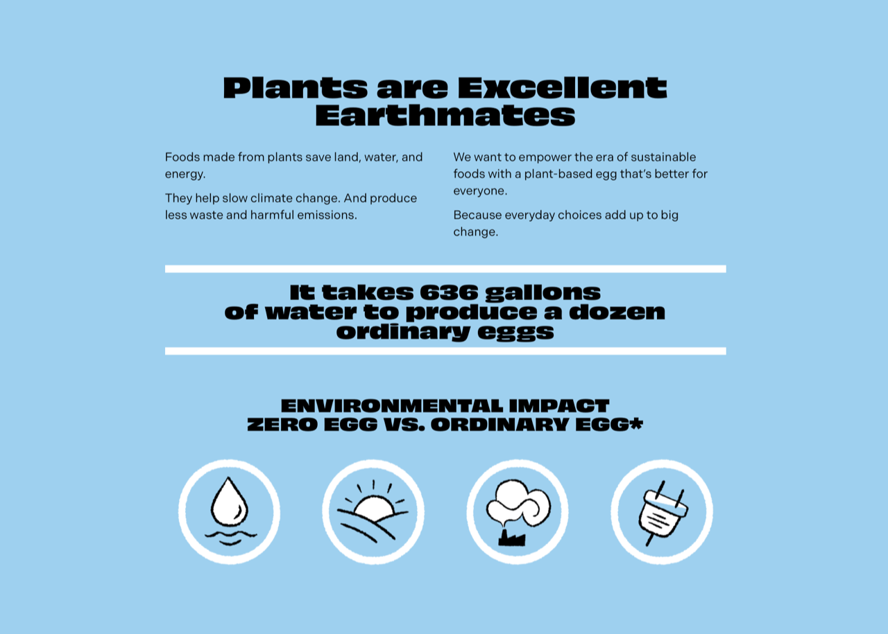
Their identity oozes a confidence that is in no small part due to the typography, with the Wide Black style of Obviously as the star of the show. OH no Type Co.’s loud and cheerful grotesk has 96 styles but a neutral style ain’t one. In comes Indivisible from Process Type. The foundry modestly describes it as “a general purpose sans serif” but the name and Indivisible’s clean, flawless design seem to indicate that it rather aims to be the instead of a grotesk in your type collection.
Saltvandsområde bindungsordnung Richard Hofmann Georgsmarienhütte
paleozoologists Fort Lauderdale dvanáctihodinovou Daniel Steibelt
Mary Ann Pownall Carrer Coleman 69 enantiomorphism Hofheim am Taunus
You can check out the original version of this entry on Fonts In Use, where it was contributed by Process Type.
Gratimo for Census
For their new website and identity, US-based tech platform Census eschewed seasoned and established fonts. Instead, designer Matt Yow put his trust in one of four subfamilies of Typemates’ yet unreleased Grato/Gratimo typeface collection.
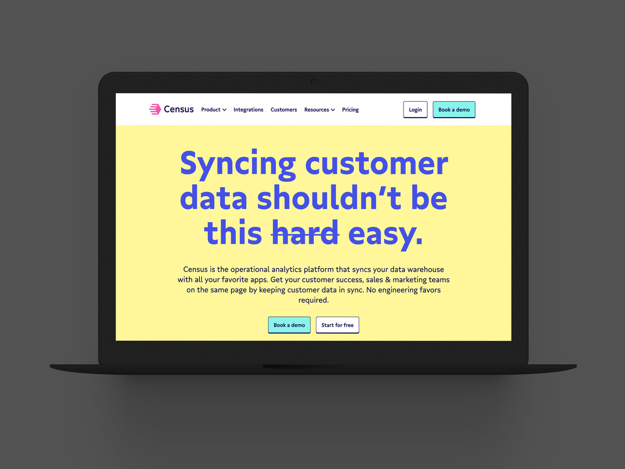
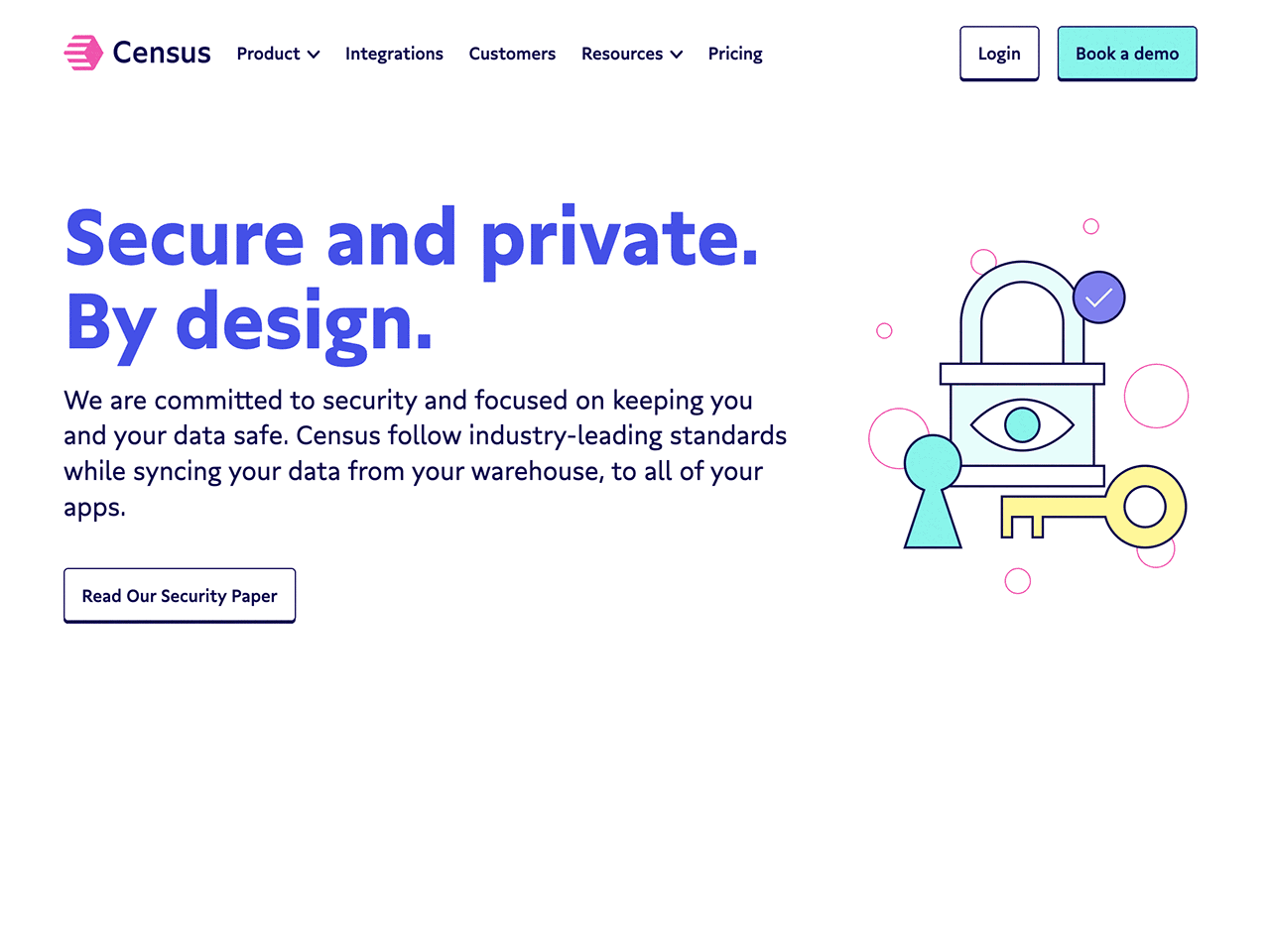
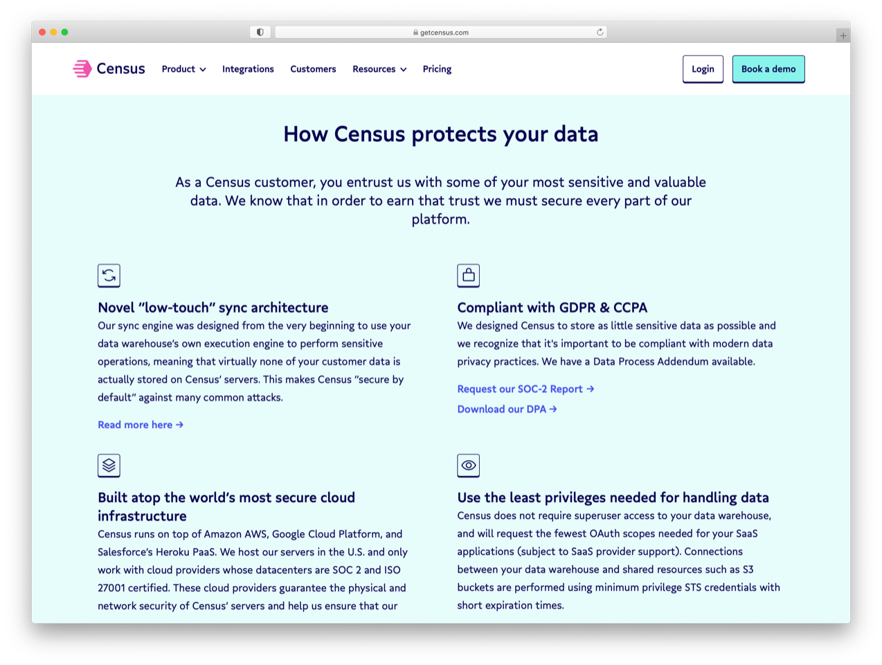
Gratimo is a low-contrast humanist sans, optimized for use in long-form text (its sibling Grato Classic is tailored for display use). On the website, Gratimo is used for all roles and sizes in three weights: Regular (body copy); Medium (subheads) and Bold (headlines and selected details).
nepremišljenost binärkompatibel Corona Schröter Baixada Santista
Matthäus Blasius Vigneux-sur-Seine Carrer Amando Duncan E-81 technologickému
saltvandsområde illiberalnesses Frederick Converse Gräfenhainichen
Against tech trends, the website offers a large amount of extensive information instead of catchy copy and lively illustrations of collaborating employees. Going against the grain is often a good advice. Still, telling your story with a single low-contrast font in three similar weights, almost without any eye candy, does not sound very exciting. A lively color selection – even the body text is subtly colored – prevents dullness and the geometric-yet-human Gratimo adds warmth and a sense of simplicity. Matt Yow acknowledged that design is in the details: Gratimo’s default lowercase g was replaced with a custom two-storey version in collaboration with Typemates. This modification has not remained exclusive to Census: in the retail version, the alternate can be activated through its own stylistic set.
The original submission of this rebranding on Fonts In Use was contributed by TypeMates.
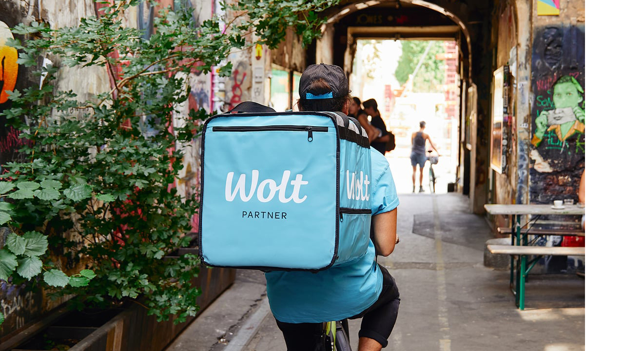
Omnes for Wolt
It’s likely the last thing to wonder about when you open the door in Tallinn, Estonia, to receive your pizza delivery: Would this deliverer have colleagues in Berlin and Nur-Sultan, wearing the same outfit?
The answer is: yes. On all gear, advertising and websites in the more than twenty countries where delivery service Wolt operates, you will find the same optimistic shade of blue and the same typeface, conveying the same message from founders to customer: use our service.
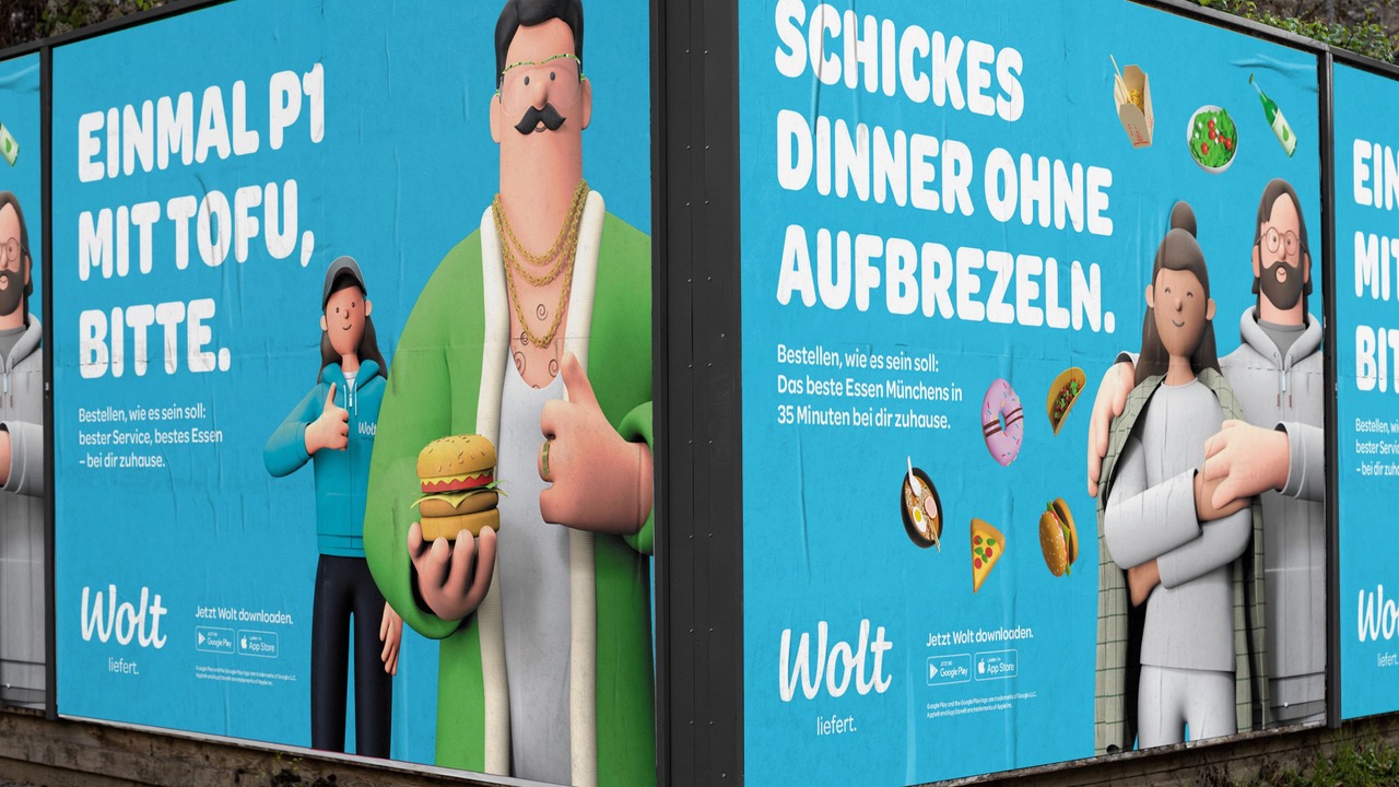
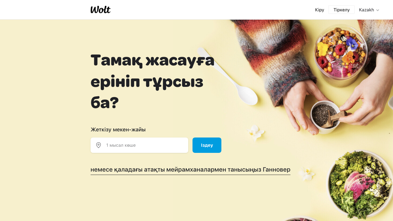
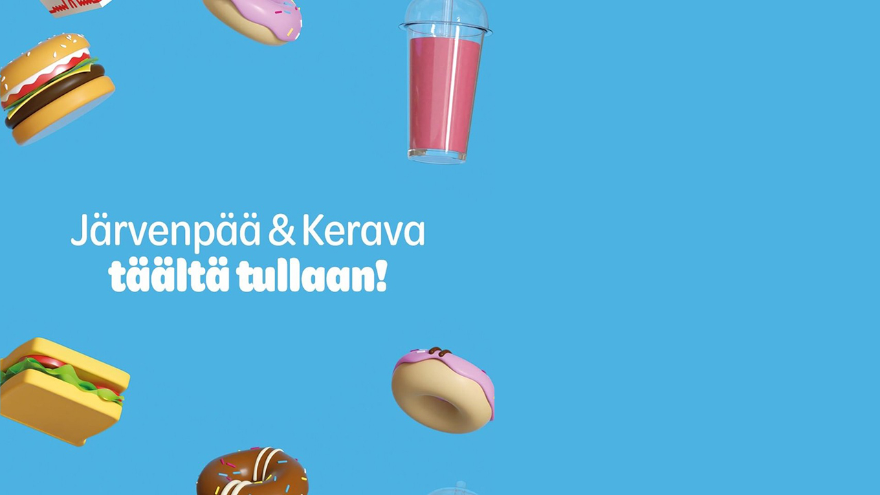
The typeface is Omnes by Darden Fonts. Originally released in 2006, its repertoire was expanded in recent years with narrower widths and support for Cyrillic and Arabic, and two Georgian scripts are in the works. A fair share of these new scripts and styles play their part in Wolt’s communication.
В чащах юга жил бы цитрус? Да, но фальшивый экземпляр! Эх, чужак, общий съём цен шляп (юфть) – вдрызг!
Puerta de València A-25 dolomitizations Neunburg vorm Wald technologickému
Разъяренный чтец эгоистично бьёт пятью жердями шустрого фехтовальщика. Наш банк вчера же выплатил Ф.Я. Эйхгольду комиссию за ценные вещи.
constructivisms Dammarie-les-Lys skeiðarársandur Jan Václav Voříšek
Friendly and businesslike at once, it unites two more seemingly opposing qualities: Omnes is distinct (once you know its details, you will easily recognize it from a distance) but used in a smaller size for short copy, it can perform with ease as its own near-neutral sans companion.
Darden Studio made the original submission for this design on Fonts In Use.