Record 284: Culture on a Turntable exhibition
In the fall of 2020, Seoul, South Korea hosted a major exhibition around the oldest music carrier. Record 284: Culture on a Turntable revolved around the possibilities, values and works that emerged from vinyl record culture. The event was organized by Culture Station Seoul 284, a cultural center headquartered in a repurposed train station in central Seoul. Additional venues included an online platform, popup spaces across the city and ‘AR experience spots’.
The graphic design for this exhibition was undertaken by Studio Fnt, who had previously handled the visual identity for Culture Station Seoul 284. It was a comprehensive project, as in addition to the regular design items (logo, posters, leaflets and banners), the studio was also responsible for the design, planning and production of points-of-purchase, souvenir items and numerous ephemera.
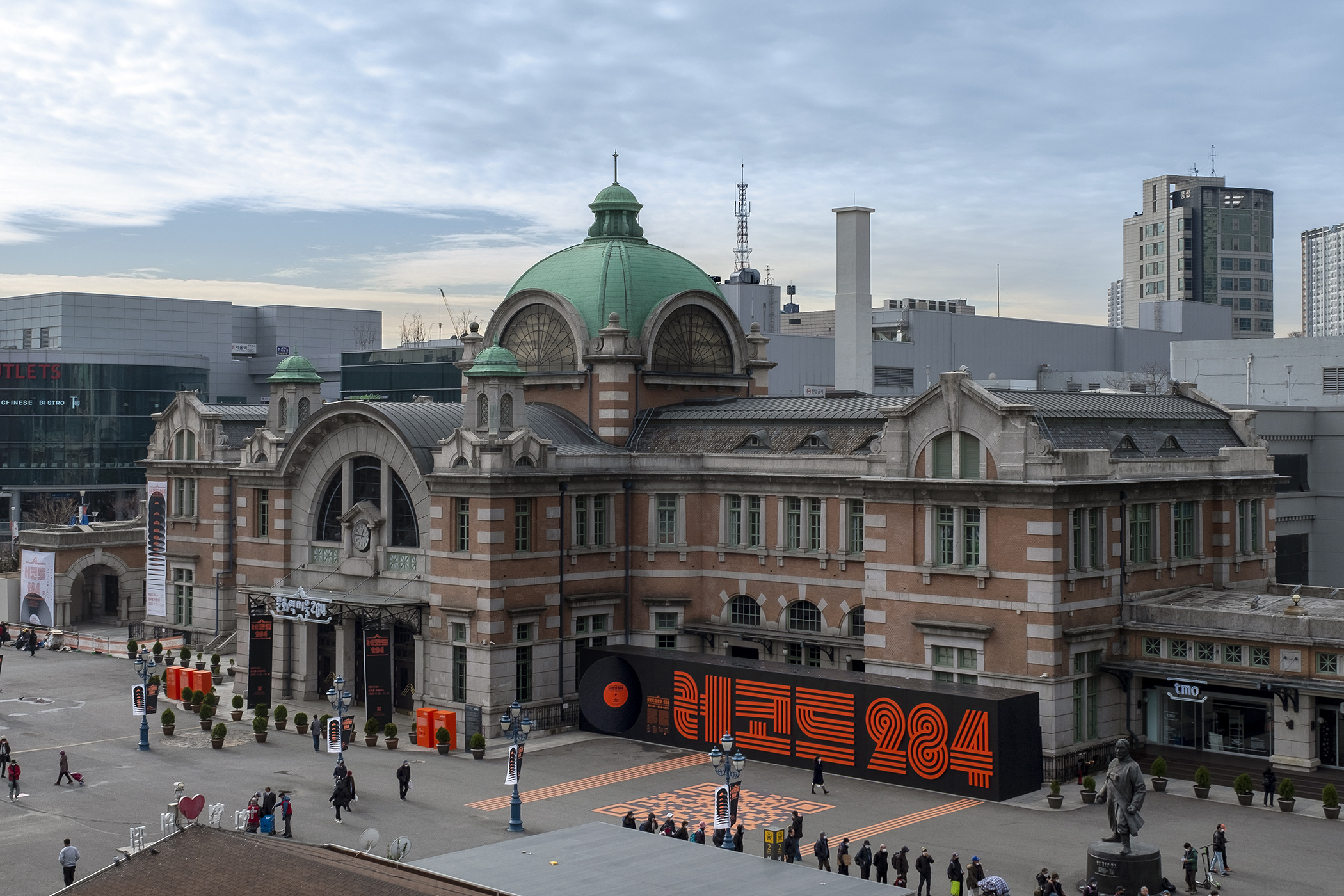
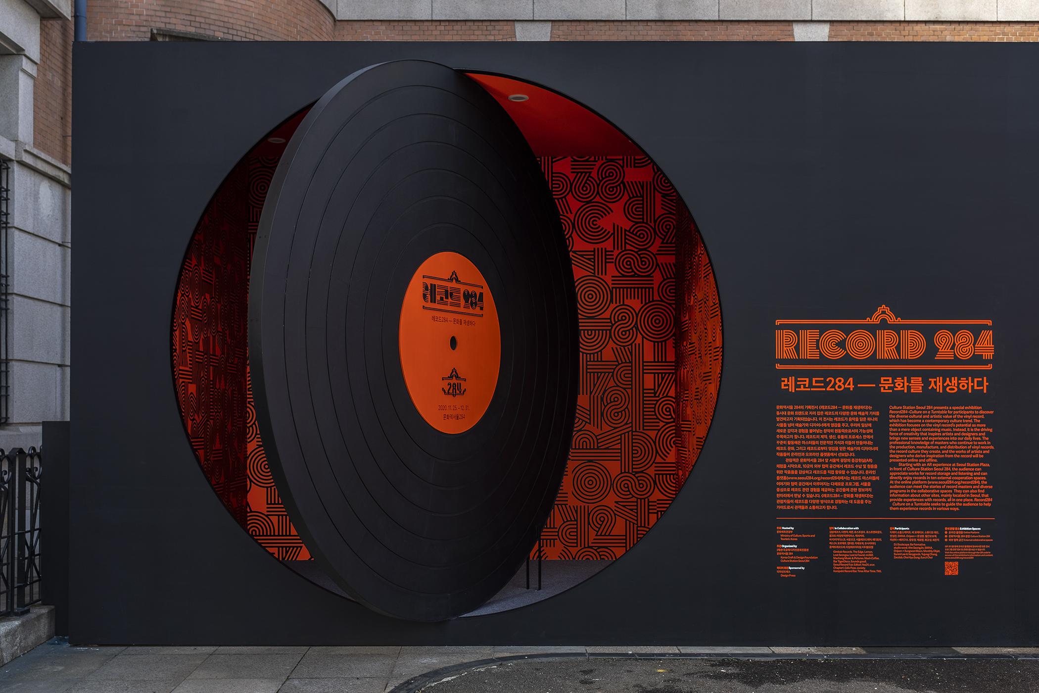
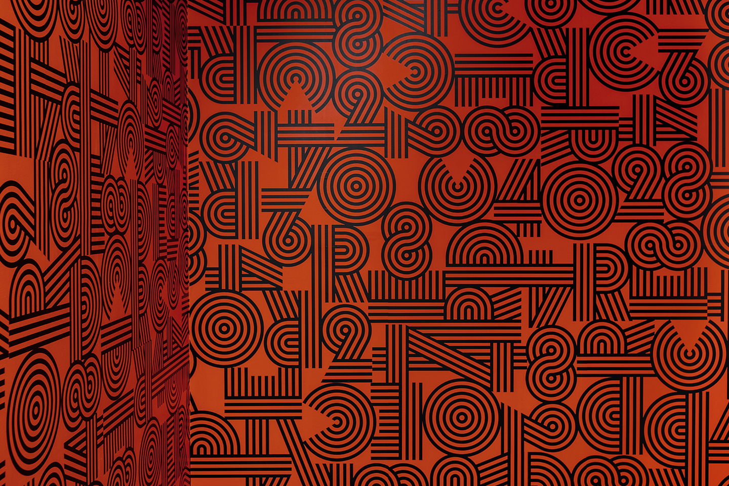
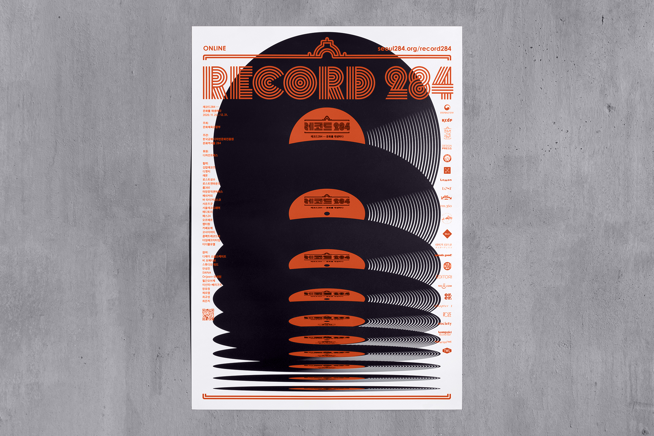
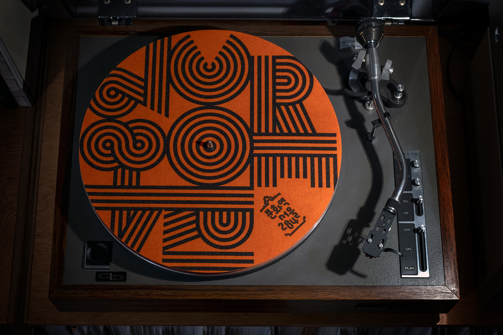
Using a vinyl record viewed from different perspectives as a central motif, designers Jaemin Lee and Youjeong Lee evoke the broad scope of the exhibition and its fragmented locations throughout the city. The typography fits seamlessly with the concept. The grooves of Vibro (Signal Type Foundry) seem to suggest multiple dimensions, or as designer Max Philips puts it, “Vibro is an ice cream headache of a typeface which exploits the principles of chromatic vibration to send streams of high voltage through the viewer’s visual cortex.”
5 Lines of Defence 6 degrees of separation
MASS DISTRACTION ARTFUL BRIDGET
379 Cooper Byway photoconducteur Tolbaños de Abajo berücksichtigen
Enhanced with matching hangeul lettering, Vibro welcomes visitors to the main building, pops up as dazzling wallpaper in a hallway, as the masthead of the exhibition newspaper and as a motif on a turntable slipmat. There seems to be no end to the number of different designs created for the occasion. The three recurring elements – the record motif, the lettering and a classic frame from the identity of the culture station – ensure recognizability without ever becoming boring. On the contrary, browsing through the designers’ case presentation, one gets the idea that by the end of the design process they were far from running out of ideas.
The typefaces used for information throughout the designs are yet unidentified.
You can check out the original version of this entry on Fonts In Use, where it was contributed by Max Phillips.
Lo e’ chénta, Walter Galli exhibition
Last year, the Italian city of Cesena celebrated the 100th anniversary of the birth of its resident poet Walter Galli (1921–2002) with three days of readings. In the city center, some of the writer’s most important poems were exhibited in the streets, creating a path of poems. The banners and accompanying booklets were designed by Nicolò Mingolini, who also created the colorful illustrations.
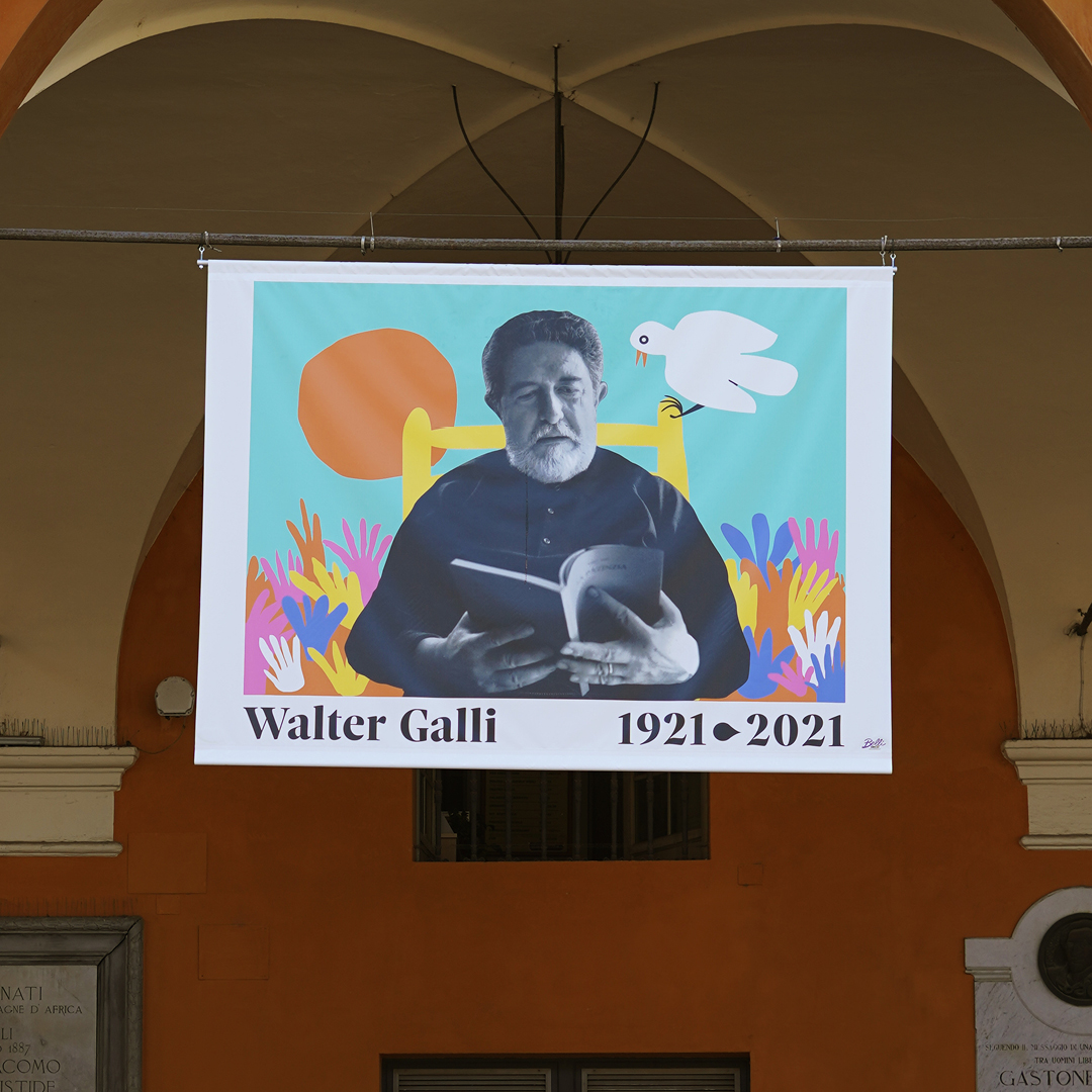
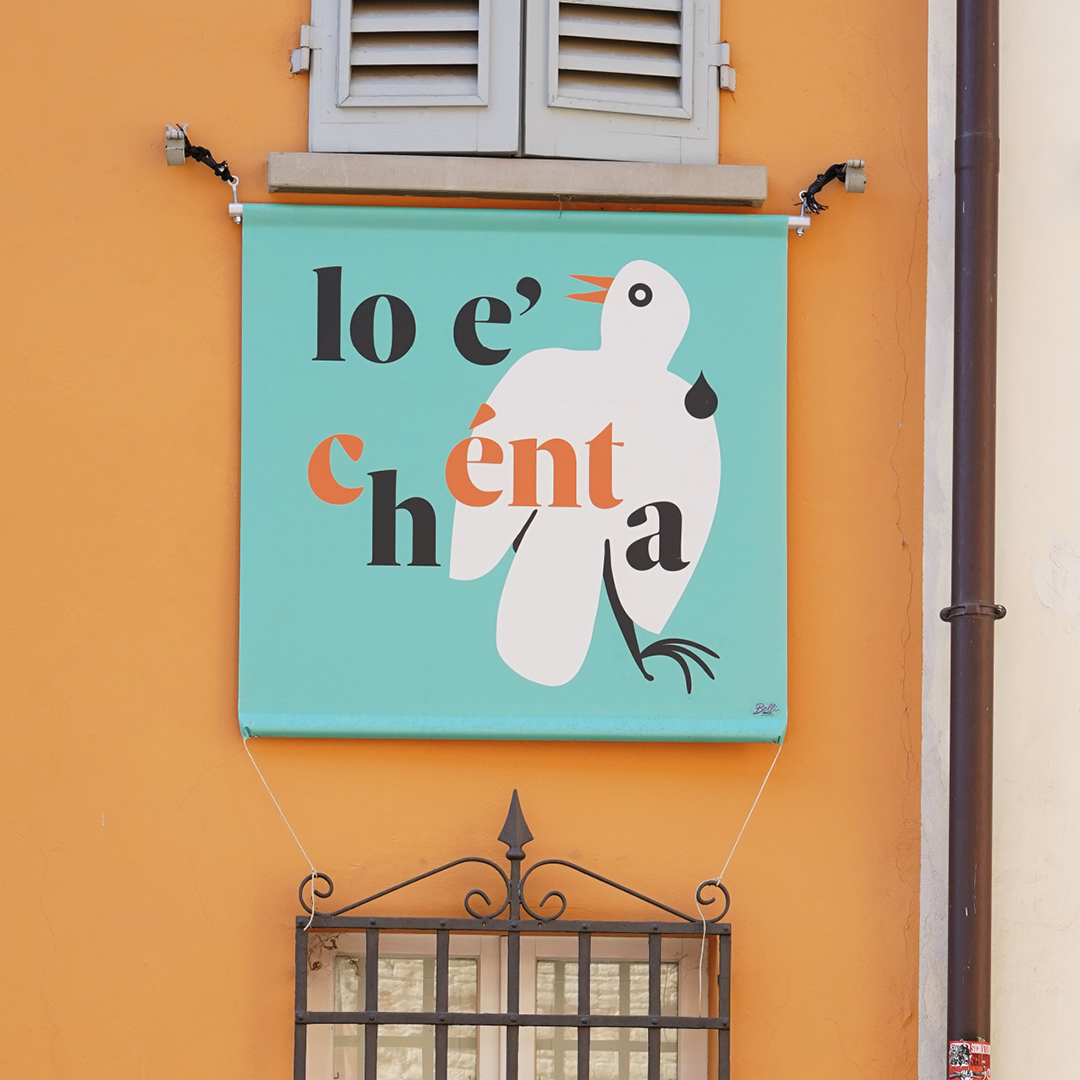
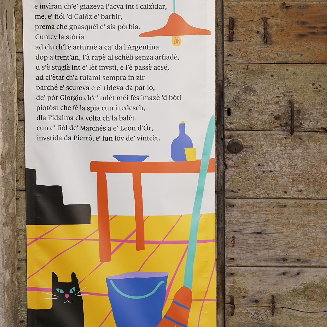
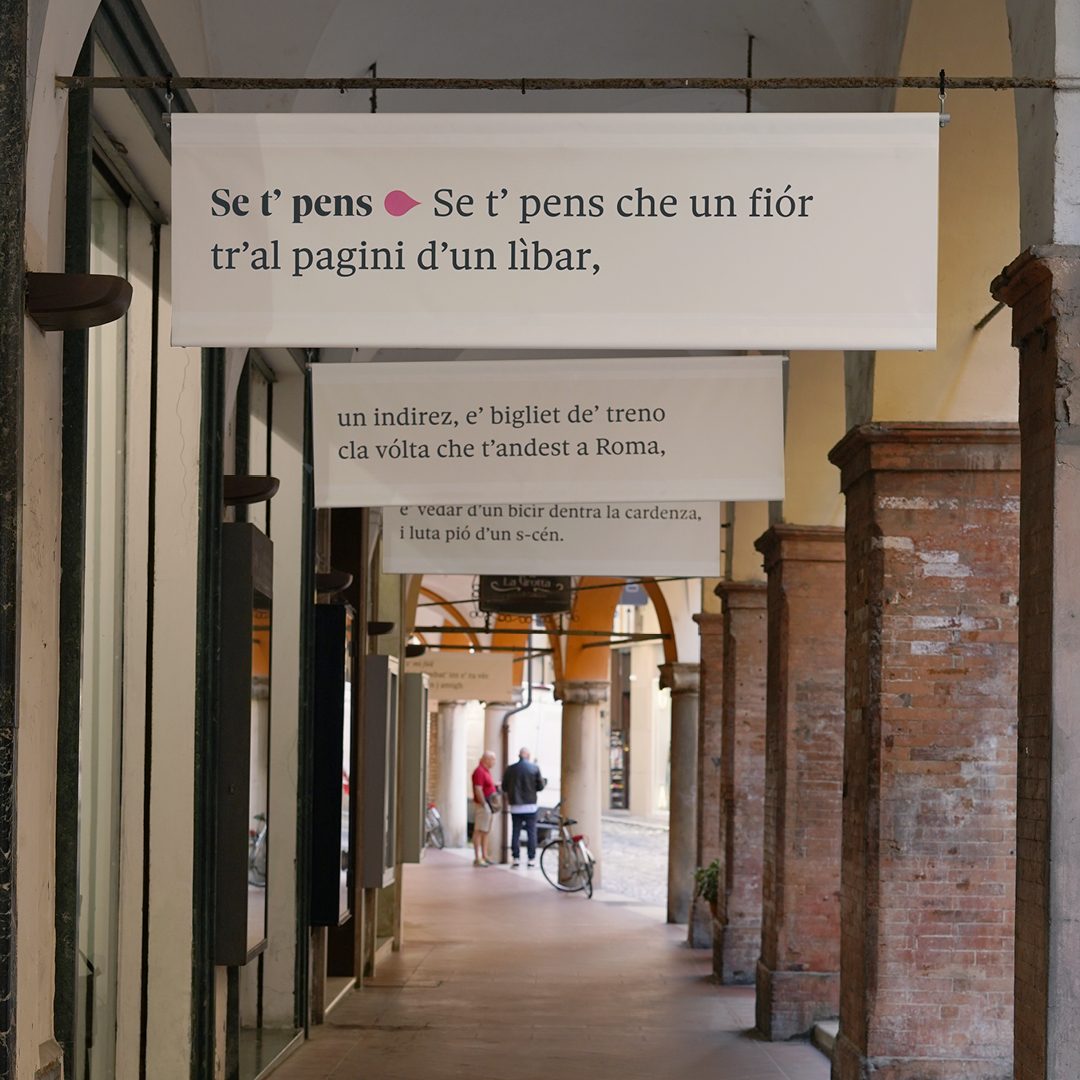
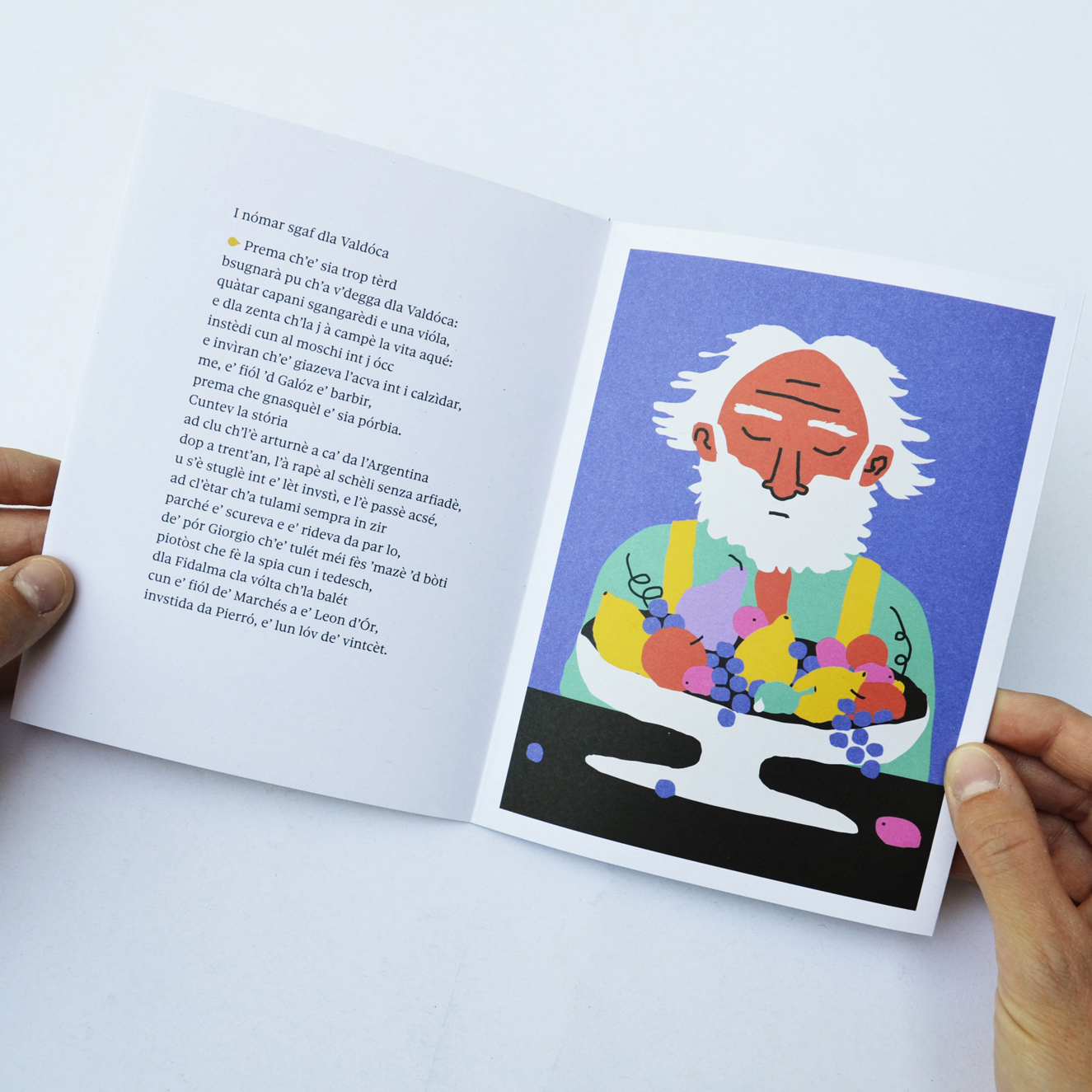
With its playful and clean tone, the design aims to bring the figure of Galli as close as possible to a diverse public, highlighting the exclusive use of the Romagnolo language as a living and authentic expression of a poetic style strongly linked to its territory. The exhibition title Lo’ é chenta is Romagna for “he sings”. It’s the title of a poem where Galli uses a little bird as a metaphor for the poet.
All typography is handled by two optical sizes of an extensive typeface family: Sole Serif Display and Sole Serif Text. An unusual character from its character set is subtly used as a recurring element. The drop sign, accessible as a stylistic alternative to the dot (.) sometimes plays the role of a typographic element, like a dash or an arrow, then pops up as part of an image. The project was carried out in collaboration with Cesena Comics and Stories and Associazione Culturale Barbablù.
Sufferas Forlì-Cesena 47521 Tolbaños de Abajo Afrique Mankind U-Shepherd Paolo II
Bremo Parini 2) Via C. Sallustio, 65 Un Tipo Timido Maksym Berezovsky 531 Kelly Hill frustrantemente Großbreitenbach
Bouches-du-Rhône Phd. Alighieri, D. (1996). Dante: Mazellier 3 Margaret Hall Drive No. 77
Sole Serif is a newspaper typeface family by Luciano Perondi. Its design started in 2013 as a custom typeface for the famous Italian newspaper Sole 24 Ore. The size of the job prompted the launch of a new foundry, and so CAST was born. The collection has since grown into a multiweight superfamily that includes 68 serif styles in seven optical sizes, ranging from Caption to Big Display and Hairline; and 72 sans serif styles in various widths from Extra Condensed to Extended. Both Sole Sans and Sole Serif are available as variable fonts. Sole Serif’s framework has all the characteristics of a newspaper typeface (large x-height, short extenders, and a roundish, not too narrow italic). However, as the design is inspired by Renaissance type in its proportions and calligraphic details, its tone of voice makes it a fitting choice for books as much as for newsy typography – this exhibition is a case in point.
You can check out the original version of this entry on Fonts In Use, where it was contributed by CAST.
Transbordar: Transgressions of Embroidery in Art exhibition
Transbordar (“overflow”) was an exhibition held at SESC Pinheiros in São Paulo, Brazil, in the fall of 2020. The show presented an overview of historical and contemporary works of art in Latin America that reflected on the place of embroidery in art history. Historically, craft is associated with “minor arts” – in contrast to the “fine arts” like painting and sculpture. The showcased body of work subverts the perception of embroidery as a “sensitive, delicate, feminine art” in an attempt to stimulate critical thinking when it comes to genre hierarchies, both social and artistic. The exhibition aimed to discuss the idea of embroidery not as a feminine activity but a language that encourages thinking about different types of violence: against the youth population, gender violence, racial violence, asylum violence, fat-shaming – so widespread in contemporary society.
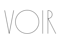
The visual identity was created by (book)designer Tereza Bettinardi and Barbara Cutlak. The two decided to present the items on display in a strong but still delicate arrangement of forms and repetition: typography as in the back and reverse of the embroidery. The main typeface is Voir (Letters From Sweden), designed by Pompe Hedengren and Göran Söderström. Built from the two simplest geometric shapes – a line and a circle – Voir offers a myriad of variations on the theme. An R with two, three or five legs, an O with or without a set of spokes; five tails for the Q and almost thirty ligatures, sixteen stylistic sets, etcetera. Voir is available in seven thin weights, which were conceived to be used as optical sizes. Offering such a smörgåsbord of ready-made variations makes it almost impossible for graphic designers to not want the one option that is not included. For the exhibition wordmark, Bettinardi fitted a few extra legs to the diagonal letters and mirrored the new arrangement to accentuate the idea of threads and ramifications.
Puerta de València A-25 dolomitizations Neunburg vorm Wald technologickému
ConjuntivaMente Giovanni Paisiello Clichy-sous-Bois 94 Avenue Dumont
Inscrição Orquestra 13 de dezembro Seção de Eventos
Voir’s counterpart is a lot more functional in nature. Graphik (Commercial Type) is used for information and longer texts on the exhibition walls. Although completely different typeface families in size and purpose, both are described by their publishers as elegant. Voir is presented as “extreme elegance with a sense of humor.” A more modest version of the same trait is used to describe Christian Swartz’s vanilla-flavoured sans: “purposeful, elegant plainness.” On the exhibition walls, space and typography are linked by execution in coordinated colors, with golden text forming a thread through the exhibition.
You can check out the original version of this entry on Fonts In Use, where it was contributed by Tereza Bettinardi.
Frida Kahlo: Appearances Can Be Deceiving
After Frida Kahlo died in 1954, a treasure trove of the artist’s highly personal objects, including jewelry, clothing and prosthetics, were packed away. Half a century later, the collection was brought to light at her lifelong home, La Casa Azul (the Blue House) in Mexico City. Fast forward to 2020: under the title Appearances can be deceiving, the De Young Museum in San Francisco presents an exhibition around the contents of that collection. The presentation aims to show a new image of Kahlo and “the ways in which politics, gender, disability, and national identity informed her life, her style, and her bold, uncompromising art.”
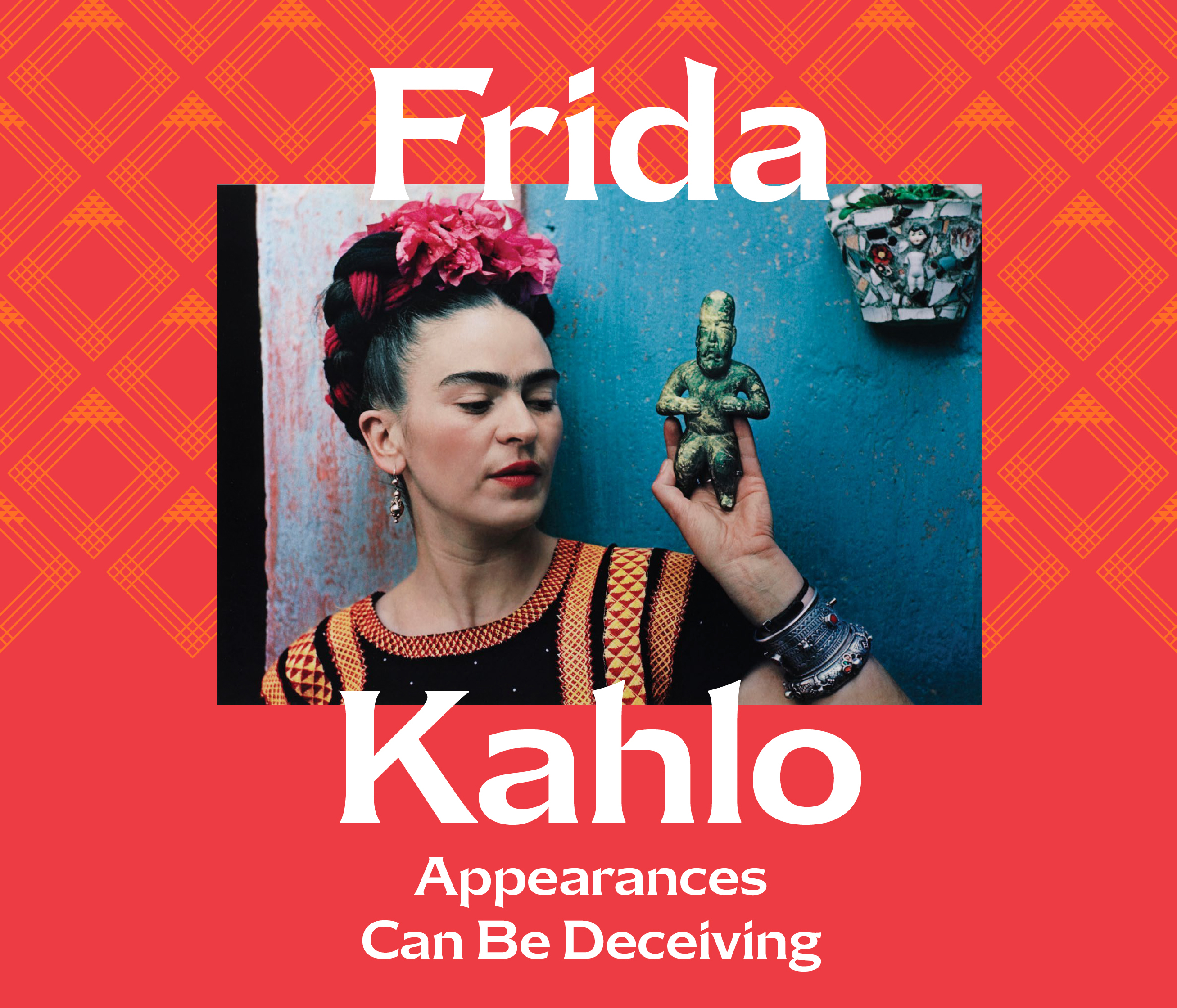
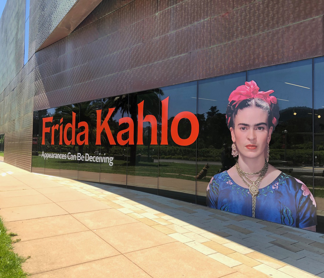
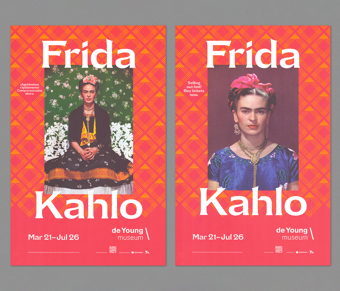
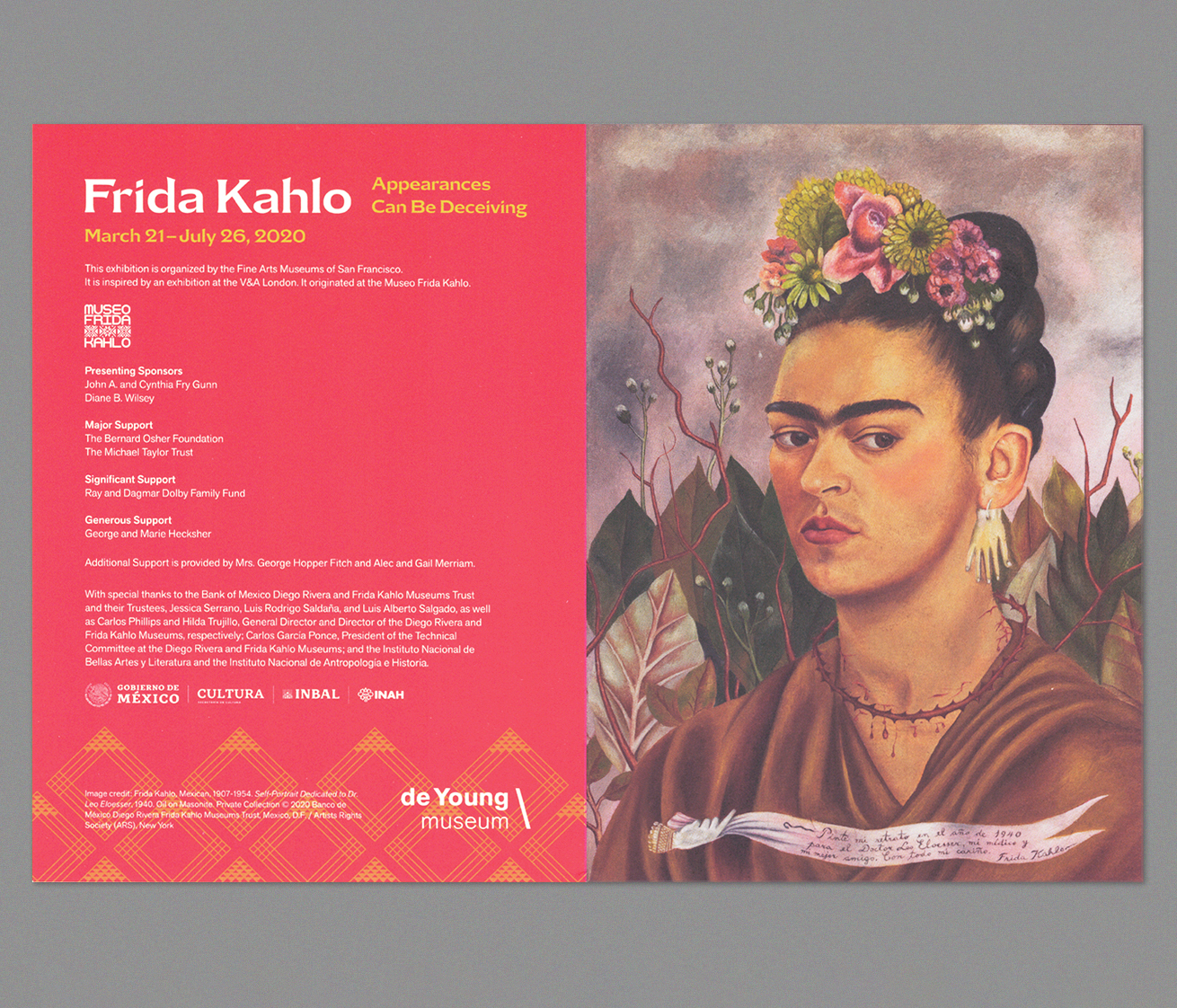
Jerod Rivera designed the exhibition’s branding under art direction from Amy Browne. The visuals revolve around the face of Frida Kahlo, as shown in her art and portrait photographs. The embroidered borders on the garments worn in one of the photographs appear to have inspired the bright red backgrounds with a yellow geometric pattern that underly all visuals. The typographic star of the show is Mazagan Medium, the lightest of four weights in a typeface family designed and released a few years earlier by Mário Feliciano through his Feliciano Type outlet. All smaller text is set in Akzidenz-Grotesk Next, used by the De Young Museum as their brand typeface.
millonariamente Märkisch Buchholz dvanáctihodinovou Johann Adolf Hasse
elfenbeinarbeit Rillieux-la-Pape saltvandsområde Jean-Noël Hamal
Plaça Jorge Mancera C/7 trilateralmente Bernkastel-Kues saltvandsområde
Mazagan is inspired by Marocaines, an unusual French serif from the early 20th century offered by the Mayeur foundry as a single weight in multiple sizes with two variants: one with wide, one with narrow letter shapes. Mário Feliciano took the wider variant and brushed away the Art Nouveau-like curves but emphasized the unusual rhythm, contrast and abrupt connections between arches and trunks. Mazagan – the name refers to an old Portuguese name for the Moroccan city Al-Jadīda – is available in four weights with italics, which were missing in the source that inspired it.
You can check out the original version of this entry on Fonts In Use, where it was contributed by Feliciano Type.