Seb McLauchlan runs his practice from London and works with studios and clients internationally. Originally from New Zealand, he moved to London in 2015 and has been working in between type and graphic design ever since.
(Michela Zoppi) How did you start with design and move to London?
(Seb McLauchlan) I went to Massey University in Wellington, where I attended the branding and identity design course. Interestingly branding was, and still is, the main design field in New Zealand; designers sustain their practice mainly through working with food branding, packaging, and adjacent sectors, like makeup, skincare, etc. Alternatively, they verge towards tech and the design of websites and apps.
Back in 2011–13, my university friends and I were looking for fertile ground, searching for what else there was to the discipline, and so we got involved with the internet, Twitter in particular, which was a very different platform at the time. We were really seeking something different, away from branding, and that’s when I found Kris Sowersby’s blog – who started Klim Type Foundry in 2005. Looking back, I can see that there was definitely an initial interest in typography, as I was playing with typefaces in a very immediate way, but his work changed my intentions completely.
(MZ) So then where did you learn how to design type?
(SM) I remember reading an interview with Kris – who is also from New Zealand – where he explained that no one was able to introduce him to the drawing programs, so he had to learn type design by himself. At the time, type design wasn’t really a thing in New Zealand, and little information circulated online. His example made me want to pursue design as a professional career, so when I was about 20, I started sending my work to Noël Leu and Thierry Blancpain from Grilli Type. Even though some of the projects were still very rough, they could see the work getting better, and when eventually they were looking for an intern, I applied. I moved to Switzerland for three or four months until I had to go back to finish my course.
We agreed to keep working together for the following months, and out of that collaboration came GT America. The type, an exploration of 19th-century American Gothics and European Neo-Grotesk letterforms, was a very large project and a huge learning curve.
At that point, I was already in conversation with OK-RM, who were looking for a designer in London. Joining OK-RM was a conscious choice. I wanted to learn not only how to make typefaces but also how to use type well in graphic design. I think the experience fundamentally shaped the way I design fonts and approach projects today; I needed that connection between type and graphic design, and also to understand what designers are looking for in typography.
(MZ) What was the first type you made with OK-RM?
(SM) Real Review by Jack Self was one of the first projects I worked on. There was a proto-typeface around that time that I was playing with, and those drawings eventually helped me with Gestalt, the official type of RR.
In 2015/16 a fully variable font was quite a novelty; Gestalt confronted the classic grotesk typefaces: Helvetica, Univers, Akzidenz-Grotesk, Folio … The aim was to boil down these faces – forgetting a little about the different proportional and contrast nuances, to remain with a set of basic, alternate shapes. Some were slightly more geometric, more aggressive, or humanistic, but all were interchangeable – why choose one when you can have them all? So the originality of Gestalt was in its mechanism, in its application, and in the conscious decision of saying “We want to use all these typefaces we like, all together.”
The uniqueness of Gestalt was the coding system more than in the drawings. The code would allow you to integrate alternative glyphs with a pseudo-random cadence as the text is composed – but mainly, it’s the expertise of the designer to typeset and appropriately swap and jumble up the letters as needed. Now it might be quite passé as an approach, but it was interesting for its time.
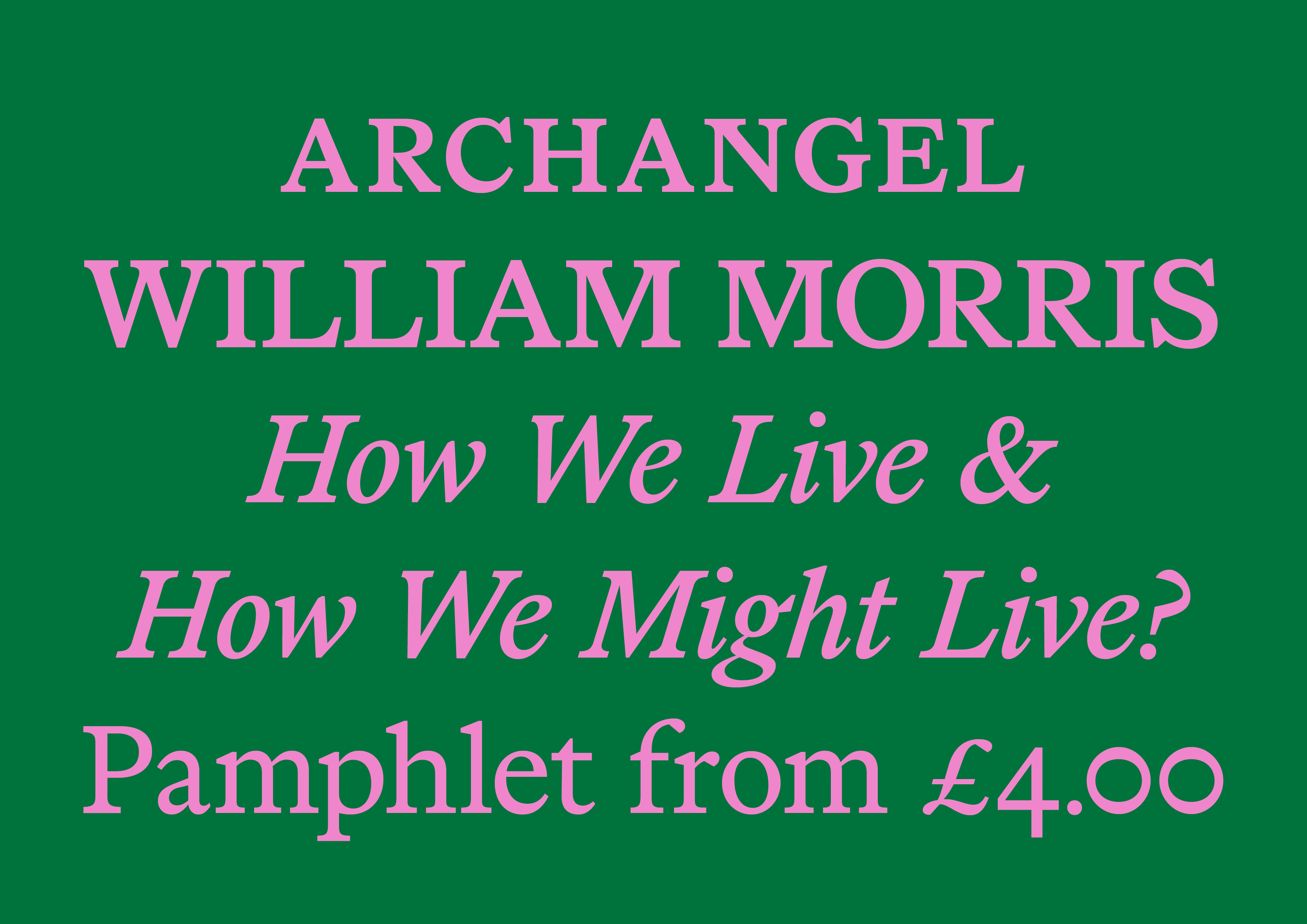
Marist, designed by Seb McLauchlan and published by Dinamo, is a warm, reader-friendly typeface with prominent serifs and wide uppercase proportions. Its forms are inspired by the overlooked Old Style genre. Specifically, two prominent typefaces served as models: Nicolas Jenson’s roman from 15th-century Venice and William Morris’s Golden Type from late-19th-century England. Morris’s Golden Type celebrated craft aesthetics from the past and questioned society’s reliance on technology. Marist picks up some of Morris and Jenson’s threads—fine-tuning their forms for contemporary eyes and digital libraries.
(MZ) Did Gestalt motivate certain questions for you that you then answer by making other work?
(SM) I started drawing Gestalt pretty early into my practice, so it was fairly uncharted territory for me. One of the main questions that came up eventually was “Why draw a new Helvetica?” But also, where do you go from there? What is missing in the genre and could be relevant today? Many of the types that came after, like ABC Ginto, ABC Marist, and the unreleased Schengen, all share a similar mode of creation, which is to look at a particular genre, mood, or style and get inspired by the culture around it. Usability and reference are entwined in my process, and this methodology started with Gestalt.
For example, when I started drawing the geometric-humanist typeface Ginto, Antique Olive was a huge reference for a long time; but at some point, I stopped looking and moved on to something else. I needed to broaden the view towards what else is there in the canon, but also what else represents an opportunity. After some time of looking elsewhere, my mindset changed, and the distance to that work did too; this allowed me to be more brutal and more confident in making design decisions.
In addition to all this development of the work and my practice as a designer, meeting Johannes and Fabian from ABC Dinamo was a huge moment in my career. It is really through our work on all of these projects and our constant conversations that I have begun to feel more confident in my work – I owe them a lot.
(MZ) Can you tell us more about the unreleased Schengen?
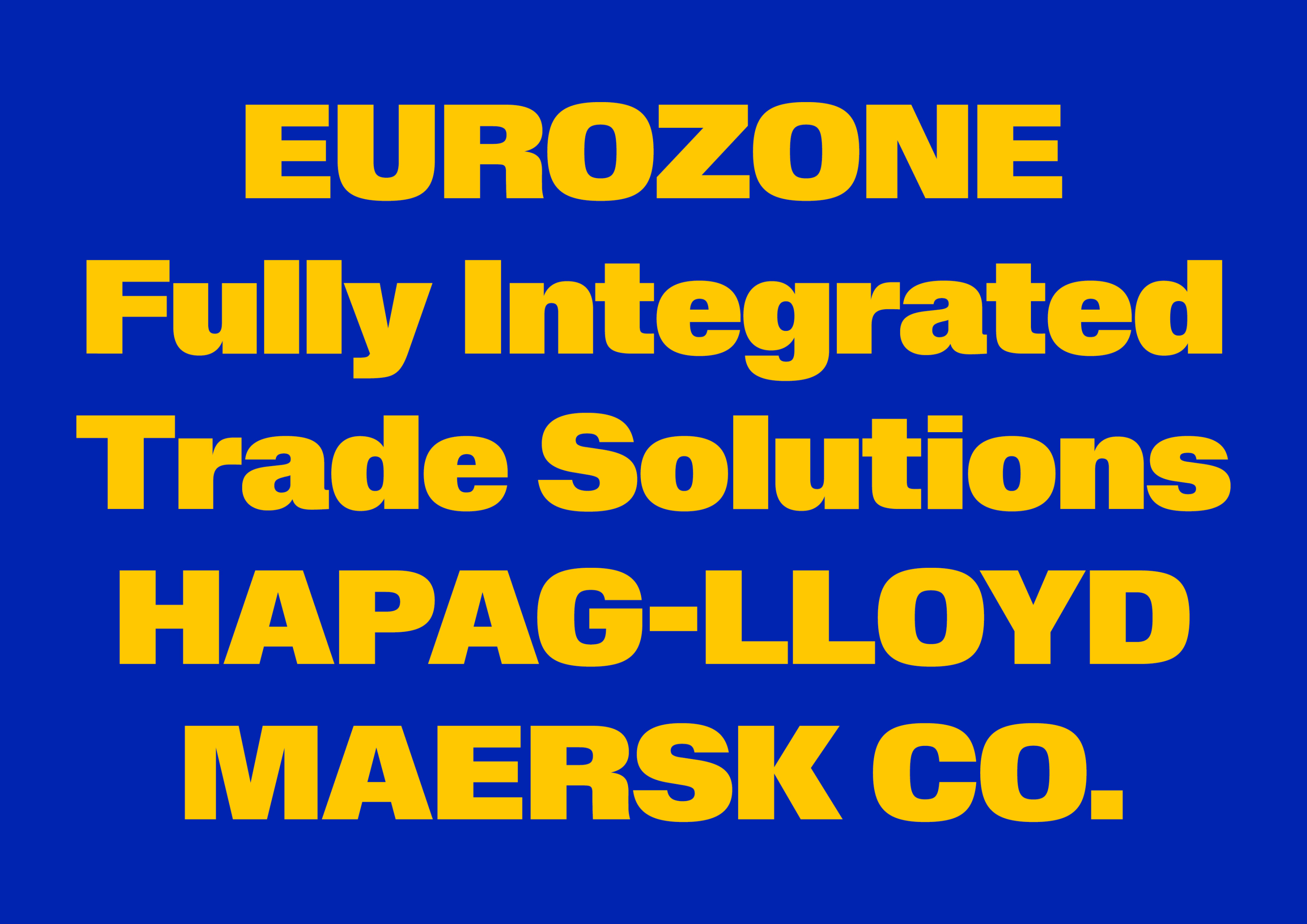
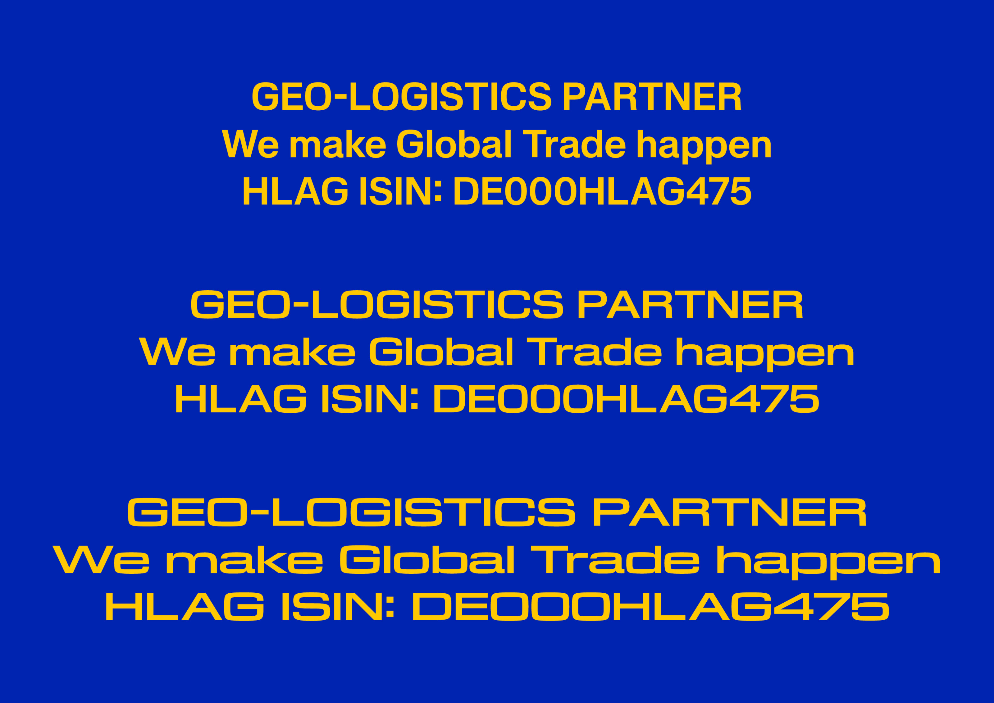
(SM) Schengen is a work in progress, with at least a couple of years to go. The idea at its current stage is to look at Helvetica and Eurostile and how these two typefaces have been adopted so heavily in transport and big vehicles for commerce (containers, trucks, shipping companies) so that they have absorbed a certain visual language related to masculinity: communicating power and strength. Alongside the cultural factor, I was curious about the possibility of making a wide monospace, and Schengen represented a good opportunity for testing my ideas.
(MZ) Alongside this work, you are also an educator, did you bring this experience with you when teaching at Kingston School of Art?
(SM) During my three years as a lecturer in graphic design, I really explored this methodology with my students. It was enriching to see how people new to type design actually fell in love with it and learnt quickly. I decided in the first year to come up with a program that would allow them to make potentially anything, the inspirations weren’t forced on them, nor was requested deep academic background research. Anything that would tickle the interest from daily life to personal culture was a valid starting point. I suggested we’d make things and rationalise the work in the making. I guess this was taken a little from my own process of learning type design, but it was interesting for the course to present an alternative pathway that is not necessarily deeply rooted in academic history and builds out of personal interest and curiosity.
(MZ) Were you working on anything in particular whilst developing this approach with Kingston?
(SM) ABC ROM, which Dinamo just released, happened over the past three or four years. The idea for ROM started from conversations and exchanges around conceptual art and publishing I have day-to-day with the designer and friend Christopher Lawson, but also with Rory and Olly from OK-RM. Looking at books and ephemera from that period I noticed there was the same “classic” choice of typefaces: Helvetica, Akzidenz-Grotesk, Franklin Gothic, Record Gothic, Bell Gothic, Monotype Grotesque … But also the method of typesetting was similar throughout, the uppercase-lowercase relation being really important.
I wanted to create a typeface that would capture a little bit of that spirit and approach family in a much broader way but with a level of independence: condensed versus compressed versus normal, in their own slightly discreet packages. So ROM was developed in seven weights for each of the six widths – including the mono, and italics. If you look at Rom Condensed next to Rom Normal they feel compatible, they could sit together, but zoom in to look at the shapes and the differences will be obvious. Like an archipelago, the families are interconnected islands: all a bit different but part of the same system. It was a real slow burner, which challenged my dedication on multiple occasions.
ABC Ginto is an exuberant geometric-humanist typeface that delights in tension, especially the tension between circular and rectangular forms. It grew from Seb McLauchlan’s researching into sans-serif typefaces from the twentieth century. He focused on the shift from strict Modernist “purity” to the more baroque, animated styles that emerged during the phototypesetting period of the ’50s and ’60s, remixing those two historic impulses to create a dynamic and charismatic set of forms.
(MZ) What’s the process behind your work and practice?
(SM) Because the design of a typeface could last years, so much happens to you as a designer and as a person in the process. Lecturing for such a continuous period taught me so much and helped me define some personal lines of enquiry. More so, the work and collaboration with studios made possible certain explorations in both graphic and type design. The typefaces I’ve been working on so far have all this big baggage behind; This is because the more I look at something, the more I like or don’t, but when I leave it and come back everything has changed again. I found my way of working through the long projects by organically shifting between cultures, the historical and the everyday being both part of the process. Lastly, I found that thinking about or seeing how designers use my typefaces has proven a fundamental challenge and source of inspiration.