JAF Lapture is an almost 20-year-old family based on a 60-year-old type design. You might be wondering why it is worth reading about such an old product. The reason? This typeface is a serif family with a unique voice. As a font family, JAF Lapture is versatile, too. It occupies a place on the market with little competition. Its design is one of few serif typefaces that successfully blend blackletter elements with roman and italic styles.
In English, the term “blackletter” likely reflects the amount of ink the fonts bring to a printed page. That must have been especially true of the Old English blackletter style, used in Britain for centuries. Due to its centuries-long use in German texts, blackletter is associated with that language most, and the German term for the style is Gebrochene Schriften, meaning “broken scripts.” They are called that because single strokes that are curved in roman letters are often made up of two straighter strokes in blackletter instead. Since not all blackletter typefaces are heavy and dark, “broken script” is a better description of the traits that comprise blackletter typefaces.
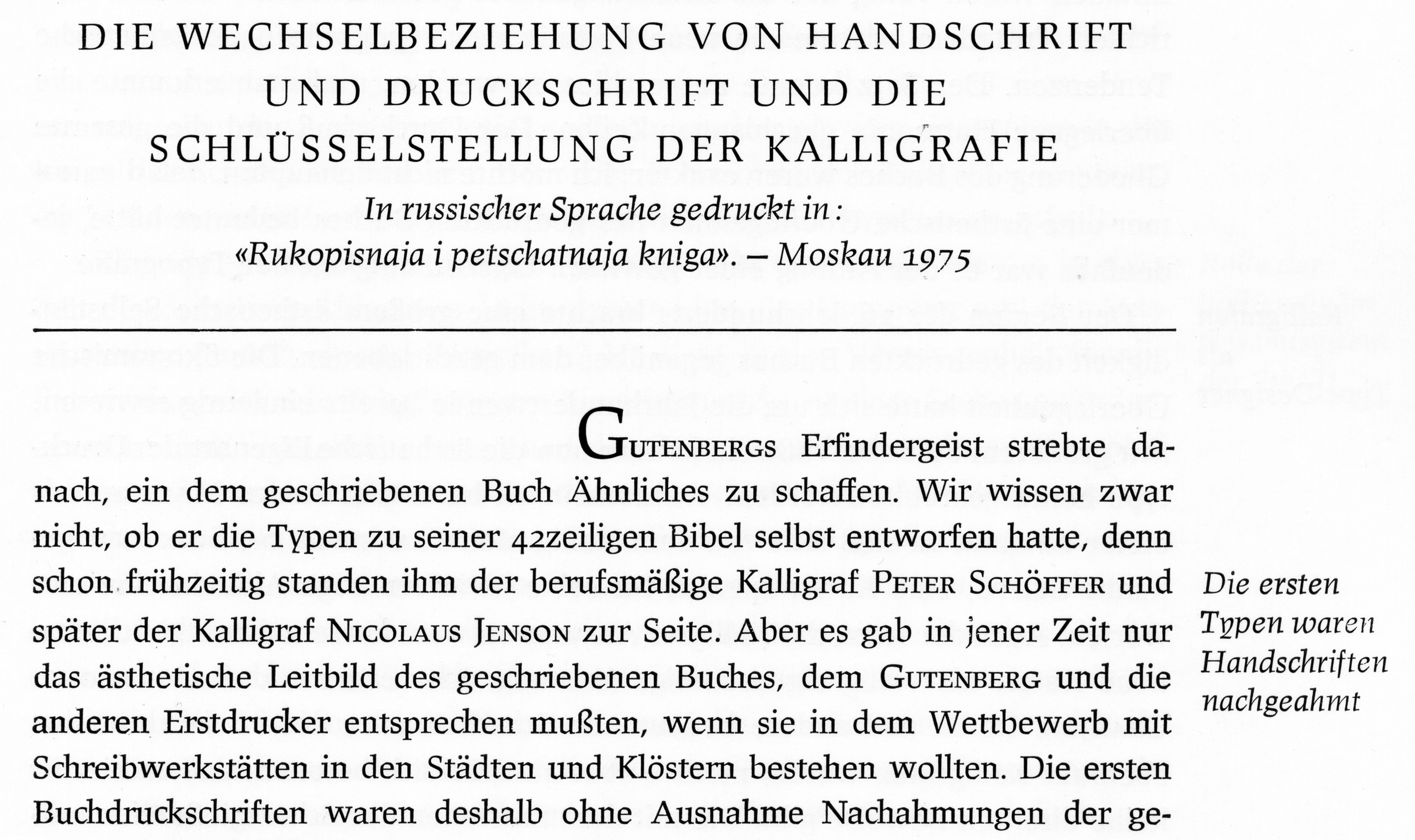
Die Buchstaben der lateinischen Schrift wurden zu Recht immer wieder auch in Beziehung zur menschlichen Figur verstanden.
Jede schriftliche Äußerung, ob mit der Hand oder mit der Schreibmaschine geschrieben, ob mit der Setzmaschine gesetzt, vermittelt immer auch einen ästhetischen Eindruck.
Der unterschiedliche Ausdruck der verschiedenen Schriftarten verpflichtet uns, die zur jeweiligen Literatur adäquate Schrift zu wählen.
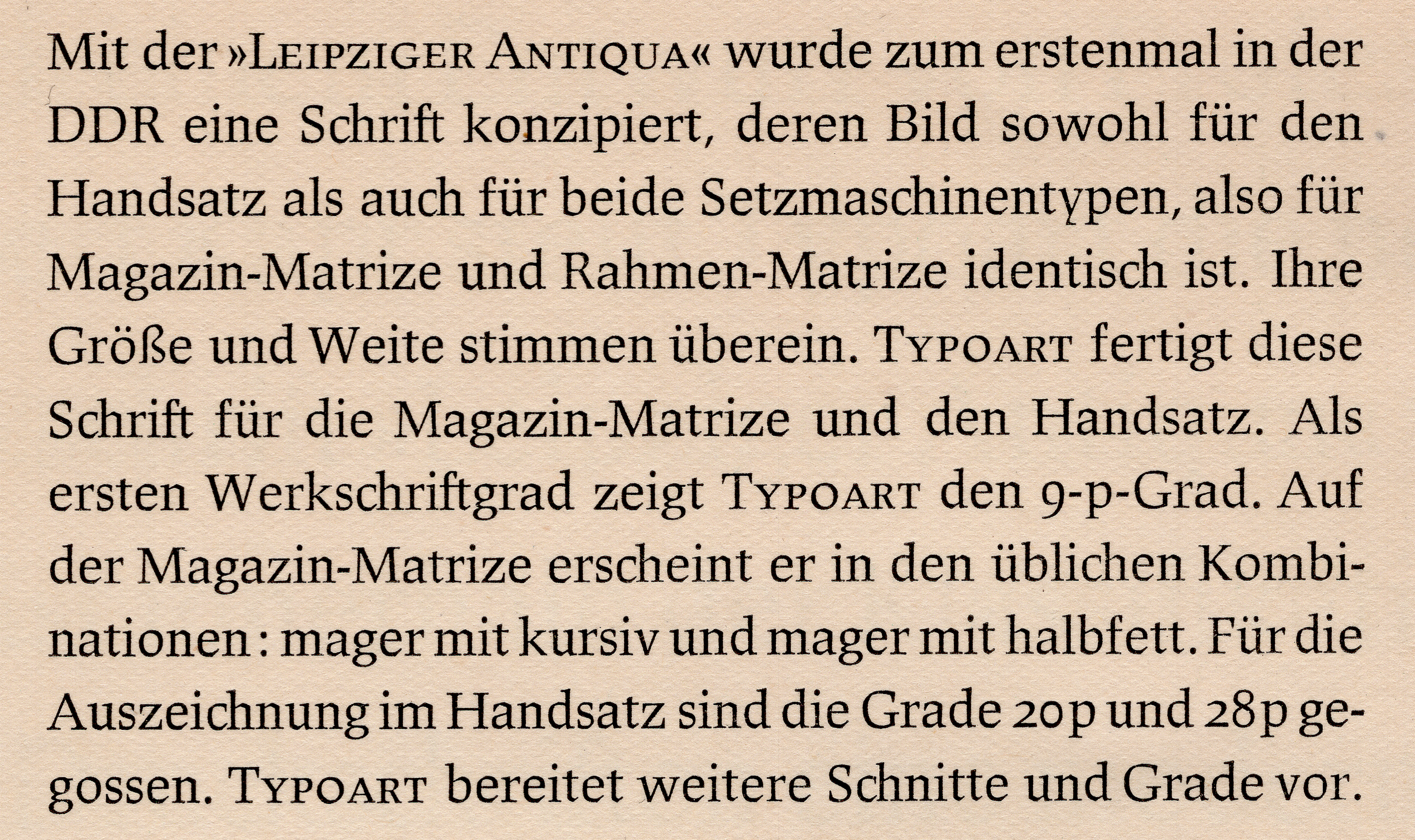
Der gegenwärtig vorherrschende Einsatz von historischen Schriften kann allerdings nicht befriedigen. Zumindest für die Literatur der sozialistischen Gegenwart sollten Schriften unserer Zeit eingesetzt werden.
While JAF Lapture is not a blackletter design, it is nevertheless a serif typeface with subtle breaks to many strokes in its letterforms. That trait is probably most visible at the bottom of the lowercase “t”, which could almost be a glyph from a blackletter typeface if considered on its own. Or the top of the “a:” in a typical serif face, the stroke making up the top and right-hand part of the “a” would be a curved arch that transitioned to a vertical stroke. In Lapture’s “a” that arch looks more like two distinct strokes, with the vertical being a third. The vertical beak-like terminal at the top-left of the “a” is novel. While it does not a blackletter reference, it does strengthen the overall broad-pen calligraphy look of JAF Lapture’s design.


With its subtle grafting of blackletter elements onto roman forms, JAF Lapture differs from Alisa Nowak’s more recent Eskapade Fraktur, itself an excellent typeface whose skeleton is a more literal mixture of roman and blackletter forms. As for Ahrens, blackletter is a space he has explored more literally elsewhere in his work. His Herb typeface, for instance, shows how well a pure blackletter-script typeface can be designed for an immersive-reading environment today. And JAF Johannes, created together with Shoko Mugikura, revives Johannes Schulz’s Johannes-Type, a 1930s hybrid blackletter and decorative sans serif typeface.
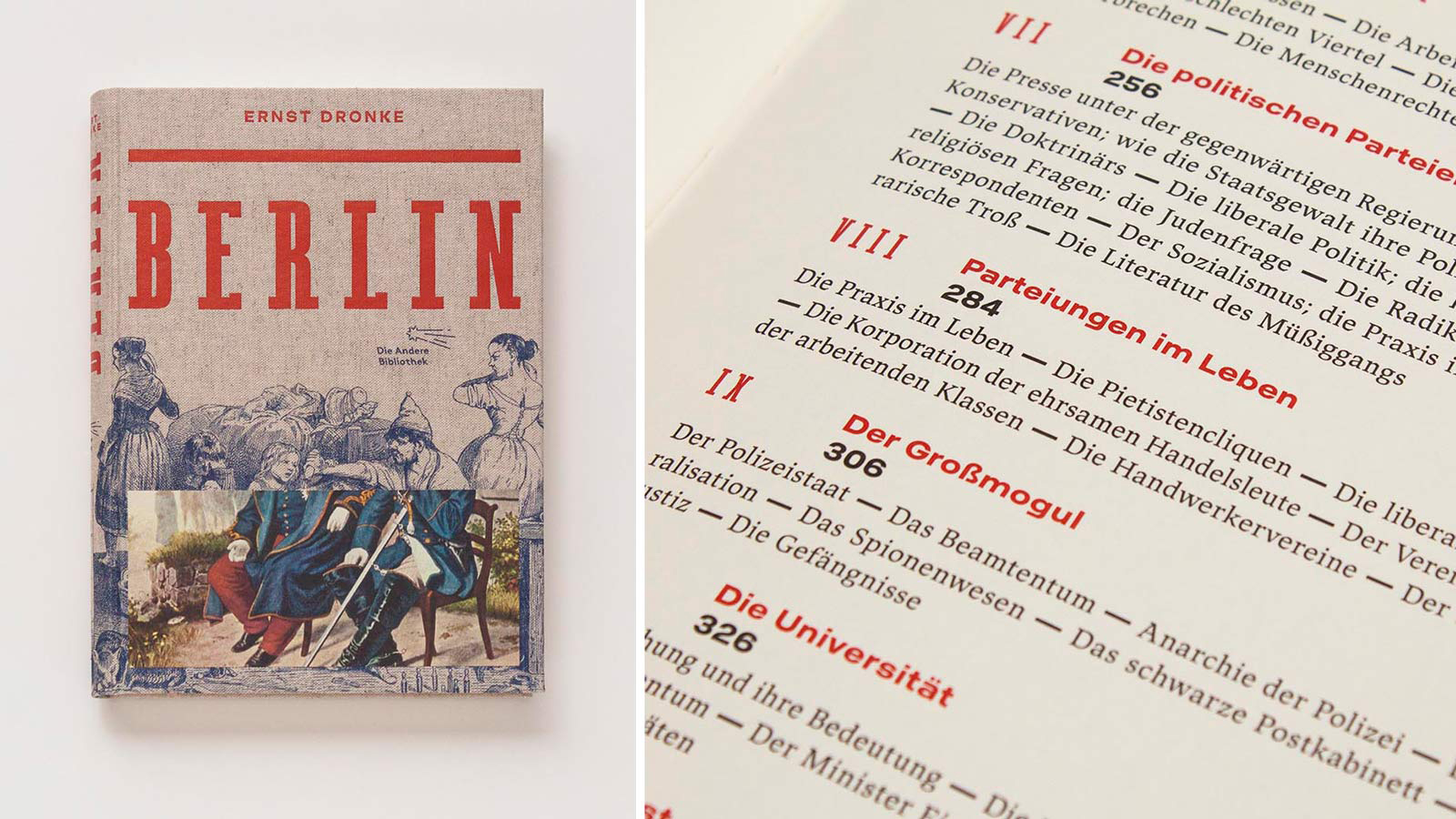
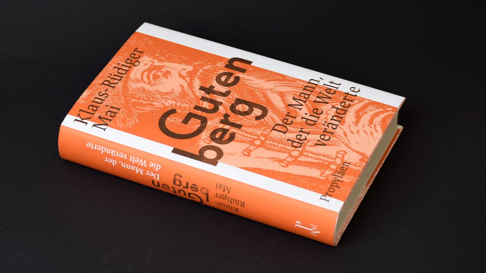
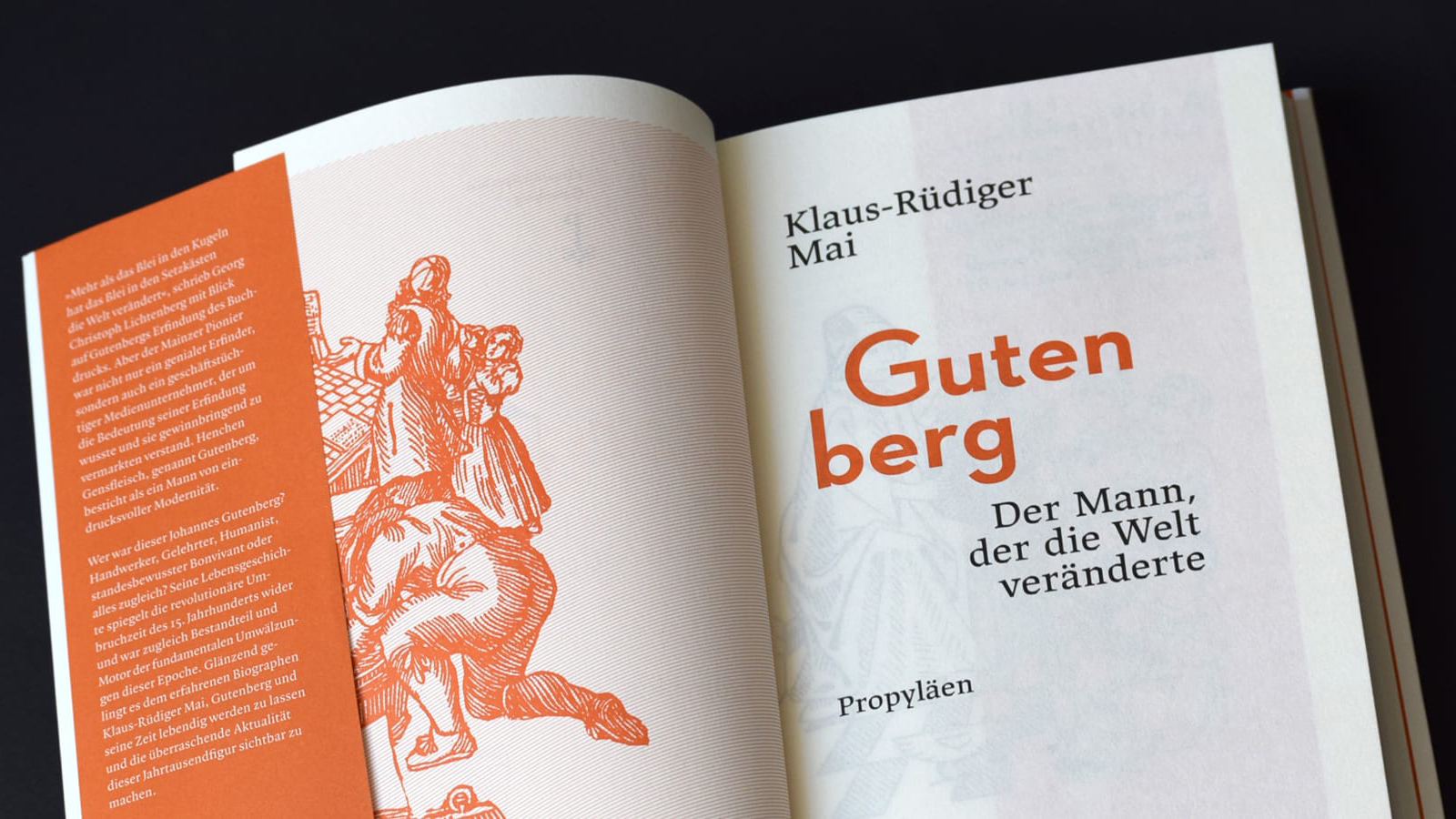
Ahrens’s JAF Lapture skillfully translates Albert Kapr’s Leipziger Antiqua typeface into digital format. Kapr (1918–1996) was one of the most prolific typographers in the former East Germany. His family authorized Ahrens’s revival. After completing his design studies in Stuttgart and working in the art school studio of the calligrapher F. H. Ernst Schneidler, Kapr moved to Weimar to become a typography instructor at a Bauhaus-successor school in 1948. Weimar was in the part of Europe soon to become the German Democratic Republic. A fervent communist, Kapr identified with the new nation. In 1951, he became a professor in Leipzig, establishing the Institute for Book Design at the Academy of Visual Arts in 1955. Together with his students, Kapr designed several typefaces. From 1963 through 1977, he was also the artistic director at VEB Typoart, the state-owned typefoundry that produced and sold Leipziger Antiqua. After Jan Tschichold, Kapr may well be the most-published author on typography in the German language. He developed Leipziger Antiqua for fellow book designers to use when setting political texts and contemporary literature but the typeface’s most prominent uses must have been in books Kapr designed himself.
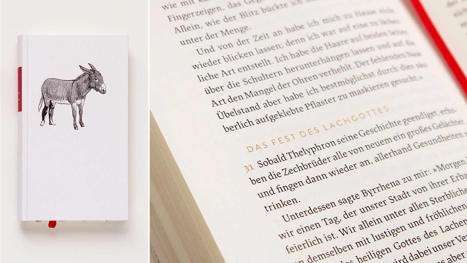
Leipziger Antiqua’s italics – and, by extension, JAF Lapture’s – are even more calligraphically-influenced than the upright styles. Their construction style is cursive, also referred to as “true italic.” That means their letters aren’t simply sloped versions of the upright ones but completely redrawn forms. In their cursiveness, the italics’ design is similar to Delphin, a typeface created by Georg Trump. Like Kapr, Trump had also been a student of Schneidler’s, albeit a generation earlier. The key characters summarizing Lapture’s italic style are the lowercase “k” and “y”, which combine looped and diagonal parts into striking shapes. Delphin handles them in the same way. Even the name “Lapture” references the original Leipziger Antiqua typeface. “Lapture” is the sound people from Leipzig make when they pronounce the word “Leipziger” in their local take on the regional Saxon-German dialect.
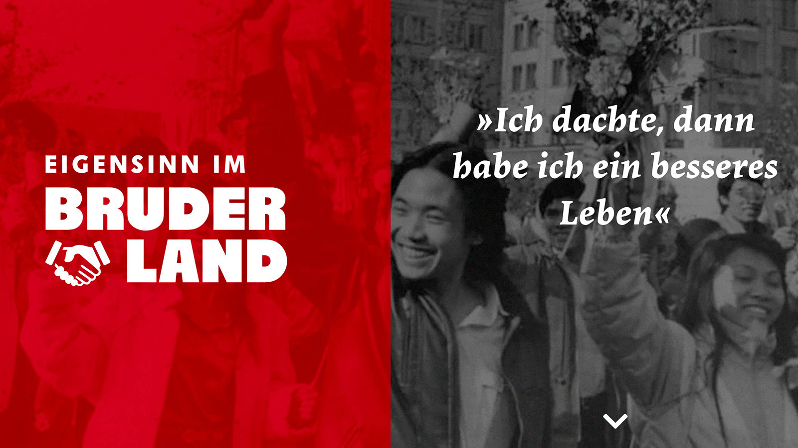
The digital JAF Lapture family only has three weights, but it is nevertheless rather large in terms of the number of styles it offers. Each of the three weights comes in four different optical sizes: Display, Subhead, Regular and a Caption size for small texts. Every size of JAF Lapture Regular, Semibold and Bold also has an italic, as described above. The fonts’ character sets include everything a well-rounded text face needs, including small caps and multiple numeral styles. Having been available for so long, Lapture has already seen a lot of use. Although several book designers have chosen it, the fonts may have had even more use in event-branding, packaging design and web design – applications that Kapr could hardly have imagined in the early 1960s.